SATURDAY SKETCHBOOK: UPSTAIRS BATHROOM OPTIONS

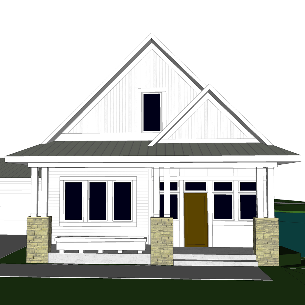
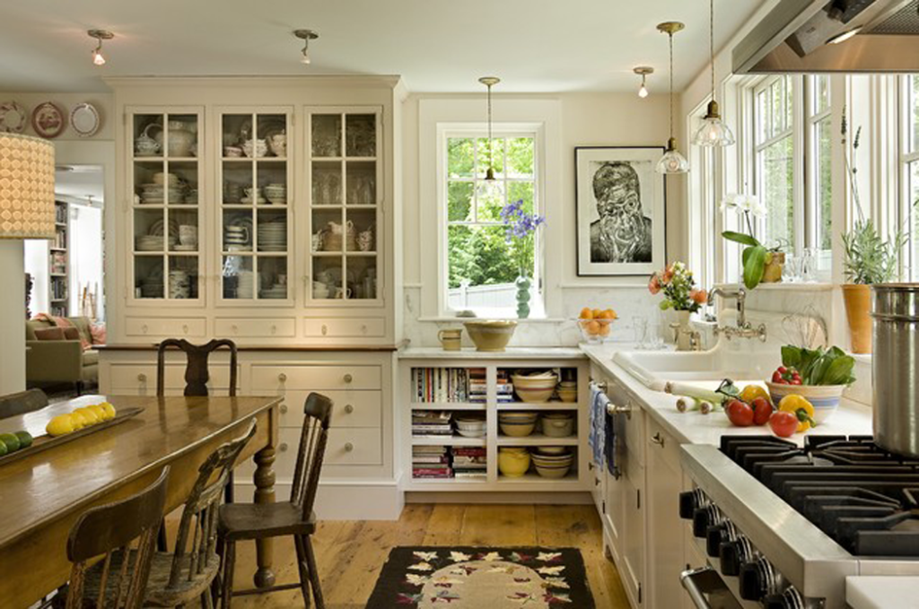
Since I recently posted about the most important aspects of bathroom design, I thought it would be a good time to take another look at the bathrooms I have been designing for our cottage.

I’m pretty happy with the location and layouts of both the main floor and lower level bathrooms, but the upstairs bath has me scratching my head. I asked Craig for help determining the best fixture positions – and, let’s just say he wasn’t super helpful. I really need to bounce these ideas off of someone, so I figured I could trust the loyal readers of this blog to give me some advice and guidance. I know you won’t let me down!

First, let me set the stage:

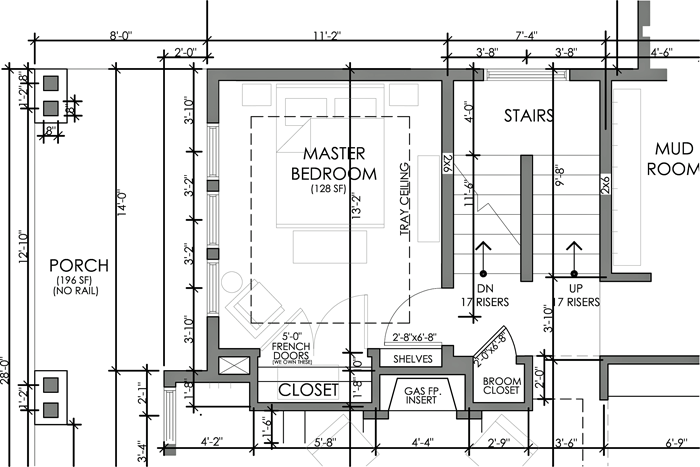
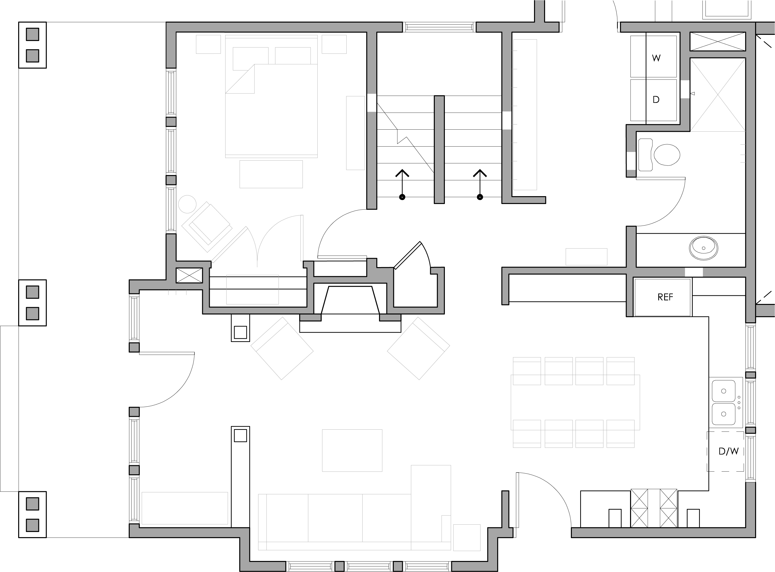
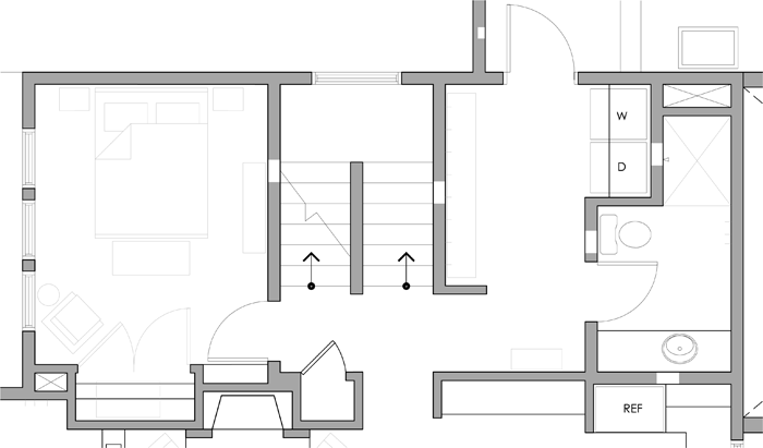
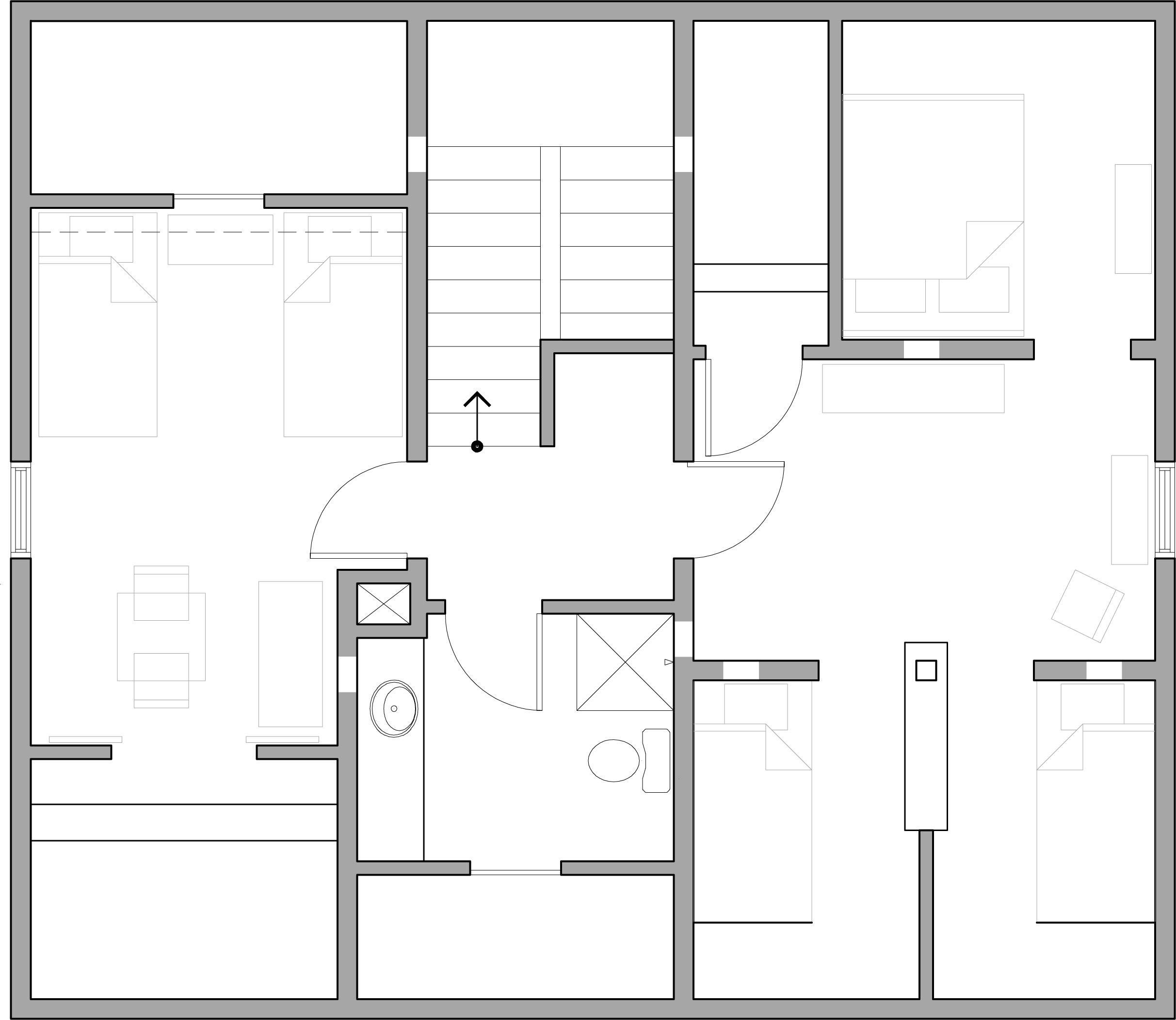
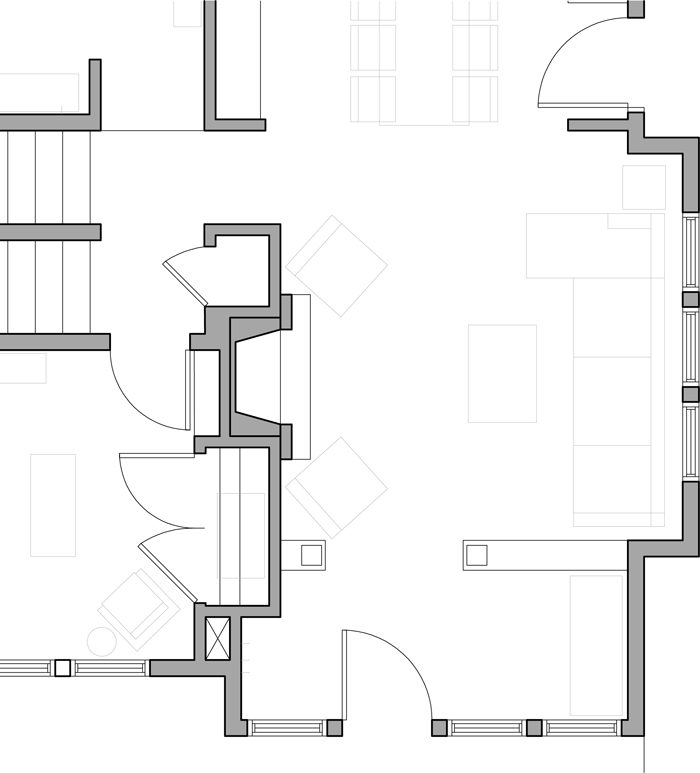
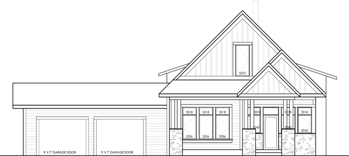
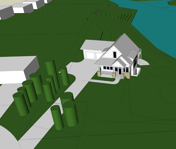
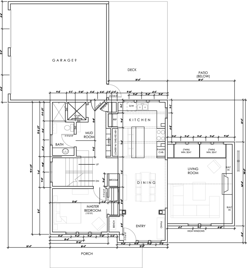
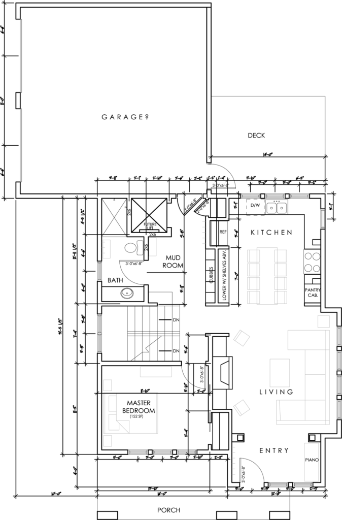
The bathroom location is not up for debate. The upstairs of the cottage is essentially three rooms, plus a hallway space. The bathroom is situated in between the boy’s and girls’ bedrooms. When someone walks up to the second level, they will enter a small hall space. Looking past the hall is the bathroom.

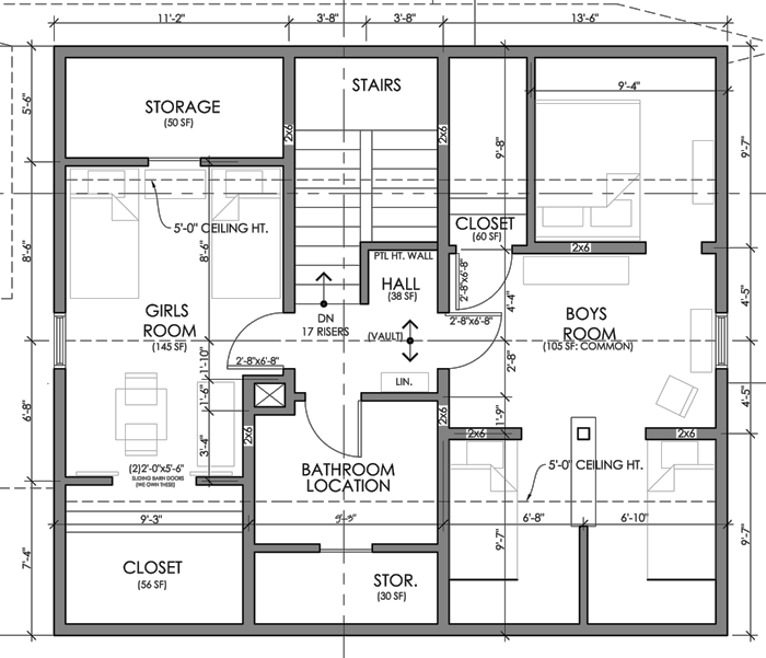
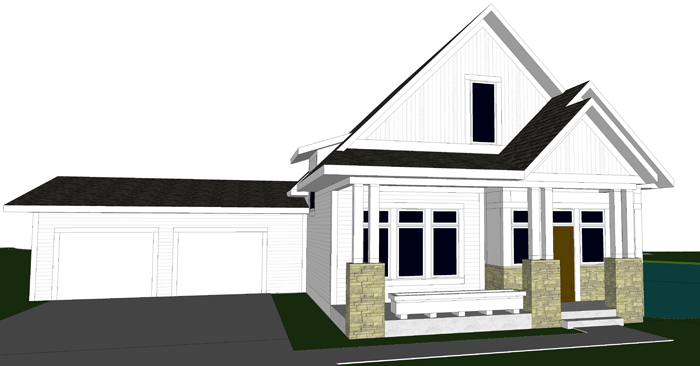
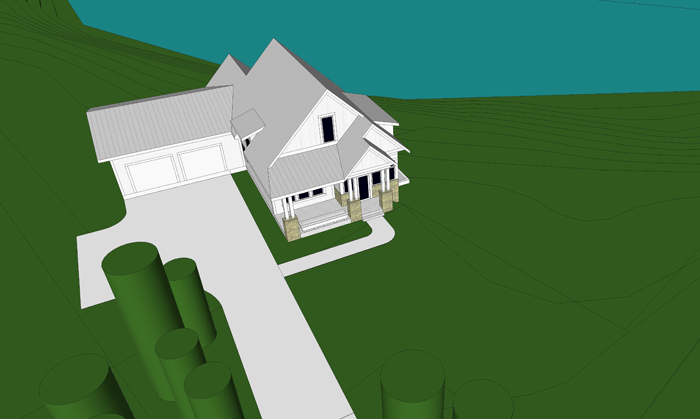
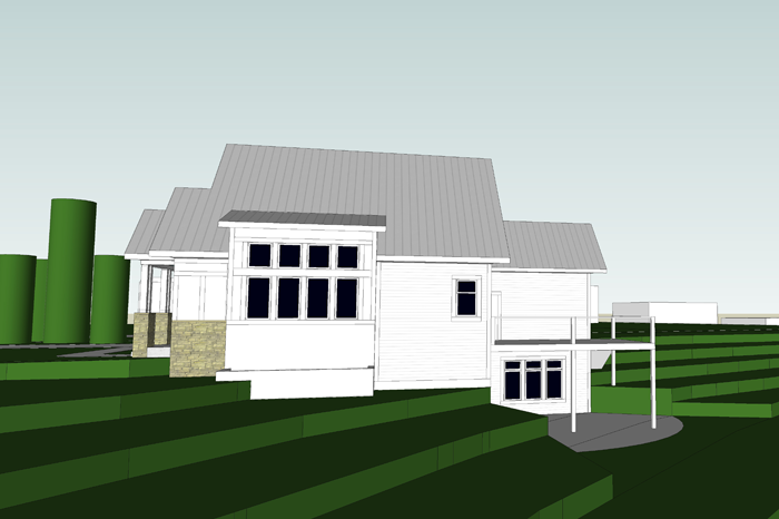
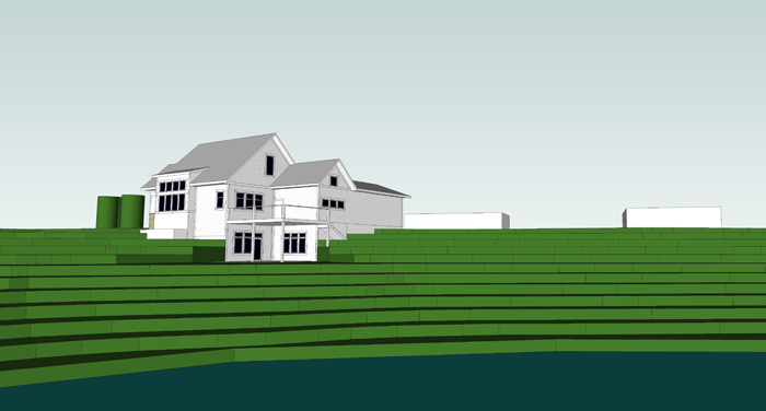
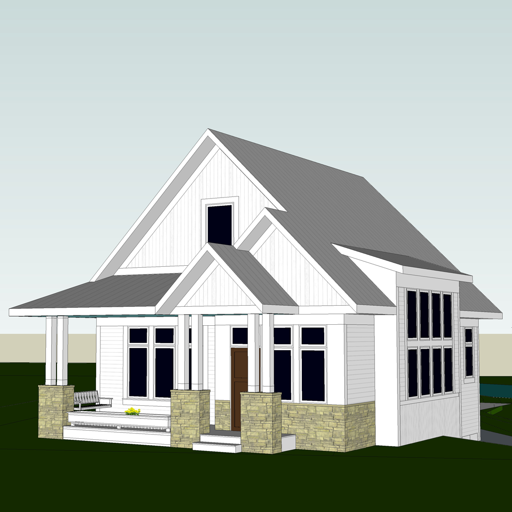
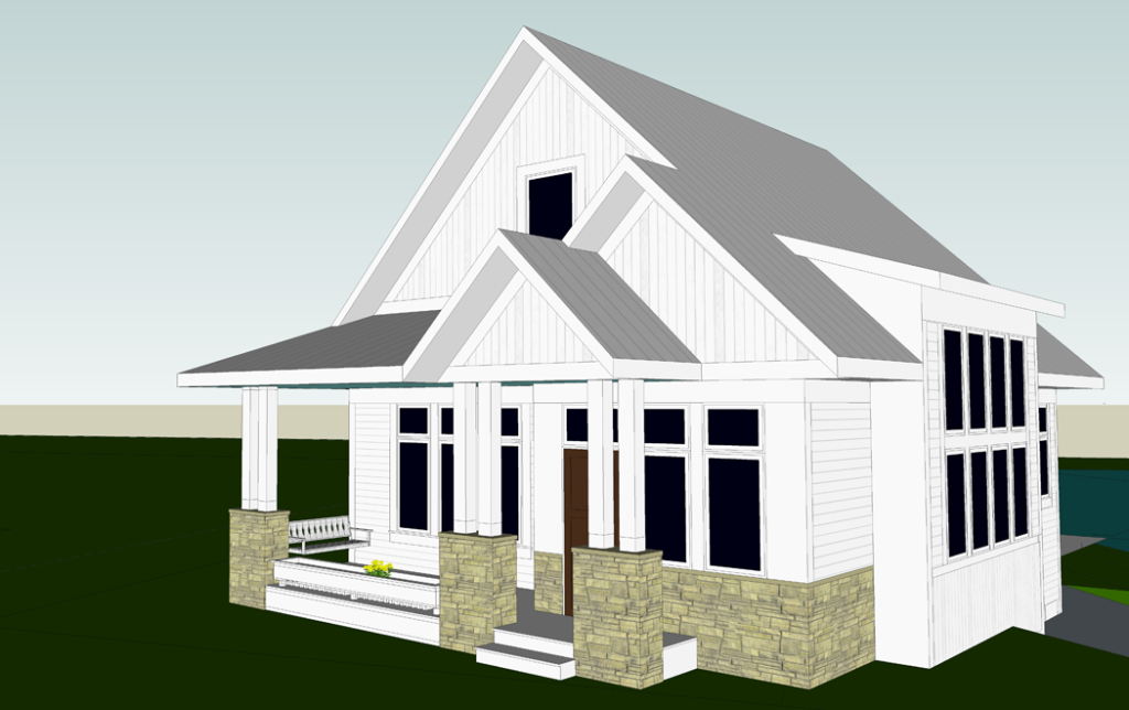
Because the second story of our cottage will be built underneath the roof trusses, the ceilings of each room will be sloped. In the image above, the dashed line that runs from the girl’s bedroom window to the boy’s bedroom window is the highest point of the vaulted ceiling. You can get an idea of what the pitch looks like by reading the post about the BOY’S BEDROOM. In section form – meaning if you were to slice the house in half, from the top of the roof down to the foundation – the second floor will look like this:


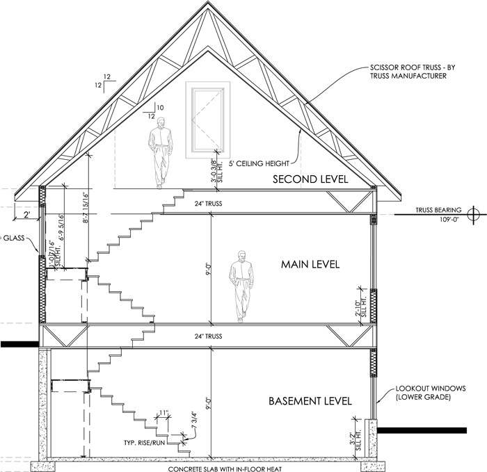
The sloped ceiling will add an element of interest and character that we are really excited about. However, in order to ensure that the bathroom fixtures are functional, I have been taking extra care in finding the most efficient position for each. This will be a 3/4 bathroom – containing a toilet, sink, and stand up shower. It will be a bit tricky to fit all three fixtures in the space, but Craig and I agree that it is important for the kids to have their own fully functional bathroom on the same level as their bedrooms.

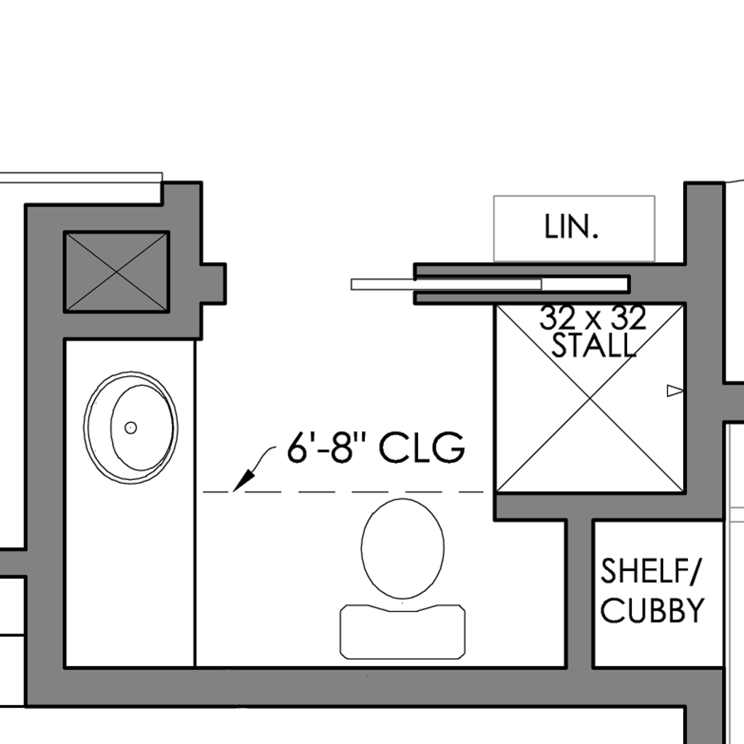
The slope of the ceiling for the bathroom will be around 4′-6″ at it’s lowest, on the outer wall (see notes below) to 9′-0″ at the door. The slope is quite dramatic. Residential building code dictates that a minimum of 6′-8″ head clearance be available at the front face/center of each fixture.

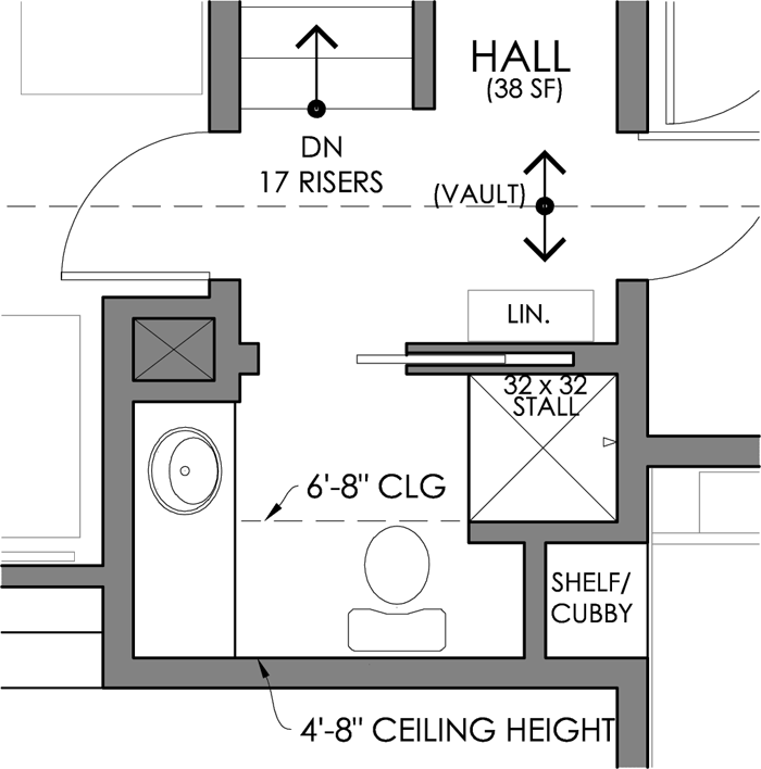
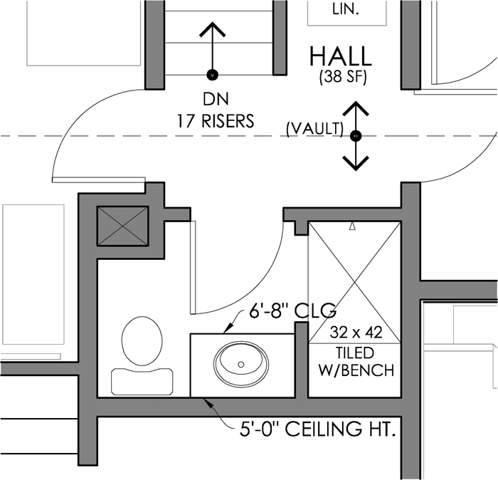
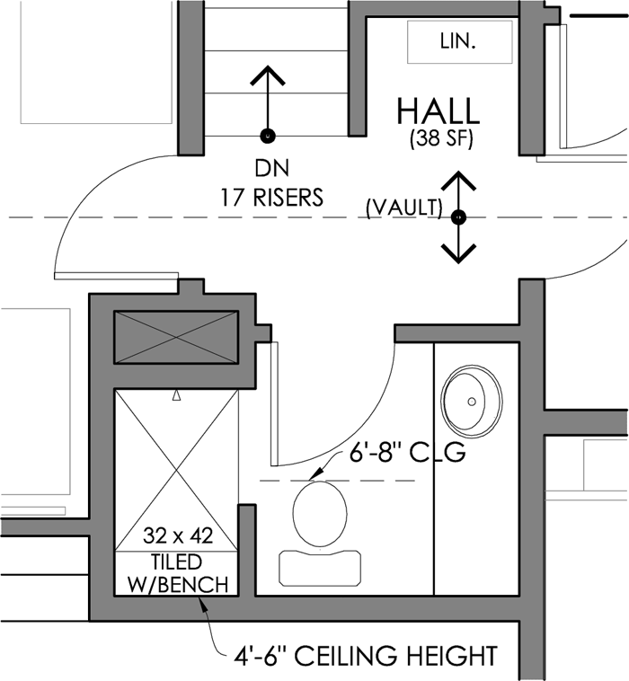
I have come up with three different layouts, each with their own merits and challenges. They are all in plan form. I understand that plans can be difficult to read for some people – and I apologize that I don’t have them in 3D form yet. I am kind of hoping to go forward with the three dimensional designing once a front-runner of these options has been chosen. * note: the shaded ‘x’ on each of the plans represents a mechanical chase that also needs to remain*


OPTION 1

This bathroom option includes 40 square feet of space. It is the most compact and likely also the most cost efficient of the three options. It features a pocket door to save floor space in the room, as well as a smaller fiberglass shower unit. The vanity is 4′-8″ long and the back of the toilet’s tank is situated along the shortest wall. The bonus of this option is that the sleeping nook in the boy’s bedroom would gain a small cubby/shelf space. I also appreciate that the hallway can be left a tad larger. The main thing I do not care for in this layout is that the toilet is quite visible from the hallway if you are walking up the stairs and the door is open. Also, the kids might appreciate a larger shower than this option allows.


OPTION 2

The next option is slightly larger, at 42 square feet, and offers a spacious shower. Because of the way that the ceiling slopes, it would need to be a custom tiled unit – which, no doubt, would be more expensive. I like the idea of the vanity being the first thing you see when you walk into the room, but am not in love with the fact that the wall behind it is only 5′-0″ high. I imagine the mirror for the vanity in this option would need to be placed on the wall that is shared with the shower. Maybe a pull out variety similar to THIS. The vanity itself is 3′-0″ long.

My favorite aspect of this layout is the privacy that the toilet has. It is sort of tucked behind the door when it is open, and completely hidden from view from the hallway.


OPTION 3

The final option is the largest, at 44 square feet. The vanity is 4′-6″ long and the shower is the same size as option 2’s shower. Again, it would be a custom tiled unit. I think that the fixtures are most easily accessible in this version and there seems to be more room to move about. The thought of the toilet being front and center when you enter the room is the thing that concerns me the most about this design.


I have started a couple of boards on Pinterest to further narrow the finishes and design elements I would like to incorporate. You can take a peek HERE and HERE.

Also – in case you are having a hard time visualizing what a bathroom with a slope ceiling might look like, PINTEREST has you covered. Lots of unique ideas there, always.


Now, I have an important favor to ask. Pretty, pretty please – could you comment on this post or on the social media link? Let me know which of these options you think is best, or which you would eliminate completely. Maybe there is a layout idea that I am completely missing. Let me know!

I will keep a tally of all the comments and let you all know which way I plan to proceed with the fun 3D portion of the design!

Thanks everyone!


SATURDAY SKETCHBOOK: MASTER BEDROOM

I hesitate to call this room the ‘Master Bedroom’, since it lacks some of what would be considered standard features. There will be no on-suite bathroom or walk-in closet. But it is the bedroom that Craig and I will use – and since we are the ‘masters’ of the property, per se’, I guess the phrase will work. Ha!

As I mentioned in this recent post – the room is not at all large. When dividing up square footage in the floor plan, we made the decision to give more to the shared/ public spaces in the house (such as the living room and kitchen) and to make the private spaces (such as bathrooms and bedrooms) a bit smaller. This is a decision that we are 100% okay with, as the members of our family tend to rarely spend time in the bedrooms.

The location of the bedroom itself was something I thought about for a very long time. Because we intend to live in Arrow Hill Cottage for as long as life allows, I wanted to be sure and include at least one bedroom on the main level. Our kids are old enough now that it works for our family to have their bedrooms upstairs – giving them (and us) a bit of separation and privacy. Besides the bedroom, the rest of the main level is shared/ public space – In order to make the room feel as private as possible, I used the stairway as a ‘buffer’ and also located the closets, fireplace, and built-ins between the living room and bedroom – which should help to reduce noise transfer.

The Master Bedroom is 10′-4″ wide by 12′-5″ long, 128 square feet. But even with it’s small size, it should be able to pack a good design punch – with a few key features.


NATURAL LIGHT

I have said before that I love natural daylight. The Master Bedroom will have three large South facing windows that overlook the front porch. They are sure to let in some great light, which I am very excited about! And because they are across from the bedroom door, the view out of these large windows is likely to be the first thing you notice when you walk in. For privacy and light filtration, these windows will likely have some sort of covering.

I like the look of a simple natural roman shade.


TRAY CEILING

We have a large amount of tongue and groove barn-wood, which was removed from an old summer kitchen on Craig’s parent’s property. I am hoping to re-purpose some of the wood in the trayed portion of the Master Bedroom ceiling. I think it will add a bit of warmth to the room, as well as sentimental/ personal appeal.

I also love sleeping with the white noise of a fan, and want to find a pretty ceiling fan to replace the chunky box fan that we are currently using.


FRENCH DOORS

The closet, though not the walk-in variety, is a decent size. We plan to use a set of vintage french doors (from the farmhouse we are currently living in) to access the closet space. Of course, the glass on the doors will need to be frosted in some way so that our clothes and shoes aren’t on display!

The doors have such a great patina, but I may need to sand and stain them to mix a bit better with the other wood tones.


TUFTED HEADBOARD

We have a queen size bed with the world’s most comfortable mattress. Although it has probably outlasted it’s life expectancy at this point, we are not ready to part with it.  I have wanted a diamond tufted headboard for a very long time. The thought of aqua velvet keeps popping up in my mind, but I think a more neutral fabric choice would better suit the room – without overpowering it.

There are a ton of great DIY tutorials for tufting, such as this one from Homeade by Carmona. It looks pretty straightforward and the directions are detailed enough that I may just get brave enough to tackle this project, and save a few dollars.

A nightstand and reading lamp with an operable arm will be situated on either side of the bed – giving the bed wall a very balanced and symmetrical look.


At the foot of the bed, I plan to position a special pine chest that my uncle built for me as a seventh birthday present. It is full of memories and keepsake items – and I cherish it!


READING NOOK

A few years ago I found this cute chair through a local online ad. It’s in a bit of rough condition currently, but it has a great shape and I can see a lot of potential! I am thinking of reupholstering it and maybe painting the frame, or staining it a different color.

There will be a series of shallow shelves behind the door, where I plan to house our book collection, as well as a few mementos and collectibles.

And of course, there will be baskets. No room is complete without baskets.


The rest of the accessories and art for the room are a bit sketchy in my mind at the moment – but I know that I want the vibe to be calm and relaxing, yet not too stuffy or formal. I am envisioning pops of color to add interest, and lots of visual texture. I love textiles such as rugs, pillows and bedding – and will surely have plenty of fun making each of those choices. Here are a few that have already caught my eye.

These pretty embroidered floral accent pillows are simply gorgeous. From Say It With Pillows on Etsy


Fun navy blue and white patterned pillow from Hayneedle


Grey and white striped sheet set from Target


This jute rug from Overstock would be a perfect natural accent to the room.


There may be enough room to have a tall and shallow dresser on the long wall.


Shallow dressers can be somewhat difficult to come by, but I did find some nice options from Wayfair, including this gorgeous piece.


On top of the dresser, I will layer art and possibly a mirror and other accessories. I love this sign from Rooted & Grounded Home (on Etsy)


I’m excited for this beautiful, clean and relaxing bedroom!


UNDERSTANDING WHAT MAKES HOME ‘YOURS’

We are in waiting mode, as three local contractors are pouring over our house plans in an effort to get us accurate bid numbers. They have seen plenty of house designs in their day – and no two exactly alike I’m sure.

There were some questions when we had our meetings with the contractors – and some comments made by friends and family, regarding the design choices we have made that make our home what it is. And I have been thinking a lot lately about how tailor fit this house is for OUR family.

I just wanted to take a little time today to encourage each of you to understand the home that YOU want to live in. What works for you and your family may not be the norm. It might not be what the real estate market expects, or trending on Pinterest. And guess what? That’s okay!


This is a list of a few of the unconventional features that have been incorporated into our new house design, and why we are happy with our choices:


LACK OF SQUARE FOOTAGE:

We understand that our house is on the small side. The primary dimensions of our house are 28 feet by 32 feet, making a rectangular footprint about the size of a standard two car garage. The smaller footprint was a function of both our challenging site, and also for monetary purposes.

We have said all along that we do not wish to live in a large house; but rather one that can accommodate today’s needs while we raise our five children, and won’t seem too spacious when they are all grown and gone. All told, the finished square footage of the cottage, including lower level and upstairs half-story, will be just over 2,000 square feet.


NO MASTER SUITE:

Most newly built homes feature a main level bedroom, complete with a large walk in closet and attached on-suite bathroom. Though our cottage will indeed have a main floor bedroom, so that we can age in place, the room will not have the features to make it a ‘suite’.

We have instead opted to have a large shared bathroom on the main level, near the mudroom/ back entry. It is only a short, accessible, distance from the bedroom; But it’s location through a public shared space will make it convenient for guests as well.

The closet for the main level bedroom is large – about 5 feet in length – but it is not a walk in style. We have justified the smaller closet space by realizing that we try not to keep items that are not useful to us. In fact, the only other closet on the main level is a small broom closet near the bedroom door.


SHARED KID BEDROOMS:

This design item seems to get a lot of attention. The idea that we can fit five children into two bedrooms gets a few raised eyebrows. For us though, it is the perfect set up. The kids will have the entire second level, which simply features two bedrooms (one for the girls, and one for the boys), and a hall bathroom to serve both rooms.

To be honest, our kids have always shared bedrooms and I think they would be a bit lost having a room all to themselves. We do, however, anticipate that as the teen years approach (our oldest son is 11) – they will want more privacy. The sleeping nooks in the boys room will aide in that regard – while still keeping them close.

Fewer bedrooms mean less nagging from mom and dad to get the rooms in order, and hopefully will develop some shared responsibility among the siblings to do their part in keeping things clean.


COMBINED KITCHEN/DINING:

While this design decision was driven primarily by the budget, during the simplification process, I have to admit that I am actually looking forward to the combined kitchen and dining space. The table, though standard height, will serve somewhat as an island if need-be.

I have been tinkering with the plan, and was careful to maintain a functional kitchen work triangle – with the table slightly offset from it. The large area of open shelving, with shallow cabinets below, almost mimics a hutch – which signifies a ‘dining’ space ever so slightly


RELATIVELY LITTLE STORAGE:

Because we know that, for us, items stored behind doors rarely get used, we have opted to have very few storage/closet spaces in the cottage. There is one small broom closet incorporated in the plans for the main level, but no coat closets. Instead we will use cubbies or hooks in the mudroom to house our outerwear. Upstairs, each bedroom will have a closet, and there are a couple of small unfinished storage areas in the eaves which will be useful for Christmas decor and other seasonal items.

It is standard to build three stall garages for new homes. Most families now have two vehicles, and will use the third stall for either an accessory item such as a boat/ ATV, or as storage space. Though we have been told that garage square footage is cheap and we should consider making ours larger – perhaps with a bonus space above – we have decided that a two car garage will be just fine for our needs. We are hoping that by setting the garage back from the house and making it only one story, it’s appearance will be minimized from the curb view. The fact that the garage will be attached is a huge bonus for our family, as we have never owned a home with that luxury. It will especially be appreciated during the cold winter months!


There you have it! Though these design choices may not be popular in today’s market – we aren’t looking to ever sell our house (instead hoping it will passed down through the generations) – and so feel no hesitation in making these changes that will allow the cottage to function in the best way possible for our family.

What makes your home personal? A unique shade of color on your walls? No formal entry space? Mix-matched cabinetry? I would love to hear, in the comments below!


SATURDAY SKETCHBOOK: FIREPLACE IDEAS


My husband and I have lived in 3 old houses over the course of our marriage – a 1905 farmhouse, a 1904 American Foursquare, and a 1920’s farmhouse. And although each of these houses have had their own share of character items, not a single one has had a fireplace.

We love the ambiance that a fireplace can add to the spaces it serves, and so for Arrow Hill Cottage we are working one into the design. For ease and safety reasons we are going to be utilizing a gas insert unit. I’m thinking something simple and not too large – maybe a model similar to this.

I have a feeling the firebox insert will be the easy decision to make. The more complicated endeavor will be determining what the fireplace surround should look like! Initially, I had designed in bookcases on either side of the fireplace; but ultimately decided that a larger bedroom closet, and a broom closet were more important for the function of the house; And so the fireplace itself will be positioned on a wall in our living room and serve as a stand-alone feature piece.

I have been tinkering around in Sketchup with a few different options of how to finish the surround, and thought it might be fun to share with you today and take a poll about which is everyone’s favorite. All four options include a chunky wood mantle, which we hope to have milled out of a tree that will need to be removed from our property for the construction of the house. I’ve intentionally left the top of the mantle bare, so that your eye can focus on the fireplace itself – but you’d better believe I will have a TON of fun changing out the decorations to dress it up!

I am sharing multiple images of each fireplace option, so that you can see how it relates to the spaces around it.


OPTION 1: WHITE BRICK + SIMPLE SHIPLAP


This is a really clean look, and pretty straightforward. It is also probably the most cost effective of all the options. If I have one concern about this option, it would be that it may be TOO white – and wouldn’t stand out enough as a focal point in a room that has all white walls and a white ceiling.


OPTION 2: STONE WITH BOARD AND BATTEN


The exterior of the cottage utilizes a bit of cultured stone on the porch column bases, as well as board and batten siding on the gable ends. I thought it might be nice to connect these element to the interior by using the same stone and paneling technique on the fireplace.


OPTION 3: CLASSIC WITH TILE


This is the fireplace finish that first comes to mind when I think about a historic home. It is clean, simple, and stately without much fuss. We have friends who had their tile laid in a herringbone pattern, which gave their fireplace a more contemporary feel and looks great! The portion above the mantle could be accented with a different color of paint, perhaps a bright pop of something dramatic.


OPTION 4: ALL STONE


This option has me a bit worried about the budget – as stone is not cheap! I do like the ‘cottage feel’ that it seems to give the space though! And it definitely draws your eye toward the fireplace as a focal point.


What do you think? Which fireplace option is your favorite? If you have any real-life personal experience about fireplaces – whether it is something not to do, or something you have done and love – please let us know by commenting to this post or on one of our social media locations!

Have a great Saturday everyone!


SATURDAY SKETCHBOOK: MORE SIMPLIFYING?

This week has been a busy one complete with my birthday, the kids starting school after Spring break, yucky weather, and the planning of a luau themed Father/daughter dance. In the midst of it all, we received a cost estimate for the building of Arrow Hill Cottage.

The estimate was higher than we thought/ hoped it might be. I want to be completely transparent with this process for all of you. Designing a house and having it built is going to be full of ups and downs, and in documenting them I hope to encourage anyone who is following a similar path.


I want my readers to understand that the process is not a straight path from point A to point B, but that each step will eventually lead to a final finished home. 


Craig and I are not complicated people, we have said all along that we want our house to be simple. Big enough for now, when we are raising 5 growing children under it’s roof – but not so large that it becomes a burden when we are empty-nesters.

When we first got the dollar figure, I will admit that we were a bit flustered once again. Not long ago, when we were told VERY preliminary costs to build, I had done a huge reduction in the size and complication of the design. We thought that these bold moves would get the number down to a more comfortable level. And surely, they did reduce the overall cost – just not enough.


Even though the bank may loan us the full amount that this contractor is estimating, we aren’t comfortable with what that would mean in terms of monthly payments.


We do not intend to be house poor. When you have a family, there are so many situations needing monetary attention that could potentially arise. If all of our monthly income is tied up in a house, it would  definitely add more stress during those times.

And so, we are at a cross roads once again. I am taking a look at the design to see where we could save and have identified a couple of areas that could be revised to be more cost effective if need-be. We will also be taking a close look at this post, and heeding our own advice. Even though we are friends with our preferred contractor, it is important to get second (and maybe third) opinions/quotes on cost.


In the end, I am confident we will be living in the house of our dreams – but that house might be a little different than what we had first imagined going into the process. And that is okay.

5 REASONS THE HOME DESIGN PROCESS SHOULD INCLUDE 3D MODELING

I have written before that I wholeheartedly believe that homes should be designed in both plan (2D) form and in the third dimension. Years ago architects and designers – in order to understand all aspects of space- would make physical 3d models. Physical models involve a considerable amount of time and attention to detail, and any little change to the design can add hours to the process. For that reason, designers would create rough models while working on concepts and save the detailed models for the very end stages of design.


Designers today have the benefit of technology on their side. Specialized software allows us to work in the third dimension through the entire design process. There are many 3D programs available for use, each with their own set of advantages. I personally use Sketchup, which I find to be extremely user friendly and powerful at the same time. One of the major bonuses of this program is that it is available FREE for personal use! In the future, I plan to offer tutorials here on the website – teaching easy steps to get started using Sketchup! In the meantime, I am offering the top five benefits of implementing 3D modeling during the home design process.


1: UNDERSTANDING THE FLOOR PLAN

Many people struggle to make sense of floor plans. Because we naturally don’t see walls cut through, or view furniture from above, a floor plan is difficult for the mind to process. It literally feels like a second language to some. Designers are trained to read these documents – but because their clients are not, frustration can arise when using a floor plan as a point of discussion.

standard floor plan view of Arrow Hill Cottage


By adding the third dimension, we are able to more fully understand how walls relate to one another, and also determine sight lines from one room to the next.  This is not only helpful for the designer, but also for the client that they may be sharing the information with.

three dimensional floor plan


2: ADDITION OF DEPTH + DIMENSION 

Construction documents are very useful for the crew who will ultimately build the house – these people are used to reading and understanding a plan set, and know how to transfer the information into a three dimensional built form. But the average person who sees a two dimensional drawing can not bring their mind to see beyond the flat image.

This is the front of Arrow Hill Cottage, as seen in a flat elevation drawing. From this view, it appears that the cottage is very long, and without depth.


Seeing the same design in three dimensional form gives you additional information – and as you can see, the garage is actually pulled back from the face of the porch by nearly 30′, giving it much less importance and prominence than what the elevation drawing would have you believe.


In this instance, the 3D model combined the information from BOTH the floor plan and the elevation into one image, making it easier to understand.


3: SCALE COMPARISON

Have you ever been in a space and found it to be either uncomfortably large or so small that it was not functional? The scale of a space is an important element that can be overlooked easily when working only in 2D.

Volume can only fully be understood with the addition of the third dimension. When designing in 3D you can easily determine the differences of how a room would look and feel with a flat ceiling versus a ceiling with a vault. In rooms with sloped ceilings, it is considerably easier to understand the amount of headroom available. Consider our boy’s bedroom design. This is a very unique space with a ceiling that slopes from 11 feet in the center, all the way down to the floor. In order to determine where to place the boy’s beds so that they wouldn’t knock their heads on the ceiling in the middle of the night, I turned to 3D modeling.


Once the Sketchup model of their room was complete, I was able to show these images to the boys – and they could literally imagine themselves IN the room. Huge smiles all around! It is really comforting to know that after all the work, they will enjoy the final product.


4: PRECISION IN PROBLEM SOLVING

There are many little details that can be missed when working only with two dimensional drawings. I find that adding the third dimension is especially helpful when I am fine tuning the design. For example, When I was looking at the cubbies in our future mudroom, I wasn’t sure which height would work best for the individual shelves and hooks. I measured items in our existing home to get a general idea of what would be most functional, but when I put those dimensions into the 3D model, I realized that the heights of the shelves competed with the height of the nearby trim, creating an awkward look.

With a bit of tweaking to the dimensions, the design is now visually appealing.


5: VISUALIZING THE FINISH PRODUCT SELECTIONS

Many of today’s 3D modeling programs, including Sketchup, have the capability to render in a semi-realistic way. Designers can add material selections, such as wood floors or a subway tile back splash. They also offer the ability to add furnishings and accessories.  These extra capabilities allow designers to create views of what the final product may look like, before the builder ever lifts a hammer.

When designing the living room of the cottage, I could tell that the space would benefit from the use of a sectional sofa. I was able to use Sketchup to find an amazing couch that fit perfectly. When the time comes to furnish the room, I can simply purchase the exact piece that I used in the design, or find an item with similar dimensions. Retailers are beginning to see this as a benefit, and have begun offering their furniture in three dimensional form, for designers to use in their mock ups – with the hope that their clients will purchase the exact pieces once they visualize how they could look in the room.


If these five reasons have convinced you that adding 3D modeling to your home design process is beneficial, I hope you will join me in the future as I share tutorials on how YOU can get started.  And, as always, if you need help in visualizing the space you can ask for a Makeover Takeover!


SATURDAY SKETCHBOOK: POSITIONING THE COTTAGE

The building site where a new home will be constructed is so, so important. Generally, it is recommended that you don’t even begin designing your house until a potential building site has been selected – so that the house can be developed to utilize the best features of the land, and avoid the pitfalls.


We purchased our building site in 2009. You can read more details about how we found and fell in love with our 4.5 acres in this post. Through the years, as I have been sketching ideas for the cottage, I have been careful to keep the lay of the land in mind – at least conceptually. I am now far enough in the design that I need to look more closely at how the cottage will actually be positioned.

This week I spent quite a bit of time fine tuning design details – the garage placement, the driveway configuration, and where the walkout door from the basement will be. Each of these decisions were heavily based on the site.


Our site is super unique, and has some interesting challenges. These are some of the site related issues that have been guiding our design:


SLOPED LAND

I’m sure that this particular parcel of land was passed over by multiple people solely because of its most dramatic natural feature – the slope. From the roadside there is a bit of flat land, but the slope down to the pond below is quite dramatic.


SETBACKS

The red area shown in the above graphic is the ‘flat’ land. The portion of land closest to the road (shown outlined in blue) is not build-able, because of setbacks and easements. Right from the start, we knew that we would likely have a longer driveway than most because of these setbacks alone.


MANY NEIGHBORS

Our land borders quite a few properties – both on the south and west property lines and, visually, across the pond. 14 parcels border ours. While this could be seen as a major drawback, I have been working strategically on the design so that our privacy within the home is maintained.


DENSE TREES

the kids standing by one of the many large trees that will need to be removed (2017)

One of the reasons we fell in love with our building site was that it was absolutely FILLED with mature trees: oak, maple, and other varieties. Sadly, there will be tree removal when the time comes to build. There is absolutely no avoiding that fact. By minimizing the overall footprint of the cottage, we hope to remove as few trees as possible.


EXPOSURE TO THE ELEMENTS

A view from our property, looking south. Our mini van is parked on the curved portion of the road.

An often overlooked, but important aspect of home design is the orientation it has in regard to the sun and wind. Because we live in a Northern climate, our strongest sunshine comes from the south. It is generally advised in this climate that you position your home with windows facing south (both for daylight, and for heating purposes in the winter). Thankfully, once a few trees are removed, we will have quite a bit of southern exposure.

It can get very cold in our state during the winter months – and the prevailing wind direction is from the northwest. I plan to rotate the cottage so that the garage can be used a bit for protection from those strong winds.


THE IDEAL POSITION FOR OUR COTTAGE

With all of these site issues in mind, I have narrowed down the placement of our cottage. I am working on finding the best angle of rotation and also determining how exactly the driveway will function – but we are getting close!


Just for fun, here are a few 3d images showing the cottage positioned on the land.

The cylinders are place holders for privacy trees (some of which are existing, and others that we hope to plant in the future. 


I worked a long time to find an appropriate position for the garage. I was sure that I wanted the garage doors to be set back from the front of the house/porch. For a while I had the garage rotated 90 degrees so that you accessed the doors from the side – but I eventually realized that this would not create ideal conditions for the driveway, making it both awkward and extremely long.  The garage is now accessed head on and set to the very back of the house so that it isn’t visually imposing.


The wall of windows on the southeast elevation will let in a ton of wonderful natural daylight. It is one of my favorite features so far, and never would have happened if we hadn’t talked to our contractor about current building prices – which prompted us to make a major change to the design.


You can see from this image how the cottage interacts with the slope. There will be a bit of excavating and retaining involved in creating the lower level walkout patio.


As the weather warms up, I hope to make a trip to the land again – and maybe stake out the corners or use spray paint to get an even more visual perspective on what we will see out of each window of the cottage.

Exciting times ahead!


SATURDAY SKETCHBOOK: PLANNING AND REVISING

This winter has been brutal. Think freezing or below for months at a time. No, I’m not exaggerating – anyone who lives in the Midwest will agree.

As I have mentioned before, our family currently lives in a rental house. As part of our agreement, we pay our own utilities – which includes the propane used to heat the house. Let’s just say the propane guy has been out here multiple times already this season, and gas isn’t cheap! The house just doesn’t heat well. It’s an older home and has leaks and cracks and windows that aren’t perfectly sealed.

This winter has been breaking us down.

One day at the dinner table Craig asked me “Is there ANY way that we can build our house sooner? I am not sure I can make it through another winter like this in the rental.” My honest answer was that I really did not know. I hadn’t let my mind go there.

But I agreed to check into it, and found myself at the bank the following week – sitting down with a loan officer who very kindly told me that our finances looked good but that she needed to have some clear estimates of how much this house would cost us to build. Gulp. Time for the dreaded bottom line.

I wrote about making sure you know what you can afford in THIS recent post. Craig and I are frugal people and no matter what a bank would tell us that we CAN spend, we would never put ourselves in a position where we had a monthly payment that was too difficult for us to meet. We had our best guess dollar figure about what we could handle/month on a loan, but had not yet determined full building costs – besides a general cost per square foot number.

We called up a contractor friend who met with us and talked us through various material decisions. He let us know industry standards and which finishes he thought weren’t worth their price tags. All very good information. Then he started throwing out numbers of recent newly built houses, similar in square footage to what we had designed, and the price tags they had attached to them. GULP again. Wow. Did he really just say that? His cost per square foot numbers were quite a bit higher than those I had been working with.

Of course, there is a range – but in all honesty even the lowest priced was slightly above our comfort level.

main level of the cottage (as designed when talking to the contractor)

Finishes will play a major role in the overall cost, and so in the next couple of weeks we are going to sit down with him once again and talk through actual numbers as they relate to our project. I am already guarding my heart – and I am pretty sure that the bottom line will require some major changes to be made. I’ll be honest that I was pretty bummed for a day or two after our meeting.

The good news is that we are heeding our own advice and finding out these costs early. We aren’t just hoping that everything will come in within our magical budget number.

And, it’s also good that I love to design. I’ve already gone back into the ‘archives’ of plans to see how different ideas could be incorporated. One of the first areas we noticed that could be revised was the large vaulted living room. The elimination of that wing of the house would essentially remove 640 square feet (320sf per level: main and lower). Based on what the contractor was telling us, in ‘real world dollars’ that may be a $100,000 decision. For our family that is a MAJOR amount of money.

I went looking for how that wing could be eliminated and eventually realized that by simply eliminating the kitchen island and moving the table into the kitchen in it’s place, a large area could be opened up and re-imagined into a living room. Interestingly, the positioning of the dining table in the kitchen is a building design trend that makes sense for a lot of families.

image source


Though this revised living room isn’t as large as the initial design and doesn’t come with all the bells and whistles I had been dreaming of, it’s okay. It has the potential to be a lovely space, maybe even with a small vault space and extra windows in the bump out area.

main level of the cottage – simplified and reduced square footage


The other major bonus is that nothing else on the main level would have to change much, so from the exterior the house looks essentially the same, minus the extra wing.

potential revised exterior without living room wing


These are all still ideas, and until we get actual bids on construction materials for our home we won’t know if this major cut will need to be made. But we are preparing for the potential, and know that whatever we end up with will be the perfect fit for our family – in size and style – while at the same time making sense for our pocketbook.


DIY TODDLER BED | RE-PURPOSED CRIB

What should you do when your child outgrows his/her crib? Consider re-purposing it into an adorable DIY toddler bed, using this simple tutorial.


repurposed crib into a toddler bed. Adorable DIY toddler bed
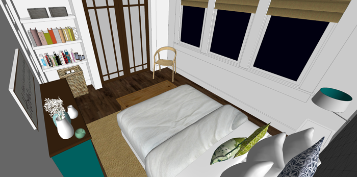
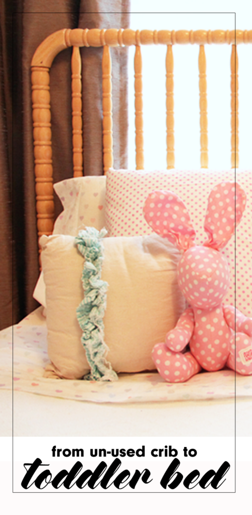
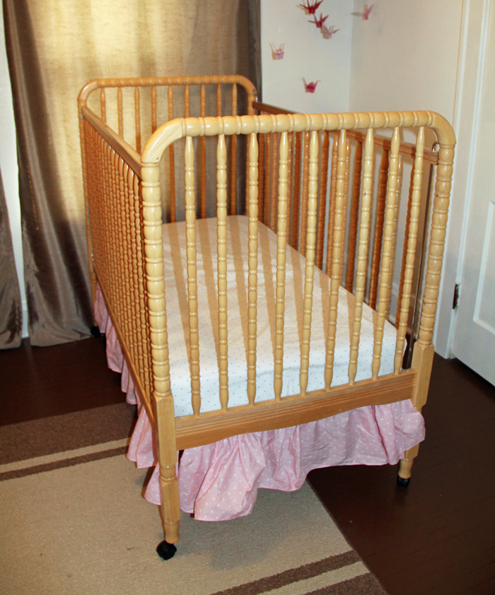
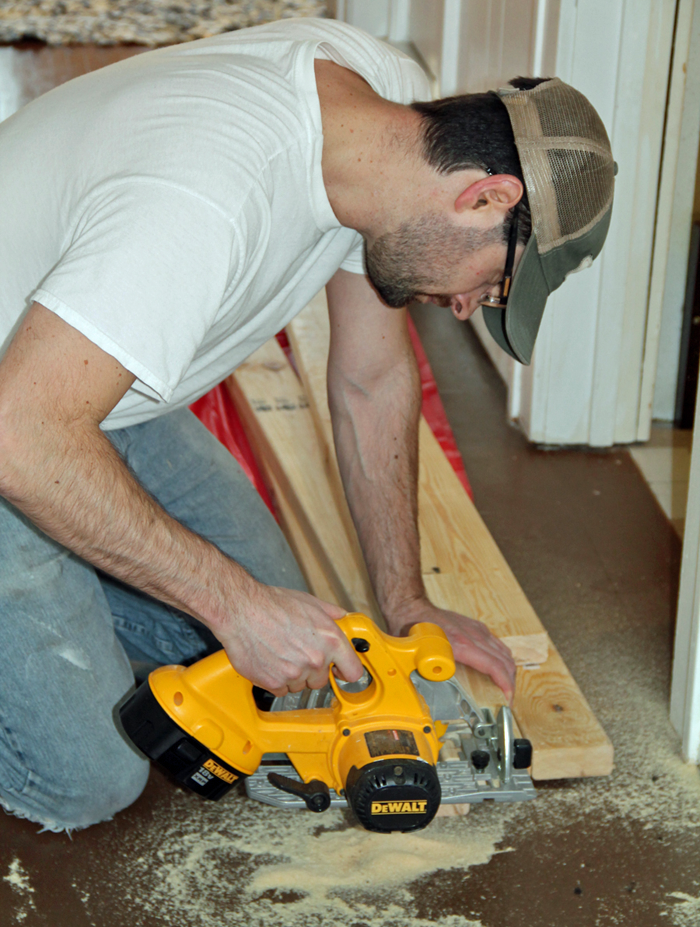
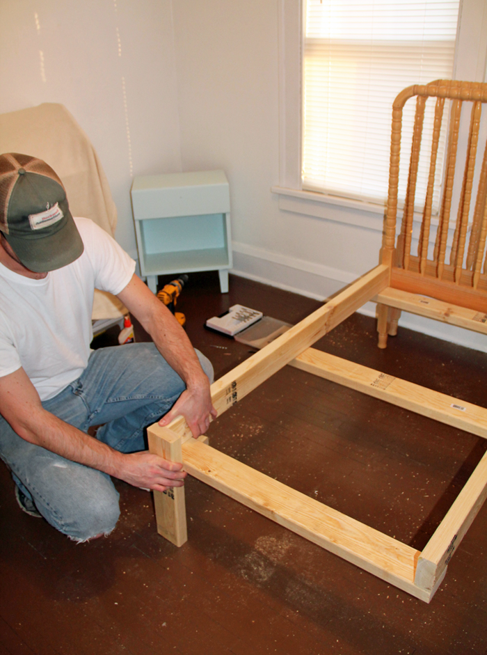
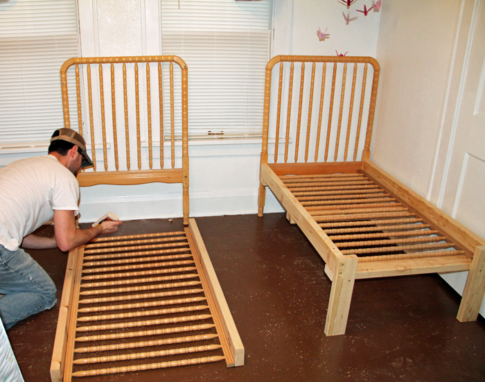
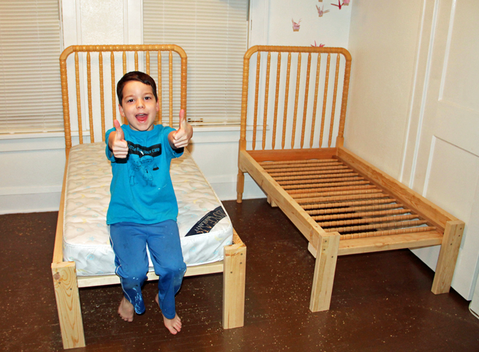
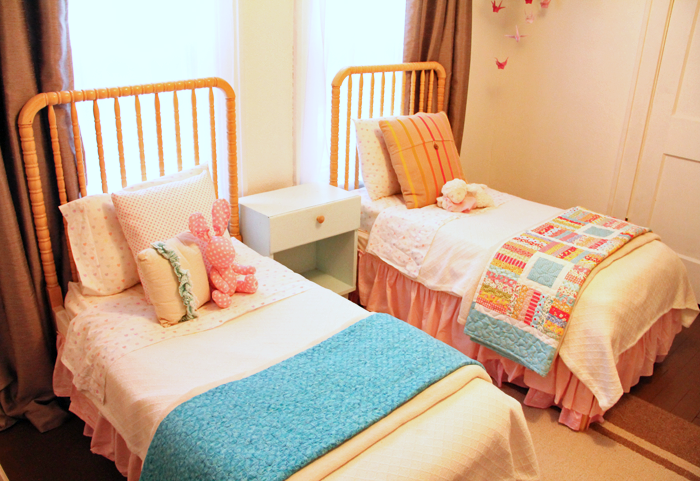
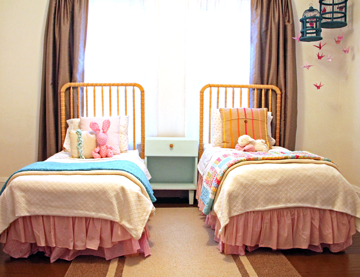
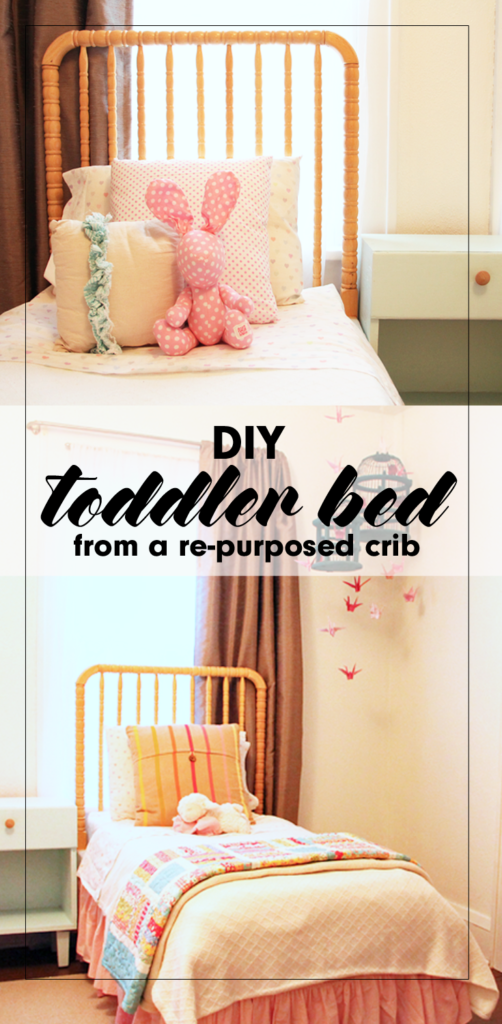
Not many moments spark the same amounts of joy and sadness as when the youngest child of the family finally outgrows the crib. With the celebratory occasion of assembling the ‘big boy/girl’ bed comes the equally emotional moment of taking the crib apart.

We were faced with this exact scenario in the months before we took the trip to China to finalize {K}’s adoption. {M} had always loved the security of her crib, the same crib that all three of our sons had also slept in, but at 3 1/2 years old, it was finally time for her to say goodbye as well.

converting an unused crib into an adorable toddler bed

It was at that moment we were faced with a difficult decision. What do we do with the crib? Maybe you are nearing this milestone and have had the same question. Today I am offering a tutorial explaining our personal crib re-purpose DIY project.


THE CRIB BEFORE

Our simple, Jenny Lind style crib was well loved but it’s natural wood finish and spindle details had a charm that we wanted to preserve.


crib transformed into toddler bed in 5 easy steps

It was given to us as a hand me down before {D} was born, over 11 years ago. Needless to say, it was equipped with the notorious ‘drop side’ – a feature now considered dangerous. We had long ago disabled the drop side, but legally the crib was no longer eligible to sell (or give away). Even still, the crib had a beautiful Jenny Lind style, and the thought of throwing it in the garbage just didn’t sit right with us.

We brainstormed a few different ideas, and eventually decided that the best option for our family was to turn this ONE crib into TWO toddler beds – one for 3 1/2 year old {M} and one for her 6 1/2 year old sister {K}, who has arthrogryposis and is small for her age. We knew they would both fit comfortably in the smaller sized bed for a while, and that the bed DIY project could save us some money as well!


CREATING THE DIY TODDLER BED

I’ll be honest that at the time of the project I wasn’t thinking in terms of getting enough pictures for a tutorial. I only have a few photos, but will try to fill in the gaps with words. If you have any questions about the process we used, feel free to comment below or send me an email!

STEP ONE

My husband Craig disassembled the crib, which actually made {M} very angry! She couldn’t see our ‘vision’ at the time and was just upset that he was breaking the comfy place where she loved to sleep. Essentially, all pieces of the crib were used to create the new beds with the exception of the hardware and the spring mat.

STEP TWO

We purchased standard 2×4 material, and Craig cut them to assemble a three sided ‘box’ that would hold the crib mattress. Because we planned to use the two tall sides of the crib as headboards, he only needed to make legs for the end of the box. He reinforced the center with a 2×4 cross base.

creating a diy toddler bed

diy toddler bed framework using crib parts as headboards


STEP THREE

Craig attached the assembled ‘box’ to the headboards, making sure everything was level. He then set one side rail into each of the ‘boxes’. The side rail piece spreads the weight from the mattress out over the 2x4s included in the ‘box’ construction.

using an old crib to make a diy toddler bed

STEP FOUR

The crib mattresses were then added. They were a perfect fit, as demonstrated by this goofy picture of {L}. Crib mattresses are a standard size, but they can vary slightly. If you try this project you will want to base your dimensions on the crib mattress you have. We happened to have two mattresses, one that was used in the crib and another that we had for a different toddler bed.

building a diy toddler bed


STEP FIVE

Dress it up! I created pink ruffle bed skirts using this easy tutorial. They really were simple to make, but a bit time consuming! I used muslin fabric to cover up the exposed 2x4s near the mattresses.

toddler bed diy ruffled bed skirt

I also found some adorable heart bedding from Pottery Barn Kids. Grandpa and Grandma purchased the bedding as a gift for the girls. A king sized texture blanket was the perfect size to cut in half, allowing me to make two matching comforters. Topped with accent pillows, and comfy colorful quilts, the beds look super cute on each DIY toddler bed!

girl bedroom bedding

repurposed crib turned into diy toddler bed


FINISHED IN THE ROOM

The finished beds look so sweet set up together in the room. I still love walking by and admiring them, over a year later!

old crib turned into two diy toddler beds

The girls really enjoy sharing a room and their little beds fit perfectly into their bright and cheery space. Although I am having fun designing their new shared space for Arrow Hill Cottage, I will be sad when we have to retire (or pass on) these special beds their daddy made them!

simple do it yourself toddler bed from an old crib


MORE SHARED BEDROOM DETAILS

Just for fun, here are a few more details of their shared bedroom.

girl bedroom reading nook

This rocker was Craig’s grandparents. We had it reupholstered before our first child was born, and have used it in the nursery ever since. It is a special piece. Next to it we have a bookshelf, making this the perfect spot for reading.

girl bedroom tour

The bookcase itself is a vintage piece from our local Carnegie Library, which is now closed. I love that the girls are able to see the fronts of the books when making their selections.

diy girl bedroom decor

Above the bookcase is a DIY piece that I put together using a mirror frame, which I spray painted white. I covered the mirror with a fabric. It is attached with temporary adhesive, because I imagine in the future the girls may opt to use the mirror itself. The heart was made by weaving strips of paper grocery bags.


girl bedroom decor ideas

Both of our girls were adopted from China – {M} at the age of two in 2015 and {K} at age six in 2017. We always want them to be aware of their beautiful birth culture. The paper crane bird cage/ mobile symbolizes peace and longevity. I folded each of the cranes by hand using a variety of pink patterned paper. The dresser was mine when I was a little girl. It was a gift to me from my grandpa, and I love that I can pass it down to daughters of my own.

shared girl bedroom ideas

Above the dresser are more symbolic and special pieces, including two panda bears from China – one from each trip.

diy toddler bed

We painted the floor in the girls room, and the entire upstairs of this rental house, a chocolate brown color. It has held up very well and is actually something I am considering for the new house.


PIN THIS DIY TODDLER BED IDEA

I hope you enjoyed this little tutorial and the impromptu room tour! I would love to see the creative ways you have re-purposed a piece into something new!

diy toddler bed from a re-purposed crib


FRONT ENTRYWAY DESIGN IDEAS

A front entrance for guests is a great feature to add to any home. It doesn’t need to be a large space, but having it laid out well is important. Today I am sharing the front entryway design ideas I have for Arrow Hill Cottage.

Although our home will have an attached garage, and our family is most likely to enter and leave in that direction, I wanted to make sure to include a straightforward front entrance – where we expect visitors to enter. I’m not sure about you, but our garage has a tendency to become cluttered and dirty far faster than any other space we own – and we don’t want our visitors to experience our day to day.


ENTERING FROM OUTSIDE

As you can see in this image, the front door will have a prominent position. Although the house is not symmetrical, your eye is drawn to the small gable above the door.

creating a charming front entryway

In case you noticed… yes, I am still #teamplanter, and it remains as part of the design, at least for now. If you have no idea what I’m talking about – go ahead and visit THIS POST to learn all about the debate.

The large stone pillars and double columns frame the view.  I’m sure there will be some sort of feature light fixture here also, but I haven’t made any decisions on that yet. And yes, I am dreaming of a light blue bead-board ceiling for the porch. Love.


cottage front entrance. Covered porch with sweet and simple front entry

I have chosen a solid wood door. Because there will be windows directly next to and above it (transom), I felt that including a smaller pane of glass within the door itself would complicate the arrangement. The windows should provide plenty of natural light (this wall will be south-west facing)


INSIDE THE ENTRYWAY

Stepping through the door, you are welcomed with a space approximately 6 feet deep by 12 feet wide. The room is partitioned from the dining room by a pair of built-in cabinets and columns.

front entryway with custom built ins and columns used to divide space

We will likely have our builder or cabinet maker create these cabinets and columns, but This Old House wrote a fantastic post about how you can make this a DIY project. I purposely chose to offset the built-in slightly from the alcove since the wall finish and the cabinet finish will be different. This will help eliminate a clumsy transition from cabinet to wall. The baseboard trim will help to tie everything together.

front entryway design ideas for our new home. Simple white bench in front entryway

As I mentioned in this post, we have found that with fewer closets we are less likely to hold onto items we don’t need. This entry is indeed the perfect opportunity to live that theory. Because most of our family’s shoes, coats and bags will be coming in through the back entry / mudroom, we won’t need much for storage near the front entry. Instead of using the recessed space as a closet, I am opting to leave the alcove open and instead will incorporate a bench with simple hooks and a shelf above.

simple front entryway design ideas

This alcove also lends itself to the inclusion of a feature wall. At the moment, I am thinking that beautiful rustic barn wood would serve as the perfect surprise. The feature wall will serve as a backdrop for a family photo gallery.

gallery photo wall in front entryway. front entryway design ideas for our new cottage

This post, from the blog Ivory Lane , has given me a ton of inspiration for the entryway gallery. I love the simple nature of the metallic frames, white picture mats, and black and white images.


ACCESSORIES + DETAILS

On top of the small shelf above the coat hooks, I envision some cute artwork that represents our family. These number squares are amazing.

cute front entryway decorations

image source


I also love sentimental signs and would love to work something like this into the entryway space.

front entryway sign idea. This simple phrase is beautiful and would be perfect in the front entryway of a home

image source


Opposite the bench area is where I envision our piano being placed. We own a low grade piano that is natural wood and wood grain veneer at the moment. I would love to paint it a soft gray color and decorate it with special accessories – such as the vintage green cottage window that I recently purchased at an antique store. I know there is some debate about painting pianos, but they make it look so easy on Pinterest, and I am really intrigued by the results.

piano positioned in front entryway

Nobody in our family is a concert pianist, but we do enjoy having a piano to tinker around on. In this location it is available, but set aside so that it isn’t in the way of other daily activities.

For the center of the room I would like to find a special light fixture. I am thinking something with a metallic finish, probably a hanging pendant.

front entryway design ideas. new home design

Perhaps something from this collection would work well.

wire framed pendant light fixtures for the front entryway. Front entryway design ideas for our new home

image source

The floor will require some sort of durable rug that will mostly protect the wood floors. I love the idea of a black and white patterned rug.

view of small and simple front entryway

This website seems to have a wonderful selection of rugs to choose from.


decorative features for our front entryway


ADDITIONAL ENTRYWAY VIEWS

And now for a few more views of the entryway. First, a view from above – one that nobody will ever experience in real life. It shows the overall space well.

front entryway floor plan layout


A view from the kitchen (standing near the stove) looking toward the entry. You can see the kitchen design in this post. The space between is the dining room, of which I am still working on designing. The only thing I know for sure is that I want to include some sort of antique hutch on the long wall.

view of front entryway from the kitchen


Another room that is still a blank slate is the living room. Besides knowing that I want to include a large sectional sofa for our large family, there are still a lot of decisions to be made here. This is a view of the entryway as seen from the living room. Again, that large open space will eventually house our dining table.

front entryway design ideas. open concept floorplan layout

I am really loving how the main level is laid out. The flow seems like it will work well for our family. In this image you can see the stairs leading to the bedrooms (up) and the family room (down). That blank spot at the landing is where the largest window of the house will be positioned. I’m excited to see the design of the stairs come together.

Maybe I will work on that next!

UPDATE: Our floorplans changed quite a bit since this was originally posted. You can see our revised design HERE.


PIN THESE ENTRYWAY DESIGN IDEAS

feeling inspired? Be sure to save this post for later!

front entryway design ideas. small space design solutions for your home. How to create a simple, small entryway design for your home