CAST IRON SINK RESTORATION | POWDER ROOM

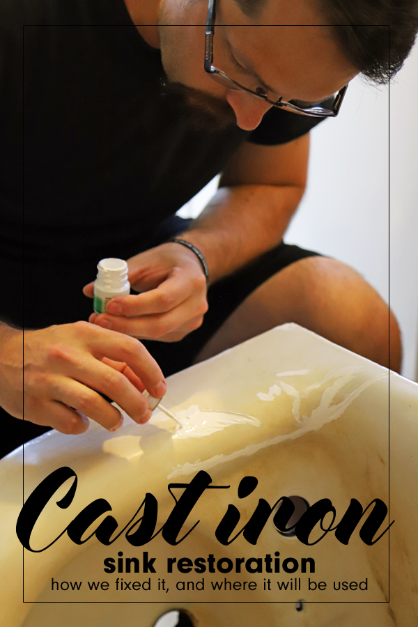
While the crews are hard at work on our house construction, my husband has been busy with a cast iron sink restoration. Read all about his progress and see how the sink looks now!

vintage cast iron sink


It’s been a super busy summer for the construction crews out at our house build site. They are currently finishing up the framing and sealing the exterior. Hopefully, all of that can be finished before the cold Fall weather starts up! In the meantime, We have been cleaning and preparing items that will be used in the new house. Bathroom vanities are getting painted, chairs are being refinished, and the cast iron sinks are getting restored!

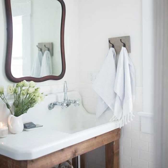
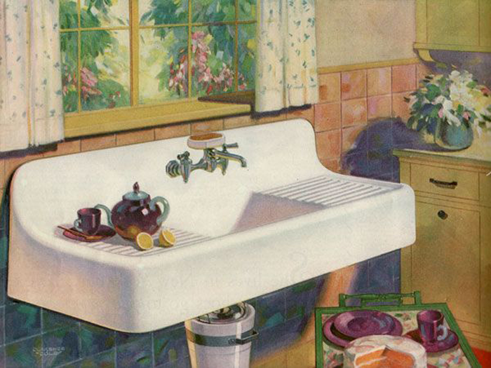
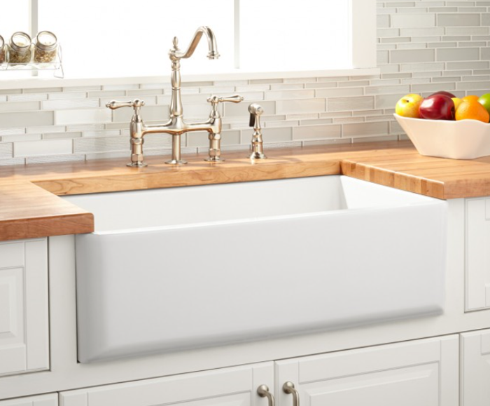
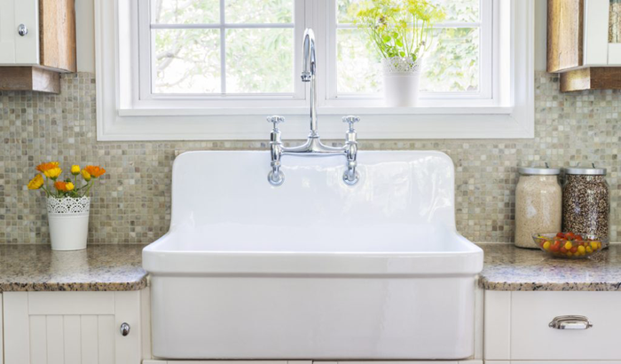
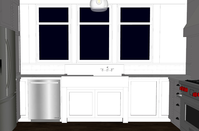
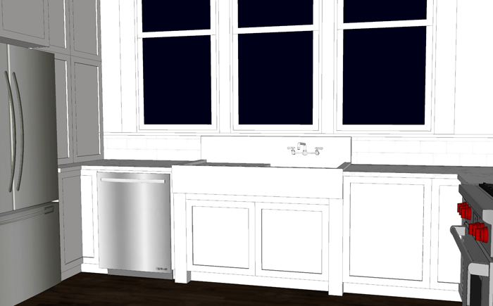
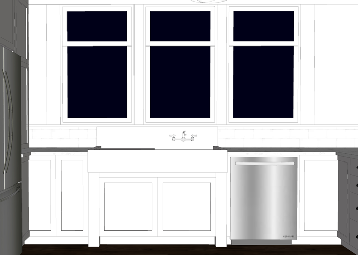
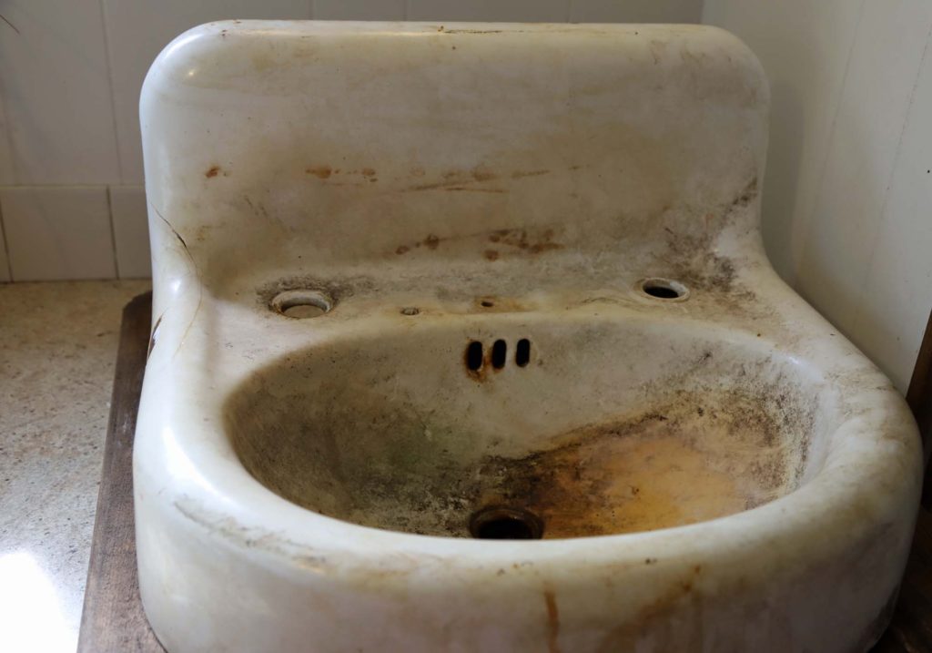
We have two vintage cast iron sinks that will be installed in the new house. One is a large, single basin farmhouse sink which will be used in the kitchen. The other is this smaller model 1930’s Kohler wall hung unit, which will be the perfect compliment to our main level powder room.

dirty cast iron sink


HISTORY OF THE CAST IRON SINKS

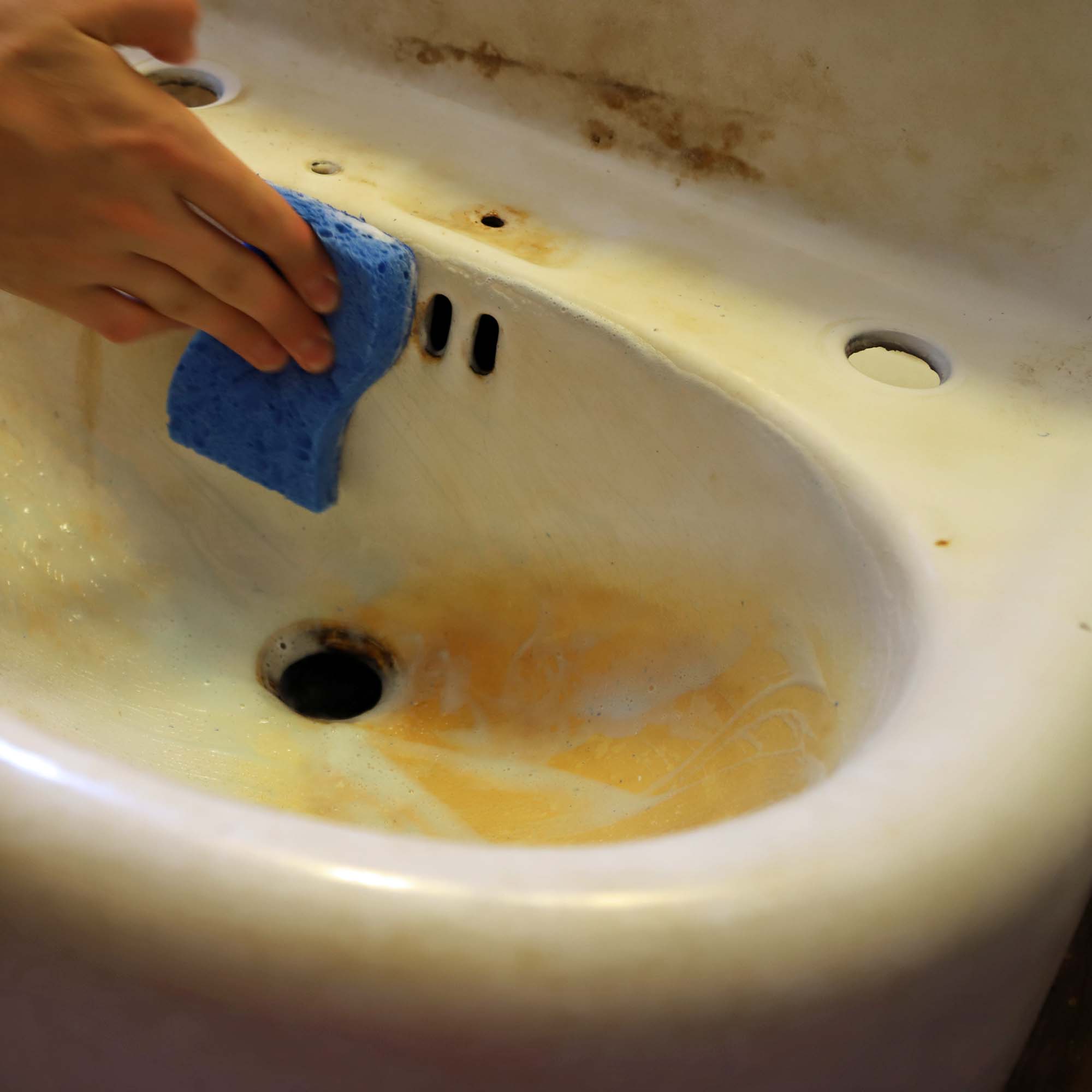
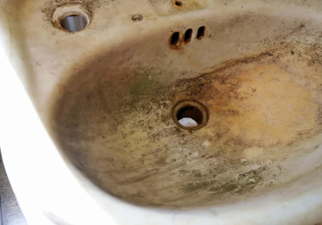
Both sinks were recovered from the property we are currently renting, my husband’s grandparents farmstead. They remodeled their house sometime in the 1960’s, and at that time put the sinks outside. They sat for 50+ years in the woods, covered with leaves and debris. Because of this, the sinks definitely needed some TLC.

We talked about hiring a company to do a complete restore, but decided to test out a DIY version on the smaller sink. Once we knew the results, we figured we would be able to make an informed decision about what to do with the larger one.


CAST IRON SINK CLEANING

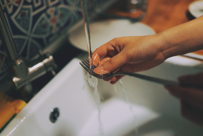
First, the sink needed some good old elbow grease. Craig started with very mild cleansers – such as a baking soda/water mixture. Eventually, he moved to harsher chemical cleaners, including ‘Iron Out’ and ‘Bar Keepers Friend.’ While they did clean the sink somewhat, none of the products were completely removing the rust stains.

cleaning the sink

Craig really wanted to remove the rust, as it could affect the sink’s future integrity if not addressed properly. He ultimately needed to use a wire wheel brush to remove the rust spots.


FIXING THE CHIP

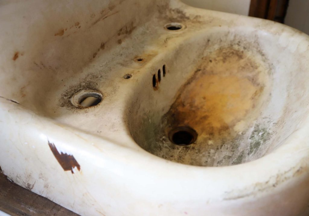
Besides the rust, the biggest issue with this sink was a large chip in the enamel, as well as a hairline crack that ran along the side and up the back splash. They were both cosmetic issues, as they did not cause any problems with the sink being able to hold water.

fixing a chip in enamel of cast iron sink

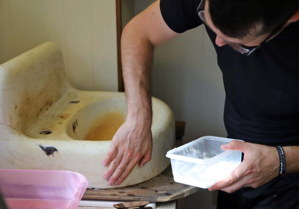
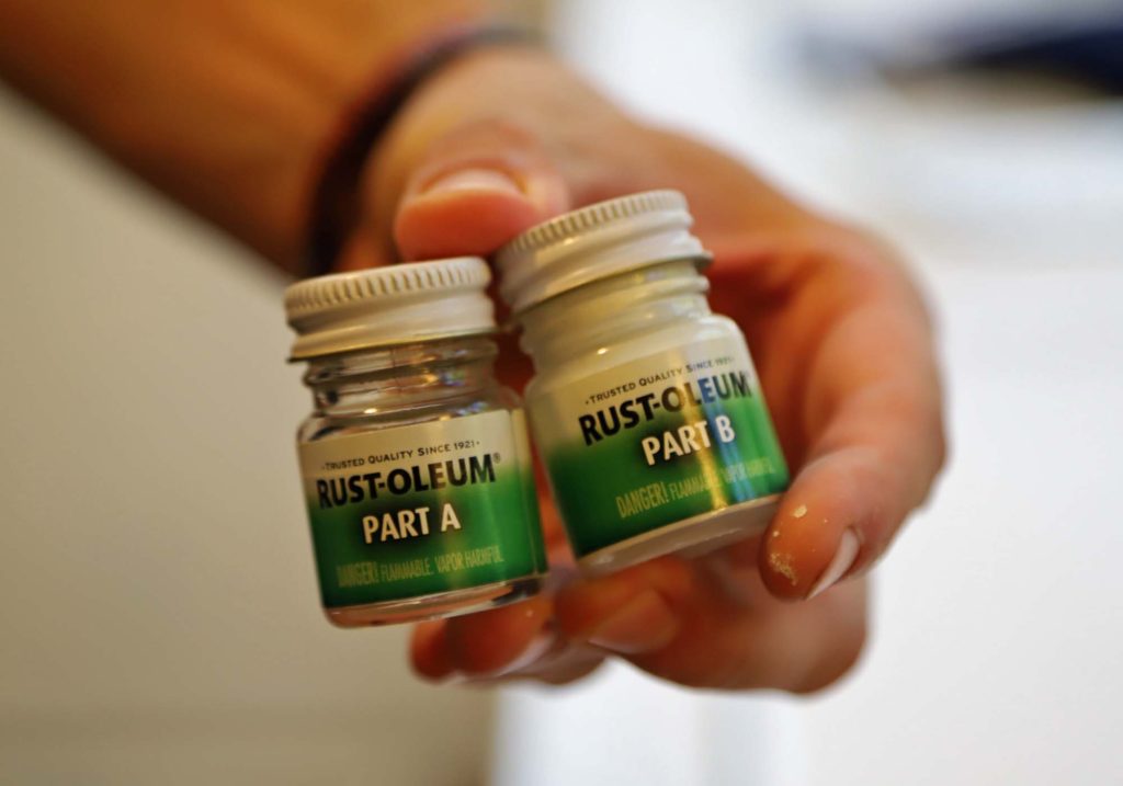
We found an epoxy material that could help fill in the imperfections. Over the course of a day, Craig applied layer after layer, allowing the epoxy to dry between coats. Once the material was above the height of the original enamel, it was left to dry for a few days before sanding.

epoxy material

filling the sink chip with epoxy

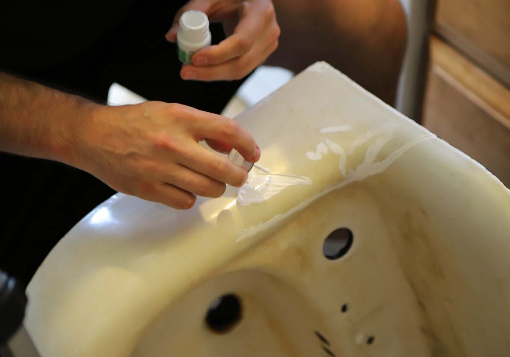
This product requires a ‘wet sanding’ technique – to help keep the dust down, and to eliminate scratches on the sink’s surface.


PAINTING THE CAST IRON SINK

We had determined, while cleaning, that the original enamel would need to be covered to get a uniform look. We were in no way looking for perfection, as we understand that this is an old sink. However, the discoloration was pretty bad from the years the sink had sat outdoors.

Once the epoxy had been sanded down smooth, it was time for paint! Craig started by painting the back of the sink with a black ‘rust inhibitor’ paint.

Rustoleum makes a specialty paint product that can be used for bathroom fixtures such as sinks and bathtubs. We decided to give it a try for the front!It goes on about the same as a standard can of spray paint, but the drying time is much longer. This allows the paint to harden.

painted cast iron

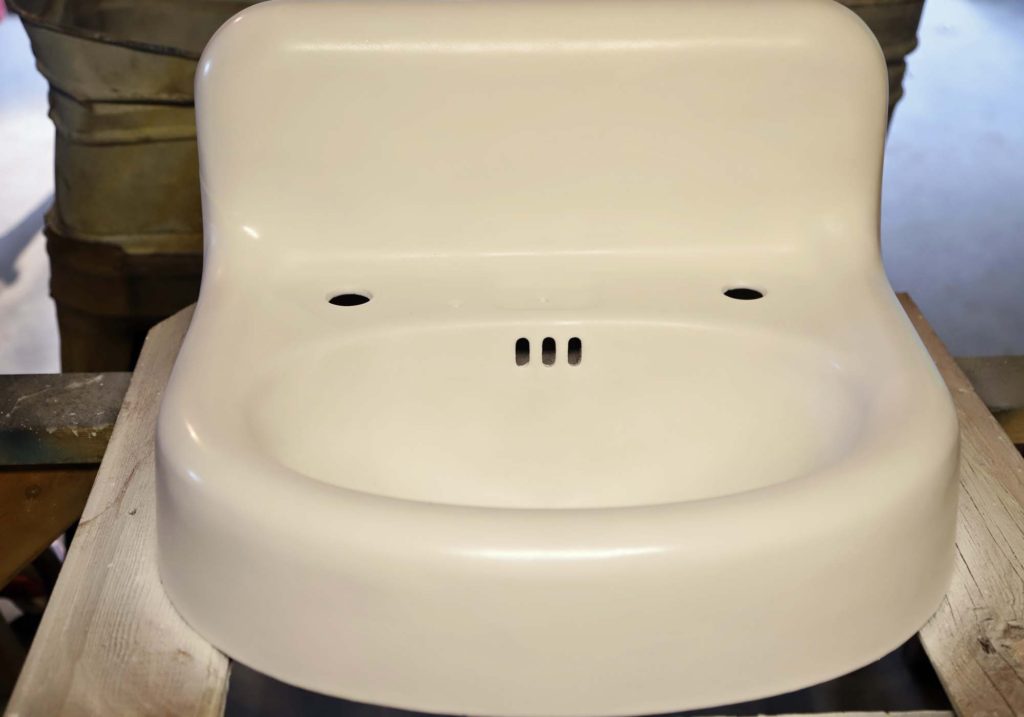
After three coats, the sink is looking great! The finish isn’t quite as shiny as the original enamel, but it is pure white and uniform. All of the rust spots are covered, and you would need to look extremely close to see any sign of the large chip or crack.

vintage sink repair

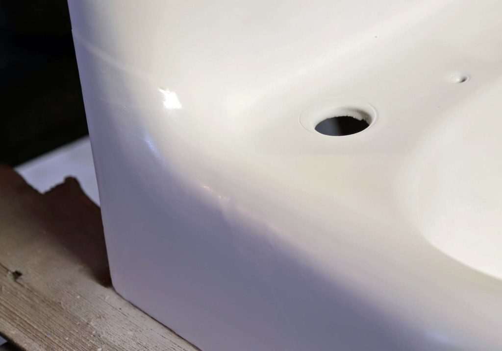
We are quite pleased with the outcome – especially considering the money we saved by doing it DIY style! Of course, until the sink is in use, we won’t know how this paint will hold up over time. I will try to remember to write an update after we have used the sink for several months.


WATCH THE CAST IRON SINK RESTORATION

For an even closer look at the steps involved in this restoration process, check out the THREE PART SERIES of videos that my husband created for his new YouTube channel, Weirdy Beardy Workshop. He has been busy filming a lot of projects, actually. So, if you want to see some behind the scenes footage, go check out his channel!


PIN THIS POST

how to restore a cast iron sink


Minimalist Cottage | Virtual Tour

Join me today as I give a virtual tour of our minimalist cottage! This is the home we hope to spend the rest of our lives in, and we have worked diligently to design it to meet all of our needs, now and in the future.

simple cottage exterior

With framing in full swing, I thought it might be a good idea to do a quick virtual tour. This could prove helpful for anyone following along with our real life progress updates. I share day to day on Instagram Stories. And also give detailed updates every couple weeks on Youtube. It will be fun to look back and see how close to the original design intent the house ends up.

When this blog was originally started, about two years ago, we were under the impression that the house would be built within the first year. But, as you know, that wasn’t the case. And, though the delays were frustrating, I am able to look back with gratefulness for the extra design time.


DESIGN CHANGES

For reference, THIS is my very first post regarding the design of the house. It was quite a bit larger then. We realized fairly early on that we needed to make major square footage cuts to keep the budget in check.

In fact, it seemed that as time went on we continued to simplify the design MORE and MORE. But with each revision we became increasingly satisfied with the house. There hasn’t been a single change, or simplification, that we have regretted – including THIS surprise last minute revision that created a more open concept main level. Every single change has led us to where we are today.

open concept floor plan for a minimal cottage

And where exactly are we? Home. A structure so perfectly suited for our family of seven that I hesitate to call it a house. It genuinely already feels like home, and we can’t wait to move in!


OUR MINIMALIST COTTAGE

The design of Arrow Hill Cottage has forced us to look closely at the way our family lives. And to explore our spacial needs both now and in the future. We realized during this process that, in many ways, we are quite minimal. It is more important for us to have time together within the same spaces, rather than retreat to our own rooms. And the storing of rarely used items is not a priority for us either.

We were able to settle on a comfortable floor plan that is just over 2,000 finished square feet. This includes the basement, main and upper levels. It should meet our needs now, with five growing children, and also accommodate my husband and I with main floor living, as we age. There is even potential, when all the kids are grown and moved out, to rent out the lower level for additional income.


TAKE THE VIRTUAL TOUR

I encourage you to watch the video of our cottage. It is quite a bit longer than the typical video I put out, but there is a ton of information! And, I think it gives great insight into why certain design decisions were made. I hope you enjoy!


Be sure to keep checking back for more house progress updates in the near future!

virtual house tour

Surprise! Super last minute redesign

Funny story. Do you remember nine months ago when I made a major redesign to the main level? I was pleased with the change at the time and thought for sure I was done designing. Joke’s on me… apparently I wasn’t!

If you’ve been following along, you know that our building project has begun. We’ve cleared out trees, dealt with sewer issues, and the crew prepared the site. In fact, just this week the foundation for the house was poured! I will have an update on that over the next couple of weeks.

It’s all very exciting and welcomed progress, yet as soon as I saw the footings laid out on the site, I felt a nudge. You see, our site has some gorgeous views. It’s a gem of a property. And when I stood in the spot that would be our future living room, imagining the three large windows facing the beautiful woods, I couldn’t help but want to open up the view even more.

I looked at the 3D images that I had drawn, and thought. Was it possible?

existing living room windows

Truth be told, I kept these thoughts to myself for a while. Surely my patient husband didn’t need the added stress of his wife redesigning a house that was currently being built. But I couldn’t shake the idea from my mind.


And then… a lightbulb moment

All along I had been holding onto the idea of our restored vintage cabinets, flanking a very formal front entry. But then I realized that this setup actually created quite a bit of rarely used square footage. Did we really want to allocate nearly a tenth of our main floor footprint to something that wouldn’t be needed on a daily basis? My simple answer was ‘no’.

with separate entry before

main floor before


Taking the formal entryway out of the picture, the space absolutely opened up. I was able to maintain a small area by the front door for coat hooks and a small bench to be used by guests and visitors. The beautiful cabinets were then positioned to frame an opening to the kitchen.

open concept floor plan | redesign

main floor after


Speaking of the kitchen. I am SO in love with this new concept, which puts the amazing cast iron sink on center stage!

looking into the kitchen space | last minute redesign


white kitchen design

That large window will be sized to fit perfectly over our vintage sink.


Overall, the public parts of the main level are now open to one another and will be graced with ton of natural daylight. And, of course, the spectacular view is expanded.

great views from living space

redesign of living and dining space

open concept living dining space

Additional benefits of the redesign

Apart from the increased view, this redesign has a couple other benefits. With a large space opened up, there is now room for an even larger dining room table. It has always been my dream to have a table that can seat at least ten. This space will accommodate a table that size, or even bigger! As a bonus, there will be room for an additional piece of furniture near the table.

Perhaps a china hutch, or a fun and interesting vintage piece such as an old apothecary cabinet.

huge dining table as part of redesign

In the kitchen, we can include a larger fridge. I had always thought we would use a counter depth model, until we found that they were quite a bit more expensive than the deeper versions. It seems silly to pay more for something that has less space, but that is just the way it is. Counter depths are considered an ‘upgrade’. Surely our growing family will fill up a standard depth fridge with no problem!

The home is also made more handicap accessible, should any of our family members find ourselves in a wheelchair at some point. There is a natural wide pseudo hallway running the entire distance of the open room, and the kitchen includes plenty of space to turn.


What the redesign entails

All of this seems to add up to a major change, but in reality it isn’t a big deal! It shouldn’t send our contractor or the crews scrambling around too much anyway!  Essentially, we will need to purchase two additional windows for the house – a large one for above the sink, and another for the living room. Our front door will change, from one with sidelights to a door only.

The exterior will also look a bit different too, with the removal of the small gable dormer above the porch and the addition of a column set.

simple white cottage exterior | redesign of cottage

Though I’ll admit that I do like the exterior look of the original design a bit better, the revised version is a manageable trade-off for the increased function and livability inside. And, I am giddy at the thought of two planters!

planter boxes on porch


So, there you have it. Our surprise redesign. I have said for years that I work best under pressure. Apparently that includes adding design tweaks mere weeks before the house needs to be built. A few of the construction document sheets will need to be re-printed. But it will be worth it.

I would love to know your thoughts on this last minute redesign. But, hey. If you have any additional improvement ideas- please keep them to yourself. There isn’t time to go back to the drawing board again after this! Ha!


Design Elements | Inspiration For Our New Cottage

Today I am excited to share with you a few of the design elements we are planning for our new cottage. Hopefully, by the end of this post you will have a good sense of what our finished interior space might look like.

Home design ideas for a newly built cottage

OUR FOREVER HOUSE

To be honest, I haven’t given a ton of thought to the interiors of any of the houses we have lived in. I think, in part, it is because I knew we would only be living in them temporarily.

This house though, being our forever house, has caused me to think more critically. We want to be very intentional about what we surround ourselves with.

antiques used in a cottage style home. vintage scale

MIXING OLD WITH NEW

Though we are building a brand new home, we feel it is important to incorporate items that have seen a bit more life, and wear and tear. The reason for this is twofold. Number one, we don’t want to feel that we can never touch anything, or be worried that our kids might break something.

Number two, we feel that a new house can seem a bit bland and stark if everything is perfect and new. A mix of found items can really help to give the interiors a casual, comfortable, and lived-in and vibe.


MAIN DESIGN ELEMENTS

There are four main categories of inspiration that I will be discussing: geometry, color, texture, and specialty items. They all work together to form an overall design style that is simple and orderly while also comfortable and casual.

Geometry

As an architecture major, I am fascinated with geometry. I love how simple lines and shapes can come together to form something interesting and beautiful.

One example of how we plan to incorporate geometric design into our new cottage is the five panel doors we have chosen. They mimic the pair of wooden doors we refinished last summer. I think they have a classic look that will pair well with the simple lines of the cottage.

Design elements for a comfortable cottage feel

This window also displays basic, yet interesting geometry. I saw it out of the corner of my eye one day when I was browsing through an antique shop. Though it was priced higher than I wanted to pay, I could not get my mind off of it. Eventually came home with me, and we have loved it ever since.

Color Scheme

When it comes to color theory, I am definitely one who prefers a mostly neutral palette, with pops of interesting color. Knowing what colors to ‘pop’ with has been something I have slowly learned through the years.

In fact, the realization of the color scheme for our new house came to me a bit by accident. A few years ago I purchased this simple pillow. It kind of spoke to me, even though I couldn’t really put my finger on why. The pillow has been a mainstay in our living room since that day, and every time I look at it I smile.


Interior design ideas incorporating neutral decor with pops of color

It wasn’t until recently that I realized that the pillow brings a couple of my very favorite design elements to life. The geometric pattern is simple, and pleasing to the eye. But also, the colors themselves are those I tend to gravitate toward. With the exception of the tan color, which I would replace with a mustard yellow.

Without even knowing it, I have been accumulating items with these colors and bringing them into our home.

This rust-red pitcher, for example, adds just the right amount of color. And the small lithograph print features many of my favorites.

vintage red pitcher


Texture

I am a huge fan of texture. More specifically, neutral texture. It is one of the reasons I am a sucker for a woven basket or a macrame wall hanging.

textured home decor

This pillow is one of the ways that I added a bit of texture to our home decor. I created a blog post a while back which details the steps to make one for yourself. I will be re-doing the video link in the near future. There have been people who have tried to make the project and have commented that the video could use a few more step by step instructions.

diy textured knot pillow

Other textured items might be really subtle. This pair of white bowls, for example, have a small bit of ribbing around their rims. I think this tiny bit of detail really adds visual interest to an otherwise ordinary piece.

vintage design elements incorporated into a brand new cottage home


Special Items

A house filled with generic, store bought items will not have the same feeling as one adorned with well loved items. Displaying items that bring you joy or remind you of someone you love is the perfect way to make a new house feel like home.

We have special items of all types that we plan to utilize at our new cottage. The cabinet in this vignette, for example, is one of a set that my husband painstakingly restored this past winter. He put so much effort into them, and they are absolutely stunning!

A cream can, saved from the run down farmstead of my great-grandparents, will become a special conversation piece in the cottage.

vintage cream can


This crate has been used as a toy box for many years by our children. We plan to bring it with us when we move. Although it may eventually be filled with different items, it will forever hold the memories of a time when our kids were younger and enjoyed it as a toy box.

BPS paints crate

We are so excited to see all of these design elements come to live in our new home! If you would like to be the first to know about the construction timeline, be sure to subscribe to my email newsletter. I will be sending out house information there first. Also, consider subscribing to the Arrow Hill Cottage YouTube Channel. There, I plan to post a house building update once per week, as soon as we break ground.

Thanks for stopping by! I enjoy sharing this journey with all of you!


TAKE A CLOSER LOOK

In this video, I do a little walk-through of each piece in the vignette. I describe the design elements and talk about each piece and how they represent the elements.


PIN THESE IDEAS

cottage design elements


MY FAVORITE INSTAGRAM ACCOUNTS THAT FEATURE POPS OF COLOR IN DECOR

Today I am finishing a three part series on COLOR THEORY and how it relates to home decor and design preferences. The basic belief is that people choose to use certain colors because of their own personalities as well as the mood that they want their home to convey. And, just as there are multiple preferences on how to furnish a home – there are variations on how color is used as well.

I have found there to be three main ways that people utilize color in their homes:


ONE: Neutrals Prevail

TWO: Pops of Color

THREE: Color Explosion


I have already featured interiors that showcase the idea of  COLOR EXPLOSION , as well as those where NEUTRALS PREVAIL.

Today though, is devoted to those interiors that are a combination of both. A little bit of neutral, and a little bit of color. Maybe this is the camp that people fall into when they just can’t make up their minds. They love color – but don’t want to over-do it; and yet they feel that keeping everything neutral is a bit boring and plain for their liking.

I’m especially excited about today’s feature because it happens to be the category that I would put myself in. I love how a mostly neutrally decorated space seems to come to life with a small infusion of color. The following Instagram accounts are swoon worthy, and feature this decorating technique well.

Note that each of these accounts seem to highlight specific colors or color combinations, which are most likely the owners favorites.


@happyhomeonhighbridge

Jennifer’s home is lovely and simple, yet is brought up a notch in drama by the combination of teal and coral that she tends towards. She has an amazing teal ship-lap wall in her dining room you need to check out!


@jogalbraithathome

It is apparent that Jo has a love for nature. The greens of her house plants serve as one of the main colors that she likes to ‘pop’ with. A complimentary Navy blue completes the palette. Her home seems casual and comfortable – as if anyone scrolling through could just hang out and chat.


@anettetalstad

Anette really loves color. Her amazing home features a variety of bright and pastel colors. The muted tones throughout are balanced with an even amount of sleek white. The tagline for her Instagram page is ‘happy home with a view’ – and yeah, she has a view all right. Go check it out!


These accounts are all gorgeous, right? I hope you have been inspired not only by today’s interiors, but those featured in the previous posts in this series also. After seeing examples of them all, which category would you say you fall into?

MY FAVORITE INSTAGRAM ACCOUNTS THAT FEATURE NEUTRAL DECOR


Decorating a home is a very personal task. The reasons why people choose to use certain colors over others has a lot to do with the inhabitants personalities and the mood that they want their home to embody. Basic COLOR THEORY tells us how the use of colors can aide in creating the desired effect. I have previously posted about how I believe there are three main ways that people use color in their homes.


ONE: Neutrals Prevail

TWO: Pops of Color

THREE: Color Explosion


I first explored interiors that feature the  COLOR EXPLOSION school of thought. I listed my three favorite Instagram accounts that display this decorating style well. Today I want to swing the pendulum in the opposite direction and offer up my three favorite Instagram accounts that have the Neutral touch.


@farmhouseonboone

With a strict color palette of white, cream, grey, black and brown, Lisa has pulled together a lovely home that has a calming and peaceful feel. Her Instagram feed gives off the same vibes. Peace.


@bluebarnandcottage

Loren’s ability to pull neutral textures together makes her interiors stand out above the rest. The visual interest that the curated variety of surfaces and materials create, mean that the spaces she designs – though minimal in color – are not stark or boring.


@thecultivatedhome

I am drawn to the casual, carefree, neutral style that Tammy has created in her home. Looking through her feed makes me feel like I could just pull up a chair and relax. The colors that she does incorporate into her spaces are muted and calming, making them perfect accents to a neutral palette.


If a neutrally decorated home is the look you are after, I hope that you will take some time to visit these accounts to see even more inspiration! Besides Instagram, each is linked to a blog that is just as impressive!

HOW TO CREATE A COMFORTABLE OUTDOOR ROOM

With Summer right around the corner, you may be anticipating enjoying the outdoors – listening to the birds sing, sipping lemonade on the porch or grilling steaks on the patio. You may be wondering what steps to take to make the perfect summer outdoor space of your own.

The truth is that not all rooms in nature are created equal. There are six key elements that will help you make an outdoor room as pulled together and comfortable as possible – one that you, and your potential party guests, will want to linger in all summer long.


1. DEFINE A SPACE, AND MAKE IT PRIVATE

How to Create a Comfortable Outdoor Room

Intimate spaces are inviting spaces. Instead of trying to figure out a way to make your entire yard an oasis, start small. Begin by locating a portion of your yard that is relatively convenient in relation to your home. A spot directly outside a dining room or kitchen, for example, might be a good choice.

Defining a space could be as simple as building a fence around the area, or changing the ground cover. Patios made of bricks or slabs of stone are popular, as are wooden decks. This defined space will be even more enjoyable if it is hidden from public view. Potted plants of varied heights could make a natural ‘green wall’ or a privacy screen might be created with chicken wire and vines.

Fun privacy ideas for your outdoor room:  1 | 2 | 3


2. BRING THE INDOORS OUT

You’ve heard of bringing the outdoors in – now think about that concept in reverse. Make it feel like an extension of the home you love, by drawing elements from the inside – outdoors. Perhaps there is a certain color or theme that your interior is decorated with. Using those same elements outdoors will create a unified look.


3. ADD CONVENIENCE

For an outdoor room to be comfortable, it also needs to be functional – so that once you are in the space, you won’t need to leave it to grab a convenience item.

If you have a grill in your space, make sure that all the grilling tools are handy. If it is a place you plan to nap in, have pillows and blankets nearby. A cart to hold beverages and snacks would be welcome in just about any outdoor room!

These conveniences are clever and useful! 1 | 2 |


4. PROVIDE VARIED SEATING

Think about your outdoor room being used by various group sizes. You may want enough seating to accommodate small group conversation, a place to dine, or even a one person seat – such as a hammock.  You can include multiple seating options, which can be rearranged as needed.

Various seating options for outdoor rooms: 1 | 2 | 3


5. KEEP IT SHADY AND PROTECTED

A shady and protected outdoor room is essential for use in the warm summer months. Shade options can range from a simple draped canvas overhead, to a detailed pergola. A full roof will offer a more protected feel, and possibly a longer season of use for your outdoor room.

If you want to extend the use of your space into the cooler months, you may consider adding operable screens/ windows and a heating source such as an outdoor gas fireplace or wood burning fire pit.


6. LAYER THE AMBIANCE 

Your outdoor room will come to life if you consider all five senses, and how they can be connected to nature, when pulling it together.

Sight: What will you see when you are in your outdoor room? A pleasant view will allow you to relax and let your other senses to be engaged. At night, solar lights or strands of lights above create a magical feeling that will make you and your guests want to stay up past bedtime.

Smell: This sense can make or break an outdoor room. Take care to ensure that items which could produce unpleasant smells, such as a garbage can, aren’t close by. Using flowers and other sweet foliage can help you connect with nature. A fire feature can also create ambiance and a pleasant, familiar smell that is sure to be enjoyed.

Hearing: Often this sense is overlooked, yet it has a huge impact on the enjoyment of a space – especially outside. If your home is in a loud neighborhood, consider a white noise machine to cancel out some of the noise. Add in pleasant sounds, such as a water feature, for comfort and tranquility.

Taste: The pleasure of preparing food outdoors is multiplied when you can pick fresh food and spices. The installation of a raised-bed garden nearby, or pots with herbs, adds an interactive element to an outdoor room.

Touch: Tactile elements such as pillows, rugs, and even the furniture that is selected to fill your outdoor room can engage the user of the space in a way that no other sense can. Take care to ensure that these items are not only pleasant, but interesting to touch.


By following these six key elements of design, you can create an outdoor room that is not only comfortable – but also engaging and interesting. Put them to work for you, then sit back, relax, and enjoy the summer!


Pin this for later:


A FARMHOUSE SINK FOR OUR COTTAGE

They say that the kitchen is the heart of the home; And a beautiful kitchen is high on the priority list of many homeowners. I am in agreement with these sentiments. After all, if my family is going to be spending a lot of time in one room, it should function well AND look nice.

The kitchen for Arrow Hill Cottage will have a classic look, with clean materials and tons of natural light. But I have to say, in all honesty, the feature I am most excited about is the kitchen sink.


Time for a little story:

About eight years ago, when my husband Craig’s family was helping his grandparents clean out their farmhouse (the very one we are living in at the moment), I spotted a cast iron sink laying in the weeds on their property – ready to be hauled away by a scrap metal collector who was paying by the pound. I am pretty sure I let out an audible shriek, then quietly and as calmly as possible, asked Craig to please find out more about it.

Turns out that it was the farmhouse’s original 1920’s kitchen sink that was removed (and tossed outside) in the late 60’s, when the room was remodeled to a more modern style.

It didn’t take too much begging for his grandparents to agree that we could save it from the pile. Craig though, needed a bit more convincing. Mostly because the thing was a beast, and hauling things around is low on his list of favorite things to do. He loves me though, and eventually gave in to my desire. We had absolutely no place to store the relic of a sink, and so we asked Craig’s parents if we could keep it in one of the sheds on their property until we built our house. And that is exactly where it has been ever since.

Craig was there last weekend, and I asked him to get a few measurements for me so that I could fine tune the kitchen design a bit more. He took pictures of the sink – in all her muddy, rusty glory – and seeing them made me fall in love all over again.


We will need to look into getting it refinished – probably at a body shop – but even with that expense I believe we are sitting on a great deal. I saw a very similar model on Etsy selling for $1,800! Another sink, on Ebay is listed for close to $1,000. Even reproduction models are over $700!

There are a couple of challenges that this farmhouse/apron sink will present. One is finding wall mounted faucet hardware. They aren’t quite as common as the counter mounted variety.

I like the look of this bronze faucet from Wayfair.


I have a feeling that lever handles might be a bit easier to operate though – so this option from American Standard might do the trick.


This one with a pull out spray faucet would be very functional – but I’m afraid it might not quite be in the budget. Maybe I can find something similar for less when the time comes to make a decision.


Another challenge will be determining how to lay the counter material. This sink style was originally designed to be a free standing unit. It probably had matching legs at some point. Kitchen design & style has changed quite a bit since the 20’s.

I am still pretty set on using a quartz counter-top material. I love the clean look. The sink will will either need to be set a bit lower than the counter height, so that the counter material can overlap the edges – to ensure that no water slips onto the cabinet below – similar to this:


OR possibly more likely, because of it’s integral back-splash, we will need to set the sink up higher and butt the counter-top material into the sides, like this:


The final design challenge that I can foresee, and perhaps the largest, is the placement of the sink itself. Because it is a single bowl sink, the placement of the faucet will be further to the right (and not in the center of the overall unit. There will be three large windows on the wall where the sink will be located, and I am unsure if I want the entire sink to be centered on the middle window (and hence, the faucet offset), or the faucet / sink basin portion centered on the middle window. Maybe you can all help me out.  Tell me which you prefer!


SINK UNIT CENTERED ON MIDDLE WINDOW


FAUCET CENTERED ON MIDDLE WINDOW


I should note that the dishwasher will likely have a cabinet panel front, so that it blends with the rest of the cabinetry. I feel like it seems to have more space on the right of the sink. Thoughts? Maybe I should take another look at the window placement and series?

Please comment below or via social media. Would love some help!


THE 4 QUESTIONS YOU SHOULD ASK YOURSELF BEFORE DESIGNING A NEW HOUSE

Designing a new house is an exciting and exhausting time for homeowners. It seems there are no less than a thousand decisions that will need to be made to create a house that is ‘just right’ for your family. And while each and every decision during the design process is an important one, there are four important questions you should ask yourself BEFORE you ever sit down at the drawing table by yourself or with a design professional.


1. WHICH HOME STYLES DO WE PREFER?

While it isn’t necessary to pick only one home style that your design MUST be based on -it is valuable to understand, at least generally, which types of homes you are drawn to. Are simple, clean lines your thing? Perhaps a modern home will be a good design guide. Do you love the charm of cozy houses? Consider the characteristics of the cottage or bungalow style. You can ask yourself if you prefer an open floor plan or one with more defined spaces, and if your family would benefit from one level living or multiple stories.

Each month I work through a series here on the blog entitled ‘Elements of Home’. I dive deep into what makes each home style unique, with the hope that the information can benefit you in determining which style would be best suited to your family’s lifestyle and preferences. You can access the series HERE.


2. WHERE WILL OUR HOUSE BE SITED?

Location, location, location. It is the mantra of real-estate. You can change a house in many ways, or in this case – build nearly anything you want – but you will not be able to change your home’s location once it is tied to the foundation; That is, unless you are willing to spend major money to do so.

You may be tempted to look at home plan books or online for floor plan ideas. And while these tools can be extremely helpful, you should at the very least have an idea of where your proposed home will be located before considering floor plans. Will you be building a new home in an established historic neighborhood? In that case, the sleek modern home with floor to ceiling panes of glass that you spied online may not be the best choice. Do you love the option of having a home with a basement level that you can walk out of? If so, you will want to make sure that you have a site in mind that will accommodate that type of setup – preferably somewhere with sloped land.

There are more detailed site related questions that you will need to answer, such as how the natural daylight will affect the interior spaces of the home – but these are questions for further in the design process.

3. WHAT DO WE NEED IN A HOME?

Generally speaking, we more easily identify our wants over our needs. Sometimes the two get mixed together, in fact. When designing a home it is very important to establish the difference. The needs are absolute must haves, whereas the wants are not as important – and can possibly be added at a later date.

Size is one of the most troubling aspects to determine. When considering home square footage, a variety of questions may arise. How many bedrooms should the house have? Will 1 bathroom be sufficient, or will we need more? What is a comfortable living room size? These questions about size can leave your head spinning – but they are some of the most important decisions regarding home design. A too small home can leave you feeling cramped; While a home too large will not be comfortable or cozy – perhaps leaving you with the feeling that you are living in a museum or office building.

As a guide to determine how much space you should design for your family, I have created a variety of worksheets – which can be accessed in THIS POST.


4. HOW MUCH CAN WE AFFORD?

It’s the age old question: How much is this going to cost me? It is best to consider the financial aspects of home construction well before you fall too in love with a design. If you speak with a loan professional about what a realistic budget for your project is, you will be able to make better informed decisions as the design process progresses. If you know you will be working with a fairly strict budget, you likely won’t be looking at the granite selection for your counter tops. Better to know what you can afford than to choose those expensive finishes only to be told you will need to downgrade the quality to something cheaper.

Another benefit to determining building budget early is that you can plan your project in phases. Perhaps the entire shell can be built straight away, with the main living spaces finished – and the basement or upper level left to be finished when the budget allows, in the future.

I lay out tips on ways you can save money on your new build in THIS POST.


If you have worked through each of the four above questions, you are well on your way to laying the groundwork for the design of your future home.

For your convenience, I have laid out these questions in a simple, one sheet print out – available in the RESOURCE LIBRARY. Search for the Preliminary Home Design Worksheet – and keep it handy for when you are ready to start thinking about designing your dream home.


7 CHARMING OLD HOUSE DETAILS MAKING A COMEBACK

Charming old house details, such as intricate woodwork and elaborate staircases, are making a major comeback!

When you think of an old house – you may envision rotting siding, squeaky floor boards, and bats in the attic. While these may very well be a reality, there are plenty of merits that old homes have to offer.

The seven charming old house details I’m about to share may have you rethinking your preconceptions. Who knows – you may decide to incorporate some of them in your home as well.

These seven old house details are finding their place in newly built homes

BUILT IN FURNITURE

These showstopping pieces add dramatic character. Because they are designed and built to fit with the house, in a specific space, they are becoming more and more popular with homeowners as storage pieces and as a custom way to add elegance and charm.

buffet


window seat


bookcase


INTRICATE WOODWORK

It’s true that slow growth timber was more readily available when the houses of yesteryear were being built. Craftsmen showcased their skills on detailed woodwork – from stair railings and wainscoting to window molding. Though it may never return to the intricacies of the Queen Anne Victorian era, an increased level of detail in woodwork is being re-introduced in today’s homes.

built in room dividers are one of the old house details that is making a comeback

craftsman woodwork


intricate stairwell woodwork


window trim


HARDWARE

There has been a huge resurgence in adding smaller vintage details to new homes, to give them an extra dose of character. One of the easiest ways to accomplish this is by utilizing decorative hardware, such as door knobs and cabinet pulls. They are generally inexpensive and readily available. Reproductions of these classic styles are also being made.

brass knobs


glass knobs


cup handle reproduction


WOOD FLOORS

Old houses have the best floors. The patina found on aged pine, maple, and oak flooring is hard to match – but even a newer wood floor is a beautiful addition to a modern built home. Wood floors are wonderfully adaptive, lending themselves to be laid in a variety of patterns.

diamond wood floor


charming character floors are more popular than ever

herringbone pattern


aged pine plank flooring


FEATURE FIREPLACES

Before the television became the center of attention, the fireplace was the focal point in most homes. Now, as a way to escape the constant bombardment of electronics, families are opting to gather together in a quiet space more often. In turn, homeowners are opting to give their fireplaces more detail and prominence.

Many new build houses are incorporating feature fireplaces, one of the old house details that is making a comeback

fireplace with shiplap above


arts and crafts fireplace


primitive fireplace


DECORATIVE CEILINGS

Gone are the years of popcorn textured ceilings and flimsy drop ceiling tiles. Homeowners are instead embracing a variety of decorative options, and looking to historic examples for inspiration.

a bright white kitchen with a bead board ceiling is a wonderful example of old house details that are making a comeback

beadboard ceiling


coffered ceiling


pressed tin ceiling


exposed structure


COZY NOOKS

Old houses are full of nooks and crannies – just think about grandma’s attic. The cocooning nature of small, set apart spaces is comforting to many homeowners. From built in dining tables to relaxing inglenooks, these interesting and intimate spaces are becoming more and more popular once again.

reading nook


inglenook


breakfast nook

Which of these seven details is your favorite? Let me know which you would love to try (or have incorporated in your home already) in the comments below.