SATURDAY SKETCHBOOK: FIREPLACE IDEAS


My husband and I have lived in 3 old houses over the course of our marriage – a 1905 farmhouse, a 1904 American Foursquare, and a 1920’s farmhouse. And although each of these houses have had their own share of character items, not a single one has had a fireplace.

We love the ambiance that a fireplace can add to the spaces it serves, and so for Arrow Hill Cottage we are working one into the design. For ease and safety reasons we are going to be utilizing a gas insert unit. I’m thinking something simple and not too large – maybe a model similar to this.

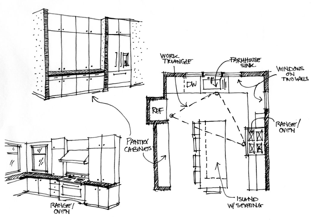
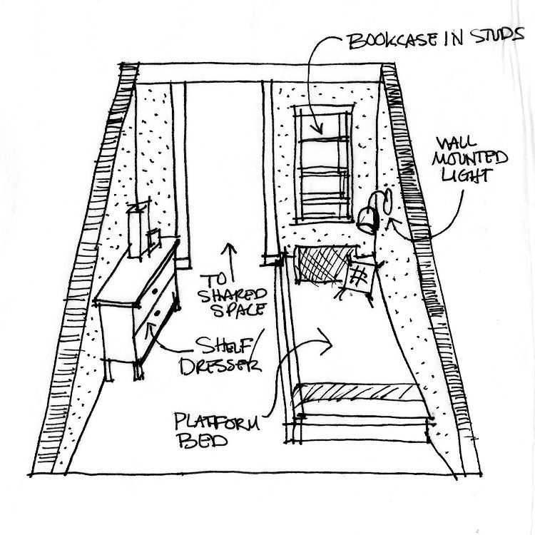
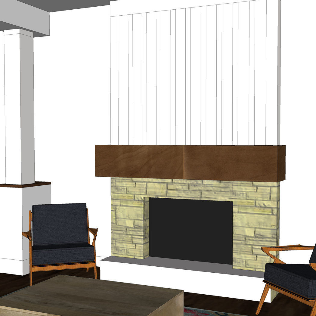
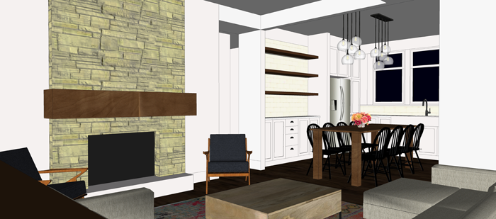
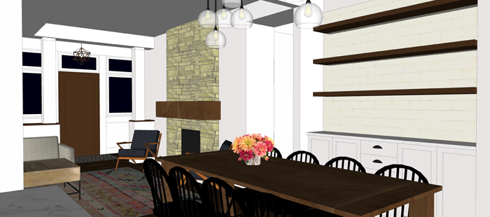
I have a feeling the firebox insert will be the easy decision to make. The more complicated endeavor will be determining what the fireplace surround should look like! Initially, I had designed in bookcases on either side of the fireplace; but ultimately decided that a larger bedroom closet, and a broom closet were more important for the function of the house; And so the fireplace itself will be positioned on a wall in our living room and serve as a stand-alone feature piece.

I have been tinkering around in Sketchup with a few different options of how to finish the surround, and thought it might be fun to share with you today and take a poll about which is everyone’s favorite. All four options include a chunky wood mantle, which we hope to have milled out of a tree that will need to be removed from our property for the construction of the house. I’ve intentionally left the top of the mantle bare, so that your eye can focus on the fireplace itself – but you’d better believe I will have a TON of fun changing out the decorations to dress it up!

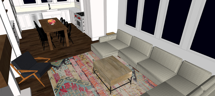
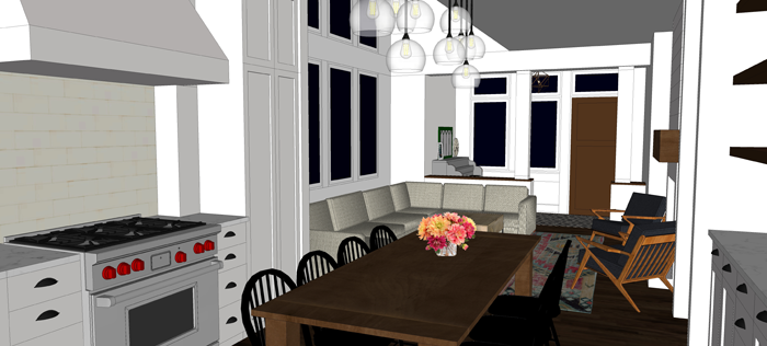
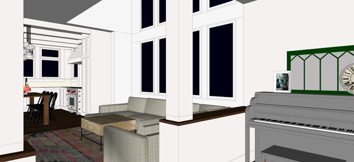
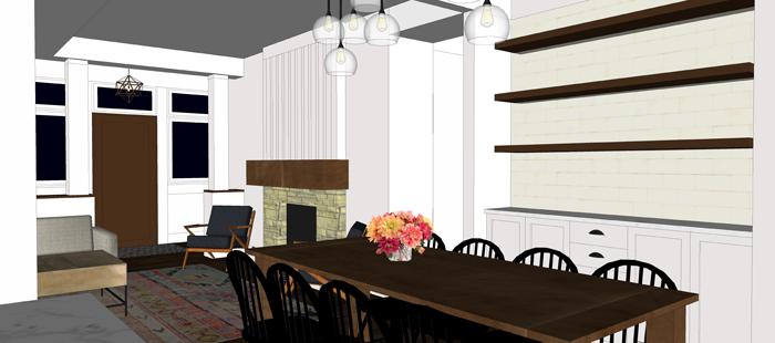
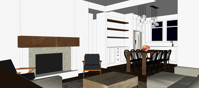
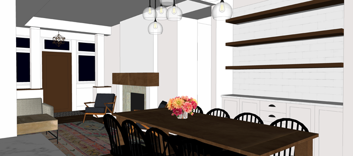
I am sharing multiple images of each fireplace option, so that you can see how it relates to the spaces around it.


OPTION 1: WHITE BRICK + SIMPLE SHIPLAP


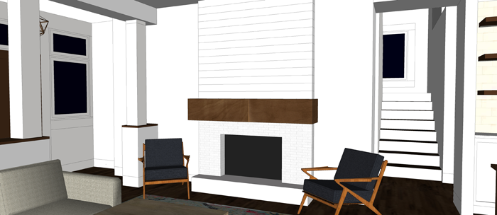
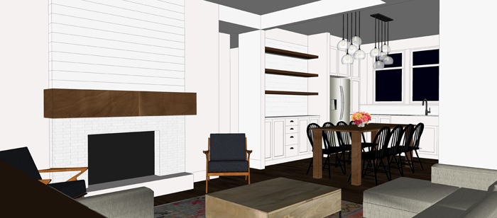
This is a really clean look, and pretty straightforward. It is also probably the most cost effective of all the options. If I have one concern about this option, it would be that it may be TOO white – and wouldn’t stand out enough as a focal point in a room that has all white walls and a white ceiling.


OPTION 2: STONE WITH BOARD AND BATTEN


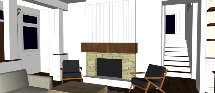
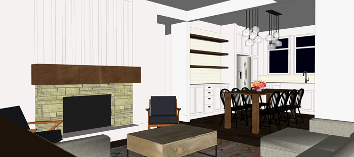
The exterior of the cottage utilizes a bit of cultured stone on the porch column bases, as well as board and batten siding on the gable ends. I thought it might be nice to connect these element to the interior by using the same stone and paneling technique on the fireplace.


OPTION 3: CLASSIC WITH TILE


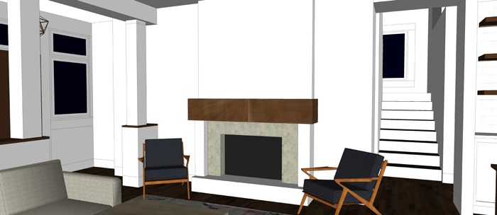
This is the fireplace finish that first comes to mind when I think about a historic home. It is clean, simple, and stately without much fuss. We have friends who had their tile laid in a herringbone pattern, which gave their fireplace a more contemporary feel and looks great! The portion above the mantle could be accented with a different color of paint, perhaps a bright pop of something dramatic.


OPTION 4: ALL STONE


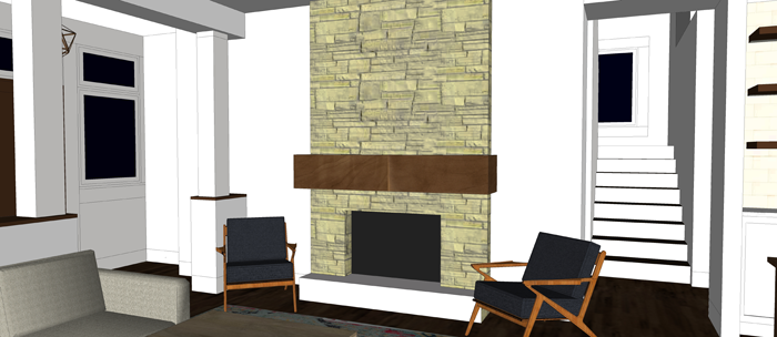
This option has me a bit worried about the budget – as stone is not cheap! I do like the ‘cottage feel’ that it seems to give the space though! And it definitely draws your eye toward the fireplace as a focal point.


What do you think? Which fireplace option is your favorite? If you have any real-life personal experience about fireplaces – whether it is something not to do, or something you have done and love – please let us know by commenting to this post or on one of our social media locations!

Have a great Saturday everyone!


FIVE INSPIRING SMALL HOME BLOGS

Thank you all so much for your kind thoughts after my most recent post. Some of you reached out to offer the benefits of living in a smaller home, and many more commented that they actually prefer our revised/simplified design over the original.

I have to say that after a few days of simmering with the thoughts of the smaller design, Craig and I are in agreement that we too prefer it! In fact, I called the contractor last night to tell him to hold off on getting bids on the larger floor plan – and instead to focus his attention on the new configuration.

In turn, I have been focusing my design efforts as well. Here is a view of the revised living room, as seen from the far corner of the kitchen. Do you spy the vaulted wall of windows? The view out of them will be stunning!

interior view from kitchen


interior view from entry

I am very grateful that my husband and I are on the same page when it comes to ‘stuff’. We are both of the mindset that if something doesn’t bring us joy or serve a purpose – it isn’t needed. The same goes for square footage. Once we realized that the smaller living space would suit us just fine, the more elaborate design was no longer appealing.

We never set out to design a large house – in fact, we have said on many occasions that living in a tiny house would be comfortable if it were just the two of us. Our family now includes seven – and so our sights are on a small house instead – one with just enough room for our needs.

It is a joy to search the web and see others living in the same way. I thought it might be inspirational to share with you some of these people, and their amazing SMALL homes.


intentionally small | 1,150 sf | owner: Nicole

Nicole has an entire blog devoted to the small spaces of her readers


mockingbird hill cottage | 950sf | owner: Claudia

Claudia offers a series of posts dedicated to small house living


smoky mountain farmhouse | 1,000 sf | owners: Alex & Susan

This charming farmhouse can be rented via VRBO!


living large in a small house | 1,300 sf | owner: Lynn

Check out Lynn’s amazing home office!


the prairie homestead | 1,100 sf | owner: Jill

Wyoming homesteading + homeschooling family of five


Continuing on with the revised/ smaller design, things seem to be falling into place. All three levels are being re-worked slightly to match the needs of our family. For now, we sit and wait for those numbers -hopeful that construction can begin this spring, but maintaining patience if we need to wait a little longer.


SATURDAY SKETCHBOOK: THE KITCHEN

With all of the posts lately regarding food, I have been dreaming of a bright beautiful kitchen to cook in!  So today I sat down and sketched out some ideas.  They are by no means refined, but hopefully they can help you all visualize what we are planning.

First, a quick floor plan.  As discussed in THIS post,  the kitchen is located in a very convenient spot on the main level.  It has direct access to the dining room and is just a short walk from the mudroom which will connect to an attached garage.  It also is within view from the front entry – which means I will need to be extra diligent about making sure it stays clean!  And in order to keep it clean and organized, the layout and function of the kitchen itself will need to be spot on.

Here is what we have so far

From the front entry you would be looking into the kitchen from the bottom of this floor plan sketch, and would see the three large windows above the sink as a focal point.  That sink is something that we are all SUPER excited about – a cast iron original farmhouse sink that was taken out of the farmhouse we are currently living in years and years ago, salvaged from the woods by us, and stored in Craig’s parents shed.  It is a ‘one basin’ design with a built in dish drain, and refinished it will look SO great!

The three main stations (oven, fridge, and sink) are arranged in a triangular fashion – a technique referred to as the ‘work triangle’.  I can imagine that corner of the island that falls within the triangle will be a great drop zone to bridge the gap between the three zones.  I am playing around with the idea of using a microwave drawer on that end of the island as well, but haven’t fully decided on that.

Near the fridge I am planning an entire row of pantry cabinets, with the upper cabinets stretching all the way to the counter.  I want to keep the look really clean, and was thinking that the large doors could be telescoping (slide in and out of the way) to reveal a spot for a coffee machine and toaster.

On the other main wall will be the range/oven station.  Again, I am playing around with the idea of bringing the cabinets straight down tot he counter to keep things clean.  The left cabinet I can imagine housing spices and cooking oils, and the right cabinet might be the perfect spot for the dishes to be stored.

In the middle of all the action will sit the crowning jewel of the kitchen, the island.  It may have a different finish than the rest of the cabinets and perhaps a butcher block island.  I haven’t thought through all of the details yet, but I do know that at 3’0″ wide x 7’0″ long it will be large enough for all five kids to sit at!

Just for fun, I made another sketch of the kitchen – kind of looking at it from above.  I think it shows the layout pretty well.

If you want a better idea of what types of colors and finishes (and organization tips) we are considering utilizing in our kitchen, go check out the Pinterest board HERE!


SATURDAY SKETCHBOOK: BOYS BEDROOM

Recently, I posted about {D}’s small BEDROOM.  I also mentioned in THIS post that we will be utilizing some of these same concepts in our new house.  All three of our boys will share a room, but each will have a smaller private sleeping nook off of the larger shared ‘communal’ portion.

I wanted to jump in today with a quick sketch of how this space looks in my head at the moment.  It might be easier for some of you to visualize 3D drawings than floor plans.

You can see from this sketch that the shared space is a good size.  It is roughly 9’6″ x 12’0″and should provide plenty of space for the boys to enjoy the things that they love to do.  A corner chair and low bookcase for reading.  A pallet accent wall to house guitars when they aren’t being used (So far, two of our boys are taking guitar lessons.  You can see a recent video of {D} practicing HERE).  There is enough room in the shared area for a large dresser with a hutch, which could house clothing & toys.  Pretty sure there will be a TV in there somewhere too… they like to spend time together playing the PlayStation on occasion.

See those three little doorway openings on the outer walls of the room?  They lead into the sleeping nooks.  One for each boy.  They are each around 7’0″ x 8’6″ – with sloping ceilings that go from about 7′ high at the highest point down to the floor at it’s lowest – so, not huge at all.  But they should get the job done nicely.  Their beds will be on low platforms with the ‘head’ of the beds toward the higher sloping portion of the ceiling.  If I can figure out a way to create some sliding trundle drawers under the bed frame, that will be great.

Each nook will have shelves built into the studs of the wall and a mounted/ hard wired light for reading.  On the opposite wall from the bed, there is space for a small dresser or shelf to house some personal belongings.  The wood floors from the main part of the bedroom will flow into the sleeping nooks, to keep things somewhat consistent – but each boy will be allowed to personalize their space with bedding, rugs, posters, and their collections.

The boys will likely be ages 12, 10 and 8 when we move into the cottage – and just about at that age when they will begin to crave more privacy.  We are hopeful that this solution will give them the best of both worlds – sharing a room with each other, as they have always done, and maintaining some separation.  They were crowded around my shoulder today as I drew these sketches and as of right now they have given me the stamp of approval on this concept.  Here’s hoping they don’t change their minds in the next couple of years!

Happy Saturday everyone!