FRAMED HOUSE TOUR | BUILD UPDATE NO. 6

Join me today as I share a full tour of our framed house! So much has happened since I last posted about the progress at the site, and I’m excited to show you everything!

building a simple house

Last we left off, on construction update no. 5, the second floor trusses were just being delivered to the site. Boy have things changed a lot since then!


PROGRESS IMAGES

Here’s a quick photo recap of all the little steps that have happened from then until now.

scissor trusses for second level of house

The large scissor trusses for the second floor were delivered. They are massive! With no dormers on the roof, they were able to get everything in place very quickly. In just a few hours they were ready to put on sheathing!

Next, the concrete for the porch was poured. They did beautiful work, and applied a broom finish. Because the posts needed to rest on the concrete, the porch floor needed to cure a bit before the next step.


They finished sheathing the front gable end and began to set up the framework for the front porch. The posts are only temporary, until the thicker cedar posts are ready to be installed.

building a house adding shingles

Once the porch roof was on, it was time for the shingles! We were more than excited for this step, as our area has experienced heavy amounts of rain for most of the Fall. It was finally time to get this huge asset of ours protected from the elements!

View from the front of the house with the shingles finished, windows framed out, and temporary porch posts. We will be doing some grading so that we don’t have so many steps to the porch.

The waterproof wrap was added to the exterior, and the windows installed! This step really helped to brighten up the entire exterior of the house! Since our final siding and trim will all be white, it is fun to see it this way.


FRAMED HOUSE TOUR

While all this was happening on the outside, a ton was also going on inside the house. In fact, the inside framing process is essentially complete! The HVAC crew has started running ductwork, and the plumbers have been coordinating as well. I thought it might be fun, before all the walls are covered with drywall, to take you on a full house tour!

fully enclosed framed house


Below are a few pictures from the interior of the house. Scroll through to the bottom of this post for a link to the video tour, and see every nook and cranny of our future house!

living room framing

View of the living/dining space


framed kitchen

Looking toward kitchen and stairway, from the living room


master bedroom interior framing

Master bedroom


laundry room space

Mudroom/ laundry room space


upstairs hallway

View of upstairs hall space and vaulted ceiling


girls bedroom framingGirls bedroom space


Boy bedroom framing | framed house tour

Boys bedroom space


second floor hallway space

View from hallway space into boys bedroom


basement family room

Basement family room


ping pong room

View from family room into the ping pong table space


FRAMED HOUSE VIDEO TOUR

Join me on the first full house tour of Arrow Hill Cottage!


PIN THE PROGRESS

new home construction | framed house tour


SIMPLE LIGHT FIXTURES | Minimalist Home Lighting

In today’s post, I share the simple light fixtures we have chosen for our new home. The clean lines and basic color palette of these selections make them the perfect compliments for the minimalist home.

simple lighting collection

This post contains affiliate links. As an Amazon associate, I earn from qualifying purchases. See my full disclosure here


This has been a very exciting week at Arrow Hill Cottage. The interior framing is just about complete, the house wrap is on, the windows are going in, and the mechanical duct work has started! Now is the time to begin ordering the light fixtures for each room.

Over the past few months, I have been searching various websites and stores for simple light fixtures that would complement the overall feeling we are trying to achieve with our home. Classic, clean, and minimal, with a bit of a vintage industrial vibe.


INTERIOR LIGHT FIXTURES

We will be using quite a few canned light fixtures, especially in the open spaces – such as the dining/ living room and basement family room. However, in many of the other rooms there will be a need for various types of task lighting.

If you are interested in any of the light fixtures we have chosen for our home, be sure to click on the links below each picture!


Flush Mount Ceiling Fixture

This ceiling hugging fixture has sleek lines, and gives off a good amount of light. We will likely install in the downstairs office and possibly in the upstairs mudroom/ back entry space.

flush mount modern light fixture

Lanros Round Modern Flush Mount Fixture


Semi-Flush Mount

In rooms where we want a bit of an upgraded look, we will be placing these semi-flush mount fixtures. The master bedroom will have one, as will the main floor powder room.

semi flush schoolhouse light fixture

vintage style semi-flush mount


Dining Chandelier

We searched for a special light fixture to be used above our dining room table. This eight light pendant fixture is the perfect fit for what we were looking for. The linear design will mirror the long farmhouse style table we will be building custom, from trees felled on our property.

eight light pendant above dining table

Savoy House – Burgess – 42″ Eight light pendant


Vanity lighting

In the master, basement and upstairs bathrooms, this simple wall pendant will give just enough character. Using the same light fixtures in multiple rooms will help keep the continuity throughout the house.

industrial style vanity light

Above Vanity Light


We are also considering this fixture in a few locations around the house,  perhaps in one of the bathrooms.

single light wall sconce

Vintage Black Wall Sconce


Accent Pendant

This pendant will be perfect, hanging above our large cast iron sink in the kitchen. In such a clean and minimalist space, this accent will really shine.

industrial light pendant

Stone & Beam Vintage Ceiling Pendant


Large Room Pendant

With the vaulted ceilings upstairs, we will be using larger pendants. These farmhouse style industrial pendants have long cords, which will bring the light lower into the room – allowing for better coverage.

Three identical pendants will be set upstairs. One for each bedroom, and one for the hallway space.

simple warehouse style light fixture

Millenium Lighting Farmhouse Pendant (17 inch)


Master Bedroom Side Lamps

On either side of our master bed, we will be placing these swing arm lamps. Perfect while reading in bed!

bedside reading lamps

Globe Electric Swing Arm Lamp


Boys Sleeping Nook Lamps

In each of the boys sleeping nooks, they will have small reading lights as well. The multi-directional quality of these trumpet style lamps is really nice.

trumpet flare reading light

Trumpet Flare Wall Sconce


Closet lights

In the closets, we will be using smaller wall mounted fixtures. This is a bit of a splurge perhaps, as some of the closets really don’t need any lighting. However, the larger closets in the kid’s rooms will benefit from the extra illumination – especially in the dark storage space behind their hanging rods!

vanity wall bar light

Wall Bar Light 


EXTERIOR LIGHT FIXTURES

The light fixtures for the exterior of the house will follow the same style as the interior of the house. There are two different styles we are going to incorporate. Barn lights, which will be placed in feature positions – above the front door and above the garage doors.

industrial style outdoor barn light

Industrial Barn Light


These other simple flood lights will be placed on the side garage doors and near the walkout door.

simple outdoor flood light

Black Flood Light


MINIMALIST HOME LIGHT FIXTURES

Feel free to pin these light fixture ideas for reference!

minimalist home lighting


Minimalist Cottage | Virtual Tour

Join me today as I give a virtual tour of our minimalist cottage! This is the home we hope to spend the rest of our lives in, and we have worked diligently to design it to meet all of our needs, now and in the future.

simple cottage exterior

With framing in full swing, I thought it might be a good idea to do a quick virtual tour. This could prove helpful for anyone following along with our real life progress updates. I share day to day on Instagram Stories. And also give detailed updates every couple weeks on Youtube. It will be fun to look back and see how close to the original design intent the house ends up.

When this blog was originally started, about two years ago, we were under the impression that the house would be built within the first year. But, as you know, that wasn’t the case. And, though the delays were frustrating, I am able to look back with gratefulness for the extra design time.


DESIGN CHANGES

For reference, THIS is my very first post regarding the design of the house. It was quite a bit larger then. We realized fairly early on that we needed to make major square footage cuts to keep the budget in check.

In fact, it seemed that as time went on we continued to simplify the design MORE and MORE. But with each revision we became increasingly satisfied with the house. There hasn’t been a single change, or simplification, that we have regretted – including THIS surprise last minute revision that created a more open concept main level. Every single change has led us to where we are today.

open concept floor plan for a minimal cottage

And where exactly are we? Home. A structure so perfectly suited for our family of seven that I hesitate to call it a house. It genuinely already feels like home, and we can’t wait to move in!


OUR MINIMALIST COTTAGE

The design of Arrow Hill Cottage has forced us to look closely at the way our family lives. And to explore our spacial needs both now and in the future. We realized during this process that, in many ways, we are quite minimal. It is more important for us to have time together within the same spaces, rather than retreat to our own rooms. And the storing of rarely used items is not a priority for us either.

We were able to settle on a comfortable floor plan that is just over 2,000 finished square feet. This includes the basement, main and upper levels. It should meet our needs now, with five growing children, and also accommodate my husband and I with main floor living, as we age. There is even potential, when all the kids are grown and moved out, to rent out the lower level for additional income.


TAKE THE VIRTUAL TOUR

I encourage you to watch the video of our cottage. It is quite a bit longer than the typical video I put out, but there is a ton of information! And, I think it gives great insight into why certain design decisions were made. I hope you enjoy!


Be sure to keep checking back for more house progress updates in the near future!

virtual house tour

MY FAVORITE INSTAGRAM ACCOUNTS THAT FEATURE POPS OF COLOR IN DECOR

Today I am finishing a three part series on COLOR THEORY and how it relates to home decor and design preferences. The basic belief is that people choose to use certain colors because of their own personalities as well as the mood that they want their home to convey. And, just as there are multiple preferences on how to furnish a home – there are variations on how color is used as well.

I have found there to be three main ways that people utilize color in their homes:


ONE: Neutrals Prevail

TWO: Pops of Color

THREE: Color Explosion


I have already featured interiors that showcase the idea of  COLOR EXPLOSION , as well as those where NEUTRALS PREVAIL.

Today though, is devoted to those interiors that are a combination of both. A little bit of neutral, and a little bit of color. Maybe this is the camp that people fall into when they just can’t make up their minds. They love color – but don’t want to over-do it; and yet they feel that keeping everything neutral is a bit boring and plain for their liking.

I’m especially excited about today’s feature because it happens to be the category that I would put myself in. I love how a mostly neutrally decorated space seems to come to life with a small infusion of color. The following Instagram accounts are swoon worthy, and feature this decorating technique well.

Note that each of these accounts seem to highlight specific colors or color combinations, which are most likely the owners favorites.


@happyhomeonhighbridge

Jennifer’s home is lovely and simple, yet is brought up a notch in drama by the combination of teal and coral that she tends towards. She has an amazing teal ship-lap wall in her dining room you need to check out!


@jogalbraithathome

It is apparent that Jo has a love for nature. The greens of her house plants serve as one of the main colors that she likes to ‘pop’ with. A complimentary Navy blue completes the palette. Her home seems casual and comfortable – as if anyone scrolling through could just hang out and chat.


@anettetalstad

Anette really loves color. Her amazing home features a variety of bright and pastel colors. The muted tones throughout are balanced with an even amount of sleek white. The tagline for her Instagram page is ‘happy home with a view’ – and yeah, she has a view all right. Go check it out!


These accounts are all gorgeous, right? I hope you have been inspired not only by today’s interiors, but those featured in the previous posts in this series also. After seeing examples of them all, which category would you say you fall into?

SATURDAY SKETCHBOOK: KITCHEN CEILING FINISH

We talked with our contractor this week, and he is 95% sure that our project will not break ground until Spring of 2019. It’s a little sad to have to wait through another winter, but we are looking on the bright side and realizing that this extra time will allow us to make sure everything is just as we want it.

There are various bits and pieces that Craig and I just can’t seem to agree on, or that he claims to not have an opinion on. And since I had such a great response when I asked for upstairs bathroom layout ideas, I figured I could come to you all again for a little input.

There have been a few exterior revisions, but mostly they are interior


I have been slowly fine tuning the design of our kitchen in collaboration with Cliq Studios, as well as determining the dimensions and design of our future harvest table – which I will share about in a future post.

We changed the window sizes and style to fit more naturally with the farmhouse sink we will be restoring. The larger center window will be a fixed picture unit, and the smaller side windows will be operable casements.

We also revised the cabinets to the right of the fridge. Initially I had them going all the way down to the counter. We eventually realized that we would like to have the extra counter space for small appliances, such as the microwave and toaster.


The cabinets to the left of the fridge are going to be shallow depth (12″ instead of the standard 24″). We see this area more as a built in buffet/ hutch space – to promote a sort of dining room within the larger kitchen space – since we do not have a separate room. The shallow depth allows more space for the dining table and chairs.


These are all changes that we think will add to the functionality and feel of the space. There is one more cosmetic option that we are having a difficult time deciding on. The ceiling.

When you enter into the house, there is a straight view from the entry into the living room, and beyond to the kitchen/dining space.


The small entry/ piano area is somewhat divided from the living room with built in cabinets and columns.


I want to also have some sort of definition between the living room and kitchen, while at the same time keeping the floor space open. I started by adding a dropped soffit between the two rooms.

It helps to separate the spaces, but I still felt that there needed to be something else to define of space or the other. Since the living room already has a feature fireplace and built in book-cases, I turned my attention to the kitchen. Here is where we are having trouble deciding – the ceiling.


Part of my family prefers the smooth drywall ceiling in both the living room and kitchen, as shown here:


Others of the family, myself included, feel that some simple 2×8 or 2×10 beams (non structural) could be that last finishing detail the kitchen needs for definition. Potentially, tongue and groove boards could be used instead of drywall (layered under the beams) as a way to add more texture. I didn’t bother drawing each and every line, but you can get an idea of what that might look like from this inspiration picture (image 3).


I prefer having the entire ceiling painted one color instead of keeping it natural/stained – mostly because we have wood shelves nearby, wood floors, and also a wood table. However, I  saw this picture on Pinterest, and thought that a soft color on the entire ceiling might look great while adding a bit of color to the all white kitchen. Perhaps a light aqua or a pale grey. I’m not sure I’m brave enough to go for it though!


So, tell me. Which do you think looks best? Please comment on this post or vote via Facebook or Instagram. I’m really curious what the majority of you favors! Thanks friends!

One last look at all of the options, side by side, as seen from the front door.


WORKING WITH CLIQ STUDIOS: PART 1

We have been working through the design of our custom home build for about a year now; And even as someone who is well versed in home design and construction, I am finding the amount of little decisions that need to be made a bit overwhelming – and up to now all of our decisions have been made on paper! I imagine that as soon as ground is broken, the decision making process will increase – probably both in frequency and in the speed at which the decisions need to be made.

I’m trying to stay on top of the game as best I can, and so have been looking ahead at some of the bigger choices that will fall on our shoulders. Specifically, I am focusing on the decisions that will affect the bottom line – the total amount this house will cost to build.  With our chosen contractor’s bids in hand, we have been looking through them with a fine toothed comb in an effort to make the best financial choices we can.

Last week my focus was on cabinet design and price, specifically for the kitchen. It is well known that a kitchen is one of the most expensive rooms in a house, perhaps THE most expensive. A large portion of the cost is determined by the cabinets that are selected. The average bid that we received for custom kitchen cabinets was around $25,000. That’s not including the counter-tops, appliances, flooring, or wall treatments! Ouch!

After the sticker shock set in, I went into research mode to see if the same/similar kitchen design could be made for less. That’s when I found Cliq Studios.


I have seen ads for Cliq Studios both on Houzz and This Old House, which are both websites that I respect and trust. I figured that if these websites were standing behind Cliq Studios, they were worth looking into further. The company is based out of Nebraska, with a warehouse in Minneapolis – only about a two hour drive from where we live. Their cabinet line is constructed of solid plywood, includes ‘soft close’ drawers and doors, and has options for several specialty accessories – such as pull out garbage cans, drawer dividers and pull out trays.

Their website boasts a whole lot of FREE – Free samples! Free design help! Free estimates! Free Shipping! I decided to put them to the test.

First, I looked through their catalog of available cabinet door styles. Unlike custom cabinet services which give you seemingly endless options on color, glaze, size, and detailing – Cliq Studios offers a limited variety of semi- custom, stock size cabinets and styles. Lucky for me, their ‘Rockford’ style is perfect for what I had been envisioning for our kitchen. I ordered this style sample, in two different colors. They arrived a couple of days later, in perfect condition.

standard white on the left, cloud white on the right

It’s hard to tell from this picture, but he Standard White has a bit of a cream tint to it, which I wasn’t a huge fan of. The Cloud White, though, was just perfect!

door construction detail


Feeling pretty confident with the quality of the sample and a style and finish that I loved, I went ahead and entered some more information on the website so that I could get a bit of design help. I’ll admit that this step made me a little nervous. I spent so much time working on fine tuning the kitchen design and was worried it would be scrapped and re-designed by their personnel.

What happened was the exact opposite! Within 24 hours of submitting the design application, I was assigned a designer. She contacted me via email a couple of days later, and we scheduled a time to talk on the phone. She asked about my vision for the space, and which aspects were most important to me.

My designer stayed on the phone with me for well over an hour, working through each and every cabinet decision – her with her cabinet design program open, and me with my AutoCad drawing and Sketchup file. Together we tweaked a few items and made the kitchen the absolute best it could be, from stock cabinetry!

She worked on the estimate for a few more days, and came back with a price quote that was less than half of what we had been told by the custom cabinet manufacturers!


I am titling this post ‘Part 1’ – because my gut at the moment tells me that we aren’t yet finished with Cliq Studios. I want to do a bit more research, but am feeling pretty comfortable that we may be getting our kitchen cabinets through them! Stay tuned!


*This post is NOT Sponsored by or affiliated with Cliq Studios – these words are my own review and critique of the services that were provided to us, free of charge.


MY FAVORITE INSTAGRAM ACCOUNTS THAT FEATURE NEUTRAL DECOR


Decorating a home is a very personal task. The reasons why people choose to use certain colors over others has a lot to do with the inhabitants personalities and the mood that they want their home to embody. Basic COLOR THEORY tells us how the use of colors can aide in creating the desired effect. I have previously posted about how I believe there are three main ways that people use color in their homes.


ONE: Neutrals Prevail

TWO: Pops of Color

THREE: Color Explosion


I first explored interiors that feature the  COLOR EXPLOSION school of thought. I listed my three favorite Instagram accounts that display this decorating style well. Today I want to swing the pendulum in the opposite direction and offer up my three favorite Instagram accounts that have the Neutral touch.


@farmhouseonboone

With a strict color palette of white, cream, grey, black and brown, Lisa has pulled together a lovely home that has a calming and peaceful feel. Her Instagram feed gives off the same vibes. Peace.


@bluebarnandcottage

Loren’s ability to pull neutral textures together makes her interiors stand out above the rest. The visual interest that the curated variety of surfaces and materials create, mean that the spaces she designs – though minimal in color – are not stark or boring.


@thecultivatedhome

I am drawn to the casual, carefree, neutral style that Tammy has created in her home. Looking through her feed makes me feel like I could just pull up a chair and relax. The colors that she does incorporate into her spaces are muted and calming, making them perfect accents to a neutral palette.


If a neutrally decorated home is the look you are after, I hope that you will take some time to visit these accounts to see even more inspiration! Besides Instagram, each is linked to a blog that is just as impressive!

HOW TO CREATE A COMFORTABLE OUTDOOR ROOM

With Summer right around the corner, you may be anticipating enjoying the outdoors – listening to the birds sing, sipping lemonade on the porch or grilling steaks on the patio. You may be wondering what steps to take to make the perfect summer outdoor space of your own.

The truth is that not all rooms in nature are created equal. There are six key elements that will help you make an outdoor room as pulled together and comfortable as possible – one that you, and your potential party guests, will want to linger in all summer long.


1. DEFINE A SPACE, AND MAKE IT PRIVATE

How to Create a Comfortable Outdoor Room

Intimate spaces are inviting spaces. Instead of trying to figure out a way to make your entire yard an oasis, start small. Begin by locating a portion of your yard that is relatively convenient in relation to your home. A spot directly outside a dining room or kitchen, for example, might be a good choice.

Defining a space could be as simple as building a fence around the area, or changing the ground cover. Patios made of bricks or slabs of stone are popular, as are wooden decks. This defined space will be even more enjoyable if it is hidden from public view. Potted plants of varied heights could make a natural ‘green wall’ or a privacy screen might be created with chicken wire and vines.

Fun privacy ideas for your outdoor room:  1 | 2 | 3


2. BRING THE INDOORS OUT

You’ve heard of bringing the outdoors in – now think about that concept in reverse. Make it feel like an extension of the home you love, by drawing elements from the inside – outdoors. Perhaps there is a certain color or theme that your interior is decorated with. Using those same elements outdoors will create a unified look.


3. ADD CONVENIENCE

For an outdoor room to be comfortable, it also needs to be functional – so that once you are in the space, you won’t need to leave it to grab a convenience item.

If you have a grill in your space, make sure that all the grilling tools are handy. If it is a place you plan to nap in, have pillows and blankets nearby. A cart to hold beverages and snacks would be welcome in just about any outdoor room!

These conveniences are clever and useful! 1 | 2 |


4. PROVIDE VARIED SEATING

Think about your outdoor room being used by various group sizes. You may want enough seating to accommodate small group conversation, a place to dine, or even a one person seat – such as a hammock.  You can include multiple seating options, which can be rearranged as needed.

Various seating options for outdoor rooms: 1 | 2 | 3


5. KEEP IT SHADY AND PROTECTED

A shady and protected outdoor room is essential for use in the warm summer months. Shade options can range from a simple draped canvas overhead, to a detailed pergola. A full roof will offer a more protected feel, and possibly a longer season of use for your outdoor room.

If you want to extend the use of your space into the cooler months, you may consider adding operable screens/ windows and a heating source such as an outdoor gas fireplace or wood burning fire pit.


6. LAYER THE AMBIANCE 

Your outdoor room will come to life if you consider all five senses, and how they can be connected to nature, when pulling it together.

Sight: What will you see when you are in your outdoor room? A pleasant view will allow you to relax and let your other senses to be engaged. At night, solar lights or strands of lights above create a magical feeling that will make you and your guests want to stay up past bedtime.

Smell: This sense can make or break an outdoor room. Take care to ensure that items which could produce unpleasant smells, such as a garbage can, aren’t close by. Using flowers and other sweet foliage can help you connect with nature. A fire feature can also create ambiance and a pleasant, familiar smell that is sure to be enjoyed.

Hearing: Often this sense is overlooked, yet it has a huge impact on the enjoyment of a space – especially outside. If your home is in a loud neighborhood, consider a white noise machine to cancel out some of the noise. Add in pleasant sounds, such as a water feature, for comfort and tranquility.

Taste: The pleasure of preparing food outdoors is multiplied when you can pick fresh food and spices. The installation of a raised-bed garden nearby, or pots with herbs, adds an interactive element to an outdoor room.

Touch: Tactile elements such as pillows, rugs, and even the furniture that is selected to fill your outdoor room can engage the user of the space in a way that no other sense can. Take care to ensure that these items are not only pleasant, but interesting to touch.


By following these six key elements of design, you can create an outdoor room that is not only comfortable – but also engaging and interesting. Put them to work for you, then sit back, relax, and enjoy the summer!


Pin this for later:


A FARMHOUSE SINK FOR OUR COTTAGE

They say that the kitchen is the heart of the home; And a beautiful kitchen is high on the priority list of many homeowners. I am in agreement with these sentiments. After all, if my family is going to be spending a lot of time in one room, it should function well AND look nice.

The kitchen for Arrow Hill Cottage will have a classic look, with clean materials and tons of natural light. But I have to say, in all honesty, the feature I am most excited about is the kitchen sink.


Time for a little story:

About eight years ago, when my husband Craig’s family was helping his grandparents clean out their farmhouse (the very one we are living in at the moment), I spotted a cast iron sink laying in the weeds on their property – ready to be hauled away by a scrap metal collector who was paying by the pound. I am pretty sure I let out an audible shriek, then quietly and as calmly as possible, asked Craig to please find out more about it.

Turns out that it was the farmhouse’s original 1920’s kitchen sink that was removed (and tossed outside) in the late 60’s, when the room was remodeled to a more modern style.

It didn’t take too much begging for his grandparents to agree that we could save it from the pile. Craig though, needed a bit more convincing. Mostly because the thing was a beast, and hauling things around is low on his list of favorite things to do. He loves me though, and eventually gave in to my desire. We had absolutely no place to store the relic of a sink, and so we asked Craig’s parents if we could keep it in one of the sheds on their property until we built our house. And that is exactly where it has been ever since.

Craig was there last weekend, and I asked him to get a few measurements for me so that I could fine tune the kitchen design a bit more. He took pictures of the sink – in all her muddy, rusty glory – and seeing them made me fall in love all over again.


We will need to look into getting it refinished – probably at a body shop – but even with that expense I believe we are sitting on a great deal. I saw a very similar model on Etsy selling for $1,800! Another sink, on Ebay is listed for close to $1,000. Even reproduction models are over $700!

There are a couple of challenges that this farmhouse/apron sink will present. One is finding wall mounted faucet hardware. They aren’t quite as common as the counter mounted variety.

I like the look of this bronze faucet from Wayfair.


I have a feeling that lever handles might be a bit easier to operate though – so this option from American Standard might do the trick.


This one with a pull out spray faucet would be very functional – but I’m afraid it might not quite be in the budget. Maybe I can find something similar for less when the time comes to make a decision.


Another challenge will be determining how to lay the counter material. This sink style was originally designed to be a free standing unit. It probably had matching legs at some point. Kitchen design & style has changed quite a bit since the 20’s.

I am still pretty set on using a quartz counter-top material. I love the clean look. The sink will will either need to be set a bit lower than the counter height, so that the counter material can overlap the edges – to ensure that no water slips onto the cabinet below – similar to this:


OR possibly more likely, because of it’s integral back-splash, we will need to set the sink up higher and butt the counter-top material into the sides, like this:


The final design challenge that I can foresee, and perhaps the largest, is the placement of the sink itself. Because it is a single bowl sink, the placement of the faucet will be further to the right (and not in the center of the overall unit. There will be three large windows on the wall where the sink will be located, and I am unsure if I want the entire sink to be centered on the middle window (and hence, the faucet offset), or the faucet / sink basin portion centered on the middle window. Maybe you can all help me out.  Tell me which you prefer!


SINK UNIT CENTERED ON MIDDLE WINDOW


FAUCET CENTERED ON MIDDLE WINDOW


I should note that the dishwasher will likely have a cabinet panel front, so that it blends with the rest of the cabinetry. I feel like it seems to have more space on the right of the sink. Thoughts? Maybe I should take another look at the window placement and series?

Please comment below or via social media. Would love some help!


SHARED BOY BEDROOM IDEAS

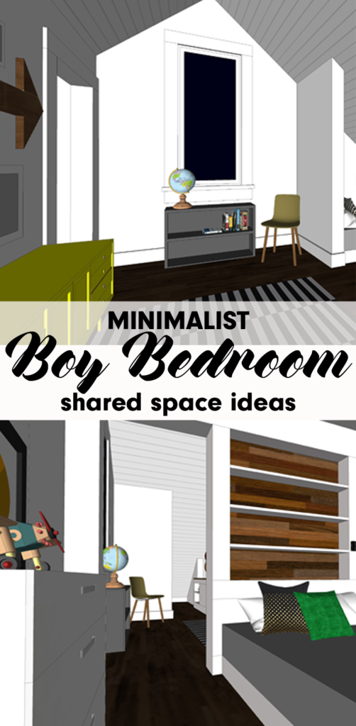
Read on for ideas on how we are designing our future home to incorporate a shared boy bedroom for our three sons. These ideas can be useful for anyone whose children share a bedroom.


private sleeping nook in shared boy bedroom


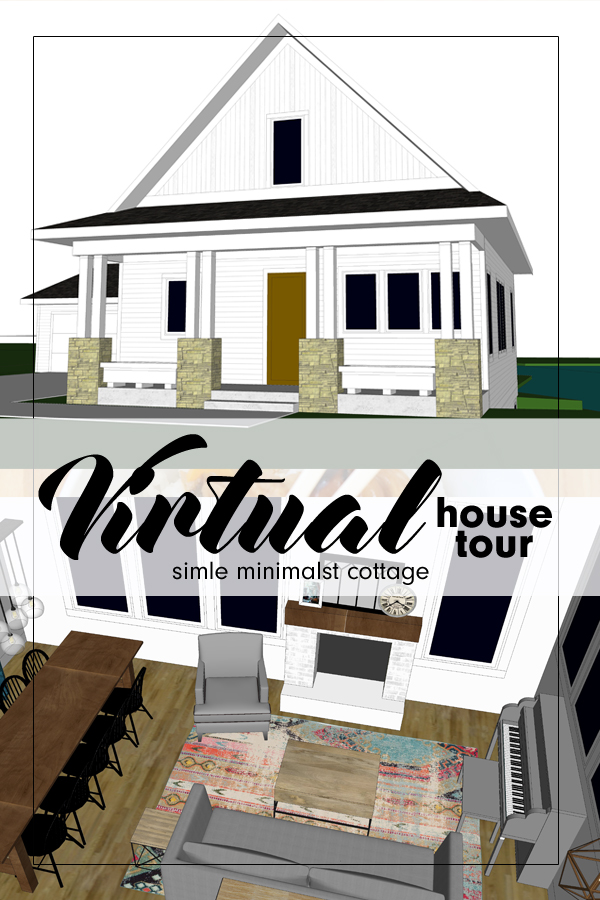
As a family on the journey toward minimalism, it only makes sense that the design of our future house, Arrow Hill Cottage, would reflect our desires. Because of this, we have been striving to build the least amount of square footage necessary for our large family to feel comfortable. One minimalist technique we are implementing is shared bedrooms for our children.


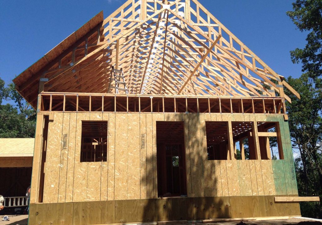
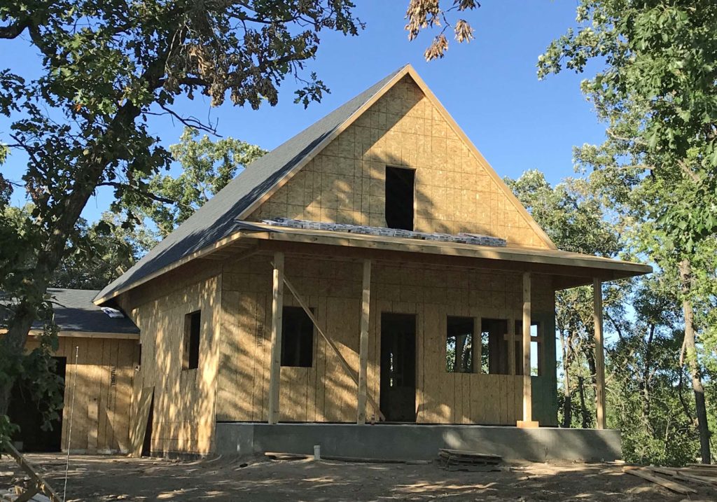
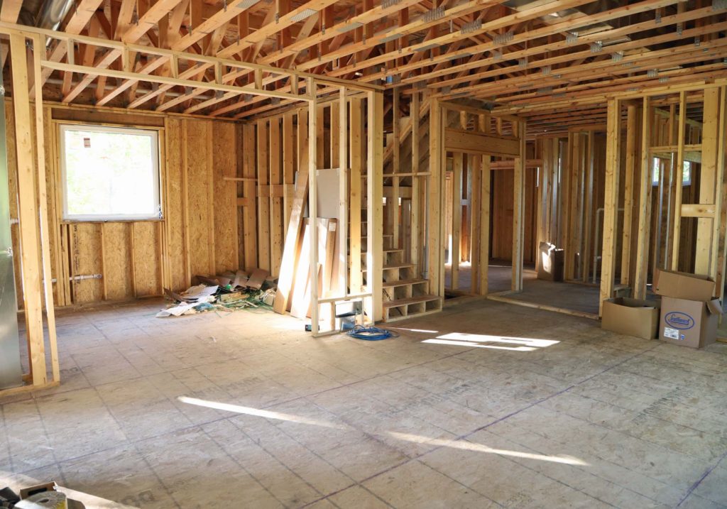
I wrote about the design of the shared boy bedroom in a previous post, when things were still very conceptual. Since that time, I have worked on structural drawings, determined window sizes, and fine tuned the overall floor plan. At this point, I feel fairly confident about what will be built.

The upper floor of our cottage will have three total rooms. A shared bathroom off of the hallway, plus a bedroom for each gender. One for the girls and one for the boys.

Our three boys are currently 11, 9 and 7 years old. They share a room in our rental house and enjoy it. However, we know that as they age they will be looking for more privacy and personalized space. Because of this, I designed their room so that it can grow with them.


THE ROOM LAYOUT


shared boy bedroom floor plan

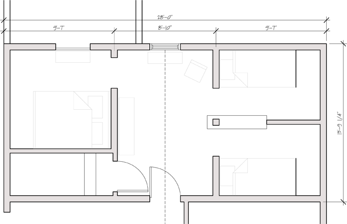
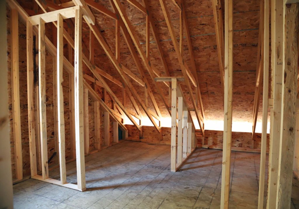
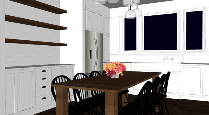
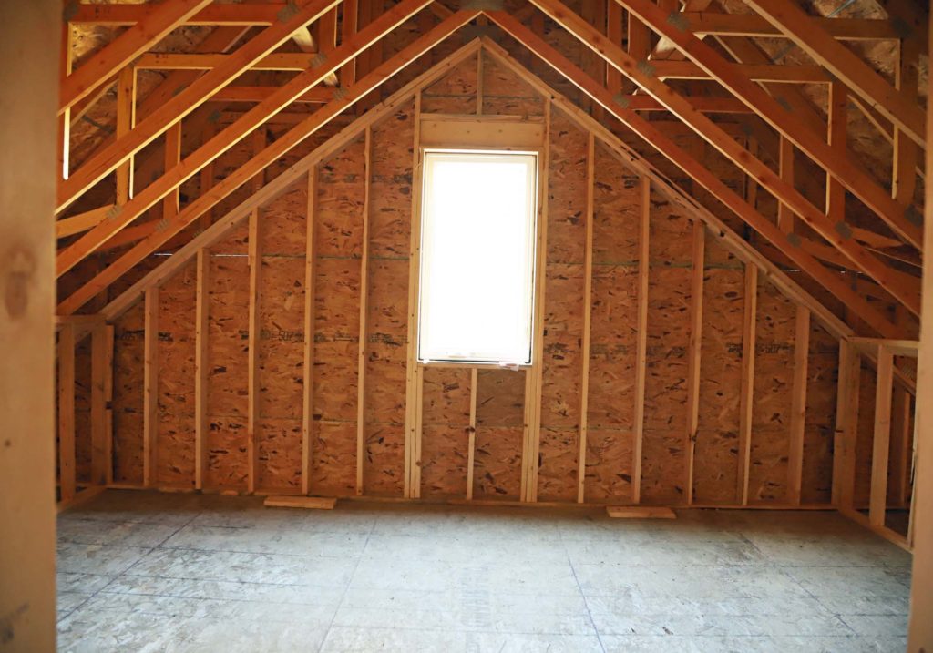
This is the floor plan of the room. Overall, from edge to edge it is 28’0 wide x 13’9″ deep. The room is vaulted at a high point of 11’5″. The ceiling slopes from the vault all the way down to the floor.


bedroom in eaves of second floor

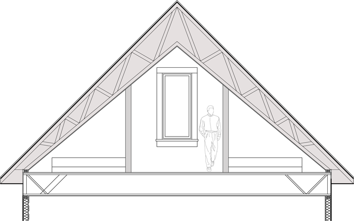
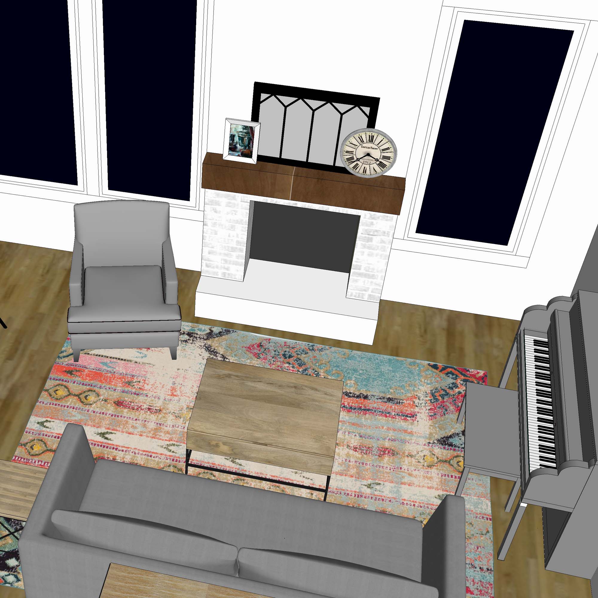
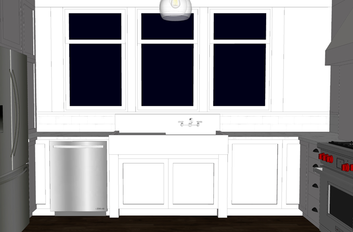
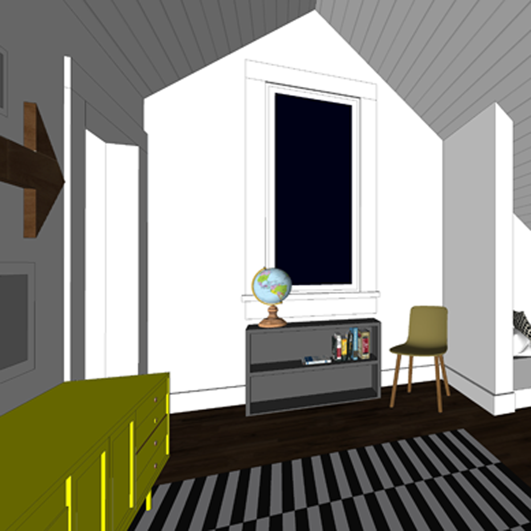
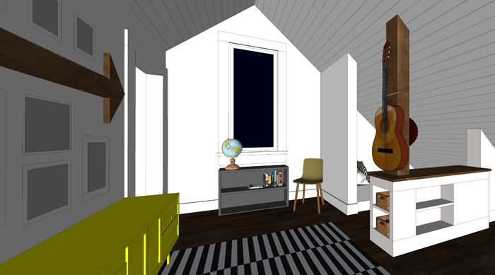
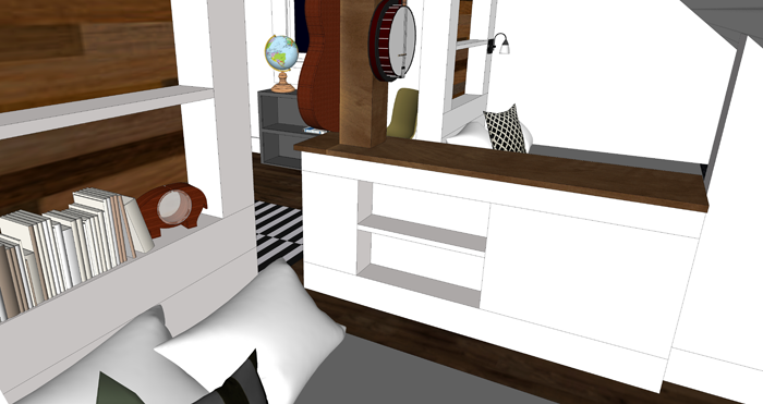
Generally speaking, the room is divided into two different zones. The center core area will be common space, shared between all of the boys. In the image above it is the space with the large window and the grown man figure ‘for scale’.


In the lower sloping portion of the room, along the outer edge, will be private sleeping nooks. One for each boy. The nooks for our younger two boys will feature twin mattresses, while our oldest son will have space for a queen sized bed.


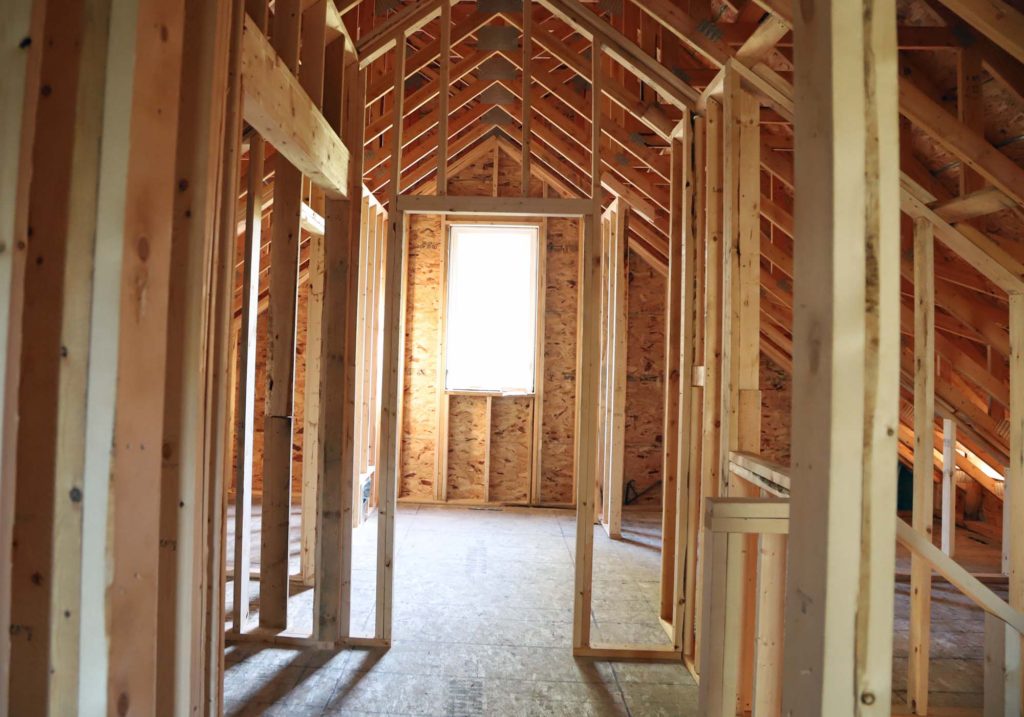
CENTRAL ‘COMMON’ SPACE

This is the view of the room as you walk into it from the hallway. The center space is about 8′ wide, but seems much more spacious because of the vaulted ceiling.  I plan to keep this portion of the room very simple and neutral style-wise, with furnishings that can grow with the boys.


clean and simple boys shared bedroom design

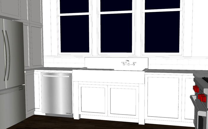
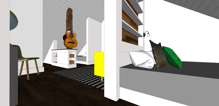
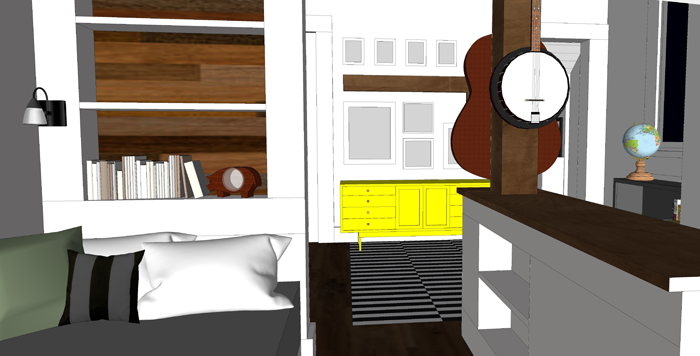
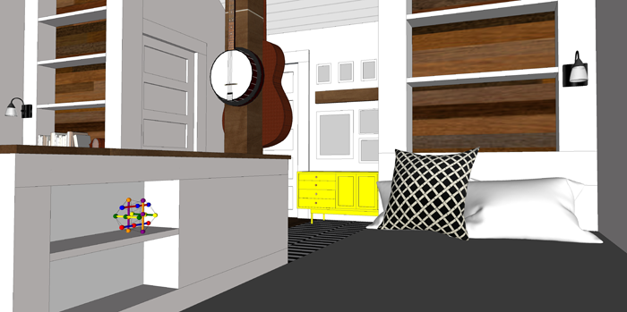
As you can see in the right of this image, the younger boys sleeping nooks are a bit more open to the center space. The larger nook is more private and is tucked behind the wall on the left.


boy bedroom design ideas. minimal home design

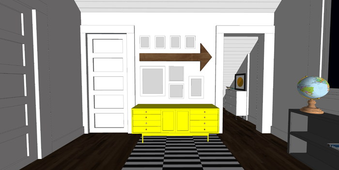
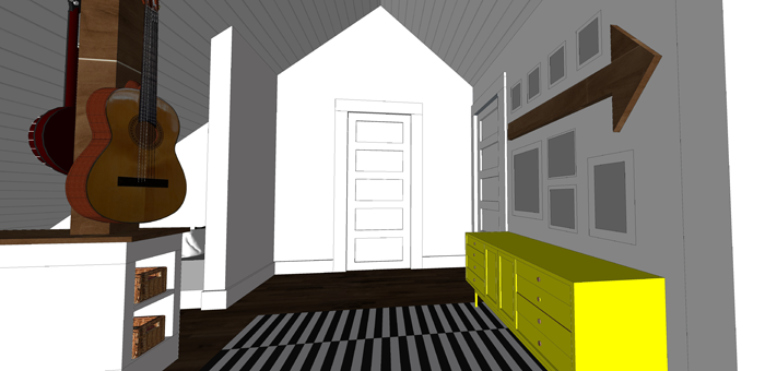
On one wall of the common space, I envision a large dresser painted in a bright color. Above it, I would like to add a gallery of photos of the boys and some fun art pieces – such as this, this and this.

Because the ceiling slopes all the way to the floor, I want it to be covered in a durable material. Perhaps whitewashed pine boards, for example. This application could add texture and visual interest as well as provide a durable surface.


shared bedroom for three boys

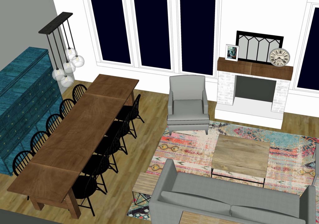
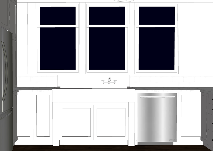
Looking back toward the bedroom entrance, you can see the closet door to the right. This one closet and the dresser will be shared by all the boys for their clothing. I imagine as they grow they will eventually be in generally the same size, at least for shirts and socks. This will help cut down on the amount of items they will need to store.


PRIVATE SLEEPING NOOKS

Although this is a shared boy bedroom, I wanted to be sure to incorporate a semi-private are for each boy to retreat to when he needs space from his brothers.


shared boy bedroom design

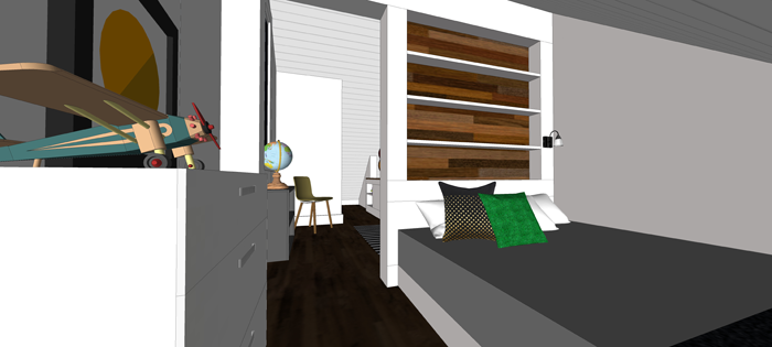
In their individual bed nooks, each boy has plenty of storage and places to display his personal belongings. The beds will be positioned not far from the floor, similar to platform beds – but I would like to at the very least allow for a 6 inch rolling drawer under each bed. Will perhaps try to tackle something similar to this DIY.

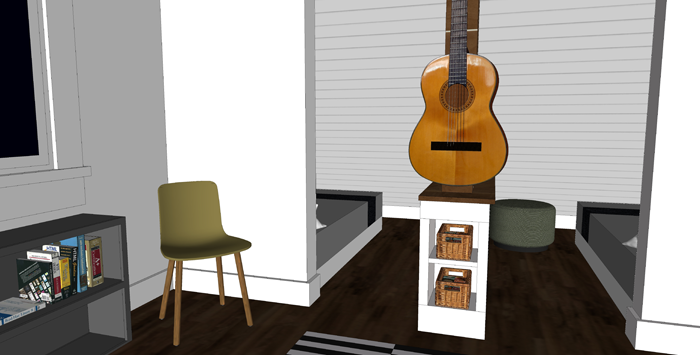
Each nook will have it’s own little lamp, as well as shallow shelving built into the wall studs. Barn-wood accents on the back of each of the shelves would add some warmth and extra character to the space. The partial height built in between the younger boy’s nooks will provide more storage, while the post will be the perfect spot to hang up their musical instruments. In this way, the instruments can also serve as room decor.


beds positioned in roof eaves of second floor


I imagine that each of the boys will put some personal touches in their own little nooks – with bedding, books, and accessories.

built in bed in boy shared bedroom

minimal shared boy bedroom


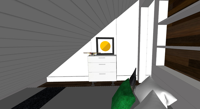
LARGER, PRIVATE NOOK

On the other side of the room is the larger sleeping nook. It will be given to our oldest son starting out. Once he moves out of the house, it will be passed down to the next in line – age wise.

As I mentioned before, this space is large enough for a queen sized bed. I appreciate this aspect while looking into the future, when our kids are all grown up with families of their own. We can see this room serving as a very nice family guest suite.

kid sleeping nook in shared bedroom space


There is room for a small dresser and some art on the side wall.

bed in eave space of shared boy bedroom


SHARED BOY BEDROOM THOUGHTS

I know that some of you reading this will be skeptical about three teenage boys sharing a room. I totally understand that, and will admit that I am a tad nervous myself. However, each family uses their house so differently. For us, the bedrooms have always been used as a place to read and sleep.

In our home we allow the kids to have musical instruments, books, and perhaps a few toys in their rooms. We do not, however, allow electronic devices (computers, tvs, phones, etc). By doing so, we hope that the shared boy bedroom will serve it’s intended purpose as a relaxing space. And, if they need to get their energy out, they can always go shoot a few hoops in the basement rec room!


We are all super happy with how the room is coming together conceptually and the boys, of course, can’t wait to see it built!


PIN THIS SHARED BOY BEDROOM
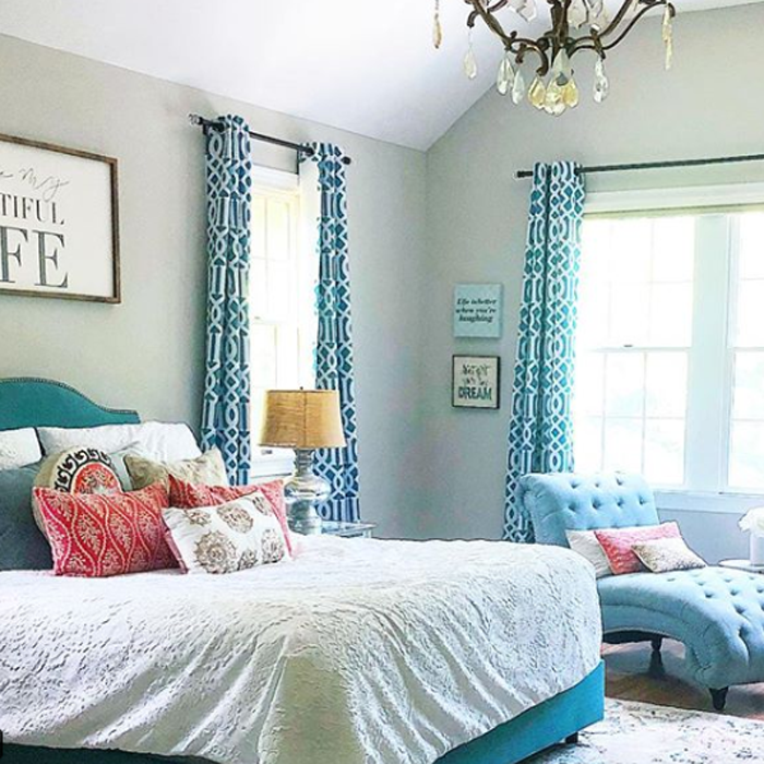
shared boy bedroom ideas for the minimalist family home