AROUND HERE: DECEMBER 2017

Around here we have been….

DRESSING WARM and bundling up for the season. The temperatures have dropped significantly over the past month. The ground is now covered in snow, and the thermometer  rarely reads in double digits. In fact, today it is foretasted that the high temperature will be -15! That’s not including wind-chill!

Despite the cold weather, {D} and {L} continue to make an effort to get outdoors and practice their football skills. They are forming a special bond over the sport, which is really fun to see. {D}s favorite is still kicking, while {L} enjoys throwing and catching best.

SINGING in celebration of our Savior’s Birth. {D} performed at Jingle Bells once again, both in a duet with a friend and with the school choir. You can listen to the performances HERE. It was a beautiful evening filled with music and talent, and all for a wonderful cause.

The rest of the kids participated in both the day school and Sunday School Christmas programs. Each of the day school kids had to remember quite a few lines for these programs. They did a wonderful job and it was fun to see them sharing the Christmas story together. {M}’s Preschool had its own program, which was adorable.


ENJOYING CHRISTMAS BREAK at home. We had such a wonderful, fun filled Christmas! With it being {K}’s first Christmas home, we wanted to make it extra special. The house was decorated in bright colors and accented with photos from our year and the special events that took place – including our trip to China to make her a part of our family. You can see all of our decorations in THIS POST.

We kept the gift giving very minimal for the kids again this year. With five little ones under the roof, they already have plenty of toys and games and actually tend to have the most fun playing with one another. We purchased each of them an activity book (paper airplanes, brain puzzles, seek and find, etc). The girls received some fun new things for their play kitchen, and the boys received micro brick sets. They are sort of like Legos, but smaller and more challenging. The largest gift of the season went to {I}, who finally got a ‘high performance’ drone.

REMINISCING on all that has happened in 2017 by watching our family videos. We are thankful that we started the new tradition this year of organizing our family photos and videos each week into mini ‘timeline videos’. Each year in the future, during Christmas break, we will take time to sit down as a family and relive the past twelve months. Since we started in July of 2017, we only have six months to review this year.

If you’d like to see these videos, and get a closer look at all that our family has been up to, you can see them on our YouTube Channel: ARROW HILL FAMILY.

Blessings to everyone for a happy and healthy 2018!

TRENDING IN HOME DESIGN & DECOR: BOLD PATTERNED TILES

Are you looking to add a statement feature to your home – maybe something a bit more than a fresh coat of paint can provide? The bold pattern tile look is very popular right now, and homeowners have really shown their creativity on where to utilize this medium. Tiles aren’t just for floors anymore!


From straight line geometric to floral patterns, there is sure to be a tile to match just about any home style and design preference. In fact, I incorporated some fun patterned tile into a recent bathroom Makeover Takeover!


WHAT ARE THEY

These tiles feature bold, graphic patterns. Typically, they will have patterns that when positioned next to one another, and sometimes rotated, form an even larger, repeating design.

The origins of this type of tile style can be traced back as far as Medieval times. During that era they were called ‘inlaid tiles’, and later – in Victorian times – Encaustic tiles. Essentially, Encaustic tiles are created by using two to six different colors of clay. The clay is arranged in a pattern before firing. Because the pattern is not simply painted on the surface of the tile, it will continue to be present even as the tile wears.

Today’s patterned tiles are made primarily from cement, but there are less expensive varieties in both ceramic and vinyl.


WHERE/HOW TO USE THEM

There are plenty of unique applications for these stunning tiles.

Bathrooms

Tiles are a wonderful flooring option for bathroom applications because they are resistant to moisture/water. In small rooms, such as bathrooms, these bold tiles generally will not be competing with other design elements.


image source


image source


Laundry Rooms

Who doesn’t need a little excitement and style when tackling the laundry?


image source


image source


Kitchen

Tiles make a wonderful backdrop on kitchen walls or floors. They might also be fun to use on counter-tops, perhaps on a center island.


image source


image source


Entry/Foyer/Mudroom

Set an inviting tone to your entryway and let guests see a sneak peek of the fun and style they can expect to see in the rest of the house.


image source

Patterned tile is wonderful at camouflaging dirt and grime.


image source


Hallway

Hallways get a bad reputation of being boring and lifeless. With the addition of a sea of pattern, this hallway could not be any more interesting!


image source


Stair Landing

Add a bit of pizzazz to those boring stairways. Doesn’t this landing just seem to come to life with the tile work?


image source


Focal Point

Let eyes focus on a featured item in your home, such as a special alcove, the fireplace, or even a piece of furniture!


image source


image source


image source


WHERE TO BUY

A large variety of retailers are now selling these tiles at reasonable prices. Click on the links below for access to some of my favorites!


1 | 2 | 3 | 4 | 5 | 6 | 7 | 8 | 9 | 10 | 11 | 12


Be sure to also click on over to this post for a comprehensive shopping guide!


MY THOUGHTS ON THIS HOME DESIGN TREND

As a lover of simple geometric patterns, this is a trend that I can totally get on board with! My caution to anyone wanting to incorporate these unique tiles is this: use them sparingly. I personally feel that the boldness of the tiles can make a large space covered in them seem too busy, even dizzying.

I also would advise that colors are pulled from the tiles to use in the rest of the space. This will help to provide balance between elements.

Finally, be sure that you choose a color and pattern of tile that you love – they surely aren’t the easiest things to replace!

CHRISTMAS DECORATING INSPIRATION FROM INSTAGRAM

I joined Instagram right around the same time that I started this blog, only a few short months ago. I mainly follow home decor sites there, and have been absolutely wowed by the amount of creativity that is shared!

This has been my first Christmas season as part of the IG community and it is plum full of amazing feeds. With Christmas right around the corner, I wanted to capture some of my favorite photos and share them with all of you.

@laureltracehome

Not one, not two, but three gorgeous Christmas trees! I am loving all of the red and white in this room, and the high windows add a touch of elegance to the space. Did you notice the amazing scroll above the mantle?


@sweetroseandwren

How adorable are these gingerbread decorations? Just SO sweet! I would have never thought to use edible items as decor, but this display is perfectly creative! And although I lack skills in the kitchen, this photo is tempting me to try my hand at a gingerbread creation of my own.


@nest.of.neff

That is one festive bed! I love the simple stripes combined with the chunky metal bed frame. The bedroom is one room that I tend to not put any effort into decorating. I think in the future I might try harder!


@ourweatherednest

I’m dreaming of a white Christmas…. in one of those amazing metal houses! This display is such a simple and perfect depiction of Christmas. Peaceful, calm, and celebrating the Savior’s birth.


@dreamywhitelifestyle

This picture just warms my heart. The room is absolutely filled with natural light (one of my love languages), and though the tree has no ornamentation, the little boy is cuddled in a warm blanket sitting amazed looking in it’s direction. The wonder of Christmas. Magical.


@desertdecor

Bringing the outdoors in, this table setting is rustic and modernly stylish with the buffalo check accents. I imagine a warm bowl of soup in those pretty white bowls.


@ripeonthevine

I am pretty sure I could curl up with a good book and just hang in this corner for an entire day! I love how the standard house plants seem to fit right into this scene. The plaid checkered pot cover helped to tie it all together.


@sweetparishplace

Ending this roundup with another gorgeous tree all decked out in red and white. Doesn’t it look magical next to that grandfather clock?


Isn’t it fun to see how different people decorate their homes for the season? If you missed the post detailing how I decorated our house for Christmas this year, you can find it here. I also invite you to visit these amazing Instagram accounts for even more inspiration by clicking on the links below each photo. Merry Christmas friends!

SATURDAY SKETCHBOOK: KITCHEN BASIC DESIGN

I spent some time this week diving into the interior of Arrow Hill Cottage. With just over 18 months remaining before we break ground, I want to get as many details ironed out as possible. I figure that the more decisions that are made on paper, the less surprises that might arise during construction.

This may end up being the most well planned house of all time…. because this mama doesn’t like surprises! Ha!

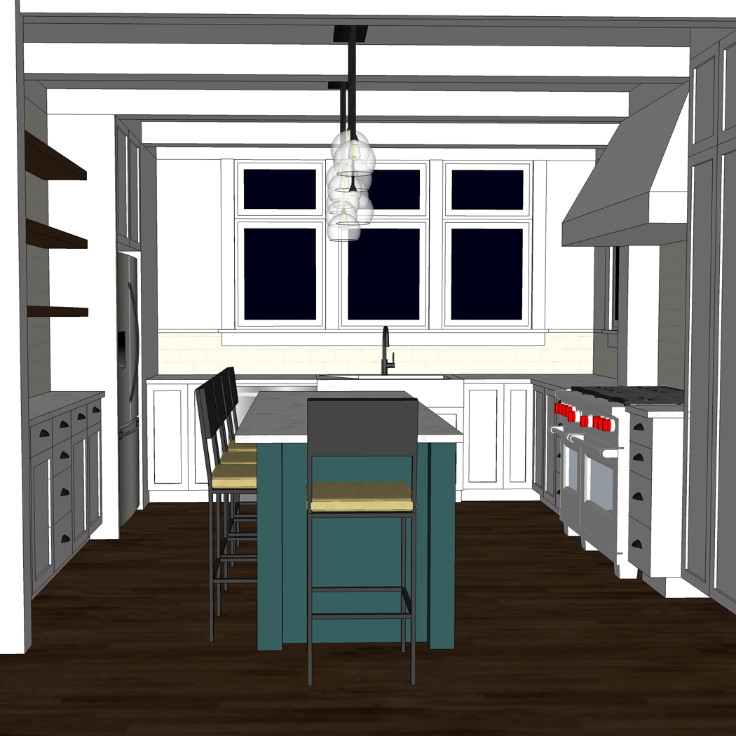
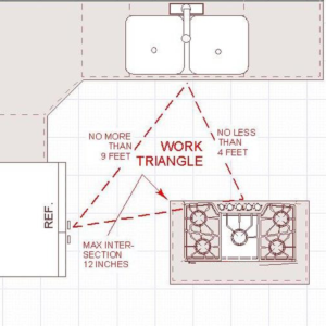
First up on the detailing docket is the kitchen. I wanted to start on it first, because I know that kitchens are the most complicated room in basically any house on the block. Ours is no different. So many decisions need to be made! You can see the basic floor plan layout of the kitchen in this post. The plan is basically still the same, but some of my initial ideas about which cabinets go where have changed.

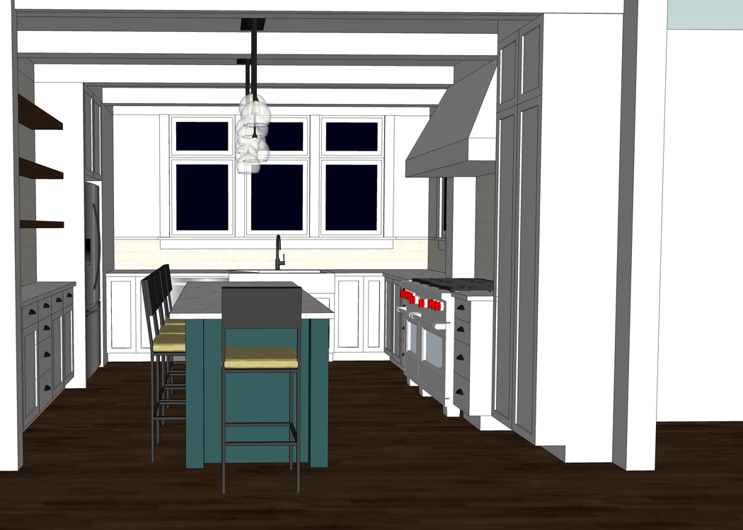
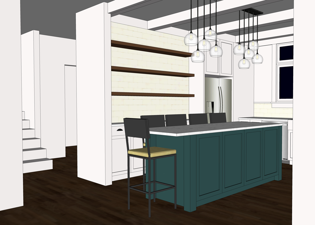
This is the view of the kitchen- standing in the dining space. It can be seen, by a long view, from the front door. The blank space you see on the right is the living room, which obviously hasn’t been detailed yet. The connection between these three spaces (kitchen, dining, living room) is great. There is definition of space but the rooms flow freely into one another.

A closer view of the space. I am loving the bright and airy feeling it has so far. I feel like your eye is drawn to the wall of windows, which was my intention. Out those windows will be a beautiful view of wooded acreage.

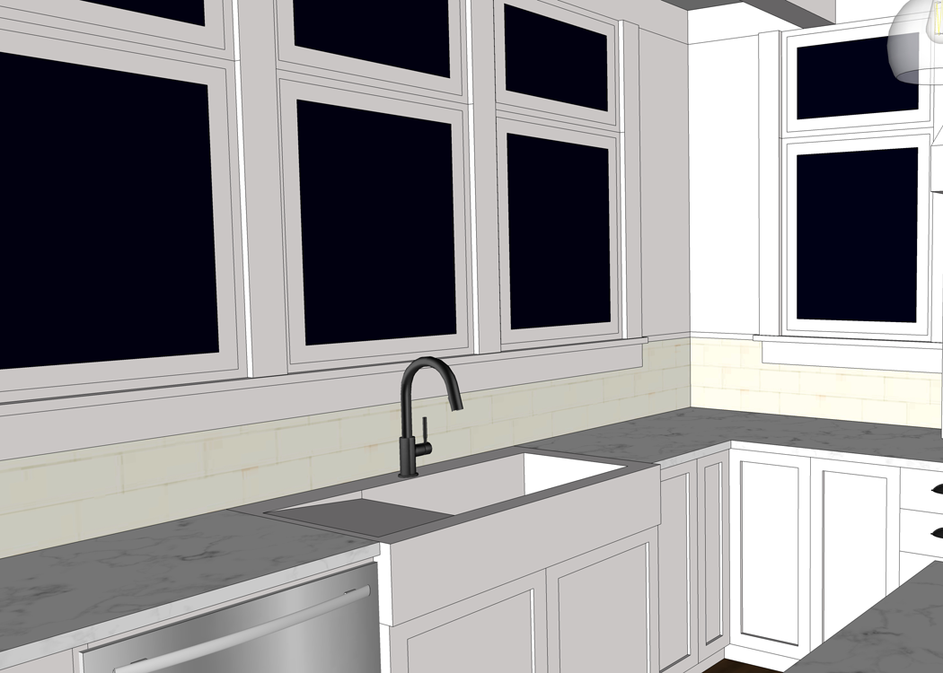
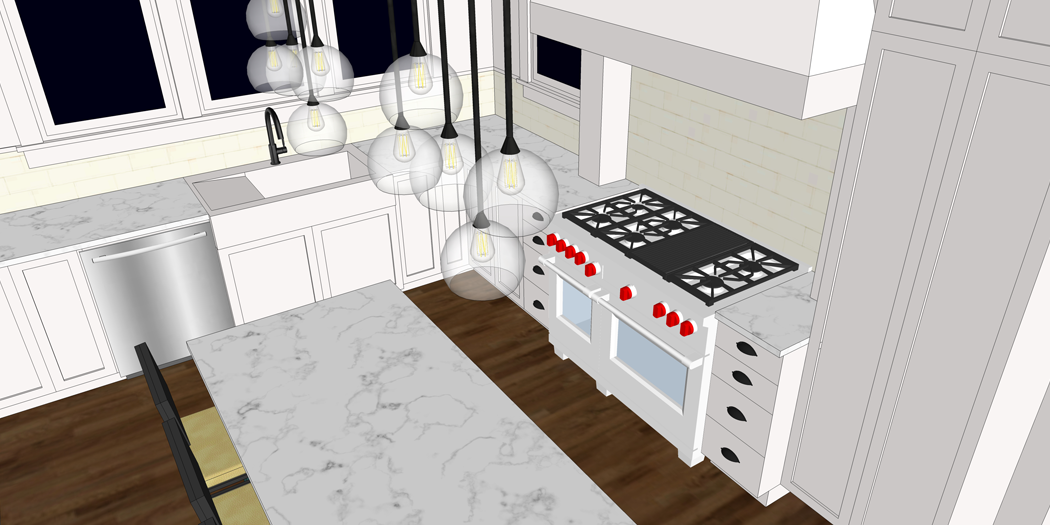
In fact, standing at the sink – which is a reclaimed piece from Craig’s grandparents home – there will be a panoramic view of nature. I think that this view, and the natural light that will be pouring in, will make monotonous kitchen work seem more bearable. Maybe.


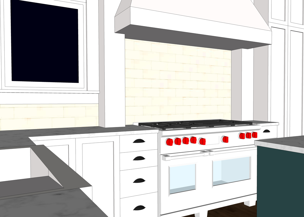
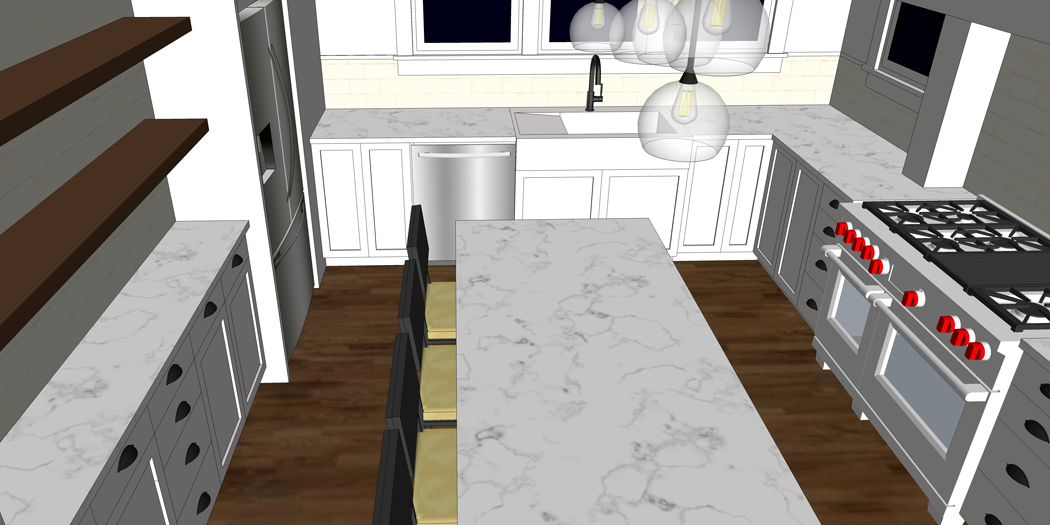
Turning toward the right side of the room, I have placed the range. This is a 48″ wide Wolf range. It is far more luxurious than any appliance we have ever owned; but I have heard only great things about this brand. And, I think it looks wonderful in the space.

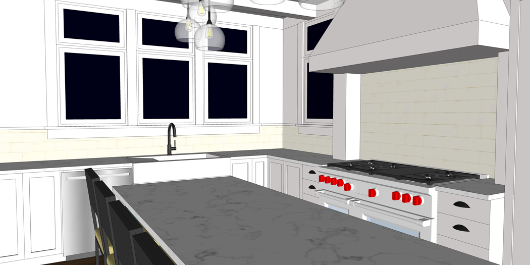
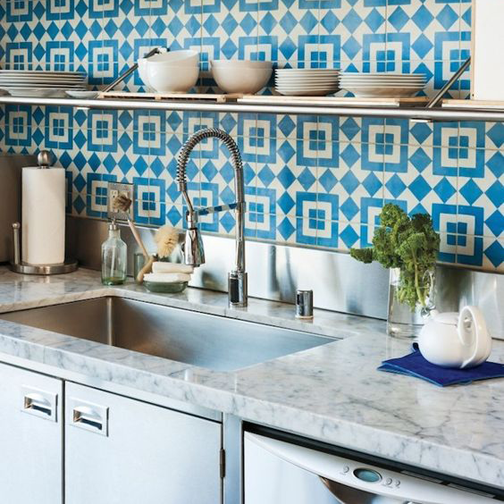
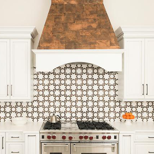
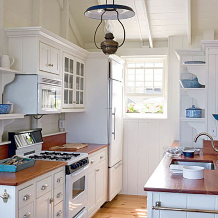
The vent hood above would have to be custom made by the cabinet manufacturer. I imagine the ‘pillars’ on either side of the stove to have secret pull out compartments for spices and oils. Another detail that will need to be worked out. I’m envisioning something like this photo.
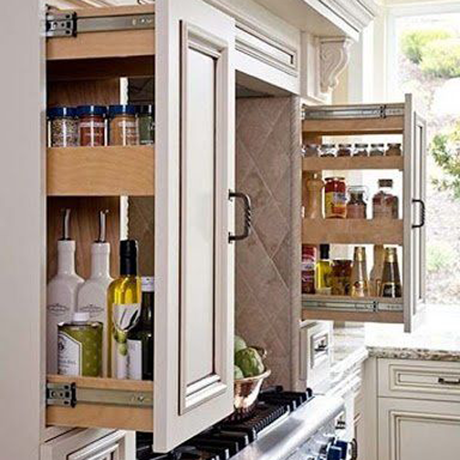

image source

To the right of the stove is a tall cabinet. At the moment, I am thinking that the doors of this cabinet will be telescoping, and when open will reveal the microwave and pantry storage.

In the center of the room is the lovely 7 foot long island. Having a large island in my kitchen has been a dream of mine for a very long time.

I want the island to be standard counter height so that it can be used as extra prep space. I am thinking that the counter top will be of the same material as what the perimeter cabinets have – some type of white granite perhaps- but I would like the base cabinetry painted a different color to add interest and to give the island more of a ‘furniture’ look.

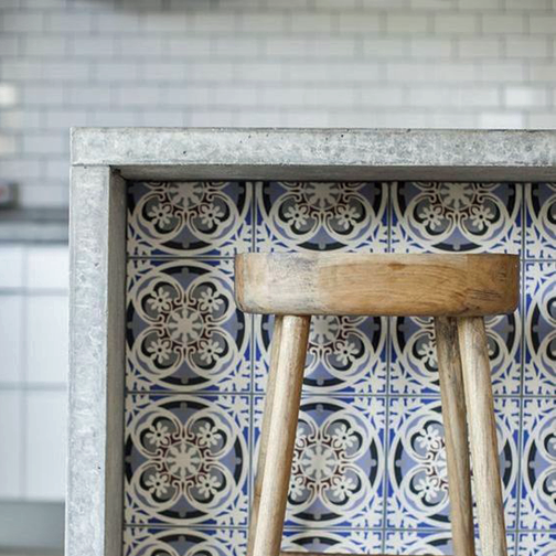
The back side of the island will have storage cabinets, while the other side will feature spots for seating. I have a bit of a debate going on in my own head right now. Should the bar stools have backs or not?

I imagine stools with backs might be more comfortable, but they also look a bit more clunky and may not be as visually pleasing. If you have an island with seating, can you please comment below letting me know which style of seating you have (backs or no backs), and what your thoughts are? Thanks!

Let’s just take a minute to admire the ceiling, shall we? I am really pushing for some beam elements. I’m not sure yet if they will fit in the budget, but I want to get them planned out anyway. If we can’t do them right away it may be something we add in the future.

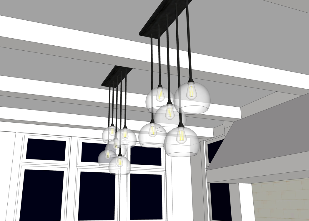
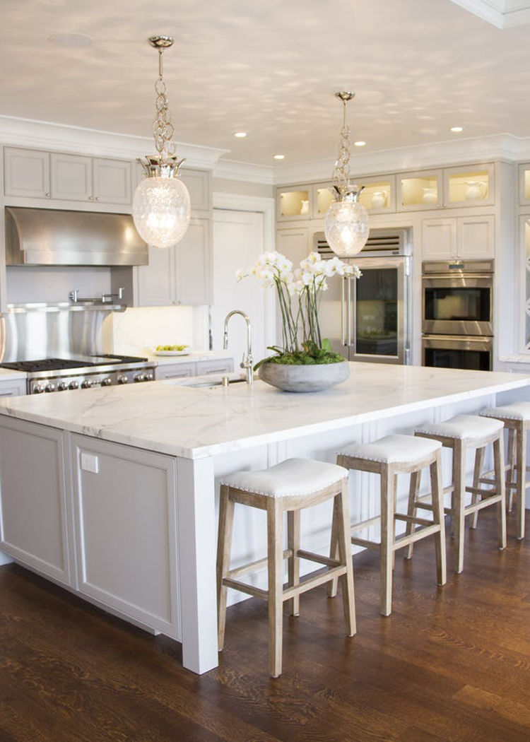
I have not formally chosen light fixtures for the kitchen, but am kind of liking the idea of purchasing multiple ‘similar looking’ pendants and clustering them above the island. An arrangement something like this photo
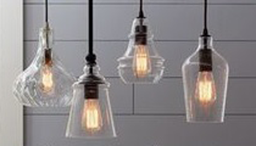

image source

Gorgeous, right? I think it would be an unconventional arrangement, but something that might fit perfectly in the house. Cottages are known for their eclectic style, after all.


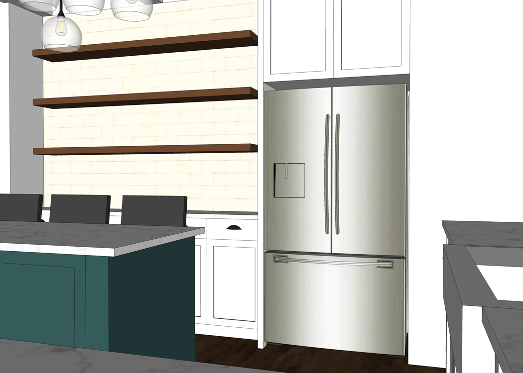
The final side of the room features a shallow cabinet and counter, which I imagine will be perfect as a breakfast bar or as a buffet during gatherings.

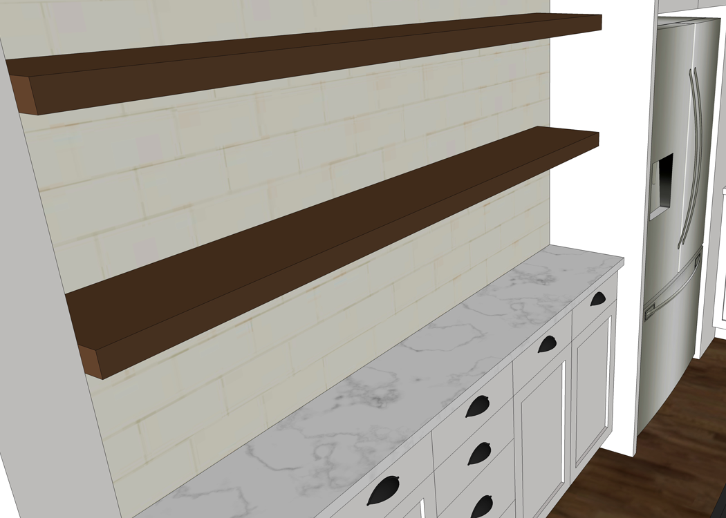
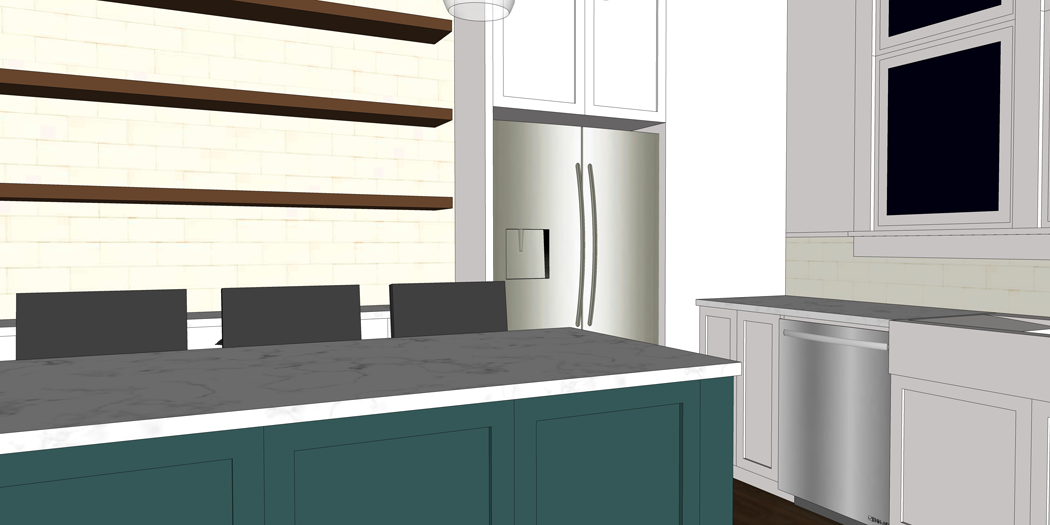
Our property has many mature oak trees, some of which will need to be removed to make room for the house. Craig and I are hoping that we can find someone local that would be able to mill the removed trees into boards. These boards could then be made into special items for the house itself, including the dining room table and possibly the shelving here in the kitchen.

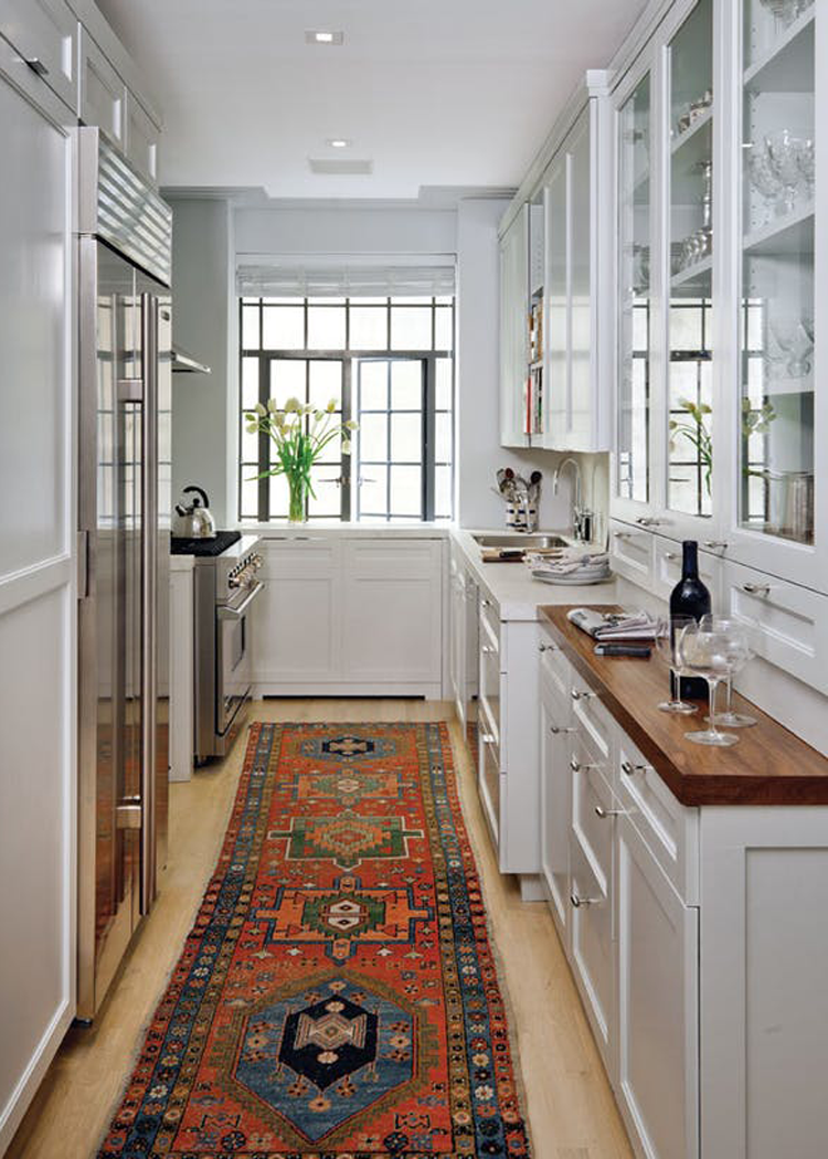
I love the idea of using the open shelves to house pantry items that can be stored in cute glass containers, such as pasta, sugar, and oatmeal. I could also see myself storing our frequently used plates, bowls and tumblers on these shelves. We’ll see how dusty the house gets. If it gets to be too much of a maintenance issue, maybe the shelves will be for display items only.

I love how this family utilizes open shelving.
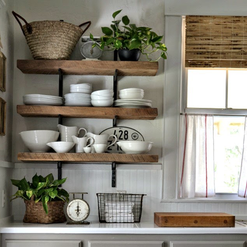

image source

The fridge will have it’s own little corner of the kitchen. One thing our kids are really looking forward to is the availability of crushed ice and cold water on demand. It’s the simple pleasures.

One last look of the kitchen – the view from standing in the living room. You can see the stairs off to the side, and I can just about imagine my hungry little children wandering down from their bedrooms for breakfast in this beautiful space. I am loving the design progress I have made so far!

Let me know what you think! Any tips or suggestions?


HOLIDAY HOME TOUR BLOG HOP

Can you believe we have less than two weeks until Christmas? This time of year is always full of beautiful things; And in honor of that, I’ve teamed up with some amazing fellow bloggers. We’re inviting you into our homes to share our Christmas decor and hopefully give some inspiration!  At the end of this post, I’ve linked to everyone’s posts so you can ‘hop’ on over and check out their homes. We hope you have fun!

Want to see how I have decorated our home for Christmas this year? I’m excited to share!

First, a bit of a disclaimer: We are living in a rental home as we prepare to build Arrow Hill Cottage. Though our rental is a pretty good fit for our family, it is difficult for this design oriented lady to accept some of the finishes. Yes, we have painted paneling. Yes, we have popcorn ceilings. No, the furniture isn’t optimally positioned. No, we can not remove walls. Ha Ha!

I worked with what I had. This is our family’s moment in time. Christmas 2017  – in the rental house.

We have five young children. They range in age from four to eleven. Old enough to understand the true meaning of Christmas, and young enough to still be excited about festive decorations and wrapped presents under the tree.

This is our daughter {K}’s first Christmas home (you can read about her adoption journey here). I really wanted her first experience of Christmas to be one of happiness, anticipation, and fun – and full of family togetherness. As such, I was sure to include the kids in the decorating festivities. I chose to keep the bulk of the decorating in the main living space, which you will see today.

I started with an amazing feed/flour sack that I found at a local antique store. Isn’t this just the most perfect fabric for the season? The bright colors and bold, fun patterns on this fabric were just right for what I was trying to achieve. I turned that one feed sack into two amazing throw pillow covers, complete with wooden buttons.

I layered in more texture on the furniture with cozy throw blankets, home made sweater pillows and a sweet DIY fleece knot pillow. Be looking for a tutorial on that coming soon!

I scored some comfy club chairs + ottomans recently for an absolute steal of a price. The bad news is that they will need to be reupholstered with something a bit less boisterous. The good news is that the fabric is red and I was able to blend it into the Christmas decor. Ha!

We don’t have a beautiful fireplace or mantle here. I chose instead to decorate our entertainment center. I covered the electronics, besides our massive TV, with burlap linen. I then put together a super colorful rag garland and draped it in front. For this craft, our boys got in on the action of ripping fabric and pretending they were the Incredible Hulk. Ha!

Perched on top of the cabinet are my Willow Tree figurines. I love the simple sentiment of this Nativity display.

Another simple garland that I created includes DIY pom poms. I had never made them before; but found this well written tutorial that showed me step by step how easy they are to create! The kids joined in the fun of creating these fluffy ‘snowballs’.

Our Christmas tree is the ultimate of hand-me-downs. Though I love the look (and smell) of a freshly cut evergreen, it is special to me that the tree which now sits in our living room is the same that my Christmas presents were placed under as a child. That’s right. This tree is as old as I am! I’d say she has aged pretty well!

The ornament and light positions were decided by the kids. I had thought of maybe moving them around to balance things a bit, but decided to embrace the quirkiness. They are so proud of their masterpiece.

I love taking photos of day to day life – sometimes though, those pictures tend to be stuffed into yet another computer file. Lately, I have been putting forth more of an effort to showcase the pictures I take. In fact, I started a YouTube channel just for that purpose! Our weekly photo vlogs have been so fun to create. At the end of the year, we plan to sit down with a big batch of popcorn and watch them together.

I decided to take one photo from each month and showcase them as part of the Christmas decor. A bit of a yearly time capsule. Each black and white photo is accented by a Popsicle stick frame. The kids helped to paint the sticks a whimsical shade of green and I assembled them.

It is a treat to be able to glance at the tree and be instantly transported back to that moment in time. We really have been through a lot this year! From traveling to China in April, as part of {K}’s adoption trip, to Craig’s knee surgery in August. What a year!

I’m not sure how I did it – but I somehow have managed to finish this year’s Christmas shopping already! I have wrapped the gifts in patterned paper that matches the colors in the rest of the room.

A little red birdie lives on top of the piano – nestled near a small painted wood sign of one of my favorite Bible passages, Psalm 127. I purchased the sign during a friend’s adoption fundraiser. It is a very special piece.

The red and green color scheme continues on the piano top, where a trio of ‘mini trees’ reside. This was another DIY project. The containers were covered in fabric and the trees were made out of a wired garland I had laying around.

Other whimsical items are spread throughout the room. This gallery of vintage frames adorned with fabric, pom poms and a pine cone was a favorite when I first put it up.

There’s that amazing fabric inspiration again. I was sure to use every last scrap. I love it so much!

I threw in a few more vintage finds for good measure.

I hope that you will gain a bit of inspiration from the decor our family is enjoying on these cold wintry days. I invite you now to visit these other amazing blogs to be further inspired!

HOLIDAY HOME TOUR

Bless Mama

Slice of Style

Babb Farm Life


THE MAIN ELEMENTS OF THE MID CENTURY MODERN HOME STYLE

Welcome to another installment in the ELEMENTS OF HOME series. Each month I showcase a different residential style here on the blog. It is my hope that this information will not only teach you a little something about the various styles; but also equip you if are designing or searching for a new house – by allowing you to determine which style(s) suit your lifestyle and preferences the most.

Today I will be over-viewing the Mid-Century Modern home – including the history of the style and what makes it unique.


HISTORY OF THE MID-CENTURY MODERN STYLE

This style received it’s name partly because of the time period in which the homes were being built. Mid-Century. Mid 20th century to be exact. There is a bit of discrepancy on which years are included; But generally speaking, the Mid-Century Modern style comprises houses built from the years 1935 to 1965.

This was a tumultuous time in history. In the mid 1930’s, the threat of the second World War was looming and various architects, including the pioneers of the Bauhaus Movement – Walter Gropius, Marcel Breuer, and later Meis van der Rohe, fled Germany for America. These men were aiming to unite art and industrial design.

At the same time, American designers were highly influenced by the simplicity and integration with nature that was prevalent in Brazilian and Scandinavian architecture.

image source

At the end of the war, as Veterans were returning to America, the need for affordable and quickly constructed houses arouse. These soldiers were looking to settle down and start their families. While architects designed stunning homes in the Mid-Century Modern style, it was real estate developer Joseph Eichler who is credited with bringing it to the masses – through his tract home development.

image source

MAIN ELEMENTS OF THE MID-CENTURY MODERN STYLE

LOCATION

Typically, these homes were constructed in suburban settings. The first Mid-Century Modern homes started to take root on the West Coast. They became popular in California and then on the East coast. Slowly, the style began to spread sporadically throughout the country.

image source

SIZE

During the Baby Boom, Americans were looking for spacious, open homes that they could entertain in. The Mid-Century style lent itself well to the desires of suburban families. Homes were designed to be between 1,500 and 2,500 square feet – only slightly smaller than 2017’s home average square footage (2,687).

image source

EXTERIOR TRADEMARKS

  • VARYING ROOF LINES: Creative roofs were popular at mid-century. Among those utilized most frequently were flat roofs with deep overhangs, saw tooth roofs, and the most beloved ‘butterfly roof’ – which got it’s name from the shape the gables take on as they connect at midpoint and extend upward.

image source

image source

  • ONE LEVEL DESIGN: Generally, Mid-Century Modern homes are one story structures.

image source

  • SPACE FOR AUTOS: This era of design was the first to begin offering shelter for automobiles. Many homes include attached garages or carports.

image source


image source

  • CONNECTION: Connection to nature was of utmost importance to the designers of the Mid-Century Modern style. As such, these homes feature a wonderful collection of indoor/outdoor spaces – such as large covered patios, enclosed courtyards, and entire walls that open up to allow access to the yard.

image source


INTERIOR SPACES

Whereas homes built before this time period were composed of smaller compartmentalized rooms, the Mid-Century modern home employed the ‘open floor plan’ approach. This was accomplished, for the first time, partly because of improved construction techniques. Heavy/solid bearing walls were replaced by posts and beams.

Typically these open spaces had a fireplace focal point.

image source

These homes were also the first to employ bi-level floor plans – including sunken living rooms, for example.

image source

COLOR SCHEME

The colors used in the Mid-Century Modern style are warm and earthy. The tones are derived from the materials used, such as stone grey and rich auburn wood. There is also a generous use of graphic black and white that accompanies this style.

Other popular colors during the period when these homes were constructed include muted jewel tones – turquoise, emerald and mustard yellow, for example.

image source

image source

COMMON FEATURES

Of course, no two houses are exactly alike; But there are design elements that are seen again and again in Mid-Century Modern styled homes – such as these statement features:

  • PRIVATE FRONT FACADES: The entrance to a Mid-Century home is generally understated and private. These homes are typically oriented so that the backyard entertaining areas receive the mid-day sun.

image source

  • CLEAN LINES: One of the primary goals of this design style is honesty of materials – where the sole ornamentation comes from the materials themselves. The creative and streamlined use of stone, block, glass and wood is prevalent.

image source


image source


  • FLOOR TO CEILING PANES OF GLASS: Continuing with the desire to create a connection with the outdoors, many Mid-Century Modern homes employ large panes of glass – offering stunning views and an abundance of daylight.

image source


INTERIOR DECOR

Generally, the Mid-Century Modern decorating style could be considered sparse. The simple lines of the architecture are mirrored in the furniture pieces; and the furniture market during the Mid-Century era had a life all it’s own. The new materials of the day including plastics, resins, composites, laminate and fiberglass opened up an entire new range of possibilities.

image source

The furnishings best suited in these homes are clean and sleek, with minimal ornamentation.

Walls, ceilings and floors also showcase simple materials. The juxtaposition of different, and sometimes contrasting, materials is common.


image source

image source

FAMOUS MID-CENTURY MODERN HOUSES

You may already be familiar with these stunning examples of residential Mid-Century Architecture. They are classic,  and adored by many.

The Philip Johnson Glass House | Architect: Mies van der Rohe | 1949


The Stahl House |Architect: Pierre Koenig | 1960


Neutra VDL Studio + Residence | Architect: Richard Neutra|1932/ rebuilt 1964


INSPIRING MID-CENTURY MODERN STYLE HOMES FROM AROUND THE WEB

These homes showcase the Mid-Century Modern style well. Take a closer look!

Left to Right: 12 | 3

I hope you enjoyed learning a bit more about the Mid-Century Modern style. Curious which residential style will be featured next month? Stay tuned!

And be sure to check out the previously showcased styles here.

CREATE A PAINTED WOOD SIGN IN 6 EASY STEPS

Painted wood signs are very popular right now. They are classic, and their neutral colors look great with a variety of home decor styles. They can be purchased at craft fairs or on Etsy. Many retail stores now sell mass produced varieties; but if you create a DIY version – a whole new world of possibilities opens up!

The great news is that creating a painted wood sign is easier than you might think. It can be accomplished in six simple steps!

SUPPLIES YOU WILL NEED

Wood ‘canvas’: A single slab of wood will work great, as will wood strips connected together. The wood can be newly purchased from a home improvement store or salvaged from an old building! Be sure to inspect it for knots or splintered pieces.

Paper/Printer: You can use computer design software to create and print your design or make a hand-drawn ‘rough draft’ on plain paper.

Transfer Paper: There is the standard carbon paper, or the colored version – which I prefer.

Pencil/Pen: Used to trace the design.

Acrylic Paint: I prefer to use Apple Barrel Paints. They are available in a wide variety of colors!

Paintbrushes: Start with a diverse selection of brushes to find your preferred size.

Sandpaper: The grit of sandpaper needed will depend on how thickly the paint is applied. Opt for a multi-pack and you will have plenty of options.

Rag: For the final cleaning.

Once you’ve gathered all the supplies listed above, you are ready to begin! Take a deep breath and let’s have fun!


STEP 1: PREPARE THE CANVAS

Sand rough edges and clean off any dirt and grime in preparation. This large piece of barn-wood I used is full of character – including holes, knots and sawed off nails!

When choosing your wood canvas, be sure to think ahead to what size your design will be.


STEP 2: PRINT OUT A DESIGN

Decide what you would like to create! This is where the DIY route comes in very handy. You can create a sign full of words or one that includes graphics. The sky is the limit, so get creative! I have been in the Holiday spirit lately and decided on a Christmas themed design. Because I had a larger wood board to paint on, I enlarged the pattern in Photoshop Elements and printed it on two pieces of standard 8.5 x 11 paper.

If you like the design I created, check out the RESOURCE TAB for a letter sized printable PDF that you can use for this project!


STEP 3: TRACE THE PATTERN

Lay the trace paper carbon/color side down onto your wood canvas. Place your printed design on top and position it to your liking. Tape the printed design onto the wood so that it stays in place. Beginning in the upper left corner of the design, trace over the pattern with a pen or pencil – applying a medium amount of pressure. You can see from the photo above that I have used this particular pattern multiple times.

When the trace paper and printed design are removed you will be left with a light outline of the pattern. This is erasable and sand-able – making it easy to revise parts that aren’t to your liking.


STEP 4: PAINT THE PATTERN

Using acrylic paint in your color of choice, fill in the pattern. If you are worried about the steadiness of your hand you can opt for an acrylic paint pen.

Allow the painted design to dry for a minimum of 12 hours.


STEP 5: SAND

Gently rub sandpaper over the painted design. This will remove some of the paint and will give the piece a softer, more vintage look. To me it seems that the sanding really helps the paint  to become ‘one’ with the wood. I love being able to see the wood grain through the paint.

I recommend you begin sanding with a finer grit of sandpaper and increase the grit depending on the amount of paint you would like to remove.


STEP 6: CLEAN

Use a damp cloth to clean the paint that has been removed by the sandpaper.

Once the water dries you can choose, as an additional step, to seal your piece with a clear poly spray. Personally, since most of my art pieces are kept indoors, I typically skip the poly.


ENJOY YOUR ART PIECE

These look great on a mantle, hanging on a gallery wall, or in a variety of different places. I am willing to bet that plenty of people on your Christmas gift list would love a painted wood sign!

And now, you can make them one!

After you try the techniques in this tutorial, please share your creations in the comments below. I would love to see them!


This post contains affiliate links. You can learn more about my policies here.

THE KITCHEN WORK TRIANGLE EXPLAINED

Have you ever spent time in a kitchen, maybe at a friend or relative’s house, that just seemed really awkward / difficult to work in? Something didn’t seem ‘quite right’ but you couldn’t put your finger on what it was? I have a guess about what caused the problem….

THE LACK OF A WORK TRIANGLE

What the what?! Has Angela lost her marbles? No. Well, not all of them anyway!

When it comes to functional kitchen design, the triangle is KEY. And I’m about to tell you why.

The quest for efficient kitchen design is not a new one. In fact, the idea of optimizing the layout of the kitchen in an educated way dates back to the 1920’s with a woman named Lillian Moeller Gilbreth.

As an engineer, psychologist and mother to twelve (TWELVE!), she had a very unique perspective to offer on the function and efficiency of the home.  In 1929 her ideas were introduced at a Women’s Exposition.

These ideas on motion and efficiency were groundbreaking and she was hailed as ‘a genius in the art of living’. It is Lillian who is credited with developing the basic work triangle.

Fun fact: She can also be thanked for other modern kitchen conveniences such as the foot pedal trash can, shelves on inside of fridge doors (including the butter tray), and wall light switches!

In the 1940’s, the University of Illinois continued to research kitchen efficiency and developed the fundamental kitchen design principles that are still in use today.


SO… WHAT EXACTLY IS THE WORK TRIANGLE?

The kitchen is an absolute workhorse in the typical American home. Imagine yourself in your own kitchen. Of all the things that go on in that space, can you agree that the primary tasks are carried out between the cook-top/oven, sink and refrigerator?

Three major stations – the sink, the fridge and the oven. THREE. The idea behind the work triangle is this: You are going to be walking between these stations repeatedly during your time in the kitchen. In order to produce efficiency, there should be no obstructions that could make it difficult to get from one station to the next. Likewise, the distance between the stations should not be so great that you tire of walking, or too close that if two people are working in the room together they are constantly bumping into one another.

Consider the center face of each of these stations as one ‘point’ on a triangle.  Those points and the space between them make up the work triangle.


image source

BASICS OF THE KITCHEN WORK TRIANGLE

The principles of the work triangle are used by architects and interior designers when creating residential kitchens. There are some basic rules that need to be followed for the triangle to work properly.

LENGTH OF SIDES: No leg of the triangle should be less than 4′ in length, or greater than 9′. The sum of all three sides combined should be between 13 and 26 feet.

SPACING: There needs to be adequate space between stations to eliminate congestion. The average distance of separation is as follows:

Between the fridge and sink stations: 4 to 7 feet of separation

Between the sink and oven stations: 4 to 6 feet of separation

Between the oven and fridge stations: 4 to 9 feet of separation

image source

OBSTACLES: Cabinets, counters, or other obstacles should not intersect any leg of the triangle by more than 12 inches. In addition, there should be no major traffic flow going through the triangle.

image source

WORKERS: The work triangle is best optimized for one person working in the kitchen at a time. Some of the efficiency will be lost if the triangle is shared by two or more people.


It should also be noted that a kitchen with a work triangle isn’t the ONLY option. If your space dictates that all three work stations be positioned along one wall, for example, it is not the end of the world. There are plenty of high functioning kitchens that do not employ these principles.

EXAMPLES OF KITCHENS WITH WORK TRIANGLES

I mentioned in a previous post that our new kitchen at Arrow Hill Cottage will utilize these principles – but since it isn’t built yet, I thought I would share a few images of kitchens that are rocking the triangle.

image source


image source


image source

So now you know! Next time you hear someone complain about their awkward kitchen, ask them if they know about the work triangle – or better yet, share this post!