SATURDAY SKETCHBOOK: EVOLUTION OF OUR DESIGN

It’s interesting, now that I have been blogging for over a year, to look back and see some of the things that I have written – particularly as it relates to our house design process.

I am actually really thankful that I started documenting the process when I did. At the time, I had no idea that our floor plans would change as dramatically as they have.  I believe it might be encouraging to others reading this blog, who might be considering the design of their future dream home – to see that even someone who is seasoned in design can begin in one place – and end in another.

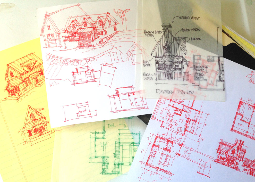
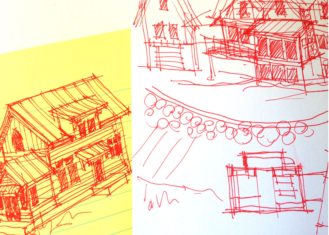
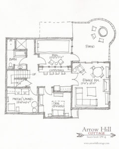
When we first started out, before our budget was completely realized, our house plans included special features such as a large vaulted living room, a small built in elevator/lift, and an endless pool in the basement.


You can see our original floor plans and my own personal thoughts about our dream home (as we believed it to be at that time) by linking to the following blog posts:

Main Level (original plan)

Upper Level (original plan)

Lower Level (original plan)

Through time, as we began to understand the true costs of what it would take to make these dreams a reality, the restrictions became more clear – and the designs began the process of fine tuning. Essentially, we had to determine which features of the design were most important to us, and which we could live without.

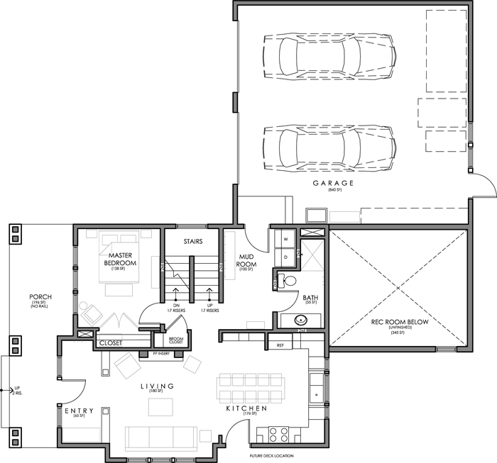
I wrote about how we made the decision to eliminate the large living room, and opted for a combined kitchen & dining space – to save on square footage – in this post.

And later, I documented in this post the fact that we would need to simplify even more – reducing the amount of windows, specifically in the living room, and also rotating the garage so that there would be a shorter driveway.


These changes didn’t come easily. I’ll admit it was hard for us to see some of the features we were most excited about slip away. But here’s the thing…


It’s still our dream house


With each change, the concept of the design was maintained, yet simplified. You could say that, essentially, we ‘cut the fat’.

In fact, as each modification has occurred, Craig and I have both looked back and realized that we prefer the more simple idea over it’s more complicated counterpart.


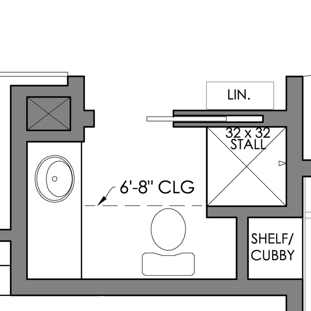
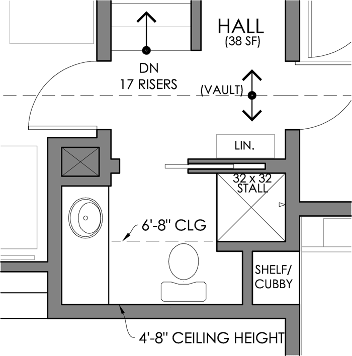
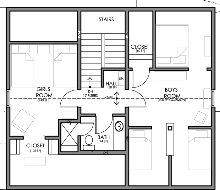
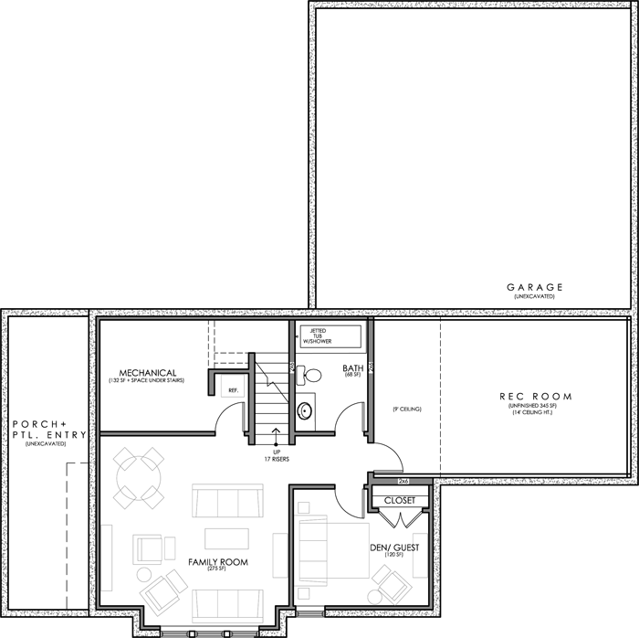
The fine tuning hasn’t been all elimination either. We have also been able to justify fun surprises, such as the rec room/ home gym in the lower level, and the nicely laid out upstairs bathroom with a large walk in shower. Both features that we know our family will greatly enjoy!

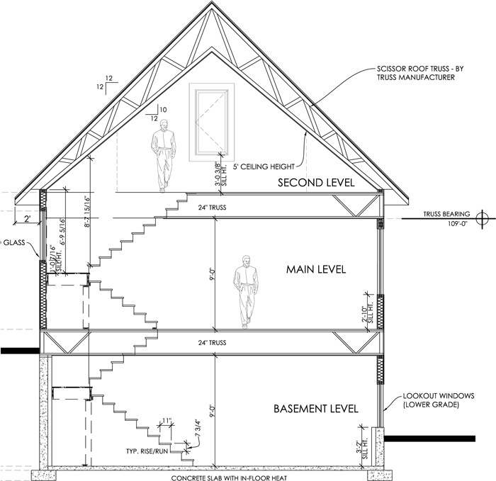
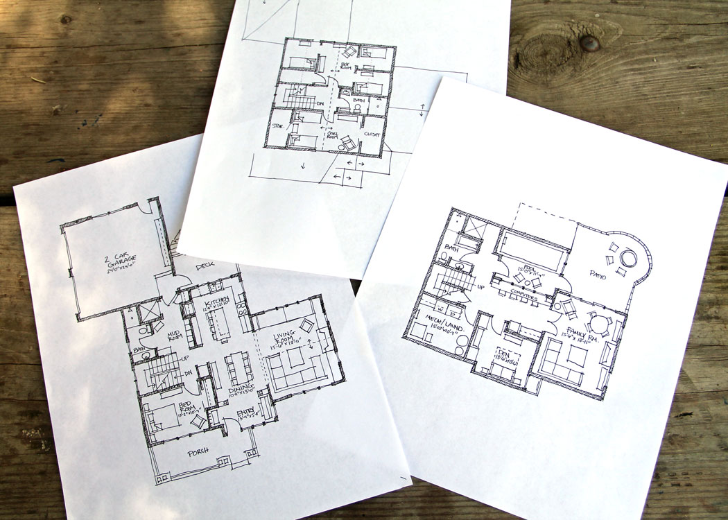
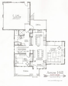
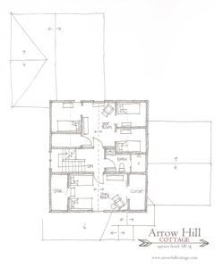
The newer floor plans, and hopefully plans that are VERY close to what will actually be built, are as follows:


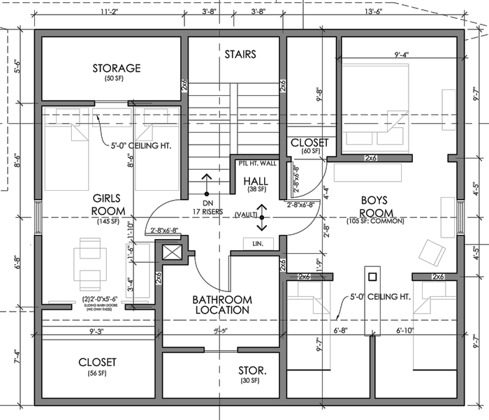
Main Level (refined design)


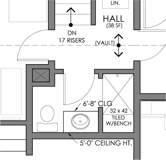
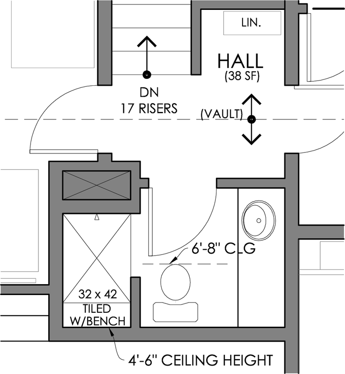
Upper Level (refined design)


Lower Level (refined design)


The exterior has changed quite a bit too – in response to the interior changes.

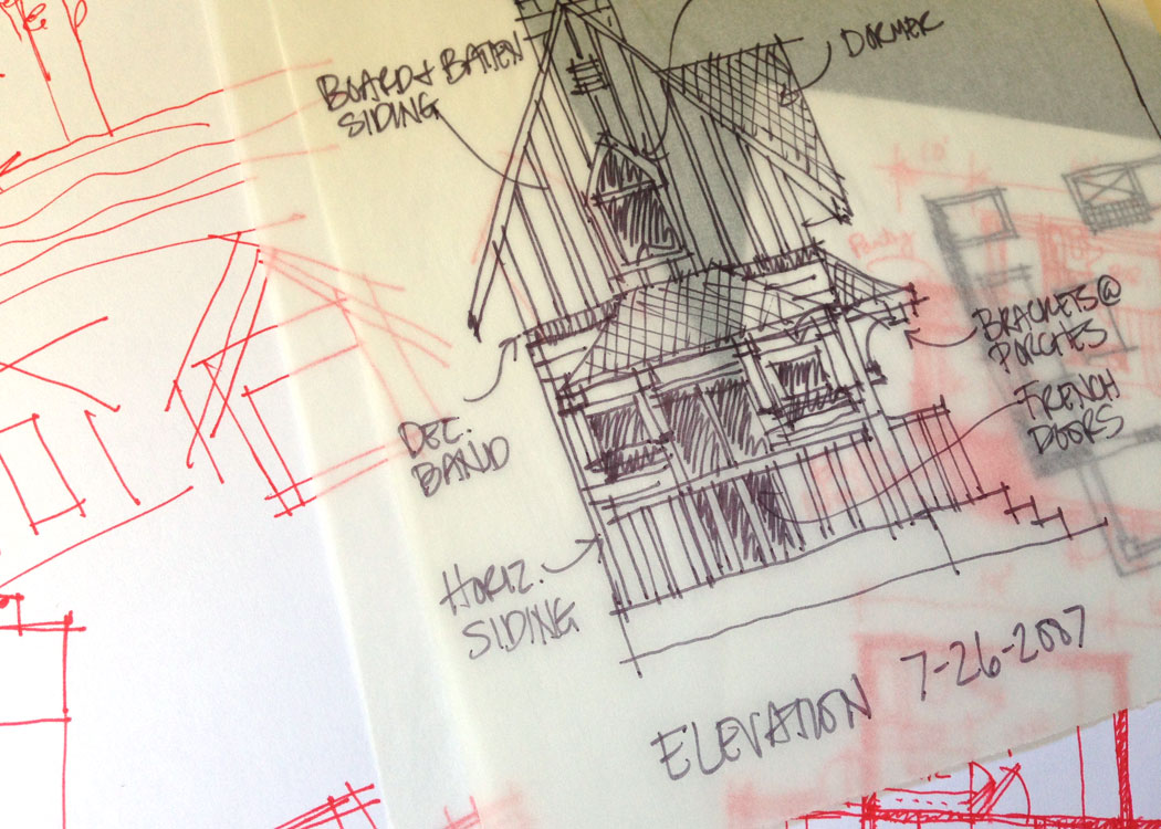
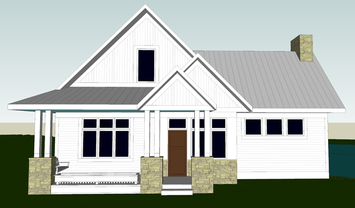
This is how the exterior design looked last summer, before we began fine tuning.


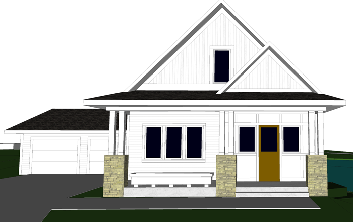
And this is how it looks now. The most notable changes include the elimination of the living room ‘wing’, the reduction to one gable over the entry door, the change in orientation of the garage, the switch from a metal roof material to asphalt, and the elimination of the transom windows. The refined exterior is more simple and balanced, I think. I especially like that the entry door is centered on the gable and framed by the columns. Also, please note that the large planter box is still there. 😉


I will be taking some time this weekend or early next week to update the slideshow images on the website itself, so that it can reflect these changes.

Hopefully this post, and the overall blog – which will eventually capture our cottage from design, through building, and into interior decorating – will be a useful reference for people who are considering a new build of their own. It isn’t necessary to have it all perfect on paper starting out. The design will evolve and allow you to love it more along the way!


SATURDAY SKETCHBOOK: UPSTAIRS BATHROOM OPTIONS

Since I recently posted about the most important aspects of bathroom design, I thought it would be a good time to take another look at the bathrooms I have been designing for our cottage.

I’m pretty happy with the location and layouts of both the main floor and lower level bathrooms, but the upstairs bath has me scratching my head. I asked Craig for help determining the best fixture positions – and, let’s just say he wasn’t super helpful. I really need to bounce these ideas off of someone, so I figured I could trust the loyal readers of this blog to give me some advice and guidance. I know you won’t let me down!

First, let me set the stage:

The bathroom location is not up for debate. The upstairs of the cottage is essentially three rooms, plus a hallway space. The bathroom is situated in between the boy’s and girls’ bedrooms. When someone walks up to the second level, they will enter a small hall space. Looking past the hall is the bathroom.

Because the second story of our cottage will be built underneath the roof trusses, the ceilings of each room will be sloped. In the image above, the dashed line that runs from the girl’s bedroom window to the boy’s bedroom window is the highest point of the vaulted ceiling. You can get an idea of what the pitch looks like by reading the post about the BOY’S BEDROOM. In section form – meaning if you were to slice the house in half, from the top of the roof down to the foundation – the second floor will look like this:


The sloped ceiling will add an element of interest and character that we are really excited about. However, in order to ensure that the bathroom fixtures are functional, I have been taking extra care in finding the most efficient position for each. This will be a 3/4 bathroom – containing a toilet, sink, and stand up shower. It will be a bit tricky to fit all three fixtures in the space, but Craig and I agree that it is important for the kids to have their own fully functional bathroom on the same level as their bedrooms.

The slope of the ceiling for the bathroom will be around 4′-6″ at it’s lowest, on the outer wall (see notes below) to 9′-0″ at the door. The slope is quite dramatic. Residential building code dictates that a minimum of 6′-8″ head clearance be available at the front face/center of each fixture.

I have come up with three different layouts, each with their own merits and challenges. They are all in plan form. I understand that plans can be difficult to read for some people – and I apologize that I don’t have them in 3D form yet. I am kind of hoping to go forward with the three dimensional designing once a front-runner of these options has been chosen. * note: the shaded ‘x’ on each of the plans represents a mechanical chase that also needs to remain*


OPTION 1

This bathroom option includes 40 square feet of space. It is the most compact and likely also the most cost efficient of the three options. It features a pocket door to save floor space in the room, as well as a smaller fiberglass shower unit. The vanity is 4′-8″ long and the back of the toilet’s tank is situated along the shortest wall. The bonus of this option is that the sleeping nook in the boy’s bedroom would gain a small cubby/shelf space. I also appreciate that the hallway can be left a tad larger. The main thing I do not care for in this layout is that the toilet is quite visible from the hallway if you are walking up the stairs and the door is open. Also, the kids might appreciate a larger shower than this option allows.


OPTION 2

The next option is slightly larger, at 42 square feet, and offers a spacious shower. Because of the way that the ceiling slopes, it would need to be a custom tiled unit – which, no doubt, would be more expensive. I like the idea of the vanity being the first thing you see when you walk into the room, but am not in love with the fact that the wall behind it is only 5′-0″ high. I imagine the mirror for the vanity in this option would need to be placed on the wall that is shared with the shower. Maybe a pull out variety similar to THIS. The vanity itself is 3′-0″ long.

My favorite aspect of this layout is the privacy that the toilet has. It is sort of tucked behind the door when it is open, and completely hidden from view from the hallway.


OPTION 3

The final option is the largest, at 44 square feet. The vanity is 4′-6″ long and the shower is the same size as option 2’s shower. Again, it would be a custom tiled unit. I think that the fixtures are most easily accessible in this version and there seems to be more room to move about. The thought of the toilet being front and center when you enter the room is the thing that concerns me the most about this design.


I have started a couple of boards on Pinterest to further narrow the finishes and design elements I would like to incorporate. You can take a peek HERE and HERE.

Also – in case you are having a hard time visualizing what a bathroom with a slope ceiling might look like, PINTEREST has you covered. Lots of unique ideas there, always.


Now, I have an important favor to ask. Pretty, pretty please – could you comment on this post or on the social media link? Let me know which of these options you think is best, or which you would eliminate completely. Maybe there is a layout idea that I am completely missing. Let me know!

I will keep a tally of all the comments and let you all know which way I plan to proceed with the fun 3D portion of the design!

Thanks everyone!


SATURDAY SKETCHBOOK: PRELIMINARY DESIGN

If at first you don’t succeed – try and try again.  That’s the mantra anyway.

In architecture we call this stage ‘Preliminary Design’.  We know that it might not be quite right, just yet; But eventually the pieces will all come together.

If any of you reading this blog have mistakenly thought that we came up with the design for our future cottage overnight, let me put your minds at ease.  It’s been a labor of love for years.  YEARS!  Let today’s sketchbook installation serve as proof.  This sketch was done almost 10 years ago to the day!

I have an entire folder full of proof, in fact.  Sketches done on little scraps of paper.  In pencil and in ink.  Sketches of floor plan ideas and exterior details.  Sketch upon sketch upon sketch. And although I am not a fan of clutter, I don’t think I will ever have the heart to throw them.  They are a sacred collection.

Though they informed the design choices that eventually led us to that perfect layout we were looking for, each sketch has merit of it’s own.  And someday I would love to revisit each idea and come up with a set of simple plan books based on them.

Someday

SATURDAY SKETCHBOOK: THE PLANS

I would like to formally introduce you to a new weekly blog feature that I am calling ‘Saturday Sketchbook.  You can look forward to weekly sketches of what is currently on my mind.  It will vary from a new art piece, a quote that has grabbed my attention, and possibly most of all – house design snippets.

Today my sketchbook is showcasing the floor plans of the cottage.  These plans are literally the investment of years of designing.  In many ways, I believe laying out the plans is one of my most favorite aspects of designing.  I see it as a puzzle of sorts – the pieces eventually are combined in the right way and everything just fits.

If anyone is wondering ‘How can she continue this blog for another 2 years if she already is finished designing the house?’ Let me tell you, this is far from over!  Though the plans are mostly set and the exterior has a basic framework, there are so many more details that need to be worked out!  Built-in/cabinet design, wall colors choices, appliance selection, well…you get the idea!  It is going to be so much fun to see these plain white plans and exterior images come to life!

I will explain more about our plan choices in future posts.  Some of you may be thinking ‘She forgot to add a master bath!’ or ‘What?!  a pool in the basement?’  – I’ll explain, I promise.

And remember, as details are added, I will be updating the galleries on the Cottage Design page – be sure to be checking there often!