AROUND HERE: JUNE 2018

Around here we have been…

GETTING USED TO SUMMER. The routine of each day has shifted. The kids are sleeping in longer and some days still in their pajamas until almost lunch time.  They are enjoying the extra time they have to explore their own interests, including the building of a wooden roller coaster in our yard. We are hopeful that this obsession will end soon and that no bones will be broken in the process.

Summer camps are also in full swing. Our school offers quite a few activities, as well as a free lunch program for kids 18 and younger. We are there almost every day. The girls participated in dance camp and had a blast with their friends, and {D} attended a camp that focused on electricity.

All the kids are making new friendships at the playground as well!


SMILING at the memories of the fun Anniversary road trip we took at the beginning of the month. We celebrated our ‘Sweet 16’ Anniversary with a surprise (and kid free!) trip that Craig had planned all on his own. We drove through Iowa, a bit of Missouri, and finally ended up in Marion, KS- a super small town that now holds a piece of our heart.

I wrote an entire post about our experience, which you can read HERE. The grand surprise was an outdoor concert featuring the amazing Christian band, Unspoken. Craig even arranged for the two of us to meet the group! This is definitely a trip that we will cherish!


GIVING Craig the credit he deserves for being an amazing daddy! Father’s day was celebrated at our home, and just as we do every year for Mother’s Day – we made sure to line everyone up and take a few photos. We love looking back on these memories and seeing how much the kids have grown. It won’t be long before Craig will no longer be able to manage this particular pose:

This year, we invited Craig’s parents over for a Father’s Day brunch after church, which meant that he was also included in the photo blitz. As we get older, it is easy to forget to take pictures of the grandparents with their adult children. That makes the times we do remember to do so even more special.

We hope we are raising our boys to be great fathers too.


PARTICIPATING in a fun football camp. The Minnesota Vikings, our favorite NFL team, collaborated with Hyundai to offer a youth football camp at their brand new practice facility in the Twin Cities. As soon as the registration became available, Angela jumped on the computer and signed all three boys up! There is a limit of 300 participants, and the spots filled up fast!

Craig and the boys spent the weekend at the house of one of Craig’s best friends from college. His family lives close to the practice facility, which was really nice. Their two boys were also able to participate in the camp. All of the kids were able to have their picture taken with Kyle Rudolf, and practiced drills led by some of the best coaching staff from the area. We are thrilled that they were given this FREE opportunity. They haven’t stopped talking about it!


This is just a glimpse at what our family has been up to. If you’d like a closer look, be sure to check out our weekly ‘mini vlogs’ on our YouTube channel ARROW HILL FAMILY. Be well everyone!

SCANDINAVIAN STYLED EXTERIOR: MAKEOVER TAKEOVER

The Makeover Takeover series focuses on helping my readers – whose own homes provide challenges that they are having a bit of trouble solving. Whether it is a room that they want guidance on styling, a floor plan that needs re-configuring, or they are stumbling with choosing an exterior color palette, I am happy to help. I offer solutions through virtual design and source links.

Today’s Takeover is the first in the series to feature an exterior remodel example. I was approached by a couple who had a unique situation. They purchased their country home a few years ago. It is nestled in an absolutely stunning setting, surrounded by nature and wildlife -giving them plenty of room to roam – something that is very appealing to them as a large, young family.

The house though, has a very interesting story. Originally built as a church, it was moved to it’s country location and set atop a new full basement by previous owners. The church, turned home, offers plenty of living space for this large family, but creates a bit of a challenge from an exterior design perspective.


THE EXTERIOR TODAY


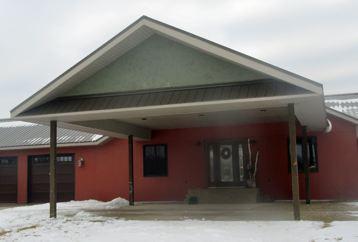
As you can see, a large drive under canopy was part of what was inherited from the house’s church days. Though it offers plenty of shade, the primary function is questionable. Because the house now has an attached garage, the homeowners do not need the extra space to park their vehicles.

Removing the canopy would prove to be more than the family wishes to take on – as it is firmly tied into the structure of the house. And the columns, which provide additional support, are embedded in concrete.


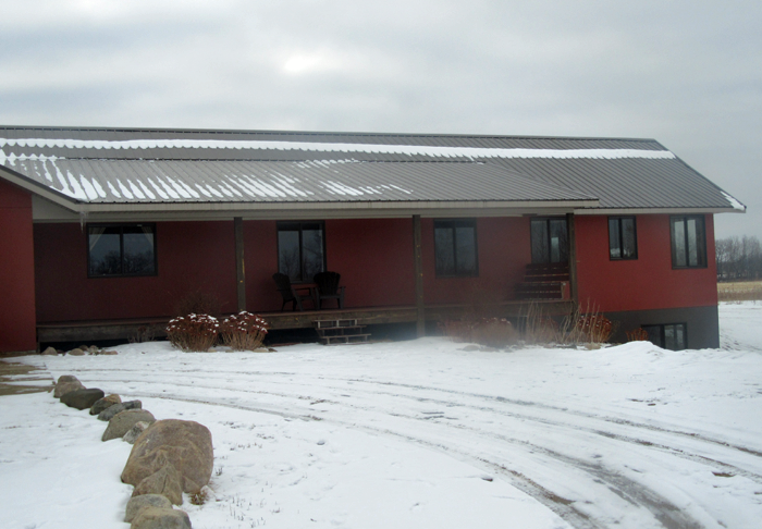
To the left of the canopy is the attached garage, and to the right is another wing of the house that features a covered porch. The family enjoys this space and how it functions. It simply needs a bit of added detail, and probably a new set of steps.


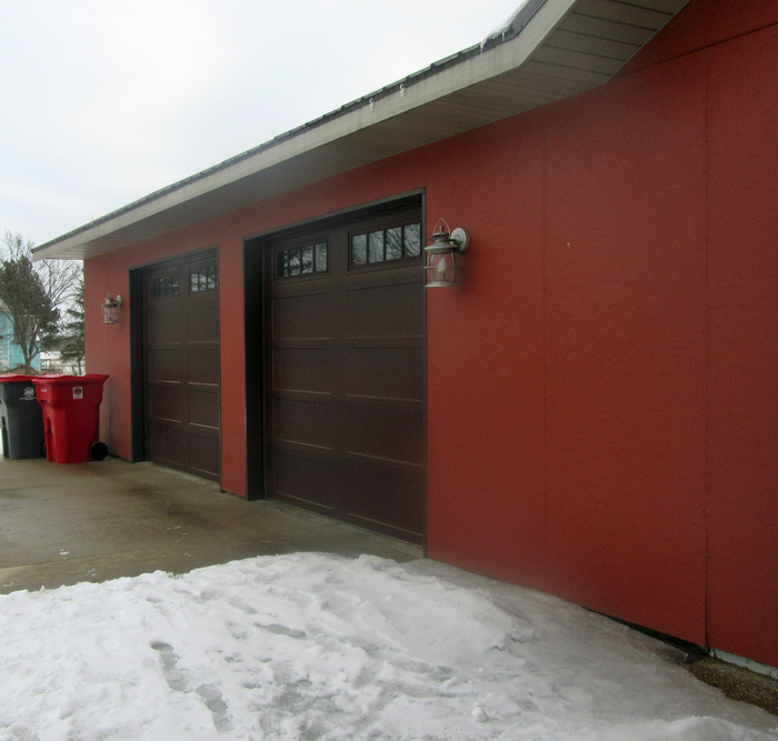
The exterior is primarily covered in faux stucco panels. Though the material is quite durable, the application is not as pleasing to the eye as it could be – with visible seams showing between each panel.


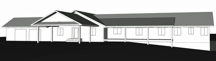
I created a non-detailed, 3D representation of the existing house. In total, the front facade is over 130 feet long. This also creates a bit of a challenge, because your eye tries to take the whole thing in at once. The canopy is a natural place for eyes to focus, but as it is at the moment – it offers little visual interest that would make you want to pause and admire.


PROPOSED CHANGES

Primarily, the homeowners asked that the visual scale of the canopy be brought to a more comfortable level, and that details be added to the exterior to give it more personality and presence.

Being of Swedish lineage, the family has a special fondness for historic Scandinavian residential design – especially it’s clean, simple lines, and the fresh contrast that often exists between the main exterior paint color and trim.

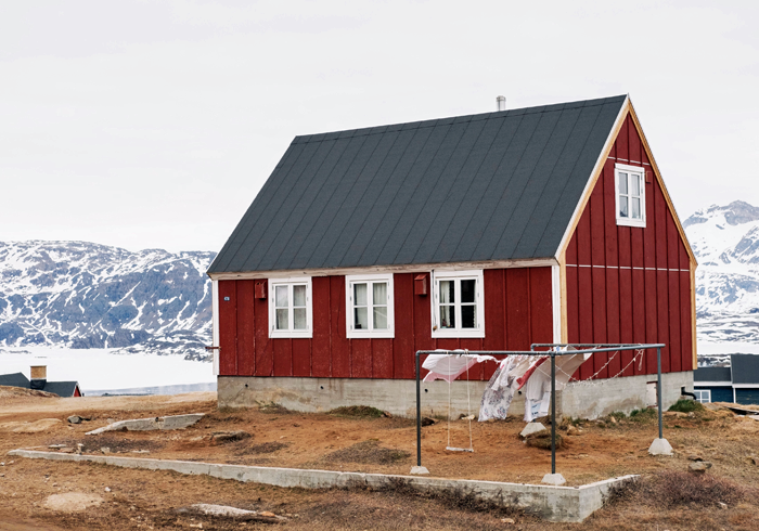
example of a simple, historic Scandinavian home


In addition, they plan to take on this exterior refresh using their own sweat equity. For that reason, they asked that all design changes presented would be simple enough for them to tackle, and not include anything that would require special structural attention.

They plan to first focus on the front facade, and eventually bring the same detailing to the other sides of the home.


FINISH INSPIRATION

My inspiration for the exterior remodel is centered around the look of classic Scandinavian residential architecture – with classic vertical board and batten detailing, and white trim to accent the red overall color of the home. At the same time, I am proposing the use of low maintenance materials and plantings, which will help the house to look fresh for years to come.


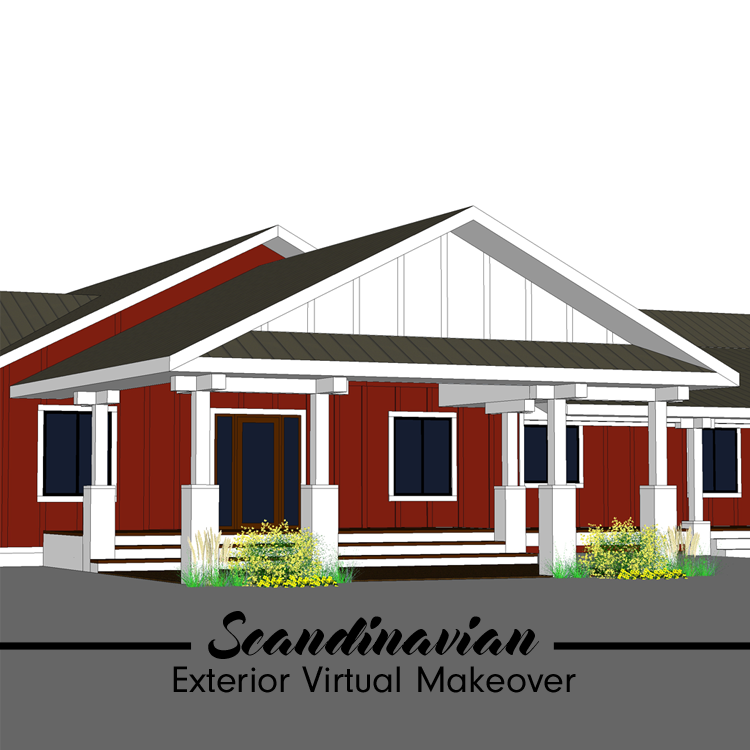
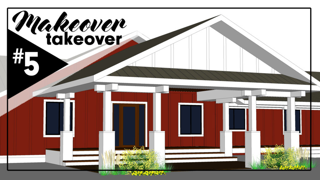
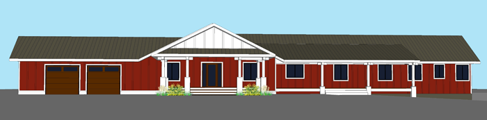
AND NOW FOR THE BIG REVEAL!

I would say that is quite a transformation! In reality, the changes that will need to be executed are not extensive. Only a few key design elements were incorporated to achieve this stunning look.


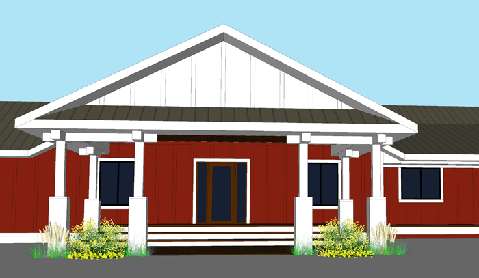
The first area of detailing that I tackled was the canopy. The visual weight of the large overhead piece, being supported by four seemingly small columns, made the entire house look unbalanced. By giving each column a wider base, and adding 8×8 timber post accents at the top, the scale of the columns appears much more sturdy.


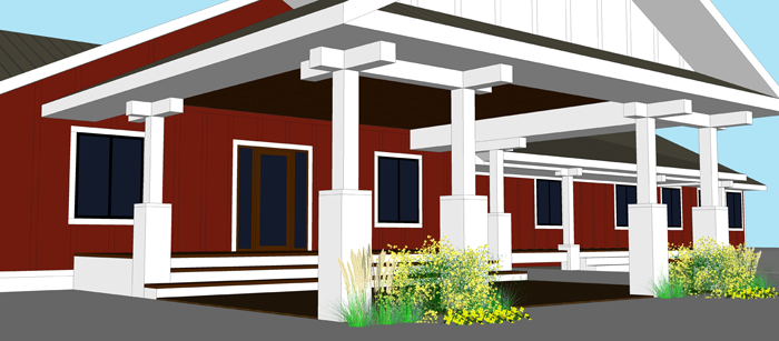
Though they will not be supporting any weight, the addition of two columns at the front face of the canopy will further add to the feeling of balance and stability. Because they line up to frame the windows on the house’s wall beyond, they will also contribute to the visual symmetry of the canopy element.


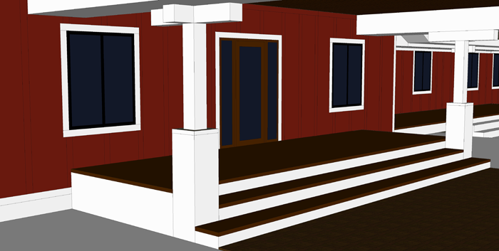
The smaller entry porch feature that currently exists is dwarfed by the size of the overhead canopy. I propose a raised deck area that extends the entire width of the canopy and projects eight feet, from the face of the house to the first set of columns. Integrating the deck with the column structure will give the sense that these elements were planned for a purpose – neither being an after-thought. The steps of this small porch extend the entire width, and lead to a ground level patio.


In order to hide the seams of the faux stucco panels, I am proposing the use of 1×2 batten pieces. These will cover the seams, and be spaced approximately 2′-0″ on center. Painted the same color as the house body, they will serve to add texture.

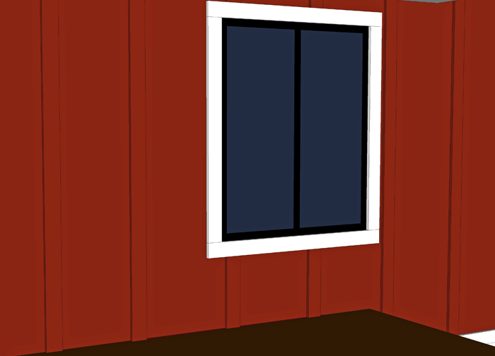
With this design, all of the windows will receive 1×4 trim. When painted white, this trim will contrast nicely with the bold house color. Framing the windows with this simple detail instantly adds visual interest to an otherwise flat facade.


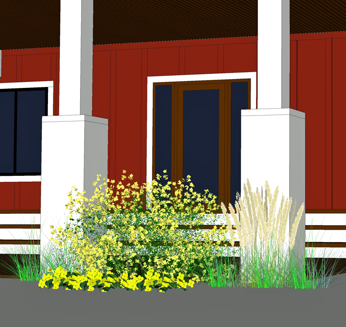
Around the perimeter of the patio, I am proposing natural grasses and low maintenance flowering bushes that can aide in softening the entire structure, as well as defining the outdoor living space.


I am very happy with how the design came together, and can’t wait to see pictures of the finished project! The family hopes to get started very soon!


If you would like a digital home design consultation for your home, please email me using the contact information provided in the main menu above. Though this service is no longer offered free of charge, my prices are very reasonable and I am able to accommodate your design needs – whether it is a one hour consultation or an entire new house design!


This post contains affiliate links to products for your convenience. If you purchase via my links, I may receive a small commission at no additional cost to you. Thanks for supporting Arrow Hill Cottage!


THE MAIN ELEMENTS OF THE TUDOR HOME STYLE

Welcome to another installment in the ELEMENTS OF HOME series. Each month, I showcase a different residential style here on the blog. It is my hope that this information will not only teach you a little something about the various styles; but also equip you if are designing or searching for a new house – by allowing you to determine which style(s) suit your lifestyle and preferences the most.

Today I will be over-viewing the Tudor home – including the history of the style and what makes it unique.


HISTORY OF THE TUDOR STYLE

The style was born in American after the height of the Queen Anne Victorian home reign. The fancy, elaborate Queen Anne’s, with all of their mass produced detailing, was falling out of favor – And, in turn, homeowners were beginning to search for handmade, craftsman touches. An interest in Medieval and early Renaissance architecture, common in early 1600’s England, brought the eclectic Tudor style to America in the early 1890s.

Many of the first homes built in this style were commissioned by European trained architects – for wealthy American families. As the popularity of Tudors grew, they became known as ‘Stockbroker Tudors’  – a nod to the many homeowners who had earned their wealth in the stock market boom of the 20’s. Eventually, the Tudor style became popular with middle class American families as well, and in the 1920’s and 30’s it was one of the most frequently built home types.


During World War II, with a resurgence of patriotism, a majority of the country’s homeowners preferred to build using the more ‘American’ architecture of the Colonial Style. That notion, partnered with the fact that Tudor style homes tended to be expensive to build and maintain, saw the style falling out of favor.  The height of it’s popularity ended in 1940.


MAIN ELEMENTS OF THE TUDOR STYLE

LOCATION

Though examples of the classic Tudor style can be found across the country, there are quite a few prime examples that exist in the Eastern states, especially in the Washington D.C. area.

Most commonly, this home style can be found in residential city neighborhoods and not in country settings, save a handful of large country estate mansions.


SIZE

The size varies widely for this home style. The first examples were built as very large homes and even mansions; But through time, as the style became more popular, modest Tudors began dotting neighborhoods. These smaller Tudor homes now make up the great majority of examples that exist in America.


EXTERIOR TRADEMARKS


  • STEEPLY PITCHED ROOF: Usually in a gable configuration, the roofs generally display little to no overhang. Though rare, some roofs are covered in a false thatching, in an attempt to mimic the picturesque thatched roofs of rural England.

an example of a false thatched roof


  • DECORATIVE HALF-TIMBERING: This non-structural technique is employed on approximately half of all Tudor style homes. This again is a nod to medieval infilled timber framing. The infill material is most commonly stucco, though brick and stone can also be found.


  • TALL, NARROW WINDOWS: Traditionally constructed of either wood or metal, in the casement style. They are frequently seen in groupings of three or more, the most prominent grouping centered below the main gable. Leaded glass paneled windows, set in a diamond pattern, are also common.


  • MASSIVE CHIMNEYS: One of the most popular detail of the Tudor style is a large, elaborate chimney. They are commonly placed in prominent locations on either the front or side of the house.

image source


INTERIOR SPACES

The interiors of Tudor homes are rich with detail and interest. The living rooms almost always feature a large focal fireplace. Heavy wood timber beams, similar to those used on the exterior detailing, commonly accent interior spaces. Arched openings between rooms is also a popular detail.

image source


The website traditionalhome.com has a wonderful slideshow featuring the Tudor style and how a home can be detailed- on both the interior and exterior – to reflect the historic nature of the home, while at the same time remaining relevant in the 21st century.


COLOR SCHEME

The exterior of classic Tudor homes are nearly all composed with a combination of four basic materials: stucco, brick, stone and wood half-timbering. Because of the use of these natural materials, the homes have a very ‘earthy’ exterior appearance. Most feature a darker base of stone or brick, and a lighter upper half with a cream or white stucco accented with dark wood beams.


NOTABLE TUDOR HOUSES


Ishpiming Mansion | Lindley Johnson & Leon Dessez | completed 1894


Agecroft Hall | Henry G. Morse | built in England in the late 1500’s and transported to America


INSPIRING TUDOR STYLE HOMES FROM AROUND THE WEB

These classic homes showcase the Tudor style well. Take a closer look!


The Happy Tudor


Tone on Tone


I hope you have enjoyed learning a bit more about the Tudor style. Curious which residential style will be featured next month? Stay tuned!

And be sure to check out the previously showcased styles here.


50 HOME DECOR IDEAS FOR THE 4TH OF JULY

With the 4th of July just two weeks away, I thought it would be fun to collect some home decor ideas from around the web. There are so many fabulous ideas that one thing led to another, and pretty soon I had FIFTY lined up. Let’s just pretend that was intentional – one for each state in the U.S of A!

Enjoy the beauty of the red, white and blue – and be sure to check out each of the linked blogs/websites under each photo to learn how to make these items or buy them for yourself!

THE REDS

1 | 2 | 3| 4 | 5| 6


THE WHITES

1 | 2 | 3| 4 | 5| 6


THE BLUES

1 | 2 | 3| 4 | 5| 6


THE MIX

1 | 2 | 3| 4 | 5| 6


THE STARS

1 | 2 | 3| 4 | 5| 6


THE STRIPES

1 | 2 | 3| 4 | 5| 6


THE FLAGS

1 | 2 | 3| 4 | 5| 6 | 7 | 8


THE (FREE) ART PRINTS

1 | 2 | 3| 4 | 5| 6


The majority above linked sites are either home decor bloggers or small Etsy shops. Find out more about each, by clicking the links below:


WEBSITE / BLOG CREDITS

The Reds:

1. Jenny Cookies   2. Catch My Party     3. JnSMDesigns (Etsy)     4. Eighteen25     5. Common Ground     6. The Country Chic Cottage


The Whites:

1. The Golden Sycamore   2. Fresh Gypsy     3. Family Chic     4. CakeryPapery     5. Design A Wreath (Etsy)     6. Elegant Wreaths (Etsy)


The Blues:

1. A Pumpkin & A Princess    2. Better Homes & Gardens     3. Crafts Unleashed     4. Bliss Bloom Blog    5. Gluesticks     6. A Fish Who Likes Flowers


The Mix:

1. Beyond the Aisle    2. Design Improvised    3. Girl in the Garage    4. The Magic Brush    5. Wholesale Party Supplies     6. eHow


The Stars:

1. One Thousand Oaks   2. The Shabby Creek Cottage     3. Balloon UP (Etsy)    4. The Concrete Cottage    5. TransparentES Decor (Etsy)    6. Simple Country Life


The Stripes:

1. Sweet Haute    2. Uncommon Designs     3. The Happy Scraps     4. Cayson Decor    5. Confessions of a Plate Addict     6. A Night Owl


The Flags:

1. Hoosier Homeade    2. Remodelacasa   3. LizMarieBlog    4. Craftiments     5. Ella Claire Inspired    6. Thrifty Decor Chic  7. Glitter Glass & Sass (Etsy) 8. Beyond the Picket Fence


Free Art Prints:

1. Sweet Rose Studio   2. Moritz Fine Designs    3. Lolly Jane     4. LandeeLu    5. Hey Let’s Make Stuff     6. Dawn Nicole Designs


SATURDAY SKETCHBOOK: BATHROOM LAYOUT UPDATE

While it is still fresh in everyone’s minds, I wanted to take some time and say ‘thank you’ to you awesome people for all of the help you gave me last weekend.

When I wasn’t sure which layout was best for our future upstairs bathroom, I went ahead and made a post about it – offering three options, and asking you to choose your favorite. I thought maybe two or three of you might comment or offer suggestions. I was completely blown away by the amount of interaction that post received both here on the blog and on social media – especially through the AHC Facebook page!

I will need to go back and look at the stats to be positive, but i’m pretty sure that it was my most engaged post of all time. Kind of crazy, considering the subject matter! If you would like to review the options, you can read the post again RIGHT HERE.


The post went live right away in the morning, around 7am; And as the day progressed, I could see that there was a strong trend emerging. Barely anyone was choosing Option #1, with the smaller shower stall. Most people agreed that when given the chance to have a larger tiled shower, they would choose it over a fiberglass or plastic unit.

people were not loving the idea of a small shower stall! 

That little tidbit was interesting to us, as Craig and I have never lived in a house with a custom/tiled stall. We have always either had the smaller stall units or a bath/shower combo unit. I guess we don’t know what we’re missing!


That left option #2 and #3.

And, between the two, another common theme emerged. Many people agreed that seeing the toilet first thing as you walk up the steps would not be attractive. Seeing the vanity first, as Option #2 showcased, was the primary reason given by people who made that choice.

However, I have a feeling that not everyone who chose the second option fully realized that the ceiling behind the vanity was sloping, hindering the ability to install a full height mirror. This was Craig’s biggest worry, I believe. He felt that a vanity with a small mirror (or no mirror) in front of it would, essentially, be useless.

toilet is hidden, but the vanity is small and there is little to no space for a mirror


The final trend in comments that we saw was regarding the counter space itself. Many of you pointed out that the larger vanity in Option #3 far outweighed the negative aspect of seeing the toilet first thing when walking into the bathroom. As one person commented, “Everyone knows it’s in there!” I’ll admit, there is a lot of truth in that statement!

people didn’t like the toilet directly in front of the door (I didn’t either) – but some thought that the additional counter space made option #3 their top choice regardless. 


You know how sometimes when you stare at something for a really long time and it starts to get fuzzy and not make sense anymore? That is what I think was happening to me. But you guys… you helped me bust through! By the end of the day, the topic had received so much discussion, that new ideas started popping into my head.

And from all those comments about how you and your families use your bathrooms, questions about swinging vs pocket doors, and thoughts about what is most visually pleasing – a brand new OPTION #4 was born!


By ‘stealing’ a mere 8 inches from the girl’s bedroom, I was able to figure out a layout complete with BOTH the large tiled shower and the extra long counter space, a pocket door, and a toilet hidden from view. I figure there is even room for a small linen cabinet or hamper in the corner.

I brought it into 3D – just to verify that all of the fixtures will work out. And I do believe we have a winner!

Rainfall shower head? check! Extra large vanity? check! Pleasant view into the room? check!


I like the idea of a round mirror and a rectangular sink. Still debating about adding a second. As you can see, the headroom will be a bit more tight on that side of the counter. The back wall behind the toilet is 4′-9″. 


At your suggestion, I am also planning to allow for a glass shower door. 


This is the view a person walking up the stairs will see. I am loving that the door is essentially centered on the back wall. I am planning a pendant light fixture for the hall, to hang in the center. I think it looks pretty balanced! I envision colorful art pieces hanging on either side of the door – maybe a ‘kid gallery’? 


Just for fun… here is an aerial view of the second floor as it is right now. I’m just getting started on the girl’s bedroom design – so it isn’t detailed. Also trying to determine what height knee walls, if any, will need to be added. 


I will be working some more on the 3D imagery – adding color and texture – and will give the big reveal of the room right here on the blog when it’s finished.

Again, I want to thank you for hanging out and helping me with this! I have other tricky spaces that have been leading me to dead ends. Maybe if I post about them, you can help me another time or two (or twenty)? Have a wonderful weekend, friends!


WHAT I’VE LEARNED FROM MY FIRST YEAR OF BLOGGING

The official ONE year anniversary of this blog has arrived! On May 29, 2017 I ‘penned’ my first blog entry – taking a step onto a path that I was unfamiliar with. Frankly, I wasn’t really sure where it would lead me.

My guiding force was to document life – the mundane and extra special moments alike. In addition, I wanted to chronicle the process of designing and building of our family’s ‘forever home’.

A couple of months into the journey I began to understand why the average lifespan of a blog is only 100 days. It’s work. A LOT of work. I will admit that during these past 365 days the idea of throwing in the towel crossed my mind more than once. When those thoughts crept in, I had to dig deep to continue. I’m glad that I did. Sitting on this side of a year, having not given up, makes me feel proud. I’ve learned a lot about blogging, and about myself, in the process.


I ENJOY WRITING AND DOCUMENTING

I have never been one to write in a journal, but am finding that I actually do enjoy keeping record of what our family has been up to. I take notes on the adventures our family has, and compile them into a monthly AROUND HERE posts. I also shoot plenty of photos and video to use in our WEEKLY TIMELINE VLOGS. These posts and vlogs have been so much fun for my family to look back on. On more than one occasion we have said out loud “When was it that (this or that) happened?” – and then realized that we could look at the documentation that I was careful to preserve, and find out. What a blessing!


RESEARCH IS TEACHING ME NEW THINGS

As it turns out, I enjoy researching topics for upcoming blog posts. I try to fact check all of the information that I put out, so that I’m not misguiding anyone. This fact checking often leads to more interesting information that I many times see as being valuable enough to include in the post as well. Even though I have a five year degree in my field of study (architecture), and have been practicing in that same field for many years, I am finding that there is always more to learn. Through blogging, I believe that my expertise on a subject that I already felt quite competent in, is improving.


THERE ARE PEOPLE FOLLOWING ALONG

At first, I was a bit dismayed that my family and close friends were the only people who were finding the blog. Slowly though, maybe around the six month mark, the site traffic began to pick up. I check analytics at the end of each month, and have found that the website steadily receives about 50% of it’s traffic from people who have never visited the site before. That means that somehow these people found the website – either through word of mouth, a google search, Pinterest, or social media – and thought it may have something to offer them. To me, that’s exciting news!

And for this reason, I have been trying to be more diligent about making sure the content of the website is consistent. If someone happens to stumble upon the blog and finds an article interesting and helpful, I want to make sure that there is even more for them to enjoy.

Our house designing process seems to be especially useful to readers, which I love. I enjoy following other blogs that document the house designing and building process, and am thankful that I can help to encourage others in that regard.


I CAN MAKE MONEY

Blogging is most definitely NOT a get rich quick scheme; But there is money to be made by doing it. I know that there are a lot of other venues I can consider in the future, but for now my primary income is from the advertisements that I put into my blog posts, and affiliate marketing posts.

Many bloggers are able to earn additional funds by offering courses or selling products. These are things that I will be thinking about as I move forward into year number two.


A YEAR ISN’T ALL THAT LONG

It is amazing to me how quickly this first year of blogging has gone. The saying ‘the days are long but the years are short’ is just as relevant to blogging as it is to raising children. Though the effort I put forth on a daily basis at times has felt overwhelming, the days have literally flown by. This mindset will help launch me into year number two – by realizing I only need to put one foot in front of the other, and be consistent, to make progress. The days are going to pass no matter what, so I may as well make use of them in some productive way.

If this first year has been one of learning, I am hoping for the second to be of growth and confidence. Soon, I hope to fine tune the website and blog so that it even further reflects the information I want to share with all of you.


As always, I appreciate each and every one of you who has chosen to hang out in this space with me. Let’s see what YEAR TWO will bring!


SATURDAY SKETCHBOOK: UPSTAIRS BATHROOM OPTIONS

Since I recently posted about the most important aspects of bathroom design, I thought it would be a good time to take another look at the bathrooms I have been designing for our cottage.

I’m pretty happy with the location and layouts of both the main floor and lower level bathrooms, but the upstairs bath has me scratching my head. I asked Craig for help determining the best fixture positions – and, let’s just say he wasn’t super helpful. I really need to bounce these ideas off of someone, so I figured I could trust the loyal readers of this blog to give me some advice and guidance. I know you won’t let me down!

First, let me set the stage:

The bathroom location is not up for debate. The upstairs of the cottage is essentially three rooms, plus a hallway space. The bathroom is situated in between the boy’s and girls’ bedrooms. When someone walks up to the second level, they will enter a small hall space. Looking past the hall is the bathroom.

Because the second story of our cottage will be built underneath the roof trusses, the ceilings of each room will be sloped. In the image above, the dashed line that runs from the girl’s bedroom window to the boy’s bedroom window is the highest point of the vaulted ceiling. You can get an idea of what the pitch looks like by reading the post about the BOY’S BEDROOM. In section form – meaning if you were to slice the house in half, from the top of the roof down to the foundation – the second floor will look like this:


The sloped ceiling will add an element of interest and character that we are really excited about. However, in order to ensure that the bathroom fixtures are functional, I have been taking extra care in finding the most efficient position for each. This will be a 3/4 bathroom – containing a toilet, sink, and stand up shower. It will be a bit tricky to fit all three fixtures in the space, but Craig and I agree that it is important for the kids to have their own fully functional bathroom on the same level as their bedrooms.

The slope of the ceiling for the bathroom will be around 4′-6″ at it’s lowest, on the outer wall (see notes below) to 9′-0″ at the door. The slope is quite dramatic. Residential building code dictates that a minimum of 6′-8″ head clearance be available at the front face/center of each fixture.

I have come up with three different layouts, each with their own merits and challenges. They are all in plan form. I understand that plans can be difficult to read for some people – and I apologize that I don’t have them in 3D form yet. I am kind of hoping to go forward with the three dimensional designing once a front-runner of these options has been chosen. * note: the shaded ‘x’ on each of the plans represents a mechanical chase that also needs to remain*


OPTION 1

This bathroom option includes 40 square feet of space. It is the most compact and likely also the most cost efficient of the three options. It features a pocket door to save floor space in the room, as well as a smaller fiberglass shower unit. The vanity is 4′-8″ long and the back of the toilet’s tank is situated along the shortest wall. The bonus of this option is that the sleeping nook in the boy’s bedroom would gain a small cubby/shelf space. I also appreciate that the hallway can be left a tad larger. The main thing I do not care for in this layout is that the toilet is quite visible from the hallway if you are walking up the stairs and the door is open. Also, the kids might appreciate a larger shower than this option allows.


OPTION 2

The next option is slightly larger, at 42 square feet, and offers a spacious shower. Because of the way that the ceiling slopes, it would need to be a custom tiled unit – which, no doubt, would be more expensive. I like the idea of the vanity being the first thing you see when you walk into the room, but am not in love with the fact that the wall behind it is only 5′-0″ high. I imagine the mirror for the vanity in this option would need to be placed on the wall that is shared with the shower. Maybe a pull out variety similar to THIS. The vanity itself is 3′-0″ long.

My favorite aspect of this layout is the privacy that the toilet has. It is sort of tucked behind the door when it is open, and completely hidden from view from the hallway.


OPTION 3

The final option is the largest, at 44 square feet. The vanity is 4′-6″ long and the shower is the same size as option 2’s shower. Again, it would be a custom tiled unit. I think that the fixtures are most easily accessible in this version and there seems to be more room to move about. The thought of the toilet being front and center when you enter the room is the thing that concerns me the most about this design.


I have started a couple of boards on Pinterest to further narrow the finishes and design elements I would like to incorporate. You can take a peek HERE and HERE.

Also – in case you are having a hard time visualizing what a bathroom with a slope ceiling might look like, PINTEREST has you covered. Lots of unique ideas there, always.


Now, I have an important favor to ask. Pretty, pretty please – could you comment on this post or on the social media link? Let me know which of these options you think is best, or which you would eliminate completely. Maybe there is a layout idea that I am completely missing. Let me know!

I will keep a tally of all the comments and let you all know which way I plan to proceed with the fun 3D portion of the design!

Thanks everyone!


A SURPRISE ANNIVERSARY ROAD TRIP

We aren’t the type of people who go ‘all out’ with milestones. Sure, we celebrate birthdays, anniversaries, and other special events – but it is never expected that we will give (or receive) any extravagant gifts or accolades. A simple acknowledgement is just fine, thank you very much.

However, it seems that Craig got a wild hair a few months ago. That wild hair put the wheels in motion on one of the best memories we have experienced during our time as a married couple. A ‘Sweet 16’ Surprise Anniversary Road Trip. He told me only this: “We will be driving for about ten and a half hours.” Not much of a clue, and I didn’t push for more. The element of surprise was part of the excitement!


After making arrangements with both sets of grandparents to care for our five young kiddos, we began our journey in our rusty 2002 Chrysler Town & Country van – on the cloudy drizzly afternoon of May 30th.


The halfway point brought us to Ames, Iowa. Craig had been there before on a work trip and he knew of a restaurant that served great food at a reasonable price. Hickory Park did not disappoint, with its awesome atmosphere and yummy barbecue.

Hickory Park Restaurant Co.


Cy the cardinal – Iowa State University’s Mascot


Finding a place to stay did prove to be a bit more of a challenge. We looked on Expedia and other hotel sites, and it seemed that there were not many rooms available. We even pulled into a unique B&B establishment, set in an old fraternity house – on the campus of Iowa State University. It too, was full.

Eventually, we were able to secure a room at Loya’s Little House Bed and Breakfast. Though we were initially a bit skeptical, as the location of the B&B was a ways outside of the city, we fell in love with the peace and quiet of the setting. The hosts were very friendly and personable, and the breakfast was second to none! We are considering bringing the entire family some day!

The interior of Loya’s B&B is peaceful and clean


and filled with fun art – all by local artists!


The property features a well manicured country setting with over 5 miles of private trails


From Ames, we headed South on the Interstate. I still had no idea where the end of the road would be – but that didn’t stop me from trying to guess. It turns out that I am a terrible guesser though, and I had no clue at all until we were literally pulling up to the town.


And that little town? It was Marion, KS – population 2,300.


Never heard of it? Neither had I! In fact, neither had Craig before he planned the trip. All sorts of questions were rolling through my head as we made our way through the brick paved streets. “What are we going to do here for two days?”, “I don’t see a single restaurant!”, and… probably the most important… “Where in the world are we going to SLEEP? Surely there is no hotel in this little town!”

And then we pulled up to it. The most stunning little hotel I have ever seen – with a beautiful stone facade and wrought iron veranda. The sign at the top read ‘Elgin Hotel: 1886’ and I was intrigued. Stepping inside was like being transported into the past. The elaborate lobby was beautifully decorated with red velvet chaises and crystal chandeliers. The intricate wood staircase in the corner of the room was inviting us to explore.

The hotel owner was friendly and welcomed us right away, giving us a brief tour and showing us to our room. Craig and I were both impressed that such an old building was in such great shape. And even though it was over 90 degrees and very humid outside, the interior of the hotel was a very comfortable temperature.


My hopes about this venture were improving, yet I still didn’t believe we would travel such a long distance to stay in a historic hotel.


And that is when Craig pulled out the ace in his sleeve – revealing that we would be attending a concert featuring my absolute favorite band, UNSPOKEN. Not only that, but we would be allowed to meet the band! My excitement then went through the roof!

this group is so full of energy


amazing acoustic performance!


Chatting with the band members was amazing. Everyone was so personable and welcoming.  And the concert – despite the miserable, muggy weather the concert was incredible! They are one of those groups whose live performances sound just as good, if not better, than the recorded versions! The lead singer even gave us a shout out regarding our anniversary – which prompted a round of applause from the audience. We like to joke that we are now famous in Marion, KS.


Speaking of the town, we were very impressed with it as well! Despite it’s small size, there was plenty going on. It was easy to see that the citizens have pride in the place they call home. Everyone was very welcoming and kind to us. One of my favorite aspects of the town was the amount of incredible old buildings it has – many of which were constructed of stone. The courthouse is a real stunner. Isn’t she gorgeous?

The courthouse is an impressive stone structure constructed in 1906


This clock tower tolls on the hour


I had to laugh at this little stone detail


The library is situated in an old train depot. We went inside and were happy to see that they had photos on display of how the old building was configured and information posted about the history of the depot itself. We thought it was a clever reuse of a building whose original purpose was no longer necessary.

Train depot turned library


unique exposed structure


And of course, as a lover of all things house related, I convinced Craig to walk with me – street after street – to document the residential architecture. There were plenty of quaint bungalows!


The town also had antique stores and an architectural salvage yard. You KNOW that I had to check this place out! I ended up finding some turned table legs that I hope to incorporate into our future farmhouse table.

When it was time to say goodbye to Marion, we were both a little sad honestly. So many fun memories were made there.

We really hope to bring our entire family back again some day.


The drive home found us in Sioux City, IA and a couple other smaller towns along the way – once again checking out some interesting old houses. These are some of my favorites:


What a refreshing trip! It was fun to take a bit of a break from our everyday routines to explore. We now feel ready to tackle summer!

If you’d like to see the interior of the Elgin Hotel, or hear a bit of the UNSPOKEN concert, you can watch THIS VIDEO on our family YouTube channel.