Porch Essentials | Create a welcoming outdoor space

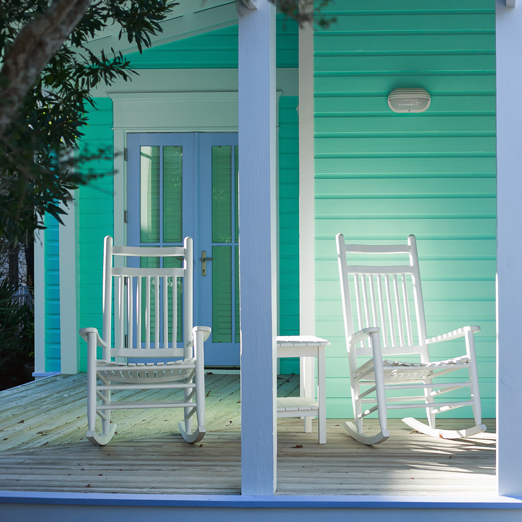
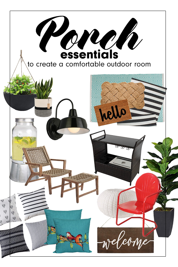
There is something special about a covered front porch. Today I am sharing the front porch essentials that can help you create a welcoming outdoor room.


Adding a welcoming front porch

This post contains affiliate links. As an Amazon associate, I earn from qualifying purchases. See my full disclosure here


Most people who see a home with a front porch will have a fond memory fill their minds. Perhaps the sight of a porch brings back feelings of family and gathering. Maybe it is a bit of nostalgia – longing for simpler times.

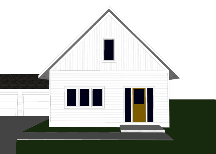
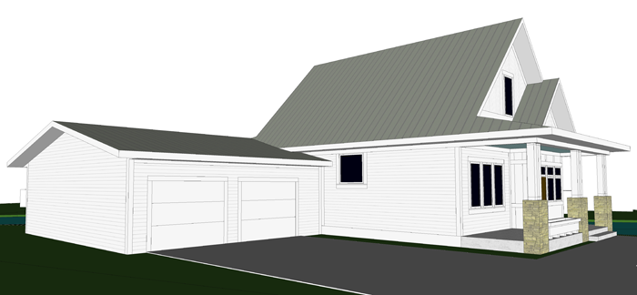
With summer right around the corner, and the anticipation of Arrow Hill Cottage being built, I have found myself really looking forward to spending time on the front porch. Though we won’t be able to enjoy the space until this time next year, I did a bit of research trying to figure out how we can make it as comfortable and relaxing as possible.

Below are the front porch essentials I believe make them special. I also share the products that can enhance each of these elements.


A SENSE OF WELCOME

To their very core purpose, porches provide a sense of welcome. They are the gateways from the hustle and bustle of the roadway to the peacefulness of indoors.

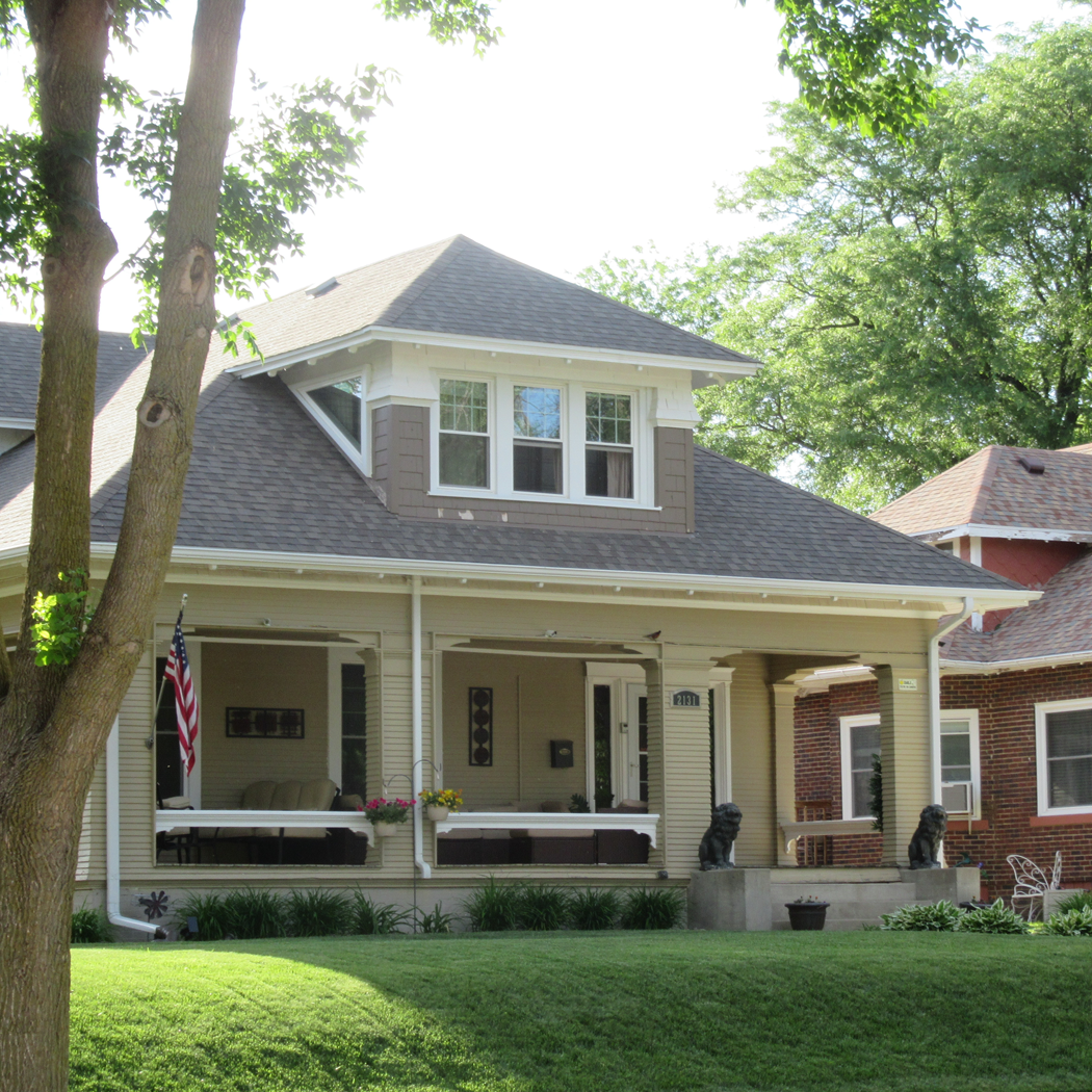
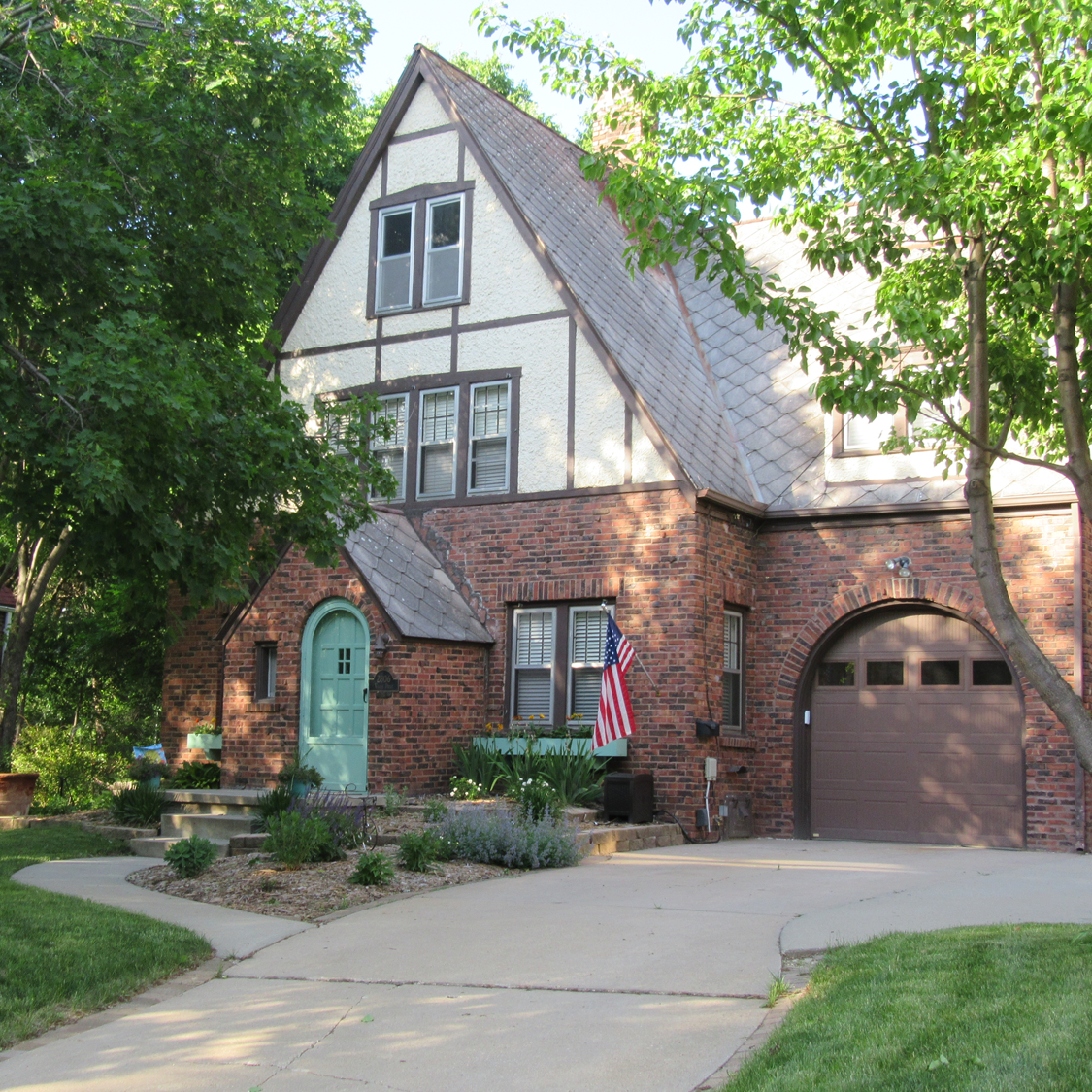
The most connected neighborhoods likely have homes that are outfitted with front porches.  Sadly, it is rare for homes to be built with front porches nowadays. It is much more typical to find a garage positioned closest to the street, with a rather small front door set back.

welcome sign for front porch

We were very careful, during the design of our cottage, to include a large covered front porch. Not only do we believe it improves the look of the house itself (see for yourself in this post), we also feel that it will make our home feel more welcoming to our friends and neighbors. Porches have a way of encouraging face to face conversations with neighbors.

Adding a welcome sign to a front porch is a great sentiment, as is a cherry welcome mat.
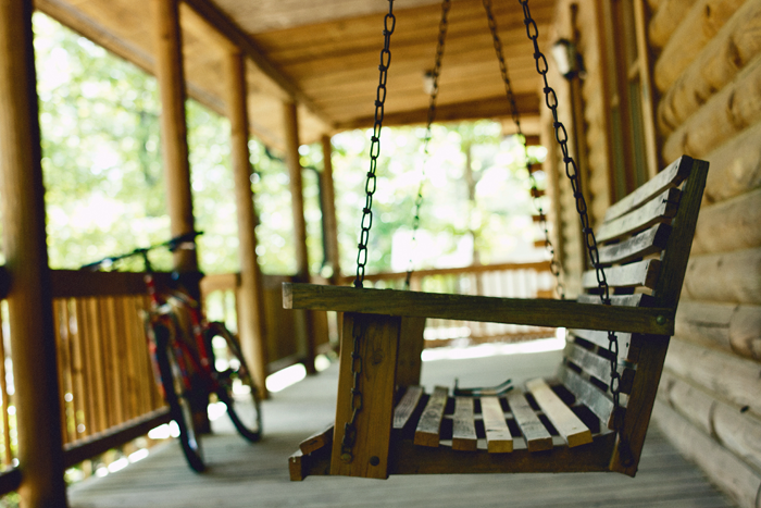
layering outdoor rugs to add comfort and texture to a front porch


A PLACE TO CONVERSE

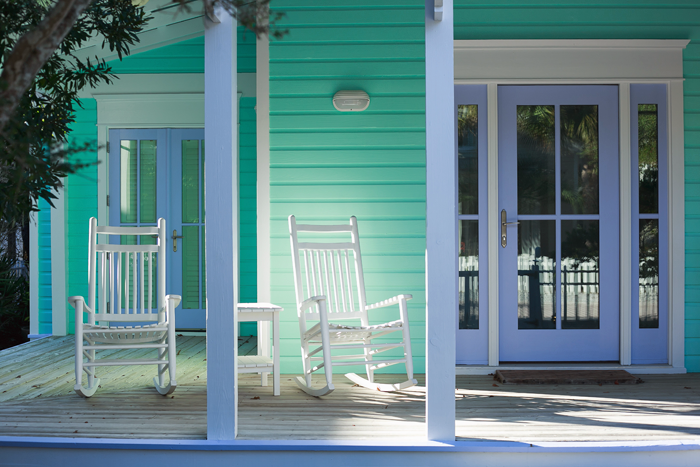
Once a person has stepped onto a front porch, they are going to want to stay a while. Almost guaranteed. Give yourself and your visitors that opportunity by providing plenty of seating.

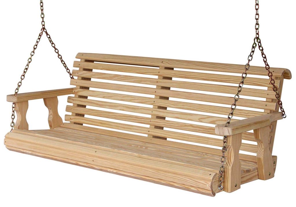
A porch swing is classic, and a staple for most front porches. We will definitely be incorporating one!

A swing is essential for a front porch

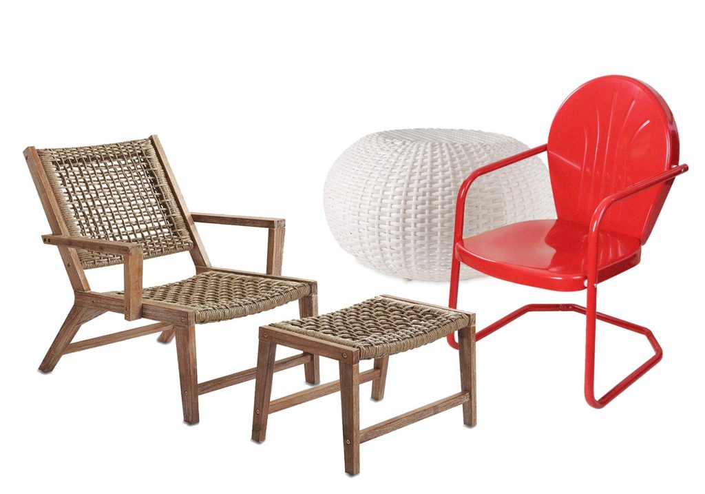
Be sure to offer a variety of seating options. Placing a matching set of chairs opposite the porch swing, for example, can create a wonderful conversation spot. Provide a mix of rocking and stationary seating.

Proper seating in a variety of configurations is important

Large ottomans or plush outdoor pillows are great for little ones. They can easily be moved around, perhaps even serving as a small table for a snack, or to hold a book.


A SPOT TO RELAX

Your front porch should be an extension of your home’s interior. Soften it’s hard lines by adding cozy elements such as layered rugs and pillows. Don’t be afraid to have fun with color and pattern. These elements can also infuse a bit of excitement and playfulness to the porch space.

indoor outdoor pillows


AN ENTERTAINING SPACE

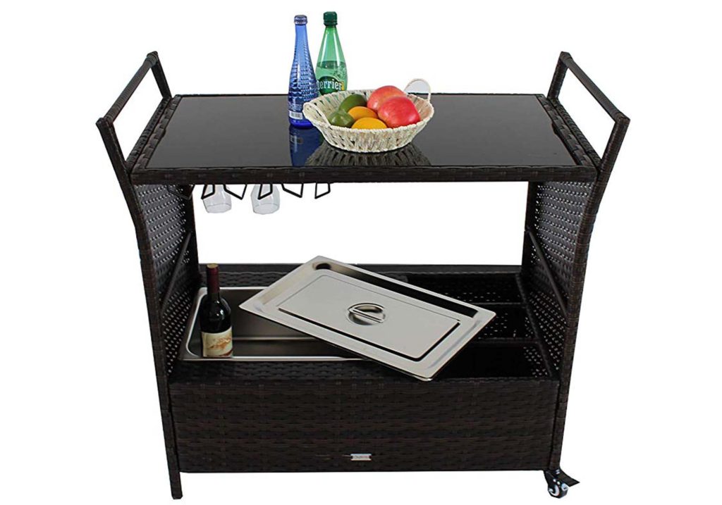
Porches also make great entertaining spaces. The purchase of a small beverage and snack cart can make a statement. Find one with wheels, so that it can easily be moved in and out of the house to be reloaded with snacks and drinks. An antique buffet or dresser can be set up in the milder weather months of the year, offering a more permanent entertainment solution.

entertaining on the front porch

A large drink dispenser allows guests to help themselves. You may even choose to refill the dispenser daily and keep it on the porch during the hot summer months, for family members to access when working and playing outdoors.

With proper seating provided, it is important to also include small tables where drinks can be placed. Nestle a table in between a set of chairs, or offer small serving trays that can be held on laps.


A CONNECTION TO NATURE

Another element that makes a front porch special is the connection it has to nature. Covered porches have a sheltering aspect, while also allowing users to feel the soft Summer breeze and smell the crispness of Fall air.

Try adding potted plants and small trees to the space. Hanging flower baskets are very popular among front porch owners.

potted plants and hanging baskets help connect to nature

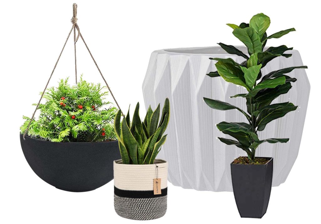
One way we are planning to further connect the porch at Arrow Hill Cottage to nature is by incorporating a large planter. This project was the topic of much debate between myself and my husband. I think that I have won the battle, at least for now, and am very excited to see the planter come to life!


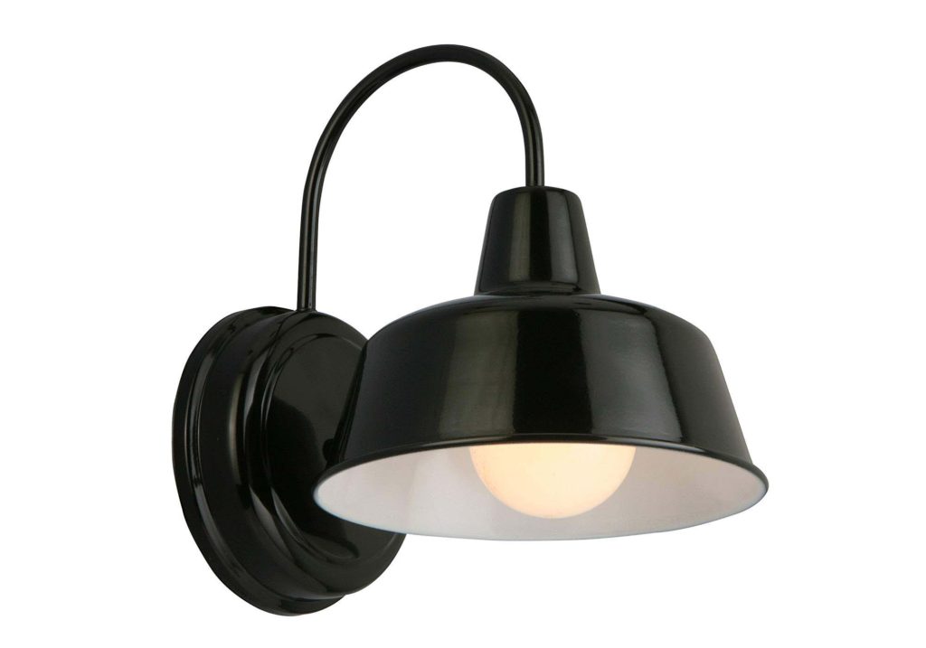
A SHELTER FROM OUTDOOR ELEMENTS

The outdoor experience can be enhanced by adding a bit of climate control to your front porch. This can be as simple as choosing appropriate lighting, to extend the usefulness of the space.

simple lighting

For the stuffy, hot summer afternoons, consider including a ceiling fan on the front porch. They can be found in a wide variety of styles.

porch ceiling fan

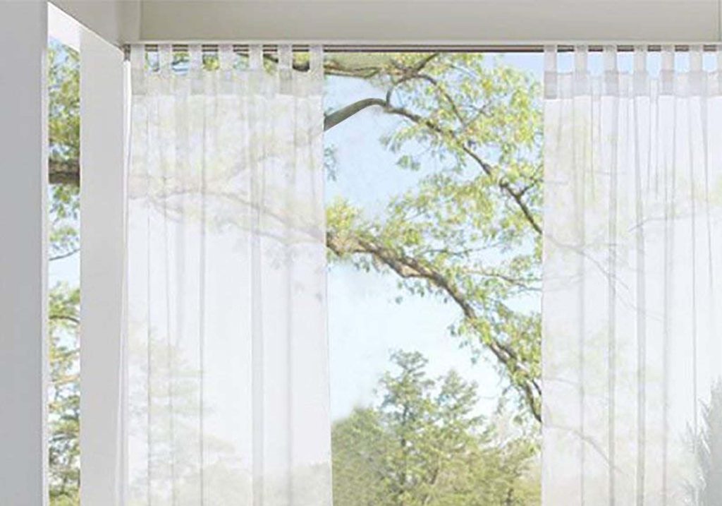
Though the ceiling of a covered porch will add some protection from the sun’s overhead rays, a set of sheer curtains can help filter light further. They may also have the added benefit of deterring bugs and proving privacy when closed fully.

filter daylight and add privacy with sheer curtains


I hope that these porch essentials and product suggestions were useful to you, and give you insight into some ways to make your space really shine! If you have a front porch that you love, I want to hear what you do to make it a go-to space. Please comment below with your tips!


PIN THESE PORCH ESSENTIAL IDEAS

create a welcoming outdoor room

Click the links below for product information of all items in this post

welcome sign | jute door mat | hello mat | aqua mat | porch swing | red chairs | black and white rug | white wicker footrest | woven chair + ottoman | geometric pillows | aqua bird pillows| hanging planters | potted fiddle leaf fig | rope plant basket | white stoneware planter | serving cart | drink dispenser | lighting | ceiling fan | sheer curtains


FRONT PORCH ESSENTIALS VIDEO


THE MAIN ELEMENTS OF THE BUNGALOW HOME STYLE

Welcome to another installment in the ELEMENTS OF HOME series. Each month, I showcase a different residential style here on the blog. It is my hope that this information will not only teach you a little something about the various styles; but also equip you if are designing or searching for a new house – by allowing you to determine which style(s) suit your lifestyle and preferences the most.

Today I will be over-viewing the bungalow home – including the history of the style and what makes it unique.


HISTORY OF THE BUNGALOW STYLE

The very term ‘bungalow’ has roots from the Indian/ Hindi word ‘bangala’ – which describes a one story house with a low, extended roof. During the British occupation in India, troops created bangalas in higher elevation ‘hill stations’. The home’s wide, covered verandas, provided shade in the hot climate as well as a comfortable cross ventilation in the hot stuffy months.

Bangalas were later built in the UK, presumably by the British colonials who had finished their tour of duty in India. Coined as ‘bungalows’, they were adapted once again for America in the early 1900’s, popping up first in the temperate climate of California. From that time until the early 1930’s, the bungalow style’s popularity reached nearly every state in the union.


When Bungalows were introduced in America, they were seen as a progressive ideal – and in many ways an opposite way of life to that of the Victorian era. The straight-forward use of materials, informal plan layout and accessibility to the outdoors that bungalow homes provided were attractive to middle-class families in particular – those who felt secure enough about their social standing that they didn’t need their home to be a status symbol or showcase their worth.

Similar to the American Foursquare home, the Bungalow style were widely available through mail-order catalogs. For those with limited means – the bungalow provided more than just the need for shelter, they provided fulfillment of the American dream.

There are also examples of architecturally designed bungalow homes. The most notable architects of this style were the Greene brothers, who practiced in California in the early 1900’s – focusing their work on the Arts & Crafts movement.


MAIN ELEMENTS OF THE BUNGALOW STYLE

LOCATION

Bungalows first began to make their U.S appearance in Southern California – that is where the most iconic examples still stand today. However, there are bungalow examples scattered throughout North America.

This housing style fills neighborhoods that are near the city center, which is an attractive asset to homeowners looking for close proximity to schools, work, and shopping districts. Generally these neighborhoods are pedestrian friendly. It is not uncommon to see multiple Bungalows situated next to one another long the street – something that creates a strong sense of community for the people who call the neighborhoods home.


SIZE

These homes are often small, with efficient, yet flexible, floor plans. Their economical use of space is especially appealing to first time homeowners and young families.

Though relatively compact, Bungalows make efficient use of every available square foot – with built in cabinets and cupboards for organization.


EXTERIOR TRADEMARKS


  • LOW PROFILE: Because they are meant to be unassuming, bungalows keep a low profile to the street. Generally they are one story in height. If a second floor is included, the living space is typically built into the roof structure. Exterior detailing of bungalows accentuate the horizontal lines, further grounding their facades.


  • PORCH: most Bungalow homes feature large front porches. Not only do porches give the homeowners a direct connection to the outdoors, they also promote neighborhood interaction – both important Bungalow ideals.


  • DOMINATING ROOF WITH DORMERS: Bungalow generally have roofs that slope toward the street – aiding in their one story appearance. Those with second floor living space may have dormers that accentuate the roof line.
  • USE OF REGIONAL MATERIALS: Builders of the original bungalows favored the use of regional materials for their lower cost and reduced maintenance. Those built on the west coast tend to employ stucco as a primary exterior material, where those in the Midwest – such as Chicago and Milwaukee – feature brick. Northeast bungalows were, at least partially, clad in shingles.


INTERIOR SPACES

Interior layouts lack redundant walls and useless space. Hallways are not common. Compared to their Victorian ancestors, the Bungalow features an open first floor plan – with rooms that have overlapping functions.

Continuing the function of space, many Bungalows feature built in cabinetry as room dividers – as opposed to full height walls. These built ins allowed rooms to flow into one another, while at the same time maintaining some separation of space.

image source

COLOR SCHEME

The original bungalow owners would often strive to use warm colors and textures that would make their homes feel welcoming and cozy. Earth tones such as tan, brown and harvest gold were, and still are common both on the exterior detailing and interior finishes and furnishings

traditional bungalow colors 

from the book Bungalow Colors: Exterior, by Robert Schweitzer


NOTABLE BUNGALOW HOUSES


‘Bungalow City’ | Boise, Idaho | Houses built between 1910-1930

This neighborhood was nicknamed ‘Bungalow City’ because of the vast amount of Bungalows that were built there in the early 1900’s. There are many prime examples of the style that are well maintained.


INSPIRING BUNGALOWS FROM AROUND THE WEB

These classic homes showcase the Bungalow style well. Take a closer look!


1916 Bungalow


Itty Bitty Bungalow


I hope you have enjoyed learning a bit more about the Bungalow style. Curious which residential style will be featured next month? Stay tuned!

And be sure to check out the previously showcased styles HERE.


THE IMPACT OF FRONT PORCH DESIGN

A covered front porch is considered a major asset to a home – one that many buyers would be willing to pay more for. The indoor/outdoor and public/private qualities that a front porch provides can add to the overall enjoyment of a home.

front porch design ideas


The detailing of a porch can also greatly impact the look of a home’s exterior. The combination of the porch’s roof-line, rails, and columns are of great importance; And determining the right proportions and styles of each of these elements can be tricky, especially if you are starting from scratch.

If you have an older home that has since lost it’s porch, you may simply need to see some historical photographs of similar homes to get a good grasp of what the proper detailing should look like. You can also take cues from these historic examples if you are designing a new home – but you may have more leeway on what might be deemed appropriate. You may need to play with a few different ideas before you land on the styling you prefer.


VISUAL EXAMPLES OF FRONT PORCH DESIGN

I will use the porch of our home, Arrow Hill Cottage, as an example of how a front porch can greatly impact the look of a home’s exterior.

Obviously, I have been going more for a ‘cottage’ look while designing the exterior – But the truth of the matter is that our home is basically a simple rectangular shape. It’s the porch that helps it come to life.

simple front porch design


Because our porch is only 14″ off of grade, we will not be required to install a railing around it. Instead we will incorporate a large planter box to help define the space. I can’t wait for my husband to build it for me (wink, wink). The columns are doubled up and positioned on stone bases that match the height of the window sill.

I would like to show you some other examples of what the house might look like with different porch detailing. First, lets take a look at this same house WITHOUT it’s porch.

Home design without a front porch


THAT’S A VISUAL SHOCK!

Insert all of the sad emoji’s here. Can you see how much character was lost with the elimination of the porch? The entire facade looks flat and uninviting. The entryway is not defined and the windows seem to have little balance. I think it’s clear that this house needs it’s porch!


The use of thinner columns and the elimination of the stone bases would have created a look that has a bit more of a Colonial styling. This set up might have looked more appropriate with a railing. For us, it wasn’t the right fit.


simple home with front porch


A thicker column profile atop brick bases might have given the house more of a Craftsman/Bungalow look. I personally love craftsman detailing; But I felt that with the steep pitch of the roof, they wouldn’t complement the house correctly either.

front porch with brick columns


Color can also play a role. Stained brown columns may have given the house more of a Modern Farmhouse vibe. Lovely, but not what we were going for.

farmhouse style front porch


All of these options are unique and none would be considered ‘wrong’ in this situation. Our choice came down to a matter of a styling preference.


If you have a home that could benefit from a front porch, but aren’t sure what it might look like – please contact me about doing a MAKEOVER TAKEOVER for you! I would be happy to offer up some options that could really make your house shine!


THE MAIN ELEMENTS OF THE A-FRAME HOME STYLE

image source

Welcome to another installment in the ELEMENTS OF HOME series. Each month, I showcase a different residential style here on the blog. It is my hope that this information will not only teach you a little something about the various styles; but also equip you if are designing or searching for a new house – by allowing you to determine which style(s) suit your lifestyle and preferences the most.

Today I will be over-viewing the A-frame home – including the history of the style and what makes it unique.


HISTORY OF THE A-FRAME STYLE

The ‘hut like’ dwelling shape of what we now know as the A-frame style has been in existence for many years, and in many countries – Europe, China, and the South Pacific Islands – primarily as accessory buildings. In 1934, Austrian-born architect Rudolph Schindler built a simple A-frame vacation house in a California resort community, overlooking Lake Arrowhead – bringing the design style to the United States.  It had an open floor plan with exposed rafters and glass-walled gables.

Americans took note, and with the rise in disposable income after WWII, families were able to afford vacation homes. Because the A-frame style was relatively simple and inexpensive to build, they became a popular choice. Eventually, as the style’s popularity increased, companies started offering kit houses. In fact, the popularity of the style rose, not from the architecturally designed examples that were built, but instead by the grass roots movement formed by DIY homeowners.

The peak of A-frame building was between the years 1950 and 1965, coinciding with the Mid-Century Modern movement; Both design styles have been making a resurgence in recent years. There are even modern day kit houses available in this style!


MAIN ELEMENTS OF THE A-FRAME STYLE

LOCATION

A-frames are in their element when positioned in the midst of nature – the forest, the mountains, and lakeside. Very rarely is this style found in neighborhoods, or lining city streets.

The A-frame’s tent like form blends perfectly in nature. Image Source: A-FrameHaus 

SIZE

The majority of A-frame homes are used as vacation properties and, as such, do not require all of the common day to day comforts/extras of a standard home. They are generally pared down to the most basic form, which means that they are quite a bit smaller than the average American home.

The tiny house movement has brought the A-frame to a whole new level of simplicity, offering a model as small as 300 sf!


EXTERIOR TRADEMARKS


  • STEEP ROOF THAT FORMS THE WALLS: The roof of an A-frame extends to the ground on both sides, leaving two gabled ends.
  • TRIANGULAR SHAPE: These homes shaped like an equilateral triangle. Its distinctive peak is formed by rafters or trusses that are joined at the top and bolted to plates or floor joists down below. The cross-piece of the ‘A’ is created by horizontal collar beams. These beams are used to stabilize the structure and many times are used as the floor support for a sleeping loft.

image source

  • MANY WINDOWS: The gabled ends of these homes are typically filled with windows, in various sizes and shapes – flooding the interior with natural light and spectacular views to the outdoors.
  • DEEP SET EAVES: Many of these homes have deep eaves – which allow protection of the gabled ends, and provide shading to the windows.

image source


INTERIOR SPACES

Many interiors feature exposed ceiling beams and structure. Coupled with the natural light that is filtered in from the gabled ends, a ‘cabin’ like atmosphere is created.  The floor space is typically left open, with a combined living/dining/ kitchen space, and only the more private bedrooms and bathrooms positioned behind walls.

Due to the shape of the structure, dead space is created on the outside corners of the floor plan – making it a somewhat difficult layout to furnish and decorate.

image source

COLOR SCHEME

Following along with their ‘one with nature’ feeling – the exterior coloring of A-frames are typically composed of materials that will blend well with their surroundings – natural wood shakes, green wood siding, dark roofing materials, etc.


NOTABLE A-FRAME HOUSES

image source

Reese House | Andrew Geller | 1957


Photo credit: Russ Carmack, courtesy Metro Parks Tacoma

Hellyer House | David Hellyer |1957


INSPIRING A-FRAME HOMES FROM AROUND THE WEB

These classic homes showcase the A-Frame style well. Take a closer look!


1 | 2 | 3


I hope you have enjoyed learning a bit more about the A-frame style. Curious which residential style will be featured next month? Stay tuned!

And be sure to check out the previously showcased styles here.


THE MAIN ELEMENTS OF THE TUDOR HOME STYLE

Welcome to another installment in the ELEMENTS OF HOME series. Each month, I showcase a different residential style here on the blog. It is my hope that this information will not only teach you a little something about the various styles; but also equip you if are designing or searching for a new house – by allowing you to determine which style(s) suit your lifestyle and preferences the most.

Today I will be over-viewing the Tudor home – including the history of the style and what makes it unique.


HISTORY OF THE TUDOR STYLE

The style was born in American after the height of the Queen Anne Victorian home reign. The fancy, elaborate Queen Anne’s, with all of their mass produced detailing, was falling out of favor – And, in turn, homeowners were beginning to search for handmade, craftsman touches. An interest in Medieval and early Renaissance architecture, common in early 1600’s England, brought the eclectic Tudor style to America in the early 1890s.

Many of the first homes built in this style were commissioned by European trained architects – for wealthy American families. As the popularity of Tudors grew, they became known as ‘Stockbroker Tudors’  – a nod to the many homeowners who had earned their wealth in the stock market boom of the 20’s. Eventually, the Tudor style became popular with middle class American families as well, and in the 1920’s and 30’s it was one of the most frequently built home types.


During World War II, with a resurgence of patriotism, a majority of the country’s homeowners preferred to build using the more ‘American’ architecture of the Colonial Style. That notion, partnered with the fact that Tudor style homes tended to be expensive to build and maintain, saw the style falling out of favor.  The height of it’s popularity ended in 1940.


MAIN ELEMENTS OF THE TUDOR STYLE

LOCATION

Though examples of the classic Tudor style can be found across the country, there are quite a few prime examples that exist in the Eastern states, especially in the Washington D.C. area.

Most commonly, this home style can be found in residential city neighborhoods and not in country settings, save a handful of large country estate mansions.


SIZE

The size varies widely for this home style. The first examples were built as very large homes and even mansions; But through time, as the style became more popular, modest Tudors began dotting neighborhoods. These smaller Tudor homes now make up the great majority of examples that exist in America.


EXTERIOR TRADEMARKS


  • STEEPLY PITCHED ROOF: Usually in a gable configuration, the roofs generally display little to no overhang. Though rare, some roofs are covered in a false thatching, in an attempt to mimic the picturesque thatched roofs of rural England.

an example of a false thatched roof


  • DECORATIVE HALF-TIMBERING: This non-structural technique is employed on approximately half of all Tudor style homes. This again is a nod to medieval infilled timber framing. The infill material is most commonly stucco, though brick and stone can also be found.


  • TALL, NARROW WINDOWS: Traditionally constructed of either wood or metal, in the casement style. They are frequently seen in groupings of three or more, the most prominent grouping centered below the main gable. Leaded glass paneled windows, set in a diamond pattern, are also common.


  • MASSIVE CHIMNEYS: One of the most popular detail of the Tudor style is a large, elaborate chimney. They are commonly placed in prominent locations on either the front or side of the house.

image source


INTERIOR SPACES

The interiors of Tudor homes are rich with detail and interest. The living rooms almost always feature a large focal fireplace. Heavy wood timber beams, similar to those used on the exterior detailing, commonly accent interior spaces. Arched openings between rooms is also a popular detail.

image source


The website traditionalhome.com has a wonderful slideshow featuring the Tudor style and how a home can be detailed- on both the interior and exterior – to reflect the historic nature of the home, while at the same time remaining relevant in the 21st century.


COLOR SCHEME

The exterior of classic Tudor homes are nearly all composed with a combination of four basic materials: stucco, brick, stone and wood half-timbering. Because of the use of these natural materials, the homes have a very ‘earthy’ exterior appearance. Most feature a darker base of stone or brick, and a lighter upper half with a cream or white stucco accented with dark wood beams.


NOTABLE TUDOR HOUSES


Ishpiming Mansion | Lindley Johnson & Leon Dessez | completed 1894


Agecroft Hall | Henry G. Morse | built in England in the late 1500’s and transported to America


INSPIRING TUDOR STYLE HOMES FROM AROUND THE WEB

These classic homes showcase the Tudor style well. Take a closer look!


The Happy Tudor


Tone on Tone


I hope you have enjoyed learning a bit more about the Tudor style. Curious which residential style will be featured next month? Stay tuned!

And be sure to check out the previously showcased styles here.


THE 8 MOST IMPORTANT ASPECTS OF BATHROOM DESIGN

They aren’t glamorous. In fact, they are quite possibly the most forgotten – while at the same time, most useful – room in the house. The bathroom.

Every house needs one; But when it comes to design, homeowners tend to spend very little time contemplating what makes a bathroom perform to the best of it’s ability. Whether you are planning a brand new bathroom or are wanting to spruce up one that is existing – these eight aspects are the ones you should focus on first.


1. LOCATION

The common Real Estate motto should echo when deciding where to place a bathroom: location, location, location. Generally speaking, bathrooms are places where people want privacy. With that being said – the first guideline of positioning a bathroom is that it should not be directly adjacent, or open into, to a very public space in your home – such as the living room.

Secondly, there should be a bathroom accessible to everyone who uses the home – from those who live in it, to the guests that visit. If the only bathroom on the main level is the master bath, for example, your guests will have to travel through your master bedroom to access it. Consider a powder room or larger hall bathroom that is easily found.

Bathrooms are also in prime position near bedrooms on other levels of a home. Searching for one in the middle of the night, when needed, can be a dangerous adventure.


2. FIXTURES NEEDED

The next major aspect to consider is in regards to the function of the bathroom itself – by indicating which fixtures the room will require. The most common fixtures include the toilet, sink, shower, and bathtub; But custom fixtures, such as a bidet, may also be requested.

The bathroom count of a home relies more on the number and types of fixtures that each one has than the square footage allocated. Generally, a bathroom is considered a ‘half bath‘ or ‘powder room’ if it contains two fixtures: A sink and a toilet.

A ‘three quarter bathroom‘ will contain these basic fixtures plus a shower; and a ‘full bathroom‘ contains all four fixtures: sink, toilet, shower, and bath-tub. (The bath-tub/ shower can be a combo unit).


3. SIZE

There is definitely a comfort factor when it comes to bathroom size. There needs to be enough space so that each fixture can be accessed and used properly. However, an overly large room can create an uncomfortable atmosphere.The user may feel awkward when using a too large room.

Think carefully about how much space is needed to comfortably use each fixture in the bathroom. You may be surprised to learn that the room can be much smaller than you initially thought!

As you can see from this graphic, the bathroom on the left is quite cramped. The bathroom on the right, containing the same three fixtures, is too large – with a large amount of wasted space in the center.


4. VIEWS INTO ROOM

Although the door is typically closed when a bathroom is in use, there are also plenty of times during the day when the door will be left open. Be thinking about what you will be able to see through that open door. Surely it is more pleasing to have a view of the sink, rather than the toilet, for example.

When determining sight lines into a space, take a string or pencil mark and draw straight lines from each fixture to the other side of the door. If these lines pass through a wall (or the door), the view to that particular fixture is private. If the line has no obstruction, the fixture is in view.


5. PROPER VENTILATION

While a window can provide a natural and cost effective form of ventilation – it is not always possible to position one in the bathroom. In those situations, a vent fan is a definite must. In fact, it would be a smart idea to include a vent fan even if the room does have a window. Not only will it allow you to contain unpleasant smells and eliminate them quickly, it will also help with to avoid moisture accumulation – which can cause mold if not dealt with properly.


6. POSITION OF THE FIXTURES

The shape and size of the bathroom will help you determine the placement of each fixture. If you are starting from scratch, locating the plumbing along one wall can help reduce the cost of installation.

As discussed in topic #4, consider the more private fixtures, such as the toilet and shower, to be out of view when the door is opened.


7. LIGHTING & COLOR

Lighting is absolutely essential for bathrooms, especially near the sink/ vanity. Natural daylight is desirable, as is soft overhead lighting. Avoid fixtures that cast shadows on your face.

As mentioned in this post, the colors used in a bathroom can affect mood. If you want to create a peaceful and calm atmosphere, consider blues or greens. Yellow is a good option if you want your bathroom to invigorate you.


8. SHARING

Though bathrooms are typically a private space, there are times when two or more people will need to use it at the same time. If that is going to be the case for your family – whether it will be a husband + wife, or siblings using the bathroom at the same time – be thinking about ways that will allow the space to remain private and shared at the same time.

One common solution that designers have adopted is called the ‘Jack and Jill’ bathroom. In this layout, the bathroom is accessed from two entry points (many times, two bedrooms). The sinks are in a public zone of the overall bathroom, and can be accessed at any time, but the toilet and shower/bathtub are positioned behind another door.

Another popular layout option is to give the toilet it’s own ‘closet’ within the overall bathroom – allowing it to be used in privacy, while keeping the rest of the room open.


Of course, there are many more decisions that will need to be made when designing your bathroom. Likely the fun ones – such as choosing flooring and accessories – are more exciting; But if you take the time to consider the eight important groundwork aspects outlined here, your bathroom will be functional and serve the occupants of your home well.


PIN THIS FOR LATER

HOW TO CREATE A COMFORTABLE OUTDOOR ROOM

With Summer right around the corner, you may be anticipating enjoying the outdoors – listening to the birds sing, sipping lemonade on the porch or grilling steaks on the patio. You may be wondering what steps to take to make the perfect summer outdoor space of your own.

The truth is that not all rooms in nature are created equal. There are six key elements that will help you make an outdoor room as pulled together and comfortable as possible – one that you, and your potential party guests, will want to linger in all summer long.


1. DEFINE A SPACE, AND MAKE IT PRIVATE

How to Create a Comfortable Outdoor Room

Intimate spaces are inviting spaces. Instead of trying to figure out a way to make your entire yard an oasis, start small. Begin by locating a portion of your yard that is relatively convenient in relation to your home. A spot directly outside a dining room or kitchen, for example, might be a good choice.

Defining a space could be as simple as building a fence around the area, or changing the ground cover. Patios made of bricks or slabs of stone are popular, as are wooden decks. This defined space will be even more enjoyable if it is hidden from public view. Potted plants of varied heights could make a natural ‘green wall’ or a privacy screen might be created with chicken wire and vines.

Fun privacy ideas for your outdoor room:  1 | 2 | 3


2. BRING THE INDOORS OUT

You’ve heard of bringing the outdoors in – now think about that concept in reverse. Make it feel like an extension of the home you love, by drawing elements from the inside – outdoors. Perhaps there is a certain color or theme that your interior is decorated with. Using those same elements outdoors will create a unified look.


3. ADD CONVENIENCE

For an outdoor room to be comfortable, it also needs to be functional – so that once you are in the space, you won’t need to leave it to grab a convenience item.

If you have a grill in your space, make sure that all the grilling tools are handy. If it is a place you plan to nap in, have pillows and blankets nearby. A cart to hold beverages and snacks would be welcome in just about any outdoor room!

These conveniences are clever and useful! 1 | 2 |


4. PROVIDE VARIED SEATING

Think about your outdoor room being used by various group sizes. You may want enough seating to accommodate small group conversation, a place to dine, or even a one person seat – such as a hammock.  You can include multiple seating options, which can be rearranged as needed.

Various seating options for outdoor rooms: 1 | 2 | 3


5. KEEP IT SHADY AND PROTECTED

A shady and protected outdoor room is essential for use in the warm summer months. Shade options can range from a simple draped canvas overhead, to a detailed pergola. A full roof will offer a more protected feel, and possibly a longer season of use for your outdoor room.

If you want to extend the use of your space into the cooler months, you may consider adding operable screens/ windows and a heating source such as an outdoor gas fireplace or wood burning fire pit.


6. LAYER THE AMBIANCE 

Your outdoor room will come to life if you consider all five senses, and how they can be connected to nature, when pulling it together.

Sight: What will you see when you are in your outdoor room? A pleasant view will allow you to relax and let your other senses to be engaged. At night, solar lights or strands of lights above create a magical feeling that will make you and your guests want to stay up past bedtime.

Smell: This sense can make or break an outdoor room. Take care to ensure that items which could produce unpleasant smells, such as a garbage can, aren’t close by. Using flowers and other sweet foliage can help you connect with nature. A fire feature can also create ambiance and a pleasant, familiar smell that is sure to be enjoyed.

Hearing: Often this sense is overlooked, yet it has a huge impact on the enjoyment of a space – especially outside. If your home is in a loud neighborhood, consider a white noise machine to cancel out some of the noise. Add in pleasant sounds, such as a water feature, for comfort and tranquility.

Taste: The pleasure of preparing food outdoors is multiplied when you can pick fresh food and spices. The installation of a raised-bed garden nearby, or pots with herbs, adds an interactive element to an outdoor room.

Touch: Tactile elements such as pillows, rugs, and even the furniture that is selected to fill your outdoor room can engage the user of the space in a way that no other sense can. Take care to ensure that these items are not only pleasant, but interesting to touch.


By following these six key elements of design, you can create an outdoor room that is not only comfortable – but also engaging and interesting. Put them to work for you, then sit back, relax, and enjoy the summer!


Pin this for later:


UNDERSTANDING WHAT MAKES HOME ‘YOURS’

We are in waiting mode, as three local contractors are pouring over our house plans in an effort to get us accurate bid numbers. They have seen plenty of house designs in their day – and no two exactly alike I’m sure.

There were some questions when we had our meetings with the contractors – and some comments made by friends and family, regarding the design choices we have made that make our home what it is. And I have been thinking a lot lately about how tailor fit this house is for OUR family.

I just wanted to take a little time today to encourage each of you to understand the home that YOU want to live in. What works for you and your family may not be the norm. It might not be what the real estate market expects, or trending on Pinterest. And guess what? That’s okay!


This is a list of a few of the unconventional features that have been incorporated into our new house design, and why we are happy with our choices:


LACK OF SQUARE FOOTAGE:

We understand that our house is on the small side. The primary dimensions of our house are 28 feet by 32 feet, making a rectangular footprint about the size of a standard two car garage. The smaller footprint was a function of both our challenging site, and also for monetary purposes.

We have said all along that we do not wish to live in a large house; but rather one that can accommodate today’s needs while we raise our five children, and won’t seem too spacious when they are all grown and gone. All told, the finished square footage of the cottage, including lower level and upstairs half-story, will be just over 2,000 square feet.


NO MASTER SUITE:

Most newly built homes feature a main level bedroom, complete with a large walk in closet and attached on-suite bathroom. Though our cottage will indeed have a main floor bedroom, so that we can age in place, the room will not have the features to make it a ‘suite’.

We have instead opted to have a large shared bathroom on the main level, near the mudroom/ back entry. It is only a short, accessible, distance from the bedroom; But it’s location through a public shared space will make it convenient for guests as well.

The closet for the main level bedroom is large – about 5 feet in length – but it is not a walk in style. We have justified the smaller closet space by realizing that we try not to keep items that are not useful to us. In fact, the only other closet on the main level is a small broom closet near the bedroom door.


SHARED KID BEDROOMS:

This design item seems to get a lot of attention. The idea that we can fit five children into two bedrooms gets a few raised eyebrows. For us though, it is the perfect set up. The kids will have the entire second level, which simply features two bedrooms (one for the girls, and one for the boys), and a hall bathroom to serve both rooms.

To be honest, our kids have always shared bedrooms and I think they would be a bit lost having a room all to themselves. We do, however, anticipate that as the teen years approach (our oldest son is 11) – they will want more privacy. The sleeping nooks in the boys room will aide in that regard – while still keeping them close.

Fewer bedrooms mean less nagging from mom and dad to get the rooms in order, and hopefully will develop some shared responsibility among the siblings to do their part in keeping things clean.


COMBINED KITCHEN/DINING:

While this design decision was driven primarily by the budget, during the simplification process, I have to admit that I am actually looking forward to the combined kitchen and dining space. The table, though standard height, will serve somewhat as an island if need-be.

I have been tinkering with the plan, and was careful to maintain a functional kitchen work triangle – with the table slightly offset from it. The large area of open shelving, with shallow cabinets below, almost mimics a hutch – which signifies a ‘dining’ space ever so slightly


RELATIVELY LITTLE STORAGE:

Because we know that, for us, items stored behind doors rarely get used, we have opted to have very few storage/closet spaces in the cottage. There is one small broom closet incorporated in the plans for the main level, but no coat closets. Instead we will use cubbies or hooks in the mudroom to house our outerwear. Upstairs, each bedroom will have a closet, and there are a couple of small unfinished storage areas in the eaves which will be useful for Christmas decor and other seasonal items.

It is standard to build three stall garages for new homes. Most families now have two vehicles, and will use the third stall for either an accessory item such as a boat/ ATV, or as storage space. Though we have been told that garage square footage is cheap and we should consider making ours larger – perhaps with a bonus space above – we have decided that a two car garage will be just fine for our needs. We are hoping that by setting the garage back from the house and making it only one story, it’s appearance will be minimized from the curb view. The fact that the garage will be attached is a huge bonus for our family, as we have never owned a home with that luxury. It will especially be appreciated during the cold winter months!


There you have it! Though these design choices may not be popular in today’s market – we aren’t looking to ever sell our house (instead hoping it will passed down through the generations) – and so feel no hesitation in making these changes that will allow the cottage to function in the best way possible for our family.

What makes your home personal? A unique shade of color on your walls? No formal entry space? Mix-matched cabinetry? I would love to hear, in the comments below!


THE MAIN ELEMENTS OF THE AMERICAN FOURSQUARE HOME STYLE

image source

Welcome to another installment in the ELEMENTS OF HOME series. Each month I showcase a different residential style here on the blog. It is my hope that this information will not only teach you a little something about the various styles; but also equip you if are designing or searching for a new house – by allowing you to determine which style(s) suit your lifestyle and preferences the most.

Today I will be over-viewing the American Foursquare home – including the history of the style and what makes it unique.


HISTORY OF THE AMERICAN FOURSQUARE STYLE

The American Foursquare style first came into recognition in the late 1890’s and was popular until the 1920’s. It is considered a ‘true American style’ and though it begins during the era when elaborate Victorian homes were popular, it tends to resonate more with elements of the Craftsman/Prairie movement – with more simple detailing and solid craftsmanship.

The essence of the design intent was to create the greatest amount of square footage possible on a standard city lot. This was achieved by utilizing a box like form, which typically included four rooms on the main level plus 4 rooms on a second story. A pyramidal roof, covering a half-story attic space, was a common feature, as was a large front porch.

Though ‘American Foursquare’ is the proper name for this house style, it is also widely known as ‘box house’ , ‘cube house’, or ‘Prairie cube.’

image source


Because of the simplicity in lines and design, the American Foursquare was also a very popular kit home. In fact, at one point Sears & Roebuck offered some 15 different styles in their catalog. Check out the book  The Houses that Sears Built  for more information on kit houses. (this is an affiliate link)


MAIN ELEMENTS OF THE AMERICAN FOURSQUARE STYLE

LOCATION

Though popular throughout the country, the American Foursquare style is most notably concentrated in the Midwest. They were primarily settled in urban areas, on standard city lots, but were also popular in a country setting.

image source


SIZE

The American Foursquare home is considered to be of ‘medium’ size. Though the original built homes were finished only on the main and second level, most also featured a full unfinished basement and a half-story attic above – which, if finished, could almost double the livable square footage. The homes are typically set a few feet above grade, making them look tall and large.


The Castleton was one of the many popular kit houses that were offered in the American Foursquare style.


EXTERIOR TRADEMARKS

  • BOXY SHAPE: The square footprint/ floor plan of this house style is further accentuated by the flat appearance of the elevations. Large double hung windows, grouped together, is commonly noted.
  • LARGE FRONT PORCH: The front porch is a hallmark that nearly ever home of this style exhibits. It extends the entire face of the front facade, providing shade and an element of ornamentation.
  • PYRAMIDAL ROOF WITH DORMER: Though exceptions exist, most American Foursquare homes feature a pyramidal or hipped roof, with a dormer on the front facade – allowing light into the attic space.

image source


INTERIOR SPACES

The first floor of a traditionally built American Foursquare home usually contains an entry foyer (often with the stairs to the second floor), a living room, dining room, and kitchen. The second floor in the larger models has four bedrooms and a bath.  Some smaller sized homes have 3 bedrooms and a bath. These interiors were so efficiently planned that minimal space was used as hallways or accessory spaces. Even today, the original Foursquare’s maintain the intent of their original floor plans – with perhaps a rear one story addition to accommodate a larger kitchen, and/or the finishing of the attic or basement space.

The interior styling is simple and handcrafted – with a focus on natural light, and finely crafted woodwork. Because every room in the home is essentially a ‘corner room’ – they receive light from two directions. Built-ins such as bookcases and window seats were popular enhancements; those building planbook or kit houses could order room-dividing colonnades and kitchen cabinets to accentuate the interior rooms.


image source


COLOR SCHEME

Because the popularity of the American Foursquare spanned many years, it is hard to summarize the paint colors most commonly used – as the taste shifted tremendously during this time frame. The one thing that is consistent throughout is the basic nature of coloring utilized. Foursquare’s are meant to be simple and classic, not showy. Where Queen Anne Victorian homes of built in the same timeframe were adorned with multiple colors to accentuate each and every detail, the American Foursquare featured a refined look – utilizing only two to three main colors. Generally, more muted, ‘earthy’ and grayed colors were the most popular.

A typical two color scheme included the body of the home is painted one color, with the trim and other details painted another, possibly contrasting shade. For a Foursquare home, the trim is most commonly lighter than the body paint choice. When the roof was composed of a colorful asphalt product, it was sometimes used as a cue for the color scheme – oftentimes homeowners would match the roof with their trim color, for example.

For a more comprehensive look at the colors of an American Foursquare home, consider reading the book Bungalow Colors by Robert Schweitzer. (this is an affiliate link)


image source


NOTABLE AMERICAN FOURSQUARE HOUSES

Hillrose | winner of the 1916 Sears Competition| popular kit house that costed $2,000 to build in 1916. A reproduction was $1 million to build in 2016!


G.C. Stockman House| 1907 Ladies Home Journal article | Designed by Frank Lloyd Wright


D.C Passive House | 2011 | New construction designed to look like a classic American Foursquare, with energy saving techniques


INSPIRING AMERICAN FOURSQUARE STYLE HOMES FROM AROUND THE WEB

These classic homes showcase the American Foursquare style well. Take a closer look!


Left to Right: 1 | 2 | 3

*** side note: My husband and I were fortunate enough to own and live in a 1904 American Foursquare, and absolutely loved it’s simplicity and practicality. They truly are classic homes.***

I hope you have enjoyed learning a bit more about the American Foursquare style. Curious which residential style will be featured next month? Stay tuned!

And be sure to check out the previously showcased styles here.


5 REASONS THE HOME DESIGN PROCESS SHOULD INCLUDE 3D MODELING

I have written before that I wholeheartedly believe that homes should be designed in both plan (2D) form and in the third dimension. Years ago architects and designers – in order to understand all aspects of space- would make physical 3d models. Physical models involve a considerable amount of time and attention to detail, and any little change to the design can add hours to the process. For that reason, designers would create rough models while working on concepts and save the detailed models for the very end stages of design.


Designers today have the benefit of technology on their side. Specialized software allows us to work in the third dimension through the entire design process. There are many 3D programs available for use, each with their own set of advantages. I personally use Sketchup, which I find to be extremely user friendly and powerful at the same time. One of the major bonuses of this program is that it is available FREE for personal use! In the future, I plan to offer tutorials here on the website – teaching easy steps to get started using Sketchup! In the meantime, I am offering the top five benefits of implementing 3D modeling during the home design process.


1: UNDERSTANDING THE FLOOR PLAN

Many people struggle to make sense of floor plans. Because we naturally don’t see walls cut through, or view furniture from above, a floor plan is difficult for the mind to process. It literally feels like a second language to some. Designers are trained to read these documents – but because their clients are not, frustration can arise when using a floor plan as a point of discussion.

standard floor plan view of Arrow Hill Cottage


By adding the third dimension, we are able to more fully understand how walls relate to one another, and also determine sight lines from one room to the next.  This is not only helpful for the designer, but also for the client that they may be sharing the information with.

three dimensional floor plan


2: ADDITION OF DEPTH + DIMENSION 

Construction documents are very useful for the crew who will ultimately build the house – these people are used to reading and understanding a plan set, and know how to transfer the information into a three dimensional built form. But the average person who sees a two dimensional drawing can not bring their mind to see beyond the flat image.

This is the front of Arrow Hill Cottage, as seen in a flat elevation drawing. From this view, it appears that the cottage is very long, and without depth.


Seeing the same design in three dimensional form gives you additional information – and as you can see, the garage is actually pulled back from the face of the porch by nearly 30′, giving it much less importance and prominence than what the elevation drawing would have you believe.


In this instance, the 3D model combined the information from BOTH the floor plan and the elevation into one image, making it easier to understand.


3: SCALE COMPARISON

Have you ever been in a space and found it to be either uncomfortably large or so small that it was not functional? The scale of a space is an important element that can be overlooked easily when working only in 2D.

Volume can only fully be understood with the addition of the third dimension. When designing in 3D you can easily determine the differences of how a room would look and feel with a flat ceiling versus a ceiling with a vault. In rooms with sloped ceilings, it is considerably easier to understand the amount of headroom available. Consider our boy’s bedroom design. This is a very unique space with a ceiling that slopes from 11 feet in the center, all the way down to the floor. In order to determine where to place the boy’s beds so that they wouldn’t knock their heads on the ceiling in the middle of the night, I turned to 3D modeling.


Once the Sketchup model of their room was complete, I was able to show these images to the boys – and they could literally imagine themselves IN the room. Huge smiles all around! It is really comforting to know that after all the work, they will enjoy the final product.


4: PRECISION IN PROBLEM SOLVING

There are many little details that can be missed when working only with two dimensional drawings. I find that adding the third dimension is especially helpful when I am fine tuning the design. For example, When I was looking at the cubbies in our future mudroom, I wasn’t sure which height would work best for the individual shelves and hooks. I measured items in our existing home to get a general idea of what would be most functional, but when I put those dimensions into the 3D model, I realized that the heights of the shelves competed with the height of the nearby trim, creating an awkward look.

With a bit of tweaking to the dimensions, the design is now visually appealing.


5: VISUALIZING THE FINISH PRODUCT SELECTIONS

Many of today’s 3D modeling programs, including Sketchup, have the capability to render in a semi-realistic way. Designers can add material selections, such as wood floors or a subway tile back splash. They also offer the ability to add furnishings and accessories.  These extra capabilities allow designers to create views of what the final product may look like, before the builder ever lifts a hammer.

When designing the living room of the cottage, I could tell that the space would benefit from the use of a sectional sofa. I was able to use Sketchup to find an amazing couch that fit perfectly. When the time comes to furnish the room, I can simply purchase the exact piece that I used in the design, or find an item with similar dimensions. Retailers are beginning to see this as a benefit, and have begun offering their furniture in three dimensional form, for designers to use in their mock ups – with the hope that their clients will purchase the exact pieces once they visualize how they could look in the room.


If these five reasons have convinced you that adding 3D modeling to your home design process is beneficial, I hope you will join me in the future as I share tutorials on how YOU can get started.  And, as always, if you need help in visualizing the space you can ask for a Makeover Takeover!