WORKING WITH CLIQ STUDIOS | PART 2

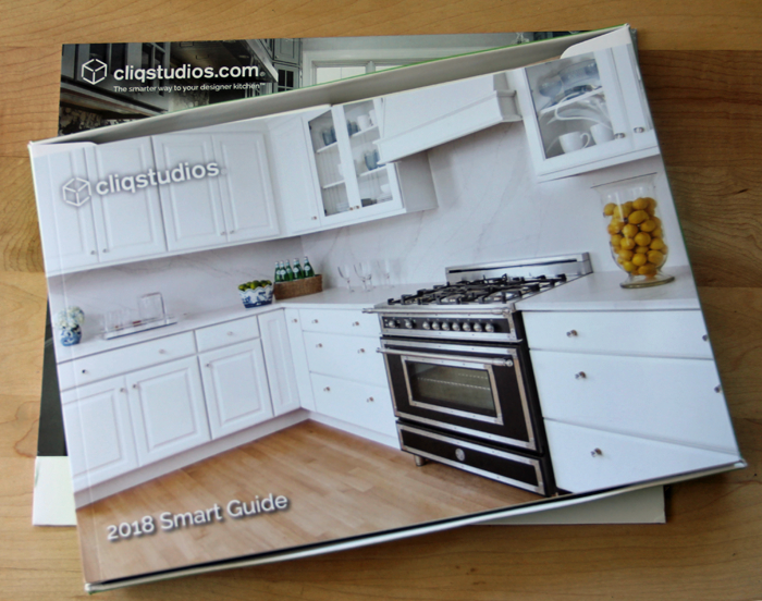
In this post, I review the process of working with the online cabinet company Cliq Studios. All opinions are my own and I was not compensated for my thoughts. I am in no way sponsored by or affiliated with the company.

Cliq Studios kitchen


Construction of our minimalist cottage has been moving along at a steady pace. With framing well underway, we are beginning to hit crunch time. Finish selections need to be made and ordered soon. In fact, we have already begun ordering the items that require a longer lead time. The cabinetry included.

We began our kitchen design over a year ago, as documented in this post. At the writing of Part 1, we were fairly confident that we would be using Cliq Studios for our cabinetry. And now that we have placed our order, I can confirm that I was right!

Today I want to share with you how the process of working with Cliq has gone for us so far.


WHY CLIQ STUDIOS?

I encourage you to go back and read Part 1 of this series for the full run-down. Essentially though, our decision to work with Cliq was primarily done because of budget constraints. Simply put – it isn’t cheap to build a house, and if you’re on a budget, something’s got to give!

We were confident that we would be able to attain a custom looking kitchen, for a fraction of the cost.


DESIGNING THE KITCHEN

When I first started the kitchen layout process with Cliq Studios, I was assigned a designer from the company. She was wonderfully patient and held my hand through a lot of revisions. And when I say a lot, I mean, A LOT. If you remember – our kitchen was in a completely different corner of the house at one point! This designer was very responsive, answered all of my questions, and gladly made any changes that I asked of her.

A few months ago, my designer took a job elsewhere and I was transitioned to someone new. This made me a bit nervous, wondering if the new designer would truly understand the ‘vision’ I had for the space.

The great news is – he totally got it!
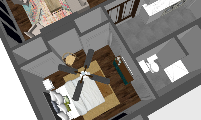
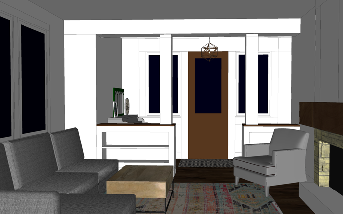
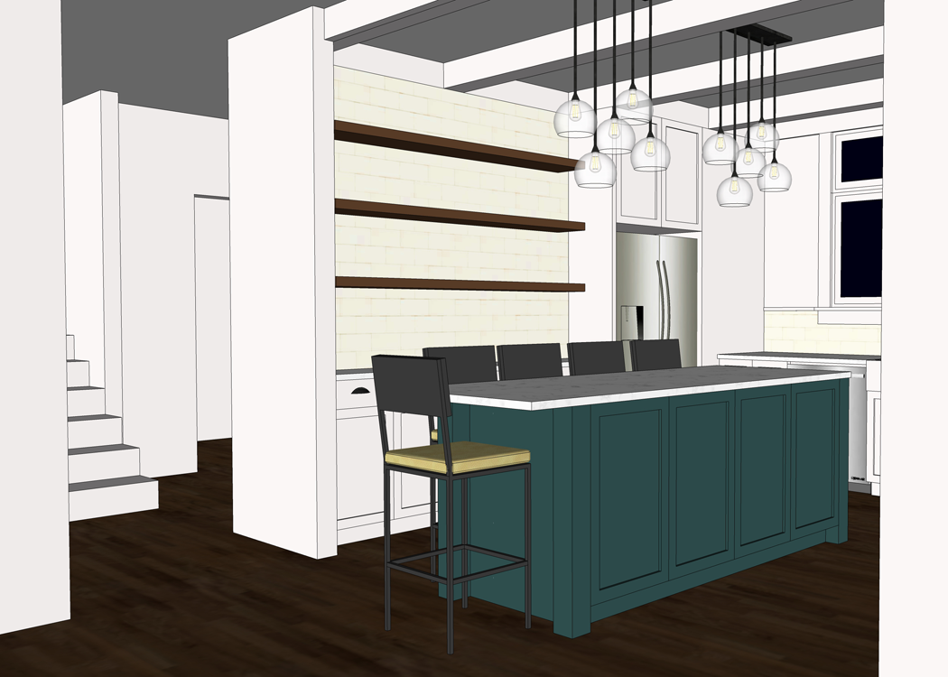
 

Our Kitchen

I made a major last minute floor plan revision right around the time that he came on board. He was happy to start fresh with the new kitchen layout, while keeping in mind the design decisions that had already been made.


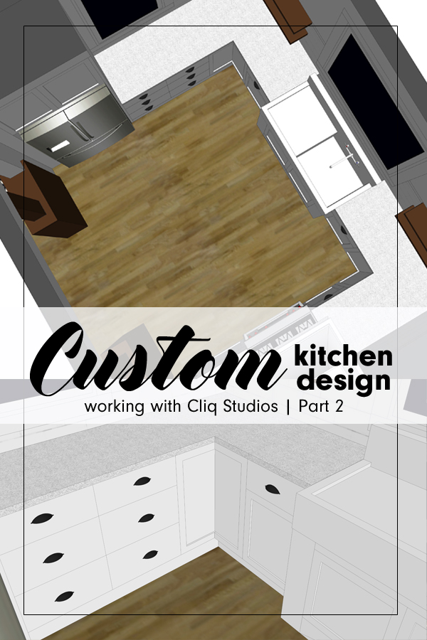
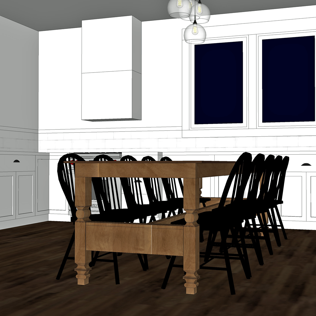
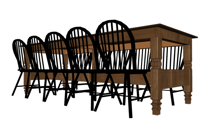
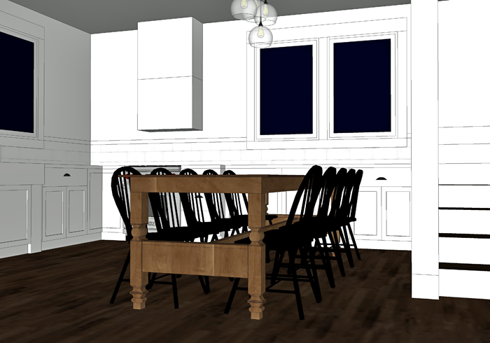
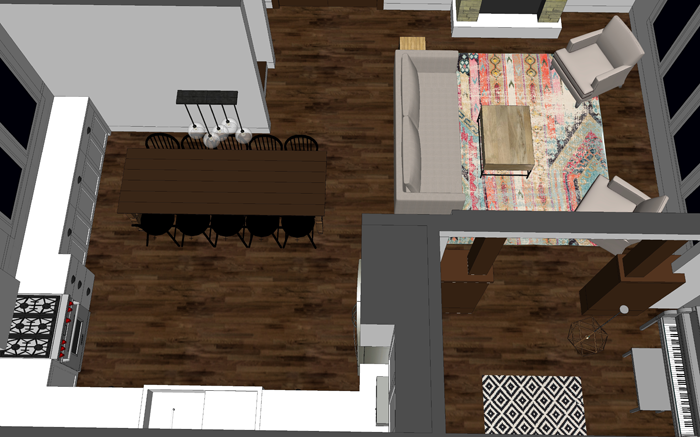
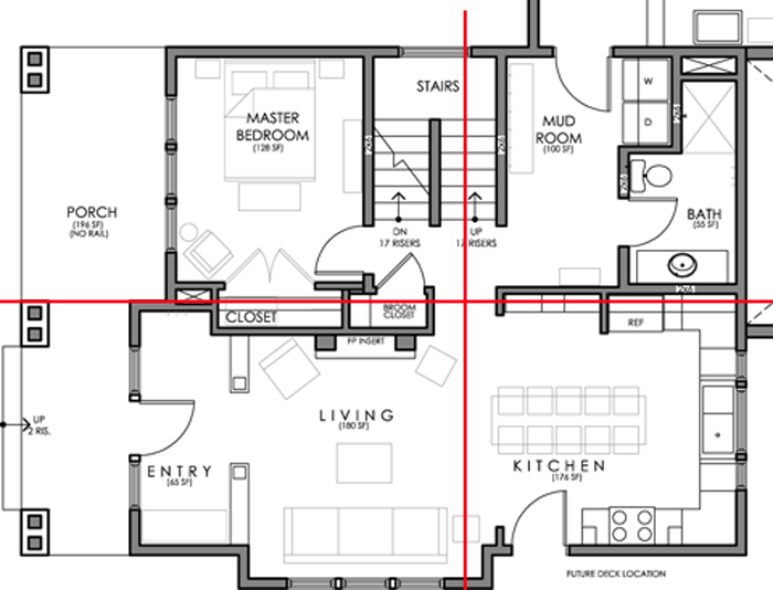
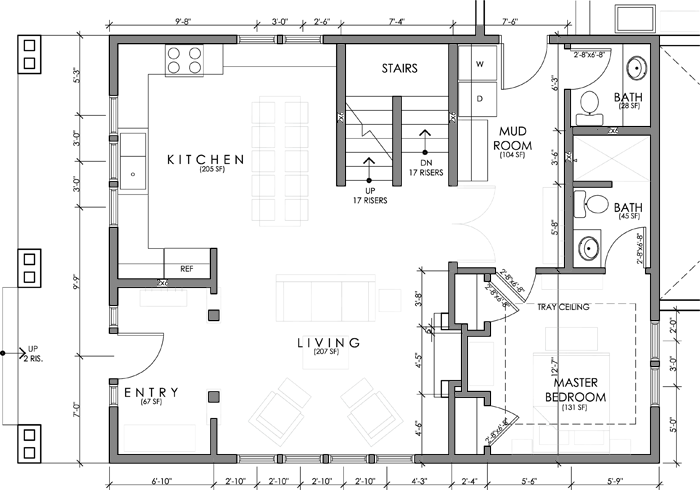
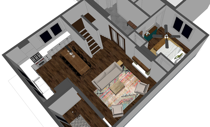
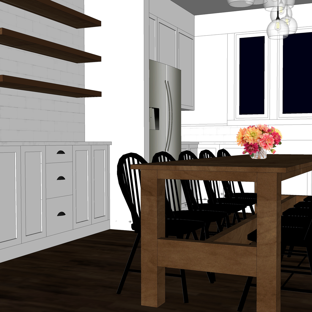
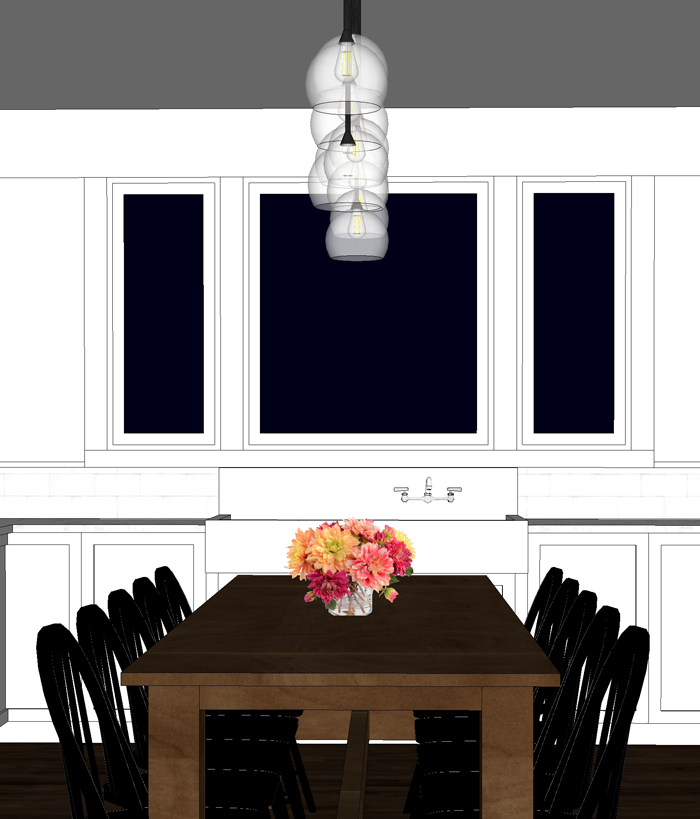
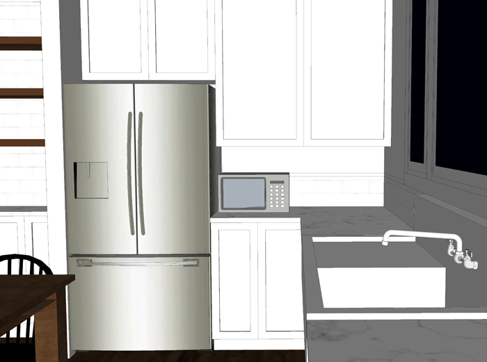
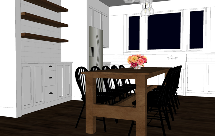
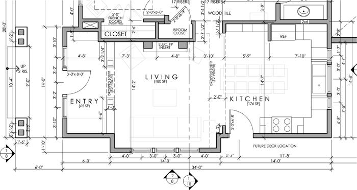
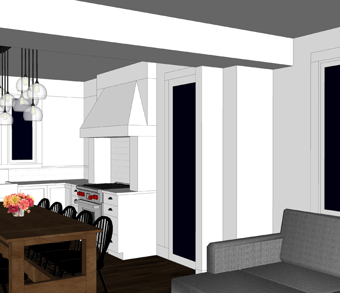
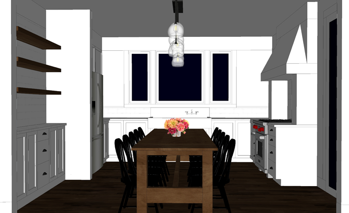
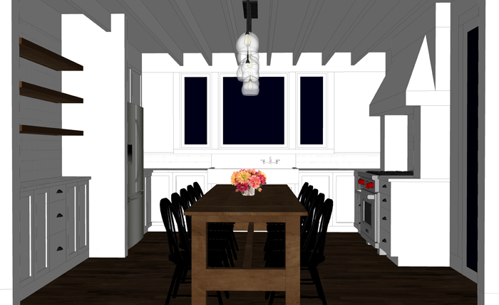
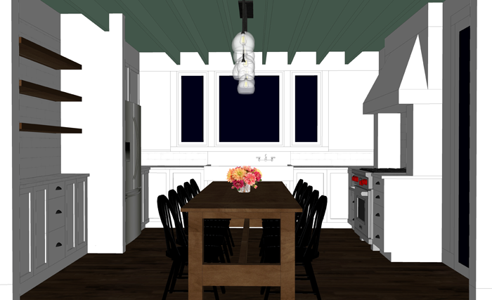
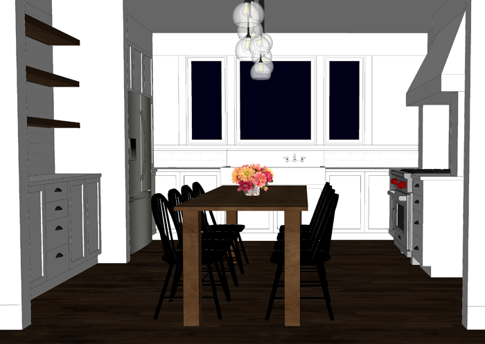
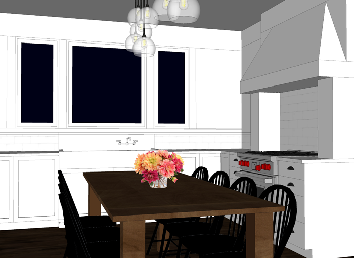
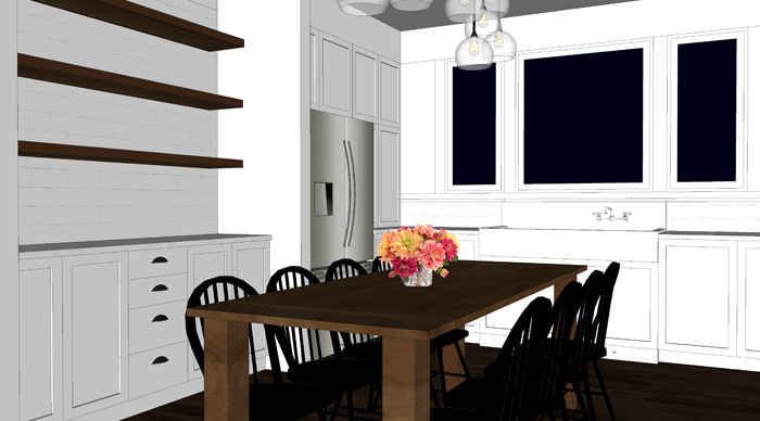
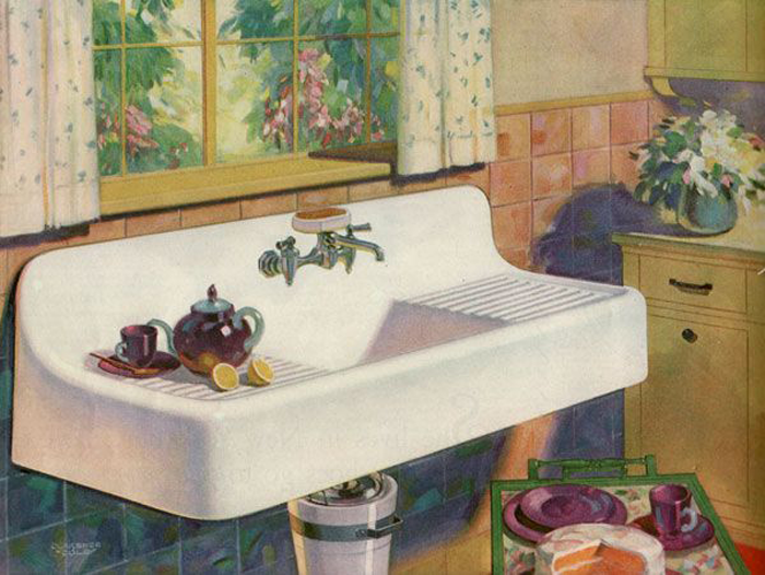
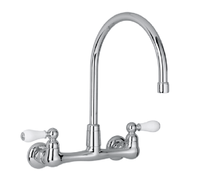
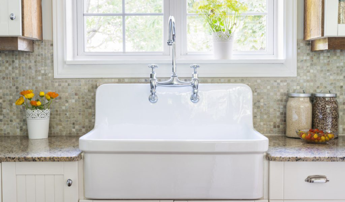
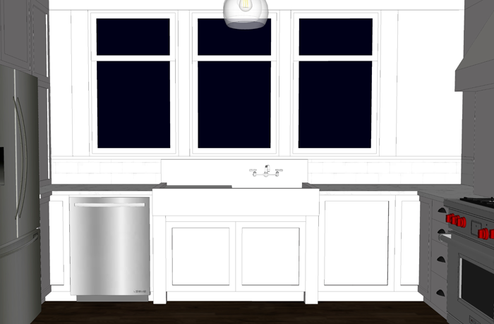
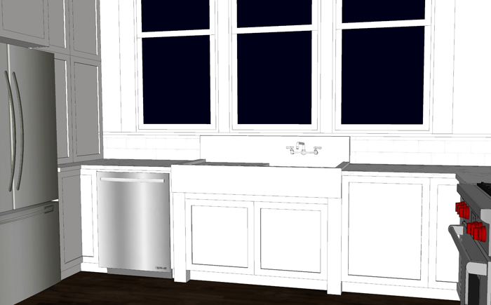
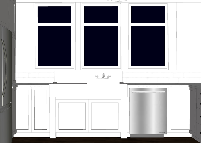
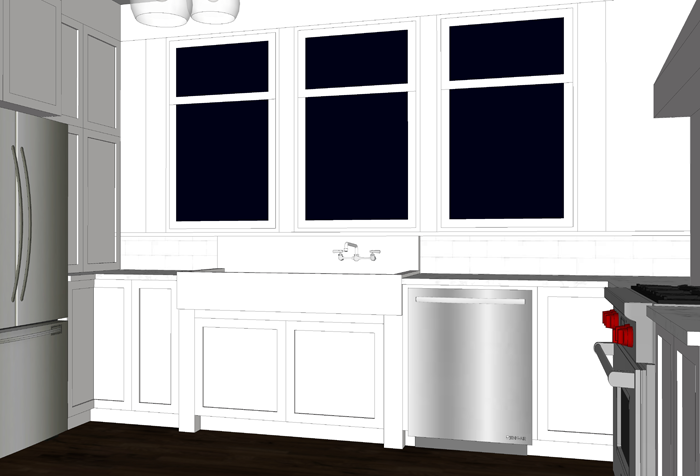
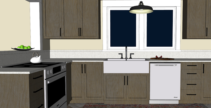
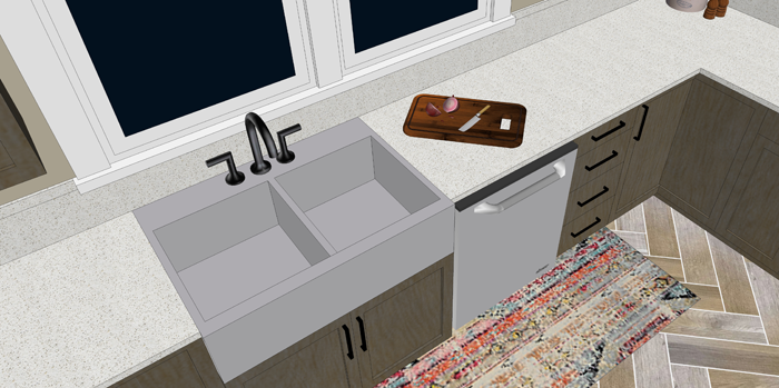
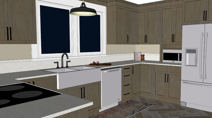
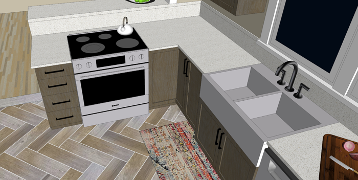
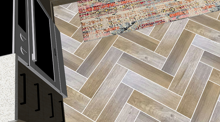
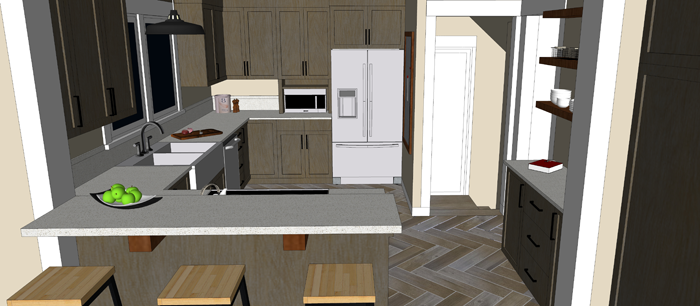
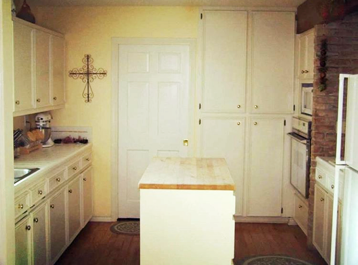
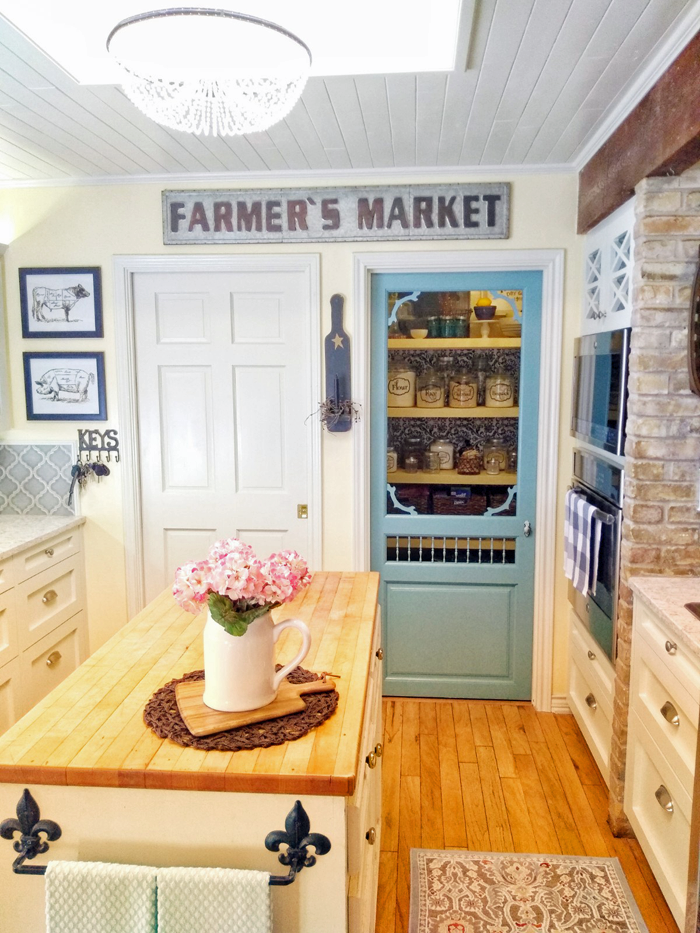
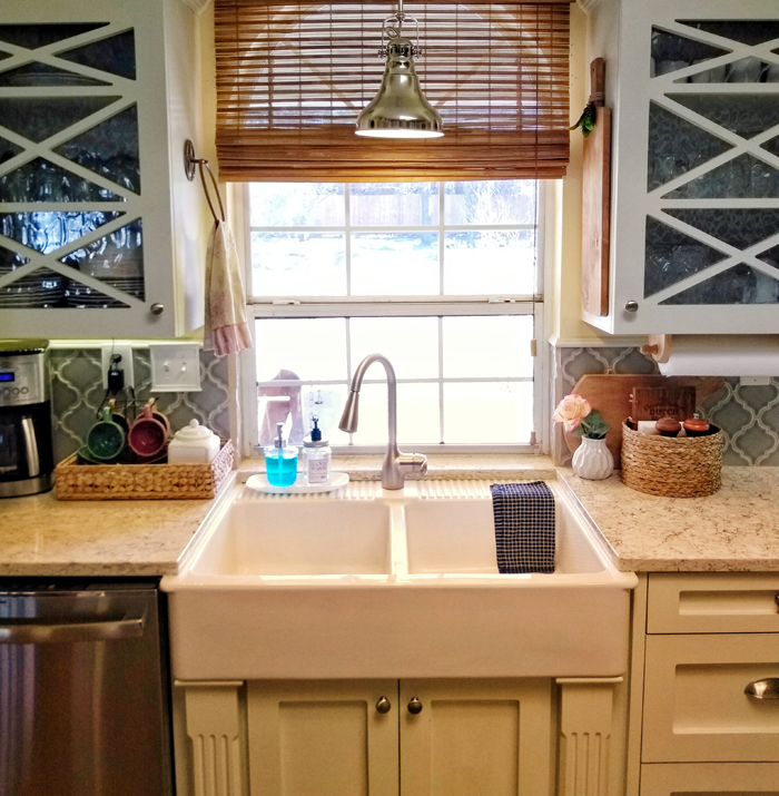
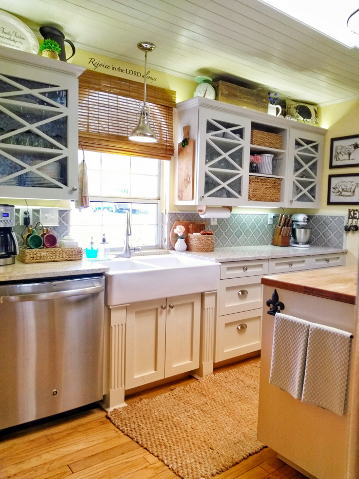
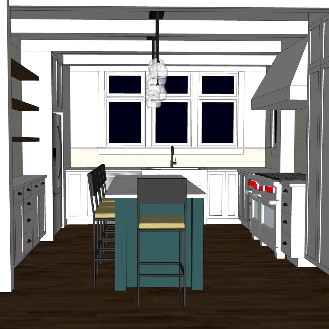
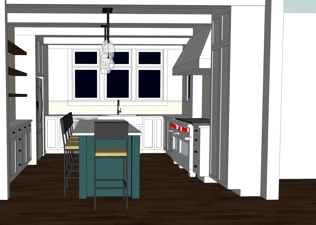
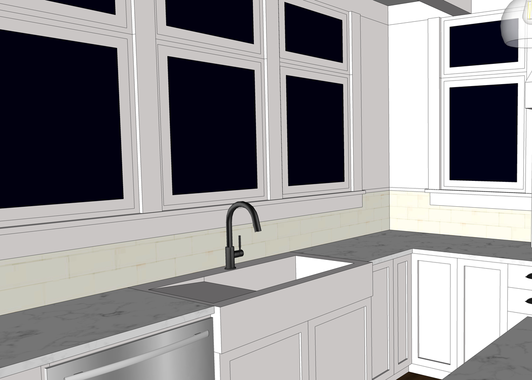
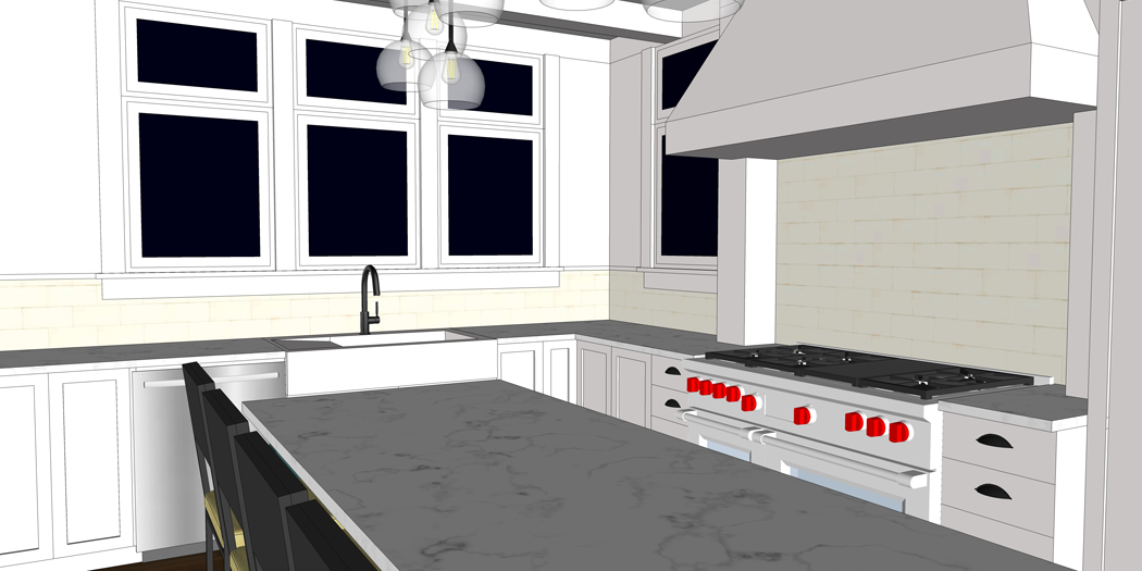
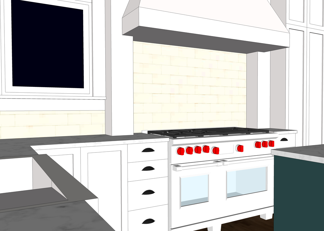
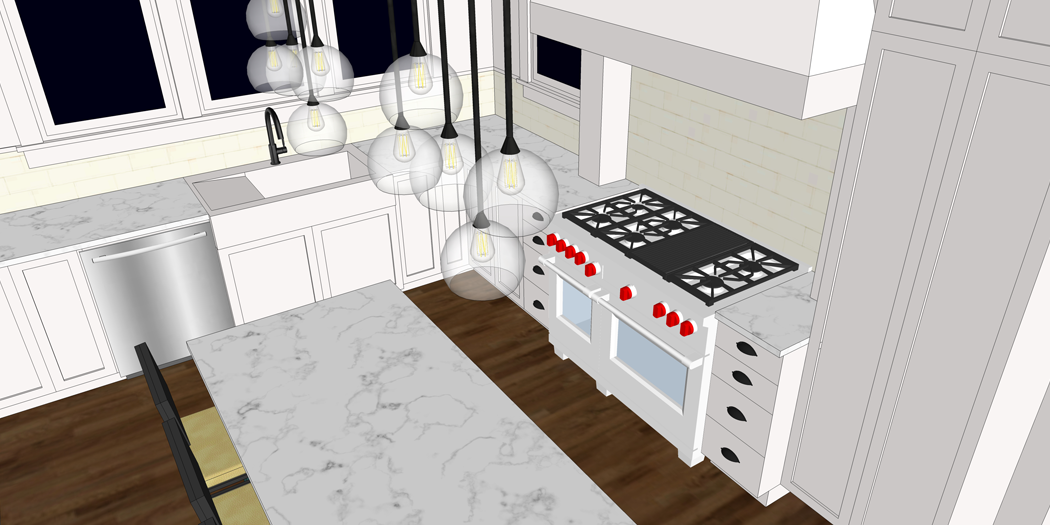
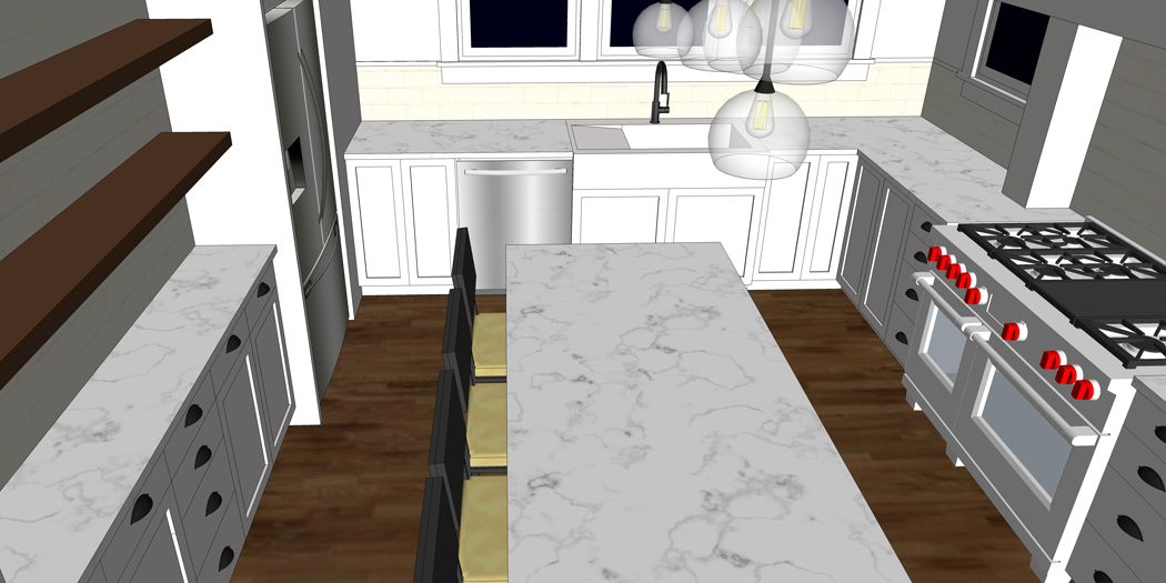
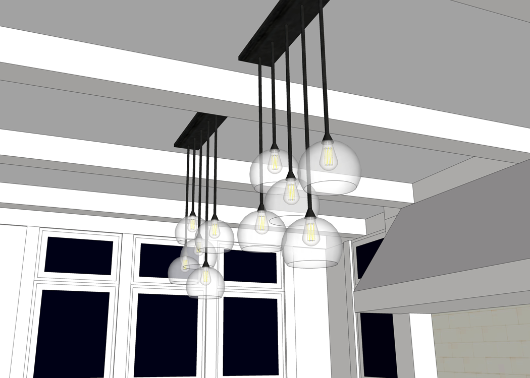
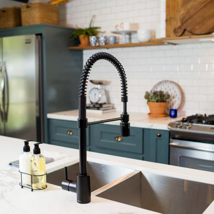
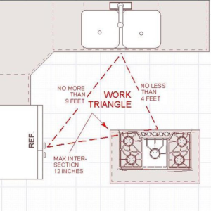
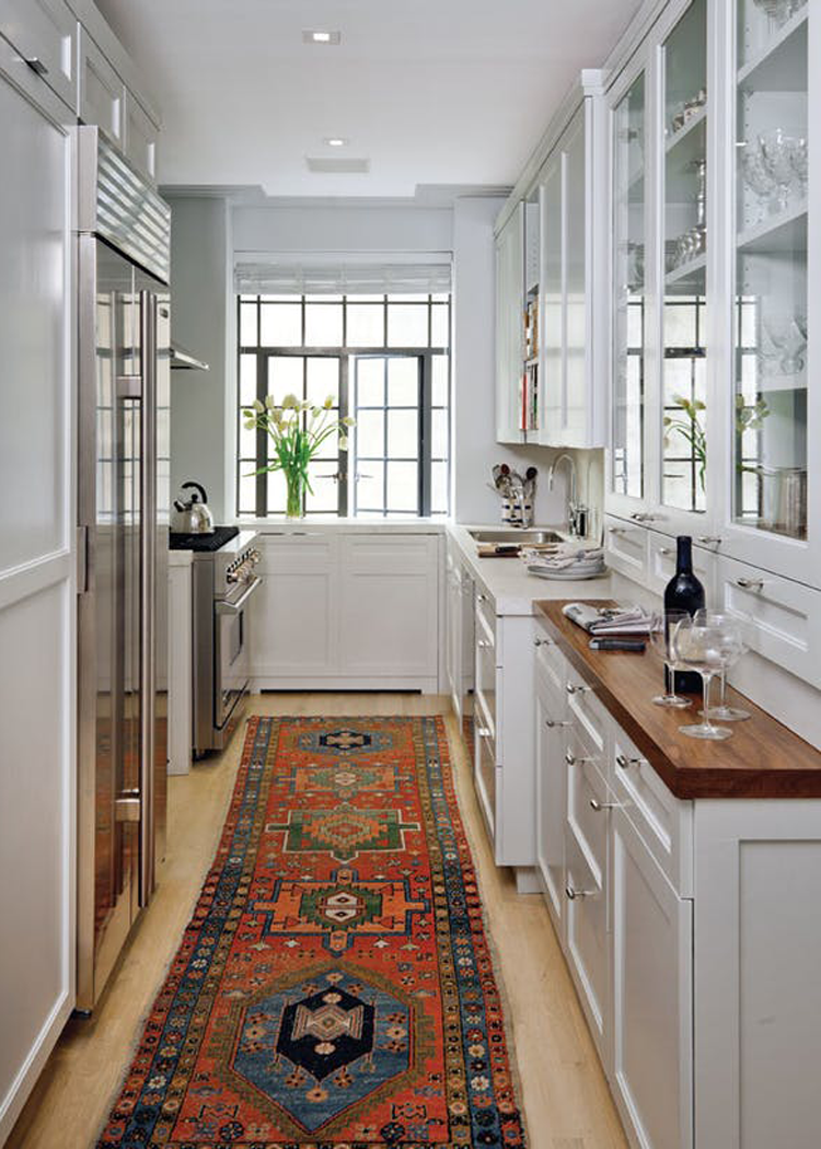
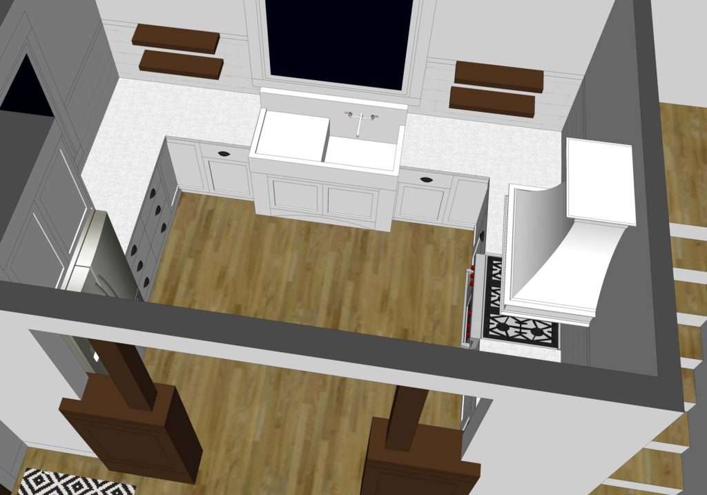
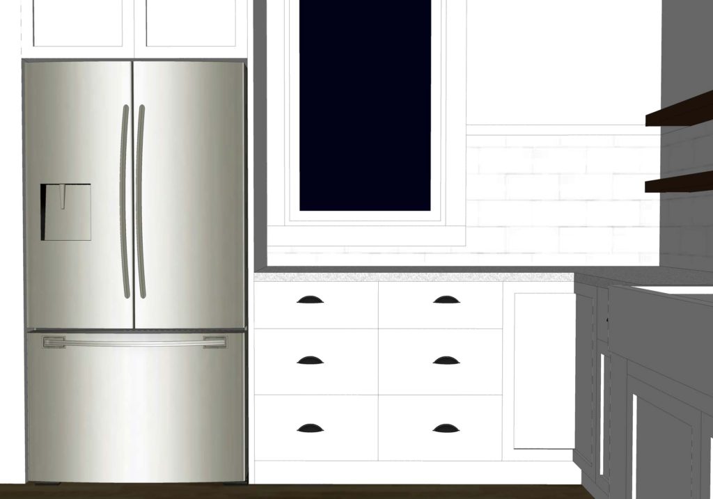
Our kitchen is roughly 10′-6″ x 13′-6″ and is a basic rectangular shape. It was always my intention to keep the design of the room extremely simple. The showcase of the space is the 1930’s era cast iron sink that we inherited. It will be centered on a large west facing window. Stainless steel appliances will complete the kitchen work triangle.

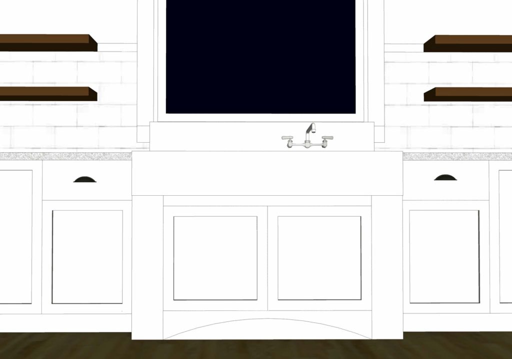
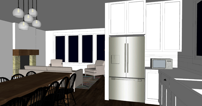
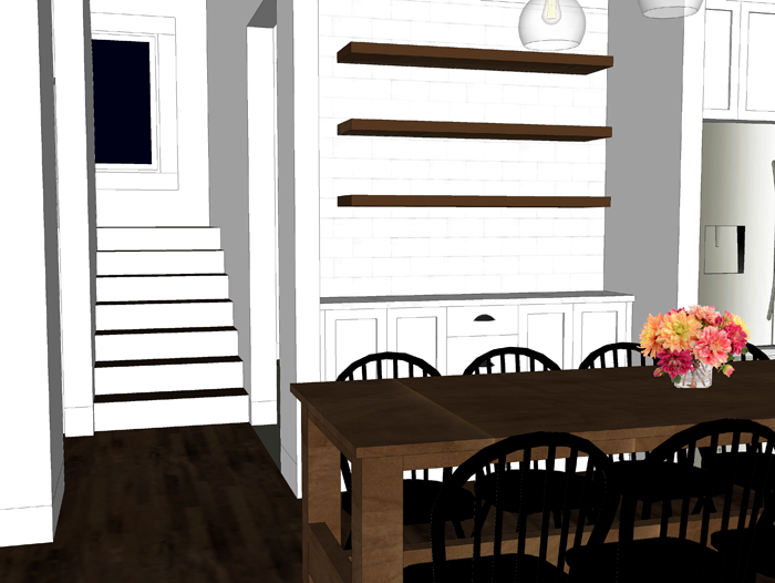
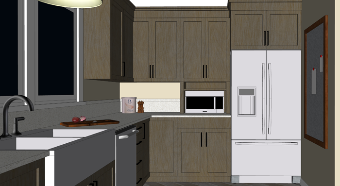
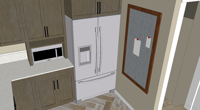
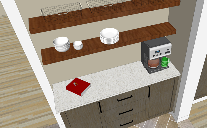
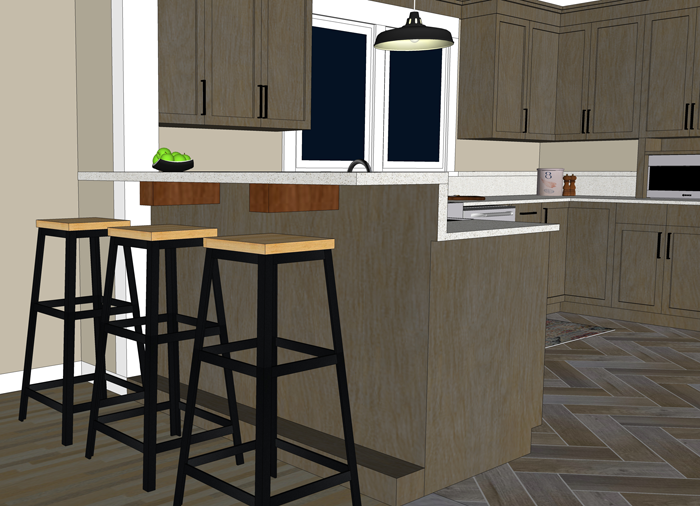
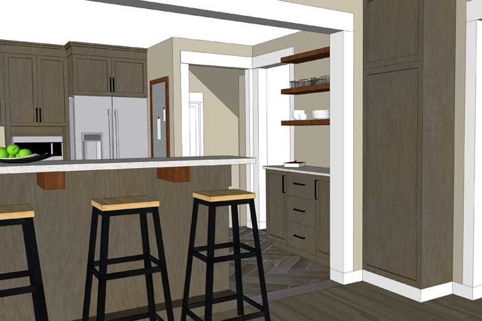
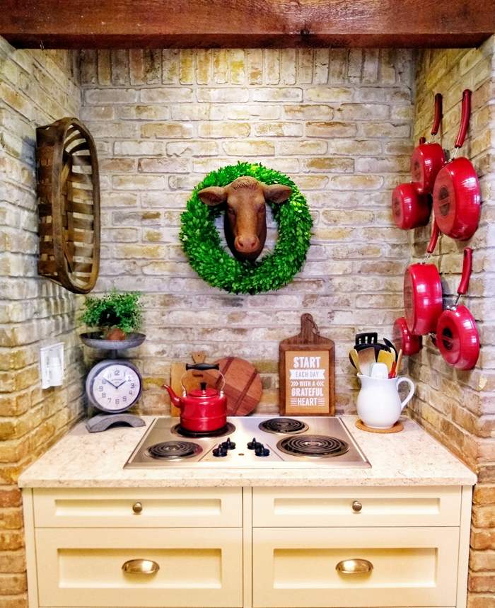
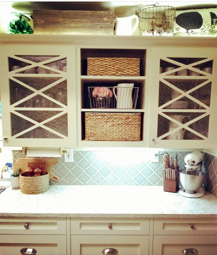
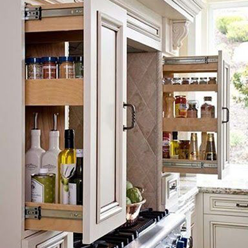
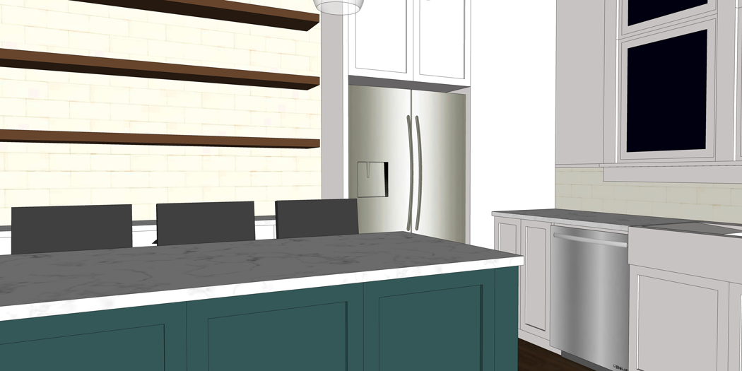
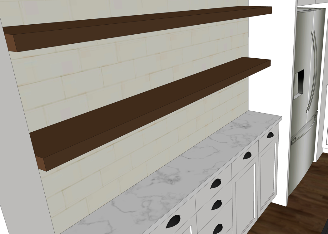
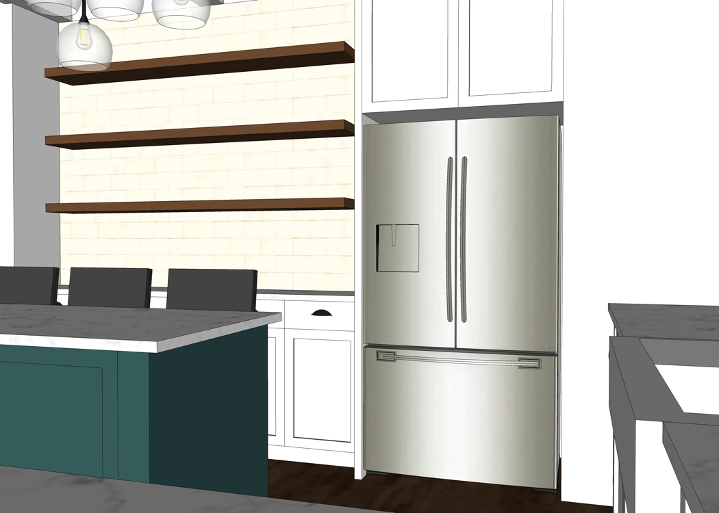
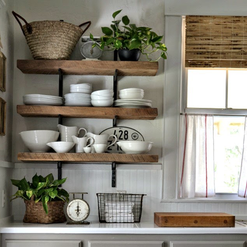
Because I personally don’t like the way upper cabinets tend to make a kitchen feel heavy and closed in, we opted for open shelving. These shelves will be custom made from trees harvested from our property, and hold the dishes we use on a daily basis. The one upper cabinet that is included in our kitchen design is located above the fridge. It’s depth will be perfect for large roasting pans and rarely used holiday platters.


large cabinet above fridge


Other Features

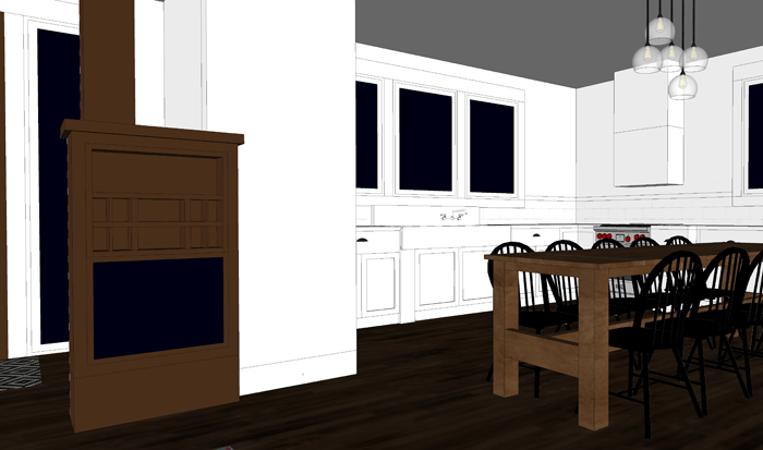
Another favorite thing in our future kitchen is the curved ‘artisian’ range hood. Though Cliq does offer this style, I have found another brand online at a better price. I’m all about finding the best deal.

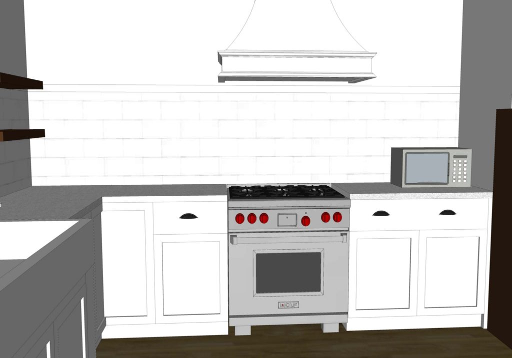
Our microwave will be a smaller counter style. I would love to get one small enough that we can stash it in the cabinet below when it isn’t in use and keep the counters clear. We actually rarely use a microwave, and I value the counter space more.

As far as where the dishwasher will go… we won’t have one! There are a lot of strange looks when we tell people this. Truthfully though, we have never owned a dishwasher. This is another instance where we value the cabinet space over the appliance. Should we ever change our mind or sell the house, we have cabinets on either side of the sink that would accommodate a smaller model.


TIPS FOR WORKING WITH CLIQ STUDIOS

There are a few difference I have found between working with a custom cabinet maker and Cliq Studios. Should you choose to go the semi-custom route, keep these tips in mind.

Finish choices are limited

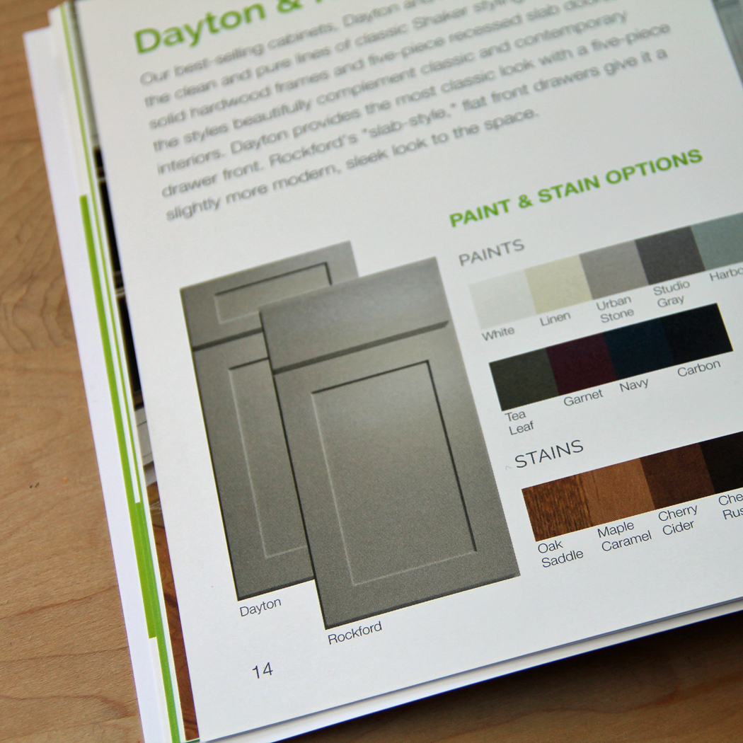
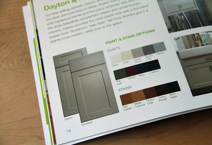
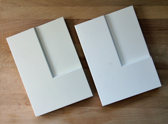
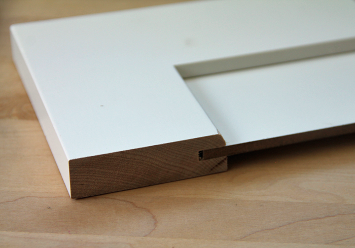
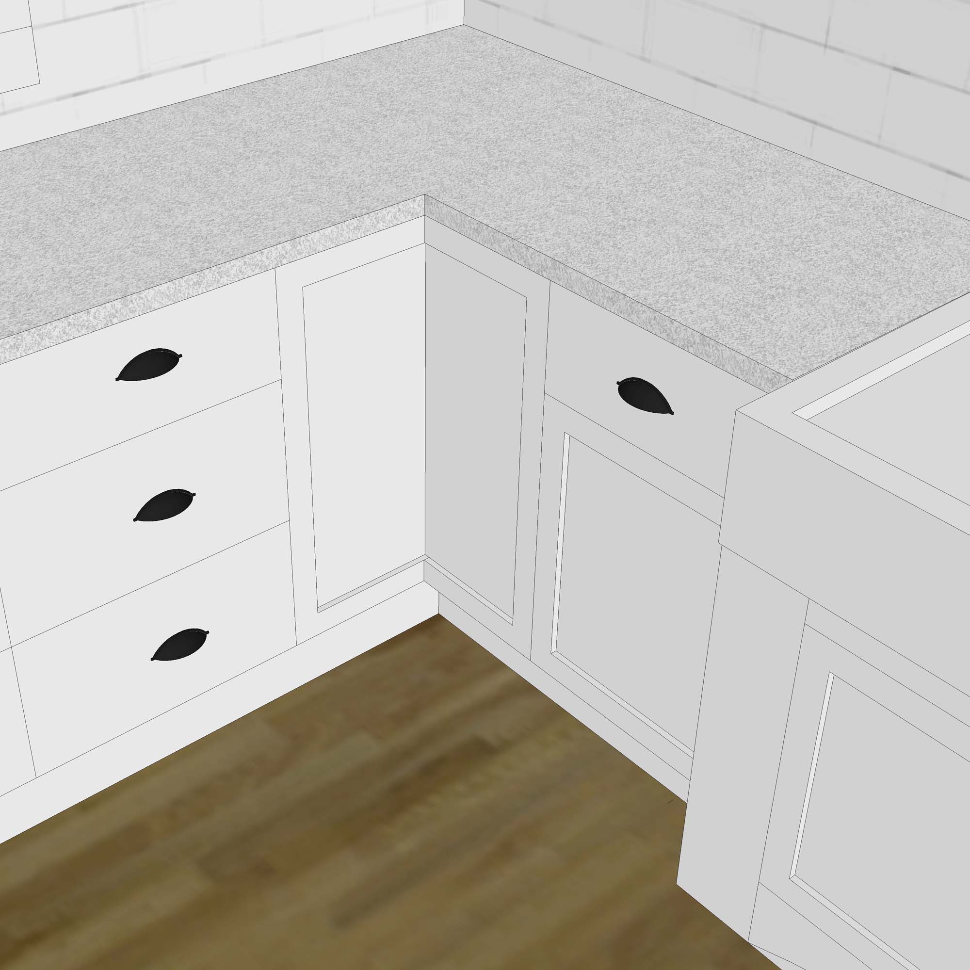
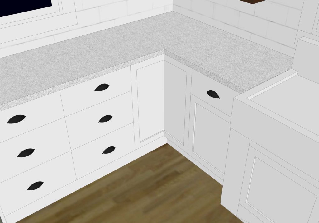
Though they offer quite a variety of wood grain and painted finishes, Cliq Studios can’t compete with a custom shop when it comes to selection. Certainly this is, in part, one of the reasons they are able to keep the consumer expenses down. I wanted simple, shaker style white cabinets for our kitchen. The ‘Rockford’ cabinet style, painted in ‘Cloud White’ was the perfect fit for us!


Size matters

Be aware that the more simple you can make the design of your kitchen, the less expensive it will be. Avoid having too many ‘custom’ sized items, which will drive up the cost. For example: The standard base cabinet is 2′-0″ deep. Requesting a cabinet that is 2′-6″ deep OR 1′-6″ deep will cost you more money.

Width of cabinets is another factor to keep in mind. Measurements need to be kept to an even inch, 24″ versus 24 1/2″, for example.  I also found that there are max sizes on certain items, such as base drawer units, which don’t go over 3′-0″ wide.

base drawer cabinets

Fillers are your friend

For those tricky spots where one of the standard sizes won’t fit, fillers are your friend. My designer was great about noting where fillers where going to be needed.

There is also the offer of larger side panels, such as those used to enclose a large fridge, for a more built-in look.


Add-on’s are extra

While Cliq studios does offer custom add-on’s such as garbage pull outs and drawer dividers, they are going to cost you extra. I did some research and found that the organization items I wanted could easily be added, after installation, for less. Another bonus of waiting is learning how the kitchen functions. After using it for a while, I may find that those upgraded features aren’t necessary.

Finally, your designer can assist you in selecting counter tops and hardware. Be advised though that the counters are only available through one company, Cambria, which sells a solid surface material. This limits your choices, and they may not have the look you are going for. Drawer pull selection is also limited, and a bit higher priced.

However, if you are fine with fewer options, and like the idea of a ‘one stop shop’ for the entire kitchen design, Cliq Studios can make it happen!


CABINETRY COSTS

After working through the redesign for a few weeks, I finally felt settled and ready to order. I had been given cost updates all along during the process, so the final numbers weren’t any huge surprise to me. Because I know that it might be helpful for someone reading this review to see the actual costs associated with ordering cabinets, I am sharing the break down of expenses.


Included in the  kitchen

(2) 3′-0″ x 3′-0″ corner lazy susan cabinets

(2) 1′-9″ x 2′-0″ drawer bases

(1) 3′-0″ x 2′-0″ standard base cabinet

(3) 1′-6″ x 2′-0″ standard base cabinets

(1) 3′-0″ x 2′-0″ upper cabinet

(1) tall side panel for fridge

(2) cabinet doors + pieces to make a custom cabinet for under the farmhouse sink

Various filler pieces

TOTAL COST: $5,242


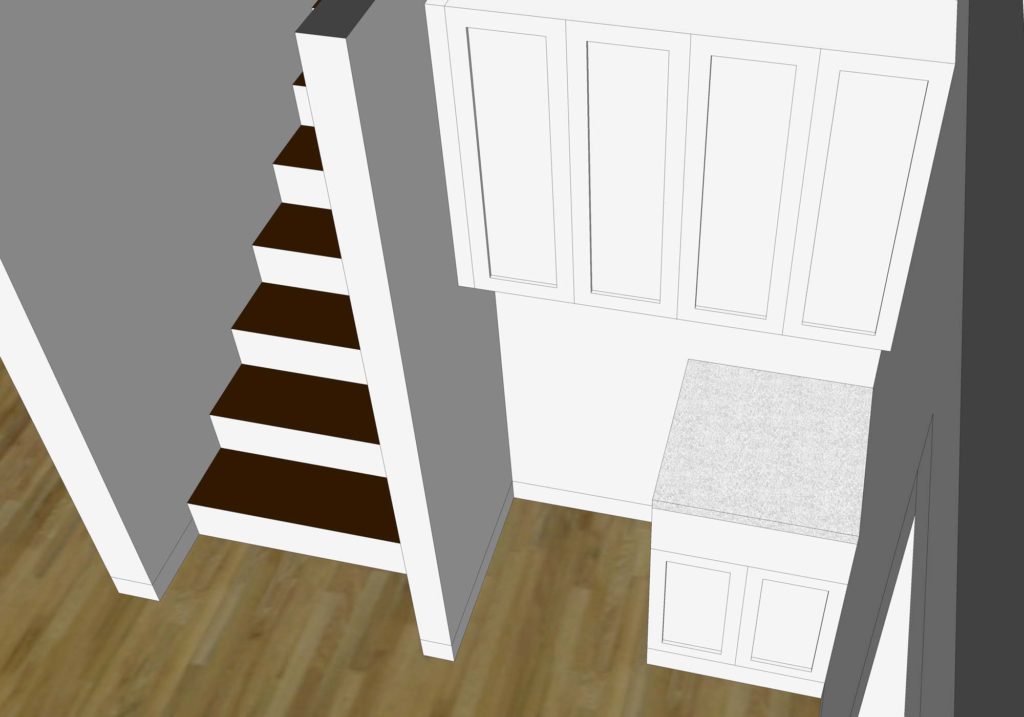
As a result of this wonderful cost savings, we were able to add a few additional cabinets. Both for the mud/laundry room and a small snack station for the basement family room.

laundry room cabinets Cliq Studios

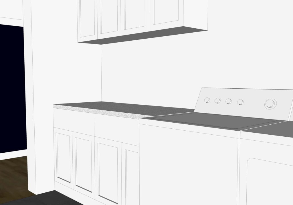
Included in the laundry room

(2) 2′-6″ x 2′-0″ standard base cabinets

(2) 2′-6″ x 3′-0″ upper cabinets

side panels for both

TOTAL COST: $1,555


Included in the snack station

(1) 2′-0″ x 2′-0″ standard base cabinet

(2) 2′-0″ x 3′-6″ upper cabinets

side panels and filler piece

TOTAL COST: $913


OVERALL COST for our Cliq Studios cabinet order: $7,710. When ordering, the taxes for our zip code were calculated. This added an additional $500 to our cost. Being able to get such a large number of plywood construction cabinets, with soft close drawers, for that price was a steal!


NEXT STEPS

Because I wanted to make sure that we didn’t hold up the process at all, I ordered our cabinets well in advance. Notice came just the other day that the cabinets are in production and should be shipped mid August! Unfortunately we won’t be quite ready for them yet. They need to be delivered to a climate controlled house, and I can’t guarantee that at this point.

Worried that this could cause a problem, I contacted our designer and asked if there was any way to delay shipment. He asked around and was able to confirm that the shipping company can offer us a 30 day extension should we not be ready to receive the cabinets. After that point we would be charged a rate of $50 per month for them to store the shipment. Certainly, this gives us peace of mind!


Overall, so far we have been very pleased with Cliq Studios! Be sure to check back for Part 3 – when I discuss delivery, installation, and my thoughts about the overall quality of the cabinetry!


PIN THIS REVIEW

Working with Cliq Studios to design a custom kitchen

HARVEST DINING TABLE DESIGN

I’ve got the basics of the kitchen plan figured out, and have begun the transformation of the dining chairs. Now is a good time to work on the design of the harvest dining table that our family will use at Arrow Hill Cottage.

This will be a custom piece, and hopefully an heirloom that will be passed down for generations. As such, I want to think through every detail to be sure it will stand the test of time.


OUR DINING PHILOSOPHY

Our family enjoys eating our meals together as a group. It is something we strive to maintain as a top priority, even while the kids grow and become more involved in other activities.

The space where the dining table will reside is directly to the right of the kitchen. In fact, I would consider our kitchen to be a kitchen/dining combination. The dining area is pulled off to the side a bit. This helps to maintain the kitchen work triangle as well as define the eating area as a place of importance.


HARVEST TABLE DESIGN BASICS

The harvest dining table design is heavily influenced by a few factors:

First, we are a family of seven. While we only need seven chairs around the table, we want to be sure to always have a few extras for guests. The set of 10 vintage chairs we are refinishing will surround the table, leaving 3 seats always ready for company. I specifically looked for chairs that had a smaller profile, knowing that we would have many set up at all times.

Second, The space where the table and chairs will sit is a bit narrow, and because of that I know that the table will need to be narrow as well.

Lastly, The table top will be made of solid wood boards – hopefully harvested from our property. We do not want to complicate the design by making a table that has extendable leaves. Whatever size the table is, it will be one hundred percent of the time.


Considering all of these factors, I knew from the start that I would be designing a long and narrow table.


HARVEST DINING TABLE INSPIRATION

I found inspiration in the form of a ‘dry sink’ turned table that I spotted at a local antique store last year.

It apparently had been used in a one room schoolhouse in the early 1900’s. When I spotted it, I kind of wanted to just take it home with me right then and there.  Unfortunately, I couldn’t justify the price tag or the fact that it would need to sit in storage for over a year before it could be utilized.

Instead, I kept my eyes open for table legs that looked similar to those used on the dry sink. I finally found them in Kansas, on the surprise anniversary road trip Craig took me on in June.

They were just the shape I had been looking for, and I love that they will hold memories of the special trip that we had together.

After measuring the chairs and determining how much space is needed between them, I came to the conclusion that the size of the table top will be 3′-0″ wide x 8′-6″ long.


DESIGNING IN THE THIRD DIMENSION

With all of this information in mind, I set to work with my favorite 3D designing tool – Sketchup. I’ve written before why 3D modeling is important during home design process. Many of the same reasons ring true for other design endeavors as well. The third dimension is just so helpful in visualizing what the end product might look like.

In this case, it also helped me to determine what sizes and lengths of lumber might be needed to get the job done. The below image lays out the 2×4 material. This configuration will be used for the framing and stability of the table. Higher quality wood will be added to the face. If we have enough, it may even be wood harvested from our land.

table framing


The legs of the table are positioned at the very ends, allowing enough space for 5 chairs on either side.


For added support, I am anticipating that there will need to be a center brace that runs from one end of the table to the other.


I have yet to determine the finish of the legs. I go back and forth with either stained wood or painted black. We may not be able to make a full decision until we begin finishing the legs. If we can’t get the stain to blend well with the lumber from our land they may need to be painted.


I think the piece will fit beautifully in the space! It will add just the right amount of simple charm. You’d better believe I am looking forward to eating many home-cooked meals with my family in this very spot!


HOME DESIGN PLOT TWIST!

Just two weeks ago I wrote about how our home design has evolved. I saw it as a bookend to the design – a way to finish off the chapter of floor plan configuration, and usher in the next phase of material selection.

And then, well… life has a funny way of sending you twists and turns when you least expect them! Today I will be writing about some major house changes that have happened – changes we didn’t even see coming!


home design changes


I have written in previous posts how we have had to make some sacrifices for our house design – based primarily on site constraints and financial limitations. Most of the things that haven’t ‘made the cut’ have been no big deal. I can live without an extra window, or the specific roofing material I was hoping to use.

There are other house elements though, that we have been bummed about not being able to include. One of the most difficult to accept was the idea that our main floor master bedroom would not have an attached bath. An attached bathroom was high on both of our wish lists, but ultimately we decided that we could live without it. After all, we have never had a true master suite in all the years we have been married.


But after working through the design of the upstairs bathroom that our kids will share, I started to think more about the bathroom situation for the rest of the house. That led me to begin feeling sad once again that I had not been able to work in the master bathroom we had been dreaming of.


And so, since our build is on hold until Spring of 2019, I figured I had some time to tinker with the home design & floor plan layout a bit more


Much to Craig’s annoyance. The blessing and the curse of loving home design is that it is probably never fully DONE. Craig is ready for things to be set in stone now. He may not understand that even after the house is built I will be tinkering, with paint colors and accessories! Ha!

During one of these mini design sessions, I realized something about the main level plan that I hadn’t before. It is essentially split into four quadrants: Living room, Kitchen/Dining, Bedroom, Utility. Maybe it is because the plan has evolved for such a long time and my eyes have been looking at it for so long, but I had never noticed that aspect before.

I also hadn’t really given much thought to the fact that the main floor was also divided in half in terms of the public and private spaces. The kitchen/living/dining half (public) and the master bedroom/bathroom/utility spaces (private).

home design plan layout


THE BIG IDEA

Then suddenly, I had an idea. I tried to swap the kitchen/dining quadrant with the master bedroom quadrant. Things suddenly started to make sense! By making this one simple swap the front half of the house would then be public, and the back private. But best of all? You guessed it. The master bedroom could finally have that attached bathroom! And just like that, we were headed in a new home design direction. PLOT TWIST!

custom home design


OTHER HOME DESIGN BONUSES

There were other fun surprises from this room swap.

I had never been super keen on the idea of having the kitchen immediately visible to people who visit. Visitors are likely to come through the front porch entryway.  Although I do try to keep my home tidy, the kitchen is ALWAYS the messiest. I think that’s normal. With the new layout, the kitchen is easily accessible – yet in a more visually private location. It will have a very similar cabinet setup as before. The biggest change is the movement of the dining table so that it in it’s own little space.

kitchen home design


When entering the front door now, the view will be of the wall of windows to the right and the fireplace directly in front. The beautiful wood french doors that we will bring with us from Craig’s grandparents homestead farmhouse will also be visible. This prominent living room location is the perfect spot for them! Previously they had been designed in as doors to our bedroom closet. The doors will likely be open most of the time. But it is nice to have the option to close off the laundry room/ mudroom space if we want.

living room home design


Also, we will be able to reuse the antique cabinets we own as room. They will act as dividers between the living and entry spaces. These cabinets have so much character, and Craig has already begun the process of refinishing them!

home design front entry idea


The improved sight lines are possibly my favorite aspect of this plan change. The openness will allow for more natural daylight to flood the common/ public spaces in the house. From this kitchen corner, we will have views to the west, east and south!

virtual home design open concept


NEW CHALLENGES

Of course, not all things magically fell into place. I did ended up pushing part of the house out two feet, to give the kitchen/dining more space. This added about 50 square feet to the overall plan, but also simplified the exterior shape of the house. We are hoping that the changes offset each other cost-wise.

I wonder what our contractor will think of all this – He will probably be as surprised as we were!


home design 3d floor plan

What do you think friends? Do you think this change is for the better like we do?


SATURDAY SKETCHBOOK: KITCHEN CEILING FINISH

We talked with our contractor this week, and he is 95% sure that our project will not break ground until Spring of 2019. It’s a little sad to have to wait through another winter, but we are looking on the bright side and realizing that this extra time will allow us to make sure everything is just as we want it.

There are various bits and pieces that Craig and I just can’t seem to agree on, or that he claims to not have an opinion on. And since I had such a great response when I asked for upstairs bathroom layout ideas, I figured I could come to you all again for a little input.

There have been a few exterior revisions, but mostly they are interior


I have been slowly fine tuning the design of our kitchen in collaboration with Cliq Studios, as well as determining the dimensions and design of our future harvest table – which I will share about in a future post.

We changed the window sizes and style to fit more naturally with the farmhouse sink we will be restoring. The larger center window will be a fixed picture unit, and the smaller side windows will be operable casements.

We also revised the cabinets to the right of the fridge. Initially I had them going all the way down to the counter. We eventually realized that we would like to have the extra counter space for small appliances, such as the microwave and toaster.


The cabinets to the left of the fridge are going to be shallow depth (12″ instead of the standard 24″). We see this area more as a built in buffet/ hutch space – to promote a sort of dining room within the larger kitchen space – since we do not have a separate room. The shallow depth allows more space for the dining table and chairs.


These are all changes that we think will add to the functionality and feel of the space. There is one more cosmetic option that we are having a difficult time deciding on. The ceiling.

When you enter into the house, there is a straight view from the entry into the living room, and beyond to the kitchen/dining space.


The small entry/ piano area is somewhat divided from the living room with built in cabinets and columns.


I want to also have some sort of definition between the living room and kitchen, while at the same time keeping the floor space open. I started by adding a dropped soffit between the two rooms.

It helps to separate the spaces, but I still felt that there needed to be something else to define of space or the other. Since the living room already has a feature fireplace and built in book-cases, I turned my attention to the kitchen. Here is where we are having trouble deciding – the ceiling.


Part of my family prefers the smooth drywall ceiling in both the living room and kitchen, as shown here:


Others of the family, myself included, feel that some simple 2×8 or 2×10 beams (non structural) could be that last finishing detail the kitchen needs for definition. Potentially, tongue and groove boards could be used instead of drywall (layered under the beams) as a way to add more texture. I didn’t bother drawing each and every line, but you can get an idea of what that might look like from this inspiration picture (image 3).


I prefer having the entire ceiling painted one color instead of keeping it natural/stained – mostly because we have wood shelves nearby, wood floors, and also a wood table. However, I  saw this picture on Pinterest, and thought that a soft color on the entire ceiling might look great while adding a bit of color to the all white kitchen. Perhaps a light aqua or a pale grey. I’m not sure I’m brave enough to go for it though!


So, tell me. Which do you think looks best? Please comment on this post or vote via Facebook or Instagram. I’m really curious what the majority of you favors! Thanks friends!

One last look at all of the options, side by side, as seen from the front door.


WORKING WITH CLIQ STUDIOS: PART 1

We have been working through the design of our custom home build for about a year now; And even as someone who is well versed in home design and construction, I am finding the amount of little decisions that need to be made a bit overwhelming – and up to now all of our decisions have been made on paper! I imagine that as soon as ground is broken, the decision making process will increase – probably both in frequency and in the speed at which the decisions need to be made.

I’m trying to stay on top of the game as best I can, and so have been looking ahead at some of the bigger choices that will fall on our shoulders. Specifically, I am focusing on the decisions that will affect the bottom line – the total amount this house will cost to build.  With our chosen contractor’s bids in hand, we have been looking through them with a fine toothed comb in an effort to make the best financial choices we can.

Last week my focus was on cabinet design and price, specifically for the kitchen. It is well known that a kitchen is one of the most expensive rooms in a house, perhaps THE most expensive. A large portion of the cost is determined by the cabinets that are selected. The average bid that we received for custom kitchen cabinets was around $25,000. That’s not including the counter-tops, appliances, flooring, or wall treatments! Ouch!

After the sticker shock set in, I went into research mode to see if the same/similar kitchen design could be made for less. That’s when I found Cliq Studios.


I have seen ads for Cliq Studios both on Houzz and This Old House, which are both websites that I respect and trust. I figured that if these websites were standing behind Cliq Studios, they were worth looking into further. The company is based out of Nebraska, with a warehouse in Minneapolis – only about a two hour drive from where we live. Their cabinet line is constructed of solid plywood, includes ‘soft close’ drawers and doors, and has options for several specialty accessories – such as pull out garbage cans, drawer dividers and pull out trays.

Their website boasts a whole lot of FREE – Free samples! Free design help! Free estimates! Free Shipping! I decided to put them to the test.

First, I looked through their catalog of available cabinet door styles. Unlike custom cabinet services which give you seemingly endless options on color, glaze, size, and detailing – Cliq Studios offers a limited variety of semi- custom, stock size cabinets and styles. Lucky for me, their ‘Rockford’ style is perfect for what I had been envisioning for our kitchen. I ordered this style sample, in two different colors. They arrived a couple of days later, in perfect condition.

standard white on the left, cloud white on the right

It’s hard to tell from this picture, but he Standard White has a bit of a cream tint to it, which I wasn’t a huge fan of. The Cloud White, though, was just perfect!

door construction detail


Feeling pretty confident with the quality of the sample and a style and finish that I loved, I went ahead and entered some more information on the website so that I could get a bit of design help. I’ll admit that this step made me a little nervous. I spent so much time working on fine tuning the kitchen design and was worried it would be scrapped and re-designed by their personnel.

What happened was the exact opposite! Within 24 hours of submitting the design application, I was assigned a designer. She contacted me via email a couple of days later, and we scheduled a time to talk on the phone. She asked about my vision for the space, and which aspects were most important to me.

My designer stayed on the phone with me for well over an hour, working through each and every cabinet decision – her with her cabinet design program open, and me with my AutoCad drawing and Sketchup file. Together we tweaked a few items and made the kitchen the absolute best it could be, from stock cabinetry!

She worked on the estimate for a few more days, and came back with a price quote that was less than half of what we had been told by the custom cabinet manufacturers!


I am titling this post ‘Part 1’ – because my gut at the moment tells me that we aren’t yet finished with Cliq Studios. I want to do a bit more research, but am feeling pretty comfortable that we may be getting our kitchen cabinets through them! Stay tuned!


*This post is NOT Sponsored by or affiliated with Cliq Studios – these words are my own review and critique of the services that were provided to us, free of charge.


A FARMHOUSE SINK FOR OUR COTTAGE

They say that the kitchen is the heart of the home; And a beautiful kitchen is high on the priority list of many homeowners. I am in agreement with these sentiments. After all, if my family is going to be spending a lot of time in one room, it should function well AND look nice.

The kitchen for Arrow Hill Cottage will have a classic look, with clean materials and tons of natural light. But I have to say, in all honesty, the feature I am most excited about is the kitchen sink.


Time for a little story:

About eight years ago, when my husband Craig’s family was helping his grandparents clean out their farmhouse (the very one we are living in at the moment), I spotted a cast iron sink laying in the weeds on their property – ready to be hauled away by a scrap metal collector who was paying by the pound. I am pretty sure I let out an audible shriek, then quietly and as calmly as possible, asked Craig to please find out more about it.

Turns out that it was the farmhouse’s original 1920’s kitchen sink that was removed (and tossed outside) in the late 60’s, when the room was remodeled to a more modern style.

It didn’t take too much begging for his grandparents to agree that we could save it from the pile. Craig though, needed a bit more convincing. Mostly because the thing was a beast, and hauling things around is low on his list of favorite things to do. He loves me though, and eventually gave in to my desire. We had absolutely no place to store the relic of a sink, and so we asked Craig’s parents if we could keep it in one of the sheds on their property until we built our house. And that is exactly where it has been ever since.

Craig was there last weekend, and I asked him to get a few measurements for me so that I could fine tune the kitchen design a bit more. He took pictures of the sink – in all her muddy, rusty glory – and seeing them made me fall in love all over again.


We will need to look into getting it refinished – probably at a body shop – but even with that expense I believe we are sitting on a great deal. I saw a very similar model on Etsy selling for $1,800! Another sink, on Ebay is listed for close to $1,000. Even reproduction models are over $700!

There are a couple of challenges that this farmhouse/apron sink will present. One is finding wall mounted faucet hardware. They aren’t quite as common as the counter mounted variety.

I like the look of this bronze faucet from Wayfair.


I have a feeling that lever handles might be a bit easier to operate though – so this option from American Standard might do the trick.


This one with a pull out spray faucet would be very functional – but I’m afraid it might not quite be in the budget. Maybe I can find something similar for less when the time comes to make a decision.


Another challenge will be determining how to lay the counter material. This sink style was originally designed to be a free standing unit. It probably had matching legs at some point. Kitchen design & style has changed quite a bit since the 20’s.

I am still pretty set on using a quartz counter-top material. I love the clean look. The sink will will either need to be set a bit lower than the counter height, so that the counter material can overlap the edges – to ensure that no water slips onto the cabinet below – similar to this:


OR possibly more likely, because of it’s integral back-splash, we will need to set the sink up higher and butt the counter-top material into the sides, like this:


The final design challenge that I can foresee, and perhaps the largest, is the placement of the sink itself. Because it is a single bowl sink, the placement of the faucet will be further to the right (and not in the center of the overall unit. There will be three large windows on the wall where the sink will be located, and I am unsure if I want the entire sink to be centered on the middle window (and hence, the faucet offset), or the faucet / sink basin portion centered on the middle window. Maybe you can all help me out.  Tell me which you prefer!


SINK UNIT CENTERED ON MIDDLE WINDOW


FAUCET CENTERED ON MIDDLE WINDOW


I should note that the dishwasher will likely have a cabinet panel front, so that it blends with the rest of the cabinetry. I feel like it seems to have more space on the right of the sink. Thoughts? Maybe I should take another look at the window placement and series?

Please comment below or via social media. Would love some help!


RUSTIC KITCHEN IDEAS: MAKEOVER TAKEOVER FOR BEN & ADELL

The Makeover Takeover series focuses on helping my readers with bits of their own homes that are giving them challenges. Whether it is a room that they want guidance on styling, a floor plan that needs re-configuring, or they are stumbling with choosing an exterior color palette, I am happy to help. I offer solutions through virtual design and source links.

My first two Takeovers were both bathrooms – a modern Small Beachy Bathroom, and a Classic + Clean Bathroom remodel in a historic home. They were both met with wonderful reviews, and this time around I was excited to shift gears a bit and work on a kitchen remodel.

My friend Adell and her husband Ben live in a super adorable traditional home with their four young kids. Though the house has architectural features that really shine, the kitchen leaves much to be desired.

THE KITCHEN TODAY

The layout of the appliances is actually quite efficient. The sink/ DW, fridge and oven are arranged in the basic work triangle, which works well.  There is a portion of wall next to the fridge that juts into the space, but because of the way the floor steps down to meet the attached garage access, it needed to stay. For the most part, I wanted to focus on the cosmetic aspects of the room and on making it as organized as possible, finding a home for everything.


PROPOSED PLAN CHANGES

As you can see from the photos, this is one busy family! There are little reminder notes, and calendars on the cupboards, and the kids art projects are taking over the fridge. I wanted to streamline the organization of these bits, cleaning up the space.

I also wanted to maximize the work space, by finding a home for all of the small appliances and kitchen gadgets that are residing on the counter tops.

They have an open layout from kitchen to dining, and the counter extends so that there is space for seating on the dining room side. However, because of the position of the stove, it isn’t a safe place for the kids to sit.

There is a pantry that opens into the kitchen. The storage is nice, but it creates a bump out that leaves a strange little corner. The family has a small table positioned here, but as you can tell by the picture – it has become a bit of a drop spot. Again, I wanted to provide them with functional storage.

And last but not least, I wanted to clean up some of the strange finishes that the previous owners of the house have left – including the wallpaper border/ back-splash and the sheet linoleum floor that was PAINTED to look like individual ceramic tiles. What? Yes, it’s true.


FINISH INSPIRATION

Adell and Ben sent me images of kitchens and materials that they love – and based off of their selections, I would say that they have a very classic style, with traditional lines and a touch of rustic flair.

I was able to source a wonderful selection of products that I think would be amazing in their space. You can learn more about each product by clicking on the titles below.

SINK: This stainless steel apron sink will match the other appliances well.

FAUCET: In a simple black finish.

COUNTER TOP MATERIAL: Quartz in a simple white color (Arctic Lace)- a clean, fresh look to compliment the dark cabinetry.

RUG: Adds a splash of color to the space.

FLOORING: This beautiful porcelain tile looks like weathered wood. Set in a herringbone pattern, it adds a beautiful surprising detail.

LIGHT FIXTURE: A black industrial barn pendant set above the kitchen sink for extra task lighting.

BAR STOOLS: Simple and a bit industrial.

CABINETS: A custom cabinet maker can get specialty sizes, but this stock variety could save a bundle.

CABINET PULLS: These simple matte black pulls compliment the cabinetry without overpowering it.

CUTTING BOARD: A dose of natural walnut adds warmth and character.

WIRE BASKETS: These simple baskets are handy for storage, but because of their openness – don’t promote clutter.

ART: A fun kitchen is one you can dance in.

WALL COLOR: ‘Agreeable Gray’ from Sherwin Williams – the perfect neutral.


AND NOW FOR THE BIG REVEAL!

Can you see the changes? Even though the footprint of the room didn’t change – it seems so much more open! The colors are muted and neutral, which will blend well with the rest of the home decor. Just for reference, let’s take another look at the space pre-makeover.

Quite the difference, I think! Here are the details of what I did to achieve the casual rustic look that Adell and Ben love.

Obviously, all new cabinetry provides a fresh look. Because they are a darker gray stain that shows some wood-grain, I opted to go with a very simple quartz for the counters. Quartz is a wonderful low maintenance surface that is perfect for families with young children. The window above the sink was doubled in size, to allow a greater view of the backyard and let in more natural daylight.

The sink was replaced with a stainless steel apron variety. The large double bowls are very efficient. All corner cabinets in the kitchen have hinged doors that allow access to Lazy Susan storage.

Above the sink I hung a large industrial barn style pendant light. This will provide wonderful task lighting, and is also a focal point for the room.

I removed a window on the fridge wall, which allowed me to even out the counters and provide a more accessible spot for the microwave. The small shelf above the microwave is the perfect size for a cookbook or two.

Next to the fridge, I am proposing a framed piece of sheet metal that can be used to hang notes, calendars and even kid artwork. This wall isn’t as visible from other rooms in the house, making it the perfect location for those random bits.

Where the pantry used to be, I am proposing a more shallow base cabinet with pull out pantry drawers. This is efficient storage for canned and boxed goods, and it offers additional counter space. Because of it’s location to the entry from the attached garage, this area naturally becomes a drop spot.

There is no shame in that. Every house needs a drop spot! The key is to keep the space organized and efficient so that it remains useful and not cluttered storage. Baskets can be placed on the shelves for papers that need to be filed, bills that need to be paid.

The counter/bar seating near the range has been raised, for safety purposes.

With the addition of rustic wood corbels, this is now an attractive spot to eat an afternoon snack or do homework.

And immediately next to the bar, where a small cart used to reside, I am proposing an additional built in cabinet – to house the broom, cleaning supplies, and all of those fun kid craft materials.

The real masterpiece of the room though has to be the amazing wood-grain tiles set in a herringbone pattern. So beautiful and durable! Accented with a pop of color from a distressed bohemian style rug, these floors really come to life!

One last look at the completed space:

I’ve created a 3d animation of the kitchen makeover for a closer look. Click the play button below to view.


I think that this casual rustic kitchen design would blend very well with the rest of Ben and Adell’s beautiful home. Working on this project for them was a lot of fun!

Remember that this is a FREE digital home design consultation, which is available to anyone who subscribes to the Arrow Hill Cottage website. If you or someone you know could benefit from this service, simply email me with a few photos and a description of what issues you would like resolved.

If chosen, I will offer a solution + inspiration through 3d images and sourced items. Hurry though! I only have the ability to do one Makeover Takeover each month and the spots are filling up quickly! I have plans to eventually make this a paid service, so if you have been thinking of contacting me about a project and want to get in on the free deal, don’t hesitate!


This post contains affiliate links to products for your convenience. If you purchase via my links, I may receive a small commission at no additional cost to you. Thanks for supporting Arrow Hill Cottage!


READER SHOWCASE: MINNA + SCOT’S HOME

You’re in for a treat today friends! The Reader Showcase is where I feature the homes and home projects that my readers have tackled. I am constantly amazed at the talent and varied styles that each person has to offer!

Today’s talent is no exception. I first met Minna on Instagram. She posted photos of her absolutely stunning home, The Little Plaid Cottage, which is plump full of character. She is super creative and her husband Scot is super handy. They make quite the duo. I think you will agree!

Minna, please tell me a little bit about your home:

I would describe our home as a cottage. It is a single story 1,430 square foot house that has lots of charm, including a large front porch, built in bookcases, a floor to ceiling rock fireplace, cedar beams on 12 foot ceilings, and a brick surrounded cook-top in the kitchen.

It was built in 1991 on the outskirts of town, and sits on half an acre.

That front porch speaks to me. Looks like a great place to relax!

What is your personal design style?

If I had to define it, I would say cottage/farmhouse. I prefer to find interesting antiques to decorate with rather than just going to Target and buying the latest Magnolia pieces that are on the shelves. I love Joanna Gaines as much as the next person, but I don’t want my house to look exactly like everyone else’s house.

Antiques have history and tell a story. They have stood the test of time and have a beauty all their own. I love displaying vintage finds in my home and plan to enjoy them for years to come. I also love decorating with plaids & buffalo check, and tend to gravitate towards wreaths and white pitchers.


Explain your favorite remodel projects. What was done to each space?

We have done quite a bit of work to our current house during the 7 years we have lived here!

KITCHEN

Our kitchen has by far been my favorite remodel project to date. We started off with popcorn ceilings, a pantry cabinet that was limited to opening the full way because it would hit the oven handle, chipped tile counter-tops, original builder grade appliances, and a shallow kitchen sink with a rotted cabinet below.

Kitchen before. Charming, but very ‘vanilla’


The first thing we did was add a walk in pantry. We were able to carve a bit of space from the attached garage and include it in the kitchen. My husband did all of the framing, finishing, painting and even built custom shelving. I found some fabric from Hobby Lobby to use on the back wall in lieu of wallpaper. We installed matching tile and added a screen door, which may seem an odd choice for a kitchen – but it works for us for two reasons: 1. It adds charm + character, and 2. It forces me to keep the things inside clean and organized!

My goodness what a great idea! The pantry looks so organized.


I found a farm sink on Craigslist for $50. The price was low because it had a chip on one corner, but I knew that we would be under-mounting it and that the counter material would hide the chip. The sink literally sat in my garage covered in a blanket for two years while we saved up for the remodel.

I can’t see the chip, can you?


To save money during the remodel, we decided to keep the upper cabinets and update them with crown molding and new doors. I knew that I wanted glass for the upper cabinets, but also wanted to do an interesting design. My husband built a triple X design on the doors and we used wavy glass, which I love because it reminds me of something you might find in an old home.

Custom cabinet design. I love the look!


We also removed the middle cabinet door above the fridge so that I could add some warmth and contrast with baskets. I lined the backs of the glass front cabinets with contact paper from Dollar tree.

My husband converted all of the bottom cabinets from shelves to drawers. It is so nice not having to get on my hands and knees to find a missing Tupperware lid in the back of a dark cabinet anymore!

Let’s all just take a moment and appreciate how lovely their cook-top is. Such a happy place to create meals!


We got an amazing deal on our quartz counter-tops and my husband cut and installed them without ever having done it before. I have to say, I am married to a perfectionist – and they turned out fabulous! Since the cabinets and counters are both white, I decided to make the back splash a contrasting color and found bluish gray Arabesque tile from Home Depot.

The tile is gorgeous, and I really love all of the neutral accessories!


The final part of the remodel was installing wood planks on the ceiling, which added so much character. We have a large skylight in the kitchen that is a wonderful feature. The ceiling height in the room is only 8 feet but the skylight opening extends to 12 feet! To draw the eye up I found bird decals online, which we affixed within the skylight. They add a special unexpected touch.

How’s that for whimsy? And a chandelier in the kitchen? Yes please!


My husband Scot DIY’d so much of our kitchen and it saved us a ton of money! We would  not have been able to afford to do a full kitchen renovation had it not been for all of his hard work!


DAUGHTER’S BEDROOM

Another area in our house that I had so much fun designing and decorating is our daughter’s bedroom. For Christmas this year we gave her a whole new room. We painted the walls with Sherwin-Williams ‘agreeable gray’, and my husband installed board and batten on an accent wall for contrast.

Her armoire and nightstands were painted with Sherwin Williams ‘cityscape’. The headboard was an incredible Black Friday deal from Walmart. We got it for a steal at $59! I shopped various other stores – including Target, H&M, and Hobby Lobby – to pull the decor of the room together.

Such a soft and comfortable looking space!

I am most pleased with the A-frame bookcase that my husband built for the room. It adds so much visual interest to the space and is so fun to style!

This bookcase is a stunner! Fun looking + functional = major win!


What would you like readers to know about designing and styling a home? Do you have any tips to share?

Think about what you personally like and are drawn to, and not necessarily what’s popular in the moment that everyone else can go to the store and buy. You are a unique individual created by God to shine and share your own creative talents with others.

Scot made this cute bench for Minna as a gift years ago

Don’t get stuck in a mold with everyone else. Be your own person and display what’s important to you and that which speaks to you. I believe Edith Schaeffer says it best: “This place should be expressing something of yourself. It should be communicating something of you to your visitors, but it should also satisfy something within you. You should feel ‘at home’ here, because you have made it home with something of yourself.”


Do you have any remodeling / decorating plans for the future?

My immediate plans are to style the small guest bedroom, which used to be our son’s bedroom before he moved out. We also want to scrape the popcorn texture off of the ceiling in other rooms in the house. It’s a messy job, but it isn’t difficult and it really does make a dramatic difference!

Outside, we have plans to paint the front porch once the weather warms up and remodel our back patio – including the addition of an outdoor kitchen and fireplace.

This space is already pretty amazing. I can’t wait to see the new additions!

A few months down the road, I would love to tackle a master bathroom remodel. We tend to focus on one project at a time and at our own pace.

We are enjoying the fruits of our labor in this house and though we don’t have plans to move any time soon, I can envision us living in a smaller one or two bedroom home on a larger piece of property sometime in the future.


Thank you so much Minna and Scot for sharing your wonderful home with all of us! I encourage all of my readers to go check out Minna’s Instagram account HERE to watch the progress while she and Scot continue to remodel and make their house into a home that reflects their personality and style.


Now it’s your turn! Have you been putting your personal touches on your home? Maybe the entire house isn’t finished, but you are particularly proud of one room – I would love to see, and share with my readers!

If you are a blog subscriber, you are eligible! Simply email photos and a brief description to angela@arrowhillcottage.com for your chance to be featured!


SATURDAY SKETCHBOOK: KITCHEN BASIC DESIGN

I spent some time this week diving into the interior of Arrow Hill Cottage. With just over 18 months remaining before we break ground, I want to get as many details ironed out as possible. I figure that the more decisions that are made on paper, the less surprises that might arise during construction.

This may end up being the most well planned house of all time…. because this mama doesn’t like surprises! Ha!

First up on the detailing docket is the kitchen. I wanted to start on it first, because I know that kitchens are the most complicated room in basically any house on the block. Ours is no different. So many decisions need to be made! You can see the basic floor plan layout of the kitchen in this post. The plan is basically still the same, but some of my initial ideas about which cabinets go where have changed.

This is the view of the kitchen- standing in the dining space. It can be seen, by a long view, from the front door. The blank space you see on the right is the living room, which obviously hasn’t been detailed yet. The connection between these three spaces (kitchen, dining, living room) is great. There is definition of space but the rooms flow freely into one another.

A closer view of the space. I am loving the bright and airy feeling it has so far. I feel like your eye is drawn to the wall of windows, which was my intention. Out those windows will be a beautiful view of wooded acreage.

In fact, standing at the sink – which is a reclaimed piece from Craig’s grandparents home – there will be a panoramic view of nature. I think that this view, and the natural light that will be pouring in, will make monotonous kitchen work seem more bearable. Maybe.


Turning toward the right side of the room, I have placed the range. This is a 48″ wide Wolf range. It is far more luxurious than any appliance we have ever owned; but I have heard only great things about this brand. And, I think it looks wonderful in the space.

The vent hood above would have to be custom made by the cabinet manufacturer. I imagine the ‘pillars’ on either side of the stove to have secret pull out compartments for spices and oils. Another detail that will need to be worked out. I’m envisioning something like this photo.


image source

To the right of the stove is a tall cabinet. At the moment, I am thinking that the doors of this cabinet will be telescoping, and when open will reveal the microwave and pantry storage.

In the center of the room is the lovely 7 foot long island. Having a large island in my kitchen has been a dream of mine for a very long time.

I want the island to be standard counter height so that it can be used as extra prep space. I am thinking that the counter top will be of the same material as what the perimeter cabinets have – some type of white granite perhaps- but I would like the base cabinetry painted a different color to add interest and to give the island more of a ‘furniture’ look.

The back side of the island will have storage cabinets, while the other side will feature spots for seating. I have a bit of a debate going on in my own head right now. Should the bar stools have backs or not?

I imagine stools with backs might be more comfortable, but they also look a bit more clunky and may not be as visually pleasing. If you have an island with seating, can you please comment below letting me know which style of seating you have (backs or no backs), and what your thoughts are? Thanks!

Let’s just take a minute to admire the ceiling, shall we? I am really pushing for some beam elements. I’m not sure yet if they will fit in the budget, but I want to get them planned out anyway. If we can’t do them right away it may be something we add in the future.

I have not formally chosen light fixtures for the kitchen, but am kind of liking the idea of purchasing multiple ‘similar looking’ pendants and clustering them above the island. An arrangement something like this photo


image source

Gorgeous, right? I think it would be an unconventional arrangement, but something that might fit perfectly in the house. Cottages are known for their eclectic style, after all.


The final side of the room features a shallow cabinet and counter, which I imagine will be perfect as a breakfast bar or as a buffet during gatherings.

Our property has many mature oak trees, some of which will need to be removed to make room for the house. Craig and I are hoping that we can find someone local that would be able to mill the removed trees into boards. These boards could then be made into special items for the house itself, including the dining room table and possibly the shelving here in the kitchen.

I love the idea of using the open shelves to house pantry items that can be stored in cute glass containers, such as pasta, sugar, and oatmeal. I could also see myself storing our frequently used plates, bowls and tumblers on these shelves. We’ll see how dusty the house gets. If it gets to be too much of a maintenance issue, maybe the shelves will be for display items only.

I love how this family utilizes open shelving.


image source

The fridge will have it’s own little corner of the kitchen. One thing our kids are really looking forward to is the availability of crushed ice and cold water on demand. It’s the simple pleasures.

One last look of the kitchen – the view from standing in the living room. You can see the stairs off to the side, and I can just about imagine my hungry little children wandering down from their bedrooms for breakfast in this beautiful space. I am loving the design progress I have made so far!

Let me know what you think! Any tips or suggestions?


THE KITCHEN WORK TRIANGLE EXPLAINED

Have you ever spent time in a kitchen, maybe at a friend or relative’s house, that just seemed really awkward / difficult to work in? Something didn’t seem ‘quite right’ but you couldn’t put your finger on what it was? I have a guess about what caused the problem….

THE LACK OF A WORK TRIANGLE

What the what?! Has Angela lost her marbles? No. Well, not all of them anyway!

When it comes to functional kitchen design, the triangle is KEY. And I’m about to tell you why.

The quest for efficient kitchen design is not a new one. In fact, the idea of optimizing the layout of the kitchen in an educated way dates back to the 1920’s with a woman named Lillian Moeller Gilbreth.

As an engineer, psychologist and mother to twelve (TWELVE!), she had a very unique perspective to offer on the function and efficiency of the home.  In 1929 her ideas were introduced at a Women’s Exposition.

These ideas on motion and efficiency were groundbreaking and she was hailed as ‘a genius in the art of living’. It is Lillian who is credited with developing the basic work triangle.

Fun fact: She can also be thanked for other modern kitchen conveniences such as the foot pedal trash can, shelves on inside of fridge doors (including the butter tray), and wall light switches!

In the 1940’s, the University of Illinois continued to research kitchen efficiency and developed the fundamental kitchen design principles that are still in use today.


SO… WHAT EXACTLY IS THE WORK TRIANGLE?

The kitchen is an absolute workhorse in the typical American home. Imagine yourself in your own kitchen. Of all the things that go on in that space, can you agree that the primary tasks are carried out between the cook-top/oven, sink and refrigerator?

Three major stations – the sink, the fridge and the oven. THREE. The idea behind the work triangle is this: You are going to be walking between these stations repeatedly during your time in the kitchen. In order to produce efficiency, there should be no obstructions that could make it difficult to get from one station to the next. Likewise, the distance between the stations should not be so great that you tire of walking, or too close that if two people are working in the room together they are constantly bumping into one another.

Consider the center face of each of these stations as one ‘point’ on a triangle.  Those points and the space between them make up the work triangle.


image source

BASICS OF THE KITCHEN WORK TRIANGLE

The principles of the work triangle are used by architects and interior designers when creating residential kitchens. There are some basic rules that need to be followed for the triangle to work properly.

LENGTH OF SIDES: No leg of the triangle should be less than 4′ in length, or greater than 9′. The sum of all three sides combined should be between 13 and 26 feet.

SPACING: There needs to be adequate space between stations to eliminate congestion. The average distance of separation is as follows:

Between the fridge and sink stations: 4 to 7 feet of separation

Between the sink and oven stations: 4 to 6 feet of separation

Between the oven and fridge stations: 4 to 9 feet of separation

image source

OBSTACLES: Cabinets, counters, or other obstacles should not intersect any leg of the triangle by more than 12 inches. In addition, there should be no major traffic flow going through the triangle.

image source

WORKERS: The work triangle is best optimized for one person working in the kitchen at a time. Some of the efficiency will be lost if the triangle is shared by two or more people.


It should also be noted that a kitchen with a work triangle isn’t the ONLY option. If your space dictates that all three work stations be positioned along one wall, for example, it is not the end of the world. There are plenty of high functioning kitchens that do not employ these principles.

EXAMPLES OF KITCHENS WITH WORK TRIANGLES

I mentioned in a previous post that our new kitchen at Arrow Hill Cottage will utilize these principles – but since it isn’t built yet, I thought I would share a few images of kitchens that are rocking the triangle.

image source


image source


image source

So now you know! Next time you hear someone complain about their awkward kitchen, ask them if they know about the work triangle – or better yet, share this post!