SATURDAY SKETCHBOOK: POSITIONING THE COTTAGE

The building site where a new home will be constructed is so, so important. Generally, it is recommended that you don’t even begin designing your house until a potential building site has been selected – so that the house can be developed to utilize the best features of the land, and avoid the pitfalls.


We purchased our building site in 2009. You can read more details about how we found and fell in love with our 4.5 acres in this post. Through the years, as I have been sketching ideas for the cottage, I have been careful to keep the lay of the land in mind – at least conceptually. I am now far enough in the design that I need to look more closely at how the cottage will actually be positioned.

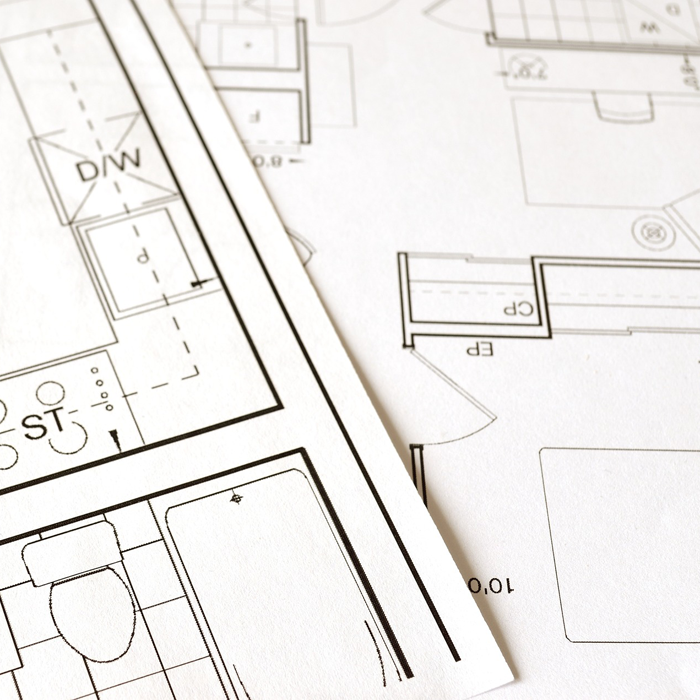
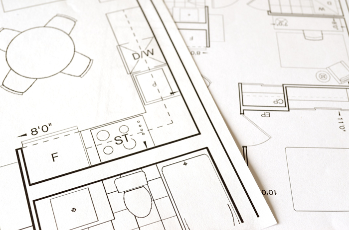
This week I spent quite a bit of time fine tuning design details – the garage placement, the driveway configuration, and where the walkout door from the basement will be. Each of these decisions were heavily based on the site.


Our site is super unique, and has some interesting challenges. These are some of the site related issues that have been guiding our design:


SLOPED LAND

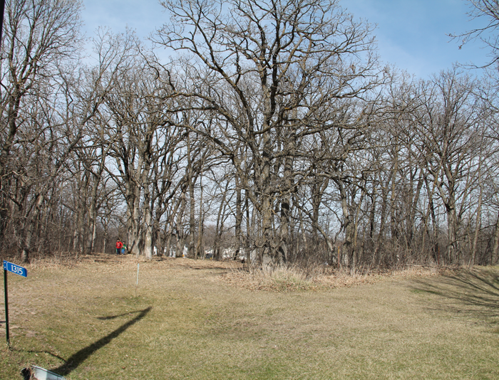
I’m sure that this particular parcel of land was passed over by multiple people solely because of its most dramatic natural feature – the slope. From the roadside there is a bit of flat land, but the slope down to the pond below is quite dramatic.


SETBACKS

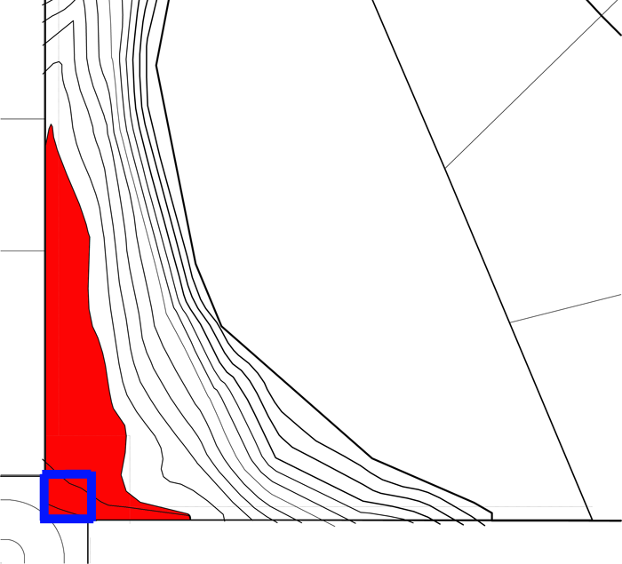
The red area shown in the above graphic is the ‘flat’ land. The portion of land closest to the road (shown outlined in blue) is not build-able, because of setbacks and easements. Right from the start, we knew that we would likely have a longer driveway than most because of these setbacks alone.


MANY NEIGHBORS

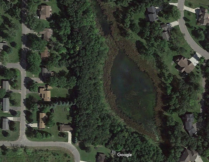
Our land borders quite a few properties – both on the south and west property lines and, visually, across the pond. 14 parcels border ours. While this could be seen as a major drawback, I have been working strategically on the design so that our privacy within the home is maintained.


DENSE TREES

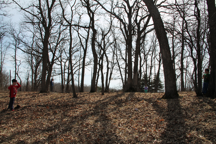
the kids standing by one of the many large trees that will need to be removed (2017)

One of the reasons we fell in love with our building site was that it was absolutely FILLED with mature trees: oak, maple, and other varieties. Sadly, there will be tree removal when the time comes to build. There is absolutely no avoiding that fact. By minimizing the overall footprint of the cottage, we hope to remove as few trees as possible.


EXPOSURE TO THE ELEMENTS

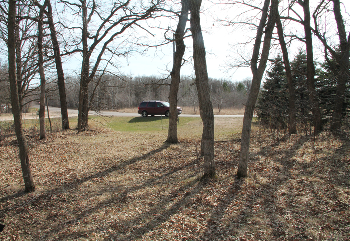
A view from our property, looking south. Our mini van is parked on the curved portion of the road.

An often overlooked, but important aspect of home design is the orientation it has in regard to the sun and wind. Because we live in a Northern climate, our strongest sunshine comes from the south. It is generally advised in this climate that you position your home with windows facing south (both for daylight, and for heating purposes in the winter). Thankfully, once a few trees are removed, we will have quite a bit of southern exposure.

It can get very cold in our state during the winter months – and the prevailing wind direction is from the northwest. I plan to rotate the cottage so that the garage can be used a bit for protection from those strong winds.


THE IDEAL POSITION FOR OUR COTTAGE

With all of these site issues in mind, I have narrowed down the placement of our cottage. I am working on finding the best angle of rotation and also determining how exactly the driveway will function – but we are getting close!


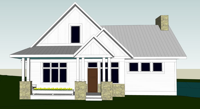
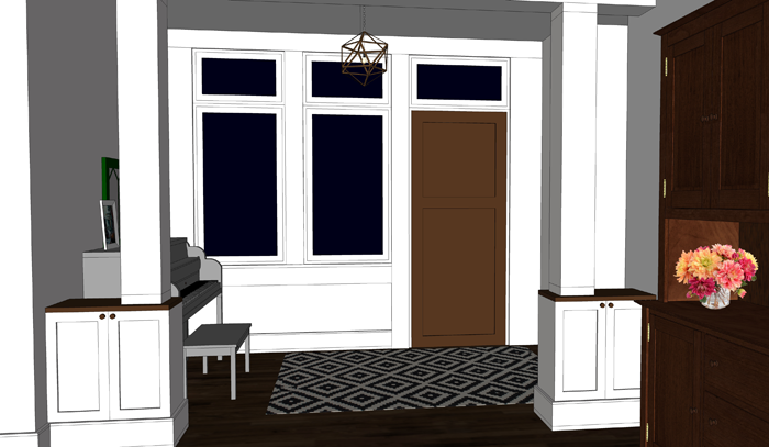
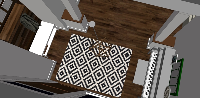
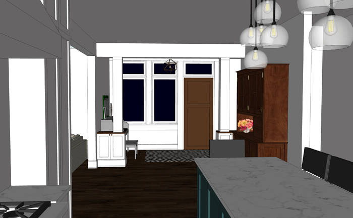
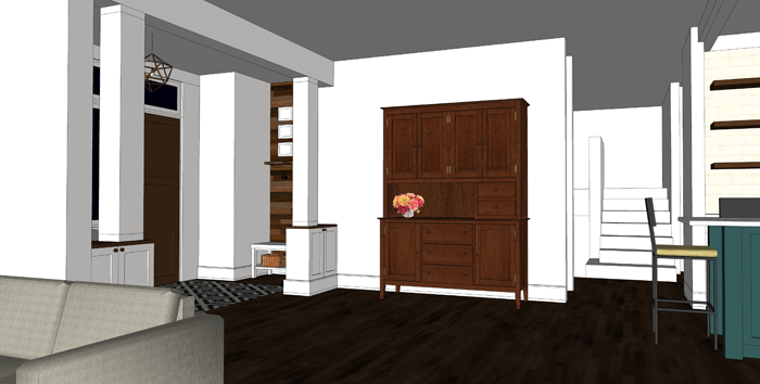
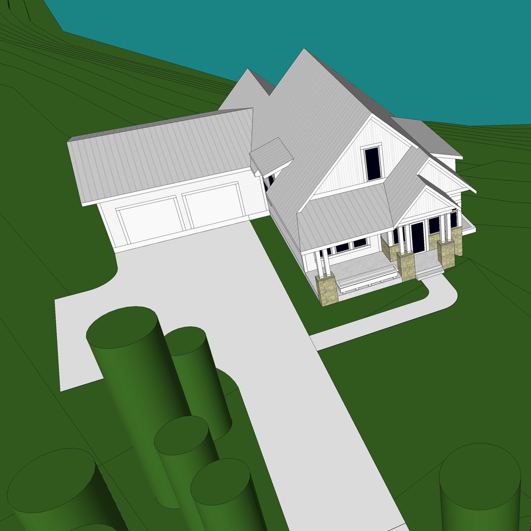
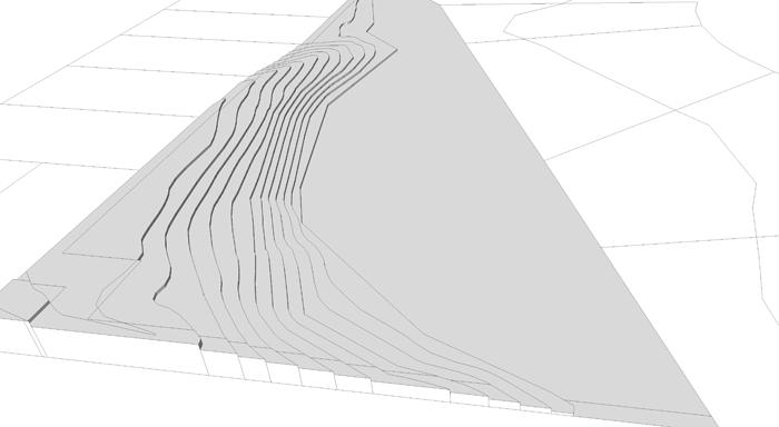
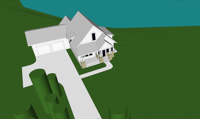
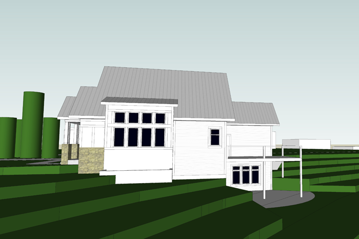
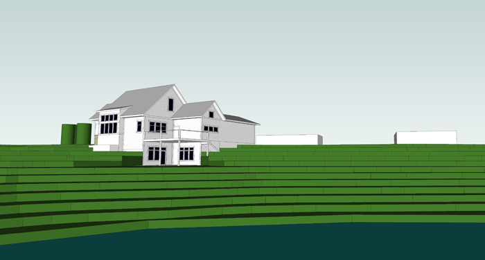
Just for fun, here are a few 3d images showing the cottage positioned on the land.

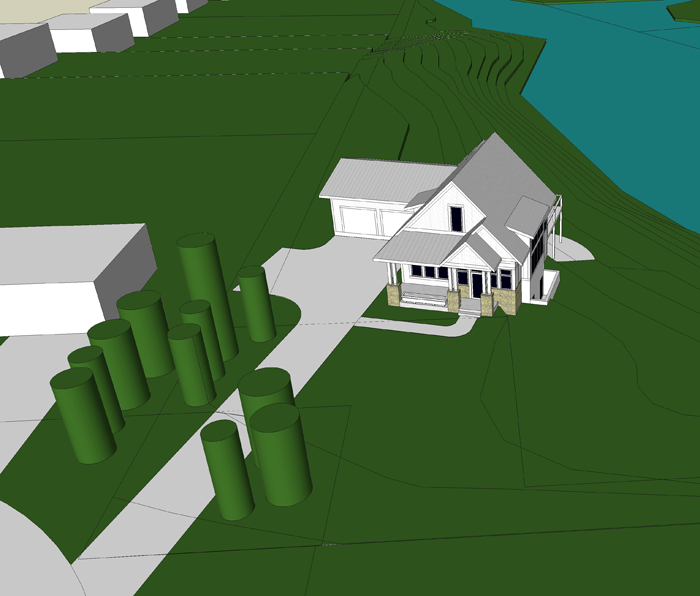
The cylinders are place holders for privacy trees (some of which are existing, and others that we hope to plant in the future. 


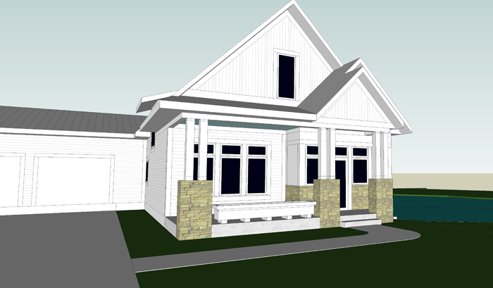
I worked a long time to find an appropriate position for the garage. I was sure that I wanted the garage doors to be set back from the front of the house/porch. For a while I had the garage rotated 90 degrees so that you accessed the doors from the side – but I eventually realized that this would not create ideal conditions for the driveway, making it both awkward and extremely long.  The garage is now accessed head on and set to the very back of the house so that it isn’t visually imposing.


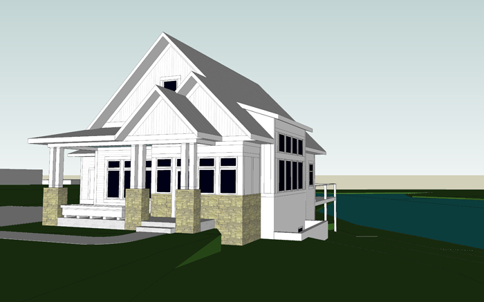
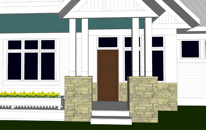
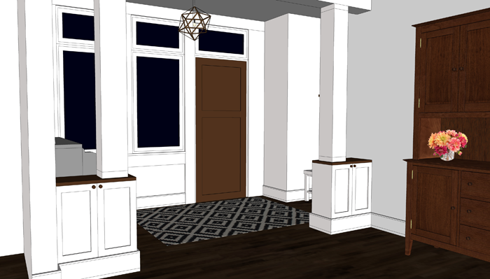
The wall of windows on the southeast elevation will let in a ton of wonderful natural daylight. It is one of my favorite features so far, and never would have happened if we hadn’t talked to our contractor about current building prices – which prompted us to make a major change to the design.


You can see from this image how the cottage interacts with the slope. There will be a bit of excavating and retaining involved in creating the lower level walkout patio.


As the weather warms up, I hope to make a trip to the land again – and maybe stake out the corners or use spray paint to get an even more visual perspective on what we will see out of each window of the cottage.

Exciting times ahead!


THE 4 QUESTIONS YOU SHOULD ASK YOURSELF BEFORE DESIGNING A NEW HOUSE

Designing a new house is an exciting and exhausting time for homeowners. It seems there are no less than a thousand decisions that will need to be made to create a house that is ‘just right’ for your family. And while each and every decision during the design process is an important one, there are four important questions you should ask yourself BEFORE you ever sit down at the drawing table by yourself or with a design professional.


1. WHICH HOME STYLES DO WE PREFER?

While it isn’t necessary to pick only one home style that your design MUST be based on -it is valuable to understand, at least generally, which types of homes you are drawn to. Are simple, clean lines your thing? Perhaps a modern home will be a good design guide. Do you love the charm of cozy houses? Consider the characteristics of the cottage or bungalow style. You can ask yourself if you prefer an open floor plan or one with more defined spaces, and if your family would benefit from one level living or multiple stories.

Each month I work through a series here on the blog entitled ‘Elements of Home’. I dive deep into what makes each home style unique, with the hope that the information can benefit you in determining which style would be best suited to your family’s lifestyle and preferences. You can access the series HERE.


2. WHERE WILL OUR HOUSE BE SITED?

Location, location, location. It is the mantra of real-estate. You can change a house in many ways, or in this case – build nearly anything you want – but you will not be able to change your home’s location once it is tied to the foundation; That is, unless you are willing to spend major money to do so.

You may be tempted to look at home plan books or online for floor plan ideas. And while these tools can be extremely helpful, you should at the very least have an idea of where your proposed home will be located before considering floor plans. Will you be building a new home in an established historic neighborhood? In that case, the sleek modern home with floor to ceiling panes of glass that you spied online may not be the best choice. Do you love the option of having a home with a basement level that you can walk out of? If so, you will want to make sure that you have a site in mind that will accommodate that type of setup – preferably somewhere with sloped land.

There are more detailed site related questions that you will need to answer, such as how the natural daylight will affect the interior spaces of the home – but these are questions for further in the design process.

3. WHAT DO WE NEED IN A HOME?

Generally speaking, we more easily identify our wants over our needs. Sometimes the two get mixed together, in fact. When designing a home it is very important to establish the difference. The needs are absolute must haves, whereas the wants are not as important – and can possibly be added at a later date.

Size is one of the most troubling aspects to determine. When considering home square footage, a variety of questions may arise. How many bedrooms should the house have? Will 1 bathroom be sufficient, or will we need more? What is a comfortable living room size? These questions about size can leave your head spinning – but they are some of the most important decisions regarding home design. A too small home can leave you feeling cramped; While a home too large will not be comfortable or cozy – perhaps leaving you with the feeling that you are living in a museum or office building.

As a guide to determine how much space you should design for your family, I have created a variety of worksheets – which can be accessed in THIS POST.


4. HOW MUCH CAN WE AFFORD?

It’s the age old question: How much is this going to cost me? It is best to consider the financial aspects of home construction well before you fall too in love with a design. If you speak with a loan professional about what a realistic budget for your project is, you will be able to make better informed decisions as the design process progresses. If you know you will be working with a fairly strict budget, you likely won’t be looking at the granite selection for your counter tops. Better to know what you can afford than to choose those expensive finishes only to be told you will need to downgrade the quality to something cheaper.

Another benefit to determining building budget early is that you can plan your project in phases. Perhaps the entire shell can be built straight away, with the main living spaces finished – and the basement or upper level left to be finished when the budget allows, in the future.

I lay out tips on ways you can save money on your new build in THIS POST.


If you have worked through each of the four above questions, you are well on your way to laying the groundwork for the design of your future home.

For your convenience, I have laid out these questions in a simple, one sheet print out – available in the RESOURCE LIBRARY. Search for the Preliminary Home Design Worksheet – and keep it handy for when you are ready to start thinking about designing your dream home.


7 CHARMING OLD HOUSE DETAILS MAKING A COMEBACK

Charming old house details, such as intricate woodwork and elaborate staircases, are making a major comeback!

When you think of an old house – you may envision rotting siding, squeaky floor boards, and bats in the attic. While these may very well be a reality, there are plenty of merits that old homes have to offer.

The seven charming old house details I’m about to share may have you rethinking your preconceptions. Who knows – you may decide to incorporate some of them in your home as well.

These seven old house details are finding their place in newly built homes

BUILT IN FURNITURE

These showstopping pieces add dramatic character. Because they are designed and built to fit with the house, in a specific space, they are becoming more and more popular with homeowners as storage pieces and as a custom way to add elegance and charm.

buffet


window seat


bookcase


INTRICATE WOODWORK

It’s true that slow growth timber was more readily available when the houses of yesteryear were being built. Craftsmen showcased their skills on detailed woodwork – from stair railings and wainscoting to window molding. Though it may never return to the intricacies of the Queen Anne Victorian era, an increased level of detail in woodwork is being re-introduced in today’s homes.

built in room dividers are one of the old house details that is making a comeback

craftsman woodwork


intricate stairwell woodwork


window trim


HARDWARE

There has been a huge resurgence in adding smaller vintage details to new homes, to give them an extra dose of character. One of the easiest ways to accomplish this is by utilizing decorative hardware, such as door knobs and cabinet pulls. They are generally inexpensive and readily available. Reproductions of these classic styles are also being made.

brass knobs


glass knobs


cup handle reproduction


WOOD FLOORS

Old houses have the best floors. The patina found on aged pine, maple, and oak flooring is hard to match – but even a newer wood floor is a beautiful addition to a modern built home. Wood floors are wonderfully adaptive, lending themselves to be laid in a variety of patterns.

diamond wood floor


charming character floors are more popular than ever

herringbone pattern


aged pine plank flooring


FEATURE FIREPLACES

Before the television became the center of attention, the fireplace was the focal point in most homes. Now, as a way to escape the constant bombardment of electronics, families are opting to gather together in a quiet space more often. In turn, homeowners are opting to give their fireplaces more detail and prominence.

Many new build houses are incorporating feature fireplaces, one of the old house details that is making a comeback

fireplace with shiplap above


arts and crafts fireplace


primitive fireplace


DECORATIVE CEILINGS

Gone are the years of popcorn textured ceilings and flimsy drop ceiling tiles. Homeowners are instead embracing a variety of decorative options, and looking to historic examples for inspiration.

a bright white kitchen with a bead board ceiling is a wonderful example of old house details that are making a comeback

beadboard ceiling


coffered ceiling


pressed tin ceiling


exposed structure


COZY NOOKS

Old houses are full of nooks and crannies – just think about grandma’s attic. The cocooning nature of small, set apart spaces is comforting to many homeowners. From built in dining tables to relaxing inglenooks, these interesting and intimate spaces are becoming more and more popular once again.

reading nook


inglenook


breakfast nook

Which of these seven details is your favorite? Let me know which you would love to try (or have incorporated in your home already) in the comments below.


RUSTIC KITCHEN IDEAS: MAKEOVER TAKEOVER FOR BEN & ADELL

The Makeover Takeover series focuses on helping my readers with bits of their own homes that are giving them challenges. Whether it is a room that they want guidance on styling, a floor plan that needs re-configuring, or they are stumbling with choosing an exterior color palette, I am happy to help. I offer solutions through virtual design and source links.

My first two Takeovers were both bathrooms – a modern Small Beachy Bathroom, and a Classic + Clean Bathroom remodel in a historic home. They were both met with wonderful reviews, and this time around I was excited to shift gears a bit and work on a kitchen remodel.

My friend Adell and her husband Ben live in a super adorable traditional home with their four young kids. Though the house has architectural features that really shine, the kitchen leaves much to be desired.

THE KITCHEN TODAY

The layout of the appliances is actually quite efficient. The sink/ DW, fridge and oven are arranged in the basic work triangle, which works well.  There is a portion of wall next to the fridge that juts into the space, but because of the way the floor steps down to meet the attached garage access, it needed to stay. For the most part, I wanted to focus on the cosmetic aspects of the room and on making it as organized as possible, finding a home for everything.


PROPOSED PLAN CHANGES

As you can see from the photos, this is one busy family! There are little reminder notes, and calendars on the cupboards, and the kids art projects are taking over the fridge. I wanted to streamline the organization of these bits, cleaning up the space.

I also wanted to maximize the work space, by finding a home for all of the small appliances and kitchen gadgets that are residing on the counter tops.

They have an open layout from kitchen to dining, and the counter extends so that there is space for seating on the dining room side. However, because of the position of the stove, it isn’t a safe place for the kids to sit.

There is a pantry that opens into the kitchen. The storage is nice, but it creates a bump out that leaves a strange little corner. The family has a small table positioned here, but as you can tell by the picture – it has become a bit of a drop spot. Again, I wanted to provide them with functional storage.

And last but not least, I wanted to clean up some of the strange finishes that the previous owners of the house have left – including the wallpaper border/ back-splash and the sheet linoleum floor that was PAINTED to look like individual ceramic tiles. What? Yes, it’s true.


FINISH INSPIRATION

Adell and Ben sent me images of kitchens and materials that they love – and based off of their selections, I would say that they have a very classic style, with traditional lines and a touch of rustic flair.

I was able to source a wonderful selection of products that I think would be amazing in their space. You can learn more about each product by clicking on the titles below.

SINK: This stainless steel apron sink will match the other appliances well.

FAUCET: In a simple black finish.

COUNTER TOP MATERIAL: Quartz in a simple white color (Arctic Lace)- a clean, fresh look to compliment the dark cabinetry.

RUG: Adds a splash of color to the space.

FLOORING: This beautiful porcelain tile looks like weathered wood. Set in a herringbone pattern, it adds a beautiful surprising detail.

LIGHT FIXTURE: A black industrial barn pendant set above the kitchen sink for extra task lighting.

BAR STOOLS: Simple and a bit industrial.

CABINETS: A custom cabinet maker can get specialty sizes, but this stock variety could save a bundle.

CABINET PULLS: These simple matte black pulls compliment the cabinetry without overpowering it.

CUTTING BOARD: A dose of natural walnut adds warmth and character.

WIRE BASKETS: These simple baskets are handy for storage, but because of their openness – don’t promote clutter.

ART: A fun kitchen is one you can dance in.

WALL COLOR: ‘Agreeable Gray’ from Sherwin Williams – the perfect neutral.


AND NOW FOR THE BIG REVEAL!

Can you see the changes? Even though the footprint of the room didn’t change – it seems so much more open! The colors are muted and neutral, which will blend well with the rest of the home decor. Just for reference, let’s take another look at the space pre-makeover.

Quite the difference, I think! Here are the details of what I did to achieve the casual rustic look that Adell and Ben love.

Obviously, all new cabinetry provides a fresh look. Because they are a darker gray stain that shows some wood-grain, I opted to go with a very simple quartz for the counters. Quartz is a wonderful low maintenance surface that is perfect for families with young children. The window above the sink was doubled in size, to allow a greater view of the backyard and let in more natural daylight.

The sink was replaced with a stainless steel apron variety. The large double bowls are very efficient. All corner cabinets in the kitchen have hinged doors that allow access to Lazy Susan storage.

Above the sink I hung a large industrial barn style pendant light. This will provide wonderful task lighting, and is also a focal point for the room.

I removed a window on the fridge wall, which allowed me to even out the counters and provide a more accessible spot for the microwave. The small shelf above the microwave is the perfect size for a cookbook or two.

Next to the fridge, I am proposing a framed piece of sheet metal that can be used to hang notes, calendars and even kid artwork. This wall isn’t as visible from other rooms in the house, making it the perfect location for those random bits.

Where the pantry used to be, I am proposing a more shallow base cabinet with pull out pantry drawers. This is efficient storage for canned and boxed goods, and it offers additional counter space. Because of it’s location to the entry from the attached garage, this area naturally becomes a drop spot.

There is no shame in that. Every house needs a drop spot! The key is to keep the space organized and efficient so that it remains useful and not cluttered storage. Baskets can be placed on the shelves for papers that need to be filed, bills that need to be paid.

The counter/bar seating near the range has been raised, for safety purposes.

With the addition of rustic wood corbels, this is now an attractive spot to eat an afternoon snack or do homework.

And immediately next to the bar, where a small cart used to reside, I am proposing an additional built in cabinet – to house the broom, cleaning supplies, and all of those fun kid craft materials.

The real masterpiece of the room though has to be the amazing wood-grain tiles set in a herringbone pattern. So beautiful and durable! Accented with a pop of color from a distressed bohemian style rug, these floors really come to life!

One last look at the completed space:

I’ve created a 3d animation of the kitchen makeover for a closer look. Click the play button below to view.


I think that this casual rustic kitchen design would blend very well with the rest of Ben and Adell’s beautiful home. Working on this project for them was a lot of fun!

Remember that this is a FREE digital home design consultation, which is available to anyone who subscribes to the Arrow Hill Cottage website. If you or someone you know could benefit from this service, simply email me with a few photos and a description of what issues you would like resolved.

If chosen, I will offer a solution + inspiration through 3d images and sourced items. Hurry though! I only have the ability to do one Makeover Takeover each month and the spots are filling up quickly! I have plans to eventually make this a paid service, so if you have been thinking of contacting me about a project and want to get in on the free deal, don’t hesitate!


This post contains affiliate links to products for your convenience. If you purchase via my links, I may receive a small commission at no additional cost to you. Thanks for supporting Arrow Hill Cottage!


READER SHOWCASE: MINNA + SCOT’S HOME

You’re in for a treat today friends! The Reader Showcase is where I feature the homes and home projects that my readers have tackled. I am constantly amazed at the talent and varied styles that each person has to offer!

Today’s talent is no exception. I first met Minna on Instagram. She posted photos of her absolutely stunning home, The Little Plaid Cottage, which is plump full of character. She is super creative and her husband Scot is super handy. They make quite the duo. I think you will agree!

Minna, please tell me a little bit about your home:

I would describe our home as a cottage. It is a single story 1,430 square foot house that has lots of charm, including a large front porch, built in bookcases, a floor to ceiling rock fireplace, cedar beams on 12 foot ceilings, and a brick surrounded cook-top in the kitchen.

It was built in 1991 on the outskirts of town, and sits on half an acre.

That front porch speaks to me. Looks like a great place to relax!

What is your personal design style?

If I had to define it, I would say cottage/farmhouse. I prefer to find interesting antiques to decorate with rather than just going to Target and buying the latest Magnolia pieces that are on the shelves. I love Joanna Gaines as much as the next person, but I don’t want my house to look exactly like everyone else’s house.

Antiques have history and tell a story. They have stood the test of time and have a beauty all their own. I love displaying vintage finds in my home and plan to enjoy them for years to come. I also love decorating with plaids & buffalo check, and tend to gravitate towards wreaths and white pitchers.


Explain your favorite remodel projects. What was done to each space?

We have done quite a bit of work to our current house during the 7 years we have lived here!

KITCHEN

Our kitchen has by far been my favorite remodel project to date. We started off with popcorn ceilings, a pantry cabinet that was limited to opening the full way because it would hit the oven handle, chipped tile counter-tops, original builder grade appliances, and a shallow kitchen sink with a rotted cabinet below.

Kitchen before. Charming, but very ‘vanilla’


The first thing we did was add a walk in pantry. We were able to carve a bit of space from the attached garage and include it in the kitchen. My husband did all of the framing, finishing, painting and even built custom shelving. I found some fabric from Hobby Lobby to use on the back wall in lieu of wallpaper. We installed matching tile and added a screen door, which may seem an odd choice for a kitchen – but it works for us for two reasons: 1. It adds charm + character, and 2. It forces me to keep the things inside clean and organized!

My goodness what a great idea! The pantry looks so organized.


I found a farm sink on Craigslist for $50. The price was low because it had a chip on one corner, but I knew that we would be under-mounting it and that the counter material would hide the chip. The sink literally sat in my garage covered in a blanket for two years while we saved up for the remodel.

I can’t see the chip, can you?


To save money during the remodel, we decided to keep the upper cabinets and update them with crown molding and new doors. I knew that I wanted glass for the upper cabinets, but also wanted to do an interesting design. My husband built a triple X design on the doors and we used wavy glass, which I love because it reminds me of something you might find in an old home.

Custom cabinet design. I love the look!


We also removed the middle cabinet door above the fridge so that I could add some warmth and contrast with baskets. I lined the backs of the glass front cabinets with contact paper from Dollar tree.

My husband converted all of the bottom cabinets from shelves to drawers. It is so nice not having to get on my hands and knees to find a missing Tupperware lid in the back of a dark cabinet anymore!

Let’s all just take a moment and appreciate how lovely their cook-top is. Such a happy place to create meals!


We got an amazing deal on our quartz counter-tops and my husband cut and installed them without ever having done it before. I have to say, I am married to a perfectionist – and they turned out fabulous! Since the cabinets and counters are both white, I decided to make the back splash a contrasting color and found bluish gray Arabesque tile from Home Depot.

The tile is gorgeous, and I really love all of the neutral accessories!


The final part of the remodel was installing wood planks on the ceiling, which added so much character. We have a large skylight in the kitchen that is a wonderful feature. The ceiling height in the room is only 8 feet but the skylight opening extends to 12 feet! To draw the eye up I found bird decals online, which we affixed within the skylight. They add a special unexpected touch.

How’s that for whimsy? And a chandelier in the kitchen? Yes please!


My husband Scot DIY’d so much of our kitchen and it saved us a ton of money! We would  not have been able to afford to do a full kitchen renovation had it not been for all of his hard work!


DAUGHTER’S BEDROOM

Another area in our house that I had so much fun designing and decorating is our daughter’s bedroom. For Christmas this year we gave her a whole new room. We painted the walls with Sherwin-Williams ‘agreeable gray’, and my husband installed board and batten on an accent wall for contrast.

Her armoire and nightstands were painted with Sherwin Williams ‘cityscape’. The headboard was an incredible Black Friday deal from Walmart. We got it for a steal at $59! I shopped various other stores – including Target, H&M, and Hobby Lobby – to pull the decor of the room together.

Such a soft and comfortable looking space!

I am most pleased with the A-frame bookcase that my husband built for the room. It adds so much visual interest to the space and is so fun to style!

This bookcase is a stunner! Fun looking + functional = major win!


What would you like readers to know about designing and styling a home? Do you have any tips to share?

Think about what you personally like and are drawn to, and not necessarily what’s popular in the moment that everyone else can go to the store and buy. You are a unique individual created by God to shine and share your own creative talents with others.

Scot made this cute bench for Minna as a gift years ago

Don’t get stuck in a mold with everyone else. Be your own person and display what’s important to you and that which speaks to you. I believe Edith Schaeffer says it best: “This place should be expressing something of yourself. It should be communicating something of you to your visitors, but it should also satisfy something within you. You should feel ‘at home’ here, because you have made it home with something of yourself.”


Do you have any remodeling / decorating plans for the future?

My immediate plans are to style the small guest bedroom, which used to be our son’s bedroom before he moved out. We also want to scrape the popcorn texture off of the ceiling in other rooms in the house. It’s a messy job, but it isn’t difficult and it really does make a dramatic difference!

Outside, we have plans to paint the front porch once the weather warms up and remodel our back patio – including the addition of an outdoor kitchen and fireplace.

This space is already pretty amazing. I can’t wait to see the new additions!

A few months down the road, I would love to tackle a master bathroom remodel. We tend to focus on one project at a time and at our own pace.

We are enjoying the fruits of our labor in this house and though we don’t have plans to move any time soon, I can envision us living in a smaller one or two bedroom home on a larger piece of property sometime in the future.


Thank you so much Minna and Scot for sharing your wonderful home with all of us! I encourage all of my readers to go check out Minna’s Instagram account HERE to watch the progress while she and Scot continue to remodel and make their house into a home that reflects their personality and style.


Now it’s your turn! Have you been putting your personal touches on your home? Maybe the entire house isn’t finished, but you are particularly proud of one room – I would love to see, and share with my readers!

If you are a blog subscriber, you are eligible! Simply email photos and a brief description to angela@arrowhillcottage.com for your chance to be featured!


FRONT ENTRYWAY DESIGN IDEAS

A front entrance for guests is a great feature to add to any home. It doesn’t need to be a large space, but having it laid out well is important. Today I am sharing the front entryway design ideas I have for Arrow Hill Cottage.

Although our home will have an attached garage, and our family is most likely to enter and leave in that direction, I wanted to make sure to include a straightforward front entrance – where we expect visitors to enter. I’m not sure about you, but our garage has a tendency to become cluttered and dirty far faster than any other space we own – and we don’t want our visitors to experience our day to day.


ENTERING FROM OUTSIDE

As you can see in this image, the front door will have a prominent position. Although the house is not symmetrical, your eye is drawn to the small gable above the door.

creating a charming front entryway

In case you noticed… yes, I am still #teamplanter, and it remains as part of the design, at least for now. If you have no idea what I’m talking about – go ahead and visit THIS POST to learn all about the debate.

The large stone pillars and double columns frame the view.  I’m sure there will be some sort of feature light fixture here also, but I haven’t made any decisions on that yet. And yes, I am dreaming of a light blue bead-board ceiling for the porch. Love.


cottage front entrance. Covered porch with sweet and simple front entry

I have chosen a solid wood door. Because there will be windows directly next to and above it (transom), I felt that including a smaller pane of glass within the door itself would complicate the arrangement. The windows should provide plenty of natural light (this wall will be south-west facing)


INSIDE THE ENTRYWAY

Stepping through the door, you are welcomed with a space approximately 6 feet deep by 12 feet wide. The room is partitioned from the dining room by a pair of built-in cabinets and columns.

front entryway with custom built ins and columns used to divide space

We will likely have our builder or cabinet maker create these cabinets and columns, but This Old House wrote a fantastic post about how you can make this a DIY project. I purposely chose to offset the built-in slightly from the alcove since the wall finish and the cabinet finish will be different. This will help eliminate a clumsy transition from cabinet to wall. The baseboard trim will help to tie everything together.

front entryway design ideas for our new home. Simple white bench in front entryway

As I mentioned in this post, we have found that with fewer closets we are less likely to hold onto items we don’t need. This entry is indeed the perfect opportunity to live that theory. Because most of our family’s shoes, coats and bags will be coming in through the back entry / mudroom, we won’t need much for storage near the front entry. Instead of using the recessed space as a closet, I am opting to leave the alcove open and instead will incorporate a bench with simple hooks and a shelf above.

simple front entryway design ideas

This alcove also lends itself to the inclusion of a feature wall. At the moment, I am thinking that beautiful rustic barn wood would serve as the perfect surprise. The feature wall will serve as a backdrop for a family photo gallery.

gallery photo wall in front entryway. front entryway design ideas for our new cottage

This post, from the blog Ivory Lane , has given me a ton of inspiration for the entryway gallery. I love the simple nature of the metallic frames, white picture mats, and black and white images.


ACCESSORIES + DETAILS

On top of the small shelf above the coat hooks, I envision some cute artwork that represents our family. These number squares are amazing.

cute front entryway decorations

image source


I also love sentimental signs and would love to work something like this into the entryway space.

front entryway sign idea. This simple phrase is beautiful and would be perfect in the front entryway of a home

image source


Opposite the bench area is where I envision our piano being placed. We own a low grade piano that is natural wood and wood grain veneer at the moment. I would love to paint it a soft gray color and decorate it with special accessories – such as the vintage green cottage window that I recently purchased at an antique store. I know there is some debate about painting pianos, but they make it look so easy on Pinterest, and I am really intrigued by the results.

piano positioned in front entryway

Nobody in our family is a concert pianist, but we do enjoy having a piano to tinker around on. In this location it is available, but set aside so that it isn’t in the way of other daily activities.

For the center of the room I would like to find a special light fixture. I am thinking something with a metallic finish, probably a hanging pendant.

front entryway design ideas. new home design

Perhaps something from this collection would work well.

wire framed pendant light fixtures for the front entryway. Front entryway design ideas for our new home

image source

The floor will require some sort of durable rug that will mostly protect the wood floors. I love the idea of a black and white patterned rug.

view of small and simple front entryway

This website seems to have a wonderful selection of rugs to choose from.


decorative features for our front entryway


ADDITIONAL ENTRYWAY VIEWS

And now for a few more views of the entryway. First, a view from above – one that nobody will ever experience in real life. It shows the overall space well.

front entryway floor plan layout


A view from the kitchen (standing near the stove) looking toward the entry. You can see the kitchen design in this post. The space between is the dining room, of which I am still working on designing. The only thing I know for sure is that I want to include some sort of antique hutch on the long wall.

view of front entryway from the kitchen


Another room that is still a blank slate is the living room. Besides knowing that I want to include a large sectional sofa for our large family, there are still a lot of decisions to be made here. This is a view of the entryway as seen from the living room. Again, that large open space will eventually house our dining table.

front entryway design ideas. open concept floorplan layout

I am really loving how the main level is laid out. The flow seems like it will work well for our family. In this image you can see the stairs leading to the bedrooms (up) and the family room (down). That blank spot at the landing is where the largest window of the house will be positioned. I’m excited to see the design of the stairs come together.

Maybe I will work on that next!

UPDATE: Our floorplans changed quite a bit since this was originally posted. You can see our revised design HERE.


PIN THESE ENTRYWAY DESIGN IDEAS

feeling inspired? Be sure to save this post for later!

front entryway design ideas. small space design solutions for your home. How to create a simple, small entryway design for your home

THE KITCHEN WORK TRIANGLE EXPLAINED

Have you ever spent time in a kitchen, maybe at a friend or relative’s house, that just seemed really awkward / difficult to work in? Something didn’t seem ‘quite right’ but you couldn’t put your finger on what it was? I have a guess about what caused the problem….

THE LACK OF A WORK TRIANGLE

What the what?! Has Angela lost her marbles? No. Well, not all of them anyway!

When it comes to functional kitchen design, the triangle is KEY. And I’m about to tell you why.

The quest for efficient kitchen design is not a new one. In fact, the idea of optimizing the layout of the kitchen in an educated way dates back to the 1920’s with a woman named Lillian Moeller Gilbreth.

As an engineer, psychologist and mother to twelve (TWELVE!), she had a very unique perspective to offer on the function and efficiency of the home.  In 1929 her ideas were introduced at a Women’s Exposition.

These ideas on motion and efficiency were groundbreaking and she was hailed as ‘a genius in the art of living’. It is Lillian who is credited with developing the basic work triangle.

Fun fact: She can also be thanked for other modern kitchen conveniences such as the foot pedal trash can, shelves on inside of fridge doors (including the butter tray), and wall light switches!

In the 1940’s, the University of Illinois continued to research kitchen efficiency and developed the fundamental kitchen design principles that are still in use today.


SO… WHAT EXACTLY IS THE WORK TRIANGLE?

The kitchen is an absolute workhorse in the typical American home. Imagine yourself in your own kitchen. Of all the things that go on in that space, can you agree that the primary tasks are carried out between the cook-top/oven, sink and refrigerator?

Three major stations – the sink, the fridge and the oven. THREE. The idea behind the work triangle is this: You are going to be walking between these stations repeatedly during your time in the kitchen. In order to produce efficiency, there should be no obstructions that could make it difficult to get from one station to the next. Likewise, the distance between the stations should not be so great that you tire of walking, or too close that if two people are working in the room together they are constantly bumping into one another.

Consider the center face of each of these stations as one ‘point’ on a triangle.  Those points and the space between them make up the work triangle.


image source

BASICS OF THE KITCHEN WORK TRIANGLE

The principles of the work triangle are used by architects and interior designers when creating residential kitchens. There are some basic rules that need to be followed for the triangle to work properly.

LENGTH OF SIDES: No leg of the triangle should be less than 4′ in length, or greater than 9′. The sum of all three sides combined should be between 13 and 26 feet.

SPACING: There needs to be adequate space between stations to eliminate congestion. The average distance of separation is as follows:

Between the fridge and sink stations: 4 to 7 feet of separation

Between the sink and oven stations: 4 to 6 feet of separation

Between the oven and fridge stations: 4 to 9 feet of separation

image source

OBSTACLES: Cabinets, counters, or other obstacles should not intersect any leg of the triangle by more than 12 inches. In addition, there should be no major traffic flow going through the triangle.

image source

WORKERS: The work triangle is best optimized for one person working in the kitchen at a time. Some of the efficiency will be lost if the triangle is shared by two or more people.


It should also be noted that a kitchen with a work triangle isn’t the ONLY option. If your space dictates that all three work stations be positioned along one wall, for example, it is not the end of the world. There are plenty of high functioning kitchens that do not employ these principles.

EXAMPLES OF KITCHENS WITH WORK TRIANGLES

I mentioned in a previous post that our new kitchen at Arrow Hill Cottage will utilize these principles – but since it isn’t built yet, I thought I would share a few images of kitchens that are rocking the triangle.

image source


image source


image source

So now you know! Next time you hear someone complain about their awkward kitchen, ask them if they know about the work triangle – or better yet, share this post!

READER SHOWCASE: CILICIA + JUSTIN’S HOME

Today I am introducing a brand new feature to the blog – THE READER SHOWCASE – where I share photos and information about projects that YOU, my lovely readers, have tackled! I know there is a ton of amazing talent out there, and am excited to show everyone in blog-land what you have been working on.

For the first installment, I asked my friend and fellow creative soul Cilicia to share all of the changes she and her husband Justin have done to their cute house. I think you will all be inspired!

Cilicia, please tell me a little bit about your home.

We live in a 2000 walkout rambler, nestled at the end of a cul de sac. It’s on the outskirts of town and feels like the best of both worlds (city and country). We have a happy view out our back windows and can enjoy both the sunrise and the sunset from our dining room table.

I love the detail they added on the garage. And that yellow door is a stunner!


What is your personal design style?

This is such a loaded question! My style has evolved so much over the last 20 years. I tried to figure this out myself early on in our home transformations, but found it rather hard to pick just one style to adhere to. I decided that I would start buying pieces that I loved, rather than pieces that fit an expected style. In doing this, you will find a mix of shabby chic, modern, contemporary, mid century and items that don’t have a place in any of those categories, in our home. To me this mixed style feels warm and inviting, while maintaining a clean look.

Please explain your favorite remodel projects. What was done to each space?

We have purchased 3 homes. Each of them have had our touch put on them. My husband and I tend to do a lot of the work ourselves, and hire out only the things we know need a professional touch. I tend to be the one who comes up with the design ideas, does the bulk of the painting, and helps with small projects. My husband is the man behind the scenes. He trusts the visions in my head and brings them to life.

These photos display some of the work we have done on our current house.

LAUNDRY


Laundry room before


Laundry room after – how amazing is that chandelier? Doing laundry in style!

MASTER BEDROOM


Master bedroom before


Master bedroom after – so cheery and bright!

LOWER LEVEL GUEST ROOM


Guest room before – just a plain old storage room!


Guest room after – I think anyone could be comfortable here in this space!

GREAT ROOM

The house also has an open great room space, which is probably the largest project we have tackled. The entire space was remodeled (except for the kitchen cabinets and counter tops, which will happen sometime in the future.) Changes include all new flooring, walls painted a more neutral color, and updated lighting throughout.


living space before

View of the living space after. I love all of the different textures and colors they used! Doesn’t it look cheerful?

The fireplace was one of the biggest changes in the space. The previous fireplace was large, three sided, and was awkwardly placed in the center of the room. Removing it really opened up the space – as you can see in the pictures.

We decided that we still wanted to have a fireplace, and carved out a nook at the end of our long dining room where we built a new fireplace. It has been an amazing feature in our home and is where we read and relax.

The decision on how to finish the fireplace took over a year to decide! At first we were set on putting rock on the outside, but I never really loved any that I saw. As time went on I realized that I actually liked the wood that we had up there, but it just needed to be lighter. Ultimately, we used a fake ship lap finish, created with very cheap wood boards that were white washed. We think it finishes the space perfectly!


Fireplace before – three sided and awkwardly positioned


Fireplace after – centered on an adorable reading nook


Close up of the fireplace and reading nook. Isn’t that refrigerator box ‘cabinet’ everything?! And… I happen to know that she reupholstered that chair on her own!


What would you like readers to know about designing and styling a home? Do you have any tips to share?

I am not a professional by any means; But after remodeling and decorating three homes, I do have some thoughts:

#1. ALWAYS remember that paint is an easy fix. Walls, floors, cupboards, and furniture are all only a paint brush away from getting a completely new feel.

She’s right! Just look at the difference that painting the walls made in the lower level bathroom of their house!

#2. Don’t be afraid to try something new. Most of what we have learned has come from trial and error.

#3. Patience!! This plays a huge role in a remodel of any kind. Whether it be with your husband, wife, children, contractors, or even yourself. Try and breathe. Trust me, you need to remember this tip!

#4. Put up the pictures. So often I hear people say that they wish that they could put pictures on the wall in a nice way. The fact is that they can! There are so many different outlets to find ideas on a wall layout. Just go to Pinterest or Google to learn how to arrange pictures on a wall. No matter how you do it, just give it a try. Family pictures add such an important personal dimension to a home!

#5. My last piece of advice is to enjoy the process. If you need to take a step back every once in awhile, do it. Each space needs its own time and generally we can’t do it all at once. Find a house you love and make a dream about all the things you want to do to make it home – then just pick one thing at a time and go for it!

A cute display in the laundry room. I love how she mixed in vintage finds!

Do you have any remodeling / decorating plans for the future? 

 We still have projects and I think we always will. I love to dream of ways to make our home feel more like “us.”  Some of the projects that I hope happen sooner than later include:

  • The addition of a three season porch to the upper level connected to our dining room. We entertain a lot, and I have already envisioned the parties, laughing, and conversations happening in that space!
  • New paint for our kitchen cabinets, to brighten them up and help update them a bit. We also would like to install new counter tops, probably in marble or granite.
  • New flooring for the entire basement, and an update to the basement bathroom.

Thank you so much Cilicia and Justin for sharing your wonderful home with all of us!

Now it’s your turn! Have you been putting your personal touches on your home? Maybe the entire house isn’t finished, but you are particularly proud of one room – I would love to see, and share with my readers!

If you are a blog subscriber, you are eligible! Simply email photos and a brief description to angela@arrowhillcottage.com for your chance to be featured!

HOW TO DECIDE WHAT SIZE HOUSE YOU SHOULD BUILD OR BUY

It’s no secret that houses come in all shapes and sizes. From mansions to tiny houses, and everything in between – there is a house that’s perfect for everyone. You may be wondering WHY there is such a discrepancy in size. Are all rooms in a mansion even used? How can people who live in tiny houses manage with such little square footage?

Generally speaking, the answer boils down to what the owners of each home feel they need + want in their property. Whereas the owners of the mansion may feel justified to include a large home gym, 15 bedrooms, and an Olympic style swimming pool in their floor plan, the tiny house owners may decide that they prefer to live with only the basics to be comfortable. The size of your home is truly a matter of preference.

Whether building a new home or buying, it is important to decide early on in the process what your needs + wants are in a home. And those decisions are made by conducting a home needs analysis. In this article I will explain how to conduct this analysis, which will help you determine not only what size of home you should buy or build, but also the quality and function you wish your home to provide.


Before we get started on the steps, a couple of notes:

Keep in mind that you are creating a ‘best case scenario’ list. It should be compiled without too much thought about the costs involved, at least for now. Use common sense though, this isn’t a fairy tale! You should also be thoughtful about knowing what is a true need, and which items are wants. This list will be a guide for you when house hunting or drawing up the plans for your new home, and you need to be willing to let go of some of the ‘wants’ should money or selection of suitable properties become an issue. It is very possible that you may not even be able to get everything in the ‘need’ category.
The goal here is to be mindful of how your family functions and translating that information into spatial needs.


STEP 1: WRITE A LIST OF THE PEOPLE WHO WILL BE USING THE HOME

Using the template provided below, make a list of each person or group of people who will be using the home. Think primarily about those family members who live in the house full time. Also consider family members who are part time residents, whether that is half of the year or for a week or two at a time.

In addition to family members, also include extended family that visits for holidays, frequent guests, co-workers (if you have a home business), and even friends if you do a fair bit of entertaining. It’s okay if you group the larger categories of people, such as friends, instead of listing them individually.

STEP 2: FILL THE PAGES WITH NEEDS + WANTS OF EACH PERSON/GROUP

Go through the list one by one. Under each ‘user’ title, you will see three categories: Needs, Wants, and Tends To.  Fill in these sections with information about each user, and be sure to add at least a couple of items in each column. Think thoughtfully and thoroughly. Ask each person that will be living in the home full time to provide input.

For example:

CHILD #1 (NAME)

NEEDS: quiet place to sleep, bathtub in the bathroom.

WANTS: separate playroom, own bedroom, close proximity to mom & dad’s bedroom.

TENDS TO: wake up early, play loudly, get messy, love the outdoors.

For people/ groups who are in the home only part time, some of the wants may be dictated by the homeowners preferences.

GRANDPA & GRANDMA

NEEDS: place to sleep when they visit that is not accessed by stairs, clearance for wheelchair movement.

WANTS: private guest bedroom with attached bathroom for easy access.

TENDS TO: have a hard time hearing, be cold, sleep in late, use the bathroom frequently.


STEP 3: MAKE A LIST OF ROOMS

Time to do some brainstorming. List all of the typical rooms and spaces you can imagine that at least ONE of the previously listed people/groups would use.

To help you complete this step, I have compiled a chart of the most common rooms in the American home and the average size/ square footage of each. This chart is available for free in the resource library.

Next to each room name, write down which people/group of people from the list of home users would utilize each space. Once you have completed this exercise, read back through the list and place a star next to those who would use the room on a DAILY basis, as shown below.

HOME OFFICE: Bob*, Nancy, Joshua* (co-worker)

STEP 4: DETERMINE THE MOST IMPORTANT ROOMS IN THE HOUSE

Read through the room name list one more time and count the number of stars attributed to each space. Write that number in the left margin next to the room name. The rooms with the most stars are going to be the most important MUST HAVE rooms in your home. I’m willing to guess that at least one of those with the most stars will be the kitchen. The rooms with the fewest stars are much less important. Perhaps two or three of these lesser important rooms/spaces could be combined into a multi-purpose room. (ex: a play room + family room combo)


STEP 5: THINK AGAIN ABOUT THE QUALITIES OF SPACE

To keep things organized, we are going to list these rooms once more – in chronological order. Use the ‘qualities of space’ worksheet linked below. Rooms with the most stars (as determined by the previous step) should be on the top of the list and rooms with the least on the bottom.

Begin thinking about comforts of the spaces themselves. On the line next to each room/space, write any important characteristics you imagine it should posses. You may find it helpful to reference the information gathered in Step 2.

Be thinking about light levels, proximity to other rooms, the noisiness or quietness of the space, and potential connection to the outdoors. Question whether the room should have designated storage, if views from the room are important, if it should be open or cozy, have a high or low ceiling.

You can be as detailed or general in this step as you would like. Remember that although we are not designing a floor plan during the home needs analysis, thinking about these qualities of space can help you determine the amount of emphasis that each room should have, and will serve as a guide when you eventually do begin the planning process or start your home search.

STEP 6: CONVERT ROOMS/SPACES TO SQUARE FOOTAGE NUMBERS

Now it is time to get out the calculator and determine the amount of square footage that should be allocated to each room.  It is important to note that the star count from the previous step will not necessarily dictate room size. Square footage is determined by multiplying the room’s width by it’s length. (ex: 10′-0″ long x 5′-0″ wide = 50 square feet).

Reference the chart from the resource library for average room sizes. Then get out a tape measure and think about these averages. Do they seem too large to you? Too small? If you currently live in a home or apartment, measure your existing rooms and jot down their sizes. Make note if those rooms feel comfortable to be in, cramped, or too expansive.

Once you have determined a room size that seems right for the way you live, write it on the worksheet in the box labeled SF (square footage).

STEP 7: COMBINE FOR THE FINAL NUMBER

This step will give you a basic idea of how large of a home you are looking to build or purchase. Simply add up all of the room square footage numbers that you calculated in step 6. Then add 10% for circulation (stairs, hallways, etc). The circulation square footage may be less or quite a bit more in the actual built house, but 10% is a good rule of thumb average to use when planning.

Example: For a cumulative 1,200 square feet (once the spaces are added) : Multiply 1,200 x .10 = 120.  Add 120 sf to 1,200 sf, for a final TOTAL of 1,320sf.

This final number will give you a general idea to the size that your family would feel comfortable living in. It is not a perfect science – the home you find or design may end up being slightly larger or smaller – but this square footage number gives you a great starting point.

I hope that with this information you will have a better idea of what size house you should build or buy. In future posts we will discuss how these spaces can connect in a thoughtful way, so be sure to keep your completed worksheets for reference!

BUFFALO CHECK HOME DECOR

This bold yet simple pattern is making a major comeback. Buffalo check home decor items can be found in abundance. Read on to learn what makes this pattern special, and why you may want to incorporate it as an accent in your home.


You may have noticed a bold check pattern showing up more and more. It has been featured on social media, as well as on popular TV shows. From upholstered pieces to tile work, it seems like this pattern is showcased just about everywhere! First considered a HOT design trend in mid 2016, it is still going strong a couple of years later.

This trend is Buffalo Check and, although the pattern may seem familiar, it is important to note that this isn’t your grandmas gingham or your uncle’s flannel shirt.


Buffalo check is created when two colors of stripe intersect, which adds a third ‘mixed’ color. The intersections create large squares of even size in all directions. Nowadays, bold + classic black and white is most popular, but Buffalo Check is available in a large variety of colors.

(image source)

If this photo appeals to you, then scroll on for more inspiration on this home design & decor trend!


WHAT IS BUFFALO CHECK

First of all, a bit of history. Or mystery. There is a fair amount of debate on where the original pattern came from. But many sources agree that it’s introduction to America came in the mid 1800’s. A designer at a Woolrich Pennsylvania wool mill, who was inspired by Scottish tartans, is said to have developed the style. He owned a herd of bison, and thought that the ruggedness of the patterned fabric matched the characteristics of the animal. It was an instant hit with workers and outdoors-men alike.


INCORPORATING BUFFALO CHECK IN YOUR HOME

Besides being a fashionable fabric choice, designers and homeowners are finding all sorts of creative applications to use this pattern in a modern way. Check out the fun ways that buffalo check home decor is being used.


Painted Furniture (image source)


Flooring 
(image source)

Curtains  (image source)


Throw Pillows (image source)


Painted Accent Wall (image source)


Tile Backsplash (image source)


And more!

Check out even more fun ways to use this versatile pattern HERE. And if you REALLY want to feel inspired, discover the Instagram hashtag #BuffaloCheckThisOut


GET THE LOOK!

This pattern is also readily available in stores and online, for very reasonable prices! Take a look at this collection of Buffalo Check Home Decor goodies. Certainly there is a piece (or two) that would look great in your home.

1 | 2 | 3 | 4 | 5 | 6 |

MY THOUGHTS ON THIS HOME DESIGN TREND

Personally, I love the simplicity of the black and white pattern. Because of it’s classic lines, the pattern works with a variety of house styles and interior design preferences. However, I do have a word of warning. Don’t go overboard with Buffalo Check Home Decor. Too much of a good thing isn’t a good thing.

For that reason, showcasing a single item in this pattern might be the best bet, allowing it to stand out as a statement piece. For example, paint an accent wall with the pattern, instead of an entire room.

Here’s hoping this home design & decor trend stays around for a long time. With it’s lengthy history and universal love, I’m betting it will!


This post contains affiliate links.  To learn more about my website disclosures, click here.

LOVE BUFFALO CHECK HOME DECOR? PIN THIS!