We talked with our contractor this week, and he is 95% sure that our project will not break ground until Spring of 2019. It’s a little sad to have to wait through another winter, but we are looking on the bright side and realizing that this extra time will allow us to make sure everything is just as we want it.
There are various bits and pieces that Craig and I just can’t seem to agree on, or that he claims to not have an opinion on. And since I had such a great response when I asked for upstairs bathroom layout ideas, I figured I could come to you all again for a little input.
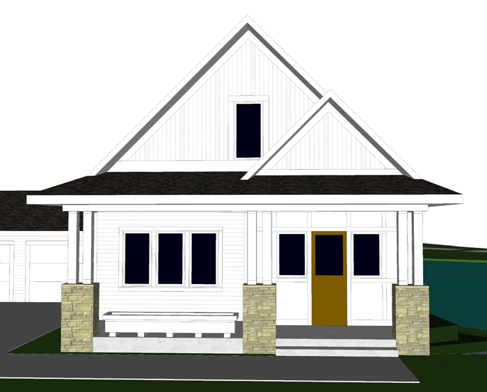
There have been a few exterior revisions, but mostly they are interior
I have been slowly fine tuning the design of our kitchen in collaboration with Cliq Studios, as well as determining the dimensions and design of our future harvest table – which I will share about in a future post.
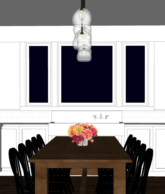
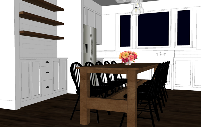
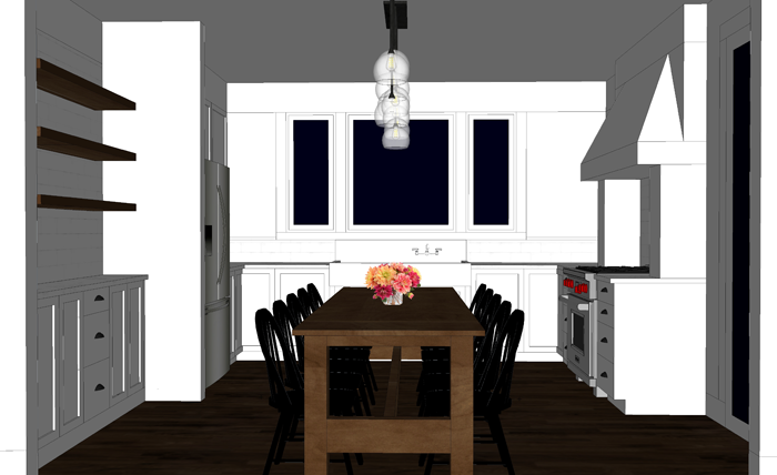
We changed the window sizes and style to fit more naturally with the farmhouse sink we will be restoring. The larger center window will be a fixed picture unit, and the smaller side windows will be operable casements.
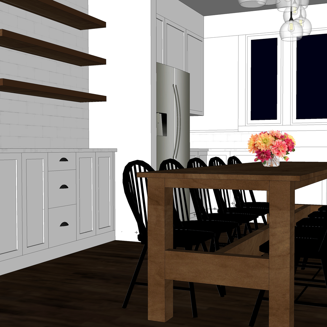
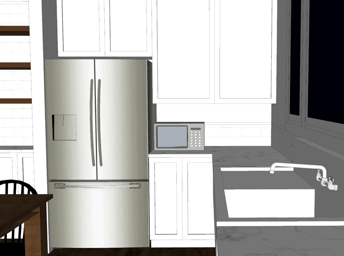
We also revised the cabinets to the right of the fridge. Initially I had them going all the way down to the counter. We eventually realized that we would like to have the extra counter space for small appliances, such as the microwave and toaster.
The cabinets to the left of the fridge are going to be shallow depth (12″ instead of the standard 24″). We see this area more as a built in buffet/ hutch space – to promote a sort of dining room within the larger kitchen space – since we do not have a separate room. The shallow depth allows more space for the dining table and chairs.
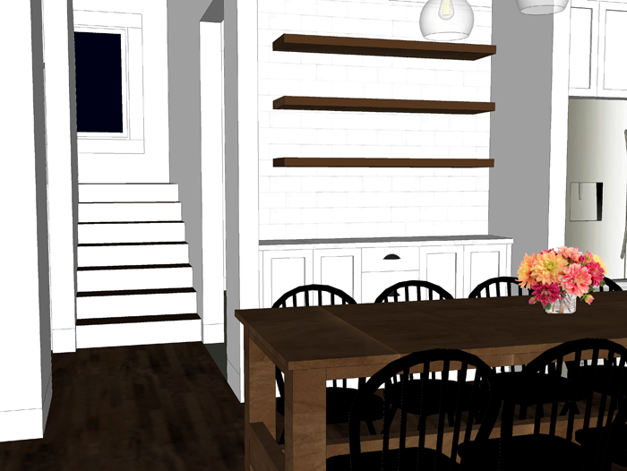
These are all changes that we think will add to the functionality and feel of the space. There is one more cosmetic option that we are having a difficult time deciding on. The ceiling.
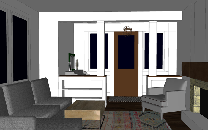
When you enter into the house, there is a straight view from the entry into the living room, and beyond to the kitchen/dining space.
The small entry/ piano area is somewhat divided from the living room with built in cabinets and columns.
I want to also have some sort of definition between the living room and kitchen, while at the same time keeping the floor space open. I started by adding a dropped soffit between the two rooms.
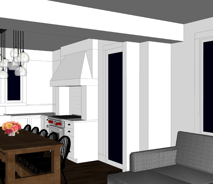
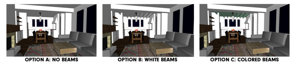
It helps to separate the spaces, but I still felt that there needed to be something else to define of space or the other. Since the living room already has a feature fireplace and built in book-cases, I turned my attention to the kitchen. Here is where we are having trouble deciding – the ceiling.
Part of my family prefers the smooth drywall ceiling in both the living room and kitchen, as shown here:
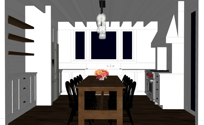
Others of the family, myself included, feel that some simple 2×8 or 2×10 beams (non structural) could be that last finishing detail the kitchen needs for definition. Potentially, tongue and groove boards could be used instead of drywall (layered under the beams) as a way to add more texture. I didn’t bother drawing each and every line, but you can get an idea of what that might look like from this inspiration picture (image 3).
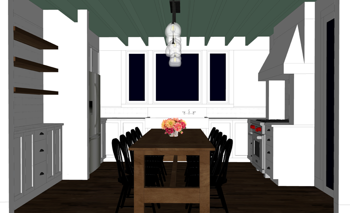
I prefer having the entire ceiling painted one color instead of keeping it natural/stained – mostly because we have wood shelves nearby, wood floors, and also a wood table. However, I saw this picture on Pinterest, and thought that a soft color on the entire ceiling might look great while adding a bit of color to the all white kitchen. Perhaps a light aqua or a pale grey. I’m not sure I’m brave enough to go for it though!
So, tell me. Which do you think looks best? Please comment on this post or vote via Facebook or Instagram. I’m really curious what the majority of you favors! Thanks friends!
One last look at all of the options, side by side, as seen from the front door.
With the floor space distance between entry to living room and kitchen & since you already have a partition built in to seperate the living room from the entry I would not add more structure via beams as this in my opinion takes away the ‘open’ feeling .& make the area seem ‘tight’ . Instead , by painting the ceiling white or a soft yellow , this would make the area appear larger . The yellow would compliment the other white & wood colors in the kitchen. Good luck with your decision & I am looking forward to reading opinions of others & their reasons for their choices . This site is definitely a learning tool for me?
There have been quite a few options via social media saying the same thing that you are. It’s possible that this truly will be a decision that gets made on site – as the project goes on. 🙂 thanks for your input!