Site Clearing | House Building Update No. 1

As step one in the construction of our new, custom designed cottage, we are starting site clearing. Our building site is essentially covered with mature trees, some of which are possibly over one hundred years old.


Arrow Hill Cottage Construction | Week 1

For future construction updates, please visit this link

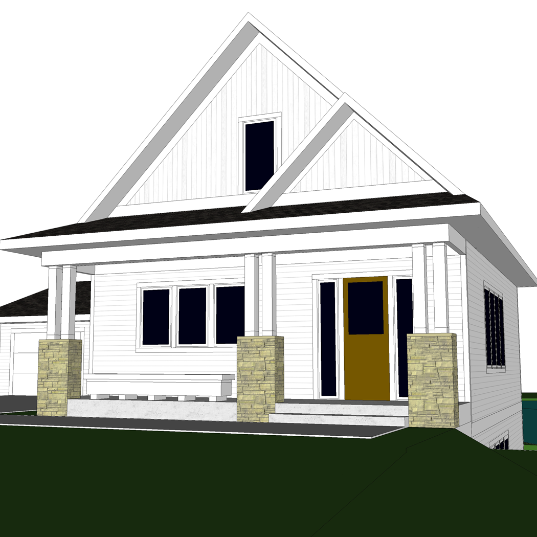
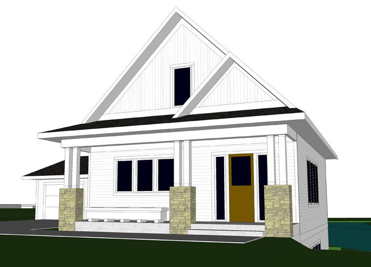
It feels a little surreal to be writing this post documenting the start of a construction process, after ten plus years of dreaming, planning, and calculating. And, in full disclosure, we aren’t even fully sure that everything will be going ahead just yet.

site clearing in preparation for our new house build

We are currently in a holding pattern, waiting on appraisal results. The bank wants to know what the value of our property, with the house we are proposing, will be worth when completed. This appraisal valuation will determine the amount of money they are willing to loan us for the construction.

Ideally, we would not have to go through the bank at all. Yet, as you are probably aware, building a brand new house is quite the investment. Knowing that we are planning to live in this house for hopefully the rest of our lives, we are willing to put more money toward it upfront.

However, as mentioned in a recent post about how to save money, we are a frugal pair. Spending this large sum of money is scary for us, and we want to be sure we are doing things in a financially wise way. Being guided by emotions alone could get us in trouble.

cutting down trees on the building site

So, for now, we wait to hear back. In the meantime, we want to be productive and moving in a forward direction. And so, this past weekend we started clearing the site.


NATURAL FEATURES OF THE SITE

Our building site features over two and a half acres of mature trees. Mainly, species of oak, maple and aspen. The land slopes toward a 6 acre pond. It is an incredible setting, and we absolutely want to be mindful of the unique natural features during construction.

building site with many mature trees

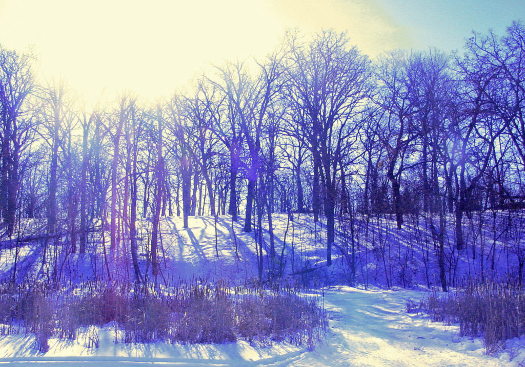
The photo above was taken many years ago, when we first purchased the property. Standing on the frozen pond and looking toward the land, one can get a clear view of the site’s beauty.

You can read about why we chose the name Arrow Hill Cottage for our property in this post. Take a virtual tour of the site by checking out this post.


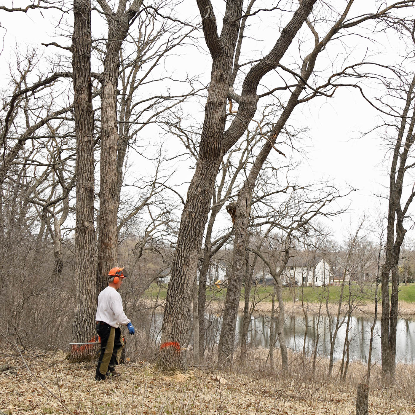
SITE CLEARING FOR OUR NEW HOUSE

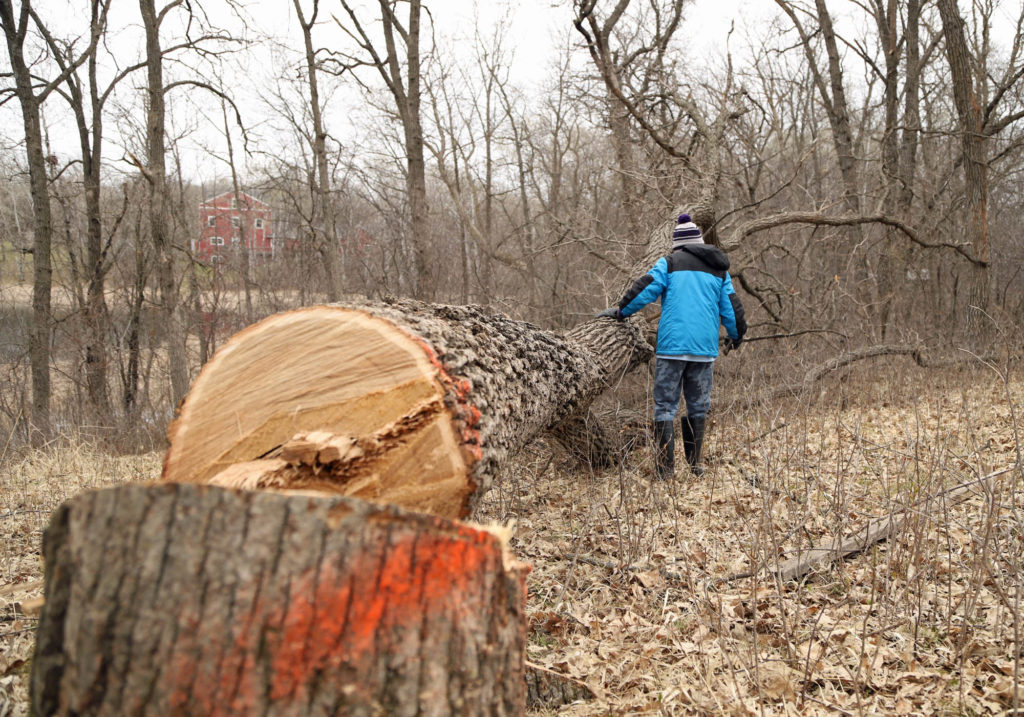
Though it is sad to think of having to take down any tree, removing a hundred year old tree is that much more painful. However, there is simply no way around the fact that some trees will need to be lost in order to build a house on this particular site.

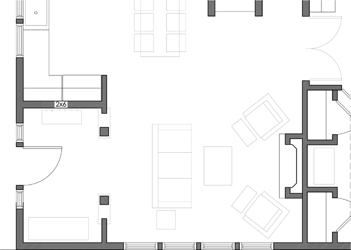
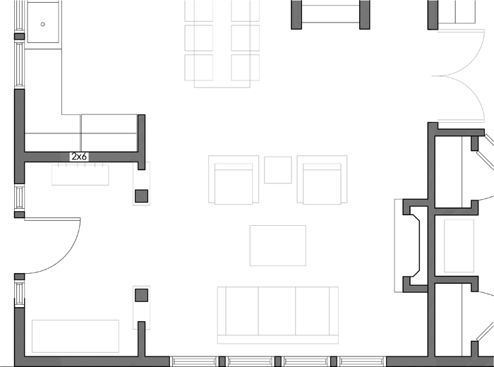
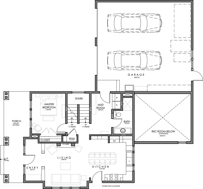
I was very careful, during the design process, to minimize the house footprint. This decision will reduce the number of trees that will need to be removed.

using a chainsaw to clear building site

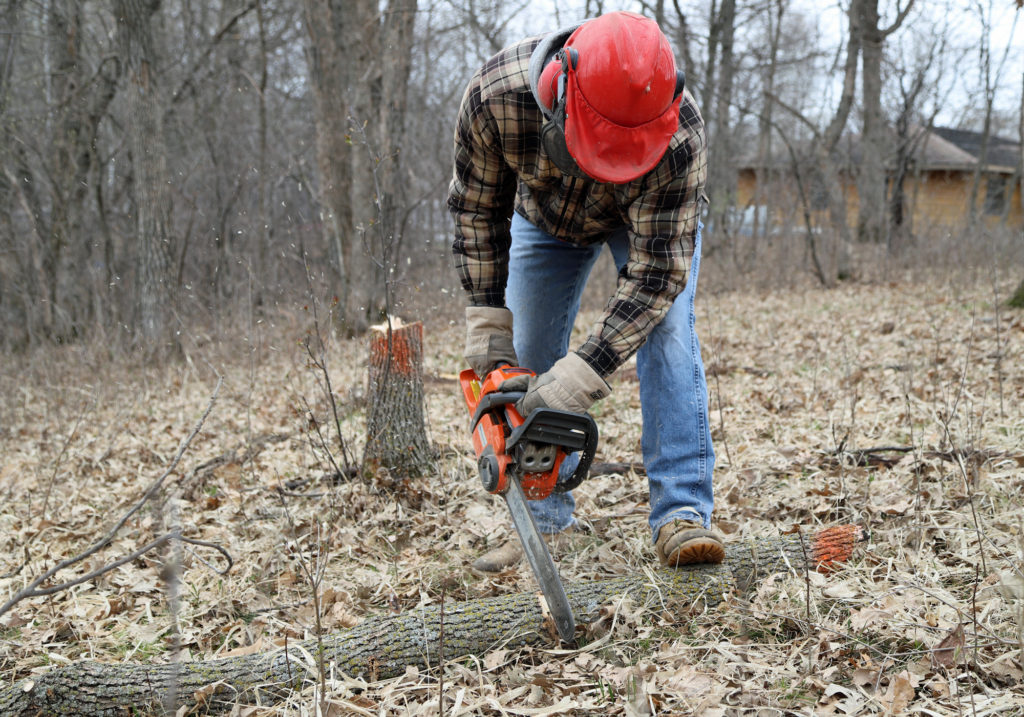
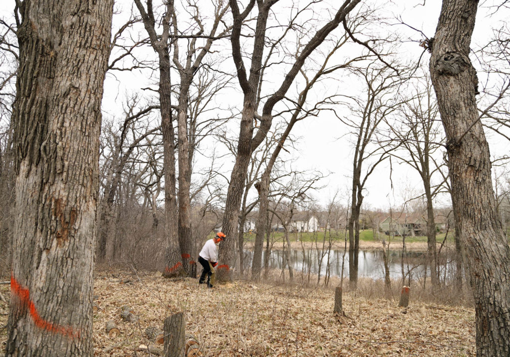
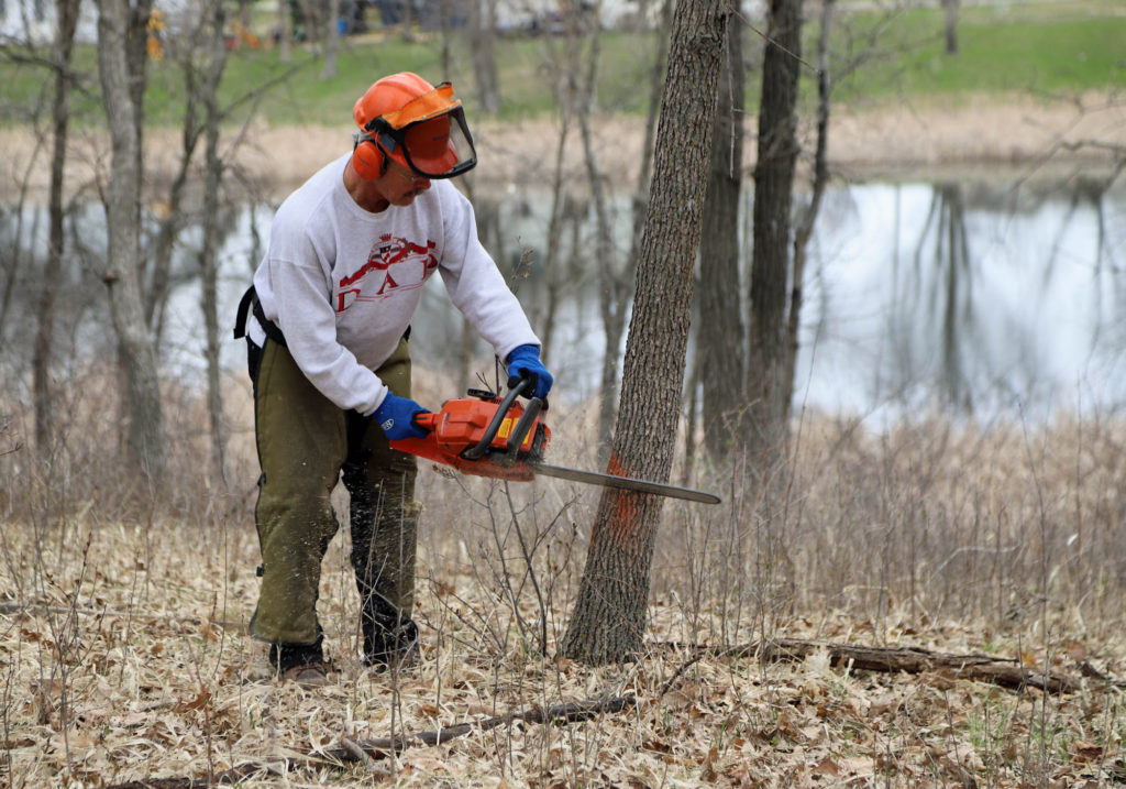
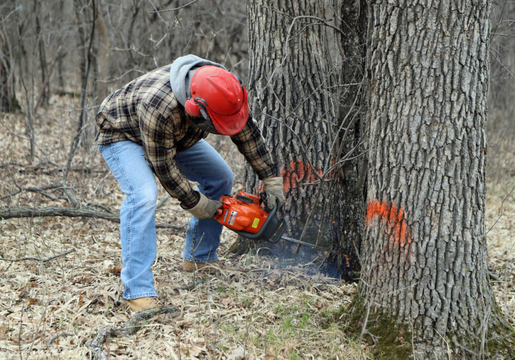
We walked the property with our contractor and the excavator, to determine a general position for the house. They marked the trees that they felt would be within the footprint, or would be too close to the finished house. Then Craig and his dad set to work.


CUTTING TREES DURING SITE CLEARING

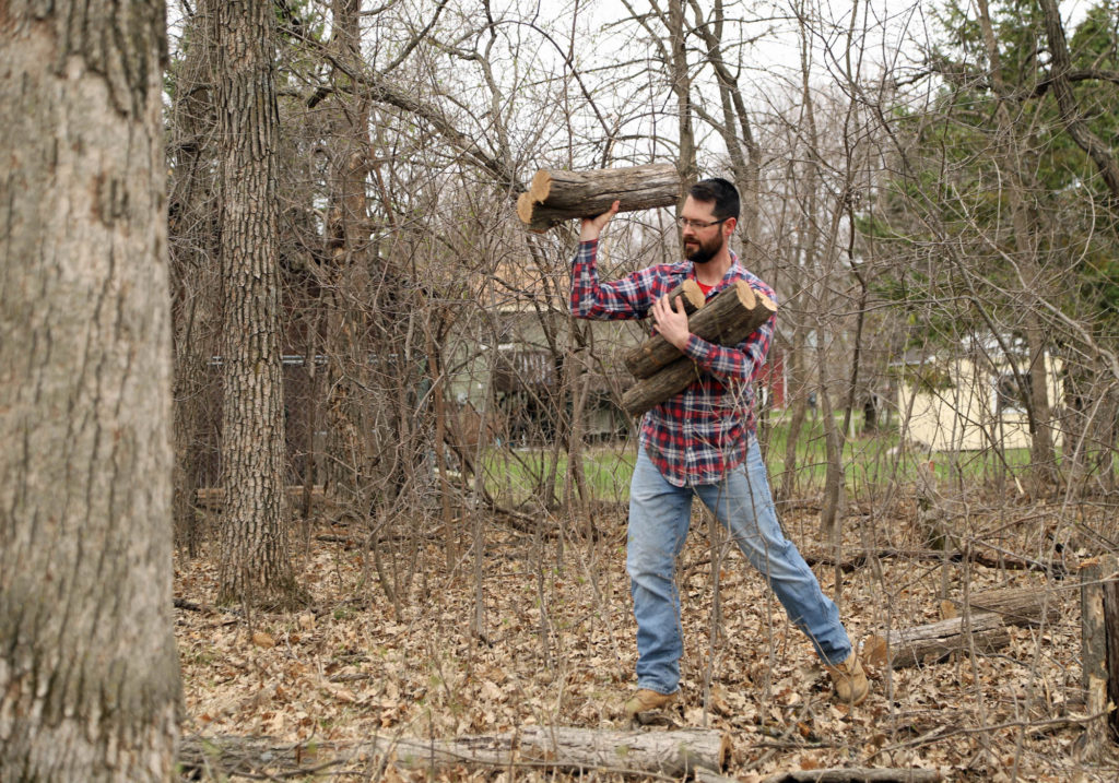
Thankfully, Craig’s dad has a lot of experience with cutting down large trees. Craig’s parents continue to heat their house through the winter by using a wood burning furnace. It definitely isn’t the most convenient method of heating a home, but the warmth is unsurpassed.

Instead of paying a tree removal company to come and cut down the trees, we were able to do a trade of service. By helping us remove the trees, we compensated Craig’s parents with wood that can be used to heat their house. A win for everyone involved.

preparing to build on the property

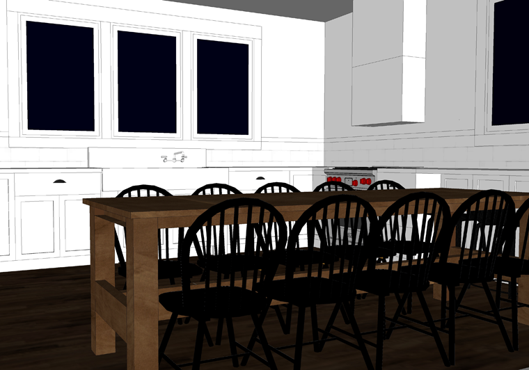
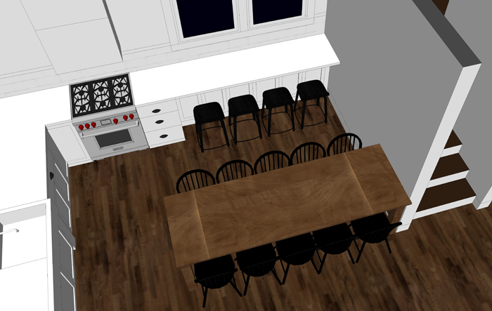
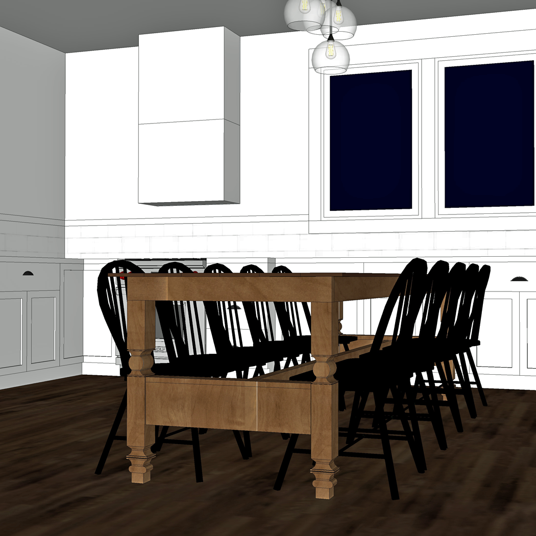
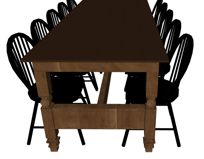
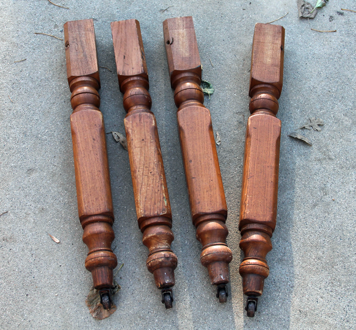
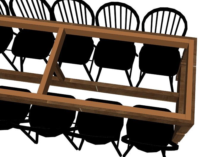
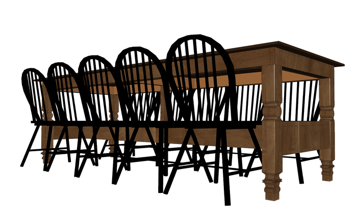
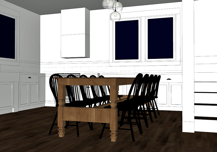
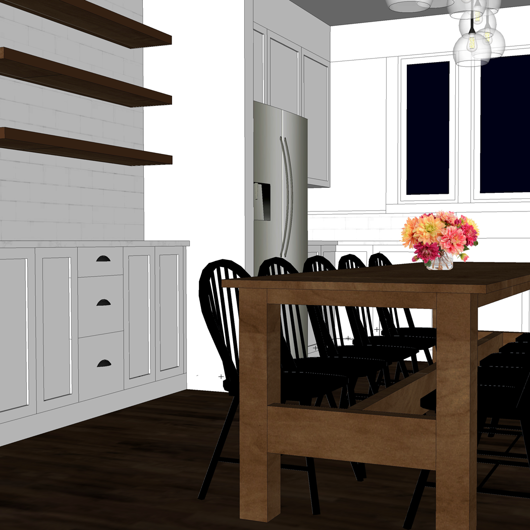
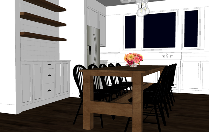
A few of the very large oak trees have long, straight trunks. We hope to find someone who is able to mill these into boards. These boards would then create a very special feature piece for the finished house – a harvest dining table.

one hundred year old oak tree will become a table


CLEARING THE SITE VIDEO

Though it was sad to cut down such large trees, it was an amazing site (and sound) to watch.


GETTING THE KIDS INVOLVED

This process is so special for our family. Our boys especially are very interested in how the house will come together. They want to be involved as much as possible, and clearing the site offered a wonderful opportunity. Our oldest and youngest son joined us this time, while our middle son helped out by watching the girls.

Keeping the kids involved in the building process

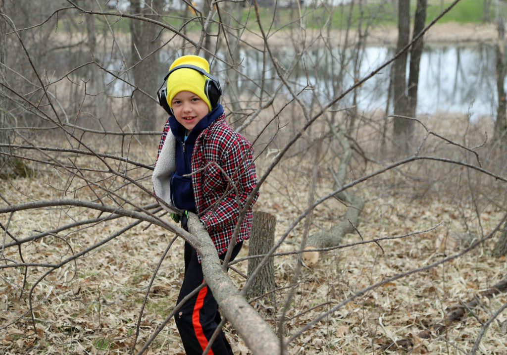
They got a kick out of trying to use semi-dulled axes to cut at a few of the smaller trees. Hauling away the branches and loading the logs into grandpa’s truck were a couple other things that kept them busy while the adults were doing the heavy work.

hot chocolate break

Of course, there is always time for a short hot cocoa break! Showing our children the hard work that is involved in building a house is invaluable. We hope that these memories will stay with them throughout their lives. And I will cherish these photos.


COMING UP NEXT

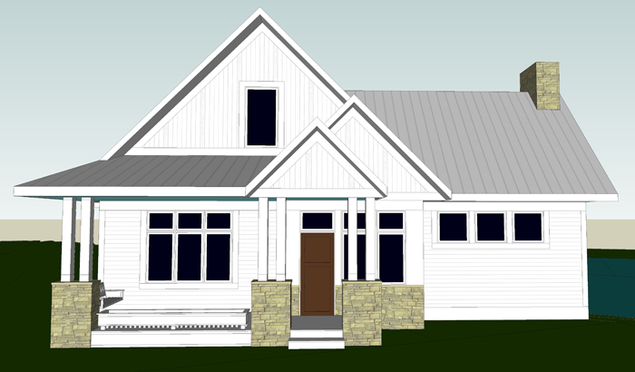
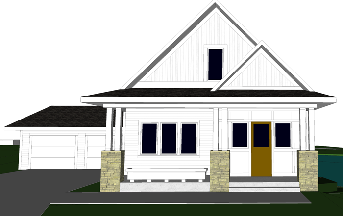
After a few more trees are cleared, and we are able to mark out the property lines and the setbacks, we will be able to position the house. There is still a bit of a question as to the most suitable angle for the house.

huge oak tree felled from our land

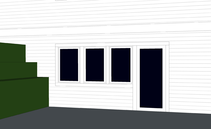
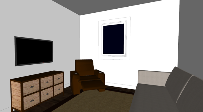
On paper, it made sense to angle the cottage so that the porch was oriented toward the road. When standing on the site, however, there is an argument to be made in favor of rotating it so that the long dimension faces the pond. This would give the best pond view out of the living room window. It would also, according to the excavator, be less expensive when it comes to positioning the walkout and the amount of retaining wall that would need to be used.

site clearing by cutting down large oak trees

The trade off of this rotation is that the view from the kitchen sink wouldn’t be ideal. It’s likely we will end up splitting the difference between both rotations.

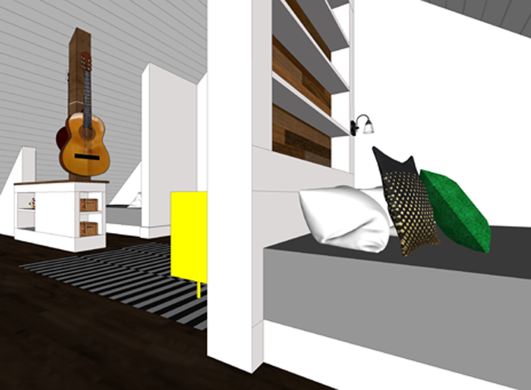
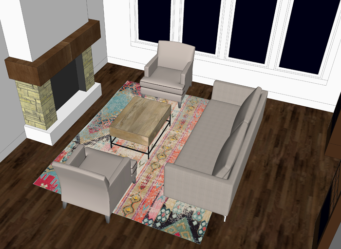
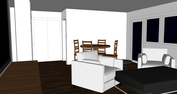
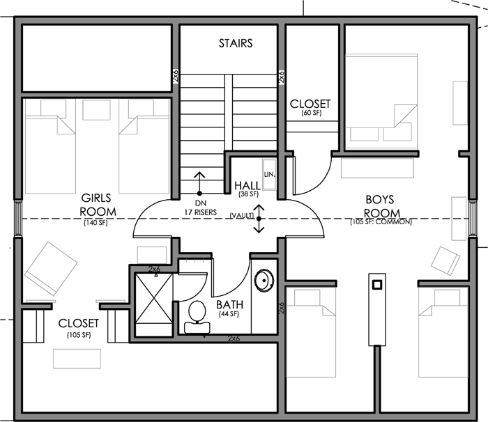
The positioning of the cottage is going to be pretty important. It isn’t like a wall color that can be changed in a few years!


OTHER SIMPLE HOUSES BEING BUILT

If you enjoy following people who build their dream homes, consider checking out these fun blogs!

Little House Simple Living

The Sunny Side Up Blog


PIN THIS POST

Keep this post handy, as a shortcut link to our entire building process! It should be a pretty exciting and busy summer!

Preparing the building site for our custom designed cottage


Design Elements | Inspiration For Our New Cottage

Today I am excited to share with you a few of the design elements we are planning for our new cottage. Hopefully, by the end of this post you will have a good sense of what our finished interior space might look like.

Home design ideas for a newly built cottage

OUR FOREVER HOUSE

To be honest, I haven’t given a ton of thought to the interiors of any of the houses we have lived in. I think, in part, it is because I knew we would only be living in them temporarily.

This house though, being our forever house, has caused me to think more critically. We want to be very intentional about what we surround ourselves with.

antiques used in a cottage style home. vintage scale

MIXING OLD WITH NEW

Though we are building a brand new home, we feel it is important to incorporate items that have seen a bit more life, and wear and tear. The reason for this is twofold. Number one, we don’t want to feel that we can never touch anything, or be worried that our kids might break something.

Number two, we feel that a new house can seem a bit bland and stark if everything is perfect and new. A mix of found items can really help to give the interiors a casual, comfortable, and lived-in and vibe.


MAIN DESIGN ELEMENTS

There are four main categories of inspiration that I will be discussing: geometry, color, texture, and specialty items. They all work together to form an overall design style that is simple and orderly while also comfortable and casual.

Geometry

As an architecture major, I am fascinated with geometry. I love how simple lines and shapes can come together to form something interesting and beautiful.

One example of how we plan to incorporate geometric design into our new cottage is the five panel doors we have chosen. They mimic the pair of wooden doors we refinished last summer. I think they have a classic look that will pair well with the simple lines of the cottage.

Design elements for a comfortable cottage feel

This window also displays basic, yet interesting geometry. I saw it out of the corner of my eye one day when I was browsing through an antique shop. Though it was priced higher than I wanted to pay, I could not get my mind off of it. Eventually came home with me, and we have loved it ever since.

Color Scheme

When it comes to color theory, I am definitely one who prefers a mostly neutral palette, with pops of interesting color. Knowing what colors to ‘pop’ with has been something I have slowly learned through the years.

In fact, the realization of the color scheme for our new house came to me a bit by accident. A few years ago I purchased this simple pillow. It kind of spoke to me, even though I couldn’t really put my finger on why. The pillow has been a mainstay in our living room since that day, and every time I look at it I smile.


Interior design ideas incorporating neutral decor with pops of color

It wasn’t until recently that I realized that the pillow brings a couple of my very favorite design elements to life. The geometric pattern is simple, and pleasing to the eye. But also, the colors themselves are those I tend to gravitate toward. With the exception of the tan color, which I would replace with a mustard yellow.

Without even knowing it, I have been accumulating items with these colors and bringing them into our home.

This rust-red pitcher, for example, adds just the right amount of color. And the small lithograph print features many of my favorites.

vintage red pitcher


Texture

I am a huge fan of texture. More specifically, neutral texture. It is one of the reasons I am a sucker for a woven basket or a macrame wall hanging.

textured home decor

This pillow is one of the ways that I added a bit of texture to our home decor. I created a blog post a while back which details the steps to make one for yourself. I will be re-doing the video link in the near future. There have been people who have tried to make the project and have commented that the video could use a few more step by step instructions.

diy textured knot pillow

Other textured items might be really subtle. This pair of white bowls, for example, have a small bit of ribbing around their rims. I think this tiny bit of detail really adds visual interest to an otherwise ordinary piece.

vintage design elements incorporated into a brand new cottage home


Special Items

A house filled with generic, store bought items will not have the same feeling as one adorned with well loved items. Displaying items that bring you joy or remind you of someone you love is the perfect way to make a new house feel like home.

We have special items of all types that we plan to utilize at our new cottage. The cabinet in this vignette, for example, is one of a set that my husband painstakingly restored this past winter. He put so much effort into them, and they are absolutely stunning!

A cream can, saved from the run down farmstead of my great-grandparents, will become a special conversation piece in the cottage.

vintage cream can


This crate has been used as a toy box for many years by our children. We plan to bring it with us when we move. Although it may eventually be filled with different items, it will forever hold the memories of a time when our kids were younger and enjoyed it as a toy box.

BPS paints crate

We are so excited to see all of these design elements come to live in our new home! If you would like to be the first to know about the construction timeline, be sure to subscribe to my email newsletter. I will be sending out house information there first. Also, consider subscribing to the Arrow Hill Cottage YouTube Channel. There, I plan to post a house building update once per week, as soon as we break ground.

Thanks for stopping by! I enjoy sharing this journey with all of you!


TAKE A CLOSER LOOK

In this video, I do a little walk-through of each piece in the vignette. I describe the design elements and talk about each piece and how they represent the elements.


PIN THESE IDEAS

cottage design elements


MINIMALIST HOME IDEAS FOR OUR NEW BUILD

As we work toward simplifying our lifestyle, we have also thought of ways that our future house can be more minimal. We have adopted the following minimalist home ideas for our new build.

minimalist home


SIMPLE + SMALL DESIGN

The first minimalist home idea that we incorporated in our design is related to the look of the house itself. We wanted the shape of the structure to be as simple as possible. The end result is a basic rectangular form, with a high pitched single gabled roof. An added porch gives the exterior a bit of extra charm.


simple cottage exterior

Overall, we will have approximately 2,000 livable square feet, including the basement. For a family of seven this equates to about 285 sf per person. Considering the average in America is closer to 800 sf per inhabitant, our cottage is on the small side. Of course, compared to homes in other parts of the world it could be labeled as a large home.

small home minimalist floor plan

We have made the best use of every available square foot by configuring the main level in an open concept format. The design also incorporates many large windows as well as white ceilings and walls. By doing so, the interior will actually feel quite spacious.


SHARED BEDROOMS

Our home will essentially include three bedrooms. The main floor bedroom, for Craig and I to share, and two bedrooms for our kids. All three of our sons will be in one of the upstairs bedrooms. Our two daughters will be in the other.

shared kid bedroom minimalist home idea

We believe it is a good life lesson for kids to learn to share a room. Though, we do understand that they will also appreciate their privacy as they reach the teen years. We were able to accomplish this by carving out small ‘sleeping nooks’ for each of the boys. You can read more about the boy’s bedroom design in THIS POST.

minimalist home shared kid bedroom


LIMITED STORAGE

Of all of the minimalist home ideas, this one quite possibly gets us the most questions. People are sure that we will need more closets and places to store things. We are of the philosophy though, that the less storage space that is available, the less inclined we will be to keep unnecessary items.

small minimalist floor plan

Each of the bedrooms will have a closet, and there will be a cabinet in the mudroom for misc. items such as a broom and vacuum. There will also be storage in various cabinets throughout the house. These few storage areas will be for items we use on a daily basis. For long term storage, such as seasonal decor, there will be access to space under the eaves – through the girl’s closet.


FUNCTIONAL KITCHEN, WITHOUT THE EXTRAS

I’ll admit that when we first began designing our dream house, it featured all of the standard luxuries that modern day kitchens employ. We then began to simplify the design and think carefully about the features we really needed. Interestingly, that large center island was not a priority. Neither was a dishwasher. Though some people might think we are crazy for not including one, we know we don’t need it. We have lived our entire lives washing dishes by hand, and have never missed the extra appliance.

simple minimalist kitchen

And, just like the limited storage we employed for the rest of the house, we thought a lot about what our needs were for kitchen storage. Because of this, we determined that we would need only very few upper cabinets. And that stylish walk-in-pantry? It isn’t a necessity in our simple home design.

Instead of placing our dining table in a separated room, it will be accessed directly off of the kitchen. This is one of my favorite minimalist home ideas incorporated in our new home design.

TECHNOLOGY FREE ZONES

Though we will have modern technology in our home, we are planning to limit the accessibility for a variety of reasons. Primarily, we don’t want technology to be the main focus. Without the distractions, we will be able to spend more time together as a family when at home.

simple minimalist living room

We will have no TV in our main floor living room, or anywhere on the first (and second) floor for that matter. Instead, we will be installing speakers so that we can listen to our favorite music.

In the main living space will be one central charging station for all of our devices. We recently refinished an ANTIQUE CABINET that will be the perfect home base for all of the cell phones, ipads, and laptops.

minimalist home ideas for new construction

The devices will be left in this cabinet overnight, since the kids will not be allowed to take any electronics up to their bedrooms. We feel that this rule will allow us to keep an eye on their internet use, for safety reasons.


ONE FEATURE THAT ISN’T SO MINIMAL

The BASEMENT REC-ROOM is probably the one large luxury that Arrow Hill Cottage will have.

While it does seem to be going against the grain of minimalism, it actually has the ability to simplify our lives. It will serve as a multi-functional space. It’s primary use will be a home gym and play space – reducing our need to have a family gym membership. Available at all times, the rec-room will be especially helpful as a way to keep our kids active in the winter months.

home gym minimalist home idea


When we have a large number of overnight guests, we envision the rec-room serving as a place for all the kids to ‘camp out’. Tents can be set up in the room, and the kids will be kept toasty by the in-floor heat.

Another way that this addition was justified for us is that we see it as a trade off. Where most American homes feature a 3 car garage, we instead opted for a 2 car space. The additional square footage was then given to the rec-room, where it will be more useful for our family.


OTHER MINIMALIST HOME IDEAS

This idea of simplifying life and embracing fewer material possessions is quite popular at the moment. Check out these other great minimalist home ideas from around the web:

50 minimalist bedroom ideas

minimalist living room decorating tips

minimal kitchen essentials


SAVE THESE IDEAS!

If you are preparing to design or build a new home for your family, consider these 5 minimalist home ideas. We are very excited to see them in place in our future home!

small minimalist home


LIVING ROOM FURNITURE ARRANGEMENTS

Rearranging furniture is a great way to add variety and interest in your home. In this post, I share the living room furniture arrangements I have designed for our cottage. 


living room furniture arrangment

Even as a little girl, I enjoyed rearranging my bedroom furniture to give the space a fresh look.

When Craig and I got married, this was an even more exciting adventure as I began to develop my decorating style. I must have come up with about 8 different living room furniture arrangements in our first house.


It is no surprise then, that while designing Arrow Hill Cottage I have had the idea of furniture placement in the back of my mind. With our original main floor layout, there wasn’t much wiggle room in terms of where the pieces could be situated. This sort of bummed me out, but I figured that if I could come up with one great placement I could learn to live with it long term.

I was excited though, once I made the major plan breakthrough that opened up the main level. Not only does the layout have a more relaxed and spacious feeling, it also allows for multiple furniture arrangements!


FURNITURE PIECES FOR THE LIVING ROOM

We have not yet selected our furniture, but I have in mind a few key pieces to search for.


Couch: I would like to find a sleek, tailored back couch – perhaps around 7 feet long. Nothing too stuffed or with a high back. Since this will be the largest piece on the main level, besides our long harvest dining table, I want to be sure that it isn’t overpowering.

A Pair of Side Chairs: Again, preferably not overstuffed. I will be looking for simple chairs with a basic and classic shape.

Coffee Table: This piece may have a bit more visual weight to it. I haven’t decided yet if it will include storage or not. In my mind right now, I envision it with black metal legs and a wooden top.

Small Side Table: To coordinate with the coffee table. A simple place to set a book or a drink.

Area Rug: In the following images, the area rug is an 8′ x 10′ size. Potentially, we could purchase a larger 10′ x 12′ size. I envision this to be a semi colorful or patterned piece.


ARRANGING THE FURNITURE

I love the ease of planning furniture placement through computer drafting. Obviously, it is much easier to move the pieces around and come up with a variety of ideas quickly. I was able to determine four living room furniture arrangements that I think would work well for our cottage.


Arrangement 1

This layout is very fireplace focused. From the front entry, a person can easily see the fireplace and the furniture is arranged to make it a focal point as well. Even though the side chairs are positioned in front of the large wall of windows, I believe there will still be a very open feel and a great view to the woods and pond.

The couch serves as a bit of a visual divider between the living room and the kitchen/dining space.


Living room furniture arrangement 1


In the 3D images, you can see that the view from the windows is not greatly compromised by the chairs. One note for this arrangement is that I might want to consider adding a sofa table into the furniture mix, so that there isn’t so much couch back exposed.


Arrangement 2

For this next layout, I used the exact same furniture placement but rotated it 90 degrees. The fireplace is flanked by the chairs, which makes the living room more intimate and cozy.

The flow between living and kitchen/dining is open, with plenty of space to walk.


The couch back is one of the first things a person entering the house from the front door would see with this furniture layout. Again, this might be a good opportunity for a sofa table. It is also one of the reasons that a lower profile couch will be a priority when making the furniture selection.

Living Room furniture arrangement 2


Arrangement 3

This living room set up gives off a more formal vibe. The couch is placed with it’s back to the large wall of windows and the chairs directly across, with the coffee table in between. The benefit of this layout is that the room feels open from both the entry and the dining space, since the couch isn’t visually dividing the passage from either direction.


Again, a low profile couch will be important so that it does not block any of the wonderful natural light that is sure to spill through the living room windows.


Arrangement 4

This combination is what I am calling the ‘Holiday Furniture Placement’. This layout might be my go-to when we have company. In the living room, the chairs and couch are set up for maximum conversation in a U-shape facing the fireplace. Additional chairs could be brought for more seating.

There is also a bit of a configuration change that could happen in the kitchen/dining space. By rotating the table, the counter space overlooking the windows could be opened up for seating as well.


I can see that there would be plenty of space for a Christmas tree in the corner closest to the entry. This would allow it to be visible, yet out of the way.


I will need to work through my ideas for this a bit more to determine if setting the cabinets a bit might be worth the compromise of less storage. The very valuable aspect of this furniture placement, and why it would work so well for large gatherings, is that it would allow us to seat 14 for a meal. For a house that has a small main floor, that is a big deal!


BENEFITS OF ARRANGING FURNITURE

Rearranging furniture is worthwhile, and not just because it provides a good cardio workout! There are many other benefits that make re-arranging furniture a good idea.


Deep Cleaning: It’s amazing the amount of toys and cracker crumbs that can be found when furniture is moved. By arranging furniture more frequently, those dust bunnies will have no place to hide.

Furniture Wearing Evenly: People have a tendency to find their favorite spot and stick with it. By moving furniture, you just might make someone give another place to sit a try.

Sunlight also has a tendency to fade certain types of fabric. By rotating which furniture has a place in front of the windows, the sun fading will be less noticeable over time.

Appreciating the Space: When a room is always set up in the exact same way, it has a tendency to become visually stagnant. By changing furniture pieces around you can invoke new life into the space. This fresh perspective can allow you to appreciate the room again.


GIVE YOUR SPACE A FRESH LOOK

If you’d like to try out some new living room furniture arrangements without sweating, check out this link from Better Homes & Gardens!

Better Homes & Gardens Furniture Arrangement Tool


Do you have tips on how often you like to re-arrange furniture? Which of the four living room furniture arrangements of the four shown above is your favorite? I would love to hear from you!


PIN THESE FURNITURE LAYOUT IDEAS FOR LATER

living room furniture arrangements


HARVEST DINING TABLE DESIGN

I’ve got the basics of the kitchen plan figured out, and have begun the transformation of the dining chairs. Now is a good time to work on the design of the harvest dining table that our family will use at Arrow Hill Cottage.

This will be a custom piece, and hopefully an heirloom that will be passed down for generations. As such, I want to think through every detail to be sure it will stand the test of time.


OUR DINING PHILOSOPHY

Our family enjoys eating our meals together as a group. It is something we strive to maintain as a top priority, even while the kids grow and become more involved in other activities.

The space where the dining table will reside is directly to the right of the kitchen. In fact, I would consider our kitchen to be a kitchen/dining combination. The dining area is pulled off to the side a bit. This helps to maintain the kitchen work triangle as well as define the eating area as a place of importance.


HARVEST TABLE DESIGN BASICS

The harvest dining table design is heavily influenced by a few factors:

First, we are a family of seven. While we only need seven chairs around the table, we want to be sure to always have a few extras for guests. The set of 10 vintage chairs we are refinishing will surround the table, leaving 3 seats always ready for company. I specifically looked for chairs that had a smaller profile, knowing that we would have many set up at all times.

Second, The space where the table and chairs will sit is a bit narrow, and because of that I know that the table will need to be narrow as well.

Lastly, The table top will be made of solid wood boards – hopefully harvested from our property. We do not want to complicate the design by making a table that has extendable leaves. Whatever size the table is, it will be one hundred percent of the time.


Considering all of these factors, I knew from the start that I would be designing a long and narrow table.


HARVEST DINING TABLE INSPIRATION

I found inspiration in the form of a ‘dry sink’ turned table that I spotted at a local antique store last year.

It apparently had been used in a one room schoolhouse in the early 1900’s. When I spotted it, I kind of wanted to just take it home with me right then and there.  Unfortunately, I couldn’t justify the price tag or the fact that it would need to sit in storage for over a year before it could be utilized.

Instead, I kept my eyes open for table legs that looked similar to those used on the dry sink. I finally found them in Kansas, on the surprise anniversary road trip Craig took me on in June.

They were just the shape I had been looking for, and I love that they will hold memories of the special trip that we had together.

After measuring the chairs and determining how much space is needed between them, I came to the conclusion that the size of the table top will be 3′-0″ wide x 8′-6″ long.


DESIGNING IN THE THIRD DIMENSION

With all of this information in mind, I set to work with my favorite 3D designing tool – Sketchup. I’ve written before why 3D modeling is important during home design process. Many of the same reasons ring true for other design endeavors as well. The third dimension is just so helpful in visualizing what the end product might look like.

In this case, it also helped me to determine what sizes and lengths of lumber might be needed to get the job done. The below image lays out the 2×4 material. This configuration will be used for the framing and stability of the table. Higher quality wood will be added to the face. If we have enough, it may even be wood harvested from our land.

table framing


The legs of the table are positioned at the very ends, allowing enough space for 5 chairs on either side.


For added support, I am anticipating that there will need to be a center brace that runs from one end of the table to the other.


I have yet to determine the finish of the legs. I go back and forth with either stained wood or painted black. We may not be able to make a full decision until we begin finishing the legs. If we can’t get the stain to blend well with the lumber from our land they may need to be painted.


I think the piece will fit beautifully in the space! It will add just the right amount of simple charm. You’d better believe I am looking forward to eating many home-cooked meals with my family in this very spot!


SATURDAY SKETCHBOOK: LOWER LEVEL

The lower level of the cottage is really starting to take shape! I think it is pretty close to what the final revision will be, and thought it might be a good time to share it with all of you.

I have to say that one of the things we have missed the most while living in our rental farmhouse is a finished basement. We used the basement in our last house as a place for the kids to be rowdy during the day, and a quiet retreat for the grownups at night. I wanted to design in those same functions for the new house – also keeping in mind that our kids will be teenagers in not too many years, and we would love it if they had friends over to our house to hang out.

The layout of the lower level is quite simple, with one very exciting bonus space

lower level plan

The lower level in 3D plan form


To the right of the stairs is a large mechanical room, which will probably have a little space within it for storage of items such as Christmas decorations.

When you first step down the stairs you enter an open family room. I have always envisioned a large, comfy sectional sofa and a couple of overstuffed chairs. On the wall – a giant tv – one of the things that Craig and the boys are most excited for. I imagine this area will be used for family movie night, as well as Playstation tournaments with friends!


Off to the other side of the room is a small space for a table and chairs. This is the table we are currently using in our dining space – and is a hand me down from Craig’s grandparents. It’s an antique piece and will serve as the perfect spot to play games as a family, or set up snacks.


After much debate, we decided to add a walkout door from the family room. This door will provide access to a future outdoor patio / fire pit area. We love that the large windows in this room will let in a lot of natural light and the visual connection to the outdoors will ensure that the space won’t feel like a basement.


From the family room, there is a small hallway space that has access to a 3/4 bathroom on one side and the den on the other. Though the room will have both an egress window and closet, so that it can be considered another legal ‘bedroom’ for the house, the den is technically going to be Craig’s space – or ‘man land’ as he calls it. He has been dreaming of a little room of his own for years! In each of the places we have lived, I have had my own office or craft room/ creative space. It’s about time that he has a chance. I imagine he will spend many hours here working on computer projects and watching sports on tv, maybe reading a book in the recliner with a cup of coffee in hand.

The couch contains a pull out queen size bed that can be used for guests when they visit.


The final space in the lower level is quite possibly going to be the most used room in the entire house. The Rec Room. A 16′ x 25′ open space for large motor activities – running, jumping, kicking, etc – it will serve as a small indoor gym.  A portion of the ceiling will be 16′ high, so that we can set up a basketball hoop and shoot free throws.


This room was on the drawing board, then off, then back on again. Once we got word from our contractor that the extra space won’t be terribly expensive (because of how our site slopes and how deep the footings will need to go for other portions of the house), we figured we would not regret adding it. It will be unfinished at the beginning of the build, until we can afford to finish it the way we’d like.


The room is large enough to shoot free throws in!

A pair of windows provide some natural lighting


If you ask the kids which room they are most excited for – I think they would collectively say that the Rec Room is the most anticipated. And, Craig and I might be right there with them on that sentiment! This indoor space will allow us to stay active even in the cold winter months, and will be especially handy now that we have discontinued our local gym membership. We have been talking about getting a treadmill, some free weights, a kicking net, pull up bar, and possibly incorporating a small rock climbing area. It will also, of course, be the perfect spot to play ping pong! All sport equipment will be stored in a large walk in closet located in the back of the room – keeping the rec room as open and uncluttered as possible.

View from rec room into family room space. Closet door is to the right in this image.

Notice the ceiling height change from 8′ to 16′


As we approach the cold winter months here in the Midwest, we are bracing ourselves while at the same time thinking that we should be in our new house next year at this time. When the snow melts in the spring, we want to be ready to break ground as soon as possible! So exciting!

HOME DESIGN PLOT TWIST!

Just two weeks ago I wrote about how our home design has evolved. I saw it as a bookend to the design – a way to finish off the chapter of floor plan configuration, and usher in the next phase of material selection.

And then, well… life has a funny way of sending you twists and turns when you least expect them! Today I will be writing about some major house changes that have happened – changes we didn’t even see coming!


home design changes


I have written in previous posts how we have had to make some sacrifices for our house design – based primarily on site constraints and financial limitations. Most of the things that haven’t ‘made the cut’ have been no big deal. I can live without an extra window, or the specific roofing material I was hoping to use.

There are other house elements though, that we have been bummed about not being able to include. One of the most difficult to accept was the idea that our main floor master bedroom would not have an attached bath. An attached bathroom was high on both of our wish lists, but ultimately we decided that we could live without it. After all, we have never had a true master suite in all the years we have been married.


But after working through the design of the upstairs bathroom that our kids will share, I started to think more about the bathroom situation for the rest of the house. That led me to begin feeling sad once again that I had not been able to work in the master bathroom we had been dreaming of.


And so, since our build is on hold until Spring of 2019, I figured I had some time to tinker with the home design & floor plan layout a bit more


Much to Craig’s annoyance. The blessing and the curse of loving home design is that it is probably never fully DONE. Craig is ready for things to be set in stone now. He may not understand that even after the house is built I will be tinkering, with paint colors and accessories! Ha!

During one of these mini design sessions, I realized something about the main level plan that I hadn’t before. It is essentially split into four quadrants: Living room, Kitchen/Dining, Bedroom, Utility. Maybe it is because the plan has evolved for such a long time and my eyes have been looking at it for so long, but I had never noticed that aspect before.

I also hadn’t really given much thought to the fact that the main floor was also divided in half in terms of the public and private spaces. The kitchen/living/dining half (public) and the master bedroom/bathroom/utility spaces (private).

home design plan layout


THE BIG IDEA

Then suddenly, I had an idea. I tried to swap the kitchen/dining quadrant with the master bedroom quadrant. Things suddenly started to make sense! By making this one simple swap the front half of the house would then be public, and the back private. But best of all? You guessed it. The master bedroom could finally have that attached bathroom! And just like that, we were headed in a new home design direction. PLOT TWIST!

custom home design


OTHER HOME DESIGN BONUSES

There were other fun surprises from this room swap.

I had never been super keen on the idea of having the kitchen immediately visible to people who visit. Visitors are likely to come through the front porch entryway.  Although I do try to keep my home tidy, the kitchen is ALWAYS the messiest. I think that’s normal. With the new layout, the kitchen is easily accessible – yet in a more visually private location. It will have a very similar cabinet setup as before. The biggest change is the movement of the dining table so that it in it’s own little space.

kitchen home design


When entering the front door now, the view will be of the wall of windows to the right and the fireplace directly in front. The beautiful wood french doors that we will bring with us from Craig’s grandparents homestead farmhouse will also be visible. This prominent living room location is the perfect spot for them! Previously they had been designed in as doors to our bedroom closet. The doors will likely be open most of the time. But it is nice to have the option to close off the laundry room/ mudroom space if we want.

living room home design


Also, we will be able to reuse the antique cabinets we own as room. They will act as dividers between the living and entry spaces. These cabinets have so much character, and Craig has already begun the process of refinishing them!

home design front entry idea


The improved sight lines are possibly my favorite aspect of this plan change. The openness will allow for more natural daylight to flood the common/ public spaces in the house. From this kitchen corner, we will have views to the west, east and south!

virtual home design open concept


NEW CHALLENGES

Of course, not all things magically fell into place. I did ended up pushing part of the house out two feet, to give the kitchen/dining more space. This added about 50 square feet to the overall plan, but also simplified the exterior shape of the house. We are hoping that the changes offset each other cost-wise.

I wonder what our contractor will think of all this – He will probably be as surprised as we were!


home design 3d floor plan

What do you think friends? Do you think this change is for the better like we do?


SATURDAY SKETCHBOOK: EVOLUTION OF OUR DESIGN

It’s interesting, now that I have been blogging for over a year, to look back and see some of the things that I have written – particularly as it relates to our house design process.

I am actually really thankful that I started documenting the process when I did. At the time, I had no idea that our floor plans would change as dramatically as they have.  I believe it might be encouraging to others reading this blog, who might be considering the design of their future dream home – to see that even someone who is seasoned in design can begin in one place – and end in another.

When we first started out, before our budget was completely realized, our house plans included special features such as a large vaulted living room, a small built in elevator/lift, and an endless pool in the basement.


You can see our original floor plans and my own personal thoughts about our dream home (as we believed it to be at that time) by linking to the following blog posts:

Main Level (original plan)

Upper Level (original plan)

Lower Level (original plan)

Through time, as we began to understand the true costs of what it would take to make these dreams a reality, the restrictions became more clear – and the designs began the process of fine tuning. Essentially, we had to determine which features of the design were most important to us, and which we could live without.

I wrote about how we made the decision to eliminate the large living room, and opted for a combined kitchen & dining space – to save on square footage – in this post.

And later, I documented in this post the fact that we would need to simplify even more – reducing the amount of windows, specifically in the living room, and also rotating the garage so that there would be a shorter driveway.


These changes didn’t come easily. I’ll admit it was hard for us to see some of the features we were most excited about slip away. But here’s the thing…


It’s still our dream house


With each change, the concept of the design was maintained, yet simplified. You could say that, essentially, we ‘cut the fat’.

In fact, as each modification has occurred, Craig and I have both looked back and realized that we prefer the more simple idea over it’s more complicated counterpart.


The fine tuning hasn’t been all elimination either. We have also been able to justify fun surprises, such as the rec room/ home gym in the lower level, and the nicely laid out upstairs bathroom with a large walk in shower. Both features that we know our family will greatly enjoy!

The newer floor plans, and hopefully plans that are VERY close to what will actually be built, are as follows:


Main Level (refined design)


Upper Level (refined design)


Lower Level (refined design)


The exterior has changed quite a bit too – in response to the interior changes.

This is how the exterior design looked last summer, before we began fine tuning.


And this is how it looks now. The most notable changes include the elimination of the living room ‘wing’, the reduction to one gable over the entry door, the change in orientation of the garage, the switch from a metal roof material to asphalt, and the elimination of the transom windows. The refined exterior is more simple and balanced, I think. I especially like that the entry door is centered on the gable and framed by the columns. Also, please note that the large planter box is still there. 😉


I will be taking some time this weekend or early next week to update the slideshow images on the website itself, so that it can reflect these changes.

Hopefully this post, and the overall blog – which will eventually capture our cottage from design, through building, and into interior decorating – will be a useful reference for people who are considering a new build of their own. It isn’t necessary to have it all perfect on paper starting out. The design will evolve and allow you to love it more along the way!


SATURDAY SKETCHBOOK: KITCHEN CEILING FINISH

We talked with our contractor this week, and he is 95% sure that our project will not break ground until Spring of 2019. It’s a little sad to have to wait through another winter, but we are looking on the bright side and realizing that this extra time will allow us to make sure everything is just as we want it.

There are various bits and pieces that Craig and I just can’t seem to agree on, or that he claims to not have an opinion on. And since I had such a great response when I asked for upstairs bathroom layout ideas, I figured I could come to you all again for a little input.

There have been a few exterior revisions, but mostly they are interior


I have been slowly fine tuning the design of our kitchen in collaboration with Cliq Studios, as well as determining the dimensions and design of our future harvest table – which I will share about in a future post.

We changed the window sizes and style to fit more naturally with the farmhouse sink we will be restoring. The larger center window will be a fixed picture unit, and the smaller side windows will be operable casements.

We also revised the cabinets to the right of the fridge. Initially I had them going all the way down to the counter. We eventually realized that we would like to have the extra counter space for small appliances, such as the microwave and toaster.


The cabinets to the left of the fridge are going to be shallow depth (12″ instead of the standard 24″). We see this area more as a built in buffet/ hutch space – to promote a sort of dining room within the larger kitchen space – since we do not have a separate room. The shallow depth allows more space for the dining table and chairs.


These are all changes that we think will add to the functionality and feel of the space. There is one more cosmetic option that we are having a difficult time deciding on. The ceiling.

When you enter into the house, there is a straight view from the entry into the living room, and beyond to the kitchen/dining space.


The small entry/ piano area is somewhat divided from the living room with built in cabinets and columns.


I want to also have some sort of definition between the living room and kitchen, while at the same time keeping the floor space open. I started by adding a dropped soffit between the two rooms.

It helps to separate the spaces, but I still felt that there needed to be something else to define of space or the other. Since the living room already has a feature fireplace and built in book-cases, I turned my attention to the kitchen. Here is where we are having trouble deciding – the ceiling.


Part of my family prefers the smooth drywall ceiling in both the living room and kitchen, as shown here:


Others of the family, myself included, feel that some simple 2×8 or 2×10 beams (non structural) could be that last finishing detail the kitchen needs for definition. Potentially, tongue and groove boards could be used instead of drywall (layered under the beams) as a way to add more texture. I didn’t bother drawing each and every line, but you can get an idea of what that might look like from this inspiration picture (image 3).


I prefer having the entire ceiling painted one color instead of keeping it natural/stained – mostly because we have wood shelves nearby, wood floors, and also a wood table. However, I  saw this picture on Pinterest, and thought that a soft color on the entire ceiling might look great while adding a bit of color to the all white kitchen. Perhaps a light aqua or a pale grey. I’m not sure I’m brave enough to go for it though!


So, tell me. Which do you think looks best? Please comment on this post or vote via Facebook or Instagram. I’m really curious what the majority of you favors! Thanks friends!

One last look at all of the options, side by side, as seen from the front door.


WORKING WITH CLIQ STUDIOS: PART 1

We have been working through the design of our custom home build for about a year now; And even as someone who is well versed in home design and construction, I am finding the amount of little decisions that need to be made a bit overwhelming – and up to now all of our decisions have been made on paper! I imagine that as soon as ground is broken, the decision making process will increase – probably both in frequency and in the speed at which the decisions need to be made.

I’m trying to stay on top of the game as best I can, and so have been looking ahead at some of the bigger choices that will fall on our shoulders. Specifically, I am focusing on the decisions that will affect the bottom line – the total amount this house will cost to build.  With our chosen contractor’s bids in hand, we have been looking through them with a fine toothed comb in an effort to make the best financial choices we can.

Last week my focus was on cabinet design and price, specifically for the kitchen. It is well known that a kitchen is one of the most expensive rooms in a house, perhaps THE most expensive. A large portion of the cost is determined by the cabinets that are selected. The average bid that we received for custom kitchen cabinets was around $25,000. That’s not including the counter-tops, appliances, flooring, or wall treatments! Ouch!

After the sticker shock set in, I went into research mode to see if the same/similar kitchen design could be made for less. That’s when I found Cliq Studios.


I have seen ads for Cliq Studios both on Houzz and This Old House, which are both websites that I respect and trust. I figured that if these websites were standing behind Cliq Studios, they were worth looking into further. The company is based out of Nebraska, with a warehouse in Minneapolis – only about a two hour drive from where we live. Their cabinet line is constructed of solid plywood, includes ‘soft close’ drawers and doors, and has options for several specialty accessories – such as pull out garbage cans, drawer dividers and pull out trays.

Their website boasts a whole lot of FREE – Free samples! Free design help! Free estimates! Free Shipping! I decided to put them to the test.

First, I looked through their catalog of available cabinet door styles. Unlike custom cabinet services which give you seemingly endless options on color, glaze, size, and detailing – Cliq Studios offers a limited variety of semi- custom, stock size cabinets and styles. Lucky for me, their ‘Rockford’ style is perfect for what I had been envisioning for our kitchen. I ordered this style sample, in two different colors. They arrived a couple of days later, in perfect condition.

standard white on the left, cloud white on the right

It’s hard to tell from this picture, but he Standard White has a bit of a cream tint to it, which I wasn’t a huge fan of. The Cloud White, though, was just perfect!

door construction detail


Feeling pretty confident with the quality of the sample and a style and finish that I loved, I went ahead and entered some more information on the website so that I could get a bit of design help. I’ll admit that this step made me a little nervous. I spent so much time working on fine tuning the kitchen design and was worried it would be scrapped and re-designed by their personnel.

What happened was the exact opposite! Within 24 hours of submitting the design application, I was assigned a designer. She contacted me via email a couple of days later, and we scheduled a time to talk on the phone. She asked about my vision for the space, and which aspects were most important to me.

My designer stayed on the phone with me for well over an hour, working through each and every cabinet decision – her with her cabinet design program open, and me with my AutoCad drawing and Sketchup file. Together we tweaked a few items and made the kitchen the absolute best it could be, from stock cabinetry!

She worked on the estimate for a few more days, and came back with a price quote that was less than half of what we had been told by the custom cabinet manufacturers!


I am titling this post ‘Part 1’ – because my gut at the moment tells me that we aren’t yet finished with Cliq Studios. I want to do a bit more research, but am feeling pretty comfortable that we may be getting our kitchen cabinets through them! Stay tuned!


*This post is NOT Sponsored by or affiliated with Cliq Studios – these words are my own review and critique of the services that were provided to us, free of charge.