Brass, Silver, Bronze and Copper finishes have been commonplace in homes for many years. But there’s a new metallic in town that is taking center stage – Rose Gold.
No, it isn’t brand new. Rose Gold finishing has been around for quite some time, mainly in jewelry. However, in the recent years, it is having a moment trending in home decor and seems to be rising in popularity.
WHAT IT IS
Essentially, Rose gold is a mix of Copper and Gold. Pure gold has a natural yellow tone to it, and pure copper a reddish hue. When the two alloys are mixed together, coloring will appear more or less red – depending on the concentration of copper use. Rose gold has just a ‘touch’ of copper, and appears more on the pink side of the spectrum.
Where Blush / Millennial Pink seems to have been the ‘it’ color for the past three or so years, Rose Gold is getting in on the action – as it’s metallic cousin.
WHERE/HOW TO USE IT
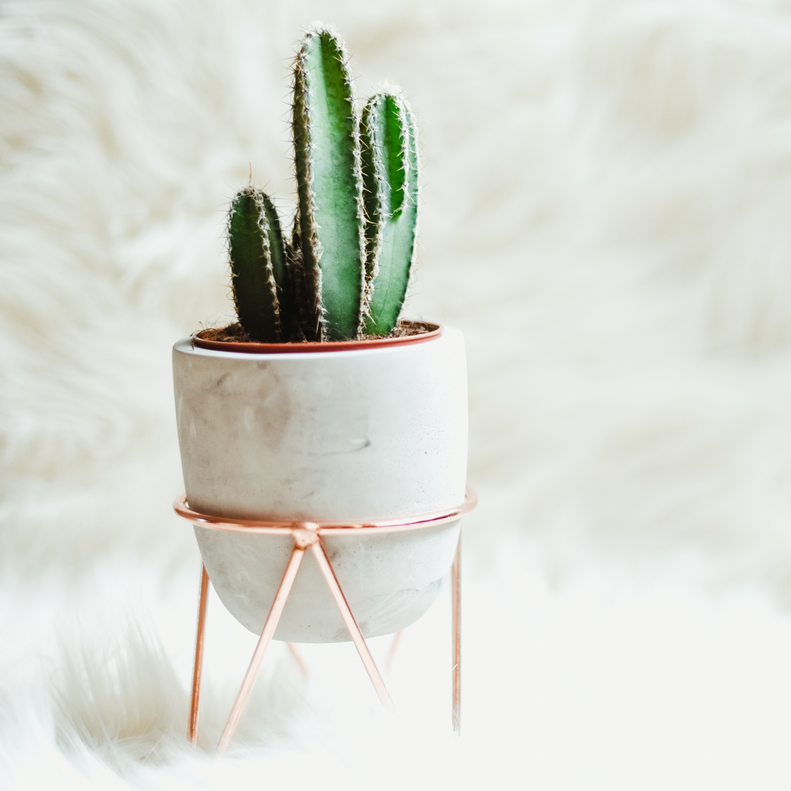
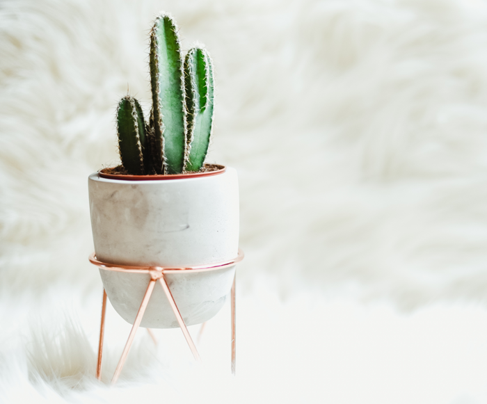
The metallic is shiny enough to catch your eye and command importance, but pale enough to be almost considered a neutral – meaning that people are not afraid to mix it into a multitude of home decor applications. Rose gold accents are showing up all over the house – from furniture, to wall art and small appliances!
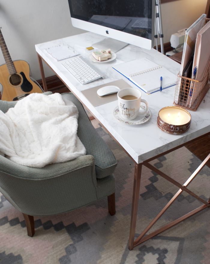
Office
Check out how the blog fox & gypsy were able to DIY this amazing rose gold + marble desk for a fraction of the store price!
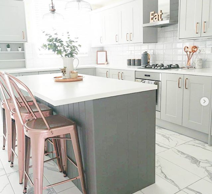
Kitchen
The kitchen styled by @all.things.homely is all glammed up! Check out the rest of her home via Instagram. I love how she ties little bits of rose gold into just about every room in her house (including the bathroom)!
Accents
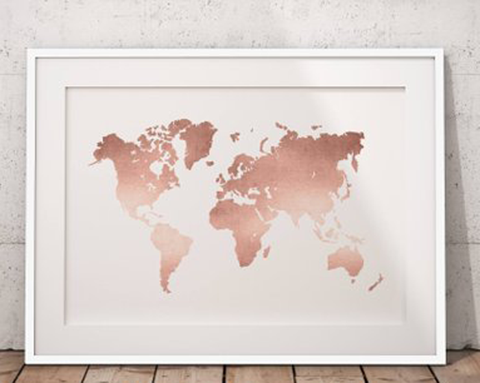
Art for the home has also stepped into the rose gold trend. This gorgeous world map print , available on Etsy, really makes a statement!
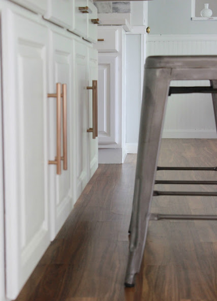
From cabinet pulls to the kitchen faucet – The detail that is added with the rose gold coloring is like jewelry to what could otherwise be considered a plain or utilitarian piece.
WHERE TO BUY
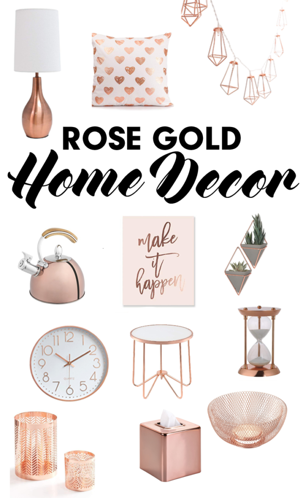
Rose gold accents and home decor items are popping up more frequently in both brick and mortar stores such as Target and Pier 1, as well as online. I found this collection of beauties on Amazon! *By clicking on the numbers below you will access affiliate links. As an Amazon associate, I earn from qualifying purchases. See my full disclosure here *
I have to say that although I am intrigued by this additional metallic finish choice, I do feel that the rose gold trend is one that may not stand the test of time. To me, it just does not seem as classic as other finishes such as oil rubbed bronze and silver.
I could see myself adding a few touches of rose gold here and there to my home decor – a pillow, a picture frame, maybe a lamp. I personally have no intention of changing over more permanent aspects such as the kitchen faucet or the door hardware; But, if you love the look – I say go for it!
Imagine your favorite color. What about that specific shade makes it stand out in your mind? Have you ever thought about how it makes you feel?
Though preferences vary – science has taught us that colors evoke similar feelings in the majority of people. How then, do the colors you choose to use in the rooms of your home affect your mood?
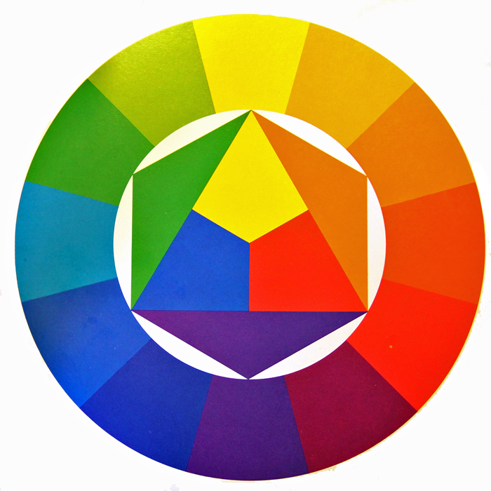
Generally speaking, all colors stem from the three main PRIMARY COLORS – Red, Blue, and Yellow.
They are further divided into three main categories: Warm, Cool, and Neutral.
WARM COLORS: Located on one side of the color wheel – Reds, Yellows, and Oranges – these shades evoke feelings of warmth because they remind us of things such as fire and the sun.
COOL COLORS: Located on the opposite side of the color wheel – Blues, Greens, and Purples – evoke cool feelings because they remind us of grass and water.
NEUTRAL COLORS: The standard neutrals – White, Gray, Black, and Brown- are considered ‘non-colors’. In reality there are wide varieties of neutral hues, with a range of warm or cool undertones. Black and brown are considered to lean toward the warm side, while white and gray tend toward cool.
WARM COLORS IN YOUR HOME
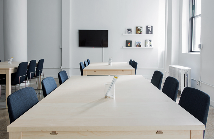
Warm colors are stimulating and fun. In your home, warm colors work well in the public and social rooms of the house such as the living room, dining room and kitchen.
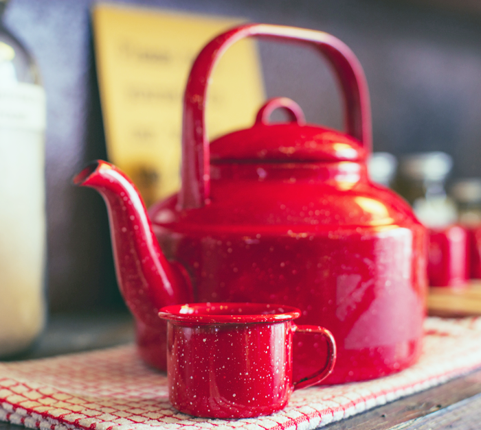
RED
Red is a very intense color, and tends to liven a room. Because of it’s intense hue, it is the perfect color to use when looking to add interest and excitement to a space. The eye will naturally be drawn to it, and even a small pop of red will raise a room’s energy level. It has been said that red stimulates conversation and increases appetites – making it a popular choice for living and dining rooms.
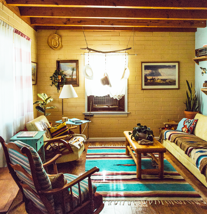
YELLOW
Yellow is considered a happy color. It can make people feel energetic and cheerful, and yet large amounts of the brighter shades of yellow may evoke feelings of anxiety, frustration, and even anger. The softer yellows are a better bet for whole room coverage, as they tend to be easier on the eyes and reflect light well. Rooms that can benefit from uplifting yellow hues include entry spaces, kitchens, and bathrooms.
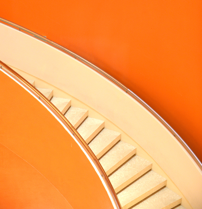
ORANGE
Orange is a highly energetic color that represents happiness and innovation. Though it has a reputation of being overwhelming, the more subtle shades (such as apricot and terracotta) have become more popular in modern day interior design. Color experts warn that the brighter the shade of orange you use, the less you need.
COOL COLORS IN YOUR HOME
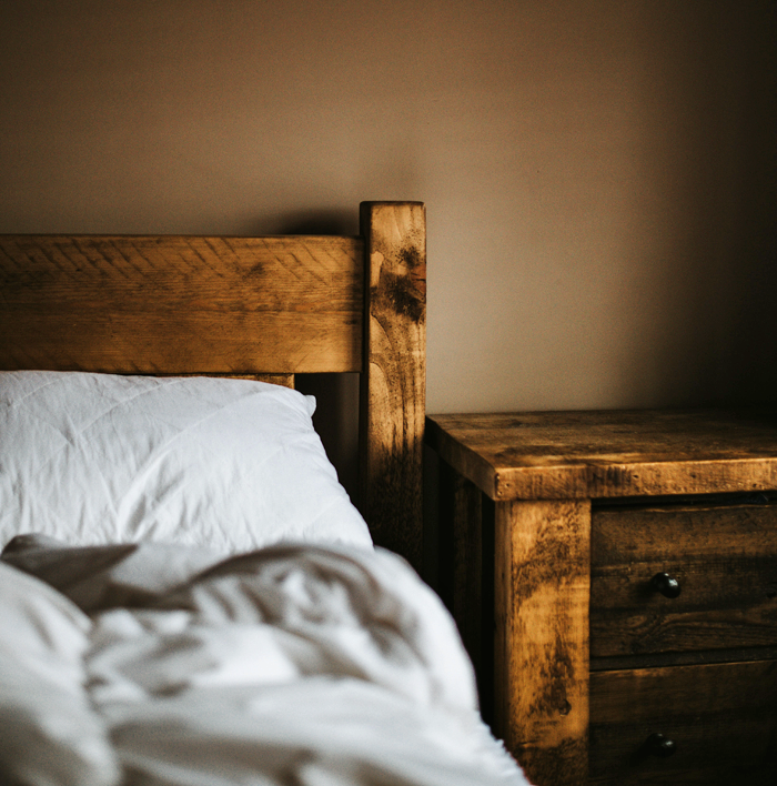
Cool colors tend to be calming. They evoke feelings of restfulness and peace – and therefore are wonderful choices for private rooms where concentration and quietness are important, such as bedrooms, offices and bathrooms.
BLUE
Blue is considered relaxing and serene. It has been said to bring down blood pressure and slow respiration – making it a popular choice for bedrooms and bathrooms, especially in the softer shades. Dark blue may evoke feelings of contemplation and in large amounts, even sadness.
GREEN
Green is considered the most restful color for the eye, as it combines the refreshing quality of blue and the cheerfulness of yellow. When used as the main color for decorating, it is said to relieve stress and help people relax. Because of it’s overall pleasant feel, green is suited for almost any room in the house.
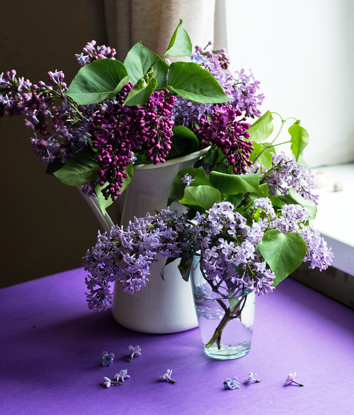
PURPLE
Purple is associated with luxury and creativity. Though rarely used as the main color in decor schemes, it does lend itself well as an accent or secondary color, by adding depth. Darker hues of purple – such as eggplant – can make a space feel rich and sophisticated, while lighter versions – such as lavender or lilac – can bring a restful quality to a space.
NEUTRAL COLORS IN YOUR HOME
The neutral shades are considered the building blocks in a decorator’s tool kit. Because of their flexibility they are useful as either the base/main color for a room, or a grounding accent color. When decorating, it is recommended that 80% of a room is composed of neutral colors, and 20% of the remaining space filled with strong accent colors – pulled from either the warm or cool tones of the color wheel.
WHITE
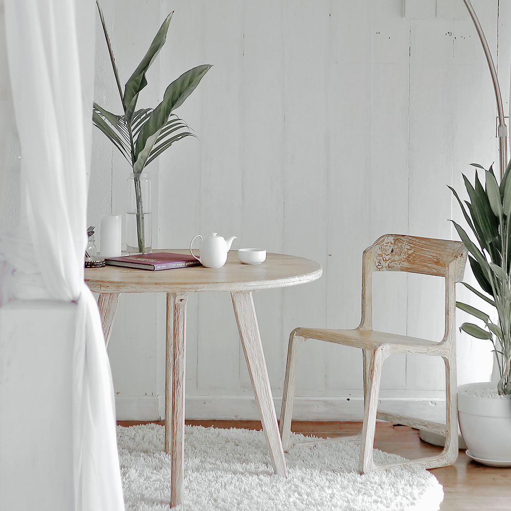
Because of it’s light reflecting abilities, White is considered airy, peaceful, and clean. Designers often use white to make roomss feel more spacious, or as a blank slate to build upon. Be careful not to whitewash everything though – too much white in one space can make it feel stark, cold and bland.
GRAY
Gray is considered the most unresponsive color – emotionless, neutral, and safe. Lighter shades of gray will feel cool and serene – with just a bit more warmth than white. Darker shades of gray can feel solid and steady. In any shade, this color blends well with others – allowing them to take center stage.
BLACK
Black is a ‘grounding’ color. It can be used as an accent to virtually any other color. In fact, some experts in the color field argue that a bit of black should be incorporated in every room to ground the color scheme. But remember, a little bit of black can go a long way!
BROWN
Brown is an earthy color that invites you to reconnect to your roots and embrace nature. It is a reliable color that makes you feel safe and warm. Brown is a popular choice as an accent color, primarily in the use of wood furnishings and cabinetry.
COMPLEMENTARY COLORS
When determining which colors will look best together in a space, you can find some great clues by going back to the basic color wheel. Colors that are opposite each other on the wheel are thought to work together well. Blue and Orange, for example, are considered complementary colors.
I find the theory of color fascinating! Do you agree with the scientific studies? Does your favorite color evoke the same feelings written in this post? I would love to know if the colors you favor tend to make their way into your home decor – comment below!
And feel free to visit my Pinterest page – for boards showcasing Hues of Home!
While historically it may have been implemented for it’s ease of installation, cost effectiveness and as a durable finish, interior wall cladding is becoming a popular design choice with modern day homeowners as they seek for something other than standard drywall.
Cladding is available in a variety of styles and materials, each with it’s own aesthetic. Read about the most popular styles, the common materials used to create them, and a few important installation tips.
CLADDING VARIATIONS
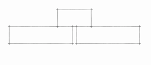
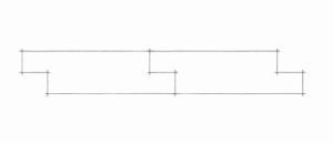
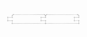
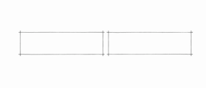
There are many cladding options available for today’s homeowner. I have compiled a list of what I consider to be the five most popular varieties, complete with a sketch of what each application looks like in cross section and a photo of the actual material used in a space.
Made with a series of boards overlaid with strips of 1x materials over the seams/joints. Plywood can be used in lieu of boards, for a more simple application. Some DIYers prefer to add the 1x strips directly to the wall at a chair rail height, and use paint to achieve the look of paneling.
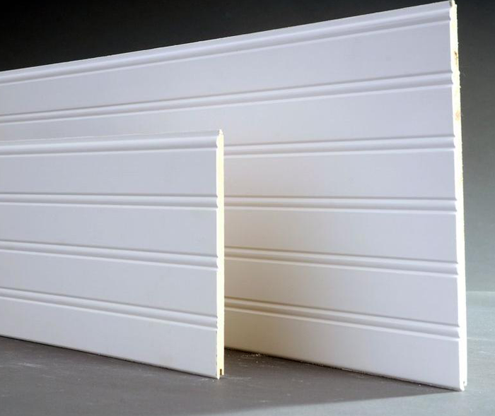
When factory produced mill-work became available in the Victorian Era, beadboard was a popular choice to clad the walls (and ceilings) of utility spaces such as bathrooms and pantries. These strips of wood are milled with joints that fit together to form one continuous wall covering.
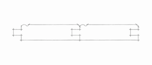
Made popular by Chip and Joanna, Shiplap is a decorative cladding treatment where horizontally laid boards interlock. An optional ‘nickel gap’ milled on the top edge of the boards creates a shadow line that highlights the individual boards. The lines of this cladding style are clean and simple, making this a popular choice for traditional and modern homes alike.
This cladding was most popularly used in Colonial-era homes and is created by boards that are milled with chamfered (or right angle cut) edges on both sides, which form a ‘v’ when the boards are combined. V-groove cladding is readily available in a variety of wood and synthetic materials.
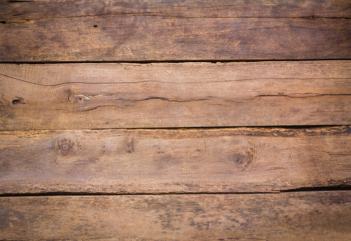
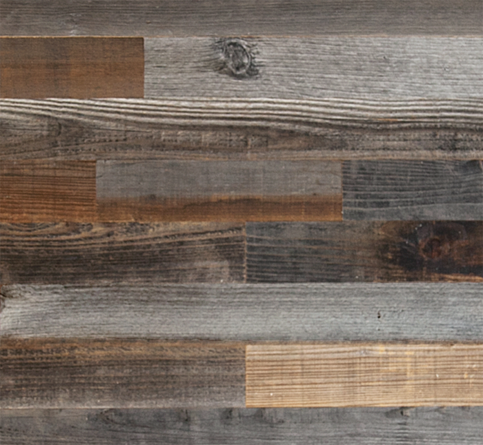
Generally, this cladding technique is created by applying salvaged boards of various sizes and colors onto a wall in a collage format. Reclaimed barn wood and shipping palettes are common materials utilized. DIYers love this cladding style for feature walls – to give their spaces a rustic and handmade look.
POPULAR MATERIALS
These cladding options are typically available in three different materials: wood/plywood, salvaged wood, and MDF. Your decision to choose one material over another may be based on a variety of factors including ease of installation/finishing, the size of your project budget, and the space you will be using the cladding in.
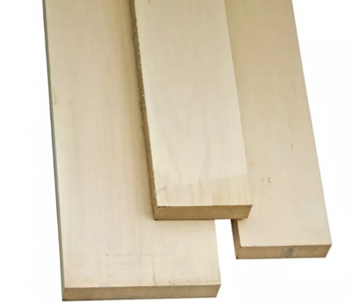
A wide variety of wood species are utilized to create the cladding material, from budget friendly pine to stunning cedar and redwood. Because wood expands and contracts over time, it important that space is left between boards during installation. Wood is very durable, but can be heavier than other material choices. Plywood sheets with grooves cut to create the appearance of planking are lightweight, easy to install, and very budget friendly.
This material can be gathered from a variety of sources – from old barns to factory floors – and has rustic charm and character. You will want to be sure that salvaged wood has been properly cleaned and dried – to avoid pesky, unwanted insects from being ushered into your space.
Companies such as Plank + Mill offer a salvaged wood product that has been cleaned, kiln dried, and planed thin before being applied to and adhesive backing. These ‘peel and stick’ products are ready to be installed directly on your walls with ease.
Medium density fibreboard is becoming a more popular material choice as natural resources become scarce. It is made up of approximately 80% wood fibre material, and a mixture of glue, water, and wax.
This material can be quite budget friendly and is available in a wide variety of sizes and even 4’x8′ sheet applications. It’s downfall is that it can not be used where moisture is a possibility, as it acts like a sponge to soak up water – eventually swelling and crumbling apart. Though there are some companies who offer a water resistant MDF material, it is not readily available.
TIPS FOR INSTALLATION
DIRECTION MATTERS
Generally speaking, vertically laid material will give the illusion of height – while horizontal boards make small spaces seem larger. Keep that in mind when making selections for your space.
KEEP IT SIMPLE
Add character, not clutter. When determining what style of cladding to use be mindful that multiple styles may not look great together. A vertical beadboard wall will clash with a horizontal shiplap wall nearby, for example. Experts caution that while one style per space is encouraged, a maximum of two styles should be used in each space. A maximum of three styles throughout the entire house is also recommended.
START LEVEL
When installing cladding in plank form, it is vitally important that the first board/plank installed in plumb and level. You may want to have an extra pair of eyes and hands available to help guide that first piece into place. Failing to take the extra time upfront can cause big problems during the rest of the process.
MY THOUGHTS ON THIS HOME DESIGN TREND
I am a texture lover, and interior wall cladding adds a depth that plastering or basic paint is not able to accomplish. The bonus of this trend is that it is fairly DIY friendly, and forgiving. Part of the charm of interior cladding is that it reminds us of older, historic homes – where perfection is not expected.
The exterior of our cottage will feature both standard lap siding and board + batten applications. I imagine we will also use a few accent spots of cladding on the interior, as a way to tie the inside and outside of the house together as a cohesive design.
The Makeover Takeover series focuses on helping my readers with bits of their own homes that are giving them challenges. Whether it is a room that they want guidance on styling, a floor plan that needs re-configuring, or they are stumbling with choosing an exterior color palette, I am happy to help. I offer solutions through virtual design and source links.
My first two Takeovers were both bathrooms – a modern Small Beachy Bathroom, and a Classic + Clean Bathroom remodel in a historic home. They were both met with wonderful reviews, and this time around I was excited to shift gears a bit and work on a kitchen remodel.
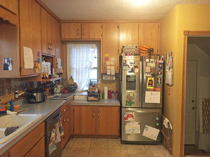
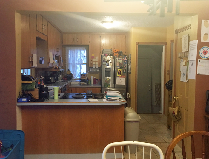
My friend Adell and her husband Ben live in a super adorable traditional home with their four young kids. Though the house has architectural features that really shine, the kitchen leaves much to be desired.
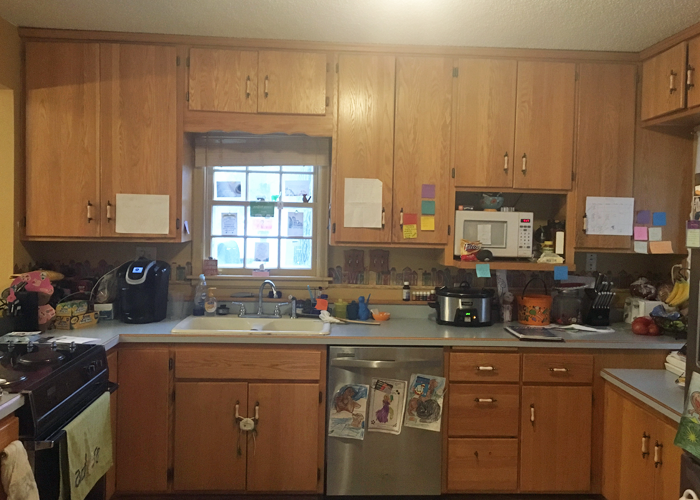
THE KITCHEN TODAY
The layout of the appliances is actually quite efficient. The sink/ DW, fridge and oven are arranged in the basic work triangle, which works well. There is a portion of wall next to the fridge that juts into the space, but because of the way the floor steps down to meet the attached garage access, it needed to stay. For the most part, I wanted to focus on the cosmetic aspects of the room and on making it as organized as possible, finding a home for everything.
PROPOSED PLAN CHANGES
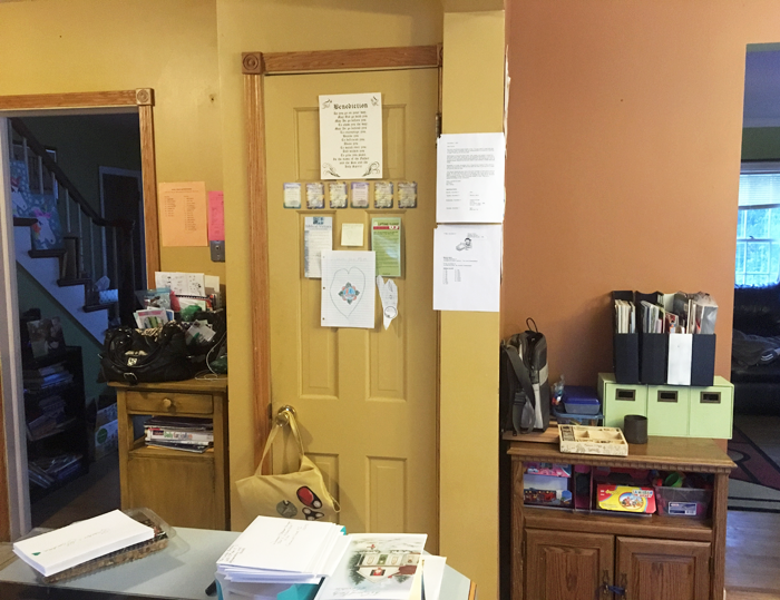
As you can see from the photos, this is one busy family! There are little reminder notes, and calendars on the cupboards, and the kids art projects are taking over the fridge. I wanted to streamline the organization of these bits, cleaning up the space.
I also wanted to maximize the work space, by finding a home for all of the small appliances and kitchen gadgets that are residing on the counter tops.
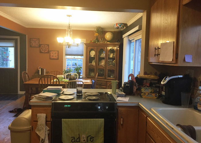
They have an open layout from kitchen to dining, and the counter extends so that there is space for seating on the dining room side. However, because of the position of the stove, it isn’t a safe place for the kids to sit.
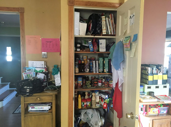
There is a pantry that opens into the kitchen. The storage is nice, but it creates a bump out that leaves a strange little corner. The family has a small table positioned here, but as you can tell by the picture – it has become a bit of a drop spot. Again, I wanted to provide them with functional storage.
And last but not least, I wanted to clean up some of the strange finishes that the previous owners of the house have left – including the wallpaper border/ back-splash and the sheet linoleum floor that was PAINTED to look like individual ceramic tiles. What? Yes, it’s true.
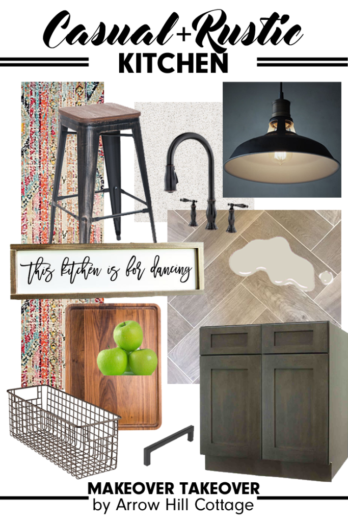
FINISH INSPIRATION
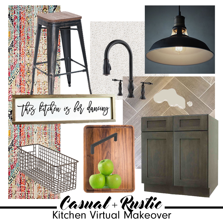
Adell and Ben sent me images of kitchens and materials that they love – and based off of their selections, I would say that they have a very classic style, with traditional lines and a touch of rustic flair.
I was able to source a wonderful selection of products that I think would be amazing in their space. You can learn more about each product by clicking on the titles below.
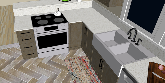
SINK: This stainless steel apron sink will match the other appliances well.
WALL COLOR: ‘Agreeable Gray’ from Sherwin Williams – the perfect neutral.
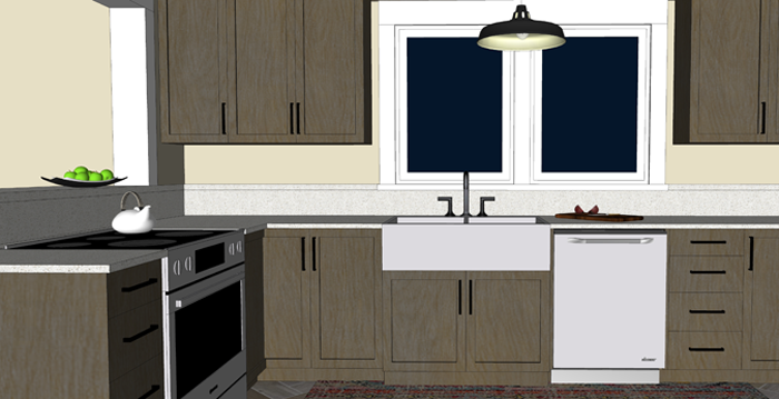
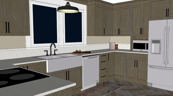
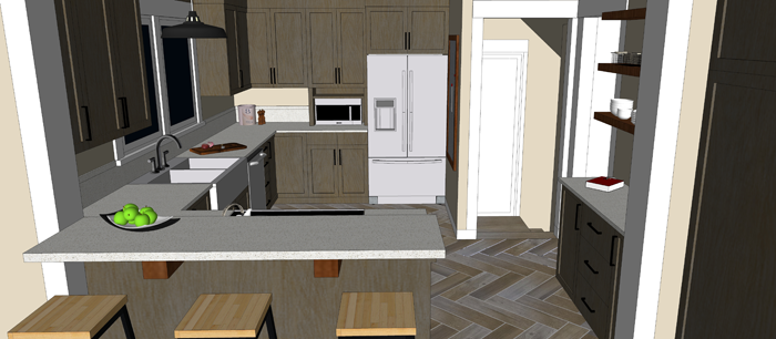
AND NOW FOR THE BIG REVEAL!
Can you see the changes? Even though the footprint of the room didn’t change – it seems so much more open! The colors are muted and neutral, which will blend well with the rest of the home decor. Just for reference, let’s take another look at the space pre-makeover.
Quite the difference, I think! Here are the details of what I did to achieve the casual rustic look that Adell and Ben love.
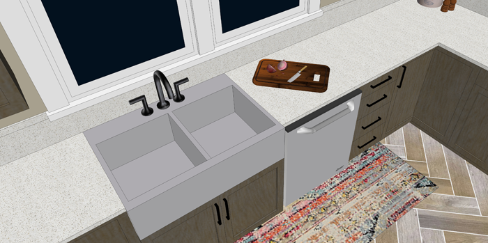
Obviously, all new cabinetry provides a fresh look. Because they are a darker gray stain that shows some wood-grain, I opted to go with a very simple quartz for the counters. Quartz is a wonderful low maintenance surface that is perfect for families with young children. The window above the sink was doubled in size, to allow a greater view of the backyard and let in more natural daylight.
The sink was replaced with a stainless steel apron variety. The large double bowls are very efficient. All corner cabinets in the kitchen have hinged doors that allow access to Lazy Susan storage.
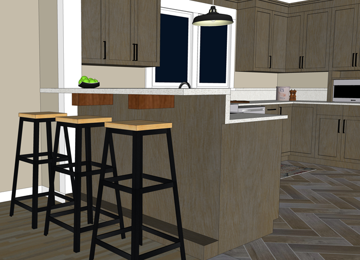
Above the sink I hung a large industrial barn style pendant light. This will provide wonderful task lighting, and is also a focal point for the room.
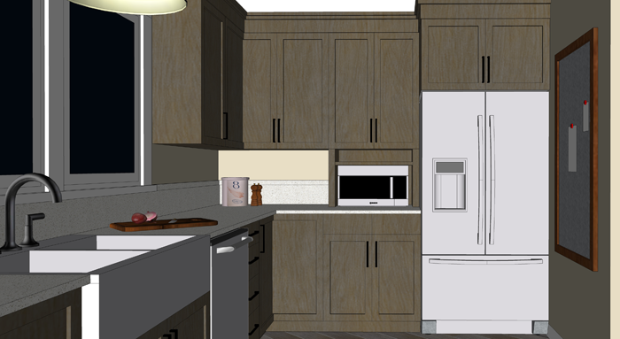
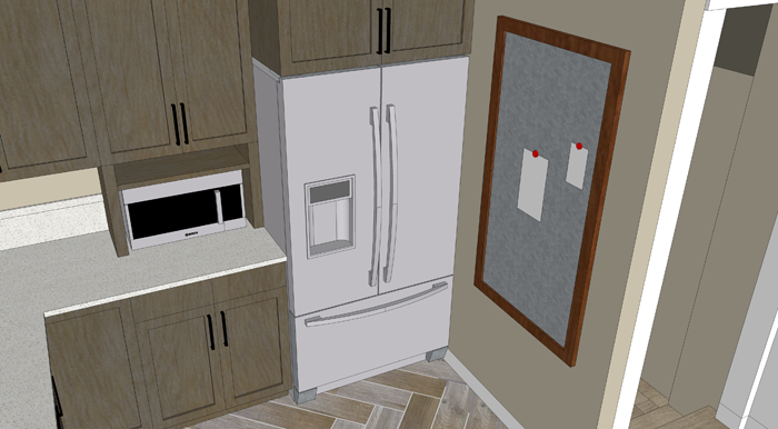
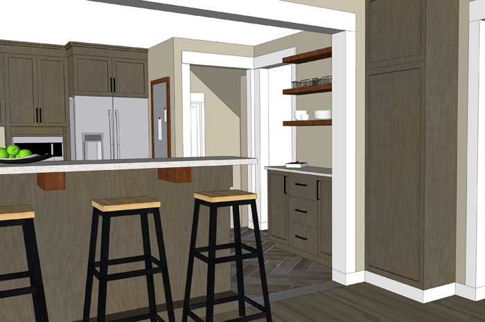
I removed a window on the fridge wall, which allowed me to even out the counters and provide a more accessible spot for the microwave. The small shelf above the microwave is the perfect size for a cookbook or two.
Next to the fridge, I am proposing a framed piece of sheet metal that can be used to hang notes, calendars and even kid artwork. This wall isn’t as visible from other rooms in the house, making it the perfect location for those random bits.
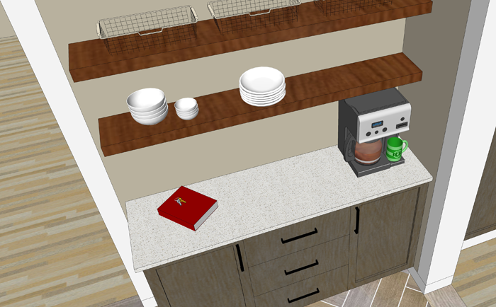
Where the pantry used to be, I am proposing a more shallow base cabinet with pull out pantry drawers. This is efficient storage for canned and boxed goods, and it offers additional counter space. Because of it’s location to the entry from the attached garage, this area naturally becomes a drop spot.
There is no shame in that. Every house needs a drop spot! The key is to keep the space organized and efficient so that it remains useful and not cluttered storage. Baskets can be placed on the shelves for papers that need to be filed, bills that need to be paid.
The counter/bar seating near the range has been raised, for safety purposes.
With the addition of rustic wood corbels, this is now an attractive spot to eat an afternoon snack or do homework.
And immediately next to the bar, where a small cart used to reside, I am proposing an additional built in cabinet – to house the broom, cleaning supplies, and all of those fun kid craft materials.
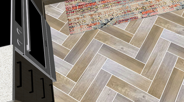
The real masterpiece of the room though has to be the amazing wood-grain tiles set in a herringbone pattern. So beautiful and durable! Accented with a pop of color from a distressed bohemian style rug, these floors really come to life!
One last look at the completed space:
I’ve created a 3d animation of the kitchen makeover for a closer look. Click the play button below to view.
I think that this casual rustic kitchen design would blend very well with the rest of Ben and Adell’s beautiful home. Working on this project for them was a lot of fun!
Remember that this is a FREE digital home design consultation, which is available to anyone who subscribes to the Arrow Hill Cottage website. If you or someone you know could benefit from this service, simply email me with a few photos and a description of what issues you would like resolved.
If chosen, I will offer a solution + inspiration through 3d images and sourced items. Hurry though! I only have the ability to do one Makeover Takeover each month and the spots are filling up quickly! I have plans to eventually make this a paid service, so if you have been thinking of contacting me about a project and want to get in on the free deal, don’t hesitate!
This post contains affiliate links to products for your convenience. If you purchase via my links, I may receive a small commission at no additional cost to you. Thanks for supporting Arrow Hill Cottage!