The cost of building materials and labor has gone up considerably through the years, making it even more difficult to build a brand new house. Many people have taken to buying a fixer upper and slowly repairing and updating it to meet their personal needs. This can be a wonderful option for those who don’t mind living in a bit of a construction zone; But for some people, a new house sounds much more appealing, for a variety of reasons.
In this article I lay out nine simple tips that can help you build a house without breaking the bank.
TIP #1: DETERMINE WHAT YOU CAN AFFORD, ESTIMATE EARLY, AND STICK TO A BUDGET
You need to determine early on how much money you have to work with.
Set up a meeting with a loan officer, who can help you get a general idea; and remember that just because you qualify for a certain loan dollar amount or have ‘x’ amount of available cash, you don’t need to spend to the max. Be sure to include the cost of your site in the budget, if you do not already own property.

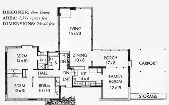
Spend time working on your first floor plan layout. Though it varies, the average cost to build a basic home, using fairly standard materials, is around $125/sf. After determining the square footage of your floor plan, multiply it by 125 to get a basic idea of how much your house might cost to build. Does this number seem to line up with what you have determined you can afford? If not, it’s time to go back to the drawing board!
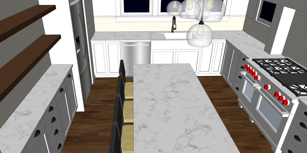
Once you determine your budget, you will need to be checking back with it continuously – not only during the design process, but also once the building begins. All decisions you make will need to be filtered through the lens of the budget. When picking finishes, for example, if you decide you really want to add granite counters in your kitchen but your budget only allows for laminate, you are going to have to make a decision and likely a compromise.
TIP #2: KNOW HOW MUCH SPACE YOU NEED

The size of your home is going to be an important deciding factor on how expensive your build is. As mentioned in this post, you should consider what size of home you actually need to live comfortably. You might be surprised to learn that you don’t need as much space as you thought you did!
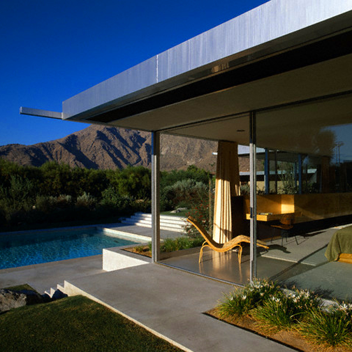
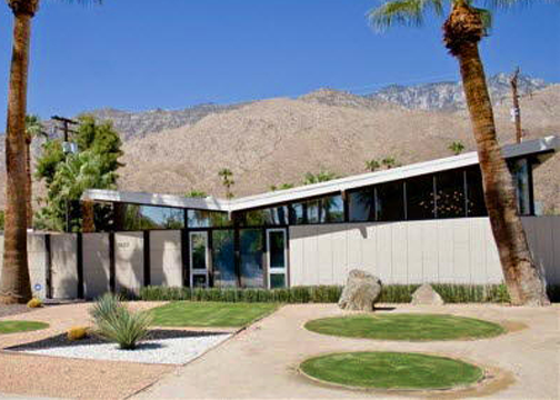
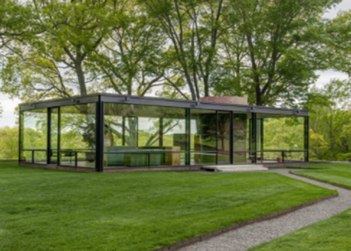
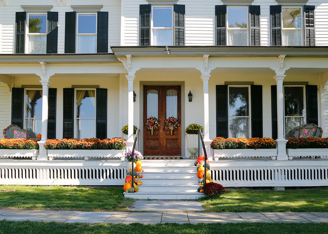
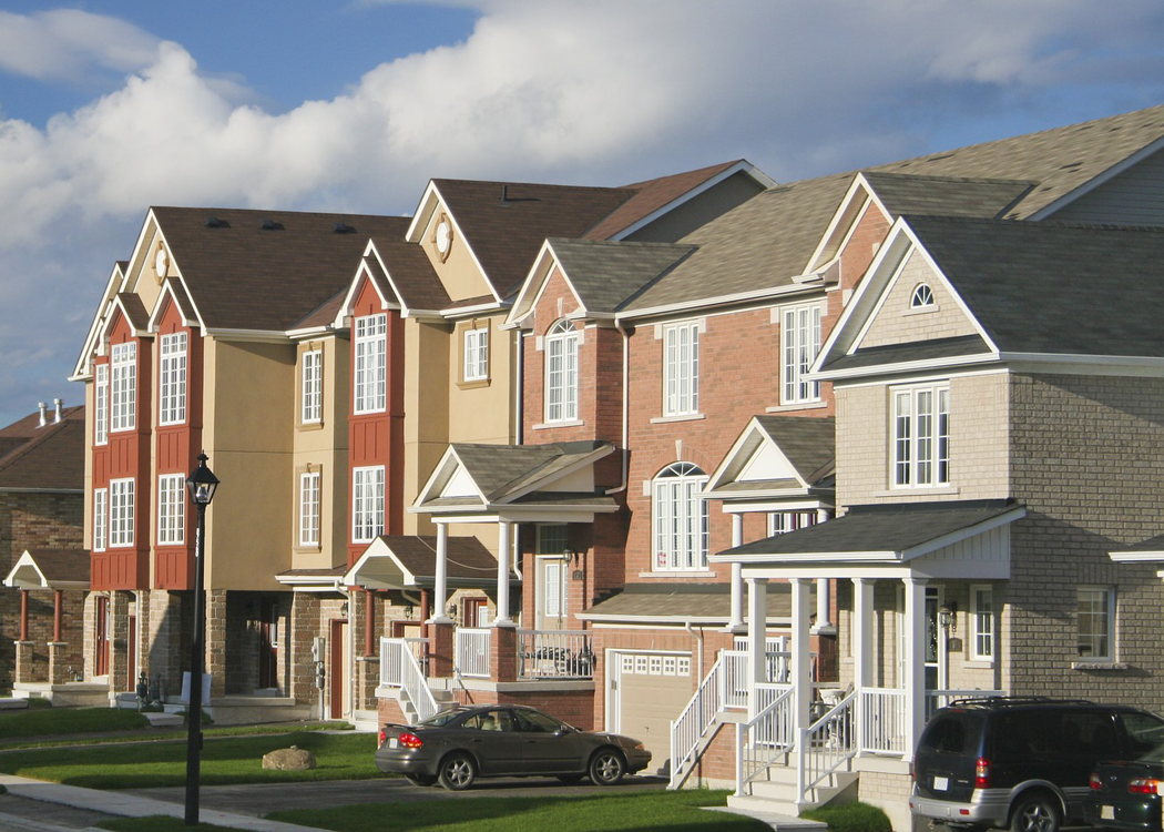
TIP #3: FIND A SUITABLE SITE
The costs associated with the building site, both in purchase and preparation can account for a large portion of the budget. Although there are exceptions, it is generally recommended that you spend no more than 20% of the total cost of a home construction project on a building site. For example, if you have $120,000 to invest in a home project, you should spend no more than about $24,000 for the land.
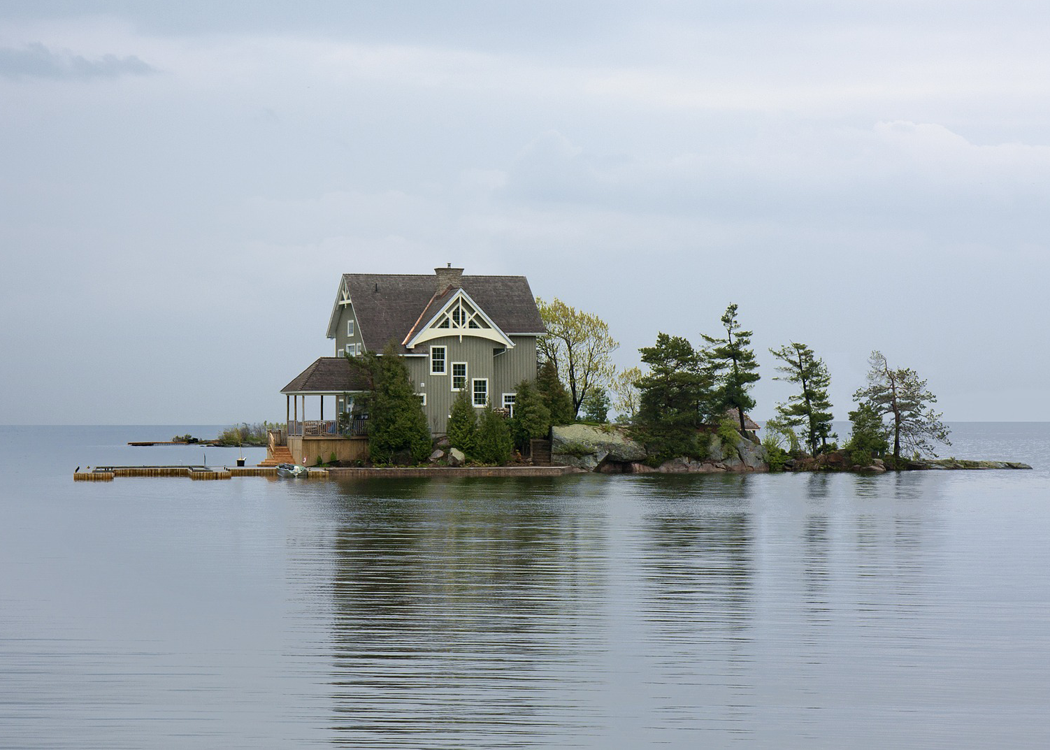
This image, from Pixabay, features a site that was probably VERY expensive to build on!
It is important to find a suitable building site near the beginning of the design process, to ensure that the site and home complement one another. The most cost effective lots are those that are flat or slightly sloped with few trees, and have access to public utilities. Be aware though that sometimes the more ‘difficult’ sites have the potential to be purchased for a deep discount; and, with some creative design, could become a perfect spot for your new home.
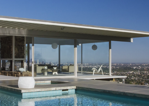
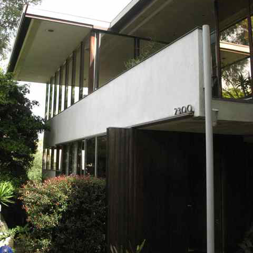
TIP #4: DESIGN SMALL & TALL
The two most expensive elements of a home to construct are the foundation and the roof. For this reason, compact two story homes are generally more affordable than one level, sprawling residences.
If you are looking for ways to reduce the footprint size of your house during the design phase, consider these techniques:
ELIMINATE HALLWAYS
Hallways are space hogs. Eliminate them by using the rooms themselves as circulation. If hallways are impossible to avoid, try to reduce them as much as possible.
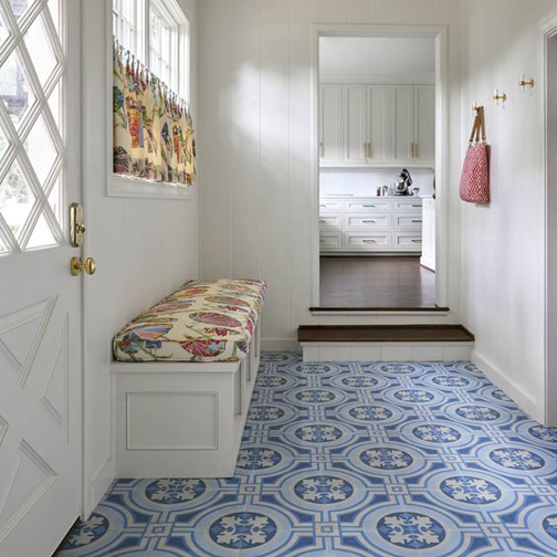
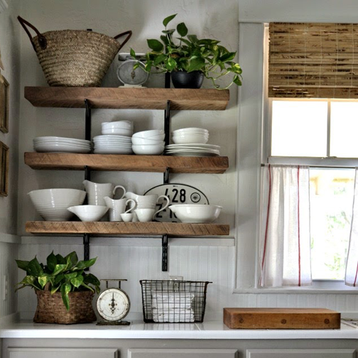
CREATE MULTI-USE ROOMS
image source
By designing rooms that can serve more than one purpose you can shave quite a bit of square footage from the floor plan. Consider an eat in kitchen, or an office that doubles as a guest room, for example.
REDUCE BELONGINGS

The fewer items you have, the less space you need to house them. Creating an entire room for the storage of seasonal decor may not be the best use of limited square footage. Consider smaller scale furniture instead of large/ bulky pieces. For example, a sectional sofa will take up less space than two couches in a living room.
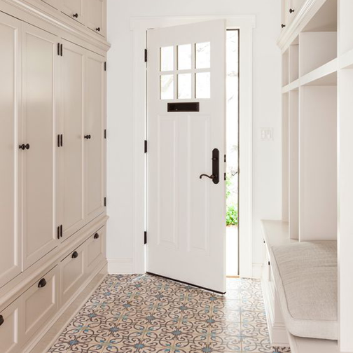
SHARE
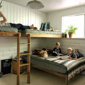
image source
If you have children – consider having them share a bedroom. Even if they aren’t fans of the idea, you can rest assured that sharing won’t hurt them, and may actually be good for bonding. Check out these bonus tips on how to accomplish a shared space for the kids.
TIP #5: CONSIDER BASIC / SIMPLE SHAPES
A rectangle or square shaped home, with four corners only, is the most simple and cost effective to build. For each corner that is added, the price increases. Extra corners affect the complexity of the foundation and the roof, which as previously mentioned, are the most expensive aspects of a new build.
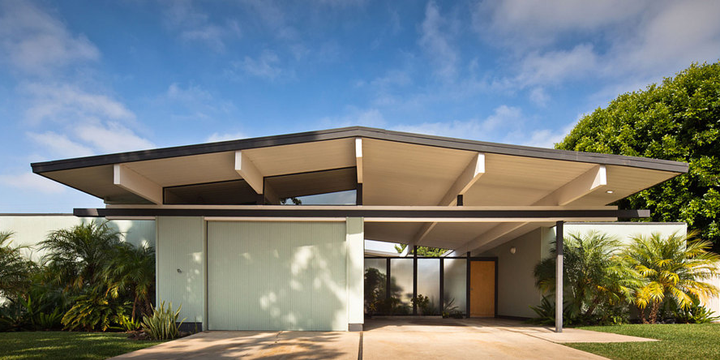
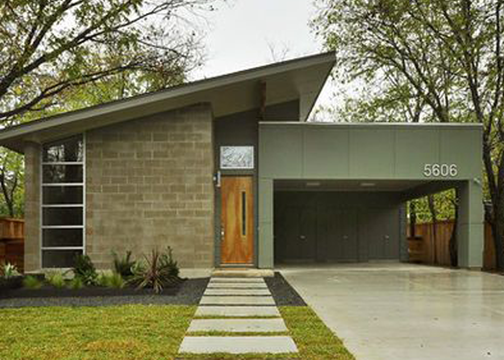
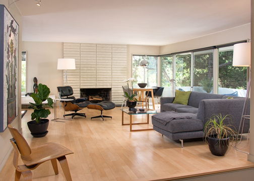
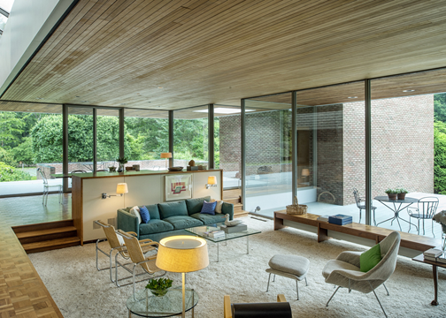
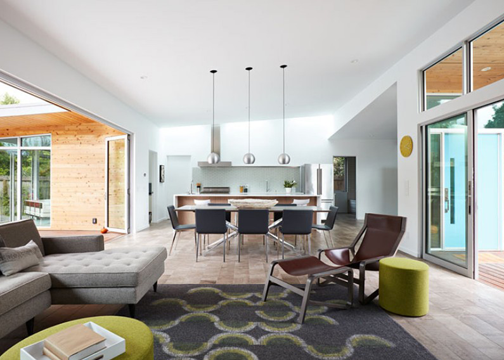
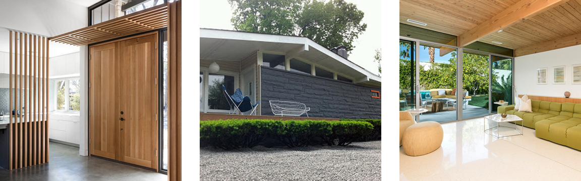
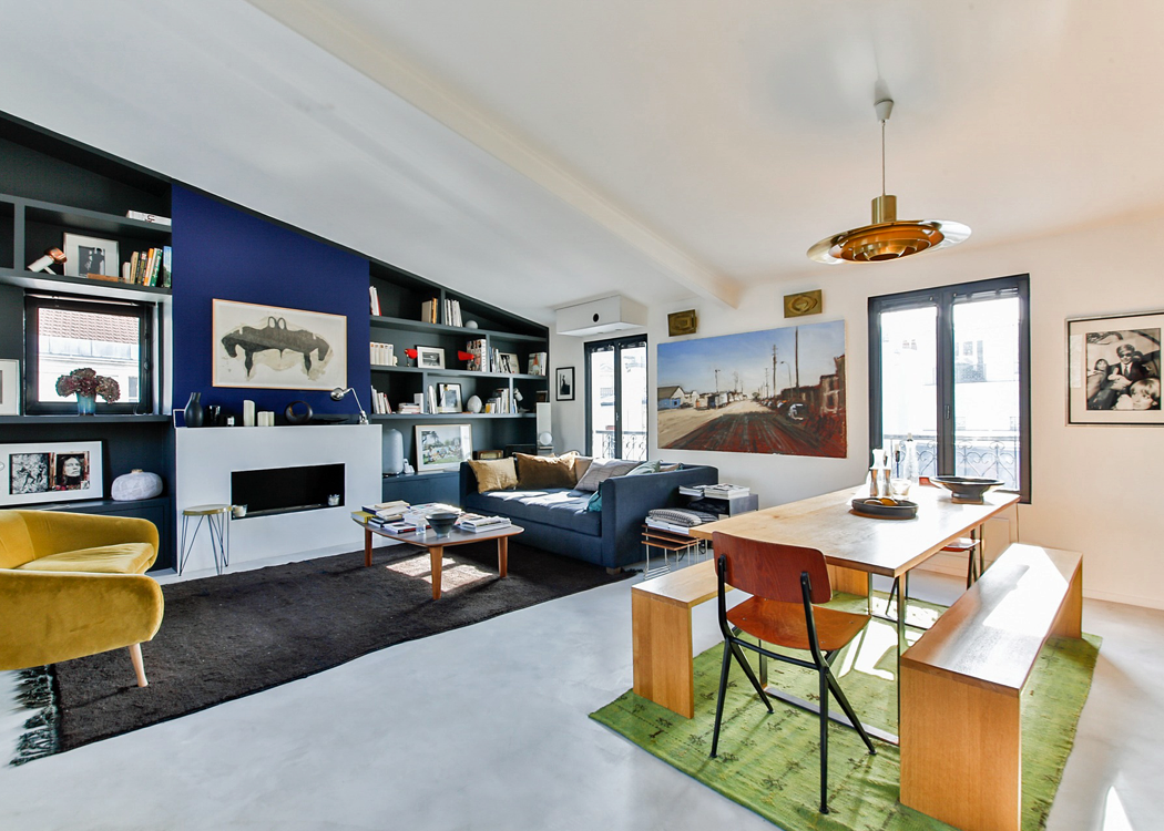
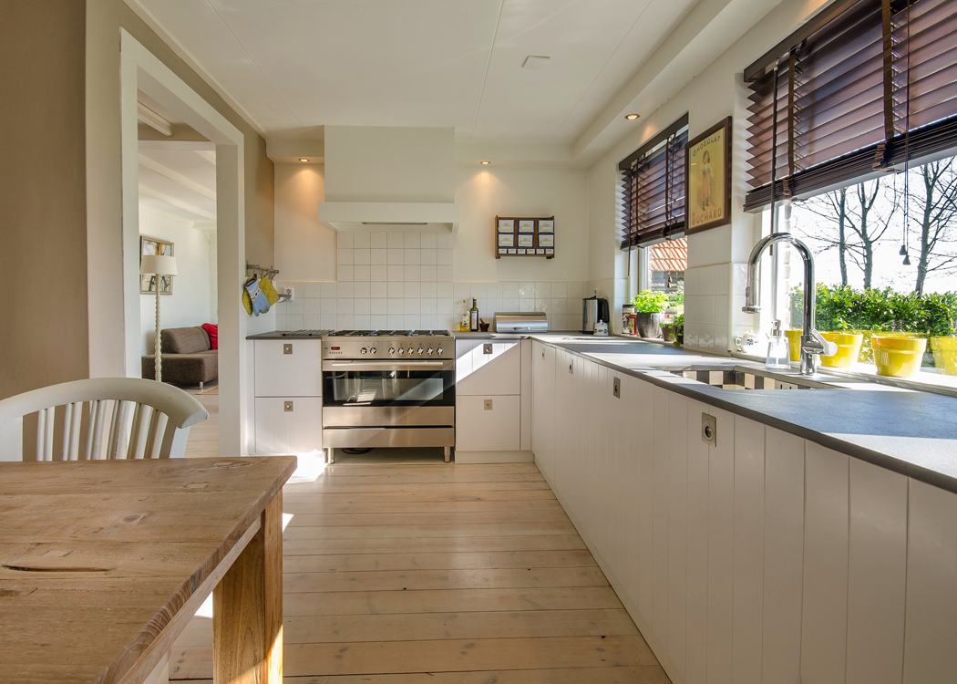
TIP #6: UTILIZE STANDARD MATERIALS
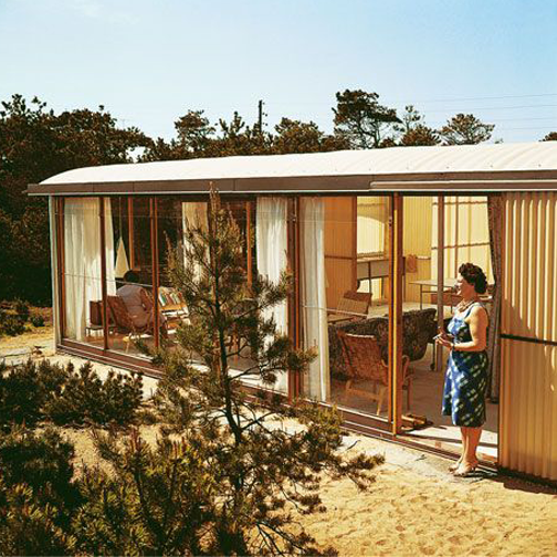
By designing with materials that are readily available, you can save a bundle. Simple cinder blocks and pine planks can be arranged in creative and aesthetically pleasing ways that won’t break the bank.
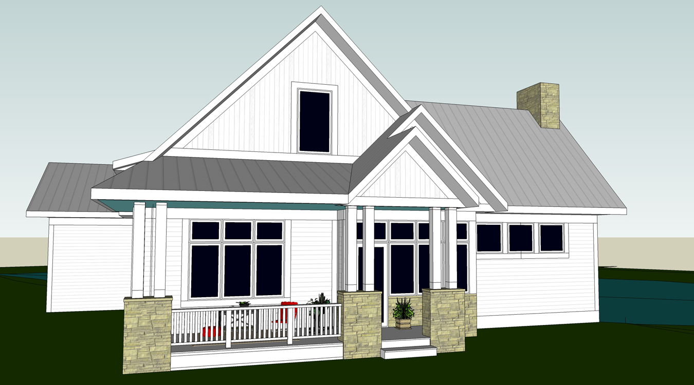
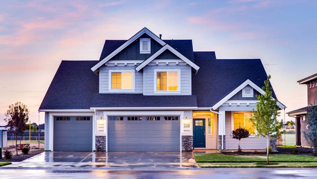
This house is an example of how standard materials can be combined in a beautiful way.
Consider checking out the discounted stock at your local home centers. As the quantities of their inventory get low, the stores will begin to offer them at bargain prices. This could be a perfect solution for those small spaces, such as powder rooms or entryways.
You can also find reclaimed materials inexpensively. Check the local Habitat ReStore, Craigslist, or even the trash yard. If you know of a house that is about to be torn down, inquire about purchasing the useful bits that are salvageable (doors, trim, or hardwood floors, for example).
Purchasing stock cabinets is another way to save big. You can create a layout using typical pre-built sizes and arrange them to get the look of custom cabinetry.
This article, written by Apartment Therapy, provides ideas on how to use stock cabinetry throughout the home.
Please note that it doesn’t always make good financial sense to use extremely cheap ‘builder grade’ materials, especially on the exterior of your home. Though the upfront costs of these materials may be lower, there is an increased possibility that they will need to be replaced more quickly, negating your initial savings.
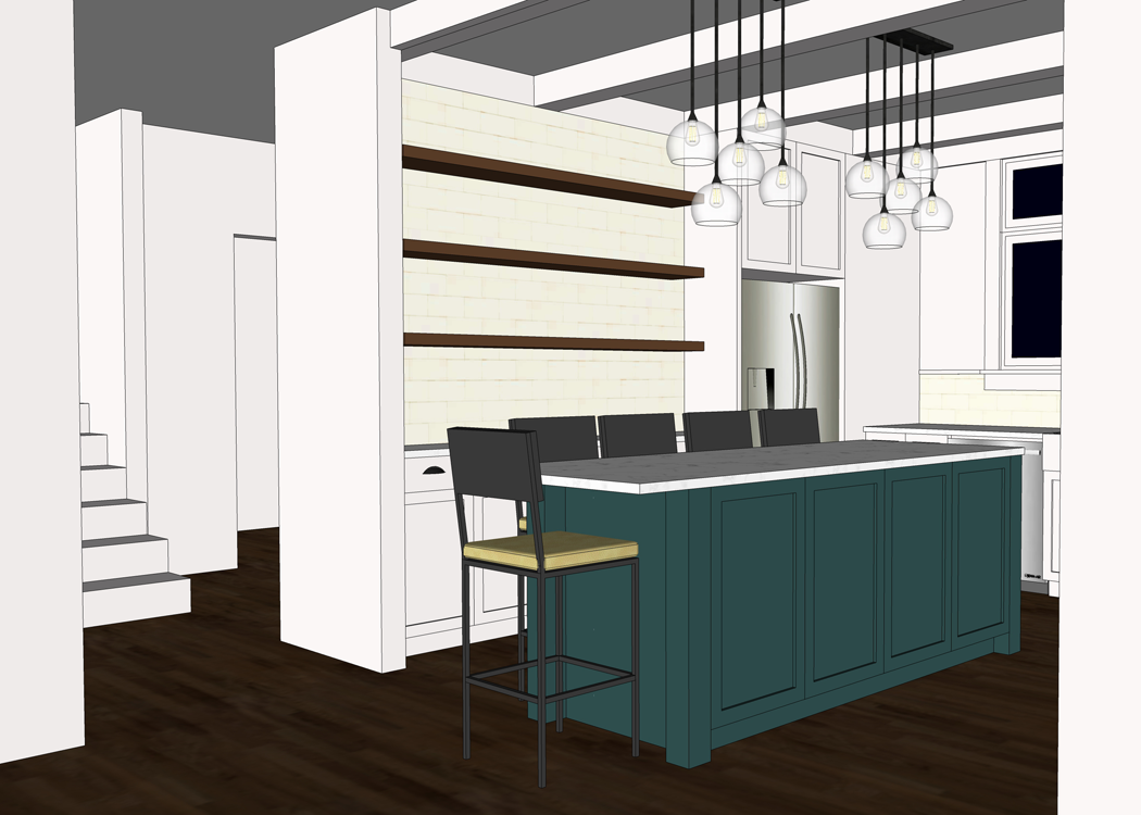
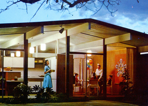
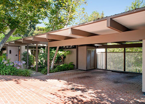
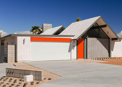
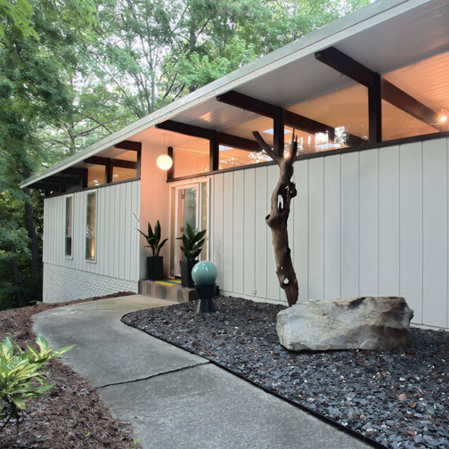
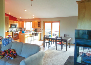
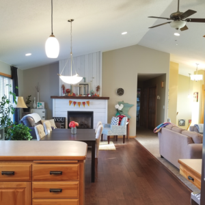
TIP #7: BUILD IN PHASES
There is a chance that while you are in the process of designing your home you will come to the realization that your family needs more space than the budget will allow. Look at the design closely to determine if there is a way you can split the construction into phases. One common technique is to build the house first, and add on the garage at a later date.
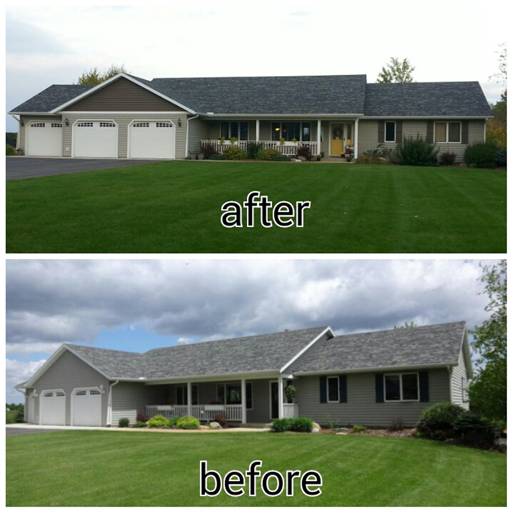
This house is a great example of one that was designed to be built in phases
Another option is to build the house shell, and finish the main floor living space only. The basement or second level / attic can be left unfinished until the money becomes available.
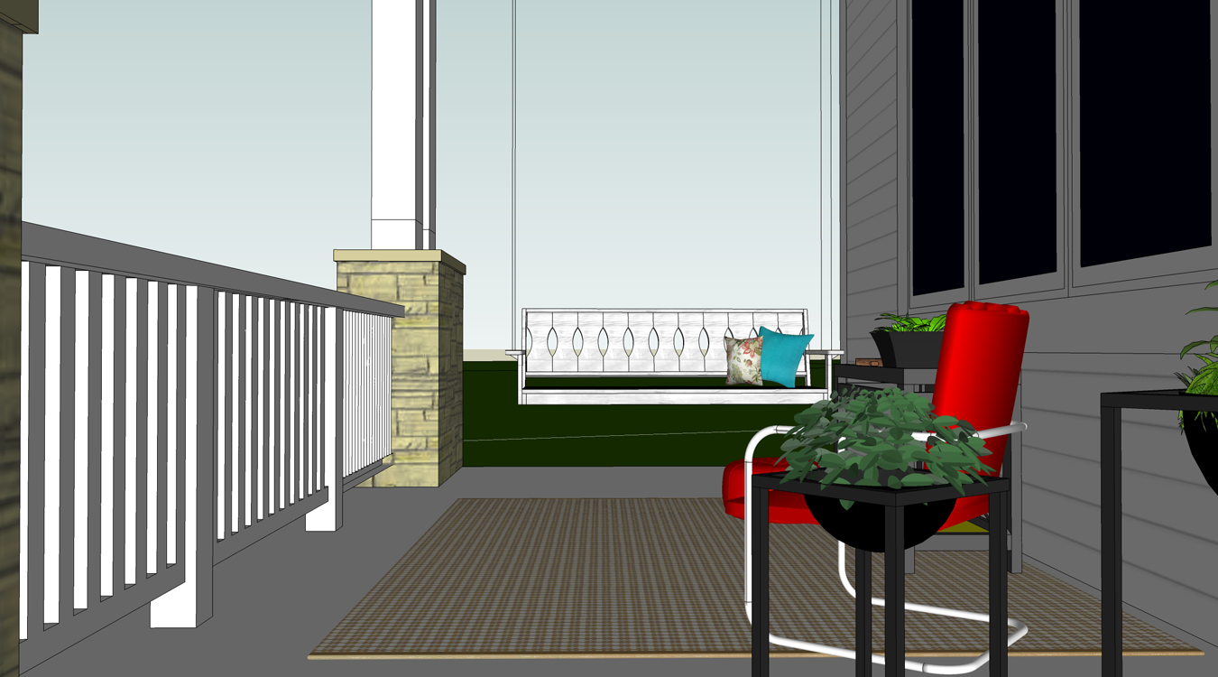
TIP #8: ADD SWEAT EQUITY
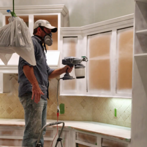
image source
Though not everyone is cut out to be the general contractor of their build project, there are plenty of smaller and more simple tasks you could tackle to save some serious cash. You could paint interior walls, install flooring, or even shingle a low pitched roof. The time you spend tackling these projects will allow the construction crew to focus on the more difficult tasks. Be prepared though, that these odd jobs will likely take you more time than a crew to finish. You should communicate and coordinate with your contractor to be sure you aren’t holding up any future steps by taking on the work yourself.
Be mindful that unless you are very familiar with construction, there are a few jobs that are probably best to steer clear of:
FOUNDATION: The foundation is just so important. It needs to be level and square. If you are using a poured foundation, it is vital that the consistency of concrete is correct. This is more than a DIY endeavor and should be passed to the pros.
ELECTRICAL: For safety reasons, the electrical work is something the typical homeowner shouldn’t tackle. Not only will your home need to pass an electrical inspection, it will also give you peace of mind to know that this specialized job was done right.
ROOF FRAMING / TRUSS WORK: The framing of the roof will likely involve the use of a crane to bring in trusses. Working in close proximity to heavy machinery can be unsafe; and if the house is two stories, a fall from that height can cause major injury.
TIP #9: DELAY BUILDING
If you aren’t quite ready to make the above compromises – your best option is to wait to build. If you start a home building project before you are ready, you risk making foolish and expensive decisions during construction that could give you a financial headache. There is something to be said about waiting. It may even make you appreciate your new home even more. In the end, you want your home to be a blessing and not a curse!

Personally speaking, my husband and I have waited a LONG time to get to the point where we felt ready to build. Designing and building a house for our family is a dream that has literally been YEARS in the making. I know that once Arrow Hill Cottage is complete we will be so thankful we took the extra time to make sure we were financially ready.
I hope you enjoyed these nine simple tips and have learned that building a house can be affordable, even on a budget, if you are careful in the design/planning stage and mindful throughout the construction.
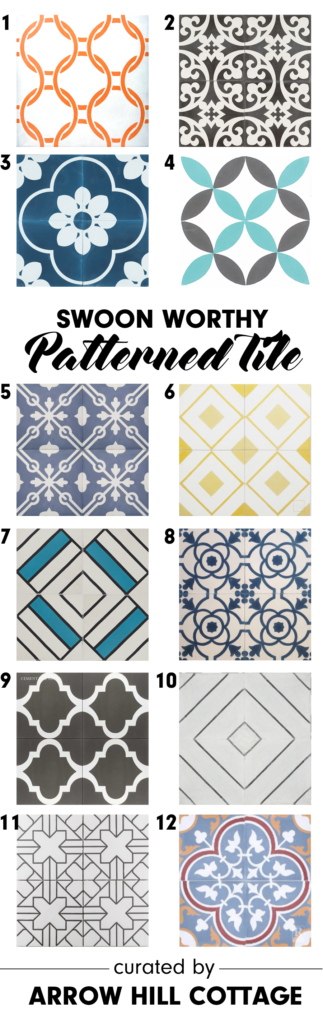
Pin this image to save these tips for later!