REFINISHED DINING CHAIRS IN 6 EASY STEPS

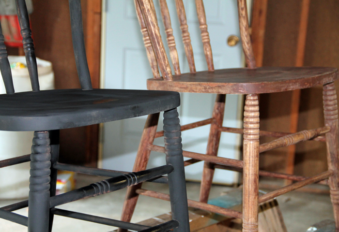
I’m happy to report that another item from my PROJECT BUCKET LIST is well underway. The dining chairs have begun their transformation from brown to black! And I am loving them!

First, a quick recap on what my plans are for these chairs.

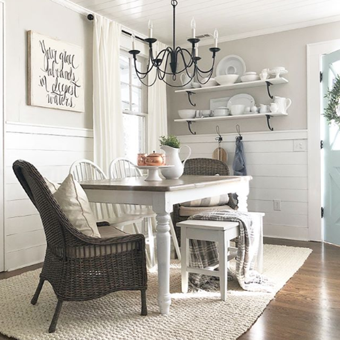
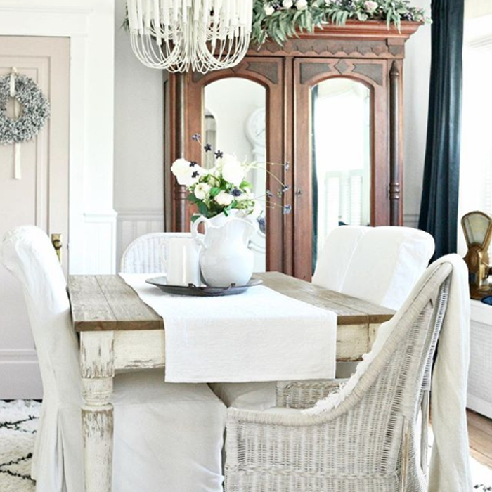
For our future dining space at Arrow Hill Cottage, we are hoping to create a unique harvest table – partially out of lumber harvested from large trees on the property. This will be a long and narrow table, with seating for ten people. We want to make sure that we always have room for guests to dine with us.


Our dining space will be directly off of the kitchen – in an area of about 9′-0″ x 14′-0″. Not a very large space by any means. And so, in order to include seating for ten people, I intentionally searched for chairs that had a small profile.

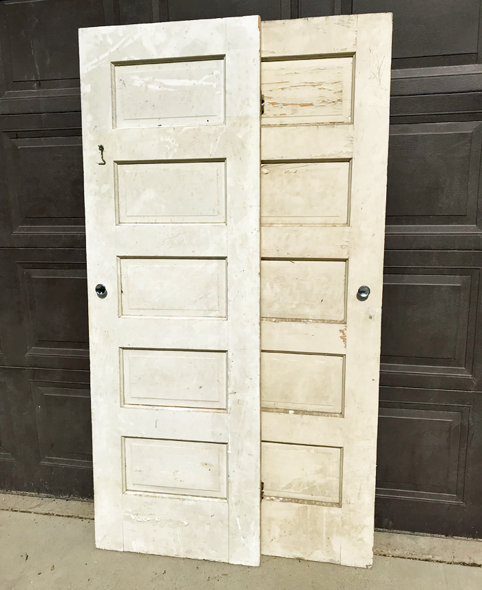
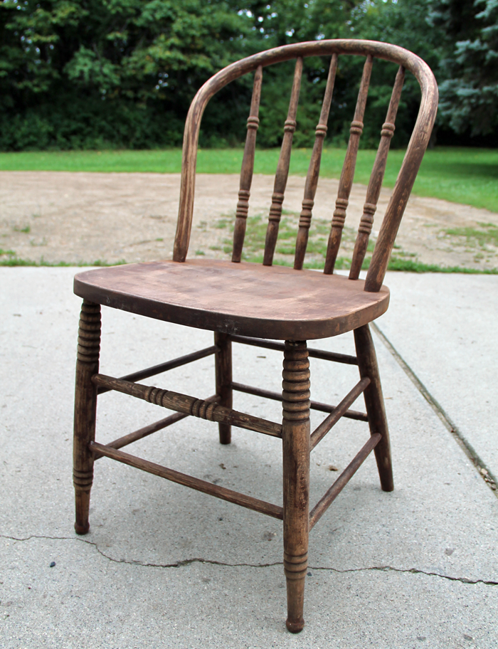
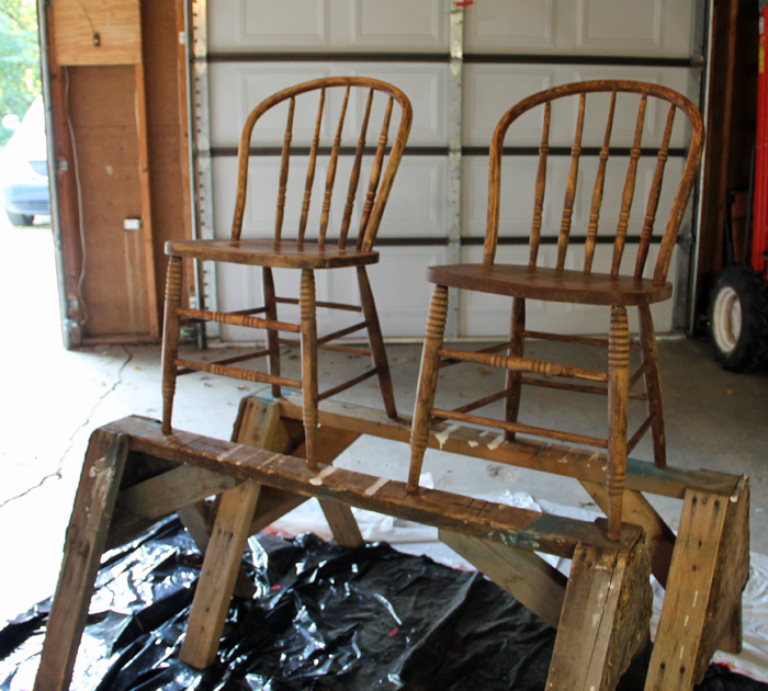
I found the perfect chairs at a local antique store. This set of  8 had been recently refinished with stain.


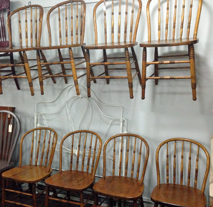
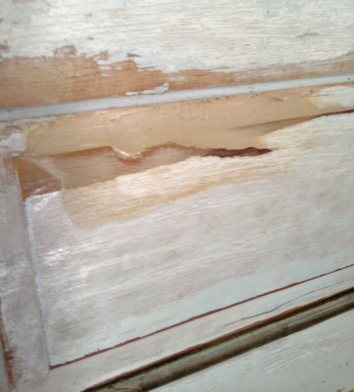
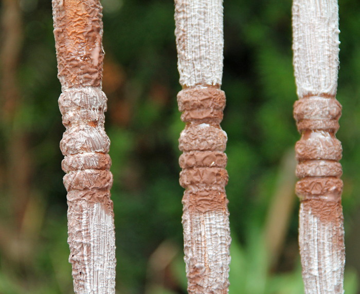
An additional 2 matching chairs were were found at a different antique store. These chairs were not in as good of shape, and were covered in quite a few layers of paint – some of which had already begun to peel off.


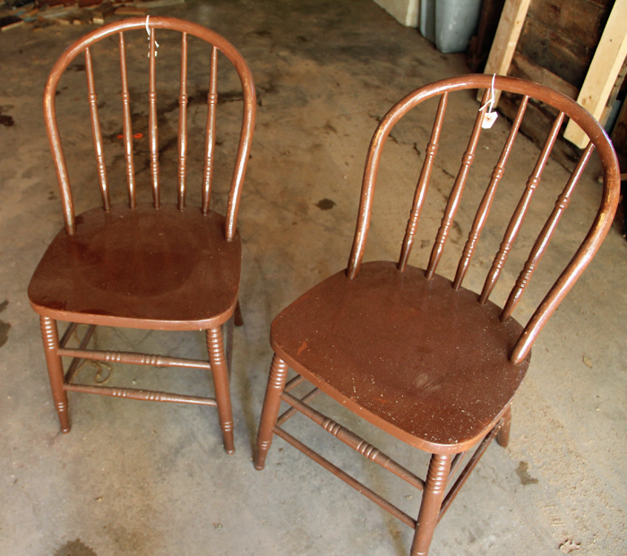
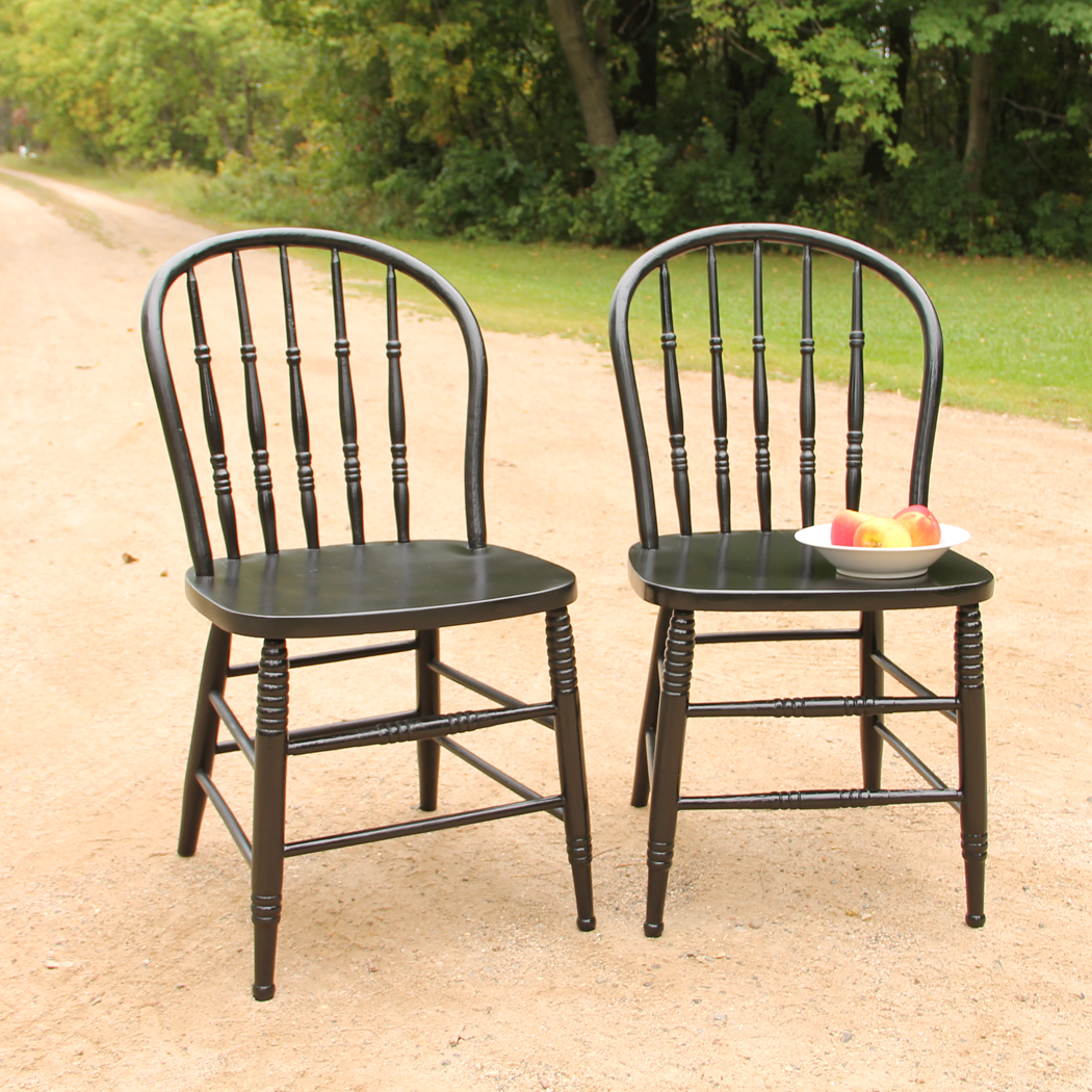
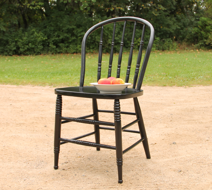
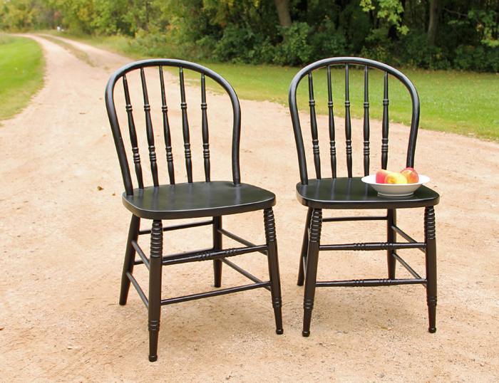
I’ve decided that with a stained wood dining table, and stained hardwood floors – our chairs will look best painted black. I started the transformation process with the two brown painted chairs.

Today I will share the 6 simple steps that I used to refinish the first two chairs. Hopefully this post can serve as a guide to anyone planning a similar project! 


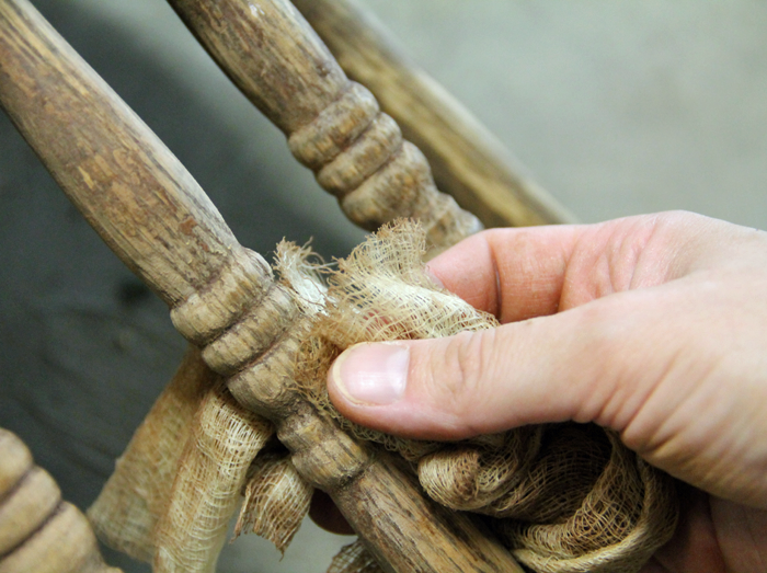
STEP 1: REMOVE EXISTING PAINT LAYERS

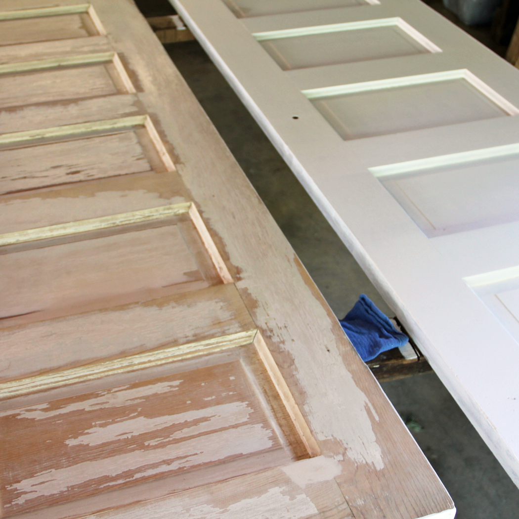
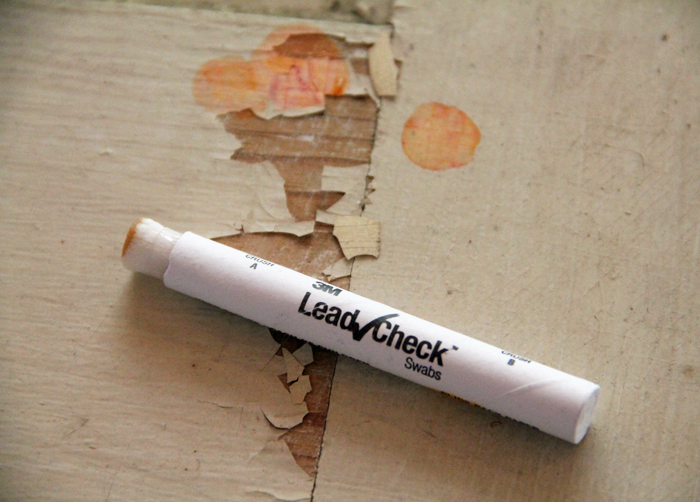
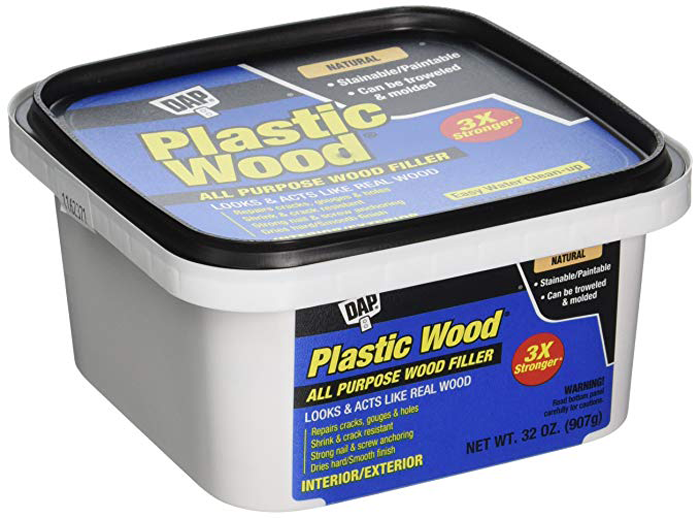
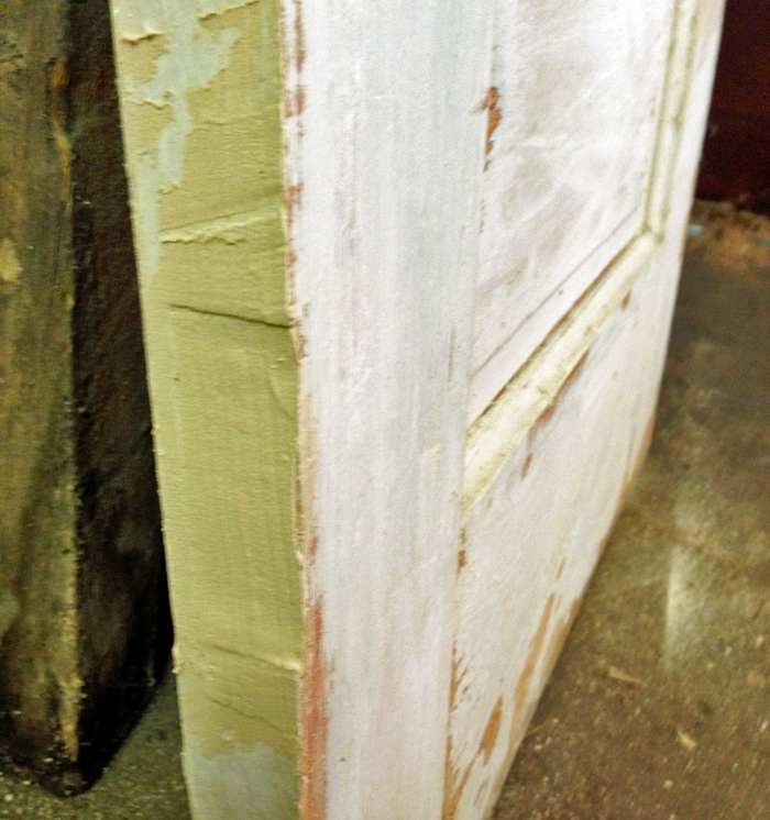
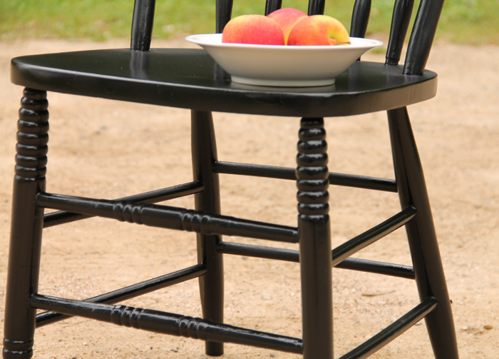
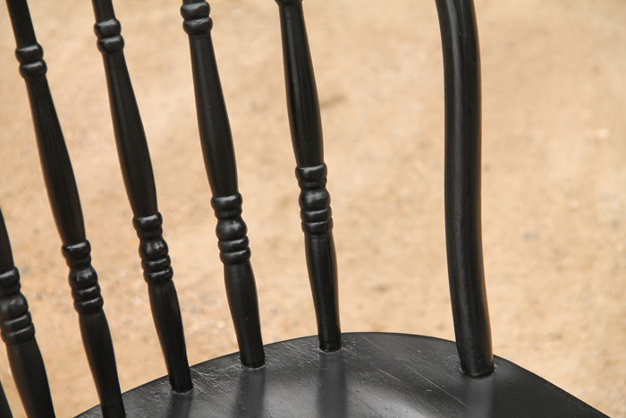
These chairs were covered in many layers of paint. While you might be able to sand some furniture pieces down to the bare wood – that was not be possible with these chairs. A power sander would have changed the shape of the spindles. It also would not have been able to get into the small turned details.


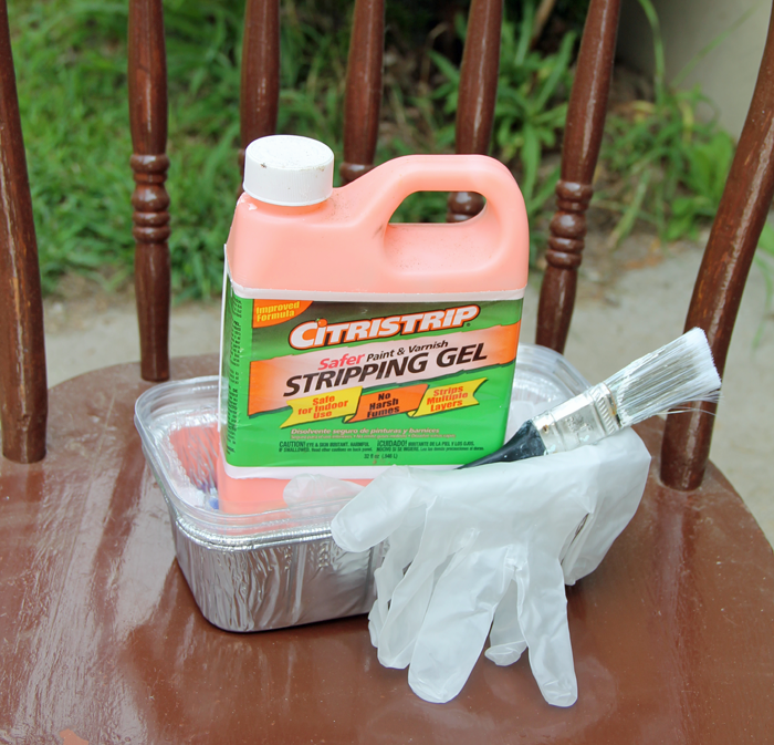
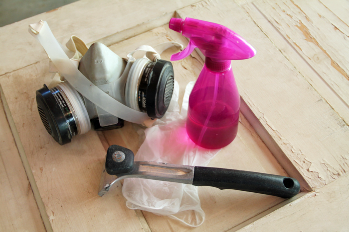
Instead, I decided to use a stripping agent to remove the paint layers. I have had great results with  Citristrip Stripping Gel. It is powerful, but has a smell that isn’t overwhelming. Even still, you want to be sure to wear a face mask or respirator. Other items you will need for this step of the process is an inexpensive paintbrush, a small container to hold the gel, a scraping tool, a stiff scrub brush, a rag, and a bucket of warm soapy water (dish-washing soap works well).

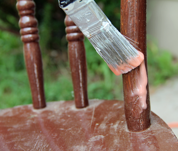
Apply the gel liberally over all areas that need paint removed. Let it sit for approximately 30 minutes and you will notice the paint start to bubble and then turn white. At that time you can begin to scrape. You may want to experiment with different tools to find the right fit for your project. If using a metal scraper, be sure not to gouge into the wood with the sharp edge of the scraper.

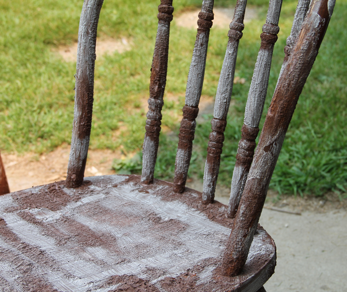
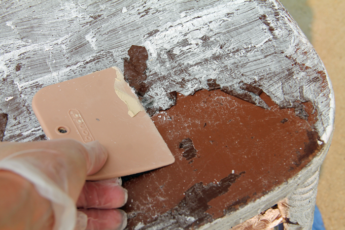
In my experience, the paint will be stripped off one layer at a time. You will need to apply multiple applications of the gel to reach bare wood.

As the paint is coming off, I like to take a water/soap soaked rag and clean off the surface. This helps to get the more fine bits of paint that may be stuck between spindles, for example.

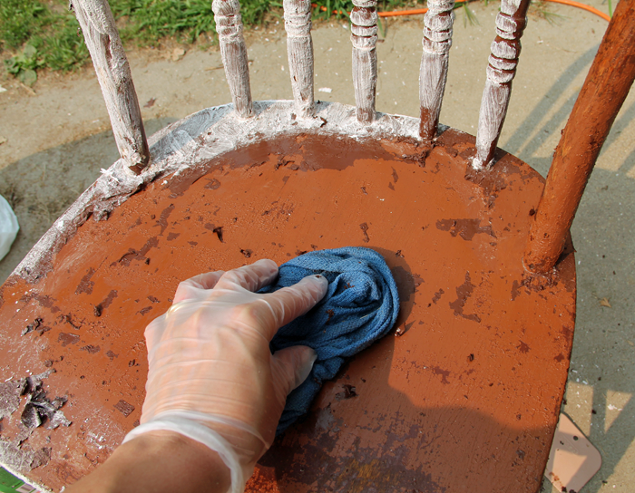
Repeat this process until you have reached the bare wood layer. At this point you will want to use your stiff brush to remove all extra debris.

Let the chair dry completely before beginning the next step.
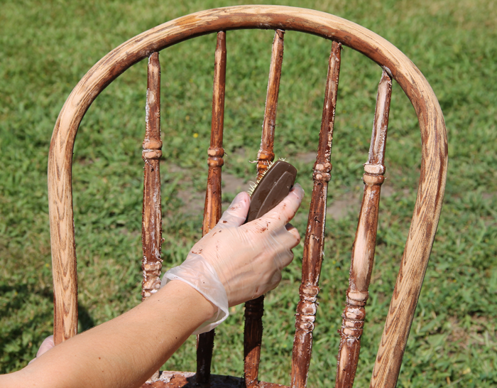
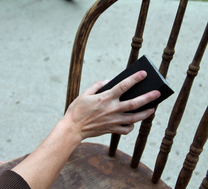
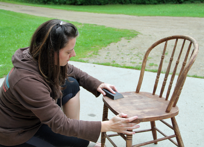
 

STEP 2: SAND

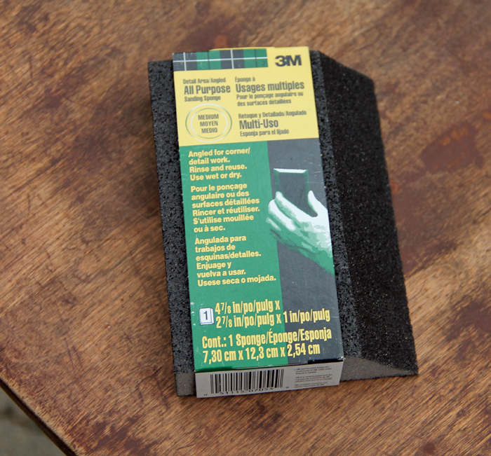
As mentioned previously, it is not a good idea to use an electric sander on fine detailed pieces of furniture. Sanding by hand can be tedious, but it will yield the best results. Instead of using flat sandpaper, I prefer to use 3M sanding sponges. They don’t rip apart like traditional sandpaper sheets – and the beveled edges of the sponge work perfectly for the detailed sanding.

Sanding is pretty straightforward. Be checking to make sure the surfaces are feeling smooth and that the detailed areas are not still filled with paint.
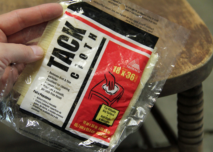
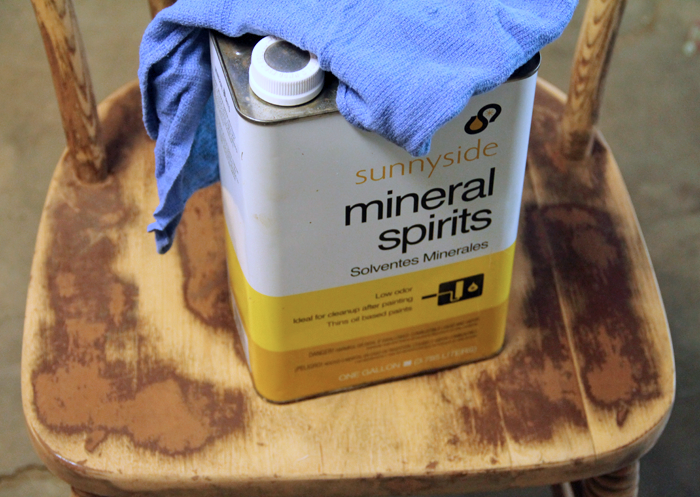
 

STEP 3: CLEAN

Using a tack cloth, wipe all of the sanding dust off of the chair. Again, be sure to get into all of the detailed areas.

As a final cleaning measure, I like to dab a bit of mineral spirits onto a rag and wipe it over the wood that will be painted. It is a quick and easy task, but will get any last bit of gunk that may be left on the furniture piece.
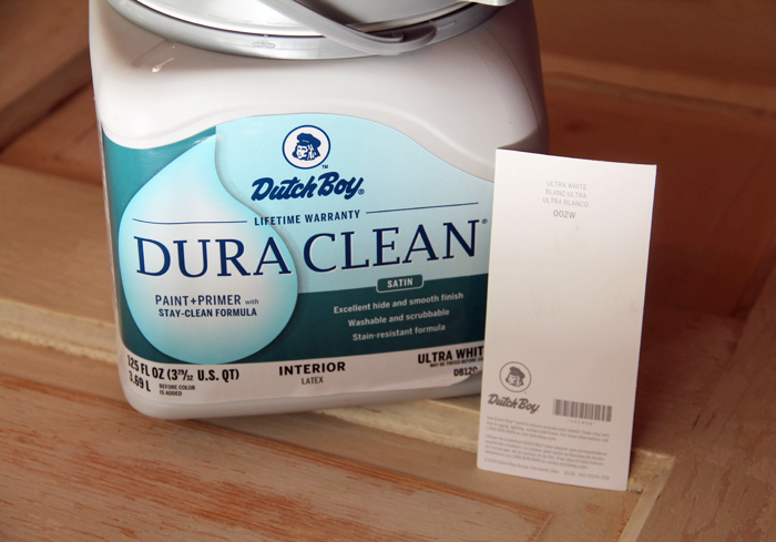
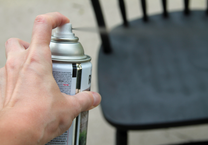
 

STEP 4: PRIME

This step is the most often forgotten or eliminated, yet it is absolutely essential! The purpose of the primer is to give the paint the ideal surface to adhere to. Even if the paint you plan on using indicates that it is a paint + primer combo, add a coat of primer first. Wood that is primed before it is painted is much more durable and will hold up better than a piece that is covered only with paint.

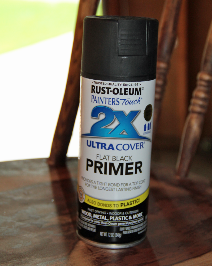
Primer can be brushed on or sprayed. I personally love the ease and simplicity of spray paint. This Rust-Oleum flat black primer went on super smooth and in one coat. One can of primer was enough to cover both of the chairs I worked on. I set my chairs side by side on a set of saw-horses, which allowed me to get access to all parts of the chairs (including the underside) at one time.


Allow the primer to dry according to directions, then lightly sand with a fine grit sandpaper or sanding sponge and clean with a tack cloth before beginning the next step.


STEP 5: PAINT

Of course, this is when the real magic happens! Choose a color that suites your decor style. Again, I used a spray paint product – Rust-Oleum Black, in a Satin finish. I recommend a finish that is either satin, semi-gloss or gloss. A flat finish will showcase every imperfection your piece may have, and is generally not as durable.

Between each layer of paint, you should sand lightly with fine grit sandpaper and clean the dust off with a tack cloth to ensure that the surface is smooth.


STEP 6: SEAL

This final step is optional, but can be important – especially on furniture pieces that will be used on a daily basis. Sealing with a clear coat can give you a surface that more easy to wipe clean should the need arise. It also adds protection from nicks and dings.

If you choose not to add a sealer product, let the piece sit for a minimum of 30 days before use. This will cure the paint to it’s maximum potential. If you are sealing your piece, wait a minimum of 24 hours after the final coat of paint has dried.

I’ll admit that I have yet to complete this step on my chairs, but I will be adding the sealer. Heaven knows that dining chairs + kids = lots and lots of wiping clean!  I will be using a product similar to THIS to get the job done.

After applying the sealing coat, wait approximately 24-48 hours before using the piece.


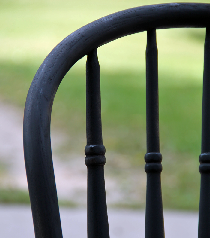
Below are a few pictures of our newly refinished black chairs. They make my heart happy!


Two down and eight to go! I might work on one of the other items on my list first though, to give myself a little painting break.

*this post contains affiliate links*

COTTAGE STYLE FALL HOME DECOR FINDS

Looking to decorate for the season? One of these Fall home decor items might just be the perfect accessory you are looking! Read on for all the source links!

Fall home decor sunflowers


It is nearly the official start of Fall – and it is being ushered in by a cooling in air temperature and the changing leaf colors. Personally, I welcome Fall with open arms. It is likely my favorite season of all. I just wish that it lasted longer and that it didn’t precede my least favorite season – Winter.

I also love Fall decorating. And thinking about decorating Arrow Hill Cottage for this season (next year) has me really excited! I did a little web shopping and found some great Fall home decor items that are perfectly suited for the cottage style!


This post contains affiliate links to products for your convenience. If you purchase via my links, I may receive a small commission at no additional cost to you. For more information, click HERE. Thanks for supporting Arrow Hill Cottage!


COTTAGE FALL DECOR FINDS


Fall home decor garland

This Burlap garland is so sweet with it’s colorful leaf pattern. It is simple, and a bit rustic. I could see it gracing a mantle throughout the Fall season, all the way through Thanksgiving.


Thanksgiving Fall art print

You can’t go wrong with simple artwork that features an adorable pumpkin! The watercolor technique adds just the right amount of visual texture.


Fall home decor door wreath

Welcome visitors with this plush harvest wreath. The colors are bright and bold, yet warm and inviting.


Fall home decor white pumpkins

More adorable white pumpkins! And gourds! These are artificial, but sure look realistic to me! An added bonus is that they will not rot. You can store them to re-use year after year.


Table runner fall home decor

A simple table runner is a staple home decor item. This neutral buffalo check pattern would not only work with Fall decor, but other seasons as well.


Fall seed garland decoration

This berry garland could really brighten up a room. Use it as a mantle decoration or string it around a banister for a fun accent.


candle fall home decor

Who doesn’t love a great smelling candle? Don’t feel like baking a pumpkin pie? Go ahead and fake it with this great scent!


Pillow home decor for Fall

Adding a themed pillow is one of the most simple decor moves you can make. This one is neutral, but has a cute Fall message.


I would be so happy to decorate with these awesome Fall home decor items! I might need to fill up the cart and put them in storage for next year!


PIN THESE FINDS FOR LATER!

Cottage Fall home decor ideas


burlap leaf garlandpumpkin art print

harvest wreath  |  white pumpkins & gourds

buffalo check runner  |   seed mantle garland

pumpkin soy candle  |   fall themed pillow


MORE POSTS ABOUT FALL HOME DECOR

You may want to check out these additional Fall decor posts from Arrow Hill Cottage!


Fall Decorating Ideas

Natural Fall Centerpieces

Free ‘Be Thankful’ Art Print


These Fall decorating ideas from around the web are also worth a read


MY FAVORITE INSTAGRAM ACCOUNTS THAT FEATURE POPS OF COLOR IN DECOR

Today I am finishing a three part series on COLOR THEORY and how it relates to home decor and design preferences. The basic belief is that people choose to use certain colors because of their own personalities as well as the mood that they want their home to convey. And, just as there are multiple preferences on how to furnish a home – there are variations on how color is used as well.

I have found there to be three main ways that people utilize color in their homes:


ONE: Neutrals Prevail

TWO: Pops of Color

THREE: Color Explosion


I have already featured interiors that showcase the idea of  COLOR EXPLOSION , as well as those where NEUTRALS PREVAIL.

Today though, is devoted to those interiors that are a combination of both. A little bit of neutral, and a little bit of color. Maybe this is the camp that people fall into when they just can’t make up their minds. They love color – but don’t want to over-do it; and yet they feel that keeping everything neutral is a bit boring and plain for their liking.

I’m especially excited about today’s feature because it happens to be the category that I would put myself in. I love how a mostly neutrally decorated space seems to come to life with a small infusion of color. The following Instagram accounts are swoon worthy, and feature this decorating technique well.

Note that each of these accounts seem to highlight specific colors or color combinations, which are most likely the owners favorites.


@happyhomeonhighbridge

Jennifer’s home is lovely and simple, yet is brought up a notch in drama by the combination of teal and coral that she tends towards. She has an amazing teal ship-lap wall in her dining room you need to check out!


@jogalbraithathome

It is apparent that Jo has a love for nature. The greens of her house plants serve as one of the main colors that she likes to ‘pop’ with. A complimentary Navy blue completes the palette. Her home seems casual and comfortable – as if anyone scrolling through could just hang out and chat.


@anettetalstad

Anette really loves color. Her amazing home features a variety of bright and pastel colors. The muted tones throughout are balanced with an even amount of sleek white. The tagline for her Instagram page is ‘happy home with a view’ – and yeah, she has a view all right. Go check it out!


These accounts are all gorgeous, right? I hope you have been inspired not only by today’s interiors, but those featured in the previous posts in this series also. After seeing examples of them all, which category would you say you fall into?

9 CREATIVE WAYS TO DECORATE WITH BOOKS

There is something so simple, so beautiful about a book. And although the digital age has seen a shift from the printed word to digital media, it doesn’t mean that books have gone out of style completely.

In fact, there are some really unique ways that people have found to keep the love of books alive – through home decor! Check out these nine creative ways to decorate with books.


SLEEP NEAR THE STORIES

image via Juvenile Hall Design

This headboard is so creative, and beautiful!

Forget sleeping under the stars… sleep under the stories instead!


FRAME YOUR FAVORITES

image via Danielle Sigwalt Interiors

Remove the dust jackets from your family favorites. Have them framed, then displayed as a unique gallery wall!


DRESS UP A MANTLE

image via littlevintagenest

Books make a great mantle accessory.

Grouped with other items, the pieces can together tell a story


STACK THEM AS SHELVES

image via Urban Outfitters

Talk about a floating shelf! This one has a cool factor like no other!


COLOR CODE CASES

image via sfgirl

This living room gets a happy dose of color from the rainbow collection of books – which are cleverly grouped by color.


NEUTRALIZE THE LOOK

image via Carrie Coleman Photography

Read how this image sparked a debate on apartment therapy.

Some people love this trend, and others hate it!


PAINT THE PAGES

image via Etsy

This beautiful and simple art piece can be purchased on Etsy – along with many other varieties. Get the look on your own by painting on an old book page.


HOLLOW THEM OUT

image via curbly

How creative is this re-purposing idea? Learn how to create a book planter of your own by following the link!


GIVE THEM NEW PURPOSE

image via knick of time

Something tells me that these homeowners feel the urge to read every time they hang up their coats


Which of these creative ideas is your favorite? Would you try any of them in your own home? Pin the image below for future reference.

TRENDING IN HOME DESIGN & DECOR: ROSE GOLD ACCENTS

Brass, Silver, Bronze and Copper finishes have been commonplace in homes for many years. But there’s a new metallic in town that is taking center stage – Rose Gold.

rose gold mini planter. Rose gold decor for the home

No, it isn’t brand new. Rose Gold finishing has been around for quite some time, mainly in jewelry. However, in the recent years, it is having a moment trending in home decor and seems to be rising in popularity.


WHAT IT IS

Essentially, Rose gold is a mix of Copper and Gold. Pure gold has a natural yellow tone to it, and pure copper a reddish hue. When the two alloys are mixed together, coloring will appear more or less red – depending on the concentration of copper use. Rose gold has just a ‘touch’ of copper, and appears more on the pink side of the spectrum.

Where Blush / Millennial Pink seems to have been the ‘it’ color for the past three or so years, Rose Gold is getting in on the action – as it’s metallic cousin.


WHERE/HOW TO USE IT

The metallic is shiny enough to catch your eye and command importance, but pale enough to be almost considered a neutral – meaning that people are not afraid to mix it into a multitude of home decor applications. Rose gold accents are showing up all over the house – from furniture, to wall art and small appliances!


Office

Rose gold desk accessories. Home office with rose gold accents

Check out how the blog fox & gypsy were able to DIY this amazing rose gold + marble desk for a fraction of the store price!


Kitchen

Kitchen with rose gold accents. Rose gold home decor ideas and inspiration

The kitchen styled by @all.things.homely is all glammed up! Check out the rest of her home via Instagram. I love how she ties little bits of rose gold into just about every room in her house (including the bathroom)!


Accents

Rose gold leaf map. Decorative accents using rose gold

Art for the home has also stepped into the rose gold trend. This gorgeous world map print , available on Etsy, really makes a statement!


Hardware

Rose gold cabinet pulls

image via Styled on State

From cabinet pulls to the kitchen faucet – The detail that is added with the rose gold coloring is like jewelry to what could otherwise be considered a plain or utilitarian piece.


WHERE TO BUY

Rose gold accents and home decor items are popping up more frequently in both brick and mortar stores such as Target and Pier 1, as well as online. I found this collection of beauties on Amazon! *By clicking on the numbers below you will access affiliate linksAs an Amazon associate, I earn from qualifying purchases. See my full disclosure here *


lamp |pillow | hanging lights

tea kettle | art print | planter

clock | table | hour glass

votive | tissue box | mesh bowl


MY THOUGHTS ON THIS HOME DESIGN TREND

I have to say that although I am intrigued by this additional metallic finish choice, I do feel that the rose gold trend is one that may not stand the test of time. To me, it just does not seem as classic as other finishes such as oil rubbed bronze and silver.

I could see myself adding a few touches of rose gold here and there to my home decor – a pillow, a picture frame, maybe a lamp. I personally have no intention of changing over more permanent aspects such as the kitchen faucet or the door hardware; But, if you love the look – I say go for it!

SIMPLE INTERIOR UPDATES FOR THE HOME

This post contains five simple home interior updates that don’t require a ton of do-it-yourself energy. In fact, you don’t even need to lift a hammer for any of them!


simple interior updates for the home. 5 ways to easily change up your interior without breaking the bank, or a sweat!


One of the joys of home ownership is the ability to ‘make it yours.’ From room size and layout, to window and cabinet choices – everything can be customized. And though you can hire a contractor or DIY your heart out to make things just right – sometimes you want to freshen things up without breaking the bank, or a sweat.


ADD SOME PAINT

Adding paint to the interior walls of your home is one of the most simple interior updates that you can do. It can make a dramatic difference, with minimal expense

Painting is one of the most inexpensive and simple interior updates a homeowner can tackle. Not only will the paint choice affect the feel and mood of the space, but it can also add visual interest. If drama is what you are after, consider painting one accent wall a bright or bold color, or adding a patterned design.

A peaceful, neutral color can soften a space and provide a simple background to build upon with other design elements such as furniture and art.


REARRANGE THE FURNITURE

Rearranging living room furniture is a simple interior update that you can try again and again until you find the furniture combination that works best

If your interior is feeling stagnant, re-arranging your furniture can give you a whole new perspective. Just swapping a few pieces can have a big impact. Play around with different configurations and make it an adventure/challenge by shopping your own house instead of the stores. You may find that a piece you didn’t care for in one room looks great in another!

Don’t be afraid to try out an antique hutch as linen storage in the bathroom, for example. You might be surprised at where each piece finds a new home!


CHANGE CABINET / DOOR HARDWARE

It's super easy to change out cabinet hardware - making it a simple interior update for your home

Hinges, knobs and pulls are like the jewelry of cabinets and doors. They make a statement. Perhaps though, yours are making an obvious statement that they are outdated. Thankfully, there is a wide variety of replacement options available at your local home improvement store and online. Grab new hardware that you love, and a screwdriver. Within hours you can have a transformed look.


ADD A GALLERY WALL

Gallery walls are a simple interior update for the home that can add style and personality.

One of the easiest ways to personalize a home is by including artwork and photographs that have special meaning to you. Arranged in unique ways, a gallery wall can really make a statement. Creating one of your own doesn’t have to be a mystery. There are plenty of tutorials online that simplify the process step by step. I always suggest using adhesive backed hooks for gallery walls, which will allow you the flexibility of re-arranging easily without filling in any pesky nail holes.


OPEN UP A CLOSET

reclaim your overstuffed closet and make it into a space that is useful. Simple interior updates for the home

Closets often house the most undiscovered / under-utilized square footage in a home. Many are either poorly organized or crammed with rarely-used items. By simply removing the doors to a standard depth closet you can gain space on the perimeter of the room for something useful, such as a small office or reading nook. A walk in closet can be transformed into a mini-bedroom or small meditation space. Get creative!

I wrote a post about alternative storage solutions. It offers tips on where to put any displaced items that you need to move out of the closet to regain the space.


These simple interior updates can be executed in a day or two, making them perfect beginner projects. The great news is that they are also reversible. If you aren’t happy with the results, you can always revert to the way things were pre-project.


PIN THESE SIMPLE INTERIOR UPDATES

Simple interior updates for the home that don't require a hammer or a lot of money

RESTORING OLD WOOD DOORS

I have to say, I’m pretty proud of myself.  Just two weeks after my big post regarding all the projects I want to accomplish, I was able to check one of them off of the list, and start two more!

There are projects on the list that range from minor to major, and I had a bit of a tough time deciding which to tackle first. Ultimately, I chose to work on the doors for the girl’s future bedroom closet – a project that I felt pretty confident I couldn’t mess up, and that wouldn’t take too long.

These old five panel doors were found in a barn over 15 years ago, and stored in various garages and sheds ever since. They were looking pretty rough, grungy and with mismatched paint – but for the most part were still solid.


STEP 1: REMOVE PEELING PAINT

I had a hunch that the doors were covered with lead-based paint. To confirm, I purchased a 3M lead test kit from our home improvement center. Sure enough, the reddish color appeared, indicating that lead was present.


The presence of lead paint isn’t overly alarming. If the application is solid and it is left untouched, it can be harmless. However, lead poisoning can occur if flaking, peeling, or chipping paint is ingested, or through the inhalation of dust created during removal. Because of this, sanding with a power sander is not a safe removal technique.


Instead, I found an article by Family Handyman – which outlines the steps needed to properly remove lead paint. I’ll admit that it did feel a bit cumbersome, especially wearing a face mask on a 90 degree + humid afternoon, but it wasn’t overly difficult.

I started with wetting the surface down with water, and then used a scraping tool to remove the paint.


I made sure to wear my face mask and rubber gloves the entire time, and disposed of the paint chips properly. I then cleaned it all really well and let it dry. Because of the intensity of the job, I only removed the paint areas that were flaking or damaged. If I had been able to sand, I may have gone all the way down to bare wood for a completely fresh start.


STEP 2: FILL/REPAIR CRACKS

In some ways, because it was covered only partially in paint, the doors looked more rough after the first step was complete. There was a bit of repair that needed to be completed though, before the new paint could be applied.

A panel on one of the doors was broken. There wasn’t a hole, but more like a pushed-in crack. Craig and I tried to position the wood back into place, but it wasn’t possible – likely because the area had warped through the years. Instead, I attempted to fill the crack with a product called Plastic Wood.


I applied the filler to the cracked panel, allowing it to dry and sanding between applications. I also filled in the areas on the side of the doors that were cut out for the hinges. The hinges were removed earlier in the prep process, because the doors will be hung with barn hardware.

The product did an amazing job of covering up the blemishes. I was super impressed! After another round of cleaning the doors, It was finally time to paint!


STEP 3: PAINT THE DOORS

It’s no secret that I love the clean look of white paint. If you have seen the 3-D renderings I have done for the cottage, you know that we will be using quite a bit of it in our home decor. I have known all along that I want to have white trim, cabinets, and doors. I’m not sure if you’ve researched white paint at all – but, there are about a million shades to choose from. It’s a tad overwhelming!


I caught a lucky break though, when I received the kitchen cabinet samples from Cliq Studios. Their ‘Cloud White’ finish is, to me, the perfect shade of white! Not too creamy or glaring, no grey or yellow tint. Just right. And since it is looking pretty positive that we will use their company for our cabinetry, I figured it would be nice to have doors that coordinated.

Turns out, Dutch Boy ‘Ultra White’ is a nearly identical match! I bought the DuraClean paint + primer in a satin finish. It went on really smooth!


I chose to use a foam roller to apply the paint.  I like using small rollers because I can more easily get into the little corners, using the end of the roller. I also feels like I am able to cover more evenly with a roller. You can see from this side by side picture the difference that even one coat of paint makes. It’s pretty incredible.


After three coats on each side, the doors were officially finished! I am so happy with how they turned out! Once we move into the new house, we will have the doors installed on barn hardware and I will do any touch-ups that are required. I haven’t decided yet if we will keep the silver knobs or not. That’s something else that can wait a while.


As I mentioned at the beginning of this post, I have already started the next two projects from the list. One is sanding down all the wood boards that will go on the ceiling in the master bedroom, the other is sanding down one of the wood chairs in preparation for painting it black. So yes, a whole lot of sanding – which is something I actually love! Sanding gives me a lot of time to think and let my mind wander, to daydream about our future home.

If you’d like to follow along with these projects in real-time, I record short clips on Instagram stories and have them saved as ‘Projects’ under my profile. I hope you can check it out!


*This post contains affiliate links*

THE MAIN ELEMENTS OF THE A-FRAME HOME STYLE

image source

Welcome to another installment in the ELEMENTS OF HOME series. Each month, I showcase a different residential style here on the blog. It is my hope that this information will not only teach you a little something about the various styles; but also equip you if are designing or searching for a new house – by allowing you to determine which style(s) suit your lifestyle and preferences the most.

Today I will be over-viewing the A-frame home – including the history of the style and what makes it unique.


HISTORY OF THE A-FRAME STYLE

The ‘hut like’ dwelling shape of what we now know as the A-frame style has been in existence for many years, and in many countries – Europe, China, and the South Pacific Islands – primarily as accessory buildings. In 1934, Austrian-born architect Rudolph Schindler built a simple A-frame vacation house in a California resort community, overlooking Lake Arrowhead – bringing the design style to the United States.  It had an open floor plan with exposed rafters and glass-walled gables.

Americans took note, and with the rise in disposable income after WWII, families were able to afford vacation homes. Because the A-frame style was relatively simple and inexpensive to build, they became a popular choice. Eventually, as the style’s popularity increased, companies started offering kit houses. In fact, the popularity of the style rose, not from the architecturally designed examples that were built, but instead by the grass roots movement formed by DIY homeowners.

The peak of A-frame building was between the years 1950 and 1965, coinciding with the Mid-Century Modern movement; Both design styles have been making a resurgence in recent years. There are even modern day kit houses available in this style!


MAIN ELEMENTS OF THE A-FRAME STYLE

LOCATION

A-frames are in their element when positioned in the midst of nature – the forest, the mountains, and lakeside. Very rarely is this style found in neighborhoods, or lining city streets.

The A-frame’s tent like form blends perfectly in nature. Image Source: A-FrameHaus 

SIZE

The majority of A-frame homes are used as vacation properties and, as such, do not require all of the common day to day comforts/extras of a standard home. They are generally pared down to the most basic form, which means that they are quite a bit smaller than the average American home.

The tiny house movement has brought the A-frame to a whole new level of simplicity, offering a model as small as 300 sf!


EXTERIOR TRADEMARKS


  • STEEP ROOF THAT FORMS THE WALLS: The roof of an A-frame extends to the ground on both sides, leaving two gabled ends.
  • TRIANGULAR SHAPE: These homes shaped like an equilateral triangle. Its distinctive peak is formed by rafters or trusses that are joined at the top and bolted to plates or floor joists down below. The cross-piece of the ‘A’ is created by horizontal collar beams. These beams are used to stabilize the structure and many times are used as the floor support for a sleeping loft.

image source

  • MANY WINDOWS: The gabled ends of these homes are typically filled with windows, in various sizes and shapes – flooding the interior with natural light and spectacular views to the outdoors.
  • DEEP SET EAVES: Many of these homes have deep eaves – which allow protection of the gabled ends, and provide shading to the windows.

image source


INTERIOR SPACES

Many interiors feature exposed ceiling beams and structure. Coupled with the natural light that is filtered in from the gabled ends, a ‘cabin’ like atmosphere is created.  The floor space is typically left open, with a combined living/dining/ kitchen space, and only the more private bedrooms and bathrooms positioned behind walls.

Due to the shape of the structure, dead space is created on the outside corners of the floor plan – making it a somewhat difficult layout to furnish and decorate.

image source

COLOR SCHEME

Following along with their ‘one with nature’ feeling – the exterior coloring of A-frames are typically composed of materials that will blend well with their surroundings – natural wood shakes, green wood siding, dark roofing materials, etc.


NOTABLE A-FRAME HOUSES

image source

Reese House | Andrew Geller | 1957


Photo credit: Russ Carmack, courtesy Metro Parks Tacoma

Hellyer House | David Hellyer |1957


INSPIRING A-FRAME HOMES FROM AROUND THE WEB

These classic homes showcase the A-Frame style well. Take a closer look!


1 | 2 | 3


I hope you have enjoyed learning a bit more about the A-frame style. Curious which residential style will be featured next month? Stay tuned!

And be sure to check out the previously showcased styles here.


SIMPLE + NEUTRAL ACCENT PILLOWS

Did you catch my recent post about Neutral Home Decor? The interiors I featured seem so relaxing and clean! If this is a decorating style that you are wishing to incorporate in your home, a great way to start is by adding accessories that are neutral; And one of the most versatile (and inexpensive) accessories is the basic throw pillow.

I have put together a collection of my favorite neutral accent pillows (and pillow covers) for inspiration. There are some great finds! * Numbers, with links, shown from left to right.


SIMPLE + NEUTRAL ACCENT PILLOWS

1. Crochet Pom Pom Pillow              2. Quatrefoil Trellis             3. Coastal Floral


4. Printed Burlap Lace              5. Gray Aztec Tribal              6. Natural Tan Burlap


7. Jute Pick             8. Natural Ticking Stripe            9. African Mud Cloth Print


10. Grey Dandelion Print             11. Embroidered Stripe              12. Metallic Diamond


Go grab one (ore more!) of these awesome finds! And be sure to pin the image below so that you can purchase the rest later. 😉


*This post contains affiliate links to products for your convenience. If you purchase via my links, I may receive a small commission at no additional cost to you. For more information, click HERE. Thanks for supporting Arrow Hill Cottage!

MY FAVORITE INSTAGRAM ACCOUNTS THAT FEATURE NEUTRAL DECOR


Decorating a home is a very personal task. The reasons why people choose to use certain colors over others has a lot to do with the inhabitants personalities and the mood that they want their home to embody. Basic COLOR THEORY tells us how the use of colors can aide in creating the desired effect. I have previously posted about how I believe there are three main ways that people use color in their homes.


ONE: Neutrals Prevail

TWO: Pops of Color

THREE: Color Explosion


I first explored interiors that feature the  COLOR EXPLOSION school of thought. I listed my three favorite Instagram accounts that display this decorating style well. Today I want to swing the pendulum in the opposite direction and offer up my three favorite Instagram accounts that have the Neutral touch.


@farmhouseonboone

With a strict color palette of white, cream, grey, black and brown, Lisa has pulled together a lovely home that has a calming and peaceful feel. Her Instagram feed gives off the same vibes. Peace.


@bluebarnandcottage

Loren’s ability to pull neutral textures together makes her interiors stand out above the rest. The visual interest that the curated variety of surfaces and materials create, mean that the spaces she designs – though minimal in color – are not stark or boring.


@thecultivatedhome

I am drawn to the casual, carefree, neutral style that Tammy has created in her home. Looking through her feed makes me feel like I could just pull up a chair and relax. The colors that she does incorporate into her spaces are muted and calming, making them perfect accents to a neutral palette.


If a neutrally decorated home is the look you are after, I hope that you will take some time to visit these accounts to see even more inspiration! Besides Instagram, each is linked to a blog that is just as impressive!