SEVEN DAILY HABITS FOR A TIDY HOUSE

It isn’t always easy to keep a tidy house. Unless you employ a daily housekeeper, chances are you will need to take matters into your own hands. Sadly, a house isn’t going to keep itself clean!

The truth is, with busy life schedules, work, kids, and other priorities, a house can get out of sorts quickly and seem overwhelming if you try to tackle it all at once.

By picking up these seven simple daily habits, you can keep your house tidy and clean – and guest ready – with minimal stress.

Tidy house tips


If this list seems overwhelming to take on all at once, consider choosing just one habit to include in your every day routine, then add the others through time. A little bit of effort can go a long way in keeping a house organized and running smoothly.
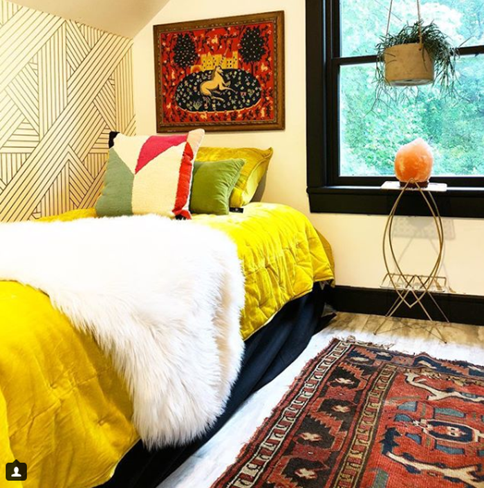
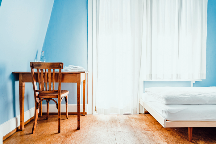
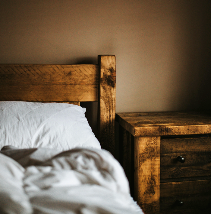
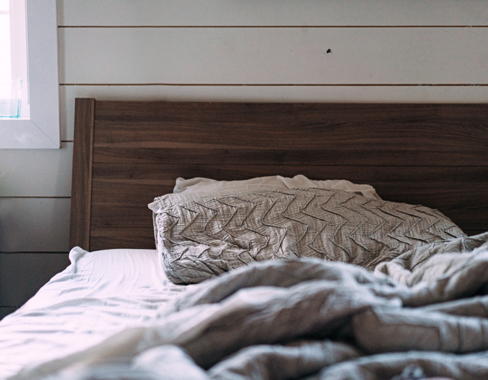
 

MAKE THE BEDS

Tidy house bed making

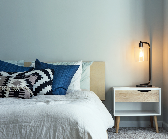
If one of the first things you do in the morning is make your bed, your day will be set up for productivity. The small win of checking off one item from the daily to-do list can make a huge difference in your perception of being able to take on the remaining items.

The great news is that making your bed is quick and easy. It should not take more than a few minutes to accomplish. A bed is typically one of the largest visible surface areas in a bedroom. Because of this, it can have a big impact. A made bed will give the illusion that the rest of the room is pretty tidy as well.

Take some time to teach your children to make their beds. Even if not done perfectly, the routine task will give them pride of ownership and a feeling of accomplishment.


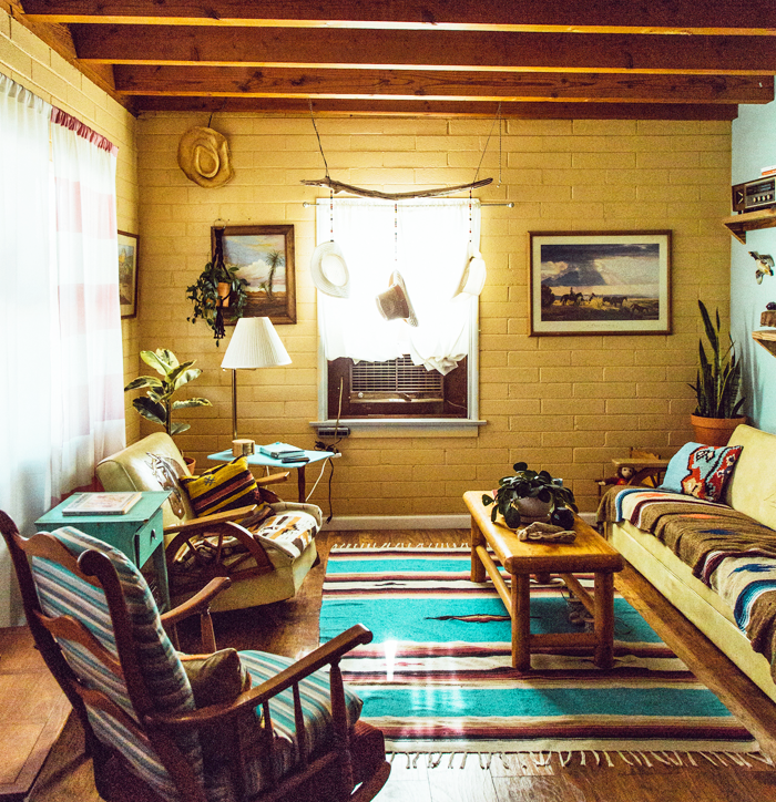
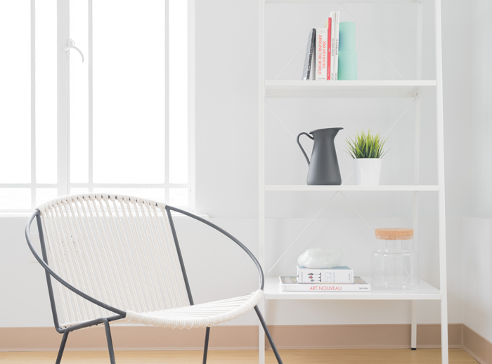
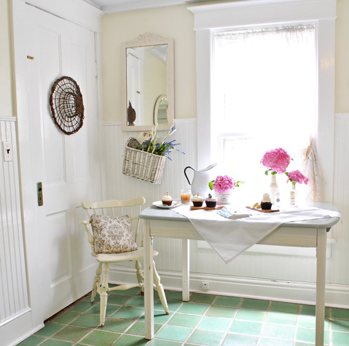
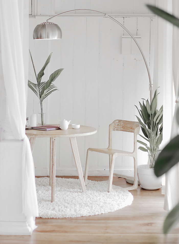
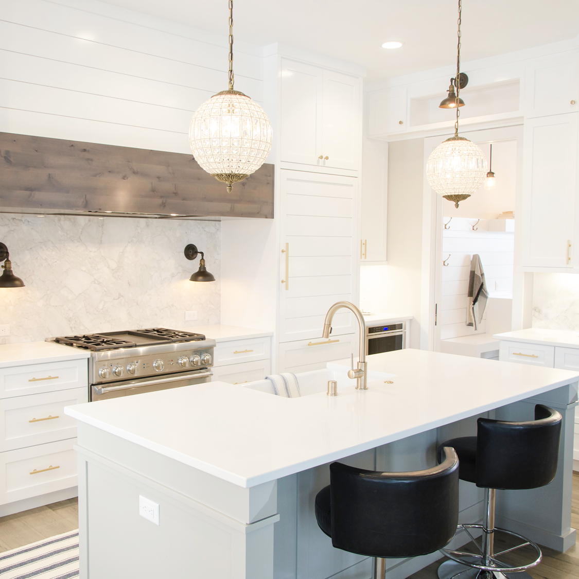
KEEP COUNTER SURFACES CLEAR

tidy house clean counters

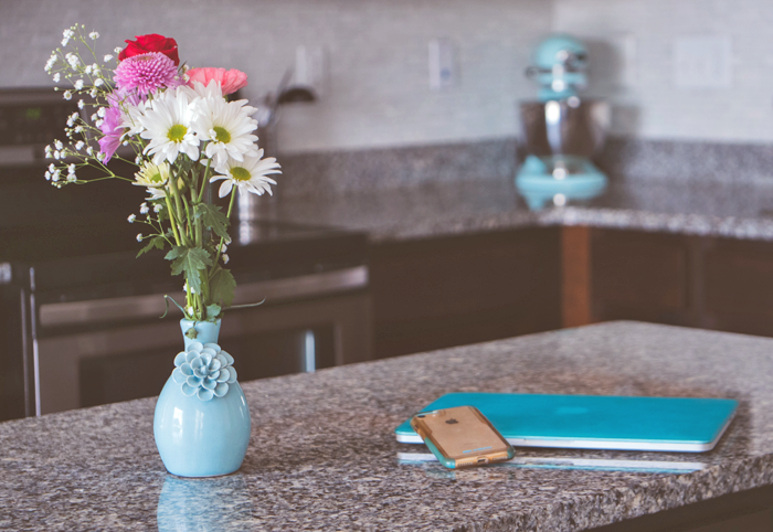
Visual clutter can immediately add stress to your day. Just as the bed is a large surface area in the bedroom, tables and counter space represent a large area in other rooms. The kitchen, for example. If they become dumping grounds for papers, clothing, and knick knacks, they lose the functionality they were designed for.

Of course, most counters will never be 100 percent clear all of the time. That is unrealistic. The goal is to work to keep the surface as clear as possible. If you use the counter to prepare dinner, for example, clear it up afterwards. After the meal has been eaten, remove the dishes from the table.


SORT THE MAIL

tidy house mail sorting station

One of the biggest counter-clutter culprits is the daily mail. Consider installing a file sorter, or placing a small basket near the entry door. Then, as soon as you enter your home, sort through the mail you bring in. Important papers can be placed in the sorter to be tackled later, and junk mail moved directly to the recycle bin.

Further this technique for other papers as well – receipts, work papers, even school art projects. Sort them straight away and you won’t find yourself with a massive pile to dig through later.


LEAVE SHOES AT THE DOOR

tidy house remove shoes

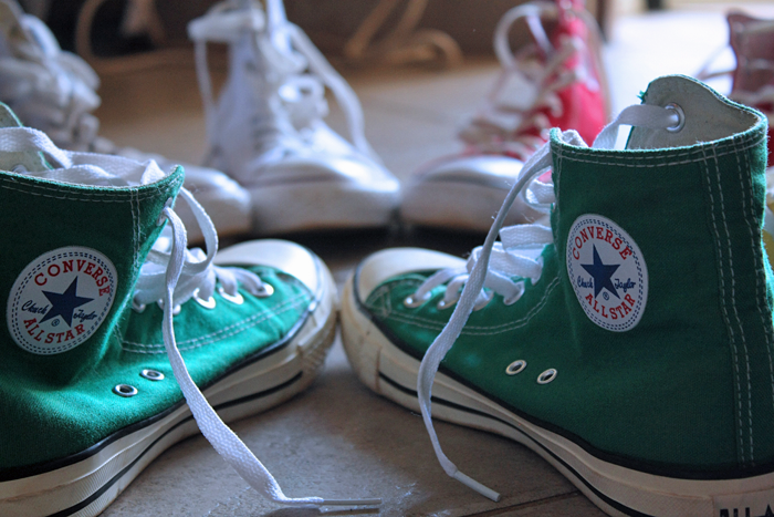
Consider all of the surfaces your shoes touch in a given day. Grass, pavement, gravel… even public restroom floors. It goes without saying that the potential for germs and debris on their soles is high. The last thing you want to do is spread that throughout your home. Unfortunately, that is exactly what happens if you leave your shoes on.

Make it a habit to remove your shoes at the door, and encourage the same of your guests. In doing so, you won’t need to clean your floors and carpets as often, and you will always know where they are. No searching for a missing shoe when you are running late!


IF YOU TAKE OUT, PUT IT BACK

tips for a tidy house

Each item in your home should have a place to rest – whether that is in a basket, bin, closet or cabinet. Once that ‘home base’ is established, be mindful that if it is taken out to be used it will be put back after.

Books will be read and placed back on the shelf, blankets in the basket near the fireplace.

Clothing should follow the same rule. When you change into your pjs in the evening, determine if the outfit you were wearing during the day is clean enough to be stored in the closet again. If not, it should make it’s way into the laundry bin No clothes should end up on the floor or the back of the chair.

This technique not only helps to keep the home tidy, but makes it easier to find items when they are needed. It helps if your children see you practicing this behavior. With enough modeling, they will learn to pick up and put away their toys after each use – meaning less work for you in the long run.


CLEAN THE KITCHEN EVERY NIGHT

7 habits for a tidy house

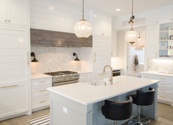
You don’t need a two hour deep clean session each day. Something as simple as making sure the dishes are washed and put away (or stored in the dishwasher) can have a big impact. The kitchen is likely to be one of the first rooms you encounter upon waking in the morning. Seeing it tidy acts like a breath of fresh air and can give you peace at the start of each day.

A clean kitchen has the added benefit of making you want to use it. Many people admit that they feel the urge to cook more often when their kitchen is organized with everything in it’s place.


BE GENEROUS

ways to keep your house tidy

Chances are if you were to take inventory of all the items you own and store in your home, you would realize that you use only a portion of them on a regular basis. Keep a donation bin handy, and toss those rarely used clothes, books, toys, and other miscellaneous items in it. Donate regularly to a local thrift store, or hold a garage sale.

The truth is: The less you have, the less you need to maintain. Less maintaining means less cleaning and more time for other things.


Your house is your haven, and when kept clean it offers a sense of peace to all inhabitants and visitors. Adopting these seven habits will start you on your journey to a tidy house.  To further your knowledge of how to simplify your home, consider reading these books:


Enough: Finding More By Living With Less

The Joy of Less: A Minimalist Guide to Declutter, Organize, and Simplify

The Life-Changing Magic of Tidying Up: The Japanese Art of Decluttering and Organizing


This post contains affiliate links to products for your convenience.  If you purchase via my links, I may receive a small commission at no additional cost to you.  Thanks for supporting Arrow Hill Cottage!

THE MAIN ELEMENTS OF THE TUDOR HOME STYLE

Welcome to another installment in the ELEMENTS OF HOME series. Each month, I showcase a different residential style here on the blog. It is my hope that this information will not only teach you a little something about the various styles; but also equip you if are designing or searching for a new house – by allowing you to determine which style(s) suit your lifestyle and preferences the most.

Today I will be over-viewing the Tudor home – including the history of the style and what makes it unique.


HISTORY OF THE TUDOR STYLE

The style was born in American after the height of the Queen Anne Victorian home reign. The fancy, elaborate Queen Anne’s, with all of their mass produced detailing, was falling out of favor – And, in turn, homeowners were beginning to search for handmade, craftsman touches. An interest in Medieval and early Renaissance architecture, common in early 1600’s England, brought the eclectic Tudor style to America in the early 1890s.

Many of the first homes built in this style were commissioned by European trained architects – for wealthy American families. As the popularity of Tudors grew, they became known as ‘Stockbroker Tudors’  – a nod to the many homeowners who had earned their wealth in the stock market boom of the 20’s. Eventually, the Tudor style became popular with middle class American families as well, and in the 1920’s and 30’s it was one of the most frequently built home types.


During World War II, with a resurgence of patriotism, a majority of the country’s homeowners preferred to build using the more ‘American’ architecture of the Colonial Style. That notion, partnered with the fact that Tudor style homes tended to be expensive to build and maintain, saw the style falling out of favor.  The height of it’s popularity ended in 1940.


MAIN ELEMENTS OF THE TUDOR STYLE

LOCATION

Though examples of the classic Tudor style can be found across the country, there are quite a few prime examples that exist in the Eastern states, especially in the Washington D.C. area.

Most commonly, this home style can be found in residential city neighborhoods and not in country settings, save a handful of large country estate mansions.


SIZE

The size varies widely for this home style. The first examples were built as very large homes and even mansions; But through time, as the style became more popular, modest Tudors began dotting neighborhoods. These smaller Tudor homes now make up the great majority of examples that exist in America.


EXTERIOR TRADEMARKS


  • STEEPLY PITCHED ROOF: Usually in a gable configuration, the roofs generally display little to no overhang. Though rare, some roofs are covered in a false thatching, in an attempt to mimic the picturesque thatched roofs of rural England.

an example of a false thatched roof


  • DECORATIVE HALF-TIMBERING: This non-structural technique is employed on approximately half of all Tudor style homes. This again is a nod to medieval infilled timber framing. The infill material is most commonly stucco, though brick and stone can also be found.


  • TALL, NARROW WINDOWS: Traditionally constructed of either wood or metal, in the casement style. They are frequently seen in groupings of three or more, the most prominent grouping centered below the main gable. Leaded glass paneled windows, set in a diamond pattern, are also common.


  • MASSIVE CHIMNEYS: One of the most popular detail of the Tudor style is a large, elaborate chimney. They are commonly placed in prominent locations on either the front or side of the house.

image source


INTERIOR SPACES

The interiors of Tudor homes are rich with detail and interest. The living rooms almost always feature a large focal fireplace. Heavy wood timber beams, similar to those used on the exterior detailing, commonly accent interior spaces. Arched openings between rooms is also a popular detail.

image source


The website traditionalhome.com has a wonderful slideshow featuring the Tudor style and how a home can be detailed- on both the interior and exterior – to reflect the historic nature of the home, while at the same time remaining relevant in the 21st century.


COLOR SCHEME

The exterior of classic Tudor homes are nearly all composed with a combination of four basic materials: stucco, brick, stone and wood half-timbering. Because of the use of these natural materials, the homes have a very ‘earthy’ exterior appearance. Most feature a darker base of stone or brick, and a lighter upper half with a cream or white stucco accented with dark wood beams.


NOTABLE TUDOR HOUSES


Ishpiming Mansion | Lindley Johnson & Leon Dessez | completed 1894


Agecroft Hall | Henry G. Morse | built in England in the late 1500’s and transported to America


INSPIRING TUDOR STYLE HOMES FROM AROUND THE WEB

These classic homes showcase the Tudor style well. Take a closer look!


The Happy Tudor


Tone on Tone


I hope you have enjoyed learning a bit more about the Tudor style. Curious which residential style will be featured next month? Stay tuned!

And be sure to check out the previously showcased styles here.


50 HOME DECOR IDEAS FOR THE 4TH OF JULY

With the 4th of July just two weeks away, I thought it would be fun to collect some home decor ideas from around the web. There are so many fabulous ideas that one thing led to another, and pretty soon I had FIFTY lined up. Let’s just pretend that was intentional – one for each state in the U.S of A!

Enjoy the beauty of the red, white and blue – and be sure to check out each of the linked blogs/websites under each photo to learn how to make these items or buy them for yourself!

THE REDS

1 | 2 | 3| 4 | 5| 6


THE WHITES

1 | 2 | 3| 4 | 5| 6


THE BLUES

1 | 2 | 3| 4 | 5| 6


THE MIX

1 | 2 | 3| 4 | 5| 6


THE STARS

1 | 2 | 3| 4 | 5| 6


THE STRIPES

1 | 2 | 3| 4 | 5| 6


THE FLAGS

1 | 2 | 3| 4 | 5| 6 | 7 | 8


THE (FREE) ART PRINTS

1 | 2 | 3| 4 | 5| 6


The majority above linked sites are either home decor bloggers or small Etsy shops. Find out more about each, by clicking the links below:


WEBSITE / BLOG CREDITS

The Reds:

1. Jenny Cookies   2. Catch My Party     3. JnSMDesigns (Etsy)     4. Eighteen25     5. Common Ground     6. The Country Chic Cottage


The Whites:

1. The Golden Sycamore   2. Fresh Gypsy     3. Family Chic     4. CakeryPapery     5. Design A Wreath (Etsy)     6. Elegant Wreaths (Etsy)


The Blues:

1. A Pumpkin & A Princess    2. Better Homes & Gardens     3. Crafts Unleashed     4. Bliss Bloom Blog    5. Gluesticks     6. A Fish Who Likes Flowers


The Mix:

1. Beyond the Aisle    2. Design Improvised    3. Girl in the Garage    4. The Magic Brush    5. Wholesale Party Supplies     6. eHow


The Stars:

1. One Thousand Oaks   2. The Shabby Creek Cottage     3. Balloon UP (Etsy)    4. The Concrete Cottage    5. TransparentES Decor (Etsy)    6. Simple Country Life


The Stripes:

1. Sweet Haute    2. Uncommon Designs     3. The Happy Scraps     4. Cayson Decor    5. Confessions of a Plate Addict     6. A Night Owl


The Flags:

1. Hoosier Homeade    2. Remodelacasa   3. LizMarieBlog    4. Craftiments     5. Ella Claire Inspired    6. Thrifty Decor Chic  7. Glitter Glass & Sass (Etsy) 8. Beyond the Picket Fence


Free Art Prints:

1. Sweet Rose Studio   2. Moritz Fine Designs    3. Lolly Jane     4. LandeeLu    5. Hey Let’s Make Stuff     6. Dawn Nicole Designs


THE 8 MOST IMPORTANT ASPECTS OF BATHROOM DESIGN

They aren’t glamorous. In fact, they are quite possibly the most forgotten – while at the same time, most useful – room in the house. The bathroom.

Every house needs one; But when it comes to design, homeowners tend to spend very little time contemplating what makes a bathroom perform to the best of it’s ability. Whether you are planning a brand new bathroom or are wanting to spruce up one that is existing – these eight aspects are the ones you should focus on first.


1. LOCATION

The common Real Estate motto should echo when deciding where to place a bathroom: location, location, location. Generally speaking, bathrooms are places where people want privacy. With that being said – the first guideline of positioning a bathroom is that it should not be directly adjacent, or open into, to a very public space in your home – such as the living room.

Secondly, there should be a bathroom accessible to everyone who uses the home – from those who live in it, to the guests that visit. If the only bathroom on the main level is the master bath, for example, your guests will have to travel through your master bedroom to access it. Consider a powder room or larger hall bathroom that is easily found.

Bathrooms are also in prime position near bedrooms on other levels of a home. Searching for one in the middle of the night, when needed, can be a dangerous adventure.


2. FIXTURES NEEDED

The next major aspect to consider is in regards to the function of the bathroom itself – by indicating which fixtures the room will require. The most common fixtures include the toilet, sink, shower, and bathtub; But custom fixtures, such as a bidet, may also be requested.

The bathroom count of a home relies more on the number and types of fixtures that each one has than the square footage allocated. Generally, a bathroom is considered a ‘half bath‘ or ‘powder room’ if it contains two fixtures: A sink and a toilet.

A ‘three quarter bathroom‘ will contain these basic fixtures plus a shower; and a ‘full bathroom‘ contains all four fixtures: sink, toilet, shower, and bath-tub. (The bath-tub/ shower can be a combo unit).


3. SIZE

There is definitely a comfort factor when it comes to bathroom size. There needs to be enough space so that each fixture can be accessed and used properly. However, an overly large room can create an uncomfortable atmosphere.The user may feel awkward when using a too large room.

Think carefully about how much space is needed to comfortably use each fixture in the bathroom. You may be surprised to learn that the room can be much smaller than you initially thought!

As you can see from this graphic, the bathroom on the left is quite cramped. The bathroom on the right, containing the same three fixtures, is too large – with a large amount of wasted space in the center.


4. VIEWS INTO ROOM

Although the door is typically closed when a bathroom is in use, there are also plenty of times during the day when the door will be left open. Be thinking about what you will be able to see through that open door. Surely it is more pleasing to have a view of the sink, rather than the toilet, for example.

When determining sight lines into a space, take a string or pencil mark and draw straight lines from each fixture to the other side of the door. If these lines pass through a wall (or the door), the view to that particular fixture is private. If the line has no obstruction, the fixture is in view.


5. PROPER VENTILATION

While a window can provide a natural and cost effective form of ventilation – it is not always possible to position one in the bathroom. In those situations, a vent fan is a definite must. In fact, it would be a smart idea to include a vent fan even if the room does have a window. Not only will it allow you to contain unpleasant smells and eliminate them quickly, it will also help with to avoid moisture accumulation – which can cause mold if not dealt with properly.


6. POSITION OF THE FIXTURES

The shape and size of the bathroom will help you determine the placement of each fixture. If you are starting from scratch, locating the plumbing along one wall can help reduce the cost of installation.

As discussed in topic #4, consider the more private fixtures, such as the toilet and shower, to be out of view when the door is opened.


7. LIGHTING & COLOR

Lighting is absolutely essential for bathrooms, especially near the sink/ vanity. Natural daylight is desirable, as is soft overhead lighting. Avoid fixtures that cast shadows on your face.

As mentioned in this post, the colors used in a bathroom can affect mood. If you want to create a peaceful and calm atmosphere, consider blues or greens. Yellow is a good option if you want your bathroom to invigorate you.


8. SHARING

Though bathrooms are typically a private space, there are times when two or more people will need to use it at the same time. If that is going to be the case for your family – whether it will be a husband + wife, or siblings using the bathroom at the same time – be thinking about ways that will allow the space to remain private and shared at the same time.

One common solution that designers have adopted is called the ‘Jack and Jill’ bathroom. In this layout, the bathroom is accessed from two entry points (many times, two bedrooms). The sinks are in a public zone of the overall bathroom, and can be accessed at any time, but the toilet and shower/bathtub are positioned behind another door.

Another popular layout option is to give the toilet it’s own ‘closet’ within the overall bathroom – allowing it to be used in privacy, while keeping the rest of the room open.


Of course, there are many more decisions that will need to be made when designing your bathroom. Likely the fun ones – such as choosing flooring and accessories – are more exciting; But if you take the time to consider the eight important groundwork aspects outlined here, your bathroom will be functional and serve the occupants of your home well.


PIN THIS FOR LATER

MY FAVORITE INSTAGRAM ACCOUNTS THAT FEATURE COLOR

I recently added a post about color theory – and how the shades of color you use in your home can affect the mood of the spaces. Since that post went live, I have been particularly aware of how different homeowners and designers use colors. Photo above by theartwerks Instagram is my favorite place to look for new inspiration; And I have come to realize that there seems to be three main schools of thought in regards to decorating with color:


ONE: Neutrals Prevail

TWO: Pops of Color

THREE: Color Explosion


I thought it might be fun to share a few of the Instagram Accounts that feature the use of color in each of these school’s of thought. Today, I will start with the ‘Color Explosion’ accounts that caught my eye.


@sararaak

Nobody does color quite like Sara. I love the cheerfulness of her feed and how she is unafraid to use color and pattern in each and every room of her home!


@blueberrylivingco

Fun and floral. That is the way I would describe the Instagram feed of Ju De Paula. She uses the tagline ‘feel the joy’ – and it is certainly possible while looking at how she decorates her space!


@katepearcevintage

The deep, rusty hues in Kate’s squares are bold yet sophisticated. Her home puts out a retro and ultra comfortable vibe, and color plays a major role in that.


I hope you get a chance to visit the links to these fabulous accounts. They truly are inspiring! Be watching for future posts that focus on the other two main ways homeowners and designers tend to use color.


HOW TO CREATE A COMFORTABLE OUTDOOR ROOM

With Summer right around the corner, you may be anticipating enjoying the outdoors – listening to the birds sing, sipping lemonade on the porch or grilling steaks on the patio. You may be wondering what steps to take to make the perfect summer outdoor space of your own.

The truth is that not all rooms in nature are created equal. There are six key elements that will help you make an outdoor room as pulled together and comfortable as possible – one that you, and your potential party guests, will want to linger in all summer long.


1. DEFINE A SPACE, AND MAKE IT PRIVATE

How to Create a Comfortable Outdoor Room

Intimate spaces are inviting spaces. Instead of trying to figure out a way to make your entire yard an oasis, start small. Begin by locating a portion of your yard that is relatively convenient in relation to your home. A spot directly outside a dining room or kitchen, for example, might be a good choice.

Defining a space could be as simple as building a fence around the area, or changing the ground cover. Patios made of bricks or slabs of stone are popular, as are wooden decks. This defined space will be even more enjoyable if it is hidden from public view. Potted plants of varied heights could make a natural ‘green wall’ or a privacy screen might be created with chicken wire and vines.

Fun privacy ideas for your outdoor room:  1 | 2 | 3


2. BRING THE INDOORS OUT

You’ve heard of bringing the outdoors in – now think about that concept in reverse. Make it feel like an extension of the home you love, by drawing elements from the inside – outdoors. Perhaps there is a certain color or theme that your interior is decorated with. Using those same elements outdoors will create a unified look.


3. ADD CONVENIENCE

For an outdoor room to be comfortable, it also needs to be functional – so that once you are in the space, you won’t need to leave it to grab a convenience item.

If you have a grill in your space, make sure that all the grilling tools are handy. If it is a place you plan to nap in, have pillows and blankets nearby. A cart to hold beverages and snacks would be welcome in just about any outdoor room!

These conveniences are clever and useful! 1 | 2 |


4. PROVIDE VARIED SEATING

Think about your outdoor room being used by various group sizes. You may want enough seating to accommodate small group conversation, a place to dine, or even a one person seat – such as a hammock.  You can include multiple seating options, which can be rearranged as needed.

Various seating options for outdoor rooms: 1 | 2 | 3


5. KEEP IT SHADY AND PROTECTED

A shady and protected outdoor room is essential for use in the warm summer months. Shade options can range from a simple draped canvas overhead, to a detailed pergola. A full roof will offer a more protected feel, and possibly a longer season of use for your outdoor room.

If you want to extend the use of your space into the cooler months, you may consider adding operable screens/ windows and a heating source such as an outdoor gas fireplace or wood burning fire pit.


6. LAYER THE AMBIANCE 

Your outdoor room will come to life if you consider all five senses, and how they can be connected to nature, when pulling it together.

Sight: What will you see when you are in your outdoor room? A pleasant view will allow you to relax and let your other senses to be engaged. At night, solar lights or strands of lights above create a magical feeling that will make you and your guests want to stay up past bedtime.

Smell: This sense can make or break an outdoor room. Take care to ensure that items which could produce unpleasant smells, such as a garbage can, aren’t close by. Using flowers and other sweet foliage can help you connect with nature. A fire feature can also create ambiance and a pleasant, familiar smell that is sure to be enjoyed.

Hearing: Often this sense is overlooked, yet it has a huge impact on the enjoyment of a space – especially outside. If your home is in a loud neighborhood, consider a white noise machine to cancel out some of the noise. Add in pleasant sounds, such as a water feature, for comfort and tranquility.

Taste: The pleasure of preparing food outdoors is multiplied when you can pick fresh food and spices. The installation of a raised-bed garden nearby, or pots with herbs, adds an interactive element to an outdoor room.

Touch: Tactile elements such as pillows, rugs, and even the furniture that is selected to fill your outdoor room can engage the user of the space in a way that no other sense can. Take care to ensure that these items are not only pleasant, but interesting to touch.


By following these six key elements of design, you can create an outdoor room that is not only comfortable – but also engaging and interesting. Put them to work for you, then sit back, relax, and enjoy the summer!


Pin this for later:


HOW ROOM COLOR CAN AFFECT MOOD

Imagine your favorite color. What about that specific shade makes it stand out in your mind? Have you ever thought about how it makes you feel?

Though preferences vary – science has taught us that colors evoke similar feelings in the majority of people. How then, do the colors you choose to use in the rooms of your home affect your mood?


Generally speaking, all colors stem from the three main PRIMARY COLORS – Red, Blue, and Yellow.

They are further divided into three main categories: Warm, Cool, and Neutral.


WARM COLORS: Located on one side of the color wheel – Reds, Yellows, and Oranges – these shades evoke feelings of warmth because they remind us of things such as fire and the sun.

COOL COLORS: Located on the opposite side of the color wheel – Blues, Greens, and Purples – evoke cool feelings because they remind us of grass and water.

NEUTRAL COLORS: The standard neutrals – White, Gray, Black, and Brown- are considered ‘non-colors’. In reality there are wide varieties of neutral hues, with a range of warm or cool undertones. Black and brown are considered to lean toward the warm side, while white and gray tend toward cool.


WARM COLORS IN YOUR HOME

Warm colors are stimulating and fun. In your home, warm colors work well in the public and social rooms of the house such as the living room, dining room and kitchen.


RED

Red is a very intense color, and tends to liven a room. Because of it’s intense hue, it is the perfect color to use when looking to add interest and excitement to a space. The eye will naturally be drawn to it, and even a small pop of red will raise a room’s energy level. It has been said that red stimulates conversation and increases appetites – making it a popular choice for living and dining rooms.


YELLOW

Yellow is considered a happy color. It can make people feel energetic and cheerful, and yet large amounts of the brighter shades of yellow may evoke feelings of anxiety, frustration, and even anger. The softer yellows are a better bet for whole room coverage, as they tend to be easier on the eyes and reflect light well. Rooms that can benefit from uplifting yellow hues include entry spaces, kitchens, and bathrooms.


ORANGE

Orange is a highly energetic color that represents happiness and innovation. Though it has a reputation of being overwhelming, the more subtle shades (such as apricot and terracotta) have become more popular in modern day interior design. Color experts warn that the brighter the shade of orange you use, the less you need.


COOL COLORS IN YOUR HOME

Cool colors tend to be calming. They evoke feelings of restfulness and peace – and therefore are wonderful choices for private rooms where concentration and quietness are important, such as bedrooms, offices and bathrooms.


BLUE

Blue is considered relaxing and serene. It has been said to bring down blood pressure and slow respiration – making it a popular choice for bedrooms and bathrooms, especially in the softer shades.  Dark blue may evoke feelings of contemplation and in large amounts, even sadness.


GREEN

Green is considered the most restful color for the eye, as it combines the refreshing quality of blue and the cheerfulness of yellow. When used as the main color for decorating, it is said to relieve stress and help people relax. Because of it’s overall pleasant feel, green is suited for almost any room in the house.


PURPLE

Purple is associated with luxury and creativity. Though rarely used as the main color in decor schemes, it does lend itself well as an accent or secondary color, by adding depth. Darker hues of purple – such as eggplant – can make a space feel rich and sophisticated, while lighter versions – such as lavender or lilac – can bring a restful quality to a space.


NEUTRAL COLORS IN YOUR HOME

The neutral shades are considered the building blocks in a decorator’s tool kit. Because of their flexibility they are useful as either the base/main color for a room, or a grounding accent color. When decorating, it is recommended that 80% of a room is composed of neutral colors, and 20% of the remaining space filled with strong accent colors – pulled from either the warm or cool tones of the color wheel.


WHITE

Because of it’s light reflecting abilities, White is considered airy, peaceful, and clean. Designers often use white to make roomss feel more spacious, or as a blank slate to build upon. Be careful not to whitewash everything though – too much white in one space can make it feel stark, cold and bland.


GRAY

Gray is considered the most unresponsive color – emotionless, neutral, and safe. Lighter shades of gray will feel cool and serene – with just a bit more warmth than white. Darker shades of gray can feel solid and steady. In any shade, this color blends well with others – allowing them to take center stage.


BLACK

Black is a ‘grounding’ color. It can be used as an accent to virtually any other color. In fact, some experts in the color field argue that a bit of black should be incorporated in every room to ground the color scheme. But remember, a little bit of black can go a long way!


BROWN

Brown is an earthy color that invites you to reconnect to your roots and embrace nature. It is a reliable color that makes you feel safe and warm. Brown is a popular choice as an accent color, primarily in the use of wood furnishings and cabinetry.


COMPLEMENTARY COLORS

When determining which colors will look best together in a space, you can find some great clues by going back to the basic color wheel. Colors that are opposite each other on the wheel are thought to work together well. Blue and Orange, for example, are considered complementary colors.


I find the theory of color fascinating! Do you agree with the scientific studies? Does your favorite color evoke the same feelings written in this post? I would love to know if the colors you favor tend to make their way into your home decor – comment below!

And feel free to visit my Pinterest page – for boards showcasing Hues of Home!

Pin this for later:


UNDERSTANDING WHAT MAKES HOME ‘YOURS’

We are in waiting mode, as three local contractors are pouring over our house plans in an effort to get us accurate bid numbers. They have seen plenty of house designs in their day – and no two exactly alike I’m sure.

There were some questions when we had our meetings with the contractors – and some comments made by friends and family, regarding the design choices we have made that make our home what it is. And I have been thinking a lot lately about how tailor fit this house is for OUR family.

I just wanted to take a little time today to encourage each of you to understand the home that YOU want to live in. What works for you and your family may not be the norm. It might not be what the real estate market expects, or trending on Pinterest. And guess what? That’s okay!


This is a list of a few of the unconventional features that have been incorporated into our new house design, and why we are happy with our choices:


LACK OF SQUARE FOOTAGE:

We understand that our house is on the small side. The primary dimensions of our house are 28 feet by 32 feet, making a rectangular footprint about the size of a standard two car garage. The smaller footprint was a function of both our challenging site, and also for monetary purposes.

We have said all along that we do not wish to live in a large house; but rather one that can accommodate today’s needs while we raise our five children, and won’t seem too spacious when they are all grown and gone. All told, the finished square footage of the cottage, including lower level and upstairs half-story, will be just over 2,000 square feet.


NO MASTER SUITE:

Most newly built homes feature a main level bedroom, complete with a large walk in closet and attached on-suite bathroom. Though our cottage will indeed have a main floor bedroom, so that we can age in place, the room will not have the features to make it a ‘suite’.

We have instead opted to have a large shared bathroom on the main level, near the mudroom/ back entry. It is only a short, accessible, distance from the bedroom; But it’s location through a public shared space will make it convenient for guests as well.

The closet for the main level bedroom is large – about 5 feet in length – but it is not a walk in style. We have justified the smaller closet space by realizing that we try not to keep items that are not useful to us. In fact, the only other closet on the main level is a small broom closet near the bedroom door.


SHARED KID BEDROOMS:

This design item seems to get a lot of attention. The idea that we can fit five children into two bedrooms gets a few raised eyebrows. For us though, it is the perfect set up. The kids will have the entire second level, which simply features two bedrooms (one for the girls, and one for the boys), and a hall bathroom to serve both rooms.

To be honest, our kids have always shared bedrooms and I think they would be a bit lost having a room all to themselves. We do, however, anticipate that as the teen years approach (our oldest son is 11) – they will want more privacy. The sleeping nooks in the boys room will aide in that regard – while still keeping them close.

Fewer bedrooms mean less nagging from mom and dad to get the rooms in order, and hopefully will develop some shared responsibility among the siblings to do their part in keeping things clean.


COMBINED KITCHEN/DINING:

While this design decision was driven primarily by the budget, during the simplification process, I have to admit that I am actually looking forward to the combined kitchen and dining space. The table, though standard height, will serve somewhat as an island if need-be.

I have been tinkering with the plan, and was careful to maintain a functional kitchen work triangle – with the table slightly offset from it. The large area of open shelving, with shallow cabinets below, almost mimics a hutch – which signifies a ‘dining’ space ever so slightly


RELATIVELY LITTLE STORAGE:

Because we know that, for us, items stored behind doors rarely get used, we have opted to have very few storage/closet spaces in the cottage. There is one small broom closet incorporated in the plans for the main level, but no coat closets. Instead we will use cubbies or hooks in the mudroom to house our outerwear. Upstairs, each bedroom will have a closet, and there are a couple of small unfinished storage areas in the eaves which will be useful for Christmas decor and other seasonal items.

It is standard to build three stall garages for new homes. Most families now have two vehicles, and will use the third stall for either an accessory item such as a boat/ ATV, or as storage space. Though we have been told that garage square footage is cheap and we should consider making ours larger – perhaps with a bonus space above – we have decided that a two car garage will be just fine for our needs. We are hoping that by setting the garage back from the house and making it only one story, it’s appearance will be minimized from the curb view. The fact that the garage will be attached is a huge bonus for our family, as we have never owned a home with that luxury. It will especially be appreciated during the cold winter months!


There you have it! Though these design choices may not be popular in today’s market – we aren’t looking to ever sell our house (instead hoping it will passed down through the generations) – and so feel no hesitation in making these changes that will allow the cottage to function in the best way possible for our family.

What makes your home personal? A unique shade of color on your walls? No formal entry space? Mix-matched cabinetry? I would love to hear, in the comments below!


THE MAIN ELEMENTS OF THE AMERICAN FOURSQUARE HOME STYLE

image source

Welcome to another installment in the ELEMENTS OF HOME series. Each month I showcase a different residential style here on the blog. It is my hope that this information will not only teach you a little something about the various styles; but also equip you if are designing or searching for a new house – by allowing you to determine which style(s) suit your lifestyle and preferences the most.

Today I will be over-viewing the American Foursquare home – including the history of the style and what makes it unique.


HISTORY OF THE AMERICAN FOURSQUARE STYLE

The American Foursquare style first came into recognition in the late 1890’s and was popular until the 1920’s. It is considered a ‘true American style’ and though it begins during the era when elaborate Victorian homes were popular, it tends to resonate more with elements of the Craftsman/Prairie movement – with more simple detailing and solid craftsmanship.

The essence of the design intent was to create the greatest amount of square footage possible on a standard city lot. This was achieved by utilizing a box like form, which typically included four rooms on the main level plus 4 rooms on a second story. A pyramidal roof, covering a half-story attic space, was a common feature, as was a large front porch.

Though ‘American Foursquare’ is the proper name for this house style, it is also widely known as ‘box house’ , ‘cube house’, or ‘Prairie cube.’

image source


Because of the simplicity in lines and design, the American Foursquare was also a very popular kit home. In fact, at one point Sears & Roebuck offered some 15 different styles in their catalog. Check out the book  The Houses that Sears Built  for more information on kit houses. (this is an affiliate link)


MAIN ELEMENTS OF THE AMERICAN FOURSQUARE STYLE

LOCATION

Though popular throughout the country, the American Foursquare style is most notably concentrated in the Midwest. They were primarily settled in urban areas, on standard city lots, but were also popular in a country setting.

image source


SIZE

The American Foursquare home is considered to be of ‘medium’ size. Though the original built homes were finished only on the main and second level, most also featured a full unfinished basement and a half-story attic above – which, if finished, could almost double the livable square footage. The homes are typically set a few feet above grade, making them look tall and large.


The Castleton was one of the many popular kit houses that were offered in the American Foursquare style.


EXTERIOR TRADEMARKS

  • BOXY SHAPE: The square footprint/ floor plan of this house style is further accentuated by the flat appearance of the elevations. Large double hung windows, grouped together, is commonly noted.
  • LARGE FRONT PORCH: The front porch is a hallmark that nearly ever home of this style exhibits. It extends the entire face of the front facade, providing shade and an element of ornamentation.
  • PYRAMIDAL ROOF WITH DORMER: Though exceptions exist, most American Foursquare homes feature a pyramidal or hipped roof, with a dormer on the front facade – allowing light into the attic space.

image source


INTERIOR SPACES

The first floor of a traditionally built American Foursquare home usually contains an entry foyer (often with the stairs to the second floor), a living room, dining room, and kitchen. The second floor in the larger models has four bedrooms and a bath.  Some smaller sized homes have 3 bedrooms and a bath. These interiors were so efficiently planned that minimal space was used as hallways or accessory spaces. Even today, the original Foursquare’s maintain the intent of their original floor plans – with perhaps a rear one story addition to accommodate a larger kitchen, and/or the finishing of the attic or basement space.

The interior styling is simple and handcrafted – with a focus on natural light, and finely crafted woodwork. Because every room in the home is essentially a ‘corner room’ – they receive light from two directions. Built-ins such as bookcases and window seats were popular enhancements; those building planbook or kit houses could order room-dividing colonnades and kitchen cabinets to accentuate the interior rooms.


image source


COLOR SCHEME

Because the popularity of the American Foursquare spanned many years, it is hard to summarize the paint colors most commonly used – as the taste shifted tremendously during this time frame. The one thing that is consistent throughout is the basic nature of coloring utilized. Foursquare’s are meant to be simple and classic, not showy. Where Queen Anne Victorian homes of built in the same timeframe were adorned with multiple colors to accentuate each and every detail, the American Foursquare featured a refined look – utilizing only two to three main colors. Generally, more muted, ‘earthy’ and grayed colors were the most popular.

A typical two color scheme included the body of the home is painted one color, with the trim and other details painted another, possibly contrasting shade. For a Foursquare home, the trim is most commonly lighter than the body paint choice. When the roof was composed of a colorful asphalt product, it was sometimes used as a cue for the color scheme – oftentimes homeowners would match the roof with their trim color, for example.

For a more comprehensive look at the colors of an American Foursquare home, consider reading the book Bungalow Colors by Robert Schweitzer. (this is an affiliate link)


image source


NOTABLE AMERICAN FOURSQUARE HOUSES

Hillrose | winner of the 1916 Sears Competition| popular kit house that costed $2,000 to build in 1916. A reproduction was $1 million to build in 2016!


G.C. Stockman House| 1907 Ladies Home Journal article | Designed by Frank Lloyd Wright


D.C Passive House | 2011 | New construction designed to look like a classic American Foursquare, with energy saving techniques


INSPIRING AMERICAN FOURSQUARE STYLE HOMES FROM AROUND THE WEB

These classic homes showcase the American Foursquare style well. Take a closer look!


Left to Right: 1 | 2 | 3

*** side note: My husband and I were fortunate enough to own and live in a 1904 American Foursquare, and absolutely loved it’s simplicity and practicality. They truly are classic homes.***

I hope you have enjoyed learning a bit more about the American Foursquare style. Curious which residential style will be featured next month? Stay tuned!

And be sure to check out the previously showcased styles here.


TRENDING IN HOME DESIGN & DECOR: INTERIOR WALL CLADDING

While historically it may have been implemented for it’s ease of installation, cost effectiveness and as a durable finish, interior wall cladding is becoming a popular design choice with modern day homeowners as they seek for something other than standard drywall.

Cladding is available in a variety of styles and materials, each with it’s own aesthetic. Read about the most popular styles, the common materials used to create them, and a few important installation tips.


CLADDING  VARIATIONS

There are many cladding options available for today’s homeowner. I have compiled a list of what I consider to be the five most popular varieties, complete with a sketch of what each application looks like in cross section and a photo of the actual material used in a space.

BOARD + BATTEN

image source

Made with a series of boards overlaid with strips of 1x materials over the seams/joints. Plywood can be used in lieu of boards, for a more simple application. Some DIYers prefer to add the 1x strips directly to the wall at a chair rail height, and use paint to achieve the look of paneling.


BEADBOARD

image source

When factory produced mill-work became available in the Victorian Era, beadboard was a popular choice to clad the walls (and ceilings) of utility spaces such as bathrooms and pantries. These strips of wood are milled with joints that fit together to form one continuous wall covering.


SHIPLAP

Photo by Bekah Russom on Unsplash

Made popular by Chip and Joanna, Shiplap is a decorative cladding treatment where horizontally laid boards interlock. An optional ‘nickel gap’ milled on the top edge of the boards creates a shadow line that highlights the individual boards. The lines of this cladding style are clean and simple, making this a popular choice for traditional and modern homes alike.


V-GROOVE

Photo by Hutomo Abrianto on Unsplash

This cladding was most popularly used in Colonial-era homes and is created by boards that are milled with chamfered (or right angle cut) edges on both sides, which form a ‘v’ when the boards are combined. V-groove cladding is readily available in a variety of wood and synthetic materials.


PLANKS

image source

Generally, this cladding technique is created by applying salvaged boards of various sizes and colors onto a wall in a collage format. Reclaimed barn wood and shipping palettes are common materials utilized. DIYers love this cladding style for feature walls – to give their spaces a rustic and handmade look.


POPULAR MATERIALS

These cladding options are typically available in three different materials: wood/plywood, salvaged wood, and MDF. Your decision to choose one material over another may be based on a variety of factors including ease of installation/finishing, the size of your project budget, and the space you will be using the cladding in.


WOOD / PLYWOOD

image source

A wide variety of wood species are utilized to create the cladding material, from budget friendly pine to stunning cedar and redwood. Because wood expands and contracts over time, it important that space is left between boards during installation. Wood is very durable, but can be heavier than other material choices. Plywood sheets with grooves cut to create the appearance of planking are lightweight, easy to install, and very budget friendly.


SALVAGED WOOD

image source

This material can be gathered from a variety of sources – from old barns to factory floors – and has rustic charm and character. You will want to be sure that salvaged wood has been properly cleaned and dried – to avoid pesky, unwanted insects from being ushered into your space.

Companies such as Plank + Mill offer a salvaged wood product that has been cleaned, kiln dried, and planed thin before being applied to and adhesive backing. These ‘peel and stick’ products are ready to be installed directly on your walls with ease.


MDF

image source

Medium density fibreboard is becoming a more popular material choice as natural resources become scarce. It is made up of approximately 80% wood fibre material, and a mixture of glue, water, and wax.

This material can be quite budget friendly and is available in a wide variety of sizes and even 4’x8′ sheet applications. It’s downfall is that it can not be used where moisture is a possibility, as it acts like a sponge to soak up water – eventually swelling and crumbling apart. Though there are some companies who offer a water resistant MDF material, it is not readily available.


TIPS FOR INSTALLATION

DIRECTION MATTERS

Generally speaking, vertically laid material will give the illusion of height – while horizontal boards make small spaces seem larger. Keep that in mind when making selections for your space.


KEEP IT SIMPLE

Add character, not clutter. When determining what style of cladding to use be mindful that multiple styles may not look great together. A vertical beadboard wall will clash with a horizontal shiplap wall nearby, for example. Experts caution that while one style per space is encouraged, a maximum of two styles should be used in each space. A maximum of three styles throughout the entire house is also recommended.


START LEVEL

When installing cladding in plank form, it is vitally important that the first board/plank installed in plumb and level.  You may want to have an extra pair of eyes and hands available to help guide that first piece into place. Failing to take the extra time upfront can cause big problems during the rest of the process.


MY THOUGHTS ON THIS HOME DESIGN TREND

I am a texture lover, and interior wall cladding adds a depth that plastering or basic paint is not able to accomplish. The bonus of this trend is that it is fairly DIY friendly, and forgiving. Part of the charm of interior cladding is that it reminds us of older, historic homes – where perfection is not expected.

The exterior of our cottage will feature both standard lap siding and board + batten applications. I imagine we will also use a few accent spots of cladding on the interior, as a way to tie the inside and outside of the house together as a cohesive design.