RUSTIC KITCHEN IDEAS: MAKEOVER TAKEOVER FOR BEN & ADELL

The Makeover Takeover series focuses on helping my readers with bits of their own homes that are giving them challenges. Whether it is a room that they want guidance on styling, a floor plan that needs re-configuring, or they are stumbling with choosing an exterior color palette, I am happy to help. I offer solutions through virtual design and source links.

My first two Takeovers were both bathrooms – a modern Small Beachy Bathroom, and a Classic + Clean Bathroom remodel in a historic home. They were both met with wonderful reviews, and this time around I was excited to shift gears a bit and work on a kitchen remodel.

My friend Adell and her husband Ben live in a super adorable traditional home with their four young kids. Though the house has architectural features that really shine, the kitchen leaves much to be desired.

THE KITCHEN TODAY

The layout of the appliances is actually quite efficient. The sink/ DW, fridge and oven are arranged in the basic work triangle, which works well.  There is a portion of wall next to the fridge that juts into the space, but because of the way the floor steps down to meet the attached garage access, it needed to stay. For the most part, I wanted to focus on the cosmetic aspects of the room and on making it as organized as possible, finding a home for everything.


PROPOSED PLAN CHANGES

As you can see from the photos, this is one busy family! There are little reminder notes, and calendars on the cupboards, and the kids art projects are taking over the fridge. I wanted to streamline the organization of these bits, cleaning up the space.

I also wanted to maximize the work space, by finding a home for all of the small appliances and kitchen gadgets that are residing on the counter tops.

They have an open layout from kitchen to dining, and the counter extends so that there is space for seating on the dining room side. However, because of the position of the stove, it isn’t a safe place for the kids to sit.

There is a pantry that opens into the kitchen. The storage is nice, but it creates a bump out that leaves a strange little corner. The family has a small table positioned here, but as you can tell by the picture – it has become a bit of a drop spot. Again, I wanted to provide them with functional storage.

And last but not least, I wanted to clean up some of the strange finishes that the previous owners of the house have left – including the wallpaper border/ back-splash and the sheet linoleum floor that was PAINTED to look like individual ceramic tiles. What? Yes, it’s true.


FINISH INSPIRATION

Adell and Ben sent me images of kitchens and materials that they love – and based off of their selections, I would say that they have a very classic style, with traditional lines and a touch of rustic flair.

I was able to source a wonderful selection of products that I think would be amazing in their space. You can learn more about each product by clicking on the titles below.

SINK: This stainless steel apron sink will match the other appliances well.

FAUCET: In a simple black finish.

COUNTER TOP MATERIAL: Quartz in a simple white color (Arctic Lace)- a clean, fresh look to compliment the dark cabinetry.

RUG: Adds a splash of color to the space.

FLOORING: This beautiful porcelain tile looks like weathered wood. Set in a herringbone pattern, it adds a beautiful surprising detail.

LIGHT FIXTURE: A black industrial barn pendant set above the kitchen sink for extra task lighting.

BAR STOOLS: Simple and a bit industrial.

CABINETS: A custom cabinet maker can get specialty sizes, but this stock variety could save a bundle.

CABINET PULLS: These simple matte black pulls compliment the cabinetry without overpowering it.

CUTTING BOARD: A dose of natural walnut adds warmth and character.

WIRE BASKETS: These simple baskets are handy for storage, but because of their openness – don’t promote clutter.

ART: A fun kitchen is one you can dance in.

WALL COLOR: ‘Agreeable Gray’ from Sherwin Williams – the perfect neutral.


AND NOW FOR THE BIG REVEAL!

Can you see the changes? Even though the footprint of the room didn’t change – it seems so much more open! The colors are muted and neutral, which will blend well with the rest of the home decor. Just for reference, let’s take another look at the space pre-makeover.

Quite the difference, I think! Here are the details of what I did to achieve the casual rustic look that Adell and Ben love.

Obviously, all new cabinetry provides a fresh look. Because they are a darker gray stain that shows some wood-grain, I opted to go with a very simple quartz for the counters. Quartz is a wonderful low maintenance surface that is perfect for families with young children. The window above the sink was doubled in size, to allow a greater view of the backyard and let in more natural daylight.

The sink was replaced with a stainless steel apron variety. The large double bowls are very efficient. All corner cabinets in the kitchen have hinged doors that allow access to Lazy Susan storage.

Above the sink I hung a large industrial barn style pendant light. This will provide wonderful task lighting, and is also a focal point for the room.

I removed a window on the fridge wall, which allowed me to even out the counters and provide a more accessible spot for the microwave. The small shelf above the microwave is the perfect size for a cookbook or two.

Next to the fridge, I am proposing a framed piece of sheet metal that can be used to hang notes, calendars and even kid artwork. This wall isn’t as visible from other rooms in the house, making it the perfect location for those random bits.

Where the pantry used to be, I am proposing a more shallow base cabinet with pull out pantry drawers. This is efficient storage for canned and boxed goods, and it offers additional counter space. Because of it’s location to the entry from the attached garage, this area naturally becomes a drop spot.

There is no shame in that. Every house needs a drop spot! The key is to keep the space organized and efficient so that it remains useful and not cluttered storage. Baskets can be placed on the shelves for papers that need to be filed, bills that need to be paid.

The counter/bar seating near the range has been raised, for safety purposes.

With the addition of rustic wood corbels, this is now an attractive spot to eat an afternoon snack or do homework.

And immediately next to the bar, where a small cart used to reside, I am proposing an additional built in cabinet – to house the broom, cleaning supplies, and all of those fun kid craft materials.

The real masterpiece of the room though has to be the amazing wood-grain tiles set in a herringbone pattern. So beautiful and durable! Accented with a pop of color from a distressed bohemian style rug, these floors really come to life!

One last look at the completed space:

I’ve created a 3d animation of the kitchen makeover for a closer look. Click the play button below to view.


I think that this casual rustic kitchen design would blend very well with the rest of Ben and Adell’s beautiful home. Working on this project for them was a lot of fun!

Remember that this is a FREE digital home design consultation, which is available to anyone who subscribes to the Arrow Hill Cottage website. If you or someone you know could benefit from this service, simply email me with a few photos and a description of what issues you would like resolved.

If chosen, I will offer a solution + inspiration through 3d images and sourced items. Hurry though! I only have the ability to do one Makeover Takeover each month and the spots are filling up quickly! I have plans to eventually make this a paid service, so if you have been thinking of contacting me about a project and want to get in on the free deal, don’t hesitate!


This post contains affiliate links to products for your convenience. If you purchase via my links, I may receive a small commission at no additional cost to you. Thanks for supporting Arrow Hill Cottage!


FRONT ENTRYWAY DESIGN IDEAS

A front entrance for guests is a great feature to add to any home. It doesn’t need to be a large space, but having it laid out well is important. Today I am sharing the front entryway design ideas I have for Arrow Hill Cottage.

Although our home will have an attached garage, and our family is most likely to enter and leave in that direction, I wanted to make sure to include a straightforward front entrance – where we expect visitors to enter. I’m not sure about you, but our garage has a tendency to become cluttered and dirty far faster than any other space we own – and we don’t want our visitors to experience our day to day.


ENTERING FROM OUTSIDE

As you can see in this image, the front door will have a prominent position. Although the house is not symmetrical, your eye is drawn to the small gable above the door.

creating a charming front entryway

In case you noticed… yes, I am still #teamplanter, and it remains as part of the design, at least for now. If you have no idea what I’m talking about – go ahead and visit THIS POST to learn all about the debate.

The large stone pillars and double columns frame the view.  I’m sure there will be some sort of feature light fixture here also, but I haven’t made any decisions on that yet. And yes, I am dreaming of a light blue bead-board ceiling for the porch. Love.


cottage front entrance. Covered porch with sweet and simple front entry

I have chosen a solid wood door. Because there will be windows directly next to and above it (transom), I felt that including a smaller pane of glass within the door itself would complicate the arrangement. The windows should provide plenty of natural light (this wall will be south-west facing)


INSIDE THE ENTRYWAY

Stepping through the door, you are welcomed with a space approximately 6 feet deep by 12 feet wide. The room is partitioned from the dining room by a pair of built-in cabinets and columns.

front entryway with custom built ins and columns used to divide space

We will likely have our builder or cabinet maker create these cabinets and columns, but This Old House wrote a fantastic post about how you can make this a DIY project. I purposely chose to offset the built-in slightly from the alcove since the wall finish and the cabinet finish will be different. This will help eliminate a clumsy transition from cabinet to wall. The baseboard trim will help to tie everything together.

front entryway design ideas for our new home. Simple white bench in front entryway

As I mentioned in this post, we have found that with fewer closets we are less likely to hold onto items we don’t need. This entry is indeed the perfect opportunity to live that theory. Because most of our family’s shoes, coats and bags will be coming in through the back entry / mudroom, we won’t need much for storage near the front entry. Instead of using the recessed space as a closet, I am opting to leave the alcove open and instead will incorporate a bench with simple hooks and a shelf above.

simple front entryway design ideas

This alcove also lends itself to the inclusion of a feature wall. At the moment, I am thinking that beautiful rustic barn wood would serve as the perfect surprise. The feature wall will serve as a backdrop for a family photo gallery.

gallery photo wall in front entryway. front entryway design ideas for our new cottage

This post, from the blog Ivory Lane , has given me a ton of inspiration for the entryway gallery. I love the simple nature of the metallic frames, white picture mats, and black and white images.


ACCESSORIES + DETAILS

On top of the small shelf above the coat hooks, I envision some cute artwork that represents our family. These number squares are amazing.

cute front entryway decorations

image source


I also love sentimental signs and would love to work something like this into the entryway space.

front entryway sign idea. This simple phrase is beautiful and would be perfect in the front entryway of a home

image source


Opposite the bench area is where I envision our piano being placed. We own a low grade piano that is natural wood and wood grain veneer at the moment. I would love to paint it a soft gray color and decorate it with special accessories – such as the vintage green cottage window that I recently purchased at an antique store. I know there is some debate about painting pianos, but they make it look so easy on Pinterest, and I am really intrigued by the results.

piano positioned in front entryway

Nobody in our family is a concert pianist, but we do enjoy having a piano to tinker around on. In this location it is available, but set aside so that it isn’t in the way of other daily activities.

For the center of the room I would like to find a special light fixture. I am thinking something with a metallic finish, probably a hanging pendant.

front entryway design ideas. new home design

Perhaps something from this collection would work well.

wire framed pendant light fixtures for the front entryway. Front entryway design ideas for our new home

image source

The floor will require some sort of durable rug that will mostly protect the wood floors. I love the idea of a black and white patterned rug.

view of small and simple front entryway

This website seems to have a wonderful selection of rugs to choose from.


decorative features for our front entryway


ADDITIONAL ENTRYWAY VIEWS

And now for a few more views of the entryway. First, a view from above – one that nobody will ever experience in real life. It shows the overall space well.

front entryway floor plan layout


A view from the kitchen (standing near the stove) looking toward the entry. You can see the kitchen design in this post. The space between is the dining room, of which I am still working on designing. The only thing I know for sure is that I want to include some sort of antique hutch on the long wall.

view of front entryway from the kitchen


Another room that is still a blank slate is the living room. Besides knowing that I want to include a large sectional sofa for our large family, there are still a lot of decisions to be made here. This is a view of the entryway as seen from the living room. Again, that large open space will eventually house our dining table.

front entryway design ideas. open concept floorplan layout

I am really loving how the main level is laid out. The flow seems like it will work well for our family. In this image you can see the stairs leading to the bedrooms (up) and the family room (down). That blank spot at the landing is where the largest window of the house will be positioned. I’m excited to see the design of the stairs come together.

Maybe I will work on that next!

UPDATE: Our floorplans changed quite a bit since this was originally posted. You can see our revised design HERE.


PIN THESE ENTRYWAY DESIGN IDEAS

feeling inspired? Be sure to save this post for later!

front entryway design ideas. small space design solutions for your home. How to create a simple, small entryway design for your home

TRENDING IN HOME DESIGN & DECOR: BOLD PATTERNED TILES

Are you looking to add a statement feature to your home – maybe something a bit more than a fresh coat of paint can provide? The bold pattern tile look is very popular right now, and homeowners have really shown their creativity on where to utilize this medium. Tiles aren’t just for floors anymore!


From straight line geometric to floral patterns, there is sure to be a tile to match just about any home style and design preference. In fact, I incorporated some fun patterned tile into a recent bathroom Makeover Takeover!


WHAT ARE THEY

These tiles feature bold, graphic patterns. Typically, they will have patterns that when positioned next to one another, and sometimes rotated, form an even larger, repeating design.

The origins of this type of tile style can be traced back as far as Medieval times. During that era they were called ‘inlaid tiles’, and later – in Victorian times – Encaustic tiles. Essentially, Encaustic tiles are created by using two to six different colors of clay. The clay is arranged in a pattern before firing. Because the pattern is not simply painted on the surface of the tile, it will continue to be present even as the tile wears.

Today’s patterned tiles are made primarily from cement, but there are less expensive varieties in both ceramic and vinyl.


WHERE/HOW TO USE THEM

There are plenty of unique applications for these stunning tiles.

Bathrooms

Tiles are a wonderful flooring option for bathroom applications because they are resistant to moisture/water. In small rooms, such as bathrooms, these bold tiles generally will not be competing with other design elements.


image source


image source


Laundry Rooms

Who doesn’t need a little excitement and style when tackling the laundry?


image source


image source


Kitchen

Tiles make a wonderful backdrop on kitchen walls or floors. They might also be fun to use on counter-tops, perhaps on a center island.


image source


image source


Entry/Foyer/Mudroom

Set an inviting tone to your entryway and let guests see a sneak peek of the fun and style they can expect to see in the rest of the house.


image source

Patterned tile is wonderful at camouflaging dirt and grime.


image source


Hallway

Hallways get a bad reputation of being boring and lifeless. With the addition of a sea of pattern, this hallway could not be any more interesting!


image source


Stair Landing

Add a bit of pizzazz to those boring stairways. Doesn’t this landing just seem to come to life with the tile work?


image source


Focal Point

Let eyes focus on a featured item in your home, such as a special alcove, the fireplace, or even a piece of furniture!


image source


image source


image source


WHERE TO BUY

A large variety of retailers are now selling these tiles at reasonable prices. Click on the links below for access to some of my favorites!


1 | 2 | 3 | 4 | 5 | 6 | 7 | 8 | 9 | 10 | 11 | 12


Be sure to also click on over to this post for a comprehensive shopping guide!


MY THOUGHTS ON THIS HOME DESIGN TREND

As a lover of simple geometric patterns, this is a trend that I can totally get on board with! My caution to anyone wanting to incorporate these unique tiles is this: use them sparingly. I personally feel that the boldness of the tiles can make a large space covered in them seem too busy, even dizzying.

I also would advise that colors are pulled from the tiles to use in the rest of the space. This will help to provide balance between elements.

Finally, be sure that you choose a color and pattern of tile that you love – they surely aren’t the easiest things to replace!

THE MAIN ELEMENTS OF THE MID CENTURY MODERN HOME STYLE

Welcome to another installment in the ELEMENTS OF HOME series. Each month I showcase a different residential style here on the blog. It is my hope that this information will not only teach you a little something about the various styles; but also equip you if are designing or searching for a new house – by allowing you to determine which style(s) suit your lifestyle and preferences the most.

Today I will be over-viewing the Mid-Century Modern home – including the history of the style and what makes it unique.


HISTORY OF THE MID-CENTURY MODERN STYLE

This style received it’s name partly because of the time period in which the homes were being built. Mid-Century. Mid 20th century to be exact. There is a bit of discrepancy on which years are included; But generally speaking, the Mid-Century Modern style comprises houses built from the years 1935 to 1965.

This was a tumultuous time in history. In the mid 1930’s, the threat of the second World War was looming and various architects, including the pioneers of the Bauhaus Movement – Walter Gropius, Marcel Breuer, and later Meis van der Rohe, fled Germany for America. These men were aiming to unite art and industrial design.

At the same time, American designers were highly influenced by the simplicity and integration with nature that was prevalent in Brazilian and Scandinavian architecture.

image source

At the end of the war, as Veterans were returning to America, the need for affordable and quickly constructed houses arouse. These soldiers were looking to settle down and start their families. While architects designed stunning homes in the Mid-Century Modern style, it was real estate developer Joseph Eichler who is credited with bringing it to the masses – through his tract home development.

image source

MAIN ELEMENTS OF THE MID-CENTURY MODERN STYLE

LOCATION

Typically, these homes were constructed in suburban settings. The first Mid-Century Modern homes started to take root on the West Coast. They became popular in California and then on the East coast. Slowly, the style began to spread sporadically throughout the country.

image source

SIZE

During the Baby Boom, Americans were looking for spacious, open homes that they could entertain in. The Mid-Century style lent itself well to the desires of suburban families. Homes were designed to be between 1,500 and 2,500 square feet – only slightly smaller than 2017’s home average square footage (2,687).

image source

EXTERIOR TRADEMARKS

  • VARYING ROOF LINES: Creative roofs were popular at mid-century. Among those utilized most frequently were flat roofs with deep overhangs, saw tooth roofs, and the most beloved ‘butterfly roof’ – which got it’s name from the shape the gables take on as they connect at midpoint and extend upward.

image source

image source

  • ONE LEVEL DESIGN: Generally, Mid-Century Modern homes are one story structures.

image source

  • SPACE FOR AUTOS: This era of design was the first to begin offering shelter for automobiles. Many homes include attached garages or carports.

image source


image source

  • CONNECTION: Connection to nature was of utmost importance to the designers of the Mid-Century Modern style. As such, these homes feature a wonderful collection of indoor/outdoor spaces – such as large covered patios, enclosed courtyards, and entire walls that open up to allow access to the yard.

image source


INTERIOR SPACES

Whereas homes built before this time period were composed of smaller compartmentalized rooms, the Mid-Century modern home employed the ‘open floor plan’ approach. This was accomplished, for the first time, partly because of improved construction techniques. Heavy/solid bearing walls were replaced by posts and beams.

Typically these open spaces had a fireplace focal point.

image source

These homes were also the first to employ bi-level floor plans – including sunken living rooms, for example.

image source

COLOR SCHEME

The colors used in the Mid-Century Modern style are warm and earthy. The tones are derived from the materials used, such as stone grey and rich auburn wood. There is also a generous use of graphic black and white that accompanies this style.

Other popular colors during the period when these homes were constructed include muted jewel tones – turquoise, emerald and mustard yellow, for example.

image source

image source

COMMON FEATURES

Of course, no two houses are exactly alike; But there are design elements that are seen again and again in Mid-Century Modern styled homes – such as these statement features:

  • PRIVATE FRONT FACADES: The entrance to a Mid-Century home is generally understated and private. These homes are typically oriented so that the backyard entertaining areas receive the mid-day sun.

image source

  • CLEAN LINES: One of the primary goals of this design style is honesty of materials – where the sole ornamentation comes from the materials themselves. The creative and streamlined use of stone, block, glass and wood is prevalent.

image source


image source


  • FLOOR TO CEILING PANES OF GLASS: Continuing with the desire to create a connection with the outdoors, many Mid-Century Modern homes employ large panes of glass – offering stunning views and an abundance of daylight.

image source


INTERIOR DECOR

Generally, the Mid-Century Modern decorating style could be considered sparse. The simple lines of the architecture are mirrored in the furniture pieces; and the furniture market during the Mid-Century era had a life all it’s own. The new materials of the day including plastics, resins, composites, laminate and fiberglass opened up an entire new range of possibilities.

image source

The furnishings best suited in these homes are clean and sleek, with minimal ornamentation.

Walls, ceilings and floors also showcase simple materials. The juxtaposition of different, and sometimes contrasting, materials is common.


image source

image source

FAMOUS MID-CENTURY MODERN HOUSES

You may already be familiar with these stunning examples of residential Mid-Century Architecture. They are classic,  and adored by many.

The Philip Johnson Glass House | Architect: Mies van der Rohe | 1949


The Stahl House |Architect: Pierre Koenig | 1960


Neutra VDL Studio + Residence | Architect: Richard Neutra|1932/ rebuilt 1964


INSPIRING MID-CENTURY MODERN STYLE HOMES FROM AROUND THE WEB

These homes showcase the Mid-Century Modern style well. Take a closer look!

Left to Right: 12 | 3

I hope you enjoyed learning a bit more about the Mid-Century Modern style. Curious which residential style will be featured next month? Stay tuned!

And be sure to check out the previously showcased styles here.

THE KITCHEN WORK TRIANGLE EXPLAINED

Have you ever spent time in a kitchen, maybe at a friend or relative’s house, that just seemed really awkward / difficult to work in? Something didn’t seem ‘quite right’ but you couldn’t put your finger on what it was? I have a guess about what caused the problem….

THE LACK OF A WORK TRIANGLE

What the what?! Has Angela lost her marbles? No. Well, not all of them anyway!

When it comes to functional kitchen design, the triangle is KEY. And I’m about to tell you why.

The quest for efficient kitchen design is not a new one. In fact, the idea of optimizing the layout of the kitchen in an educated way dates back to the 1920’s with a woman named Lillian Moeller Gilbreth.

As an engineer, psychologist and mother to twelve (TWELVE!), she had a very unique perspective to offer on the function and efficiency of the home.  In 1929 her ideas were introduced at a Women’s Exposition.

These ideas on motion and efficiency were groundbreaking and she was hailed as ‘a genius in the art of living’. It is Lillian who is credited with developing the basic work triangle.

Fun fact: She can also be thanked for other modern kitchen conveniences such as the foot pedal trash can, shelves on inside of fridge doors (including the butter tray), and wall light switches!

In the 1940’s, the University of Illinois continued to research kitchen efficiency and developed the fundamental kitchen design principles that are still in use today.


SO… WHAT EXACTLY IS THE WORK TRIANGLE?

The kitchen is an absolute workhorse in the typical American home. Imagine yourself in your own kitchen. Of all the things that go on in that space, can you agree that the primary tasks are carried out between the cook-top/oven, sink and refrigerator?

Three major stations – the sink, the fridge and the oven. THREE. The idea behind the work triangle is this: You are going to be walking between these stations repeatedly during your time in the kitchen. In order to produce efficiency, there should be no obstructions that could make it difficult to get from one station to the next. Likewise, the distance between the stations should not be so great that you tire of walking, or too close that if two people are working in the room together they are constantly bumping into one another.

Consider the center face of each of these stations as one ‘point’ on a triangle.  Those points and the space between them make up the work triangle.


image source

BASICS OF THE KITCHEN WORK TRIANGLE

The principles of the work triangle are used by architects and interior designers when creating residential kitchens. There are some basic rules that need to be followed for the triangle to work properly.

LENGTH OF SIDES: No leg of the triangle should be less than 4′ in length, or greater than 9′. The sum of all three sides combined should be between 13 and 26 feet.

SPACING: There needs to be adequate space between stations to eliminate congestion. The average distance of separation is as follows:

Between the fridge and sink stations: 4 to 7 feet of separation

Between the sink and oven stations: 4 to 6 feet of separation

Between the oven and fridge stations: 4 to 9 feet of separation

image source

OBSTACLES: Cabinets, counters, or other obstacles should not intersect any leg of the triangle by more than 12 inches. In addition, there should be no major traffic flow going through the triangle.

image source

WORKERS: The work triangle is best optimized for one person working in the kitchen at a time. Some of the efficiency will be lost if the triangle is shared by two or more people.


It should also be noted that a kitchen with a work triangle isn’t the ONLY option. If your space dictates that all three work stations be positioned along one wall, for example, it is not the end of the world. There are plenty of high functioning kitchens that do not employ these principles.

EXAMPLES OF KITCHENS WITH WORK TRIANGLES

I mentioned in a previous post that our new kitchen at Arrow Hill Cottage will utilize these principles – but since it isn’t built yet, I thought I would share a few images of kitchens that are rocking the triangle.

image source


image source


image source

So now you know! Next time you hear someone complain about their awkward kitchen, ask them if they know about the work triangle – or better yet, share this post!

TRADITIONAL BATHROOM REMODEL IDEAS: MAKEOVER TAKEOVER FOR MATT & HARMONY

I’m back today with another MAKEOVER TAKEOVER!  The first virtual takeover, of my own parents bathroom, was received very well and I have since had a few requests come in from readers with tricky spaces they would like help with.

Remember that this is a FREE digital home design consultation, which is available to anyone who subscribes to the Arrow Hill Cottage website. If you would like this free service, simply email me with a few photos and a description of what issues you would like resolved. If chosen, I will offer a solution + inspiration through 3d images and sourced items. Hurry though! I only have the ability to do one Makeover Takeover each month and the spots are filling up quickly!

This post contains affiliate links to products for your convenience.  If you purchase via my links, I may receive a small commission at no additional cost to you.  Thanks for supporting Arrow Hill Cottage!

For this Makeover Takeover installation, I had the fun privilege of helping with a bathroom that is located in a house that Craig and I used to own! We sold our 1905 American Foursquare to Matt & Harmony about three years ago, and it has been amazing watching them transform it to meet the needs of their own family. It is wonderful knowing that a house you lived in and loved for nearly 10 years is now in the care of people who love it just as much! They have tackled other remodel projects in the home with much success and have decided it is now time to turn their sights on the upstairs hall bathroom to make it their own.

This is the only bathroom on the second level of the house, and serves all four bedrooms. The owners before us had done a bit of repair in the room – to get it clean and updated. They didn’t, however, take the style or period of the house into much consideration and some of the finishes just don’t seem quite right. When Craig and I lived in the house, the most major update we gave the bathroom was removing the plaster ceiling and installing drywall. We also added a new light fixture/ vent fan, installed built in shelving in the corner for extra storage, and painted the room a bright yellow.

This is how the room looks today:


PROPOSED PLAN CHANGES

As you can see by the plan, there are some odd angles in the room. There is ample space though, and some nice natural light brought in by a high square window. There isn’t much of a reason to reconfigure the fixture locations in the room. Thankfully the layout seems logical. Matt & Harmony did request that the large clawfoot tub be removed and replaced with a tiled shower. Though it is a really cool vintage touch, the shape of the tub means that it isn’t super functional to stand and shower in. I’m sure the historic fixture will find new life in another bathroom somewhere.

Another major change for the bathroom is the door. Currently the door swings in and hits the toilet. It makes sense to install a sliding barn door. Not only will it free up space in the room, it will look amazing!

FINISH INSPIRATION

Matt & Harmony shared with me some inspiration images of finish materials they want to see in the space, and let me tell you – they have GREAT style! They really did make my job very easy! I was able to source amazing items from various online retailers to create an inspiration board for an updated traditional bathroom that fits the time period of the house and the classic style of it’s owners. You can learn more about each product by clicking on the titles below.

VANITY: This piece is a great focal point for the room. Created using reclaimed lumber, it adds warmth and history.

FAUCET:Dark bronze with an antique look, this faucet complements the vanity well.

SUBWAY TILE: You really can’t go wrong with a simple white subway tile!

HEXAGON TILE: Another all white option, the hex tiles are the perfect choice to pay homage to the period of the home. They were all the rage in 1905!

PATTERNED TILE: The fun pattern adds a bit of whimsy to the room. I added it in the shower only, so as not to make the small room seem too busy.

SHOWER PARTITION: Ties in the other black and white elements in the room.

SHOWER FAUCET: Complete with a rain shower head and a hand held spray, this faucet system is versatile. It also has a matching finish to the sink faucet.

BOARD & BATTEN: A great traditional detail that adds charm to the room. The link will bring you to a tutorial on how to install DIY board & batten.

TOWEL RING: Providing a simple place to hang a hand towel near the sink

MIRROR: This thin trimmed mirror looks great with the other finishes in the room.

WALL SCONCE: An updated light fixture with vintage charm

DOOR HARDWARE: The sliding barn door will require some heavy duty hardware!

RUG: Fluffy white and just big enough for place to stand both at the sink and when getting out of the shower. The bonus is that it is washable and has a non-slip backing!

HAMPER:Large enough for dirty towels and clothes, but small enough to not overtake the small room. Comes with a lid and a liner.

WASTE BASKET: A small metal variety with a lid – fits perfectly in the small niche, under the shelving.

SHELVING: Adding a bit of industrial look to the space, these shelves dress up the niche.

SHOWER BENCH: A shower bench adds a lot of versatility to a shower, allowing even young children to shower safely. This bench is made to fold when not in use.

WORD ART: Fitting sentiments for a bathroom!

FLOWER CANVAS ART: These flowers add the perfect pop of color.

TOWEL HOOKS: One for each member of the family – lined up on one wall.

TOWELS: These colorful fluffy towels are sure to brighten up the room.

WALL PAINT COLOR: I think this light grey color from Behr, called ‘Cotton Grey’ provides the perfect backdrop.


AND NOW FOR THE BIG REVEAL!

Can you spot the differences? Quite a few changes, I would say. I think the virtual makeover gave the room a much more period appropriate style – and yet the room also has clean and contemporary lines, a fresh look.

More views of the virtually remodeled space

The 3d animation really shows the space changes well. Click on the play button for a virtual tour!


I hope that Matt and Harmony are able to incorporate some of these changes and that they invite Craig and I over to see it in person once they do! Working on their bathroom gave me a lot of fun ideas for our bathrooms at Arrow Hill. Maybe I will work on those next!

If you like what you see, and think a friend could get some inspiration from this bathroom virtual makeover, go ahead and use the buttons below to share this post. Spread the word about the free Makeover Takeover service while you’re at it.

Thanks friends!


10 HOME DESIGN TIPS FROM THE 2017 TOH ‘IDEA HOUSE’

You probably know ‘This Old House’ as the PBS TV show focused on bringing dilapidated old homes back from the brink of despair. They make it look easy. So easy. The show has been airing since 1979, and is still going strong. I was introduced to its glory by watching episodes every Sunday with my dad in our living room. The show really helped to harbor my love for residential design and appreciation of fine craftsmanship.

In 2015 the show branched out from renovations and built the very first IDEA HOUSE, a bright blue storybook cottage.


I remember being drawn in to the charm of the home when I saw the feature in the magazine (yes, I have a subscription!), and I was really blown away at how well it had been executed. This Old House had gone NEW! They released the 2016 IDEA HOUSE the following year, a modern farmhouse styled home which was jam packed with energy efficiency.


I anticipated the 2017 IDEA HOUSE, and was excited to see a 14 page spread of the design in the October issue of the magazine! It is a Rhode Island beach house in the classic coastal style. Isn’t it stunning?

***all photos are property of This Old House***

After reading the article, and snooping around on the TOH website a bit, I’m ready to share with all of you my list of 10 home design tips to take away from the 2017 This Old House Idea House.


1. DESIGN FOR MULTIPLE GENERATIONS
: Though multi-generational housing is quite common in most areas of the world, it has only recently become a trending concept in America. Perhaps it is an increased need to care for aging parents or a desire for families to cut down on housing costs driving this shift. Whatever the reason, it makes sense to plan for multiple future scenarios, even if it isn’t necessarily something that is needed for you right now. To accomplish this, the Idea Home cleverly situated bedroom and living spaces on multiple levels -allowing for privacy and connection at the same time. The bonus space above the garage, currently set up as a game room, could easily be converted to a studio apartment for a young adult not quite ready to fly the nest, or for aging parents who need some extra day to day help.

2. ALLOW THE CHARACTER OF THE REGION TO INFLUENCE YOUR HOMES EXTERIOR: A quaint log cabin would look out of place in a metropolitan setting, but graceful on a wooded lot. Natural and built elements in the immediate surroundings should be considered when designing your home. The designers of the Idea House hit the nail on the head by choosing a classic seaside shingle style for the home’s location near the ocean. 


3. INCORPORATE TRADITIONAL INFLUENCES INTO NEW HOME CONSTRUCTION
: Classic homes offer visual interest and unique angles that aren’t typically adopted in new builds. It is worth the effort to find builders who can incorporate detail, and the This Old House team did just that. The use of a wrap around porch, intricate gambrel roofs, shake siding, curving walls, and a unique eyebrow window add up to create a home that is not only beautiful, but personable. 

4. CREATE DEFINITION FOR INTERIOR SPACES: Although open concept floor plans are popular in today’s new homes, often times they make for an expansive space that feels lifeless and lacks intimacy. The Idea House cleverly uses ceiling design, partial walls, and columns to create defined spaces within the larger open plan. Sight lines remain open from one room to the next, but there is a coziness that is added by this extra layer of detail.


5. DESIGN FOR ONE LEVEL LIVING / AGING IN PLACE
: Going a bit further with the idea of designing for multiple generations under one roof, the Idea House team was also mindful that the family who eventually lives in this house may desire to stay there long term (who wouldn’t?).  Concepts such as using minimal stairs from the garage to the house and from the house to outdoor spaces, plus the addition of a first floor bedroom suite, drive this practice. Smaller details to make everyday life a bit easier for the older generation, such as lever style handles and a curbless walk in shower, were also incorporated.


6. CUSTOMIZE YOUR HOME TO FIT YOUR LIFESTYLE
: Again, this house was designed for a typical family – but not with one particular family in mind. That being said, the space is far from generic. There are details throughout the house that suggest how customizing could benefit. One such example is the dog washing station in the mudroom. A feature such as this can really bring a standard house into ‘home’ status, by allowing it to function in the way the family who lives there needs it to.

7. USE A COHESIVE COLOR PALETTE: Color helps to tie things together, and this house utilizes coordinating color palettes and decorating motifs seamlessly. There is definitely a ‘beachy’ vibe going on with a variety of blue hues and drift wood accents. The kitchen is sleek but playful with its seaside glass tile back-splash; and the master bathroom gets in on the theme with fanciful sea creature wallpaper!


8. PROVIDE AN INDOOR/OUTDOOR CONNECTION
: Nobody wants to feel like they are living in a box. With the advancement of glazing and insulation, larger windows are now a reality of home construction – and providing stunning views from inside the home to the natural world is a desirable attribute. The Idea House takes the concept of connection a step further by locating a gorgeous screened in porch directly off of the living room. With its vaulted ceiling and cozy fireplace, it is sure to be a family favorite nearly year-round!


9. UTILIZE MODERN TECHNOLOGY:
 The advances that have been made in technology recently are incredible, and the housing market is also seeing benefits from this development. The Idea House takes technology to the next level by incorporating a thermostat in each individual room with a VRF system, which provides room by room comfort and offers an estimated cost savings of 40% over conventional heating systems. The thermostats are controlled by a smartphone app. The security system is also top notch, with plenty of smart features that will ensure that the family who eventually lives in the home will feel safe and secure.


10. MAKE THE MOST OF EVERY SQUARE INCH
: Though the house is a generous size, the designers made sure that every bit of the 3,000+ square feet is functional. In the bunk room, built in beds were crafted in the space under the eaves, providing a cozy and charming spot for children or visitors to sleep. Personally, I’m pretty sure the bunk room would be my fave spot to hang out. Just take a look!


There you have it, 10 amazing house design ideas! As always, This Old House did not disappoint! The level of innovation, detail and character of this home are in line with that standard of excellence we have come to expect from the TOH team.

Want a closer look at the house? I encourage you to visit the This Old House Website to see the floor plans and check out a virtual tour, which allows you to look 360 degrees around each room. Very cool! They also documented each step of the construction and design process, including the installation of shingle siding, the building of the intricate chippendale railing, and discussion of what elements influenced the home’s overall color palette.

Stay tuned, the next project they are tackling looks to be just as intriguing! Get a sneak peek here. Spoiler alert! Mike Rowe makes an appearance!


25 HOME DESIGN BOOKS TO READ FOR INSPIRATION


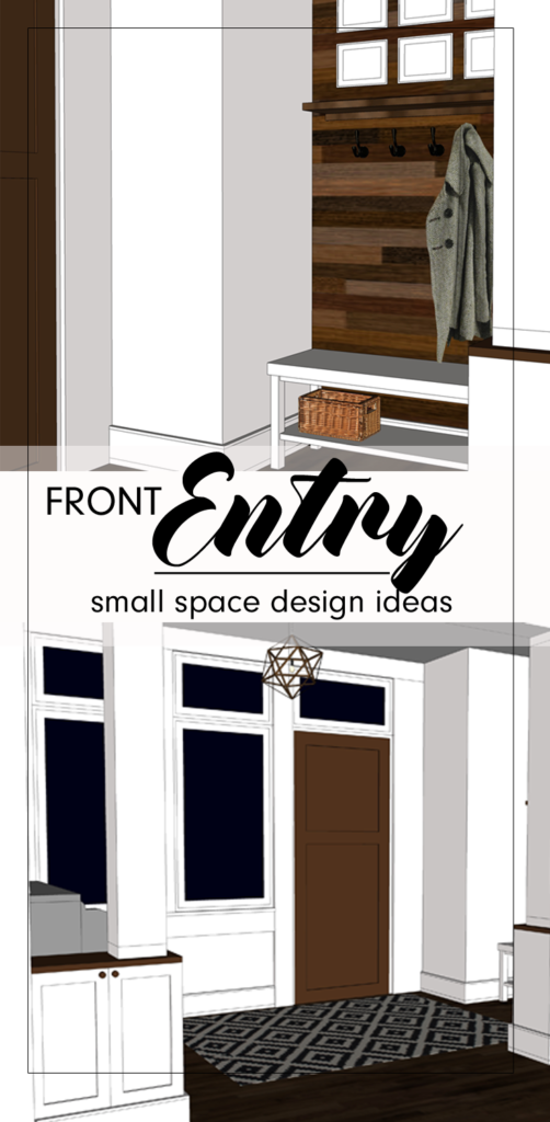
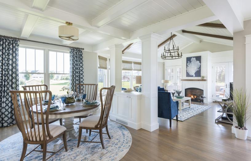
Designing a home can be a pretty overwhelming thought, especially considering there is no right or wrong way to do it.  How do you narrow down the decisions when there seem to be endless possibilities of size, style and function?

Sometimes, you know what you like when you see it.  You realize which direction to take when you see that someone else has been successful following a similar path.  These days, technology gives us inspiration at our fingertips through venues such as Houzz, Pinterest and Instagram.  You can search the internet for ideas and tips, but there is just something so comforting and personal about using a book for inspiration.

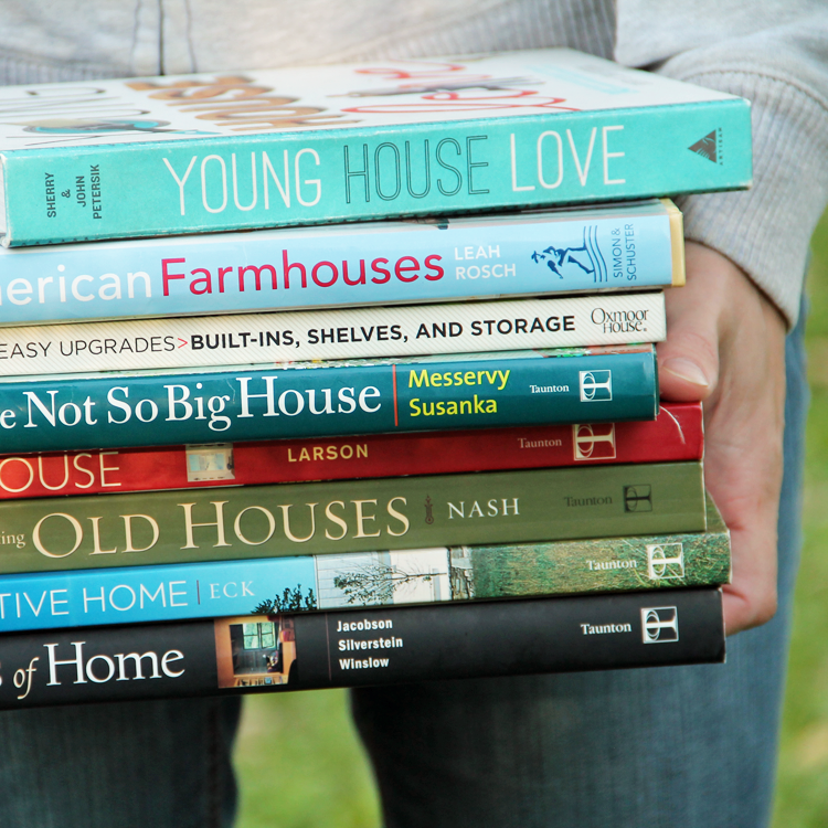
I have amassed a large collection of Home & Garden + DIY books through my years working in the architecture field, and they are literally referenced ALL.THE.TIME both for personal enjoyment and professional development. The amazing thing is that even with all of this use, each time I flip through their pages, I seem to notice something new. A solution to a problem we have been having at our own home, a simple plan change that might benefit a client, or an inspiring use of materials.

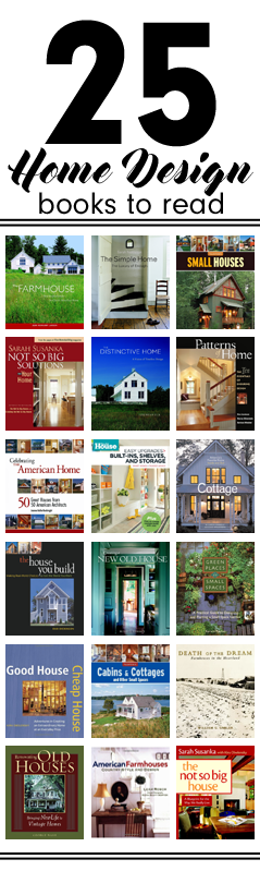
From my personal library, I have curated a collection of 25 Home Design books that are MUST READS – the cream of the crop.  The words I use to describe each book in the reviews below are my own thoughts and insights.  You can click on the images to learn more about each book, read reviews from other customers, or purchase for yourself.

Happy Reading!


This post contains affiliate links to products for your convenience.  If you purchase via my links, I may receive a small commission at no additional cost to you.  Thanks for supporting Arrow Hill Cottage!


1. THE NOT SO BIG HOUSE: A BLUEPRINT FOR THE WAY WE REALLY LIVE by Sarah Susanka

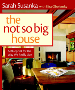
I am starting out the list with one of the classics. Originally released in 1998, this ground-breaker was re-written in 2009 to include 16 additional pages of high class information.

The author, Sarah Susanka, is a renowned architect and leader in the small house movement, giving her readers a simple message – that quality should come before quantity.  The book gives homeowners plenty to think about in regards to what is really necessary in a home.

The Not So Big House encourages house design that means more than the total square footage.

  
2. CREATING THE NOT SO BIG HOUSE: INSIGHT AND IDEAS FOR THE NEW AMERICAN HOME by Sarah Susanka

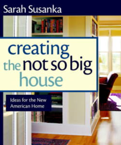
The Not So Big House started a movement to change they way people think about the American home, and this book calls those ideas to action by presenting key design strategies.

As in book one, Sarah gives plenty of examples of how these strategies can help make a smaller home live large.

With plenty of inspiring images to describe the topics presented, this book is easy to follow, and the techniques presented are useful whether you are building new or remodeling your existing home.

 
3. NOT SO BIG SOLUTIONS FOR YOUR HOME by Sarah Susanka

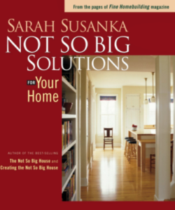
Whereas the first two books in the Not So Big series focused on overall concepts, Not So Big Solutions for Your Home tunes into the small details that can improve how people use their homes.  Simple tips are offered to homeowners looking to make their spaces more functional. From positioning a tv in a family room, to designating a mail sorting station, there are ideas to solve all sorts of the common problems that homeowners face.

The concepts in this book are complemented almost entirely with hand drawn sketches, which adds a personal and fun touch.


4. INSIDE THE NOT SO BIG HOUSE: THE DETAILS THAT BRING A HOME TO LIFE by Sarah Susanka and Marc Vassallo

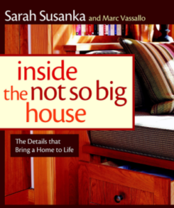
This book is not as much of a ‘How To’ as the others books in the series are. I would describe it more as a collection of homes, each designed with the Not So Big principles, that are presented as case studies of a well designed home.

The pretty pictures serve as evidence that by following the ideas in the previous books you can attain a personalized home to fit your family’s lifestyle.

Home styles from the modest ranch to a Tuscan villa are represented. In that respect, I feel that this book has a little inspiration for everyone’s style.


5. OUTSIDE THE NOT SO BIG HOUSE: CREATING THE LANDSCAPE OF HOME by Julie Moir Messervy & Sarah Susanka

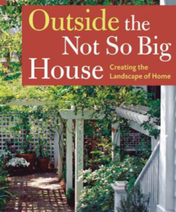
Extend your home beyond its four walls by using the concepts of landscape design presented in this book. Learn how to embrace the site that your home occupies by not only appreciating the elements that nature provides, but finding a link to connect the home’s interior to it’s surroundings.

Concepts discussed include discovering privacy in your yard, using variety in plantings, and living lightly on the land. The twenty homes/landscapes presented in this book each utilize these concepts in an interesting and thoughtful way.


6. NOT SO BIG REMODELING: TAILORING YOUR HOME FOR THE WAY YOU REALLY LIVE by Sarah Susanka and Marc Vassallo

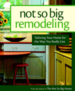
Through the pages, authors Sarah Susanka and Marc Vassallo provide simple but clever ideas that can have a big impact on how the space in your home is used. Many of their ideas work within the existing footprint of the home, though they also show examples that involve adding on just a little.  No major home overhauls are tackled.

Not So Big Remodeling does a wonderful job of showcasing basic remodeling solutions for virtually any room your home may have – from bathrooms to home offices, even basements!


7. SMALL HOUSES by the Editors of Fine Homebuilding

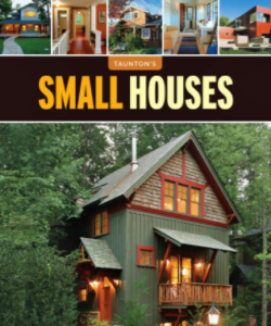
One of my favorite things about this book is the way it is laid out.  It is broken into sections based on house size, from those under 1,200 square feet all the way up to homes as large as 2,250 square feet.  This varied range of scale proves that ‘small’ is a relative term.

If building new, Small Houses provides a list of ten techniques to keep the size down, including the use of multipurpose space and using varying scale to elongate the feeling of expanse.  The book also provides examples of homes that were improved with small additions over time.


8. COTTAGE: AMERICA’S FAVORITE HOME INSIDE & OUT by M. Caren Connolly & Louis Wasserman

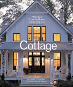
You can probably guess from the name of our future property (and this website) Arrow Hill Cottage, that I have a fondness for this particular home style.  What appeals to me about cottages is their personally scaled size, cozy intimate interiors and deep connection to their surroundings.

The authors of this book feature 24 unique cottages through beautiful photography and amazing watercolor drawings – including mini floor plans of each. The text is also well thought out and informative – providing insight into site planning, the use of vernacular building materials, and current and future trends in cottage design.


9. THE FARMHOUSE: NEW INSPIRATION FOR THE CLASSIC AMERICAN HOME by Jean Renkamp Larson

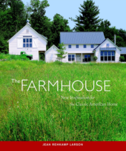
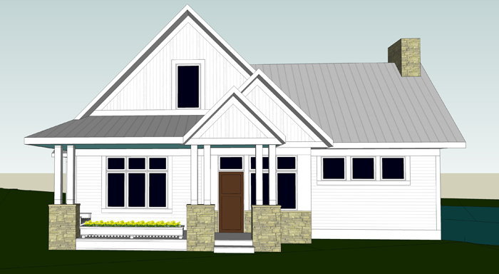
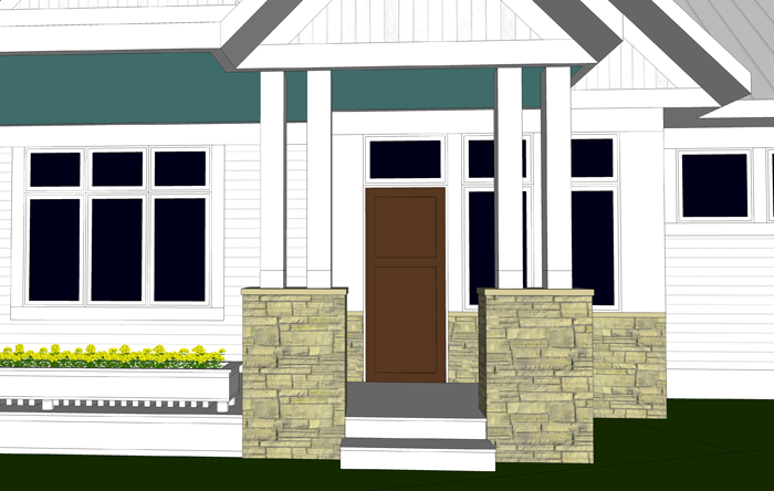
There is just something about a farmhouse.  It is an iconic symbol of a more simple era. Farmhouses aren’t pretentious or showy, yet they are timeless and well loved by many.

This book presents a collection of newly built and remodeled homes, each that use the classic farmhouse as a model for design.  The examples of homes throughout its pages prove that the hearty form and basic shapes of the style is highly adaptable for modern day living. Jean Renkamp Larson did a wonderful job showcasing the simplistic beauty of today’s interpretation of this classic home style.


10. PATTERNS OF HOME: THE TEN ESSENTIALS OF ENDURING DESIGN by Max Jacobson, Murray Silverstein & Barbara Winslow

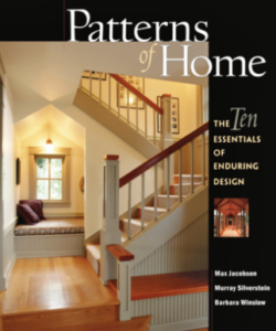
The three architects who authored this book present what they consider to be the ten essential elements that make a home timeless.

The book is clearly written, with wonderful photographs of houses from all over the country used to showcase the patterns – including the composition of building materials, the way light is captured, and the flow between rooms. The concepts laid out in this book, if executed properly, can really make a difference between a purely functional home and one that inspires it’s inhabitants.


11. DEATH OF THE DREAM: FARMHOUSES IN THE HEARTLAND by William G. Gabler

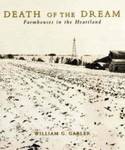
This book is unlike any other on this list, in that it is more of a history lesson than a tutorial of design.  It is also regional specific, focusing the attention on farmhouses built in the Minnesota prairie.

The author is an amazing story teller and photographer and he beautifully illustrates how pioneer farm families, mainly immigrants from Europe, settled on government provided free land with the dream of starting a new life. He explains how these homes were designed in an evolutionary way, by the people who inhabited them, based primarily on the immediate environmental conditions that presented.


12. THE SIMPLE HOME: THE LUXURY OF ENOUGH by Sarah Nettleton

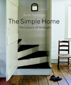
The Simple Home encourages you to think about the sounds, feelings, and movement that allow you connect to life itself – thinking less about what you want in a home and more about who you are and what you need to be fulfilled – then translating them into elements of your home.

The author of this book contends that less is more, and that by eliminating non-essentials, you can design a simple home that will help you and your family appreciate the simple pleasures of living. The book is laid out with six main concepts to keep in mind.  Simple is: Enough, Flexible, Thrifty, Timeless, Sustainable, and Resolved Complexity.


13. THE HOUSE YOU BUILD: MAKING REAL WORLD CHOICES TO GET THE HOME YOU WANT by Duo Dickinson

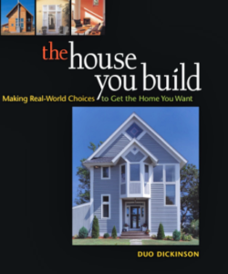
The house is the largest purchase most Americans will ever make.  Why then, the author questions, aren’t more people living in the home of their dreams? The budget seems to be a stumbling block for many, and Duo Dickinson sets out in this book to encourage the readers that it doesn’t have to be.

20 homes are presented and the cost to build each is listed, which I believe was a wonderful decision on the author’s part.  By adding this little bit of information, left out of nearly every other home design book I have read, Mr. Dickinson immediately brings the homes to a relate-able level to his readers. They are real world examples, homes built by people of all walks of life.


14. GREEN PLACES IN SMALL SPACES: A PRACTICAL GUIDE TO DESIGNING & PLANTING A SMALL SPACE GARDEN by Kerwin Fischer

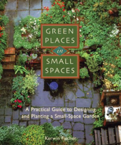
This book does a wonderful job explaining gardening in simple layman terms so that even people like me, who don’t posses a green thumb, can feel confident trying their hand at growing their own plants and flowers.

Kerwin Fischer, the author, starts at the basics of how to select a spot to make ‘green’, by evaluating aspects such as light levels, protection from wind, and access to water.

Further in the book, he thoroughly describes which flowers bloom during which seasons, and also explains how to prep flower beds or pots for their dormant seasons.


15. YOUNG HOUSE LOVE: 243 WAYS TO PAINT, CRAFT, UPDATE AND SHOW YOUR HOME SOME LOVE by Sherry & John Petersik

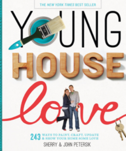
I have been following the Young House Love blog for years, so when they released their first book – with the same title – I was super pumped! The book does not disappoint and is written in the same personable voice that John and Sherry Petersik are known for.  And just like the blog, the book is a treasure trove of creative ideas.  From learning how to style a bed, to creating coasters – there is a project for every skill level, and by tackling them, you are sure to add some whimsy and personality to your home.

I consider this book to be more of a home DECOR book, but included it in this list because sometimes a simple spruce up is all the inspiration you need.


16. CREATING A NEW OLD HOUSE: YESTERDAYS CHARACTER FOR TODAY’S HOME by Russell Versaci

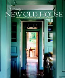
Perhaps you love the charm of historic houses, but don’t feel like signing up for all of the upkeep that they require.  This book shows that it is possible to craft a new home with the familiar forms and harmonious proportions of these traditional structures, while providing the amenities necessary for modern day living.

Mr. Versaci lays out what he calls the Eight Pillars of Traditional Design, which are techniques that should be used to create new houses with traditional qualities. They include using authentic details, crafting with natural materials, and respecting the character of place by complementing the lay of the land.


17. THE DISTINCTIVE HOME: A VISION OF TIMELESS DESIGN by Jeremiah Eck

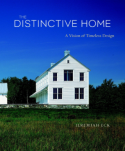
The author of this book has a theory that for a home to be distinctive, or timeless, it needs to have a balance of site, floorplan, and exterior and interior detailing.  He provides multiple house examples, and lays out how each of them excels in each of these four categories.

The book is well organized and easy to understand and also includes small reference floor plans for many of the homes, which is personally one of my favorite things about home design books! The Distinctive Home will probably be most useful for people who are looking to design a brand new home, and not those that are remodeling a historic one.


18. CELEBRATING THE AMERICAN HOME: 50 GREAT HOUSES FROM 50 AMERICAN ARCHITECTS by Joanne Kellar Bouknight

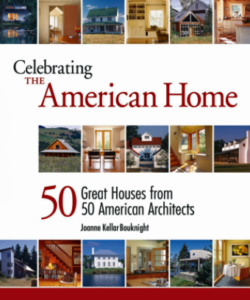
The title of this book really describes what it is all about! All 50 homes were selected by a panel of distinguished residential architects, who chose them based on how well they illustrate great residential design – including five important qualities: a great response to the site they occupy, a comfortable scale both inside and out, livability that accommodates both everyday life and special occasions, a deep respect for craft, and a distinctiveness that transcends the ordinary.

A wide variety of home styles are represented in the selection, from a humble cabin by the lake to a modern townhouse in the heart of the city.


19. GOOD HOUSE CHEAP HOUSE: ADVENTURES IN CREATING AN EXTRAORDINARY HOME AT AN EVERYDAY PRICE by Kira Obolensky

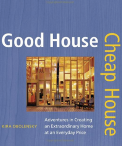
Want to design and build your own home, but fear that finances won’t allow it? This book seeks to prove that a good house does not need to cost a fortune.

The author presents three main aspects that can help you save money when designing and building your own home.

There are 27 homes featured in the book, and each of them brings something unique to the table.  A house on stilts.  An owner who poured concrete counter tops for his kitchen. A structure inspired by music.  Each home perfect for its owners.


20. FLEA MARKET STYLE: DECORATING.DISPLAYING.COLLECTING by Better Homes and Gardens

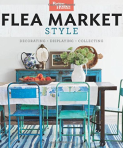
Another home decorating book to make my list, Flea Market Style has such amazing images that portray a variety of house interiors – including bohemian, cottage and country styles – proof that style is personal.

Decorating with found treasures, whether collected by thrifting, rummaging or antique shopping, is a favorite of homeowners.  This book shares practical tips and advice for shopping and lays out concepts on how to display your finds without giving your house a cluttered look.

The last section of the book reveals ideas on how to re-purpose your finds into unique home decor items.


21. CABINS & COTTAGES AND OTHER SMALL SPACES by the Editors of Fine Homebuilding

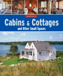
I’m just going to go ahead and say it.  I love this book!

As a big fan of houses that are scaled to fit its occupants, I was impressed to see such a wide variety of examples presented – even a house boat example is included!  The photos and sketches are beautiful to look at. Truly inspiring.

Readers will also appreciate that most designs list the total square footage and the general cost per square foot. This information is helpful in understanding what a new home might cost to build in the real world.  These examples seem attainable, without being bland and boring.


22. AMERICAN FARMHOUSES: COUNTRY STYLE & DESIGN by Leah Rosch

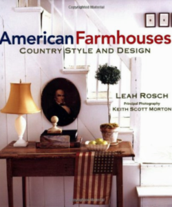
This book explores the individualism and heritage of the charming farmhouse look, which is still one of the most popular decorating styles in America today.

Leah Rosch chose to use photographs by Keith Scott Morton to illustrate the beauty and charm of the homes presented in the book, rather than using much written word. The last pages include a detailed list of manufacturers, craftsmen, and architectural antiques dealers nationwide – which, although potentially somewhat dated, can serve as an amazing resource to those looking to bring the classic look and detailing of these country homes to their interiors.


23. EASY UPGRADES: BUILT-INS, SHELVES, AND STORAGE by This Old House

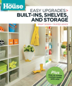
Get the most out of your home by making each square inch useful.  One of the best ways to do this is through the use of  built-ins. This book offers built-in solutions for every room and many situations, including window seats and under the stair storage.

This book is a great idea generator and in true This Old House fashion, it contains colorful and clear inspiration images and encourages its readers to tackle a few of the projects on their own – with detailed instructions and steps.


24. A FIELD GUIDE TO AMERICAN HOUSES: THE DEFINITIVE GUIDE TO IDENTIFYING AND UNDERSTANDING AMERICA’S DOMESTIC ARCHITECTURE by Virginia Savage McAlester

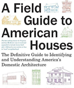
I would definitely recommend that you pick up this book. It is filled with incredible vignette sketches that clearly describe all of the hallmarks of each style of American domestic architecture – from the early Native American dwellings, to historic folk houses, all the way to the modern day home.

It is truly an essential guide to understanding the beauty and diversity of houses built for American families.


25. RENOVATING OLD HOUSES: BRINGING NEW LIFE TO VINTAGE HOMES by George Nash

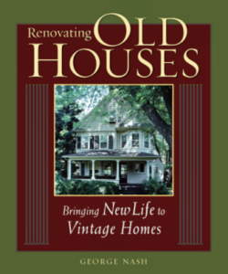
This book is a must have if you own a historic home. These homes were built to last, but they can surely throw curve balls when it comes to maintaining and renovating them!

The author, who is also a seasoned contractor, obviously loves homes of an older generation and wants to see them cared for properly.  In his writing, he clearly lays out how to do so in a professional way.  He walks through every step, including how to evaluate if a house is a candidate for renovation, and provides tips on adding modern conveniences without stepping on the character of the home.


I hope you feel inspired to pick up a book or two from this list, I promise you won’t regret it! Which are you going to read first?

Do you know someone else who could use this information? Share it with them by clicking on the icons below!