We talked with our contractor this week, and he is 95% sure that our project will not break ground until Spring of 2019. It’s a little sad to have to wait through another winter, but we are looking on the bright side and realizing that this extra time will allow us to make sure everything is just as we want it.
There are various bits and pieces that Craig and I just can’t seem to agree on, or that he claims to not have an opinion on. And since I had such a great response when I asked for upstairs bathroom layout ideas, I figured I could come to you all again for a little input.
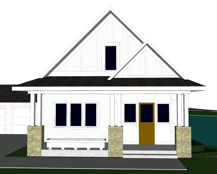
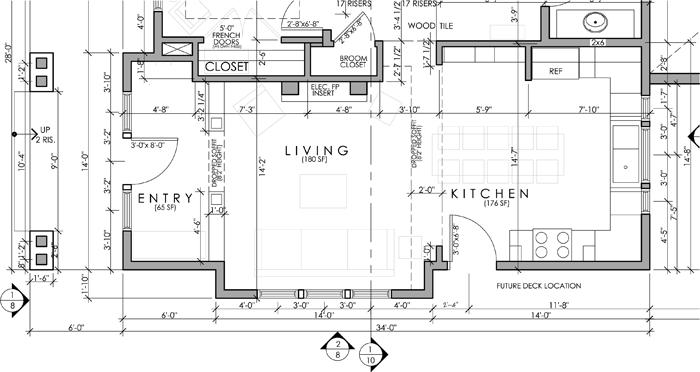
There have been a few exterior revisions, but mostly they are interior
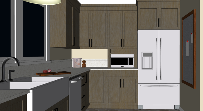
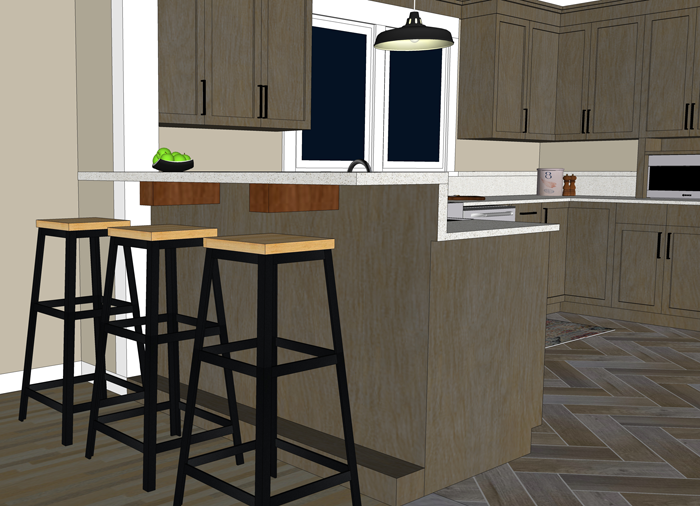
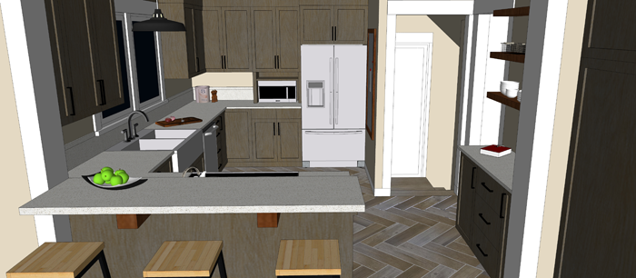
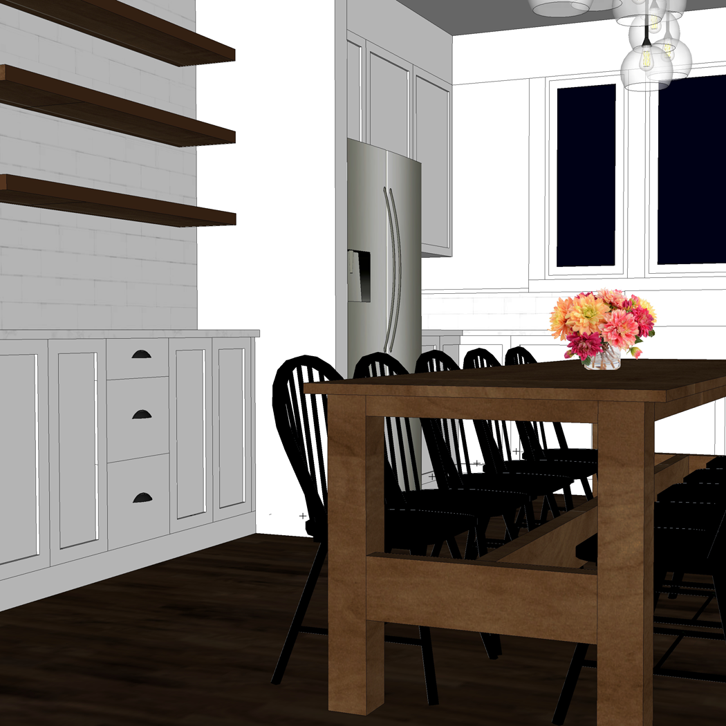
I have been slowly fine tuning the design of our kitchen in collaboration with Cliq Studios, as well as determining the dimensions and design of our future harvest table – which I will share about in a future post.
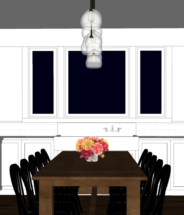
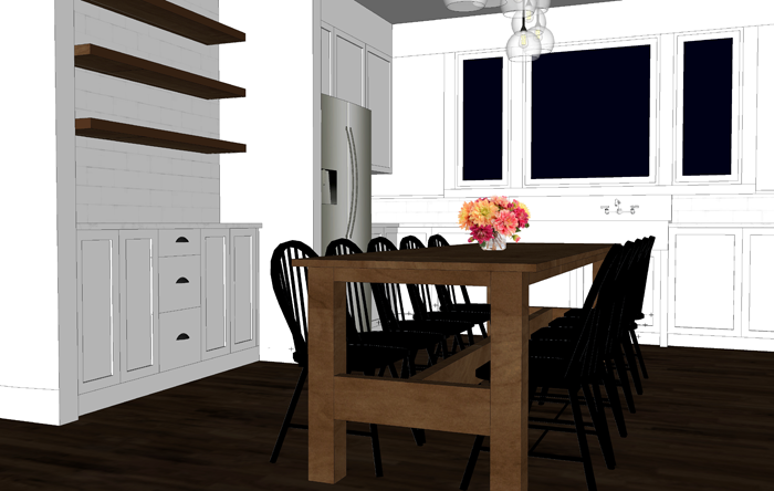
We changed the window sizes and style to fit more naturally with the farmhouse sink we will be restoring. The larger center window will be a fixed picture unit, and the smaller side windows will be operable casements.
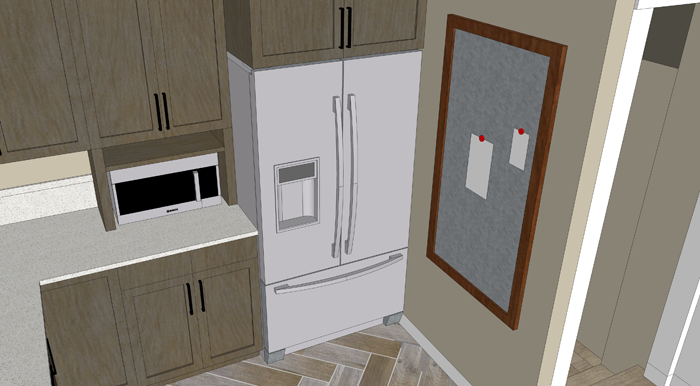
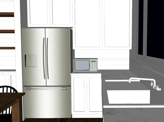
We also revised the cabinets to the right of the fridge. Initially I had them going all the way down to the counter. We eventually realized that we would like to have the extra counter space for small appliances, such as the microwave and toaster.
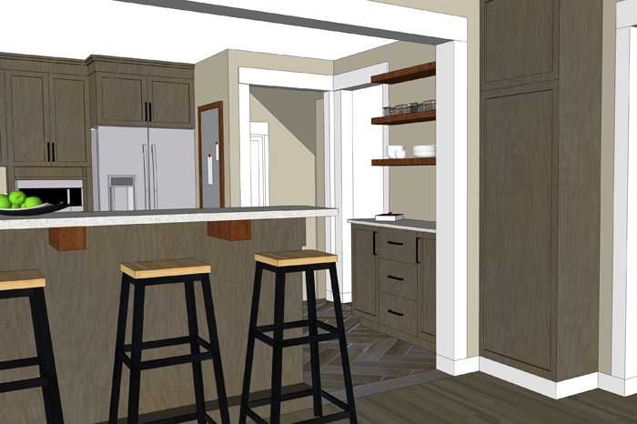
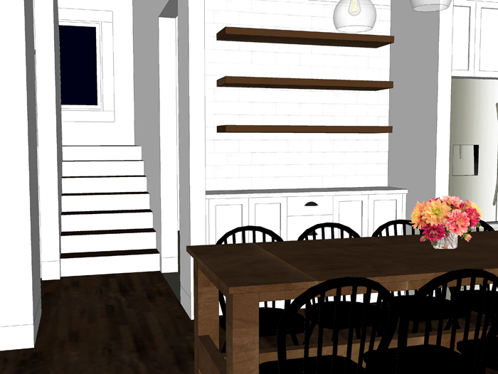
The cabinets to the left of the fridge are going to be shallow depth (12″ instead of the standard 24″). We see this area more as a built in buffet/ hutch space – to promote a sort of dining room within the larger kitchen space – since we do not have a separate room. The shallow depth allows more space for the dining table and chairs.
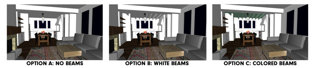
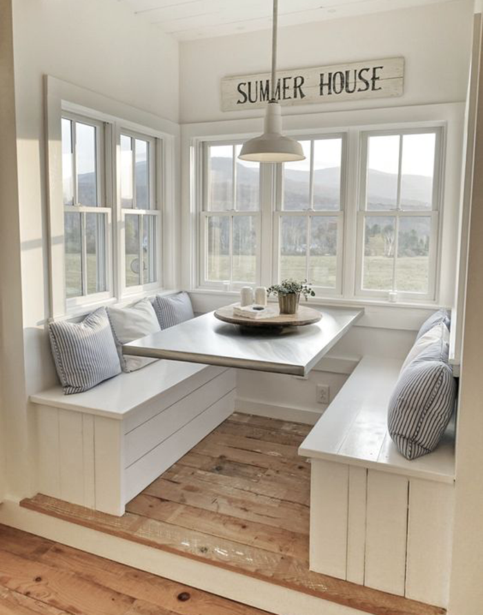
These are all changes that we think will add to the functionality and feel of the space. There is one more cosmetic option that we are having a difficult time deciding on. The ceiling.
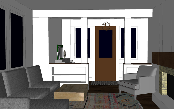
When you enter into the house, there is a straight view from the entry into the living room, and beyond to the kitchen/dining space.
The small entry/ piano area is somewhat divided from the living room with built in cabinets and columns.
I want to also have some sort of definition between the living room and kitchen, while at the same time keeping the floor space open. I started by adding a dropped soffit between the two rooms.
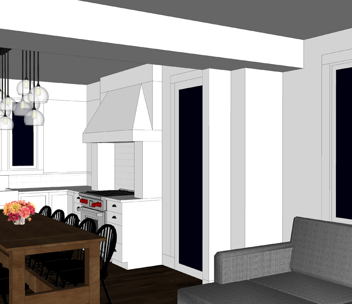
It helps to separate the spaces, but I still felt that there needed to be something else to define of space or the other. Since the living room already has a feature fireplace and built in book-cases, I turned my attention to the kitchen. Here is where we are having trouble deciding – the ceiling.
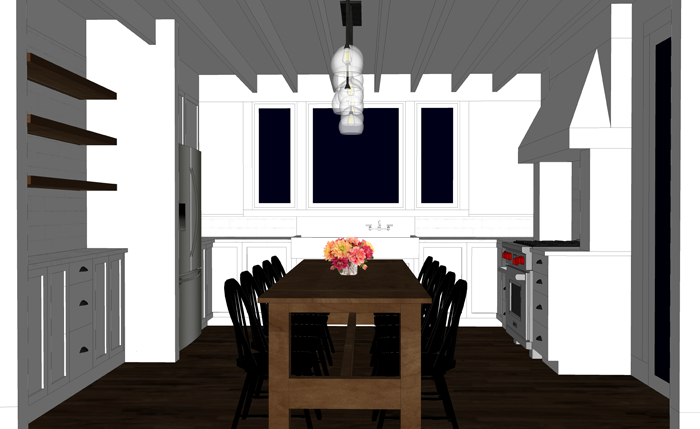
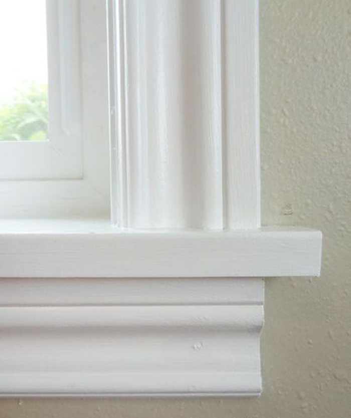
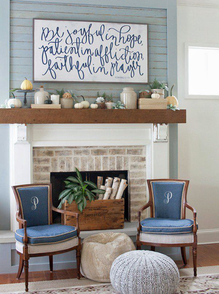
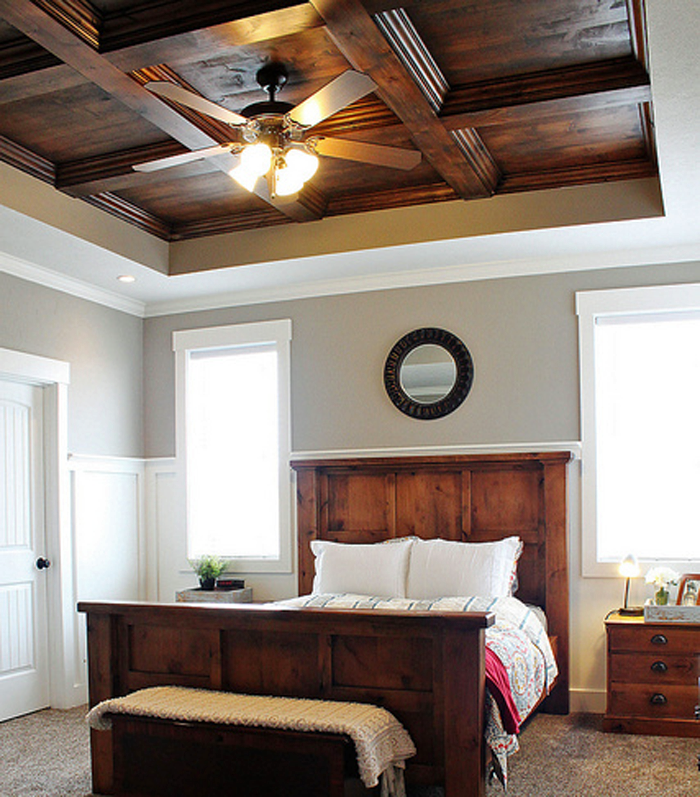
Part of my family prefers the smooth drywall ceiling in both the living room and kitchen, as shown here:
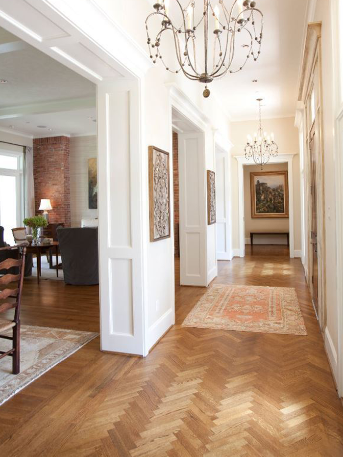
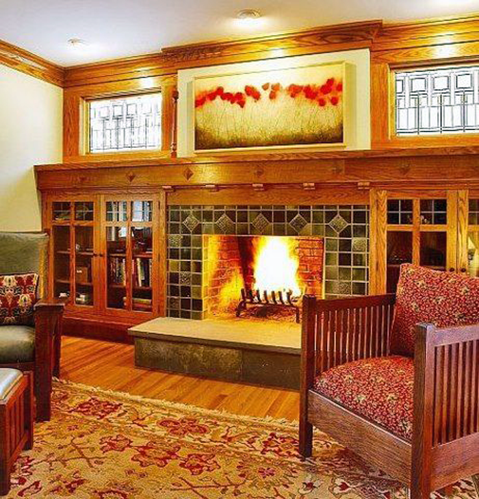
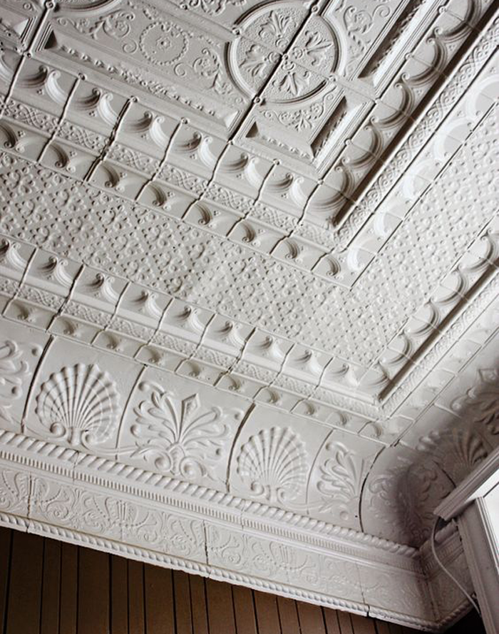
Others of the family, myself included, feel that some simple 2×8 or 2×10 beams (non structural) could be that last finishing detail the kitchen needs for definition. Potentially, tongue and groove boards could be used instead of drywall (layered under the beams) as a way to add more texture. I didn’t bother drawing each and every line, but you can get an idea of what that might look like from this inspiration picture (image 3).
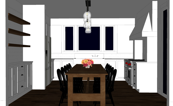
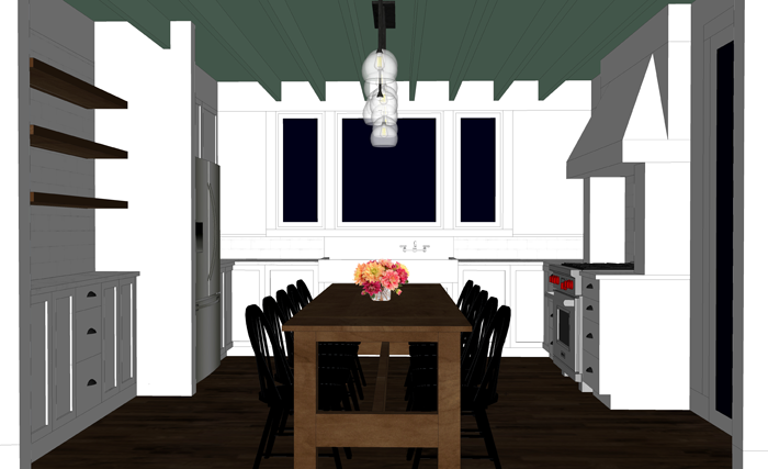
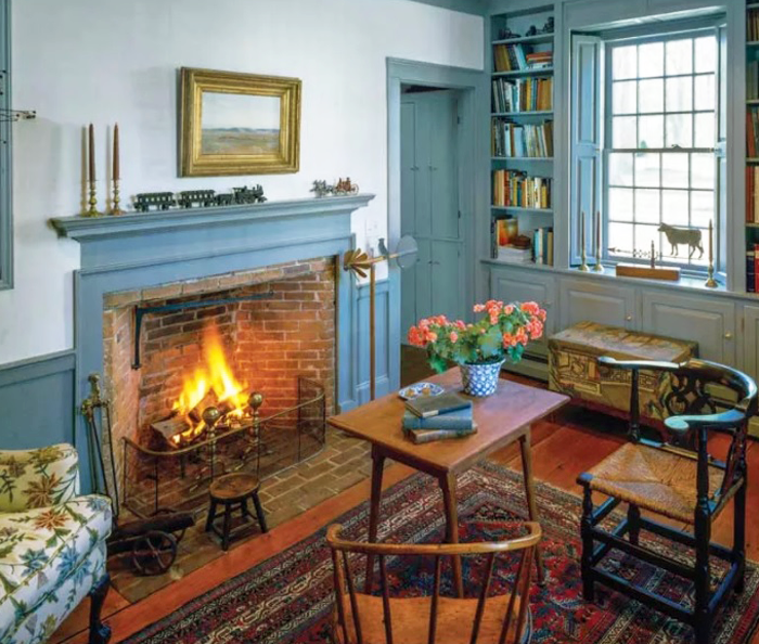
I prefer having the entire ceiling painted one color instead of keeping it natural/stained – mostly because we have wood shelves nearby, wood floors, and also a wood table. However, I saw this picture on Pinterest, and thought that a soft color on the entire ceiling might look great while adding a bit of color to the all white kitchen. Perhaps a light aqua or a pale grey. I’m not sure I’m brave enough to go for it though!
So, tell me. Which do you think looks best? Please comment on this post or vote via Facebook or Instagram. I’m really curious what the majority of you favors! Thanks friends!
One last look at all of the options, side by side, as seen from the front door.
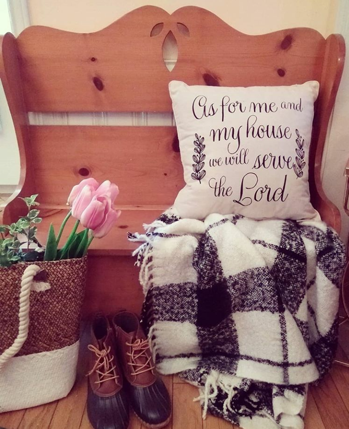
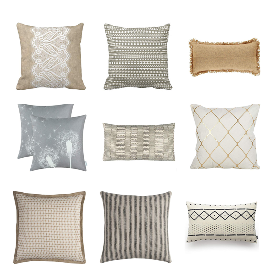
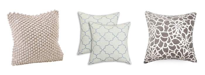
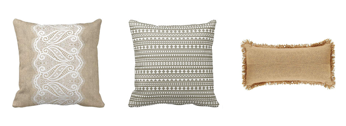
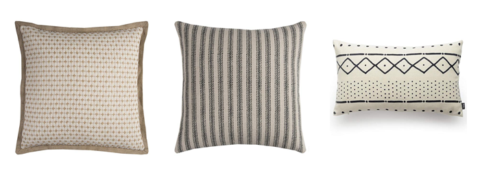
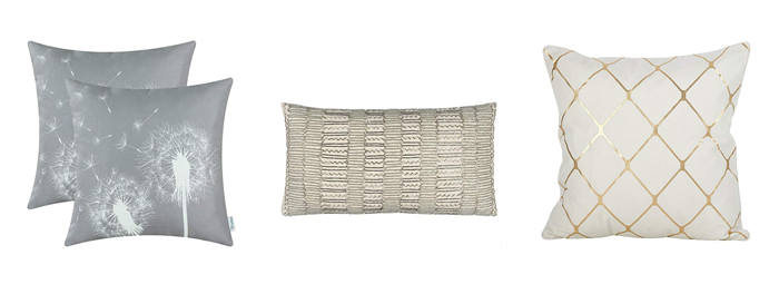
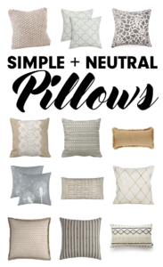
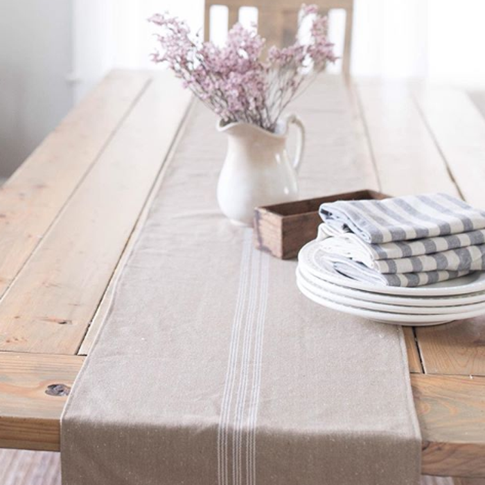
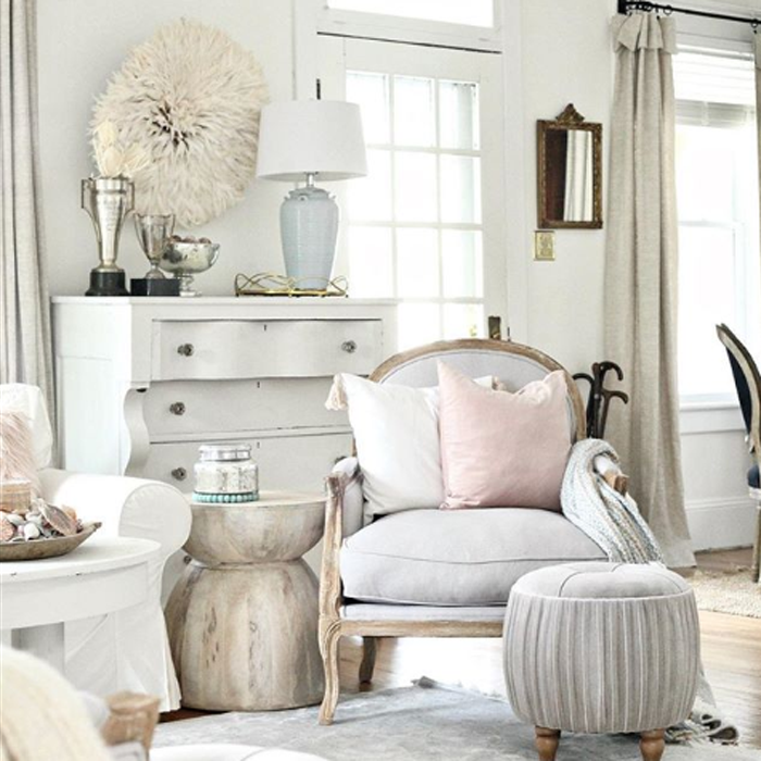
Did you catch my recent post about Neutral Home Decor? The interiors I featured seem so relaxing and clean! If this is a decorating style that you are wishing to incorporate in your home, a great way to start is by adding accessories that are neutral; And one of the most versatile (and inexpensive) accessories is the basic throw pillow.
I have put together a collection of my favorite neutral accent pillows (and pillow covers) for inspiration. There are some great finds! * Numbers, with links, shown from left to right.
Go grab one (ore more!) of these awesome finds! And be sure to pin the image below so that you can purchase the rest later. 😉
*This post contains affiliate links to products for your convenience. If you purchase via my links, I may receive a small commission at no additional cost to you. For more information, click HERE. Thanks for supporting Arrow Hill Cottage!
Decorating a home is a very personal task. The reasons why people choose to use certain colors over others has a lot to do with the inhabitants personalities and the mood that they want their home to embody. Basic COLOR THEORY tells us how the use of colors can aide in creating the desired effect. I have previously posted about how I believe there are three main ways that people use color in their homes.
ONE: Neutrals Prevail
TWO: Pops of Color
THREE: Color Explosion
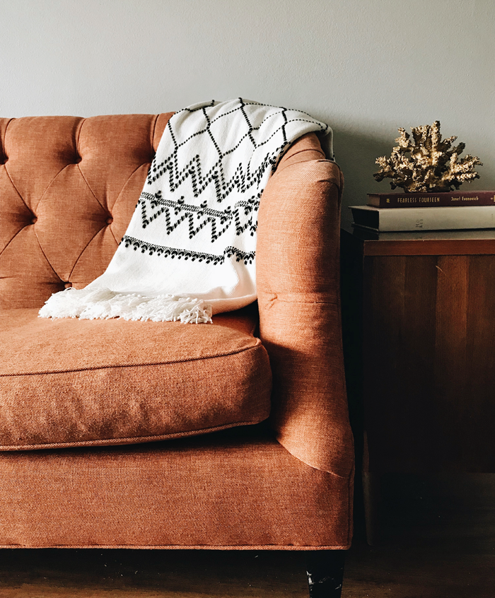
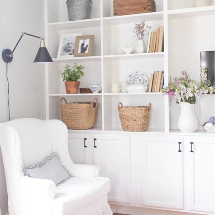
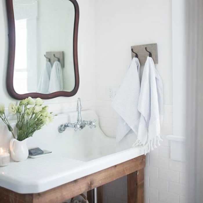
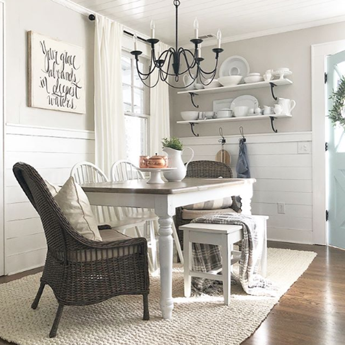
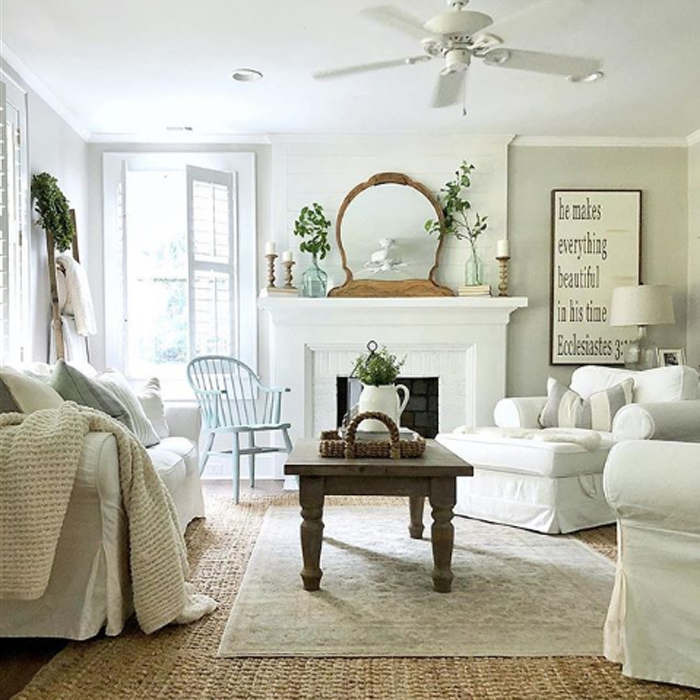
I first explored interiors that feature the COLOR EXPLOSION school of thought. I listed my three favorite Instagram accounts that display this decorating style well. Today I want to swing the pendulum in the opposite direction and offer up my three favorite Instagram accounts that have the Neutral touch.
With a strict color palette of white, cream, grey, black and brown, Lisa has pulled together a lovely home that has a calming and peaceful feel. Her Instagram feed gives off the same vibes. Peace.
Loren’s ability to pull neutral textures together makes her interiors stand out above the rest. The visual interest that the curated variety of surfaces and materials create, mean that the spaces she designs – though minimal in color – are not stark or boring.
I am drawn to the casual, carefree, neutral style that Tammy has created in her home. Looking through her feed makes me feel like I could just pull up a chair and relax. The colors that she does incorporate into her spaces are muted and calming, making them perfect accents to a neutral palette.
If a neutrally decorated home is the look you are after, I hope that you will take some time to visit these accounts to see even more inspiration! Besides Instagram, each is linked to a blog that is just as impressive!
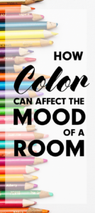
Imagine your favorite color. What about that specific shade makes it stand out in your mind? Have you ever thought about how it makes you feel?
Though preferences vary – science has taught us that colors evoke similar feelings in the majority of people. How then, do the colors you choose to use in the rooms of your home affect your mood?
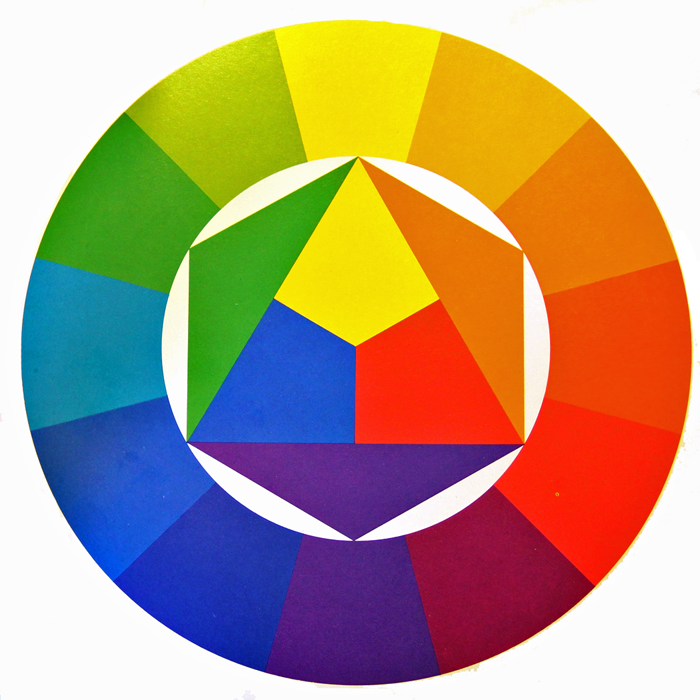
Generally speaking, all colors stem from the three main PRIMARY COLORS – Red, Blue, and Yellow.
They are further divided into three main categories: Warm, Cool, and Neutral.
WARM COLORS: Located on one side of the color wheel – Reds, Yellows, and Oranges – these shades evoke feelings of warmth because they remind us of things such as fire and the sun.
COOL COLORS: Located on the opposite side of the color wheel – Blues, Greens, and Purples – evoke cool feelings because they remind us of grass and water.
NEUTRAL COLORS: The standard neutrals – White, Gray, Black, and Brown- are considered ‘non-colors’. In reality there are wide varieties of neutral hues, with a range of warm or cool undertones. Black and brown are considered to lean toward the warm side, while white and gray tend toward cool.
WARM COLORS IN YOUR HOME
Warm colors are stimulating and fun. In your home, warm colors work well in the public and social rooms of the house such as the living room, dining room and kitchen.
RED
Red is a very intense color, and tends to liven a room. Because of it’s intense hue, it is the perfect color to use when looking to add interest and excitement to a space. The eye will naturally be drawn to it, and even a small pop of red will raise a room’s energy level. It has been said that red stimulates conversation and increases appetites – making it a popular choice for living and dining rooms.
YELLOW
Yellow is considered a happy color. It can make people feel energetic and cheerful, and yet large amounts of the brighter shades of yellow may evoke feelings of anxiety, frustration, and even anger. The softer yellows are a better bet for whole room coverage, as they tend to be easier on the eyes and reflect light well. Rooms that can benefit from uplifting yellow hues include entry spaces, kitchens, and bathrooms.
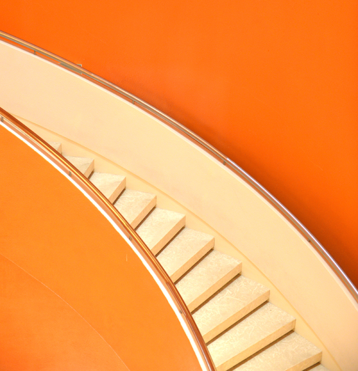
ORANGE
Orange is a highly energetic color that represents happiness and innovation. Though it has a reputation of being overwhelming, the more subtle shades (such as apricot and terracotta) have become more popular in modern day interior design. Color experts warn that the brighter the shade of orange you use, the less you need.
COOL COLORS IN YOUR HOME
Cool colors tend to be calming. They evoke feelings of restfulness and peace – and therefore are wonderful choices for private rooms where concentration and quietness are important, such as bedrooms, offices and bathrooms.
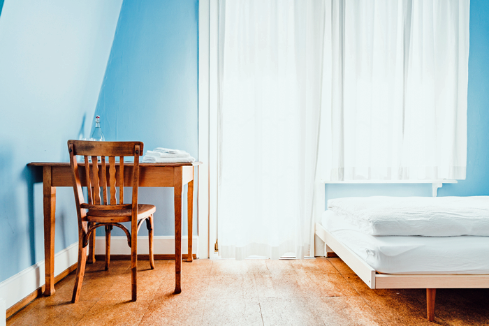
BLUE
Blue is considered relaxing and serene. It has been said to bring down blood pressure and slow respiration – making it a popular choice for bedrooms and bathrooms, especially in the softer shades. Dark blue may evoke feelings of contemplation and in large amounts, even sadness.
GREEN
Green is considered the most restful color for the eye, as it combines the refreshing quality of blue and the cheerfulness of yellow. When used as the main color for decorating, it is said to relieve stress and help people relax. Because of it’s overall pleasant feel, green is suited for almost any room in the house.
PURPLE
Purple is associated with luxury and creativity. Though rarely used as the main color in decor schemes, it does lend itself well as an accent or secondary color, by adding depth. Darker hues of purple – such as eggplant – can make a space feel rich and sophisticated, while lighter versions – such as lavender or lilac – can bring a restful quality to a space.
NEUTRAL COLORS IN YOUR HOME
The neutral shades are considered the building blocks in a decorator’s tool kit. Because of their flexibility they are useful as either the base/main color for a room, or a grounding accent color. When decorating, it is recommended that 80% of a room is composed of neutral colors, and 20% of the remaining space filled with strong accent colors – pulled from either the warm or cool tones of the color wheel.
WHITE
Because of it’s light reflecting abilities, White is considered airy, peaceful, and clean. Designers often use white to make roomss feel more spacious, or as a blank slate to build upon. Be careful not to whitewash everything though – too much white in one space can make it feel stark, cold and bland.
GRAY
Gray is considered the most unresponsive color – emotionless, neutral, and safe. Lighter shades of gray will feel cool and serene – with just a bit more warmth than white. Darker shades of gray can feel solid and steady. In any shade, this color blends well with others – allowing them to take center stage.
BLACK
Black is a ‘grounding’ color. It can be used as an accent to virtually any other color. In fact, some experts in the color field argue that a bit of black should be incorporated in every room to ground the color scheme. But remember, a little bit of black can go a long way!
BROWN
Brown is an earthy color that invites you to reconnect to your roots and embrace nature. It is a reliable color that makes you feel safe and warm. Brown is a popular choice as an accent color, primarily in the use of wood furnishings and cabinetry.
COMPLEMENTARY COLORS
When determining which colors will look best together in a space, you can find some great clues by going back to the basic color wheel. Colors that are opposite each other on the wheel are thought to work together well. Blue and Orange, for example, are considered complementary colors.
I find the theory of color fascinating! Do you agree with the scientific studies? Does your favorite color evoke the same feelings written in this post? I would love to know if the colors you favor tend to make their way into your home decor – comment below!
And feel free to visit my Pinterest page – for boards showcasing Hues of Home!
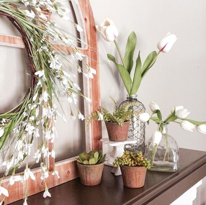
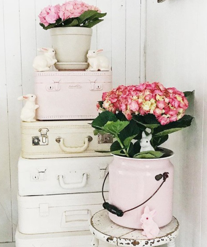
The calendar says that Spring has officially begun. The weather, however, is painting an entirely different picture. My area of the country is expected to experience record breaking snowfall this coming weekend – we’re talking FEET of snow. I don’t like that idea. Not even a little bit.
As a way to distract my mind, I took to Instagram to find the signs of Spring via home decor. I just love all the creativity I found, and I have to admit that looking at all the Spring pictures did the trick. Now, if I could just walk into one of these scenes over the next couple of weeks and not have to live the reality – that would be great!
Have you ever seen a more ‘springy’ room? I’m pretty sure I haven’t! You guys seriously have to check out Leslie’s IG feed and blog. This house is pure magic – every square inch of it. The transformation of this room in particular was enough to make me a follower!
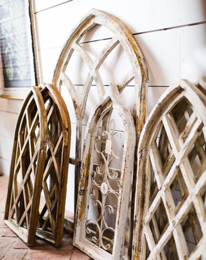
The trellis pattern of these rustic window frames remind me of garden gates. They are for sale, and I can guarantee that if I lived closer I would be visiting the shop and taking a few of these beauties home with me!
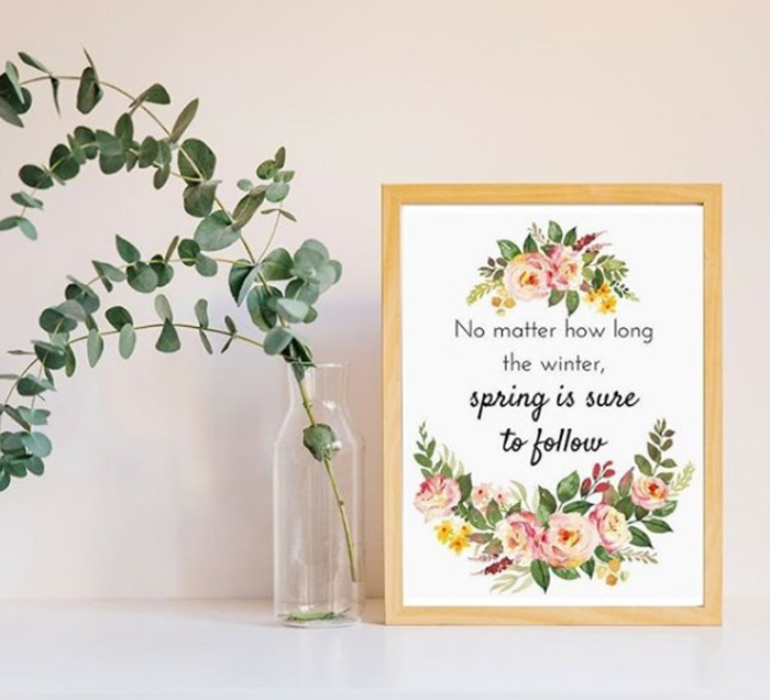
Guess what guys? This beautiful print is available for free on One Thousand Oak’s blog. Click HERE to grab one – I’m going to! Thanks for the little reminder, Jaclyn!
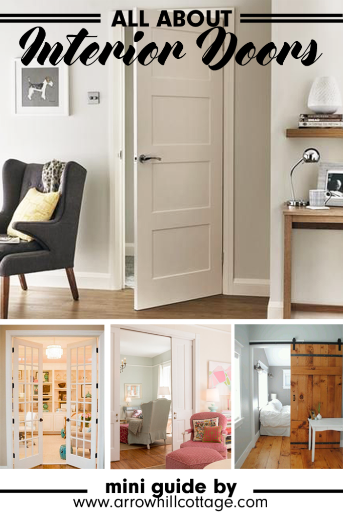
Each home interior has it’s own personality. When it comes to decorating inside our homes – paint colors, furniture, and throw pillows are usually the first things that come to mind. During a more extensive decor remodel – the floors, walls and ceilings will typically get special attention. But many times an important element is overlooked.
Interior doors.
Choosing the interior doors for your home can be a challenge, but finding a type and style that flows with the rest of your interior can add an extra detail that will really make your home feel pulled together and unified. The great news is that there are many interior door choices available (both for purchase and as DIY endeavors) – and finding the right match for your home should not only be possible, but fun.
I have put together a little guide, complete with inspiring images, to help take the guess work out of your decision making.
DOOR OPERATION TYPES
Choose which will work best for the function and space you are trying to serve. Each has it’s own benefits. Listed below are the most popular types available in today’s market.
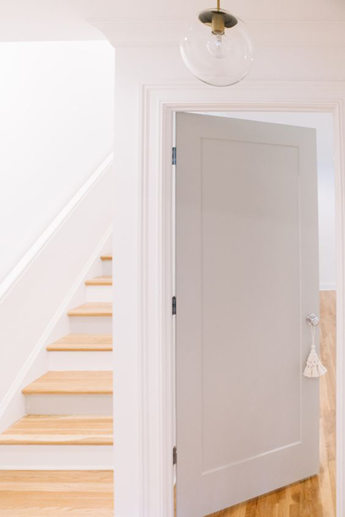
This door type is the most common used for home interiors. They can be hinged on either the right or left side of the frame, and swing into or out of the room – depending on how you want them to function. These doors are readily available in a large variety of sizes. The most common residential size is a standard 2′-8″ wide by 6′-8″ high.
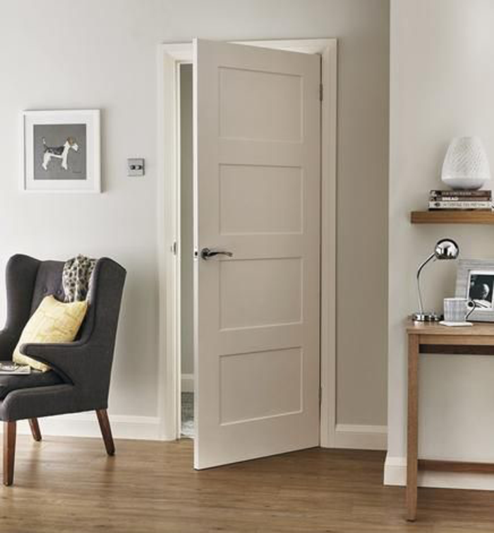
Bi-fold doors are also called folding doors, and are most commonly used for closets in homes. The door, when closed, fills the entire cased opening – but, as the name would suggest, fold in half (outward) when opened. The benefit of the bi-fold door is that you do not need as much space in front of the door to be clear when opening.
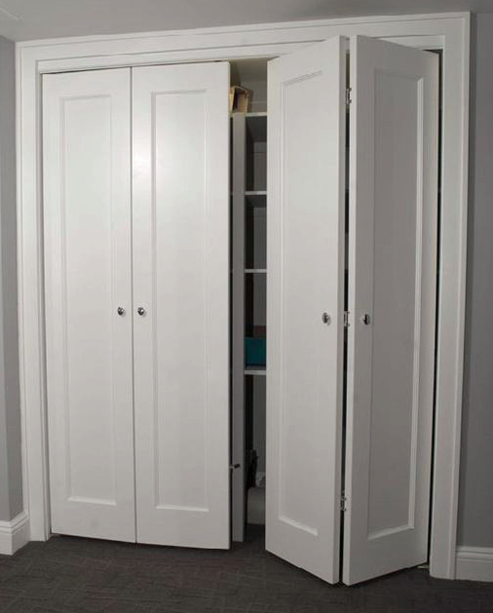
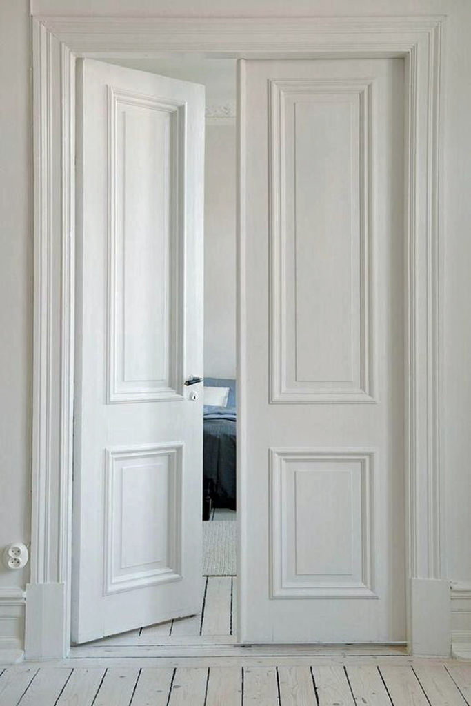
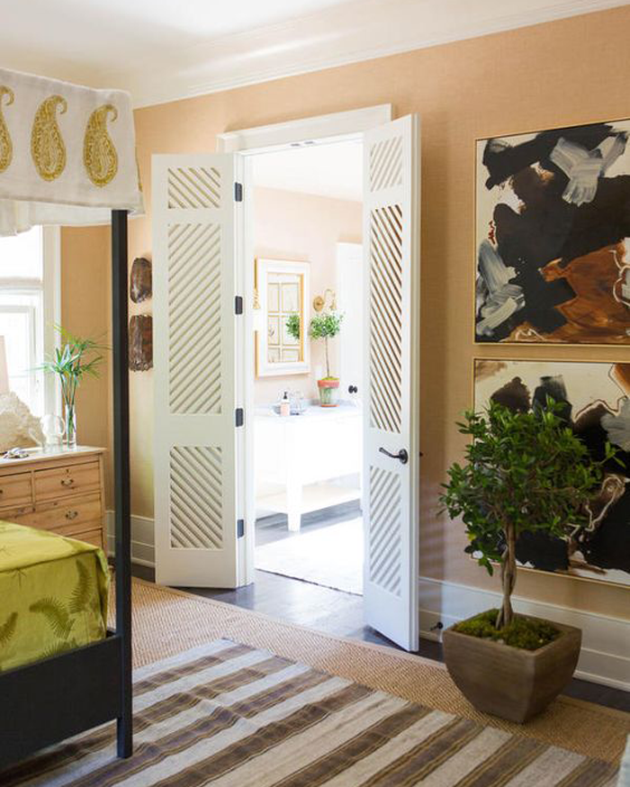
A pair of doors that swing either into our out of a room, hinged on the outer edge of the opening. When both doors are open a large opening is created. This door type is very popular to use between rooms – for privacy when needed, or the feeling of an open floor plan when privacy is not a concern. Generally french doors utilize some sort of glass panel configuration.
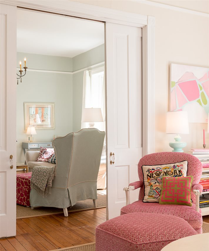
Pocket doors are considered the ultimate space savers. The door travels on rollers that are suspended in an overhead track. When fully open, the door is completely hidden in a cavity created in the adjacent wall. This type of door is becoming more common as the function has improved over the years. Pocket doors have the ability to lock, making them useful in a variety of applications – from closets to bathrooms.
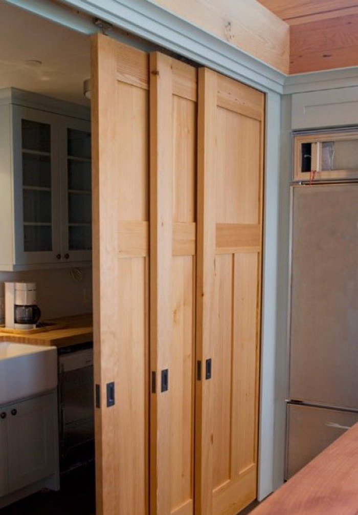
Bypass doors also come in pairs, or in a three door configuration (as shown). They are set on a track that fills the opening, with one door mounted slightly in front of the other – so that when they open they will slide past one another. These doors are almost exclusively used for closet applications. The benefit of this door type is that it does not take up extra floor space with a swing; But, you will only have access to those things behind the door that is open – making them a bit inconvenient.
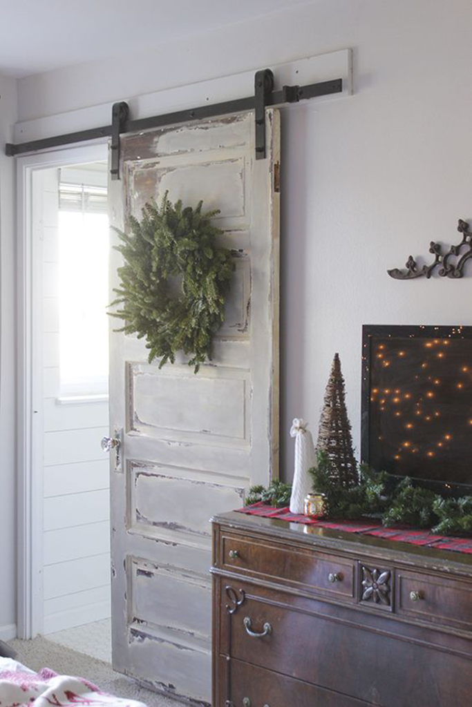
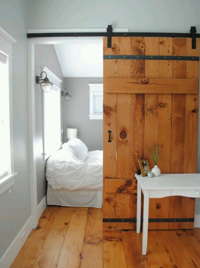
This type of door has been made very popular recently by the tv show ‘Fixer Upper’. Barn doors hang from a track outside the room/closet that will be accessed. Because of this, the doors themselves need to be wider than the opening – and the track needs to be long enough so that the door can slide completely out of the way. Essentially, the track needs to be at least double the width of the opening you want to access. Be sure that the hardware used to mount and operate the door is high quality – so that you don’t end up with clunky (or squeaky) operation.
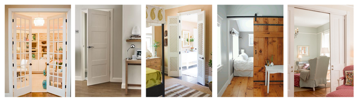
INTERIOR DOOR STYLES
You can find the above door operation types in a variety of styles to match the preferences for your home design. Listed here are the most common styles.
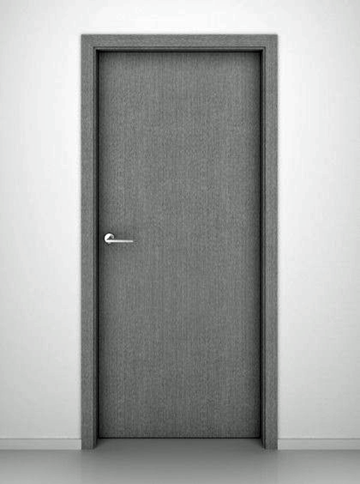
This style of door is also called ‘flush’. Essentially these are doors that have no extra ornamentation, and have a smooth simple finish. They are most commonly used in modern styled homes. They can be made of a solid piece of wood, but more commonly are composed of thinner veneer pieces of wood – which creates a door that is more lightweight.
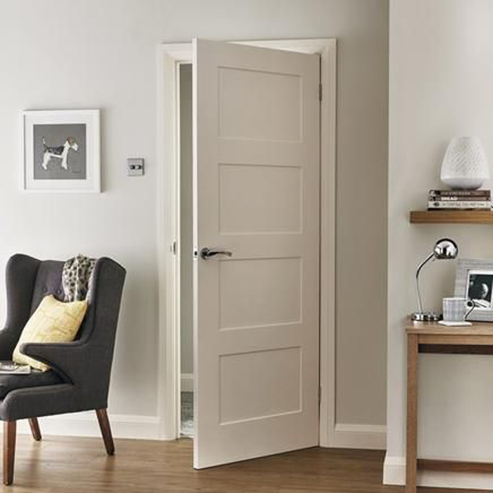
A shaker (or craftsman) style door is composed of a flat center panel and square edge raised panels. These doors have a clean, simple look and are one of the most popular varieties used today.
Plank doors are composed of a series of boards, or planks – either in a vertical or horizontal application. They are popular for homes with country styled decor.
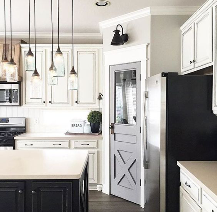
When you see this type of door, you will most likely have visions of barns going through your mind. That classic ‘x’ pattern is called a cross buck. These doors are also becoming very popular with homes designed in the ‘farmhouse style’.
This style features a door that has slats, or louvers. They are a perfect choice for areas that need ventilation but also require a bit of privacy or screening, such as a laundry space or electrical closet. The filtered light that the louvers allow can be a benefit for some design applications.
Again, there are so many choices when it comes to interior doors! I hope that this mini-guide can help you determine the differences between the doors, and allow you to choose the perfect version to accent your home!
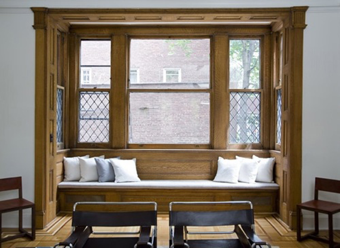
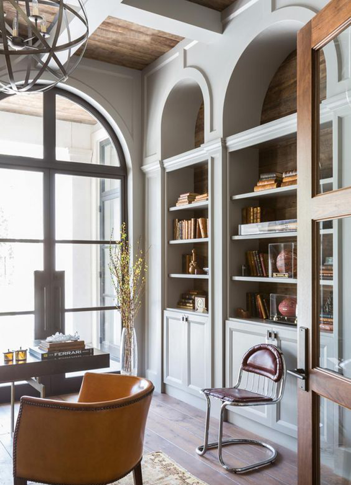
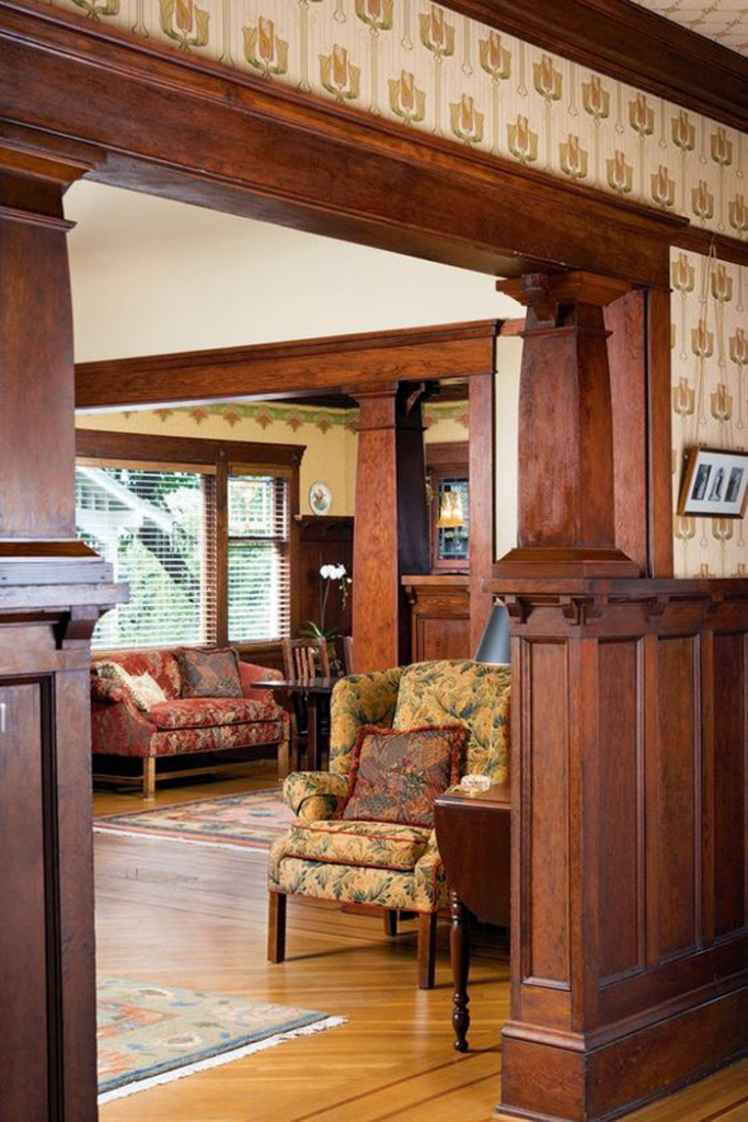
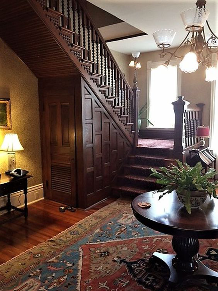
When you think of an old house – you may envision rotting siding, squeaky floor boards, and bats in the attic. While these may very well be a reality, there are plenty of merits that old homes have to offer.
The seven charming old house details I’m about to share may have you rethinking your preconceptions. Who knows – you may decide to incorporate some of them in your home as well.
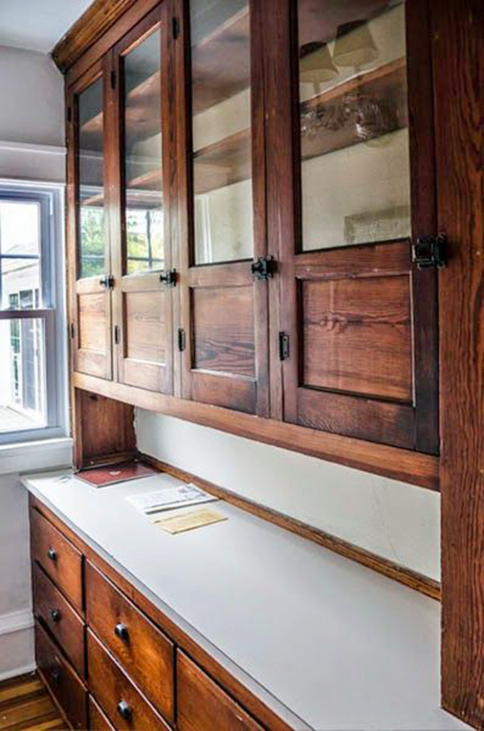
BUILT IN FURNITURE
These showstopping pieces add dramatic character. Because they are designed and built to fit with the house, in a specific space, they are becoming more and more popular with homeowners as storage pieces and as a custom way to add elegance and charm.
It’s true that slow growth timber was more readily available when the houses of yesteryear were being built. Craftsmen showcased their skills on detailed woodwork – from stair railings and wainscoting to window molding. Though it may never return to the intricacies of the Queen Anne Victorian era, an increased level of detail in woodwork is being re-introduced in today’s homes.
There has been a huge resurgence in adding smaller vintage details to new homes, to give them an extra dose of character. One of the easiest ways to accomplish this is by utilizing decorative hardware, such as door knobs and cabinet pulls. They are generally inexpensive and readily available. Reproductions of these classic styles are also being made.
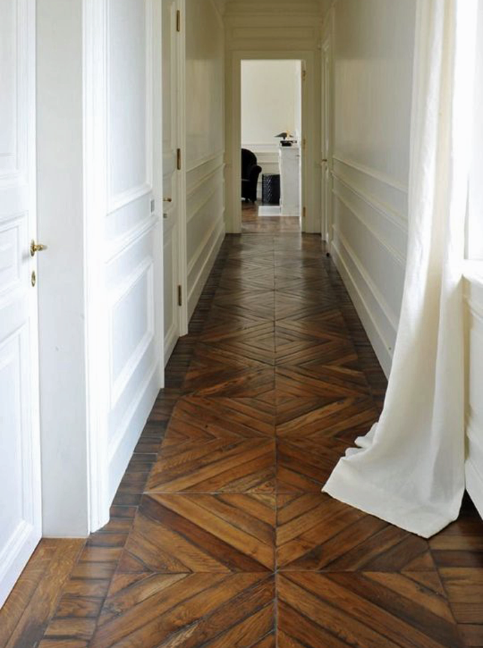
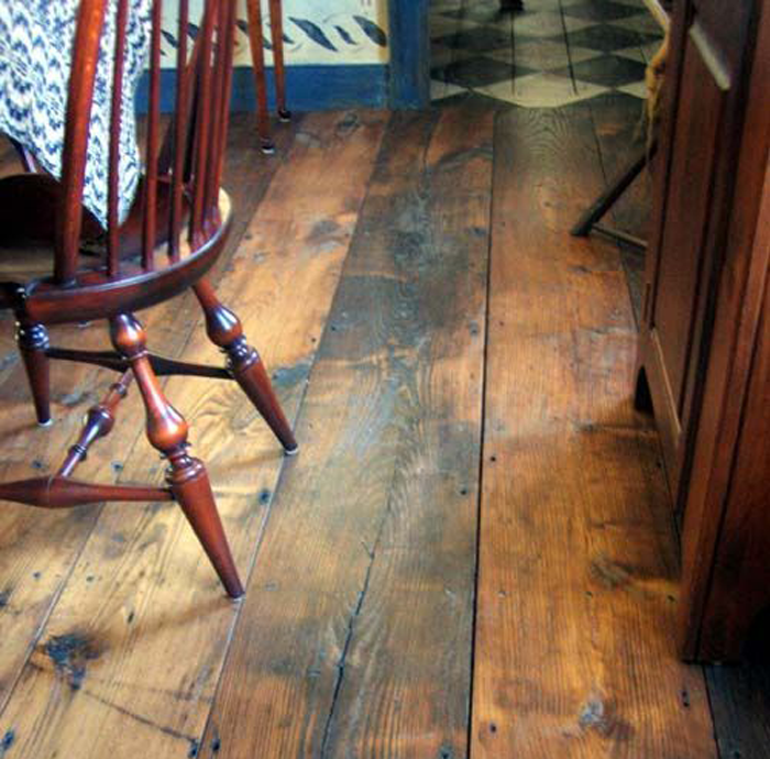
Old houses have the best floors. The patina found on aged pine, maple, and oak flooring is hard to match – but even a newer wood floor is a beautiful addition to a modern built home. Wood floors are wonderfully adaptive, lending themselves to be laid in a variety of patterns.
Before the television became the center of attention, the fireplace was the focal point in most homes. Now, as a way to escape the constant bombardment of electronics, families are opting to gather together in a quiet space more often. In turn, homeowners are opting to give their fireplaces more detail and prominence.
Gone are the years of popcorn textured ceilings and flimsy drop ceiling tiles. Homeowners are instead embracing a variety of decorative options, and looking to historic examples for inspiration.
Old houses are full of nooks and crannies – just think about grandma’s attic. The cocooning nature of small, set apart spaces is comforting to many homeowners. From built in dining tables to relaxing inglenooks, these interesting and intimate spaces are becoming more and more popular once again.
Which of these seven details is your favorite? Let me know which you would love to try (or have incorporated in your home already) in the comments below.
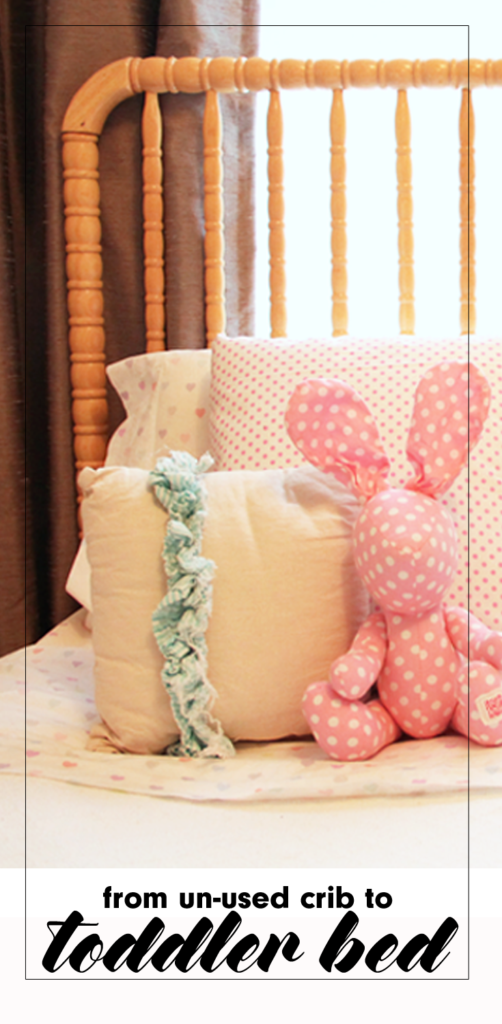
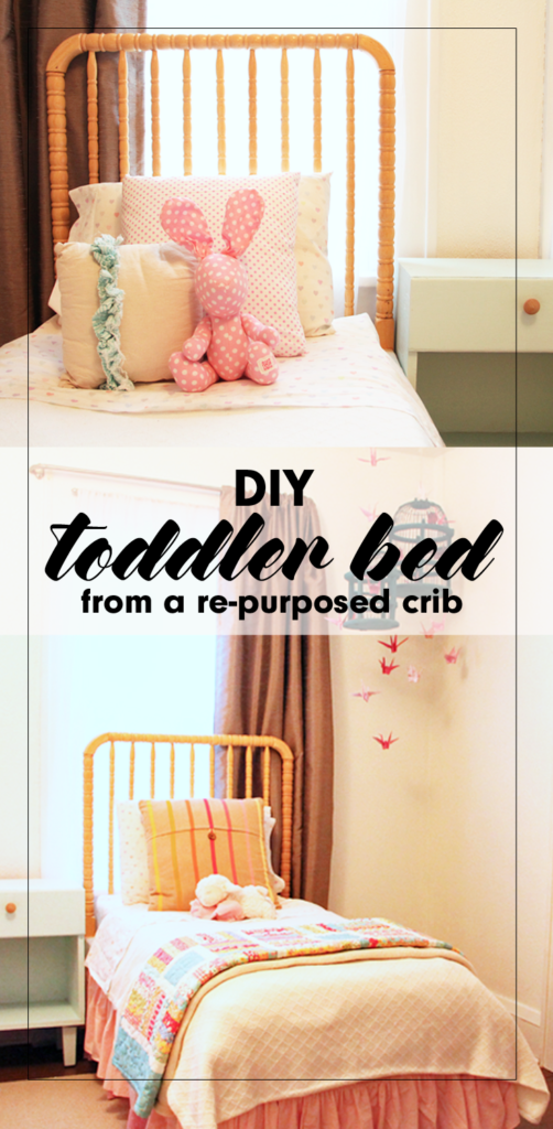
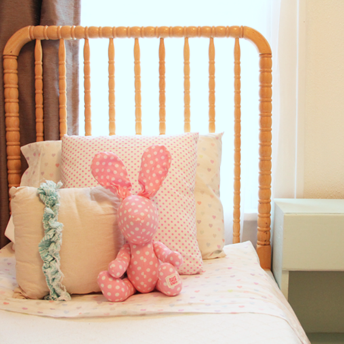
What should you do when your child outgrows his/her crib? Consider re-purposing it into an adorable DIY toddler bed, using this simple tutorial.
Not many moments spark the same amounts of joy and sadness as when the youngest child of the family finally outgrows the crib. With the celebratory occasion of assembling the ‘big boy/girl’ bed comes the equally emotional moment of taking the crib apart.
We were faced with this exact scenario in the months before we took the trip to China to finalize {K}’s adoption. {M} had always loved the security of her crib, the same crib that all three of our sons had also slept in, but at 3 1/2 years old, it was finally time for her to say goodbye as well.
It was at that moment we were faced with a difficult decision. What do we do with the crib? Maybe you are nearing this milestone and have had the same question. Today I am offering a tutorial explaining our personal crib re-purpose DIY project.
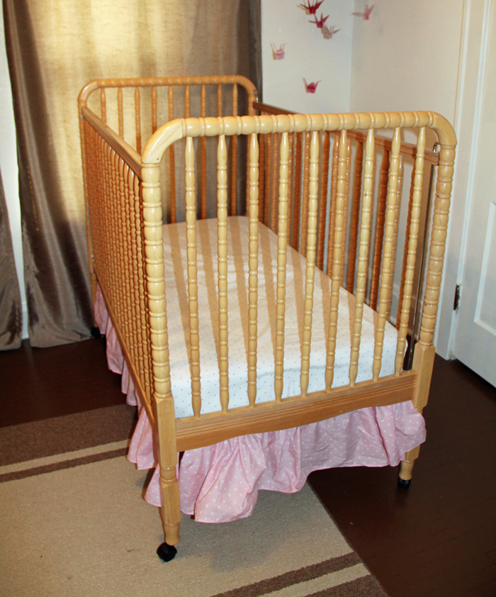
THE CRIB BEFORE
Our simple, Jenny Lind style crib was well loved but it’s natural wood finish and spindle details had a charm that we wanted to preserve.
It was given to us as a hand me down before {D} was born, over 11 years ago. Needless to say, it was equipped with the notorious ‘drop side’ – a feature now considered dangerous. We had long ago disabled the drop side, but legally the crib was no longer eligible to sell (or give away). Even still, the crib had a beautiful Jenny Lind style, and the thought of throwing it in the garbage just didn’t sit right with us.
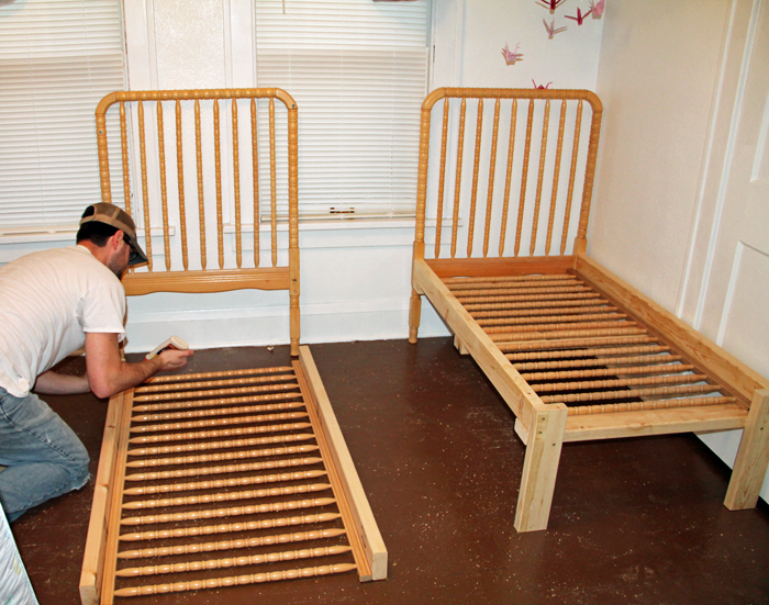
We brainstormed a few different ideas, and eventually decided that the best option for our family was to turn this ONE crib into TWO toddler beds – one for 3 1/2 year old {M} and one for her 6 1/2 year old sister {K}, who has arthrogryposis and is small for her age. We knew they would both fit comfortably in the smaller sized bed for a while, and that the bed DIY project could save us some money as well!
CREATING THE DIY TODDLER BED
I’ll be honest that at the time of the project I wasn’t thinking in terms of getting enough pictures for a tutorial. I only have a few photos, but will try to fill in the gaps with words. If you have any questions about the process we used, feel free to comment below or send me an email!
STEP ONE
My husband Craig disassembled the crib, which actually made {M} very angry! She couldn’t see our ‘vision’ at the time and was just upset that he was breaking the comfy place where she loved to sleep. Essentially, all pieces of the crib were used to create the new beds with the exception of the hardware and the spring mat.
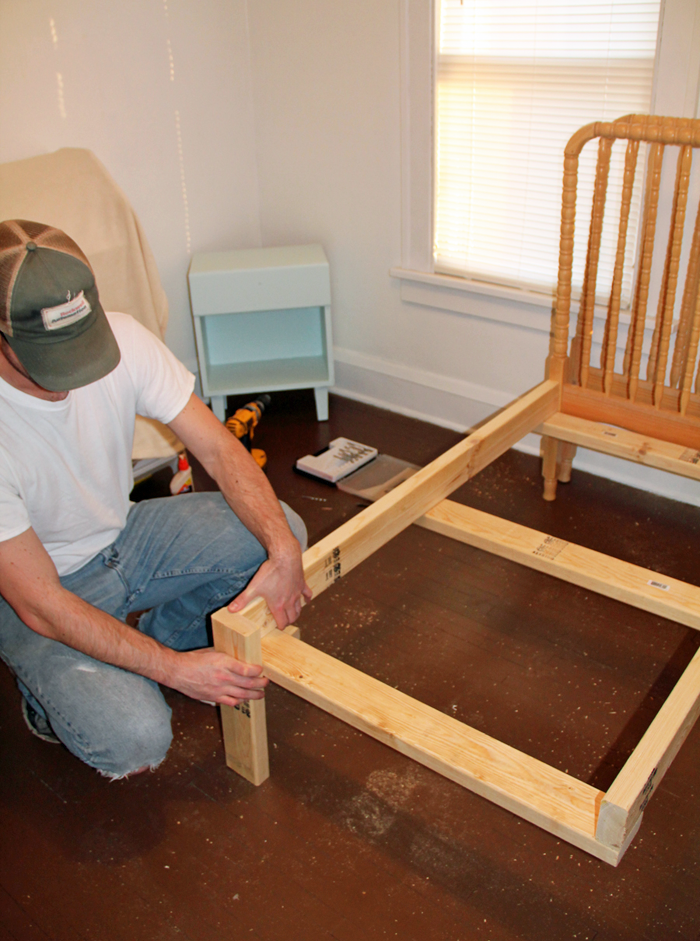
STEP TWO
We purchased standard 2×4 material, and Craig cut them to assemble a three sided ‘box’ that would hold the crib mattress. Because we planned to use the two tall sides of the crib as headboards, he only needed to make legs for the end of the box. He reinforced the center with a 2×4 cross base.
STEP THREE
Craig attached the assembled ‘box’ to the headboards, making sure everything was level. He then set one side rail into each of the ‘boxes’. The side rail piece spreads the weight from the mattress out over the 2x4s included in the ‘box’ construction.
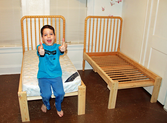
STEP FOUR
The crib mattresses were then added. They were a perfect fit, as demonstrated by this goofy picture of {L}. Crib mattresses are a standard size, but they can vary slightly. If you try this project you will want to base your dimensions on the crib mattress you have. We happened to have two mattresses, one that was used in the crib and another that we had for a different toddler bed.
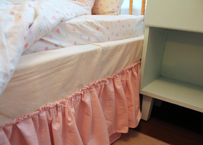
STEP FIVE
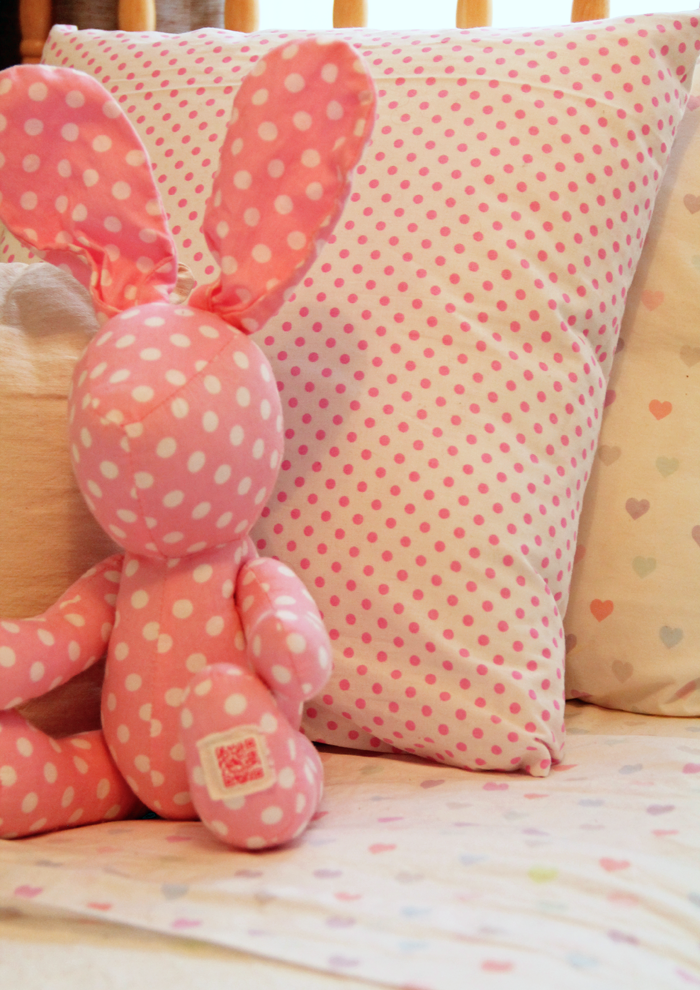
Dress it up! I created pink ruffle bed skirts using this easy tutorial. They really were simple to make, but a bit time consuming! I used muslin fabric to cover up the exposed 2x4s near the mattresses.
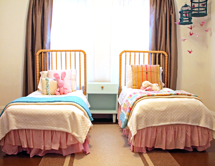
I also found some adorable heart bedding from Pottery Barn Kids. Grandpa and Grandma purchased the bedding as a gift for the girls. A king sized texture blanket was the perfect size to cut in half, allowing me to make two matching comforters. Topped with accent pillows, and comfy colorful quilts, the beds look super cute on each DIY toddler bed!
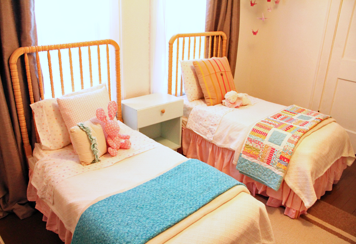
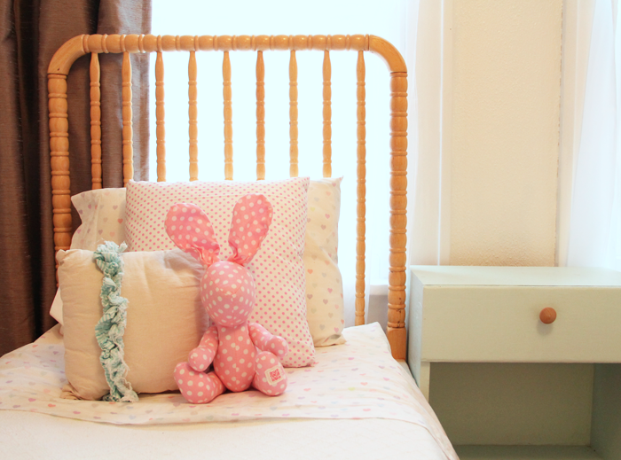
FINISHED IN THE ROOM
The finished beds look so sweet set up together in the room. I still love walking by and admiring them, over a year later!
The girls really enjoy sharing a room and their little beds fit perfectly into their bright and cheery space. Although I am having fun designing their new shared space for Arrow Hill Cottage, I will be sad when we have to retire (or pass on) these special beds their daddy made them!
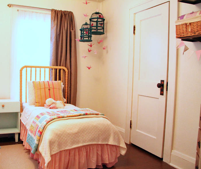
MORE SHARED BEDROOM DETAILS
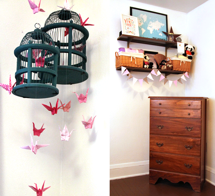
Just for fun, here are a few more details of their shared bedroom.
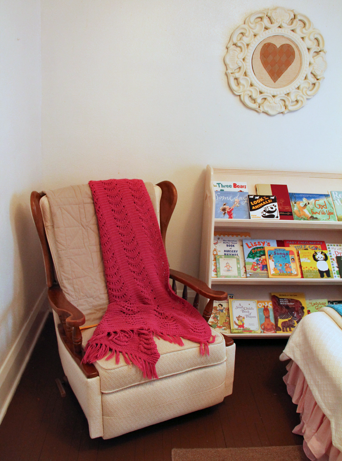
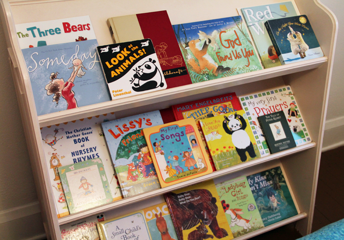
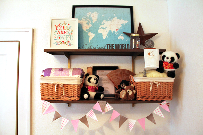
This rocker was Craig’s grandparents. We had it reupholstered before our first child was born, and have used it in the nursery ever since. It is a special piece. Next to it we have a bookshelf, making this the perfect spot for reading.
The bookcase itself is a vintage piece from our local Carnegie Library, which is now closed. I love that the girls are able to see the fronts of the books when making their selections.
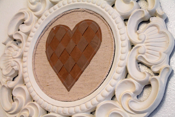
Above the bookcase is a DIY piece that I put together using a mirror frame, which I spray painted white. I covered the mirror with a fabric. It is attached with temporary adhesive, because I imagine in the future the girls may opt to use the mirror itself. The heart was made by weaving strips of paper grocery bags.
Both of our girls were adopted from China – {M} at the age of two in 2015 and {K} at age six in 2017. We always want them to be aware of their beautiful birth culture. The paper crane bird cage/ mobile symbolizes peace and longevity. I folded each of the cranes by hand using a variety of pink patterned paper. The dresser was mine when I was a little girl. It was a gift to me from my grandpa, and I love that I can pass it down to daughters of my own.
Above the dresser are more symbolic and special pieces, including two panda bears from China – one from each trip.
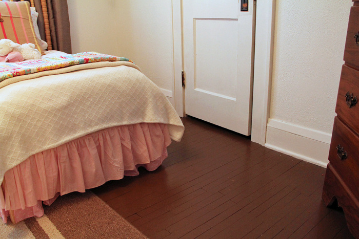
We painted the floor in the girls room, and the entire upstairs of this rental house, a chocolate brown color. It has held up very well and is actually something I am considering for the new house.
PIN THIS DIY TODDLER BED IDEA
I hope you enjoyed this little tutorial and the impromptu room tour! I would love to see the creative ways you have re-purposed a piece into something new!
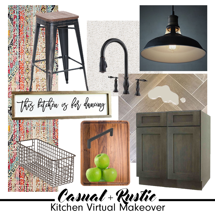
The Makeover Takeover series focuses on helping my readers with bits of their own homes that are giving them challenges. Whether it is a room that they want guidance on styling, a floor plan that needs re-configuring, or they are stumbling with choosing an exterior color palette, I am happy to help. I offer solutions through virtual design and source links.
My first two Takeovers were both bathrooms – a modern Small Beachy Bathroom, and a Classic + Clean Bathroom remodel in a historic home. They were both met with wonderful reviews, and this time around I was excited to shift gears a bit and work on a kitchen remodel.
My friend Adell and her husband Ben live in a super adorable traditional home with their four young kids. Though the house has architectural features that really shine, the kitchen leaves much to be desired.
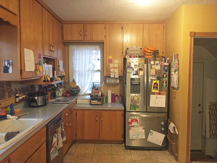
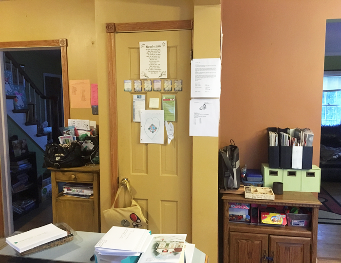
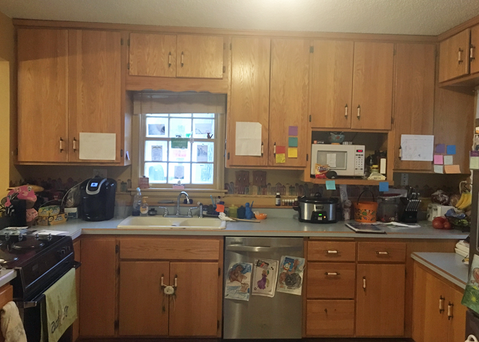
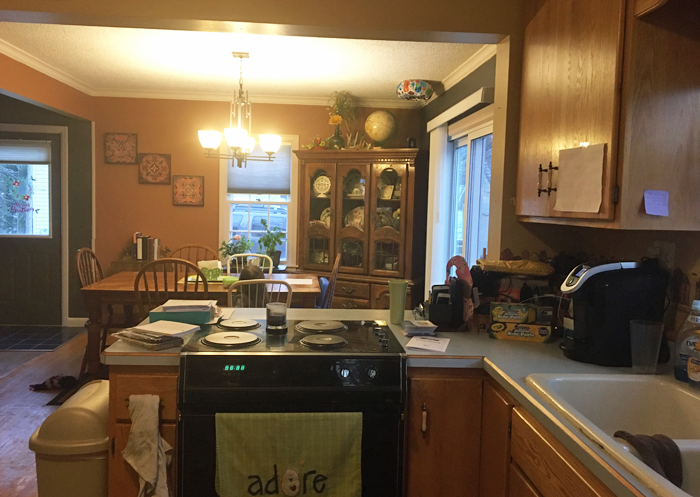
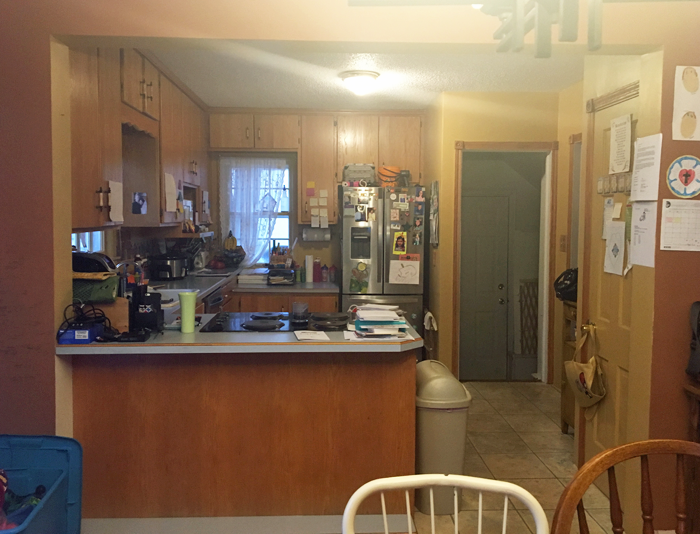
THE KITCHEN TODAY
The layout of the appliances is actually quite efficient. The sink/ DW, fridge and oven are arranged in the basic work triangle, which works well. There is a portion of wall next to the fridge that juts into the space, but because of the way the floor steps down to meet the attached garage access, it needed to stay. For the most part, I wanted to focus on the cosmetic aspects of the room and on making it as organized as possible, finding a home for everything.
PROPOSED PLAN CHANGES
As you can see from the photos, this is one busy family! There are little reminder notes, and calendars on the cupboards, and the kids art projects are taking over the fridge. I wanted to streamline the organization of these bits, cleaning up the space.
I also wanted to maximize the work space, by finding a home for all of the small appliances and kitchen gadgets that are residing on the counter tops.
They have an open layout from kitchen to dining, and the counter extends so that there is space for seating on the dining room side. However, because of the position of the stove, it isn’t a safe place for the kids to sit.
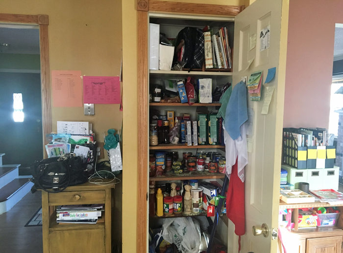
There is a pantry that opens into the kitchen. The storage is nice, but it creates a bump out that leaves a strange little corner. The family has a small table positioned here, but as you can tell by the picture – it has become a bit of a drop spot. Again, I wanted to provide them with functional storage.
And last but not least, I wanted to clean up some of the strange finishes that the previous owners of the house have left – including the wallpaper border/ back-splash and the sheet linoleum floor that was PAINTED to look like individual ceramic tiles. What? Yes, it’s true.
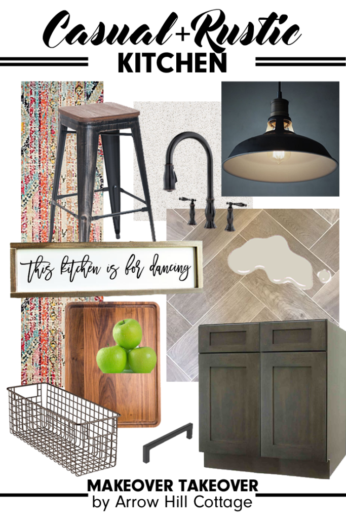
FINISH INSPIRATION
Adell and Ben sent me images of kitchens and materials that they love – and based off of their selections, I would say that they have a very classic style, with traditional lines and a touch of rustic flair.
I was able to source a wonderful selection of products that I think would be amazing in their space. You can learn more about each product by clicking on the titles below.
SINK: This stainless steel apron sink will match the other appliances well.
WALL COLOR: ‘Agreeable Gray’ from Sherwin Williams – the perfect neutral.
AND NOW FOR THE BIG REVEAL!
Can you see the changes? Even though the footprint of the room didn’t change – it seems so much more open! The colors are muted and neutral, which will blend well with the rest of the home decor. Just for reference, let’s take another look at the space pre-makeover.
Quite the difference, I think! Here are the details of what I did to achieve the casual rustic look that Adell and Ben love.
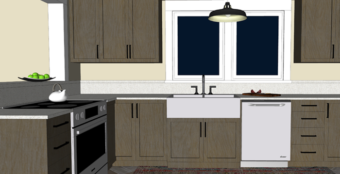
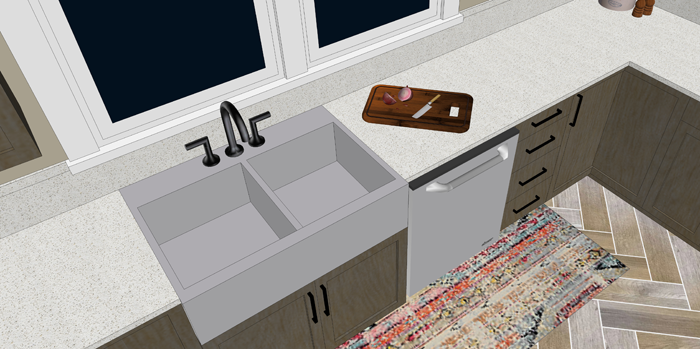
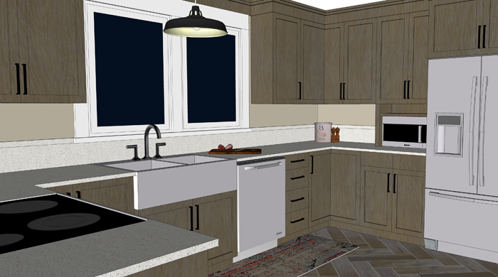
Obviously, all new cabinetry provides a fresh look. Because they are a darker gray stain that shows some wood-grain, I opted to go with a very simple quartz for the counters. Quartz is a wonderful low maintenance surface that is perfect for families with young children. The window above the sink was doubled in size, to allow a greater view of the backyard and let in more natural daylight.
The sink was replaced with a stainless steel apron variety. The large double bowls are very efficient. All corner cabinets in the kitchen have hinged doors that allow access to Lazy Susan storage.
Above the sink I hung a large industrial barn style pendant light. This will provide wonderful task lighting, and is also a focal point for the room.
I removed a window on the fridge wall, which allowed me to even out the counters and provide a more accessible spot for the microwave. The small shelf above the microwave is the perfect size for a cookbook or two.
Next to the fridge, I am proposing a framed piece of sheet metal that can be used to hang notes, calendars and even kid artwork. This wall isn’t as visible from other rooms in the house, making it the perfect location for those random bits.
Where the pantry used to be, I am proposing a more shallow base cabinet with pull out pantry drawers. This is efficient storage for canned and boxed goods, and it offers additional counter space. Because of it’s location to the entry from the attached garage, this area naturally becomes a drop spot.
There is no shame in that. Every house needs a drop spot! The key is to keep the space organized and efficient so that it remains useful and not cluttered storage. Baskets can be placed on the shelves for papers that need to be filed, bills that need to be paid.
The counter/bar seating near the range has been raised, for safety purposes.
With the addition of rustic wood corbels, this is now an attractive spot to eat an afternoon snack or do homework.
And immediately next to the bar, where a small cart used to reside, I am proposing an additional built in cabinet – to house the broom, cleaning supplies, and all of those fun kid craft materials.
The real masterpiece of the room though has to be the amazing wood-grain tiles set in a herringbone pattern. So beautiful and durable! Accented with a pop of color from a distressed bohemian style rug, these floors really come to life!
One last look at the completed space:
I’ve created a 3d animation of the kitchen makeover for a closer look. Click the play button below to view.
I think that this casual rustic kitchen design would blend very well with the rest of Ben and Adell’s beautiful home. Working on this project for them was a lot of fun!
Remember that this is a FREE digital home design consultation, which is available to anyone who subscribes to the Arrow Hill Cottage website. If you or someone you know could benefit from this service, simply email me with a few photos and a description of what issues you would like resolved.
If chosen, I will offer a solution + inspiration through 3d images and sourced items. Hurry though! I only have the ability to do one Makeover Takeover each month and the spots are filling up quickly! I have plans to eventually make this a paid service, so if you have been thinking of contacting me about a project and want to get in on the free deal, don’t hesitate!
This post contains affiliate links to products for your convenience. If you purchase via my links, I may receive a small commission at no additional cost to you. Thanks for supporting Arrow Hill Cottage!
You’re in for a treat today friends! The Reader Showcase is where I feature the homes and home projects that my readers have tackled. I am constantly amazed at the talent and varied styles that each person has to offer!
Today’s talent is no exception. I first met Minna on Instagram. She posted photos of her absolutely stunning home, The Little Plaid Cottage, which is plump full of character. She is super creative and her husband Scot is super handy. They make quite the duo. I think you will agree!
Minna, please tell me a little bit about your home:
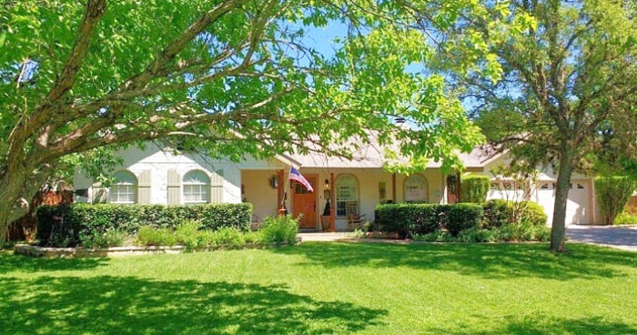
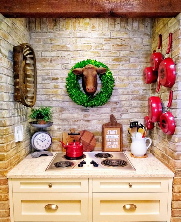
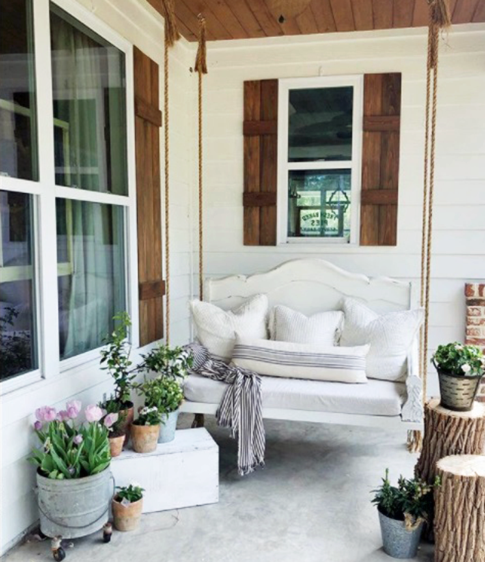
I would describe our home as a cottage. It is a single story 1,430 square foot house that has lots of charm, including a large front porch, built in bookcases, a floor to ceiling rock fireplace, cedar beams on 12 foot ceilings, and a brick surrounded cook-top in the kitchen.
It was built in 1991 on the outskirts of town, and sits on half an acre.
That front porch speaks to me. Looks like a great place to relax!
What is your personal design style?
If I had to define it, I would say cottage/farmhouse. I prefer to find interesting antiques to decorate with rather than just going to Target and buying the latest Magnolia pieces that are on the shelves. I love Joanna Gaines as much as the next person, but I don’t want my house to look exactly like everyone else’s house.
Antiques have history and tell a story. They have stood the test of time and have a beauty all their own. I love displaying vintage finds in my home and plan to enjoy them for years to come. I also love decorating with plaids & buffalo check, and tend to gravitate towards wreaths and white pitchers.
Explain your favorite remodel projects. What was done to each space?
We have done quite a bit of work to our current house during the 7 years we have lived here!
KITCHEN
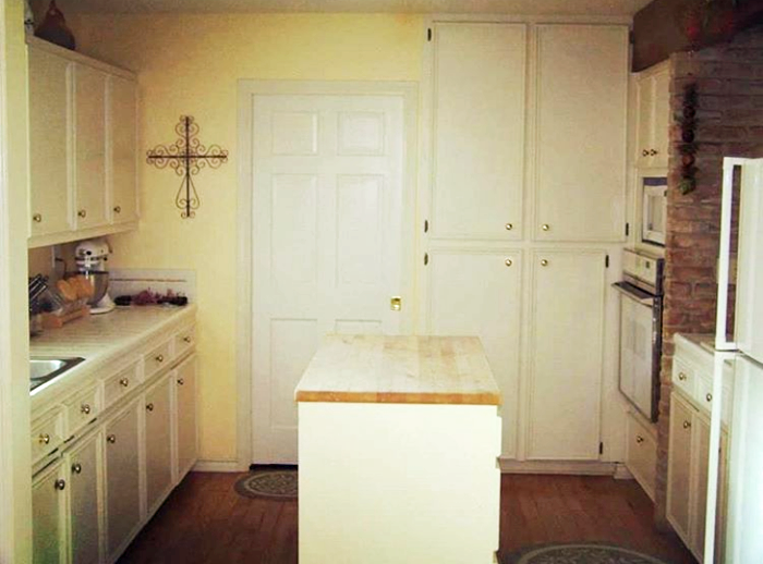
Our kitchen has by far been my favorite remodel project to date. We started off with popcorn ceilings, a pantry cabinet that was limited to opening the full way because it would hit the oven handle, chipped tile counter-tops, original builder grade appliances, and a shallow kitchen sink with a rotted cabinet below.
Kitchen before. Charming, but very ‘vanilla’
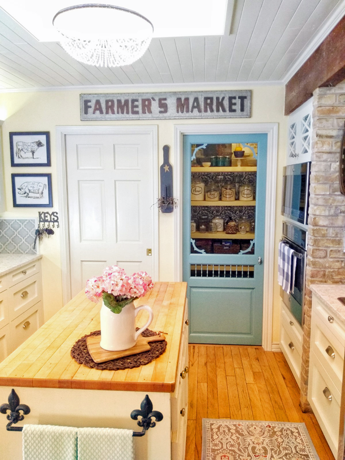
The first thing we did was add a walk in pantry. We were able to carve a bit of space from the attached garage and include it in the kitchen. My husband did all of the framing, finishing, painting and even built custom shelving. I found some fabric from Hobby Lobby to use on the back wall in lieu of wallpaper. We installed matching tile and added a screen door, which may seem an odd choice for a kitchen – but it works for us for two reasons: 1. It adds charm + character, and 2. It forces me to keep the things inside clean and organized!
My goodness what a great idea! The pantry looks so organized.
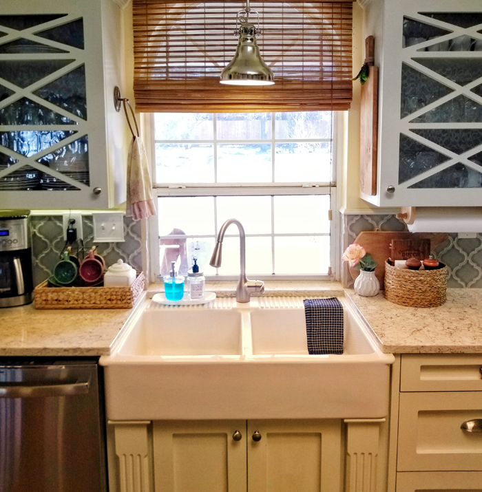
I found a farm sink on Craigslist for $50. The price was low because it had a chip on one corner, but I knew that we would be under-mounting it and that the counter material would hide the chip. The sink literally sat in my garage covered in a blanket for two years while we saved up for the remodel.
I can’t see the chip, can you?
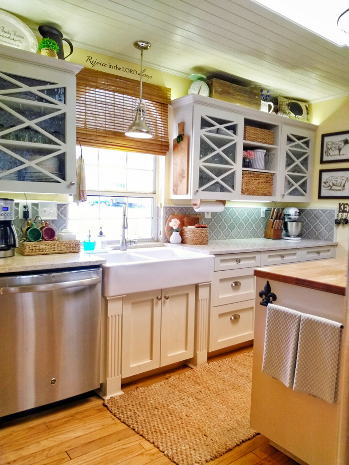
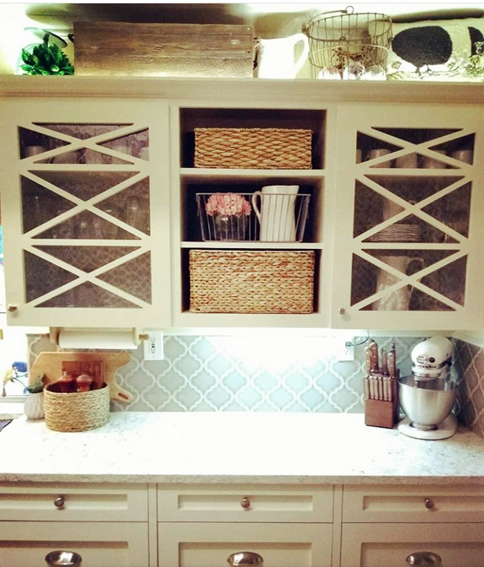
To save money during the remodel, we decided to keep the upper cabinets and update them with crown molding and new doors. I knew that I wanted glass for the upper cabinets, but also wanted to do an interesting design. My husband built a triple X design on the doors and we used wavy glass, which I love because it reminds me of something you might find in an old home.
Custom cabinet design. I love the look!
We also removed the middle cabinet door above the fridge so that I could add some warmth and contrast with baskets. I lined the backs of the glass front cabinets with contact paper from Dollar tree.
My husband converted all of the bottom cabinets from shelves to drawers. It is so nice not having to get on my hands and knees to find a missing Tupperware lid in the back of a dark cabinet anymore!
Let’s all just take a moment and appreciate how lovely their cook-top is. Such a happy place to create meals!
We got an amazing deal on our quartz counter-tops and my husband cut and installed them without ever having done it before. I have to say, I am married to a perfectionist – and they turned out fabulous! Since the cabinets and counters are both white, I decided to make the back splash a contrasting color and found bluish gray Arabesque tile from Home Depot.
The tile is gorgeous, and I really love all of the neutral accessories!
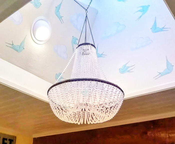
The final part of the remodel was installing wood planks on the ceiling, which added so much character. We have a large skylight in the kitchen that is a wonderful feature. The ceiling height in the room is only 8 feet but the skylight opening extends to 12 feet! To draw the eye up I found bird decals online, which we affixed within the skylight. They add a special unexpected touch.
How’s that for whimsy? And a chandelier in the kitchen? Yes please!
My husband Scot DIY’d so much of our kitchen and it saved us a ton of money! We would not have been able to afford to do a full kitchen renovation had it not been for all of his hard work!
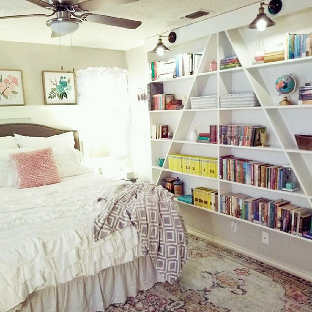
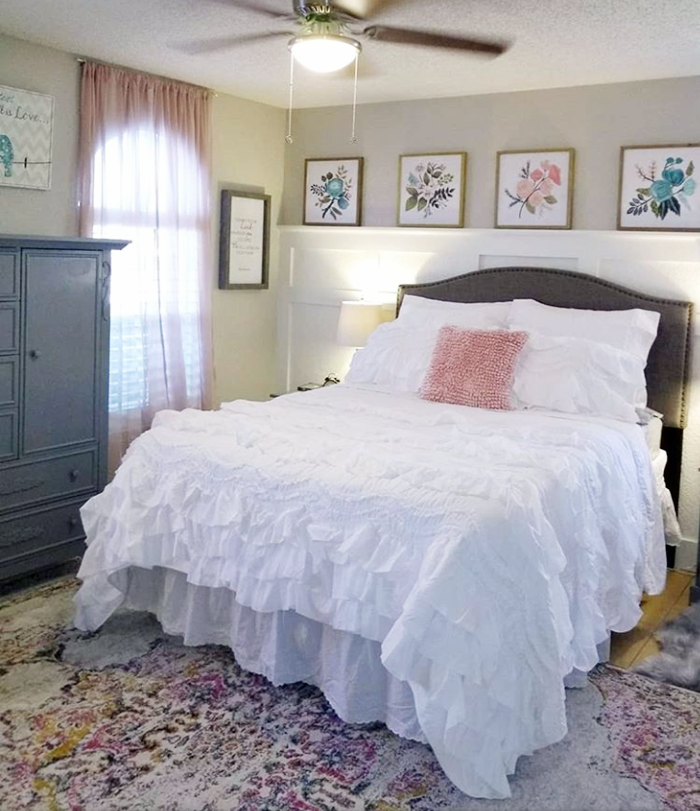
DAUGHTER’S BEDROOM
Another area in our house that I had so much fun designing and decorating is our daughter’s bedroom. For Christmas this year we gave her a whole new room. We painted the walls with Sherwin-Williams ‘agreeable gray’, and my husband installed board and batten on an accent wall for contrast.
Her armoire and nightstands were painted with Sherwin Williams ‘cityscape’. The headboard was an incredible Black Friday deal from Walmart. We got it for a steal at $59! I shopped various other stores – including Target, H&M, and Hobby Lobby – to pull the decor of the room together.
Such a soft and comfortable looking space!
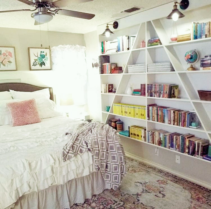
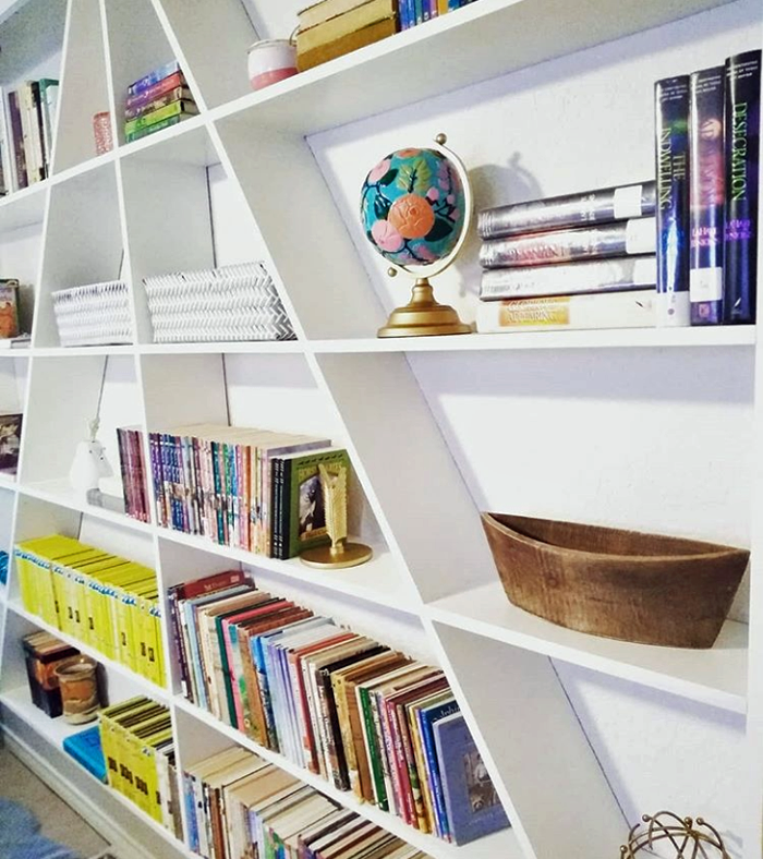
I am most pleased with the A-frame bookcase that my husband built for the room. It adds so much visual interest to the space and is so fun to style!
This bookcase is a stunner! Fun looking + functional = major win!
What would you like readers to know about designing and styling a home? Do you have any tips to share?
Think about what you personally like and are drawn to, and not necessarily what’s popular in the moment that everyone else can go to the store and buy. You are a unique individual created by God to shine and share your own creative talents with others.
Scot made this cute bench for Minna as a gift years ago
Don’t get stuck in a mold with everyone else. Be your own person and display what’s important to you and that which speaks to you. I believe Edith Schaeffer says it best: “This place should be expressing something of yourself. It should be communicating something of you to your visitors, but it should also satisfy something within you. You should feel ‘at home’ here, because you have made it home with something of yourself.”
Do you have any remodeling / decorating plans for the future?
My immediate plans are to style the small guest bedroom, which used to be our son’s bedroom before he moved out. We also want to scrape the popcorn texture off of the ceiling in other rooms in the house. It’s a messy job, but it isn’t difficult and it really does make a dramatic difference!
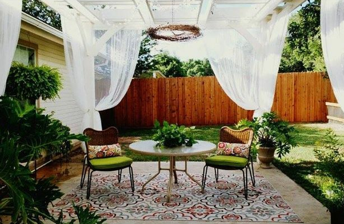
Outside, we have plans to paint the front porch once the weather warms up and remodel our back patio – including the addition of an outdoor kitchen and fireplace.
This space is already pretty amazing. I can’t wait to see the new additions!
A few months down the road, I would love to tackle a master bathroom remodel. We tend to focus on one project at a time and at our own pace.
We are enjoying the fruits of our labor in this house and though we don’t have plans to move any time soon, I can envision us living in a smaller one or two bedroom home on a larger piece of property sometime in the future.
Thank you so much Minna and Scot for sharing your wonderful home with all of us! I encourage all of my readers to go check out Minna’s Instagram account HERE to watch the progress while she and Scot continue to remodel and make their house into a home that reflects their personality and style.
Now it’s your turn! Have you been putting your personal touches on your home? Maybe the entire house isn’t finished, but you are particularly proud of one room – I would love to see, and share with my readers!
If you are a blog subscriber, you are eligible! Simply email photos and a brief description to angela@arrowhillcottage.com for your chance to be featured!


 Not many moments spark the same amounts of joy and sadness as when the youngest child of the family finally outgrows the crib. With the celebratory occasion of assembling the ‘big boy/girl’ bed comes the equally emotional moment of taking the crib apart.