HOW ROOM COLOR CAN AFFECT MOOD

Imagine your favorite color. What about that specific shade makes it stand out in your mind? Have you ever thought about how it makes you feel?

Though preferences vary – science has taught us that colors evoke similar feelings in the majority of people. How then, do the colors you choose to use in the rooms of your home affect your mood?


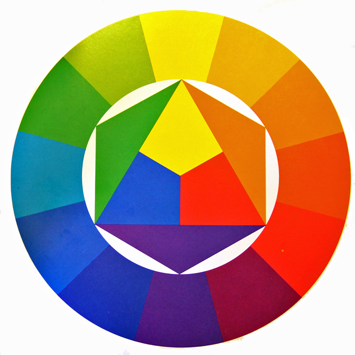
Generally speaking, all colors stem from the three main PRIMARY COLORS – Red, Blue, and Yellow.

They are further divided into three main categories: Warm, Cool, and Neutral.


WARM COLORS: Located on one side of the color wheel – Reds, Yellows, and Oranges – these shades evoke feelings of warmth because they remind us of things such as fire and the sun.

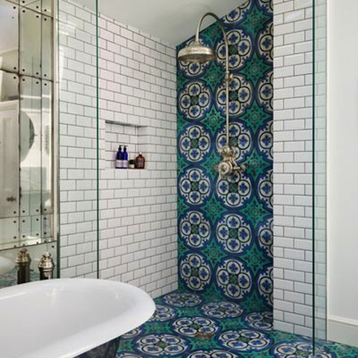
COOL COLORS: Located on the opposite side of the color wheel – Blues, Greens, and Purples – evoke cool feelings because they remind us of grass and water.

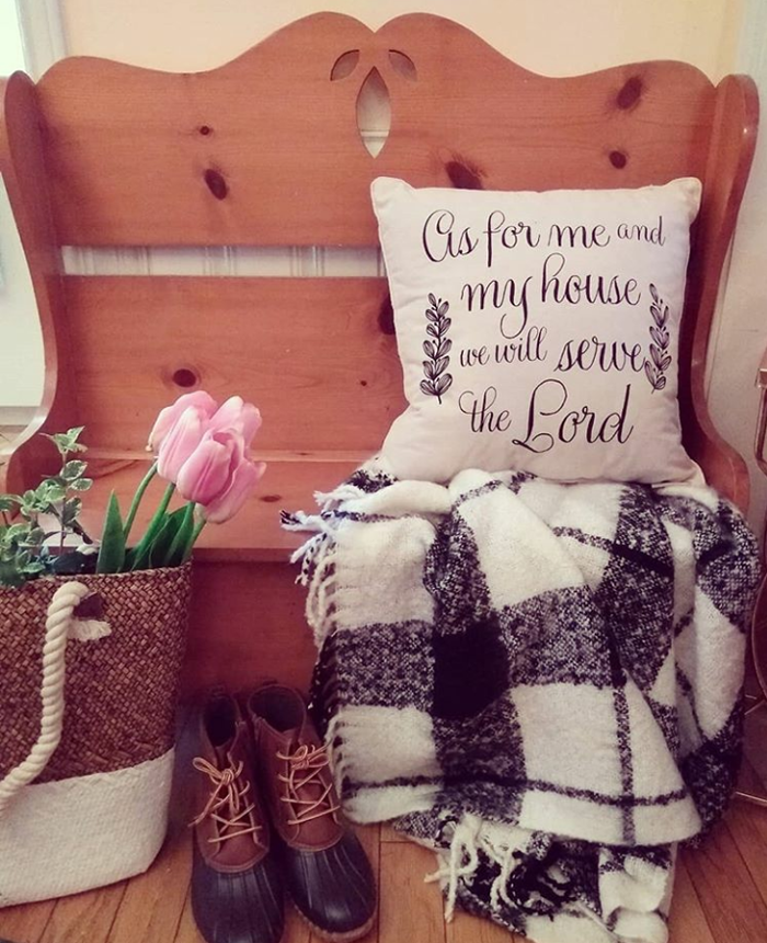
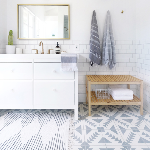
NEUTRAL COLORS: The standard neutrals – White, Gray, Black, and Brown- are considered ‘non-colors’. In reality there are wide varieties of neutral hues, with a range of warm or cool undertones. Black and brown are considered to lean toward the warm side, while white and gray tend toward cool.


WARM COLORS IN YOUR HOME

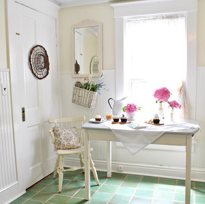
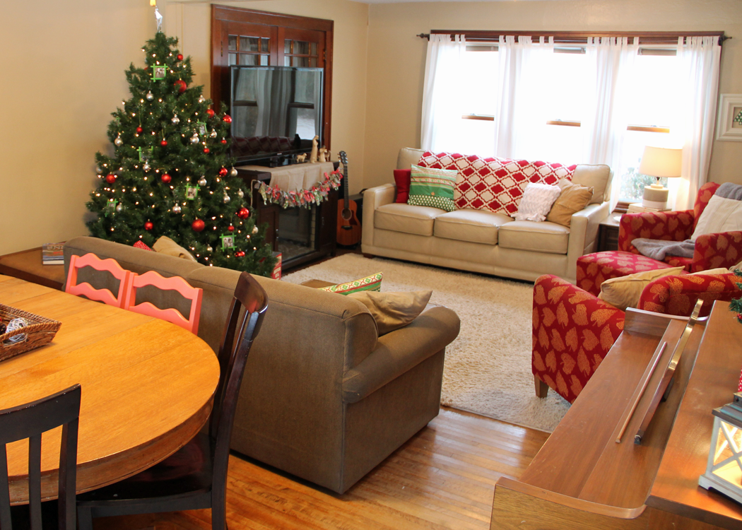
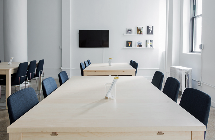
Warm colors are stimulating and fun. In your home, warm colors work well in the public and social rooms of the house such as the living room, dining room and kitchen.
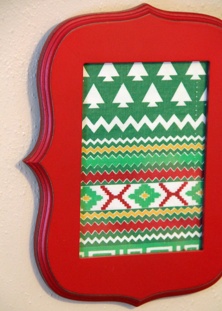
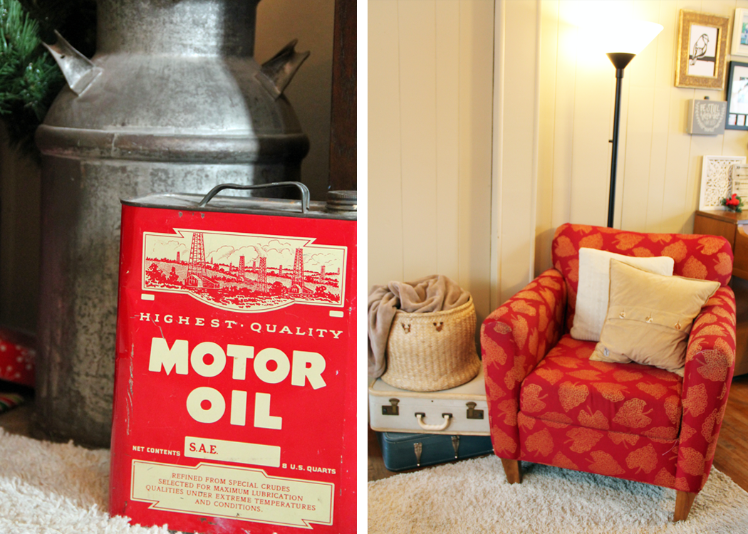
 

RED

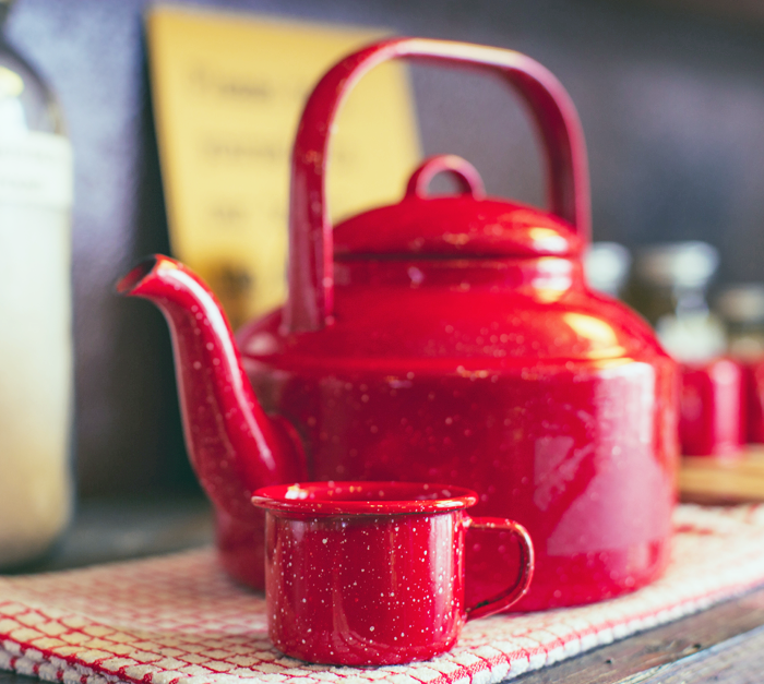
Red is a very intense color, and tends to liven a room. Because of it’s intense hue, it is the perfect color to use when looking to add interest and excitement to a space. The eye will naturally be drawn to it, and even a small pop of red will raise a room’s energy level. It has been said that red stimulates conversation and increases appetites – making it a popular choice for living and dining rooms.


YELLOW

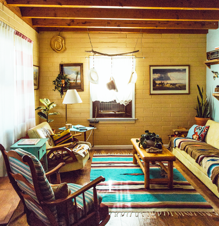
Yellow is considered a happy color. It can make people feel energetic and cheerful, and yet large amounts of the brighter shades of yellow may evoke feelings of anxiety, frustration, and even anger. The softer yellows are a better bet for whole room coverage, as they tend to be easier on the eyes and reflect light well. Rooms that can benefit from uplifting yellow hues include entry spaces, kitchens, and bathrooms.


ORANGE

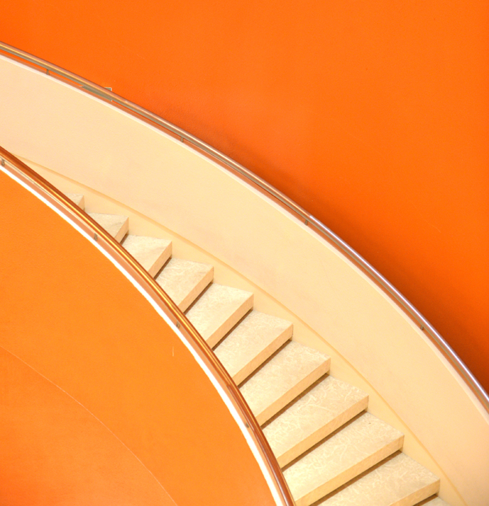
Orange is a highly energetic color that represents happiness and innovation. Though it has a reputation of being overwhelming, the more subtle shades (such as apricot and terracotta) have become more popular in modern day interior design. Color experts warn that the brighter the shade of orange you use, the less you need.


COOL COLORS IN YOUR HOME

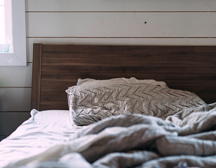
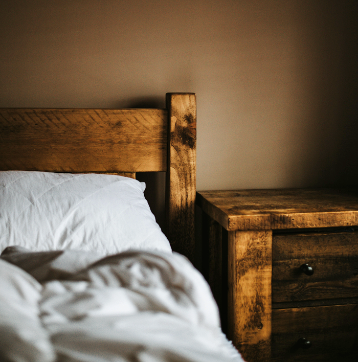
Cool colors tend to be calming. They evoke feelings of restfulness and peace – and therefore are wonderful choices for private rooms where concentration and quietness are important, such as bedrooms, offices and bathrooms.
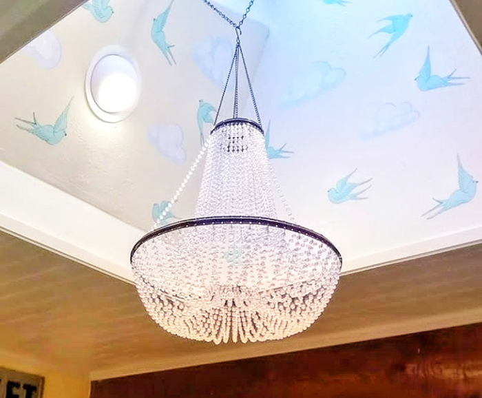
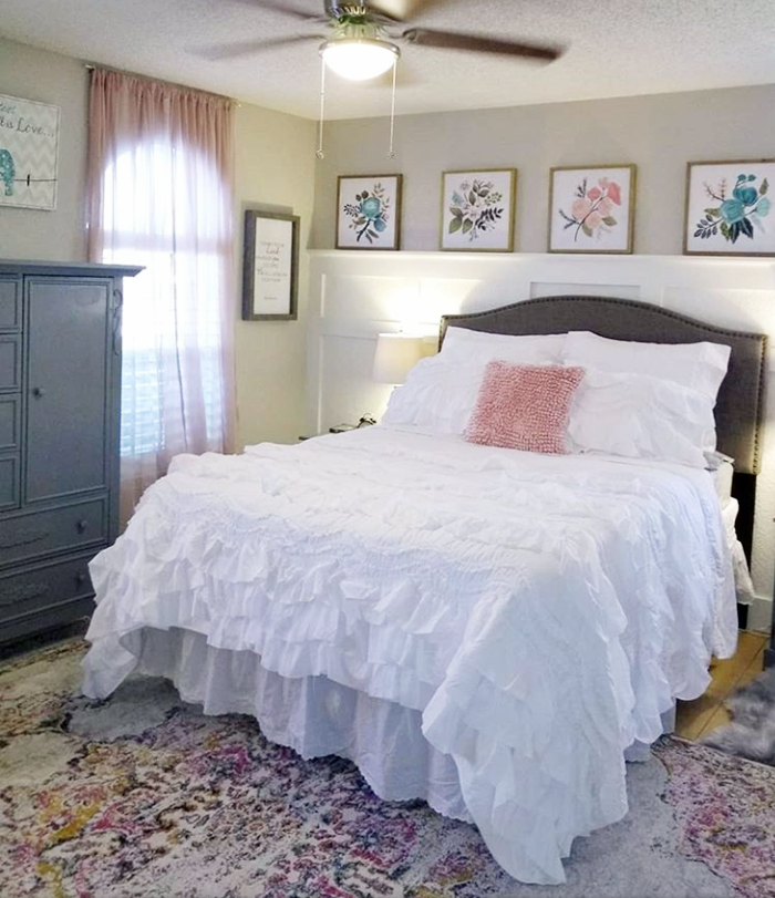
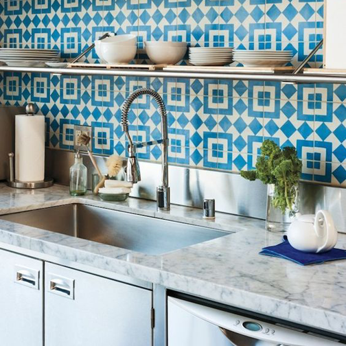


BLUE

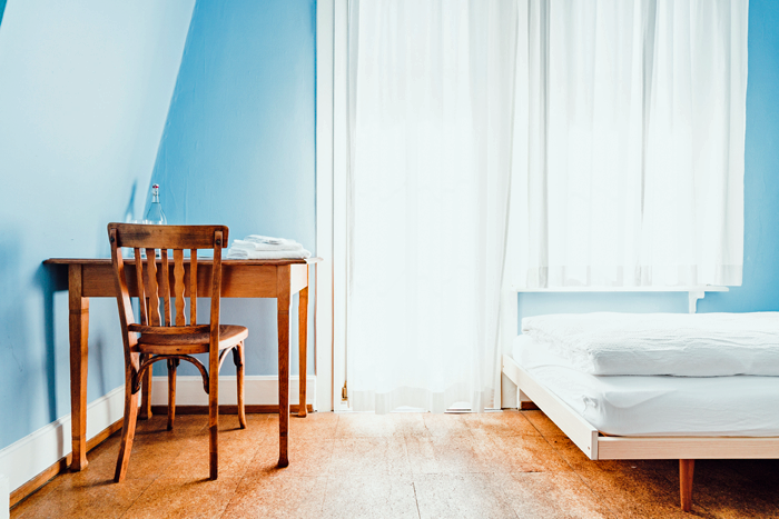
Blue is considered relaxing and serene. It has been said to bring down blood pressure and slow respiration – making it a popular choice for bedrooms and bathrooms, especially in the softer shades.  Dark blue may evoke feelings of contemplation and in large amounts, even sadness.


GREEN

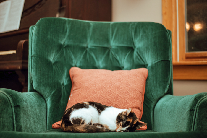
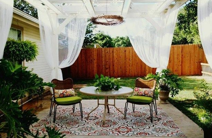
Green is considered the most restful color for the eye, as it combines the refreshing quality of blue and the cheerfulness of yellow. When used as the main color for decorating, it is said to relieve stress and help people relax. Because of it’s overall pleasant feel, green is suited for almost any room in the house.


PURPLE

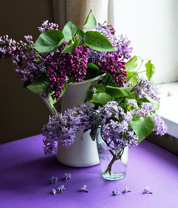
Purple is associated with luxury and creativity. Though rarely used as the main color in decor schemes, it does lend itself well as an accent or secondary color, by adding depth. Darker hues of purple – such as eggplant – can make a space feel rich and sophisticated, while lighter versions – such as lavender or lilac – can bring a restful quality to a space.


NEUTRAL COLORS IN YOUR HOME

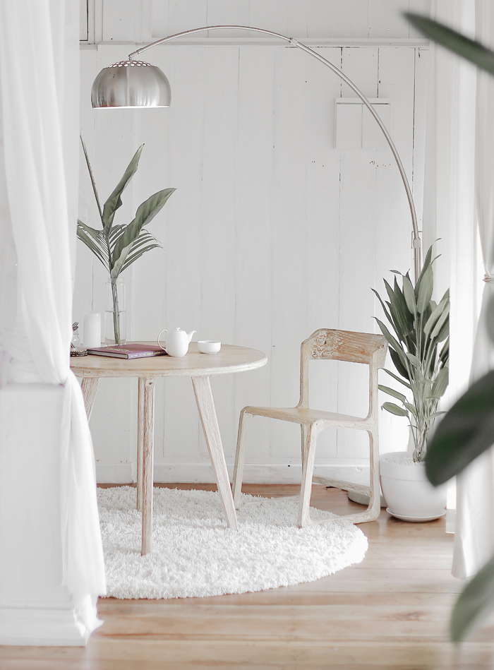
The neutral shades are considered the building blocks in a decorator’s tool kit. Because of their flexibility they are useful as either the base/main color for a room, or a grounding accent color. When decorating, it is recommended that 80% of a room is composed of neutral colors, and 20% of the remaining space filled with strong accent colors – pulled from either the warm or cool tones of the color wheel.


WHITE

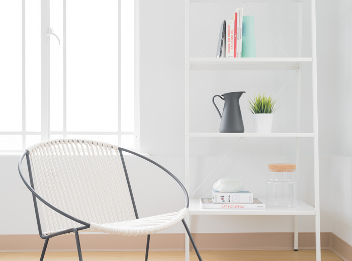
Because of it’s light reflecting abilities, White is considered airy, peaceful, and clean. Designers often use white to make roomss feel more spacious, or as a blank slate to build upon. Be careful not to whitewash everything though – too much white in one space can make it feel stark, cold and bland.


GRAY

Gray is considered the most unresponsive color – emotionless, neutral, and safe. Lighter shades of gray will feel cool and serene – with just a bit more warmth than white. Darker shades of gray can feel solid and steady. In any shade, this color blends well with others – allowing them to take center stage.
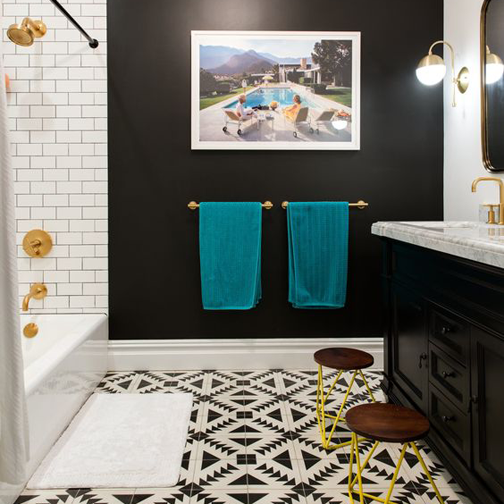
 

BLACK

Black is a ‘grounding’ color. It can be used as an accent to virtually any other color. In fact, some experts in the color field argue that a bit of black should be incorporated in every room to ground the color scheme. But remember, a little bit of black can go a long way!
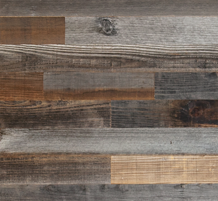
 

BROWN

Brown is an earthy color that invites you to reconnect to your roots and embrace nature. It is a reliable color that makes you feel safe and warm. Brown is a popular choice as an accent color, primarily in the use of wood furnishings and cabinetry.


COMPLEMENTARY COLORS

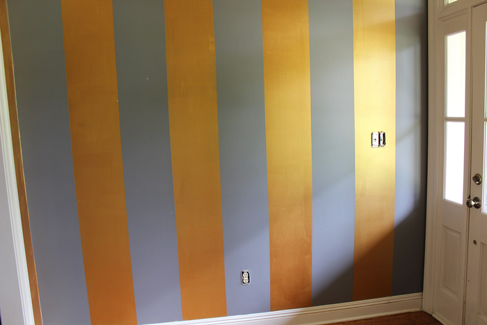
When determining which colors will look best together in a space, you can find some great clues by going back to the basic color wheel. Colors that are opposite each other on the wheel are thought to work together well. Blue and Orange, for example, are considered complementary colors.


I find the theory of color fascinating! Do you agree with the scientific studies? Does your favorite color evoke the same feelings written in this post? I would love to know if the colors you favor tend to make their way into your home decor – comment below!

And feel free to visit my Pinterest page – for boards showcasing Hues of Home!
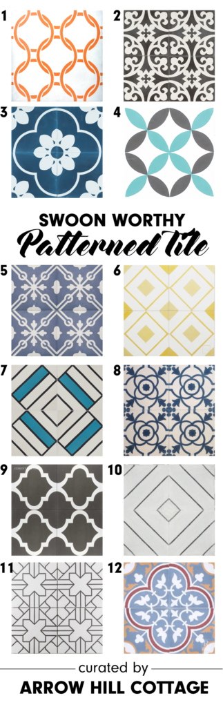
Pin this for later:


TRENDING IN HOME DESIGN & DECOR: INTERIOR WALL CLADDING

While historically it may have been implemented for it’s ease of installation, cost effectiveness and as a durable finish, interior wall cladding is becoming a popular design choice with modern day homeowners as they seek for something other than standard drywall.

Cladding is available in a variety of styles and materials, each with it’s own aesthetic. Read about the most popular styles, the common materials used to create them, and a few important installation tips.


CLADDING  VARIATIONS

There are many cladding options available for today’s homeowner. I have compiled a list of what I consider to be the five most popular varieties, complete with a sketch of what each application looks like in cross section and a photo of the actual material used in a space.

BOARD + BATTEN

image source

Made with a series of boards overlaid with strips of 1x materials over the seams/joints. Plywood can be used in lieu of boards, for a more simple application. Some DIYers prefer to add the 1x strips directly to the wall at a chair rail height, and use paint to achieve the look of paneling.


BEADBOARD

image source

When factory produced mill-work became available in the Victorian Era, beadboard was a popular choice to clad the walls (and ceilings) of utility spaces such as bathrooms and pantries. These strips of wood are milled with joints that fit together to form one continuous wall covering.


SHIPLAP

Photo by Bekah Russom on Unsplash

Made popular by Chip and Joanna, Shiplap is a decorative cladding treatment where horizontally laid boards interlock. An optional ‘nickel gap’ milled on the top edge of the boards creates a shadow line that highlights the individual boards. The lines of this cladding style are clean and simple, making this a popular choice for traditional and modern homes alike.


V-GROOVE

Photo by Hutomo Abrianto on Unsplash

This cladding was most popularly used in Colonial-era homes and is created by boards that are milled with chamfered (or right angle cut) edges on both sides, which form a ‘v’ when the boards are combined. V-groove cladding is readily available in a variety of wood and synthetic materials.


PLANKS

image source

Generally, this cladding technique is created by applying salvaged boards of various sizes and colors onto a wall in a collage format. Reclaimed barn wood and shipping palettes are common materials utilized. DIYers love this cladding style for feature walls – to give their spaces a rustic and handmade look.


POPULAR MATERIALS

These cladding options are typically available in three different materials: wood/plywood, salvaged wood, and MDF. Your decision to choose one material over another may be based on a variety of factors including ease of installation/finishing, the size of your project budget, and the space you will be using the cladding in.


WOOD / PLYWOOD

image source

A wide variety of wood species are utilized to create the cladding material, from budget friendly pine to stunning cedar and redwood. Because wood expands and contracts over time, it important that space is left between boards during installation. Wood is very durable, but can be heavier than other material choices. Plywood sheets with grooves cut to create the appearance of planking are lightweight, easy to install, and very budget friendly.


SALVAGED WOOD

image source

This material can be gathered from a variety of sources – from old barns to factory floors – and has rustic charm and character. You will want to be sure that salvaged wood has been properly cleaned and dried – to avoid pesky, unwanted insects from being ushered into your space.

Companies such as Plank + Mill offer a salvaged wood product that has been cleaned, kiln dried, and planed thin before being applied to and adhesive backing. These ‘peel and stick’ products are ready to be installed directly on your walls with ease.


MDF

image source

Medium density fibreboard is becoming a more popular material choice as natural resources become scarce. It is made up of approximately 80% wood fibre material, and a mixture of glue, water, and wax.

This material can be quite budget friendly and is available in a wide variety of sizes and even 4’x8′ sheet applications. It’s downfall is that it can not be used where moisture is a possibility, as it acts like a sponge to soak up water – eventually swelling and crumbling apart. Though there are some companies who offer a water resistant MDF material, it is not readily available.


TIPS FOR INSTALLATION

DIRECTION MATTERS

Generally speaking, vertically laid material will give the illusion of height – while horizontal boards make small spaces seem larger. Keep that in mind when making selections for your space.


KEEP IT SIMPLE

Add character, not clutter. When determining what style of cladding to use be mindful that multiple styles may not look great together. A vertical beadboard wall will clash with a horizontal shiplap wall nearby, for example. Experts caution that while one style per space is encouraged, a maximum of two styles should be used in each space. A maximum of three styles throughout the entire house is also recommended.


START LEVEL

When installing cladding in plank form, it is vitally important that the first board/plank installed in plumb and level.  You may want to have an extra pair of eyes and hands available to help guide that first piece into place. Failing to take the extra time upfront can cause big problems during the rest of the process.


MY THOUGHTS ON THIS HOME DESIGN TREND

I am a texture lover, and interior wall cladding adds a depth that plastering or basic paint is not able to accomplish. The bonus of this trend is that it is fairly DIY friendly, and forgiving. Part of the charm of interior cladding is that it reminds us of older, historic homes – where perfection is not expected.

The exterior of our cottage will feature both standard lap siding and board + batten applications. I imagine we will also use a few accent spots of cladding on the interior, as a way to tie the inside and outside of the house together as a cohesive design.


SPRING DECORATING IDEAS: DESIGN INSPIRATION FROM INSTAGRAM

The calendar says that Spring has officially begun. The weather, however, is painting an entirely different picture. My area of the country is expected to experience record breaking snowfall this coming weekend – we’re talking FEET of snow. I don’t like that idea. Not even a little bit.

As a way to distract my mind, I took to Instagram to find the signs of Spring via home decor. I just love all the creativity I found, and I have to admit that looking at all the Spring pictures did the trick. Now, if I could just walk into one of these scenes over the next couple of weeks and not have to live the reality – that would be great!

Enjoy the decorating inspiration, friends!


@tracey_hiebert

Bunnies! And vintage suitcases! And chippy paint! So many lovely things in one little corner – and the textures are the icing on the decor’ cake!


@thelesliestyle

Have you ever seen a more ‘springy’ room? I’m pretty sure I haven’t! You guys seriously have to check out Leslie’s IG feed and blog. This house is pure magic – every square inch of it. The transformation of this room in particular was enough to make me a follower!


@grayapplemarket

The trellis pattern of these rustic window frames remind me of garden gates. They are for sale, and I can guarantee that if I lived closer I would be visiting the shop and taking a few of these beauties home with me!


@hollyshobby

Tulips are one of the first signs of Spring, and this decor set up has me dreaming of the new life that the season is sure to bring.


@the_pleaseant_farmhouse

Oh, how I could use a moment on this amazing porch. So in love with all of the greenery. And that swing? Yes please!


@onethousandoaks

Guess what guys? This beautiful print is available for free on One Thousand Oak’s blog. Click HERE to grab one – I’m going to! Thanks for the little reminder, Jaclyn!

READER SHOWCASE: HEATHER + JEREMY’S HOME

I am so excited about today’s Reader Showcase feature! This series is where I have the opportunity to share the homes and home projects that my readers have tackled. I am constantly amazed at the talent and varied styles that each person has to offer!

I follow Heather on Instagram and am so inspired by her lovely home and how polished, yet casual, her spaces seem to look. She really has a lovely aesthetic.


Heather, please tell me a little bit about your home:

We live in a traditional builder grade brick home that is about 20 years old. We purchased it a year and a half ago and have been slowly tackling projects ever since! The house is sited in a small, historic town in Louisiana – nestled in a subdivision. The half acre parcel of land is beautifully landscaped, with a peaceful creek nearby, plenty of trees, and wildlife.


What is your personal design style?

My personal design style is a combination of modern and traditional farmhouse. I love to mix the old with new. Joanna Gaines has definitely been a primary source of inspiration. In fact, my husband often calls me ‘Little JoJo’. We live on a pretty tight budget, so the majority of our home decor is thrift-ed or DIYed. My husband and I love going to flea markets, thrift stores, trade shows, and antique stores to look for vintage pieces to add to our home. I think what I love most about vintage decor is that it is ‘one of a kind’. Each piece is unique and has so much character. There may be another item very similar, but it won’t have the same nicks, cracks, patina and history behind it.


Explain your favorite remodel projects. What was done to each space?


LIVING ROOM

My favorite remodel project has been our living room transformation. My husband and I DIYed everything in this space. When we purchased the home, all of the details were very traditional and dated. The fireplace had black marble with a fluted mantel. There were built-ins on both sides of the fireplace. The walls were painted a tan color, and a ceiling fan hung above the sofa.

The first step in our living room renovation was to tear out the built-ins. Though the storage was good, the materials they were constructed of were very cheap. My original plan was to tear out the built-ins and replace them with furniture pieces; However, once we pulled them out, we realized there were no floors underneath! The oak floors in the room have a honey color stain. Having the floors completely refinished or replaced was not in the budget. I had to come up with something that would cover the areas without flooring, and so we decided to do a built in bench seat on one side of the fireplace and I found a perfectly sized piece of furniture for the other side.

We then installed faux shiplap on the fireplace wall. This was a good option for this wall because it covered all of the sheetrock blemishes where the built-ins were.


When we set to work on the fireplace itself, we started by replacing the black marble tiles. I really wanted to add a hearth, and since we had never laid brick before, we felt it was best to contract it out. We learned an important lesson during that process – always get more than one quote! Of the two quotes to lay the hearth, one was 4 times more expensive than the other!


The mantel was very decorative with lots of moldings and fluted columns down the side. Again, this was not my style.

fireplace surround before


I wanted a simple, rustic look and found an old reclaimed pine board to use as a mantle instead. To finish off the living room space, we replaced the ceiling fan with the Edison Bulb chandelier from World Market. We also added drop cloths as window treatments to soften up the room – another in-expensive and easy DIY project!

fireplace after

FOYER

The foyer was actually the very first project we ever tackled in our house. I think it was a great starter project for us, since it was a small space. It was still a design challenge though, as the room was originally painted with purple and metallic gold stripes!

foyer before: a bold choice!


As you can imagine, it would have been incredibly difficult to paint over the bold pattern, and so we decided to cover the walls with something instead. After much research, we ultimately decided to use a faux shiplap in the space. It looks just like the real thing, but it is actually panel boards that are cut with lines every 6 inches.

We painted both the walls and trim in White Dove by Benjamin Moore – which really gave it a fresh look, and even increased it’s perceived size! The space turned out better than we ever expected and completing it gave us the motivation to tackle other, larger home improvement projects.


What would you like readers to know about designing and styling a home? Do you have any tips to share?

Most importantly, have fun! Be creative and play around with different styles without being afraid to break the rules to create a style all your own!

Another tip I have is that if you don’t have a ton of money to style your home, start with ‘shopping your space’. You don’t always need new decor – sometimes you just need new combinations in different rooms. Think of ways that you can re-purpose or up-cycle what you already have. If you use your imagination and think outside of the box, you can create some pretty amazing things. I’ve picked up many items from the Dollar Tree that I have transformed into beautiful decor just by getting a little creative.


Do you have any remodeling / decorating plans for the future?

We are slowly going room by room making this house into our dream home. So far we’ve completed the foyer, living room, and our oldest son’s bedroom. It’s been a slow process, but my husband and I both enjoy doing it. It gives you such a sense of satisfaction and accomplishment when you are able to complete a project.

The room that I am most looking forward to renovating is my kitchen! While it’s not horrible, it just isn’t the kitchen of my dreams. I can’t wait to add a farmhouse sink, subway tile, quartz counter-tops and all of the other farmhouse elements.

current kitchen: I hope they keep the paver floors!!! 

Other projects that we hope to complete soon include painting the dark red exterior brick of our house to white. I would also love to makeover our master bedroom, and freshen up the laundry room by stenciling the floor tiles, among other things. If only there were more hours in a day!


Thank you so much Heather and Jeremy for sharing your wonderful home with us! I encourage all of my readers to subscribe to Heather’s Instagram account HERE so that you can follow along while she and Jeremy continue to remodel and make their house into a home that reflects their personality and style. Heather also has an amazing blog, Beauty for Ashes, where you can find plenty of home design inspiration and instruction. Go check it out! 


Now it’s your turn! Have you been adding personal touches on your home? Maybe the entire house isn’t finished, but you are particularly proud of one room – I would love to see, and share with my readers!

If you are a blog subscriber, you are eligible! Simply email photos and a brief description to angela@arrowhillcottage.com for your chance to be featured!

READER SHOWCASE: MINNA + SCOT’S HOME

You’re in for a treat today friends! The Reader Showcase is where I feature the homes and home projects that my readers have tackled. I am constantly amazed at the talent and varied styles that each person has to offer!

Today’s talent is no exception. I first met Minna on Instagram. She posted photos of her absolutely stunning home, The Little Plaid Cottage, which is plump full of character. She is super creative and her husband Scot is super handy. They make quite the duo. I think you will agree!

Minna, please tell me a little bit about your home:

I would describe our home as a cottage. It is a single story 1,430 square foot house that has lots of charm, including a large front porch, built in bookcases, a floor to ceiling rock fireplace, cedar beams on 12 foot ceilings, and a brick surrounded cook-top in the kitchen.

It was built in 1991 on the outskirts of town, and sits on half an acre.

That front porch speaks to me. Looks like a great place to relax!

What is your personal design style?

If I had to define it, I would say cottage/farmhouse. I prefer to find interesting antiques to decorate with rather than just going to Target and buying the latest Magnolia pieces that are on the shelves. I love Joanna Gaines as much as the next person, but I don’t want my house to look exactly like everyone else’s house.

Antiques have history and tell a story. They have stood the test of time and have a beauty all their own. I love displaying vintage finds in my home and plan to enjoy them for years to come. I also love decorating with plaids & buffalo check, and tend to gravitate towards wreaths and white pitchers.


Explain your favorite remodel projects. What was done to each space?

We have done quite a bit of work to our current house during the 7 years we have lived here!

KITCHEN

Our kitchen has by far been my favorite remodel project to date. We started off with popcorn ceilings, a pantry cabinet that was limited to opening the full way because it would hit the oven handle, chipped tile counter-tops, original builder grade appliances, and a shallow kitchen sink with a rotted cabinet below.

Kitchen before. Charming, but very ‘vanilla’


The first thing we did was add a walk in pantry. We were able to carve a bit of space from the attached garage and include it in the kitchen. My husband did all of the framing, finishing, painting and even built custom shelving. I found some fabric from Hobby Lobby to use on the back wall in lieu of wallpaper. We installed matching tile and added a screen door, which may seem an odd choice for a kitchen – but it works for us for two reasons: 1. It adds charm + character, and 2. It forces me to keep the things inside clean and organized!

My goodness what a great idea! The pantry looks so organized.


I found a farm sink on Craigslist for $50. The price was low because it had a chip on one corner, but I knew that we would be under-mounting it and that the counter material would hide the chip. The sink literally sat in my garage covered in a blanket for two years while we saved up for the remodel.

I can’t see the chip, can you?


To save money during the remodel, we decided to keep the upper cabinets and update them with crown molding and new doors. I knew that I wanted glass for the upper cabinets, but also wanted to do an interesting design. My husband built a triple X design on the doors and we used wavy glass, which I love because it reminds me of something you might find in an old home.

Custom cabinet design. I love the look!


We also removed the middle cabinet door above the fridge so that I could add some warmth and contrast with baskets. I lined the backs of the glass front cabinets with contact paper from Dollar tree.

My husband converted all of the bottom cabinets from shelves to drawers. It is so nice not having to get on my hands and knees to find a missing Tupperware lid in the back of a dark cabinet anymore!

Let’s all just take a moment and appreciate how lovely their cook-top is. Such a happy place to create meals!


We got an amazing deal on our quartz counter-tops and my husband cut and installed them without ever having done it before. I have to say, I am married to a perfectionist – and they turned out fabulous! Since the cabinets and counters are both white, I decided to make the back splash a contrasting color and found bluish gray Arabesque tile from Home Depot.

The tile is gorgeous, and I really love all of the neutral accessories!


The final part of the remodel was installing wood planks on the ceiling, which added so much character. We have a large skylight in the kitchen that is a wonderful feature. The ceiling height in the room is only 8 feet but the skylight opening extends to 12 feet! To draw the eye up I found bird decals online, which we affixed within the skylight. They add a special unexpected touch.

How’s that for whimsy? And a chandelier in the kitchen? Yes please!


My husband Scot DIY’d so much of our kitchen and it saved us a ton of money! We would  not have been able to afford to do a full kitchen renovation had it not been for all of his hard work!


DAUGHTER’S BEDROOM

Another area in our house that I had so much fun designing and decorating is our daughter’s bedroom. For Christmas this year we gave her a whole new room. We painted the walls with Sherwin-Williams ‘agreeable gray’, and my husband installed board and batten on an accent wall for contrast.

Her armoire and nightstands were painted with Sherwin Williams ‘cityscape’. The headboard was an incredible Black Friday deal from Walmart. We got it for a steal at $59! I shopped various other stores – including Target, H&M, and Hobby Lobby – to pull the decor of the room together.

Such a soft and comfortable looking space!

I am most pleased with the A-frame bookcase that my husband built for the room. It adds so much visual interest to the space and is so fun to style!

This bookcase is a stunner! Fun looking + functional = major win!


What would you like readers to know about designing and styling a home? Do you have any tips to share?

Think about what you personally like and are drawn to, and not necessarily what’s popular in the moment that everyone else can go to the store and buy. You are a unique individual created by God to shine and share your own creative talents with others.

Scot made this cute bench for Minna as a gift years ago

Don’t get stuck in a mold with everyone else. Be your own person and display what’s important to you and that which speaks to you. I believe Edith Schaeffer says it best: “This place should be expressing something of yourself. It should be communicating something of you to your visitors, but it should also satisfy something within you. You should feel ‘at home’ here, because you have made it home with something of yourself.”


Do you have any remodeling / decorating plans for the future?

My immediate plans are to style the small guest bedroom, which used to be our son’s bedroom before he moved out. We also want to scrape the popcorn texture off of the ceiling in other rooms in the house. It’s a messy job, but it isn’t difficult and it really does make a dramatic difference!

Outside, we have plans to paint the front porch once the weather warms up and remodel our back patio – including the addition of an outdoor kitchen and fireplace.

This space is already pretty amazing. I can’t wait to see the new additions!

A few months down the road, I would love to tackle a master bathroom remodel. We tend to focus on one project at a time and at our own pace.

We are enjoying the fruits of our labor in this house and though we don’t have plans to move any time soon, I can envision us living in a smaller one or two bedroom home on a larger piece of property sometime in the future.


Thank you so much Minna and Scot for sharing your wonderful home with all of us! I encourage all of my readers to go check out Minna’s Instagram account HERE to watch the progress while she and Scot continue to remodel and make their house into a home that reflects their personality and style.


Now it’s your turn! Have you been putting your personal touches on your home? Maybe the entire house isn’t finished, but you are particularly proud of one room – I would love to see, and share with my readers!

If you are a blog subscriber, you are eligible! Simply email photos and a brief description to angela@arrowhillcottage.com for your chance to be featured!


TRENDING IN HOME DESIGN & DECOR: BOLD PATTERNED TILES

Are you looking to add a statement feature to your home – maybe something a bit more than a fresh coat of paint can provide? The bold pattern tile look is very popular right now, and homeowners have really shown their creativity on where to utilize this medium. Tiles aren’t just for floors anymore!


From straight line geometric to floral patterns, there is sure to be a tile to match just about any home style and design preference. In fact, I incorporated some fun patterned tile into a recent bathroom Makeover Takeover!


WHAT ARE THEY

These tiles feature bold, graphic patterns. Typically, they will have patterns that when positioned next to one another, and sometimes rotated, form an even larger, repeating design.

The origins of this type of tile style can be traced back as far as Medieval times. During that era they were called ‘inlaid tiles’, and later – in Victorian times – Encaustic tiles. Essentially, Encaustic tiles are created by using two to six different colors of clay. The clay is arranged in a pattern before firing. Because the pattern is not simply painted on the surface of the tile, it will continue to be present even as the tile wears.

Today’s patterned tiles are made primarily from cement, but there are less expensive varieties in both ceramic and vinyl.


WHERE/HOW TO USE THEM

There are plenty of unique applications for these stunning tiles.

Bathrooms

Tiles are a wonderful flooring option for bathroom applications because they are resistant to moisture/water. In small rooms, such as bathrooms, these bold tiles generally will not be competing with other design elements.


image source


image source


Laundry Rooms

Who doesn’t need a little excitement and style when tackling the laundry?


image source


image source


Kitchen

Tiles make a wonderful backdrop on kitchen walls or floors. They might also be fun to use on counter-tops, perhaps on a center island.


image source


image source


Entry/Foyer/Mudroom

Set an inviting tone to your entryway and let guests see a sneak peek of the fun and style they can expect to see in the rest of the house.


image source

Patterned tile is wonderful at camouflaging dirt and grime.


image source


Hallway

Hallways get a bad reputation of being boring and lifeless. With the addition of a sea of pattern, this hallway could not be any more interesting!


image source


Stair Landing

Add a bit of pizzazz to those boring stairways. Doesn’t this landing just seem to come to life with the tile work?


image source


Focal Point

Let eyes focus on a featured item in your home, such as a special alcove, the fireplace, or even a piece of furniture!


image source


image source


image source


WHERE TO BUY

A large variety of retailers are now selling these tiles at reasonable prices. Click on the links below for access to some of my favorites!


1 | 2 | 3 | 4 | 5 | 6 | 7 | 8 | 9 | 10 | 11 | 12


Be sure to also click on over to this post for a comprehensive shopping guide!


MY THOUGHTS ON THIS HOME DESIGN TREND

As a lover of simple geometric patterns, this is a trend that I can totally get on board with! My caution to anyone wanting to incorporate these unique tiles is this: use them sparingly. I personally feel that the boldness of the tiles can make a large space covered in them seem too busy, even dizzying.

I also would advise that colors are pulled from the tiles to use in the rest of the space. This will help to provide balance between elements.

Finally, be sure that you choose a color and pattern of tile that you love – they surely aren’t the easiest things to replace!

CHRISTMAS DECORATING INSPIRATION FROM INSTAGRAM

I joined Instagram right around the same time that I started this blog, only a few short months ago. I mainly follow home decor sites there, and have been absolutely wowed by the amount of creativity that is shared!

This has been my first Christmas season as part of the IG community and it is plum full of amazing feeds. With Christmas right around the corner, I wanted to capture some of my favorite photos and share them with all of you.

@laureltracehome

Not one, not two, but three gorgeous Christmas trees! I am loving all of the red and white in this room, and the high windows add a touch of elegance to the space. Did you notice the amazing scroll above the mantle?


@sweetroseandwren

How adorable are these gingerbread decorations? Just SO sweet! I would have never thought to use edible items as decor, but this display is perfectly creative! And although I lack skills in the kitchen, this photo is tempting me to try my hand at a gingerbread creation of my own.


@nest.of.neff

That is one festive bed! I love the simple stripes combined with the chunky metal bed frame. The bedroom is one room that I tend to not put any effort into decorating. I think in the future I might try harder!


@ourweatherednest

I’m dreaming of a white Christmas…. in one of those amazing metal houses! This display is such a simple and perfect depiction of Christmas. Peaceful, calm, and celebrating the Savior’s birth.


@dreamywhitelifestyle

This picture just warms my heart. The room is absolutely filled with natural light (one of my love languages), and though the tree has no ornamentation, the little boy is cuddled in a warm blanket sitting amazed looking in it’s direction. The wonder of Christmas. Magical.


@desertdecor

Bringing the outdoors in, this table setting is rustic and modernly stylish with the buffalo check accents. I imagine a warm bowl of soup in those pretty white bowls.


@ripeonthevine

I am pretty sure I could curl up with a good book and just hang in this corner for an entire day! I love how the standard house plants seem to fit right into this scene. The plaid checkered pot cover helped to tie it all together.


@sweetparishplace

Ending this roundup with another gorgeous tree all decked out in red and white. Doesn’t it look magical next to that grandfather clock?


Isn’t it fun to see how different people decorate their homes for the season? If you missed the post detailing how I decorated our house for Christmas this year, you can find it here. I also invite you to visit these amazing Instagram accounts for even more inspiration by clicking on the links below each photo. Merry Christmas friends!

HOLIDAY HOME TOUR BLOG HOP

Can you believe we have less than two weeks until Christmas? This time of year is always full of beautiful things; And in honor of that, I’ve teamed up with some amazing fellow bloggers. We’re inviting you into our homes to share our Christmas decor and hopefully give some inspiration!  At the end of this post, I’ve linked to everyone’s posts so you can ‘hop’ on over and check out their homes. We hope you have fun!

Want to see how I have decorated our home for Christmas this year? I’m excited to share!

First, a bit of a disclaimer: We are living in a rental home as we prepare to build Arrow Hill Cottage. Though our rental is a pretty good fit for our family, it is difficult for this design oriented lady to accept some of the finishes. Yes, we have painted paneling. Yes, we have popcorn ceilings. No, the furniture isn’t optimally positioned. No, we can not remove walls. Ha Ha!

I worked with what I had. This is our family’s moment in time. Christmas 2017  – in the rental house.

We have five young children. They range in age from four to eleven. Old enough to understand the true meaning of Christmas, and young enough to still be excited about festive decorations and wrapped presents under the tree.

This is our daughter {K}’s first Christmas home (you can read about her adoption journey here). I really wanted her first experience of Christmas to be one of happiness, anticipation, and fun – and full of family togetherness. As such, I was sure to include the kids in the decorating festivities. I chose to keep the bulk of the decorating in the main living space, which you will see today.

I started with an amazing feed/flour sack that I found at a local antique store. Isn’t this just the most perfect fabric for the season? The bright colors and bold, fun patterns on this fabric were just right for what I was trying to achieve. I turned that one feed sack into two amazing throw pillow covers, complete with wooden buttons.

I layered in more texture on the furniture with cozy throw blankets, home made sweater pillows and a sweet DIY fleece knot pillow. Be looking for a tutorial on that coming soon!

I scored some comfy club chairs + ottomans recently for an absolute steal of a price. The bad news is that they will need to be reupholstered with something a bit less boisterous. The good news is that the fabric is red and I was able to blend it into the Christmas decor. Ha!

We don’t have a beautiful fireplace or mantle here. I chose instead to decorate our entertainment center. I covered the electronics, besides our massive TV, with burlap linen. I then put together a super colorful rag garland and draped it in front. For this craft, our boys got in on the action of ripping fabric and pretending they were the Incredible Hulk. Ha!

Perched on top of the cabinet are my Willow Tree figurines. I love the simple sentiment of this Nativity display.

Another simple garland that I created includes DIY pom poms. I had never made them before; but found this well written tutorial that showed me step by step how easy they are to create! The kids joined in the fun of creating these fluffy ‘snowballs’.

Our Christmas tree is the ultimate of hand-me-downs. Though I love the look (and smell) of a freshly cut evergreen, it is special to me that the tree which now sits in our living room is the same that my Christmas presents were placed under as a child. That’s right. This tree is as old as I am! I’d say she has aged pretty well!

The ornament and light positions were decided by the kids. I had thought of maybe moving them around to balance things a bit, but decided to embrace the quirkiness. They are so proud of their masterpiece.

I love taking photos of day to day life – sometimes though, those pictures tend to be stuffed into yet another computer file. Lately, I have been putting forth more of an effort to showcase the pictures I take. In fact, I started a YouTube channel just for that purpose! Our weekly photo vlogs have been so fun to create. At the end of the year, we plan to sit down with a big batch of popcorn and watch them together.

I decided to take one photo from each month and showcase them as part of the Christmas decor. A bit of a yearly time capsule. Each black and white photo is accented by a Popsicle stick frame. The kids helped to paint the sticks a whimsical shade of green and I assembled them.

It is a treat to be able to glance at the tree and be instantly transported back to that moment in time. We really have been through a lot this year! From traveling to China in April, as part of {K}’s adoption trip, to Craig’s knee surgery in August. What a year!

I’m not sure how I did it – but I somehow have managed to finish this year’s Christmas shopping already! I have wrapped the gifts in patterned paper that matches the colors in the rest of the room.

A little red birdie lives on top of the piano – nestled near a small painted wood sign of one of my favorite Bible passages, Psalm 127. I purchased the sign during a friend’s adoption fundraiser. It is a very special piece.

The red and green color scheme continues on the piano top, where a trio of ‘mini trees’ reside. This was another DIY project. The containers were covered in fabric and the trees were made out of a wired garland I had laying around.

Other whimsical items are spread throughout the room. This gallery of vintage frames adorned with fabric, pom poms and a pine cone was a favorite when I first put it up.

There’s that amazing fabric inspiration again. I was sure to use every last scrap. I love it so much!

I threw in a few more vintage finds for good measure.

I hope that you will gain a bit of inspiration from the decor our family is enjoying on these cold wintry days. I invite you now to visit these other amazing blogs to be further inspired!

HOLIDAY HOME TOUR

Bless Mama

Slice of Style

Babb Farm Life


CREATE A PAINTED WOOD SIGN IN 6 EASY STEPS

Painted wood signs are very popular right now. They are classic, and their neutral colors look great with a variety of home decor styles. They can be purchased at craft fairs or on Etsy. Many retail stores now sell mass produced varieties; but if you create a DIY version – a whole new world of possibilities opens up!

The great news is that creating a painted wood sign is easier than you might think. It can be accomplished in six simple steps!

SUPPLIES YOU WILL NEED

Wood ‘canvas’: A single slab of wood will work great, as will wood strips connected together. The wood can be newly purchased from a home improvement store or salvaged from an old building! Be sure to inspect it for knots or splintered pieces.

Paper/Printer: You can use computer design software to create and print your design or make a hand-drawn ‘rough draft’ on plain paper.

Transfer Paper: There is the standard carbon paper, or the colored version – which I prefer.

Pencil/Pen: Used to trace the design.

Acrylic Paint: I prefer to use Apple Barrel Paints. They are available in a wide variety of colors!

Paintbrushes: Start with a diverse selection of brushes to find your preferred size.

Sandpaper: The grit of sandpaper needed will depend on how thickly the paint is applied. Opt for a multi-pack and you will have plenty of options.

Rag: For the final cleaning.

Once you’ve gathered all the supplies listed above, you are ready to begin! Take a deep breath and let’s have fun!


STEP 1: PREPARE THE CANVAS

Sand rough edges and clean off any dirt and grime in preparation. This large piece of barn-wood I used is full of character – including holes, knots and sawed off nails!

When choosing your wood canvas, be sure to think ahead to what size your design will be.


STEP 2: PRINT OUT A DESIGN

Decide what you would like to create! This is where the DIY route comes in very handy. You can create a sign full of words or one that includes graphics. The sky is the limit, so get creative! I have been in the Holiday spirit lately and decided on a Christmas themed design. Because I had a larger wood board to paint on, I enlarged the pattern in Photoshop Elements and printed it on two pieces of standard 8.5 x 11 paper.

If you like the design I created, check out the RESOURCE TAB for a letter sized printable PDF that you can use for this project!


STEP 3: TRACE THE PATTERN

Lay the trace paper carbon/color side down onto your wood canvas. Place your printed design on top and position it to your liking. Tape the printed design onto the wood so that it stays in place. Beginning in the upper left corner of the design, trace over the pattern with a pen or pencil – applying a medium amount of pressure. You can see from the photo above that I have used this particular pattern multiple times.

When the trace paper and printed design are removed you will be left with a light outline of the pattern. This is erasable and sand-able – making it easy to revise parts that aren’t to your liking.


STEP 4: PAINT THE PATTERN

Using acrylic paint in your color of choice, fill in the pattern. If you are worried about the steadiness of your hand you can opt for an acrylic paint pen.

Allow the painted design to dry for a minimum of 12 hours.


STEP 5: SAND

Gently rub sandpaper over the painted design. This will remove some of the paint and will give the piece a softer, more vintage look. To me it seems that the sanding really helps the paint  to become ‘one’ with the wood. I love being able to see the wood grain through the paint.

I recommend you begin sanding with a finer grit of sandpaper and increase the grit depending on the amount of paint you would like to remove.


STEP 6: CLEAN

Use a damp cloth to clean the paint that has been removed by the sandpaper.

Once the water dries you can choose, as an additional step, to seal your piece with a clear poly spray. Personally, since most of my art pieces are kept indoors, I typically skip the poly.


ENJOY YOUR ART PIECE

These look great on a mantle, hanging on a gallery wall, or in a variety of different places. I am willing to bet that plenty of people on your Christmas gift list would love a painted wood sign!

And now, you can make them one!

After you try the techniques in this tutorial, please share your creations in the comments below. I would love to see them!


This post contains affiliate links. You can learn more about my policies here.

21 HOLIDAY CARD DISPLAY IDEAS

Have the holiday cards from friends and family started to arrive? Give them a place of importance with one of these 21 creative holiday card display ideas.

It is the most wonderful mail season of the year! Soon the holiday cards are going to come pouring in. Seeing the beautiful smiling faces of friends and family and reading about how things are going in their lives is one of the highlights of Christmas for me. I love it so much that I give these cards a prominent place in the home – right in the front entry!

Christmas card garland display

This is the set-up we have used to display our Holiday cards for the past few years. It consists of a simple artificial garland with wire branches. The cards are held in place by pinching the branches around them. The beauty of this system is that any size or shape of card is easy to display.

When your holiday cards arrive, I encourage you to resist the urge to stack them in a pile and instead display them. They will bring you joy throughout the entire holiday season! Not sure how to display them? I’ve got you covered! I have collected a variety of creative ideas that are both functional and beautiful. Enjoy!


DIY HOLIDAY CARD DISPLAY IDEAS

With a few supplies and a little elbow grease you can create a beautiful and unique holder/ display for your holiday cards. Each photo below comes with a detailed step by step tutorial, just a click away!

TWINE TREE | via Design Improvised

holiday card display clothes pins


VINTAGE WINDOW DISPLAY | via The Lily Pad Cottage

holiday cards displayed on old windows


CLOTHES PIN WREATH | via Gwenny Penny

clothes pin wreath holiday card display


RUSTIC LOG | via Anything & Everything

diy holiday card display


WOOD BOARD DISPLAY | via Shanty 2 Chic

holiday card display diy project


CHICKEN WIRE | via Lolly Jane

christmas card display diy project


TASSEL GARLAND | via The Glitter Guide

unique christmas card display ideas


WINDOW SHUTTER DISPLAY | via Pretty Handy Girl

holiday card display craft


BANNISTER GARLAND | via The Sunny Side Up Blog

garland christmas card display idea


VINTAGE BOOK DISPLAY | via Four Corners Design

book used as Christmas card display

Those are all pretty amazing, right? Most of them look to be pretty simple and created with readily available items!


STORE BOUGHT HOLIDAY CARD DISPLAY IDEAS

Maybe you aren’t a super crafty person, or maybe.. just maybe… the holiday season is busy enough without another DIY project added to the mix. A store bought display might be more your speed. There are many fun (and affordable) options that you can purchase!

SPIRAL WREATH HOLDER | via The Container Store

holiday card display hooks


GARLAND DISPLAY | via Etsy

Christmas card display ideas


WHITE WASHED TREE | via Pier 1 Imports

Holiday card display


SHABBY STAR | via Birch Lane

Christmas card holder


REINDEER HOLDER | via Pottery Barn

Christmas card holder


PAINTED WOOD DISPLAY | via Etsy

Christmas card display


SIMPLE NEUTRAL HOLDER | via Bed Bath and Beyond

neutral Christmas card holder


LED TREE | via Wayfair

small Christmas card holiday card holder


PLANKED WREATH | via Pier 1 Imports

wreath holiday card holder


RIBBON DISPLAY | via Etsy

ribbon Christmas card holder

So many choices, so many Holiday cards to display! Yay!


PIN THESE CREATIVE HOLIDAY CARD DISPLAY IDEAS!

Pin the image below for easy access to these options!

holiday card display ideas